|
| Group |
Round |
C/R |
Comment |
Date |
Image |
| 64 |
Apr 20 |
Comment |
Both the crops will work depending on what is focus of your story, the chess room or the chess players. And if you are focusing on the chess players or the game, we need to see the expressions clearly. Currently the bright doorway is a distraction. Your first crop will work here.
And if you want to highlight the chess room, you can try to reduce the brightness of what is outside the door and keep the current crop. |
Apr 25th |
| 64 |
Apr 20 |
Comment |
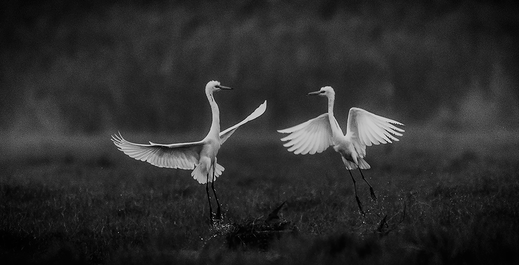
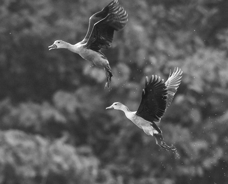
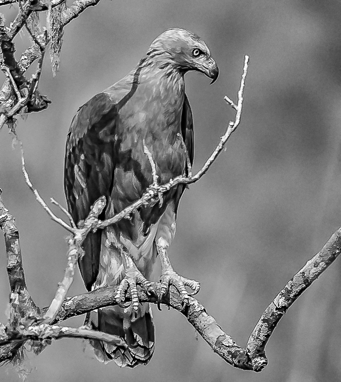
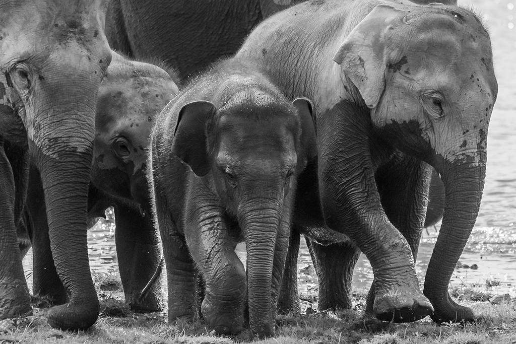
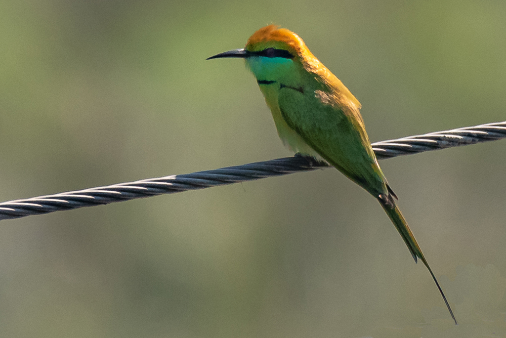
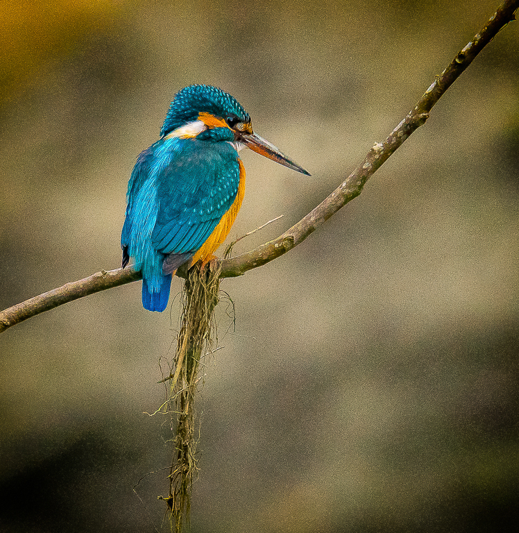
You have done well to separate the bird from the background in your mono conversion. Mono tones brings some uniqueness to this image. You have good details and texture on the bird. And as others has said, you can try to remove some of the bright spots from the background.
Thanks for sharing your editing technique. |
Apr 25th |
| 64 |
Apr 20 |
Comment |
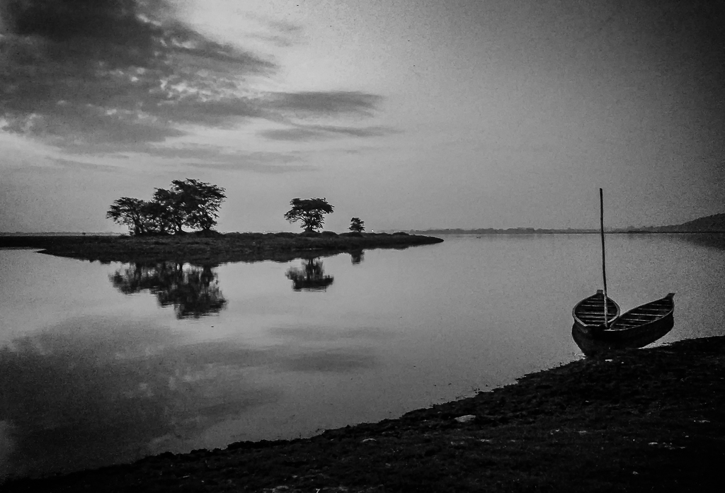
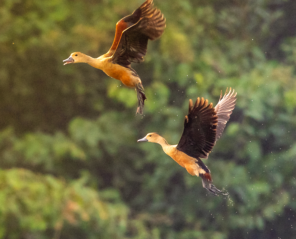
I liked the monochrome conversion. You have brought out good details on the duck. Very good contrast, texture and patterns on the feather. You have also done well to isolate the bird from the dark water. |
Apr 25th |
| 64 |
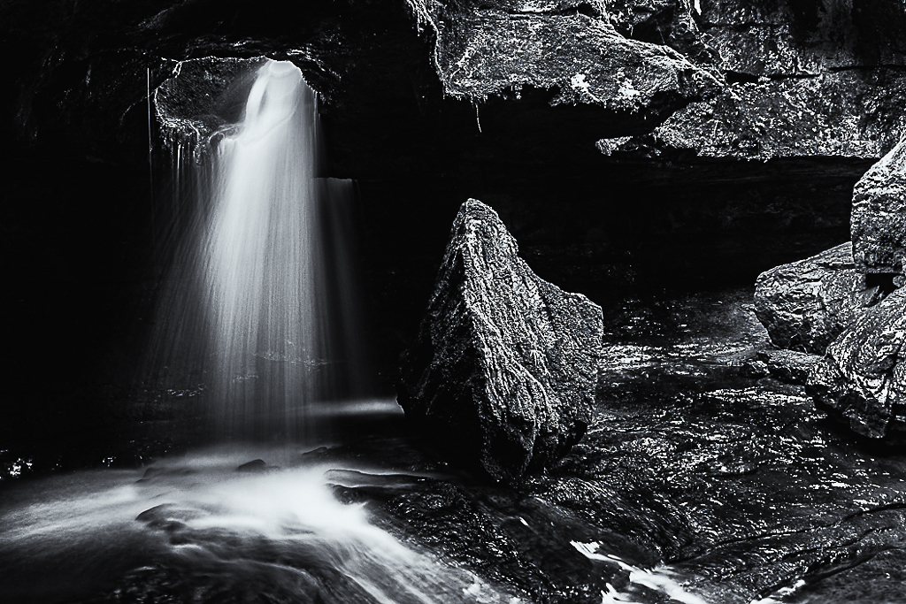
Apr 20 |
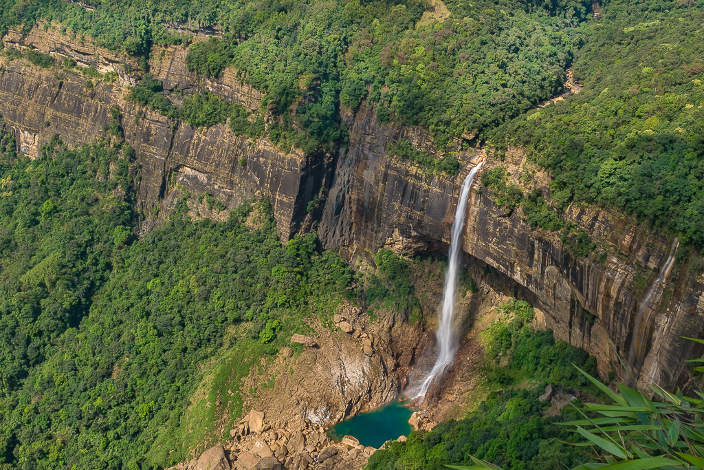
Comment |
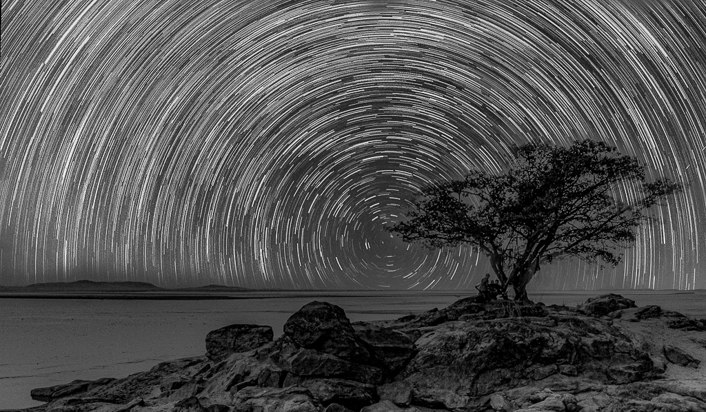
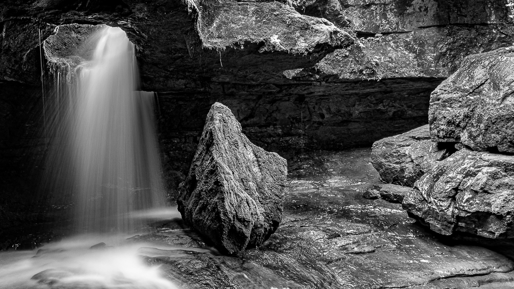
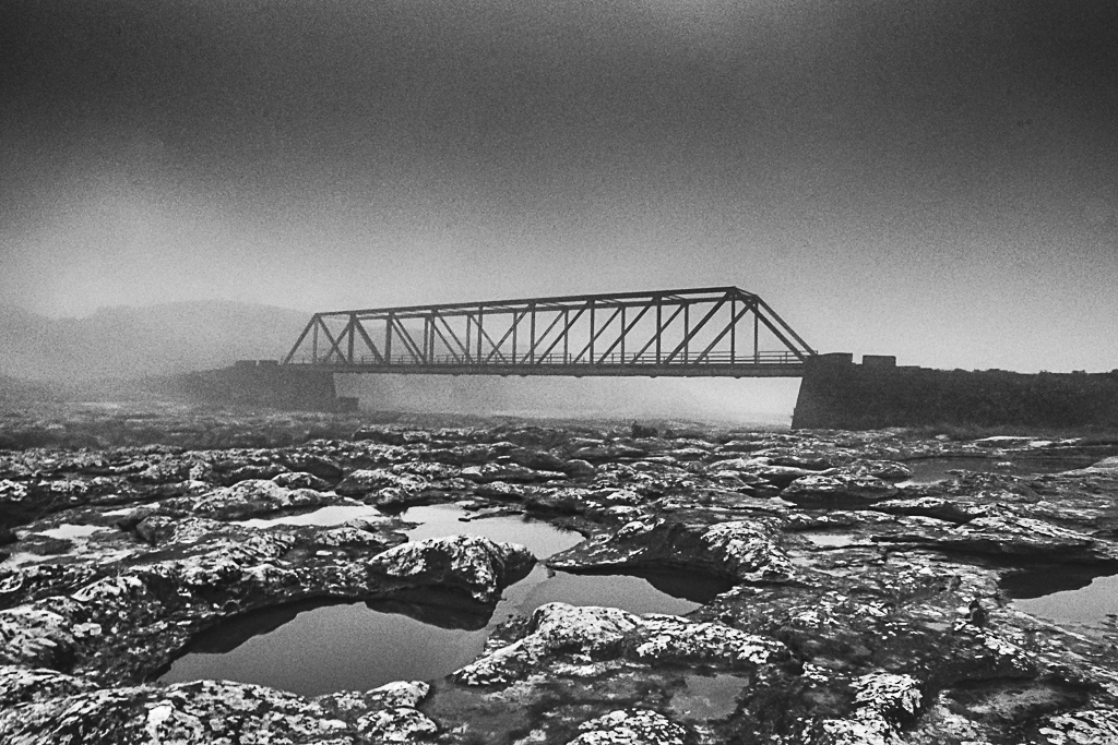
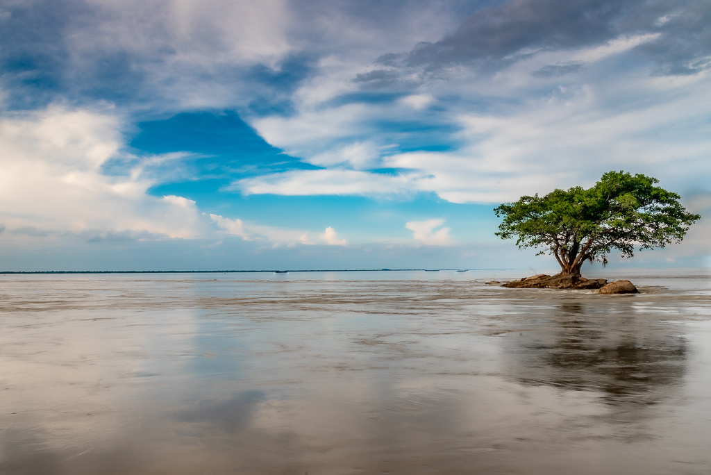
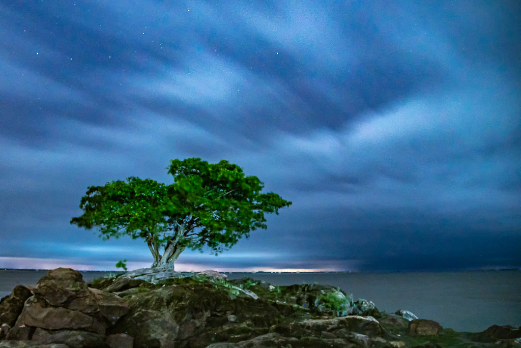
This is an epic image of this location and a new perspective for me. Good details, texture and patterns on the rocks. Image depicts the vastness of the place. Only the image seems to be tilted towards the right. |
Apr 25th |
| 64 |
Apr 20 |
Comment |
The image is full of repeated shapes and patterns which draws the attention. But as you go down the middle, there is less contrast between the branches and background. With f/3.2 are we loosing some DoF. |
Apr 25th |
| 64 |
Apr 20 |
Comment |
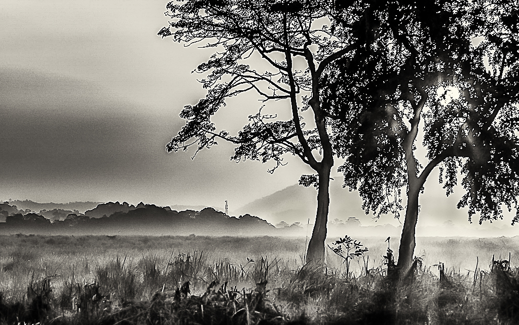
I liked the monochrome version of your image. Looks like a work of art - like a pencil sketch. The subtle tones and a low key treatment makes the image quite appealing and unique. I liked the tree on the right skyline breaking pattern of a line of houses. Nothing for me to add here. |
Apr 25th |
| 64 |
Apr 20 |
Comment |
Thanks for all your feedback and encouragement. |
Apr 25th |
| 64 |
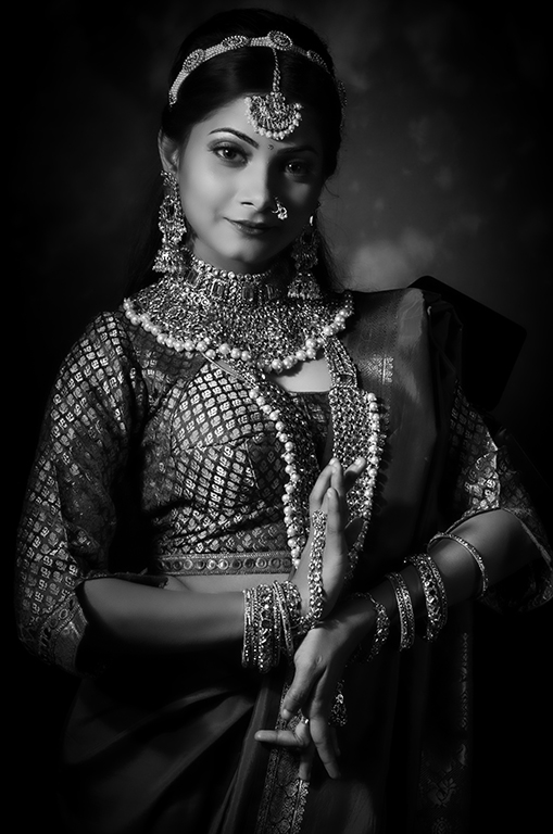
Apr 20 |
Reply |
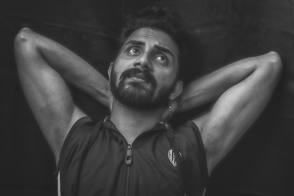
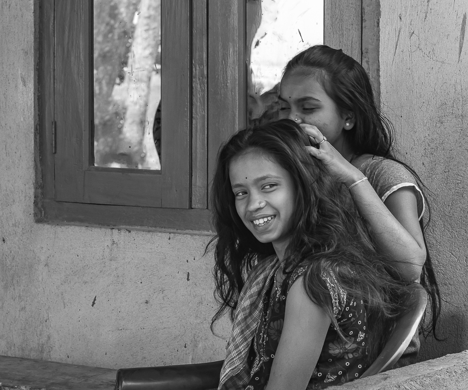
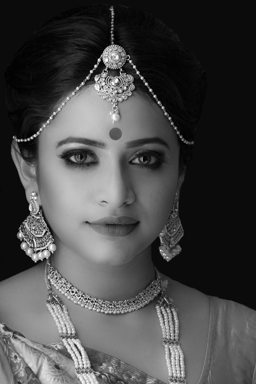
I agree with you. Need to tone down the nose jewelry a bit. |
Apr 25th |
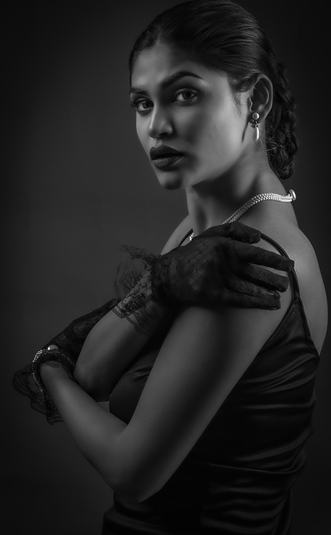
| 64 |
Apr 20 |
Reply |
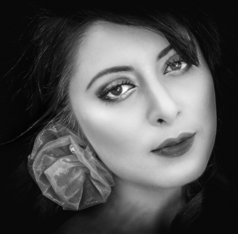
Here we have used two lights for the Rembrandt lighting effect. One light (key light) at the left side of the model kept a bit higher and another light at half the height on the right with half strength compared to the light on the left. And we have used a light to illuminate and to separate the model from the background. |
Apr 25th |
7 comments - 2 replies for Group 64
|
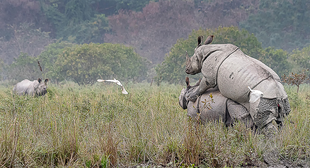
| 72 |
Apr 20 |
Comment |
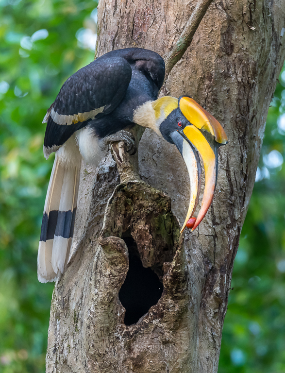
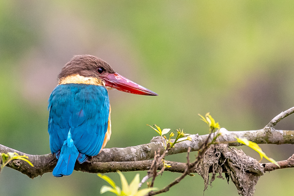
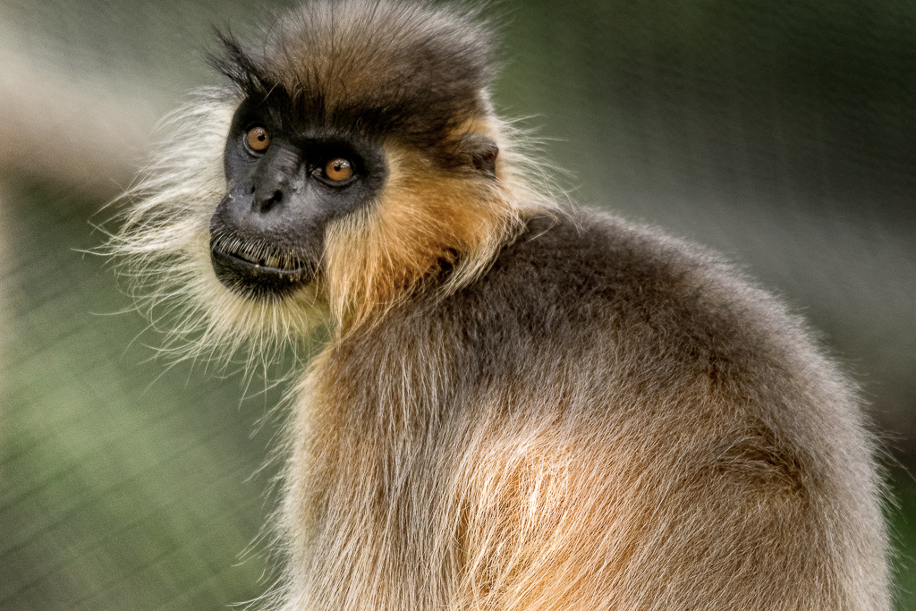
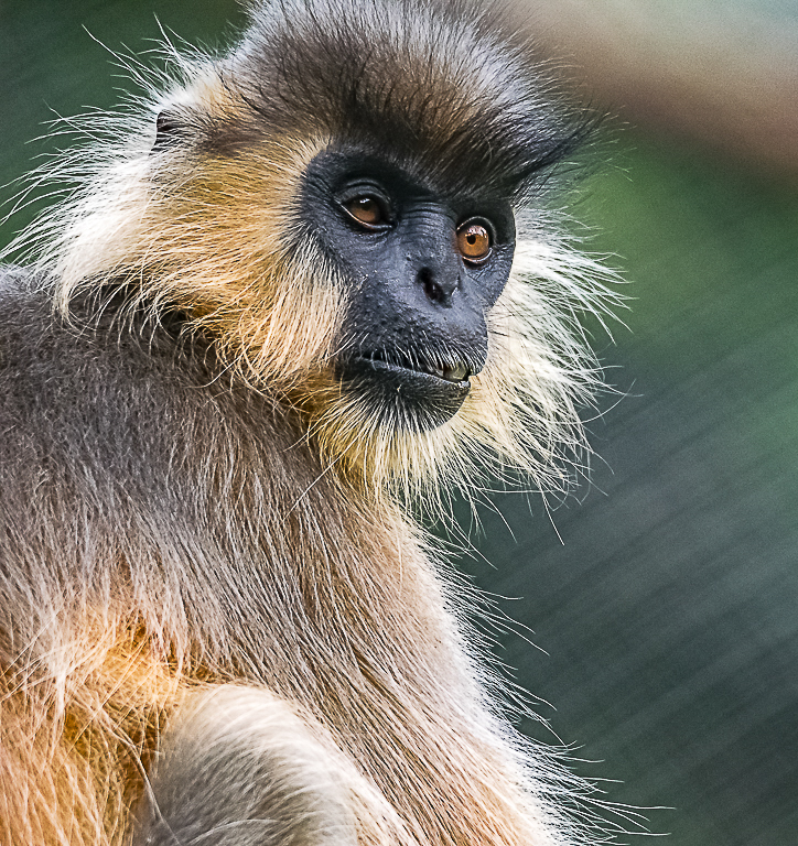
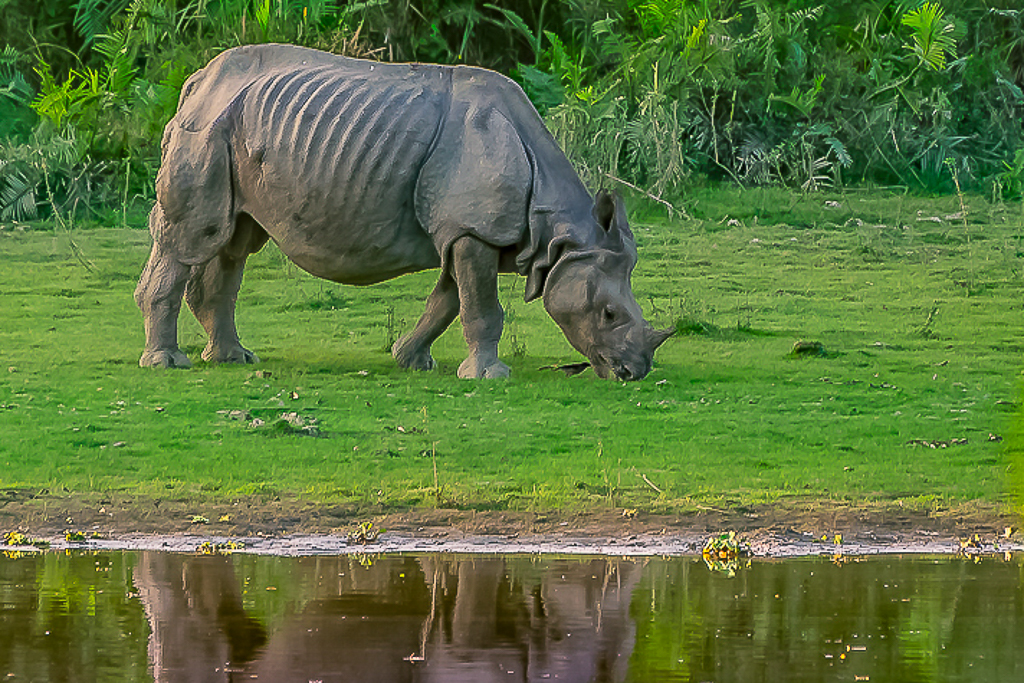
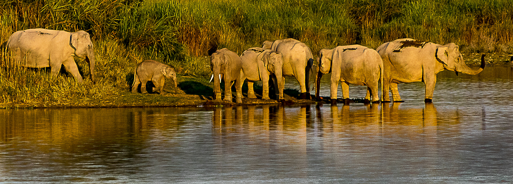
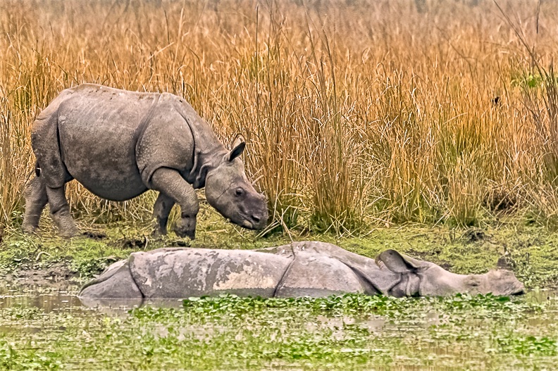
This is beautiful. Good sharpness, colors, texture and details. Crop is good. I always like animals in their Natural habitat. Here we can see that. Nice work. |
Apr 30th |
| 72 |
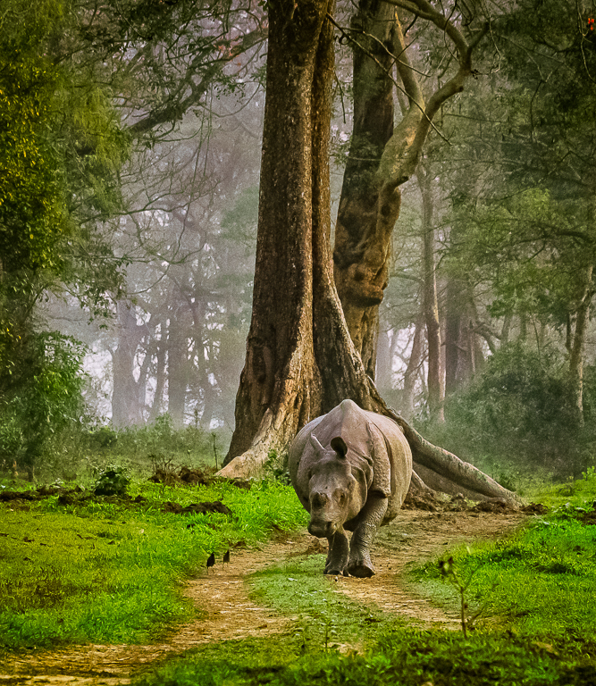
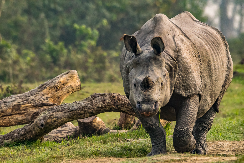
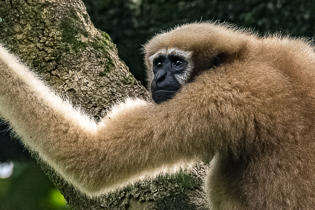
Apr 20 |
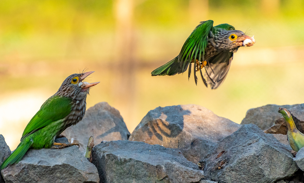
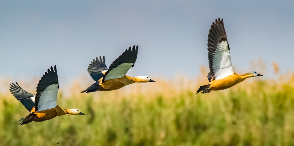
Comment |
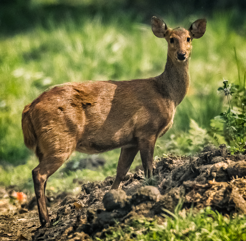
The image us sharp with good colors and details. You got good DoF. Light is very good and giving due focus on the subject. Background is nice and soft. Very interesting image. |
Apr 30th |
| 72 |
Apr 20 |
Comment |
This is a beautiful high key image in monochrome. Talks lot of the time we are currently living in. The image is sharp with good tones. Well done. |
Apr 30th |
| 72 |
Apr 20 |
Comment |
Good creative image and vision. I liked the use of light to create the effect and layers. Good colors. |
Apr 30th |
| 72 |
Apr 20 |
Comment |
This is an impressive image and captured beautiful Sunset rays the way you wanted. Image has depth and layers. Only one feedback. If you can increase the exposure of foreground a bit. |
Apr 30th |
| 72 |
Apr 20 |
Comment |
Thanks all for the feedback. I will incorporate some of the feedbacks before entering this image in salons this month. |
Apr 30th |
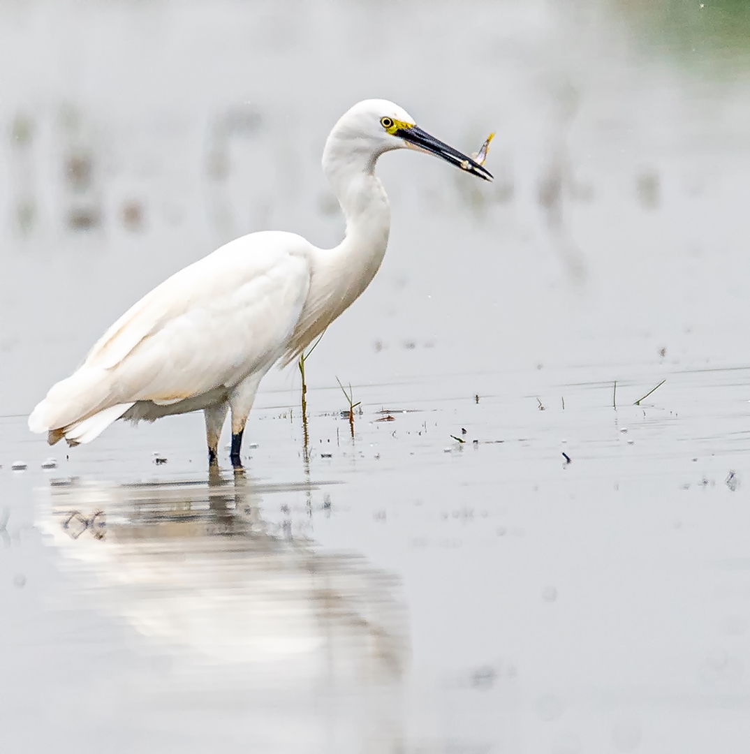
| 72 |
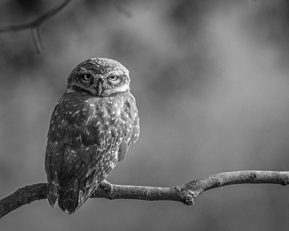
Apr 20 |
Comment |
Nice image of this owl. For me, crop is just right for keeping the focus on the bird. Image is sharp with good details on the bird. I liked the soft background and overall colors of this image. |
Apr 30th |
7 comments - 0 replies for Group 72
|
14 comments - 2 replies Total
|