|
| Group |
Round |
C/R |
Comment |
Date |
Image |
| 36 |
Feb 23 |
Comment |
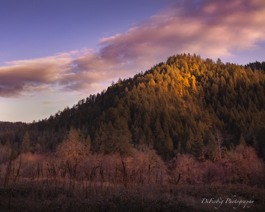
Here is what I meant. I have tried to emphasise the foreground, the middle ground with the trees and the background with the point of interest. I have also tried to make a path from the lower to the upper trees for the eyes to follow. Just a suggestion 🙂 |
Feb 27th |
 |
| 36 |
Feb 23 |
Comment |
I like the idea to focus the light beam on the stars. To me, there are too many details that take away attention from the main object. Therefore I support Barbara`s suggestion. |
Feb 24th |
| 36 |
Feb 23 |
Comment |
A well-captured picture, taking into account captured through a car window. I like the palette and the unreal feeling. The section of the rainbow makes this picture stand out from the crowd. |
Feb 24th |
| 36 |
Feb 23 |
Comment |
I like the depth of this image, it has a clear foreground, middle and background. The mountain top is to me the point of interest, but the moon is competing for attention. My suggestion is to crop to a square format and in that way focus on the main attraction. |
Feb 24th |
| 36 |
Feb 23 |
Comment |
I like the composition and the cold and warm colours that make the picture appealing. I would consider straightening the tower to a more vertical position. |
Feb 24th |
| 36 |
Feb 23 |
Comment |
Timing is everything in this picture. The light is almost like an explosion that is reflected in the ground. Well done! |
Feb 24th |
| 36 |
Feb 23 |
Comment |
A beautiful autumn image. The colours are the main attraction and the road is second. The post-production is well done. I have a problem finding a point where I can rest my eyes and see a pattern in the composition. A variation in the intensity of light might help. |
Feb 24th |
7 comments - 0 replies for Group 36
|
| 74 |
Feb 23 |
Comment |
Interesting to see that you have gone into architecture. The verticals and the symmetry are good. One problem with windows involved is that the outside is blown out, but it is well-balanced here. An architectural image should either describe the structure or awoke some emotion. To me, it doesn't fulfil any of the criteria. The main reason is that the two lamps are the main attraction as they have the highest contrast and brightness. The reflection at the bottom divides the picture into two without any meaning to me.
I know that this comment may feel harsh, but it is my sincere meaning and is meant to make you proceed with architecture photography and improve day by day. This is a genre that takes time and a lot of work to succeed in, so just keep going. |
Feb 11th |
1 comment - 0 replies for Group 74
|
8 comments - 0 replies Total
|