|
| Group |
Round |
C/R |
Comment |
Date |
Image |
| 36 |
Jan 23 |
Comment |
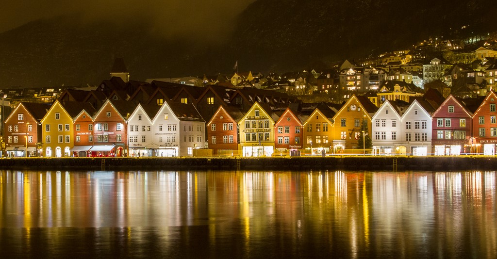
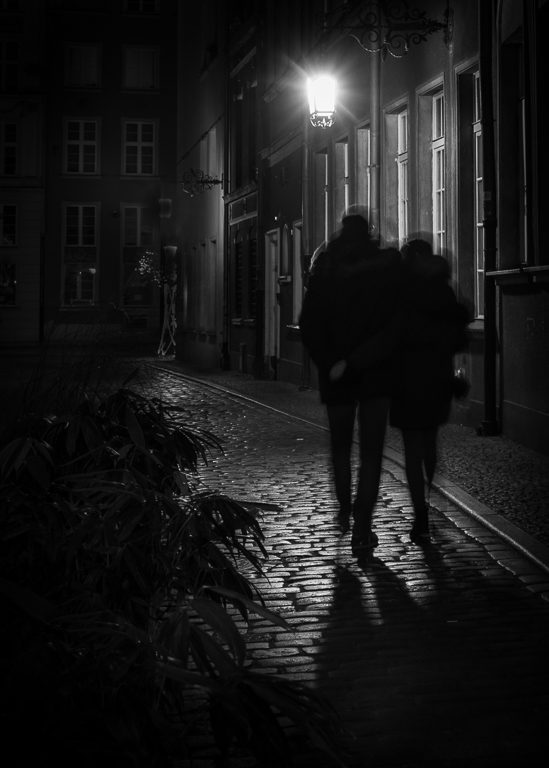
I like the eye-catching artwork and the two people sitting below it. One looks at the artwork and the other with a jacket in the same red colour as in the artwork. The open door to the restaurant creates depth and also balance in the picture. The persons to the right only distract the scene in my opinion. My suggestion is to crop from both left and right so that the two lamp frames at the top are almost at the edges. |
Jan 28th |
| 36 |
Jan 23 |
Comment |
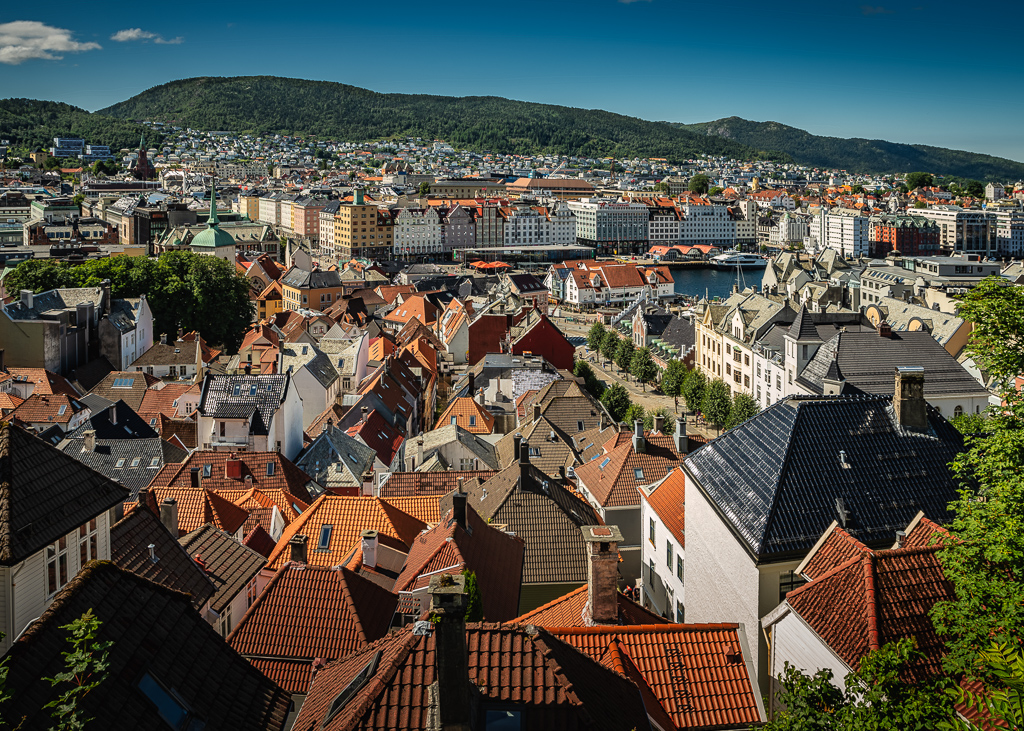
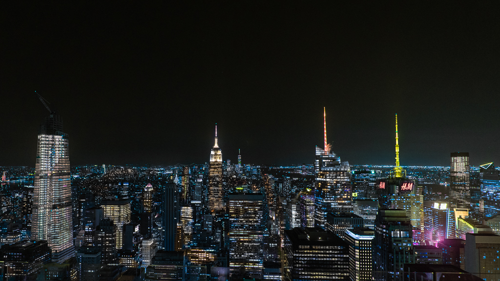
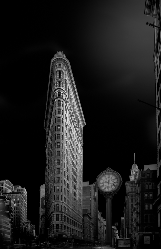
This picture could easily be sold as a postcard over LA. It is well-captured and well-edited. I have no more to say. |
Jan 28th |
| 36 |
Jan 23 |
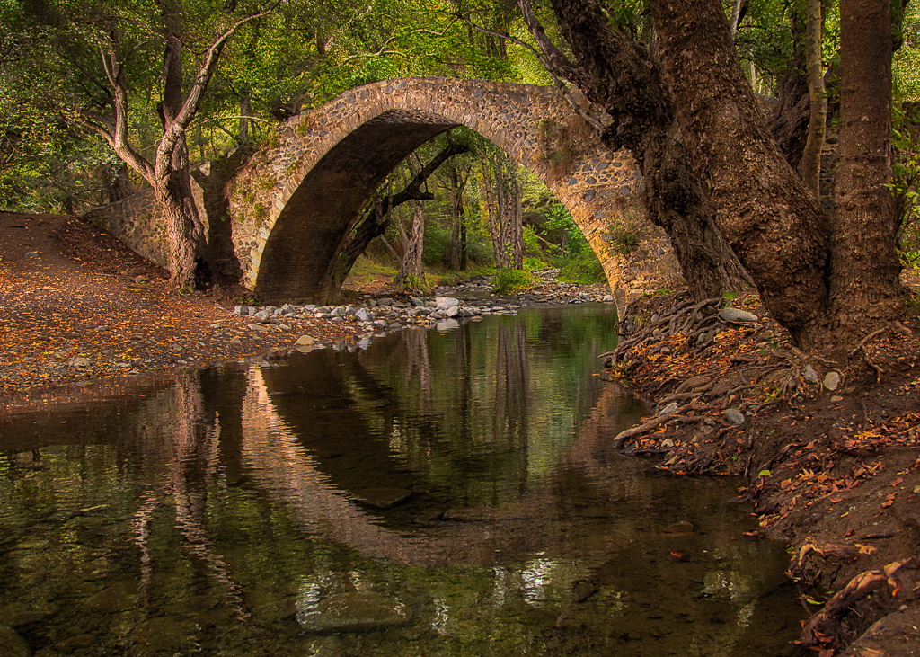
Comment |
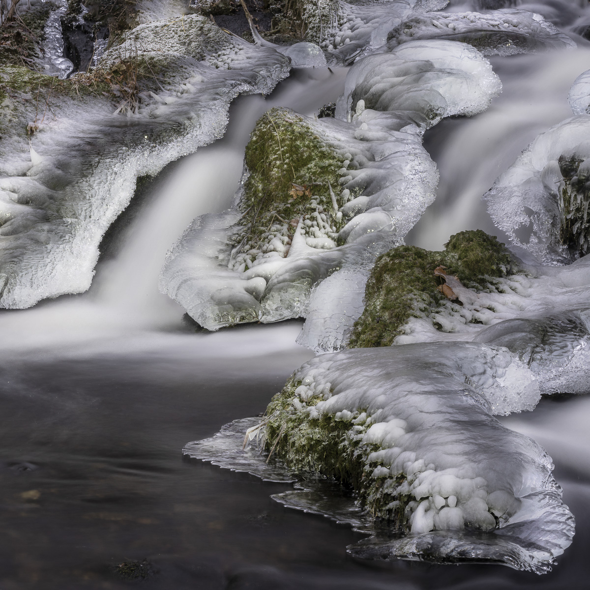
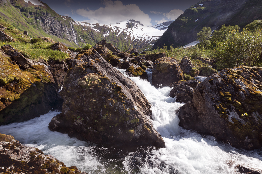
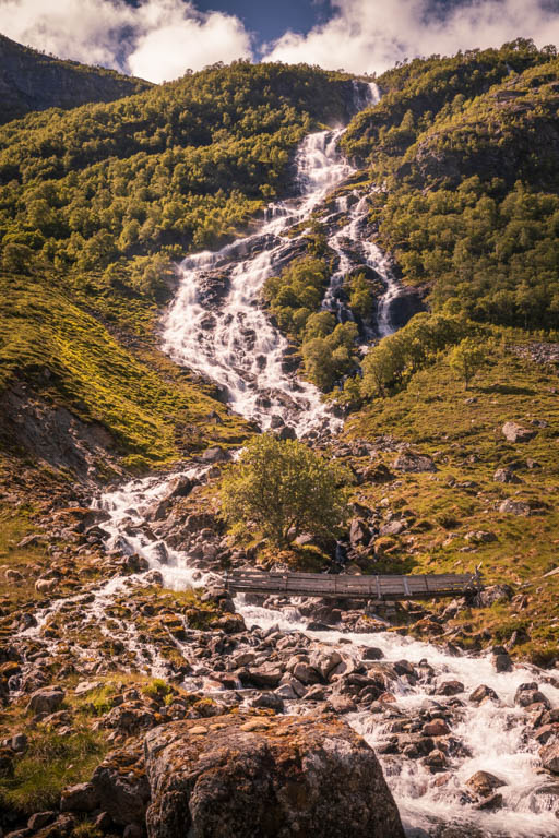
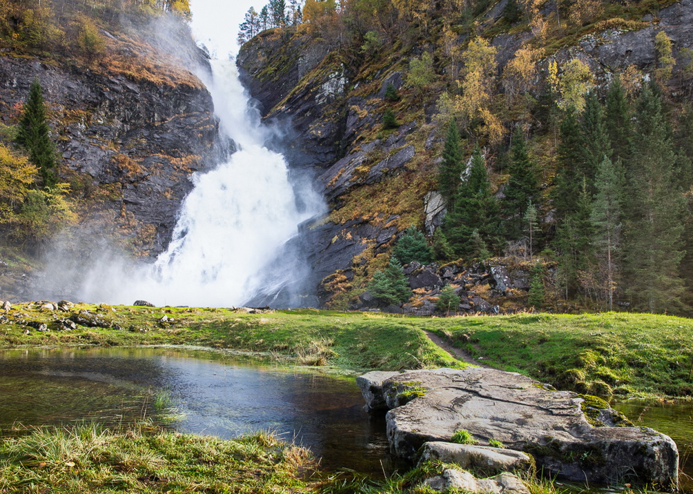
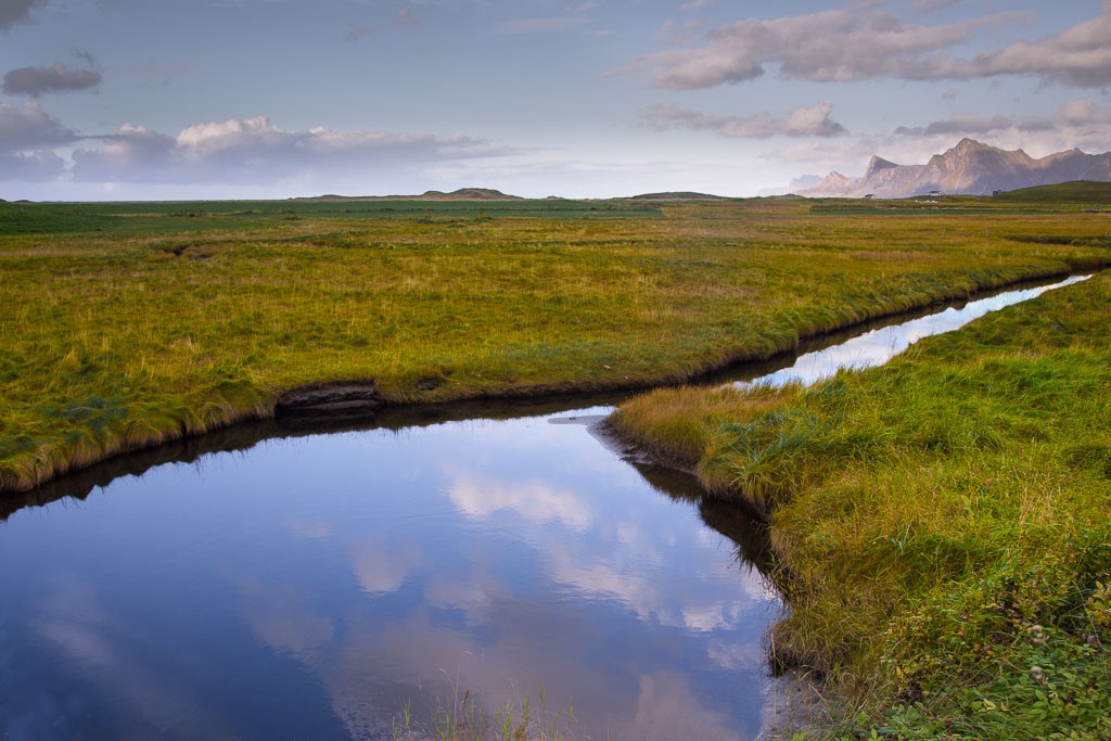
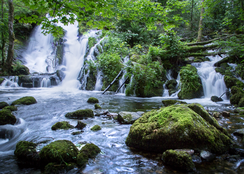
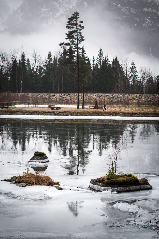
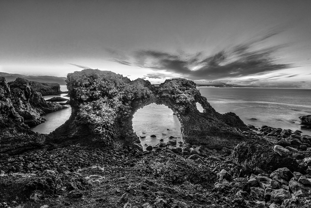
I like the low camera angle and the cropping. My first impression was that the trees are over-saturated and therefore take too much attention. To me, the rock in the middle of the stream is the main object and suggests darkening the surroundings to make the rock shine. The white stream is partly burned out and is better in the original. |
Jan 28th |
| 36 |
Jan 23 |
Comment |
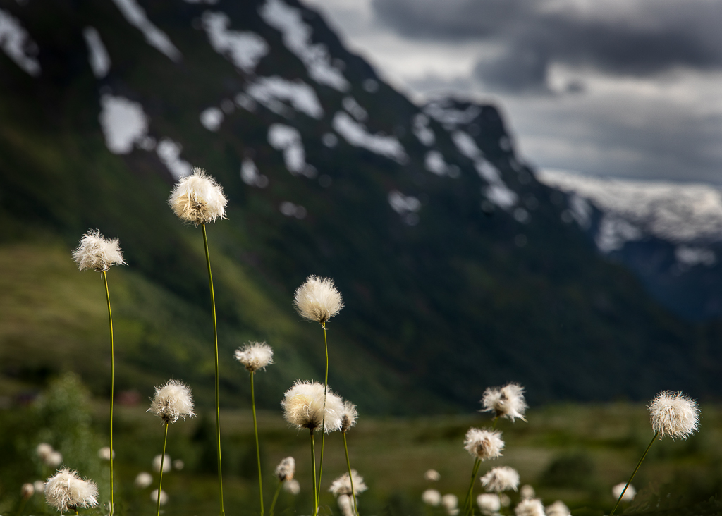
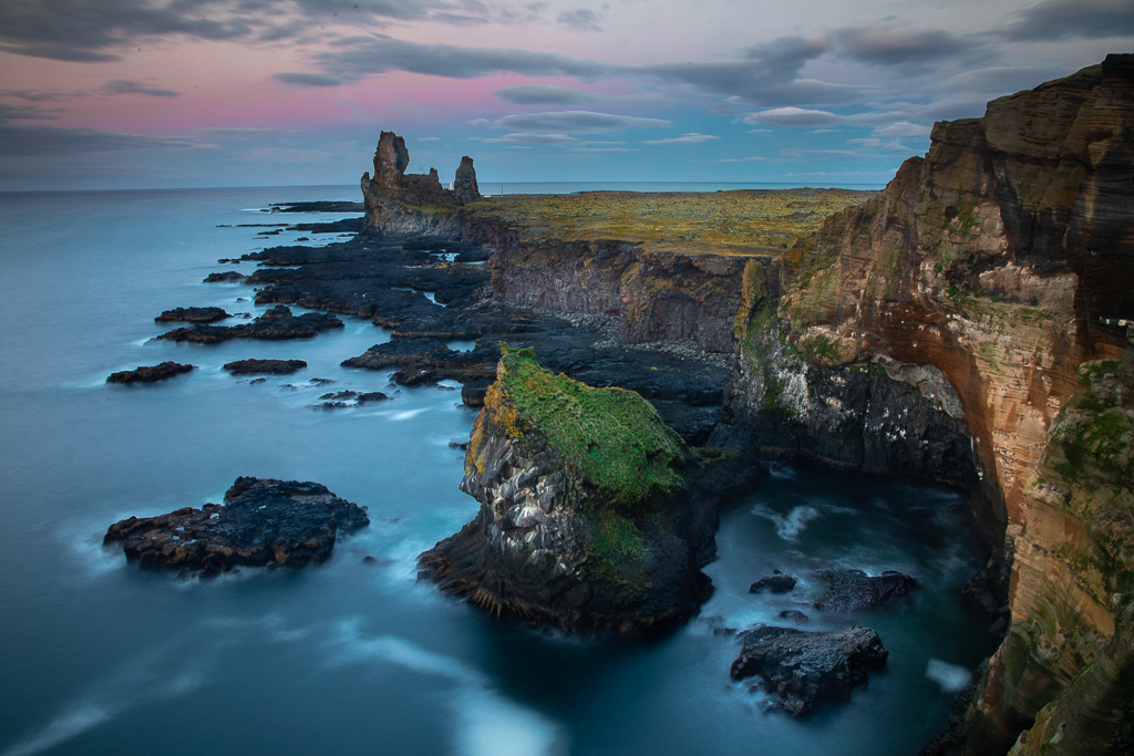
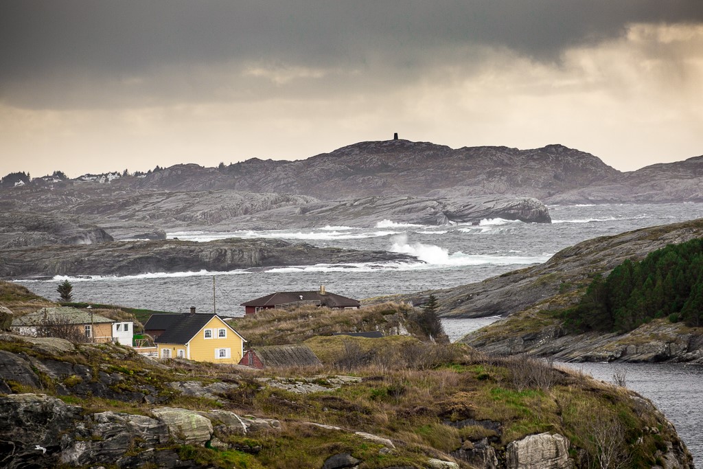
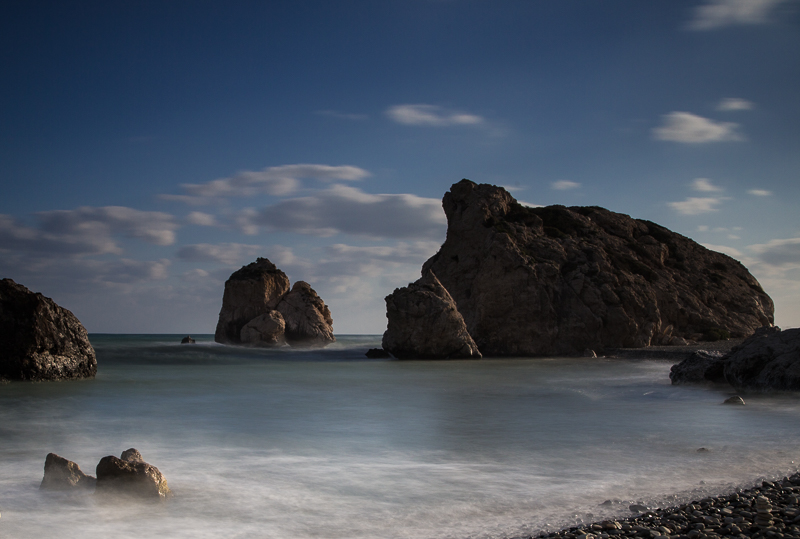
Oh, here you can really feel the wind in your backbone! Your struggle was heavily rewarded, I would say. I am not sure if it would work or not, but you could try to darken the sky in order to make a contrast to the ground, but not so much that the straws vanish. I am not in favour of the suggested pictures as they look artificial and the clouds go in the opposite direction of the wind. |
Jan 28th |
| 36 |
Jan 23 |
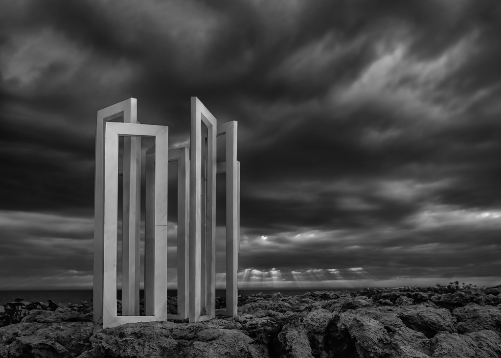
Comment |
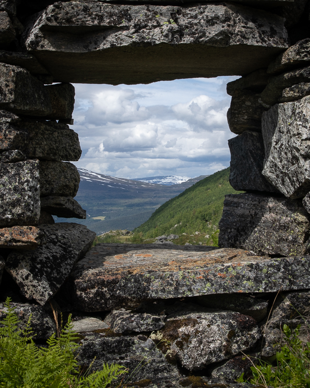
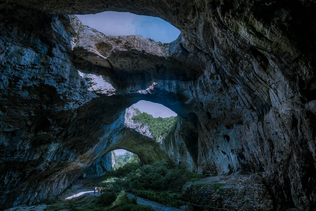
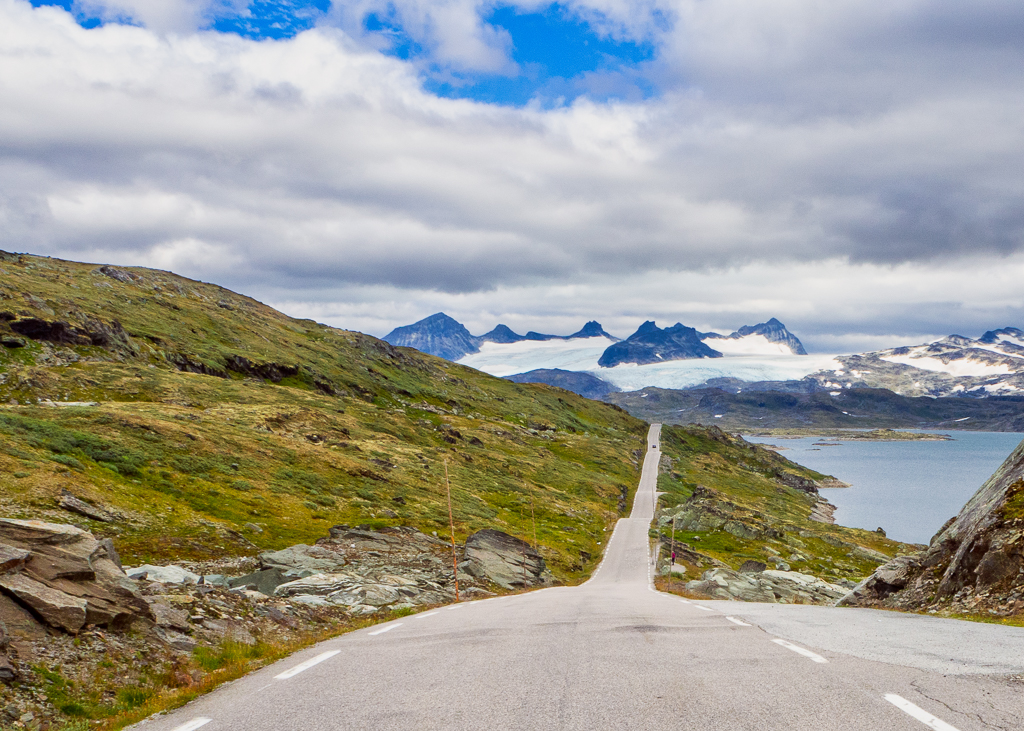
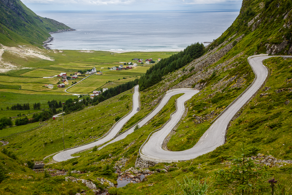
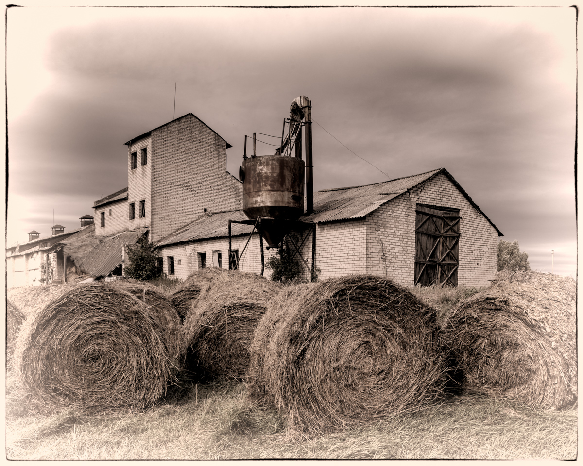
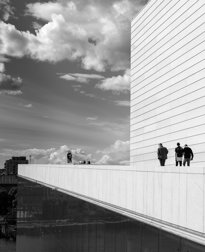
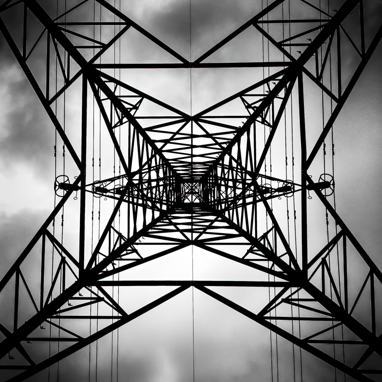
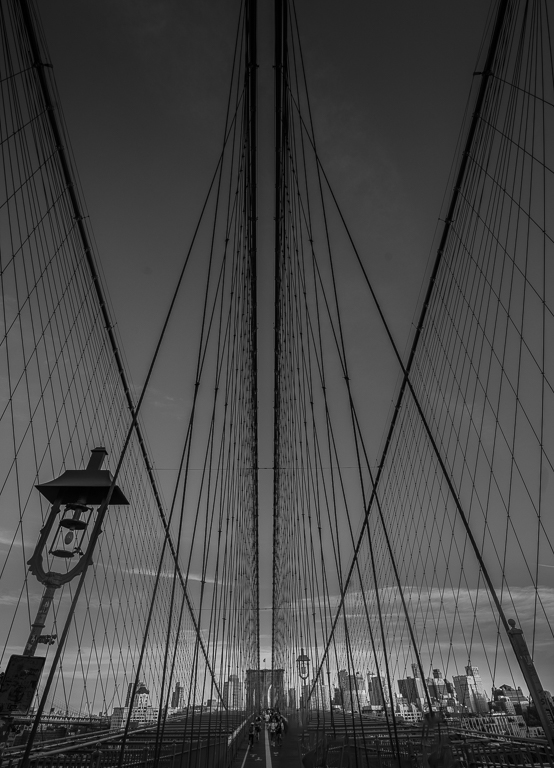
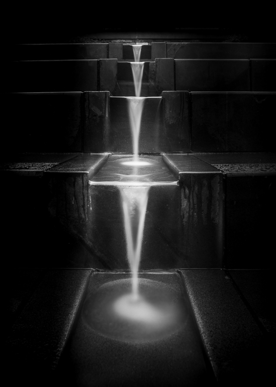
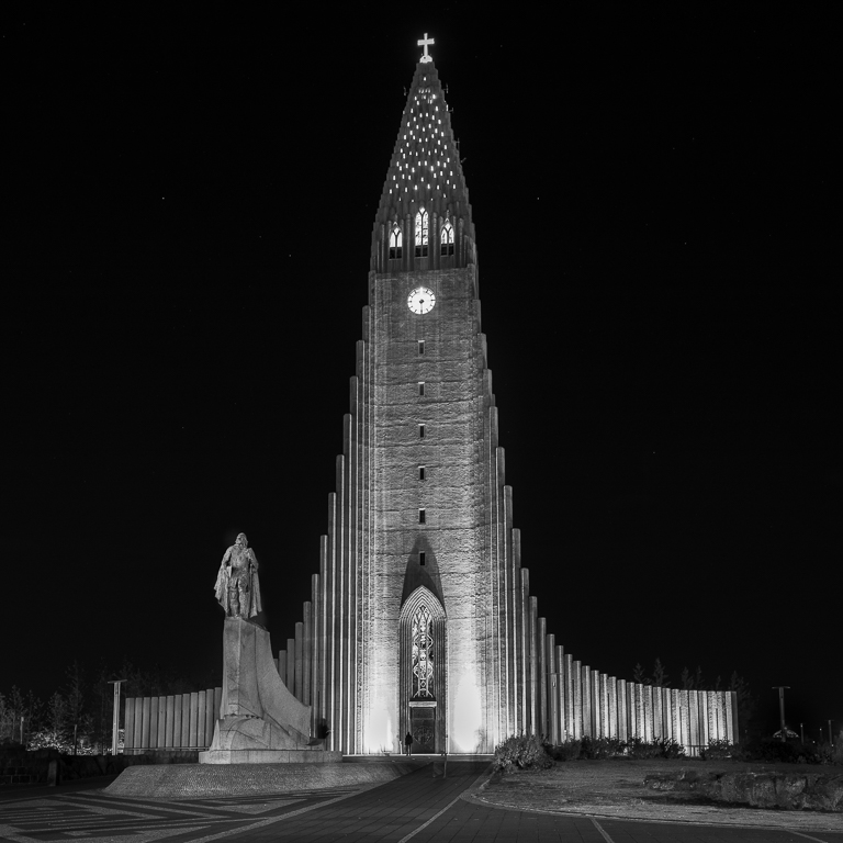
An interesting composition! The first thing I scrutinize when I see a picture like this is the symmetry, is it about symmetrical or is it symmetrical? This one is as spot-on as you can get! To me, this is what makes this image stand out, everybody can take a picture of a colourful scene, but this one demonstrates that the photographer knows his trade. |
Jan 28th |
| 36 |
Jan 23 |
Comment |
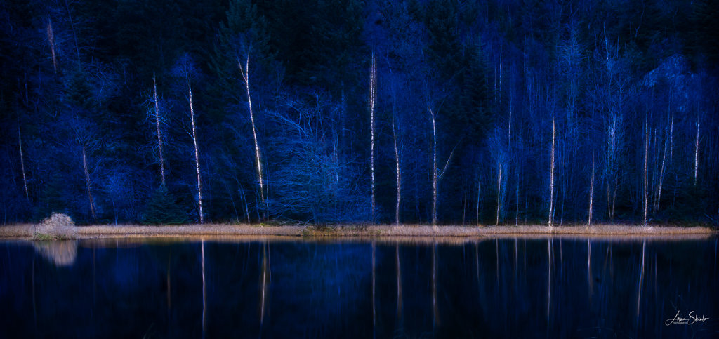
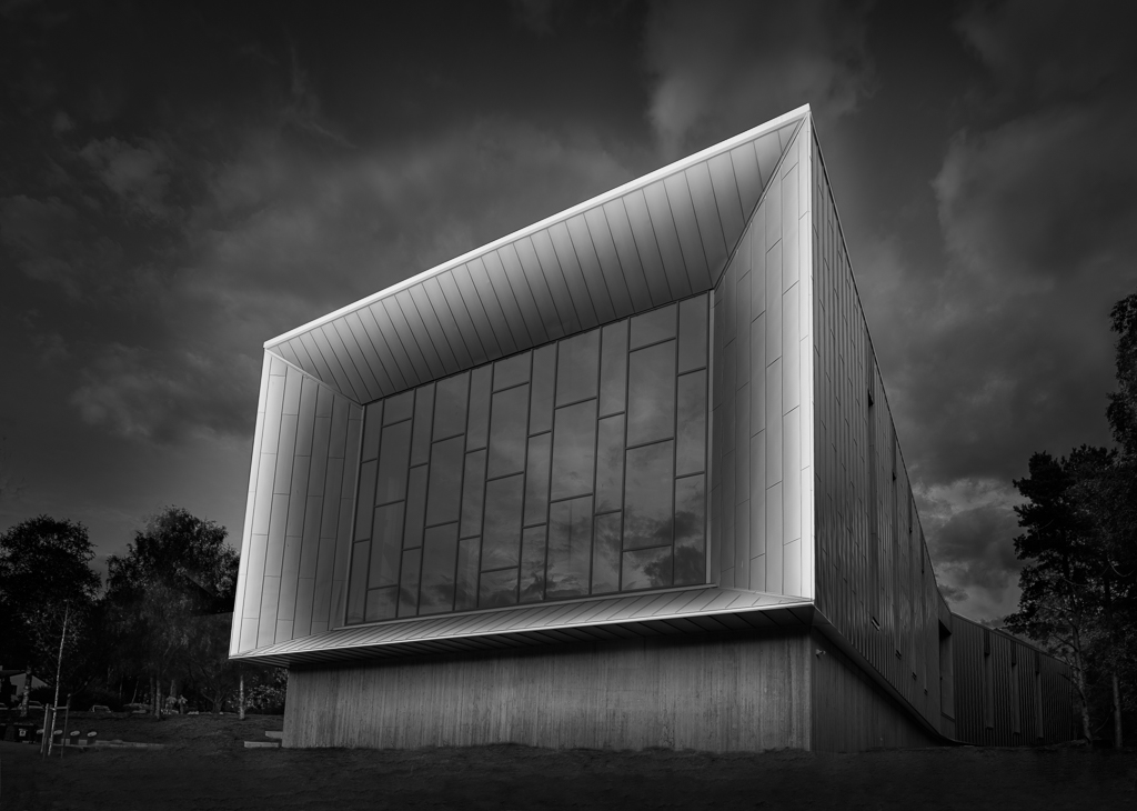
You have succeeded very well with your painterly approach in my opinion. Less is more and that works well here by taking down the saturation. Since most has already been said already, my comment is to make it even moodier by giving the road a tint of golden colour and darkening the upper right corner as it takes attention from the main subject. You could try darkening the whole picture slightly, but I am not sure. |
Jan 28th |
| 36 |
Jan 23 |
Comment |
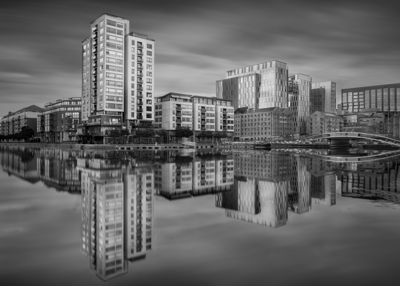
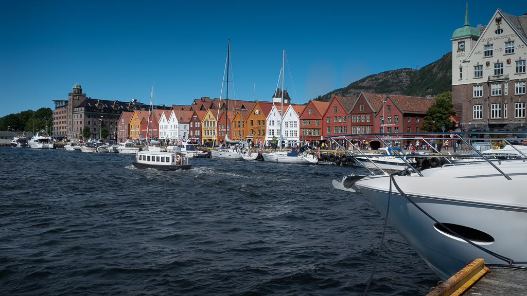
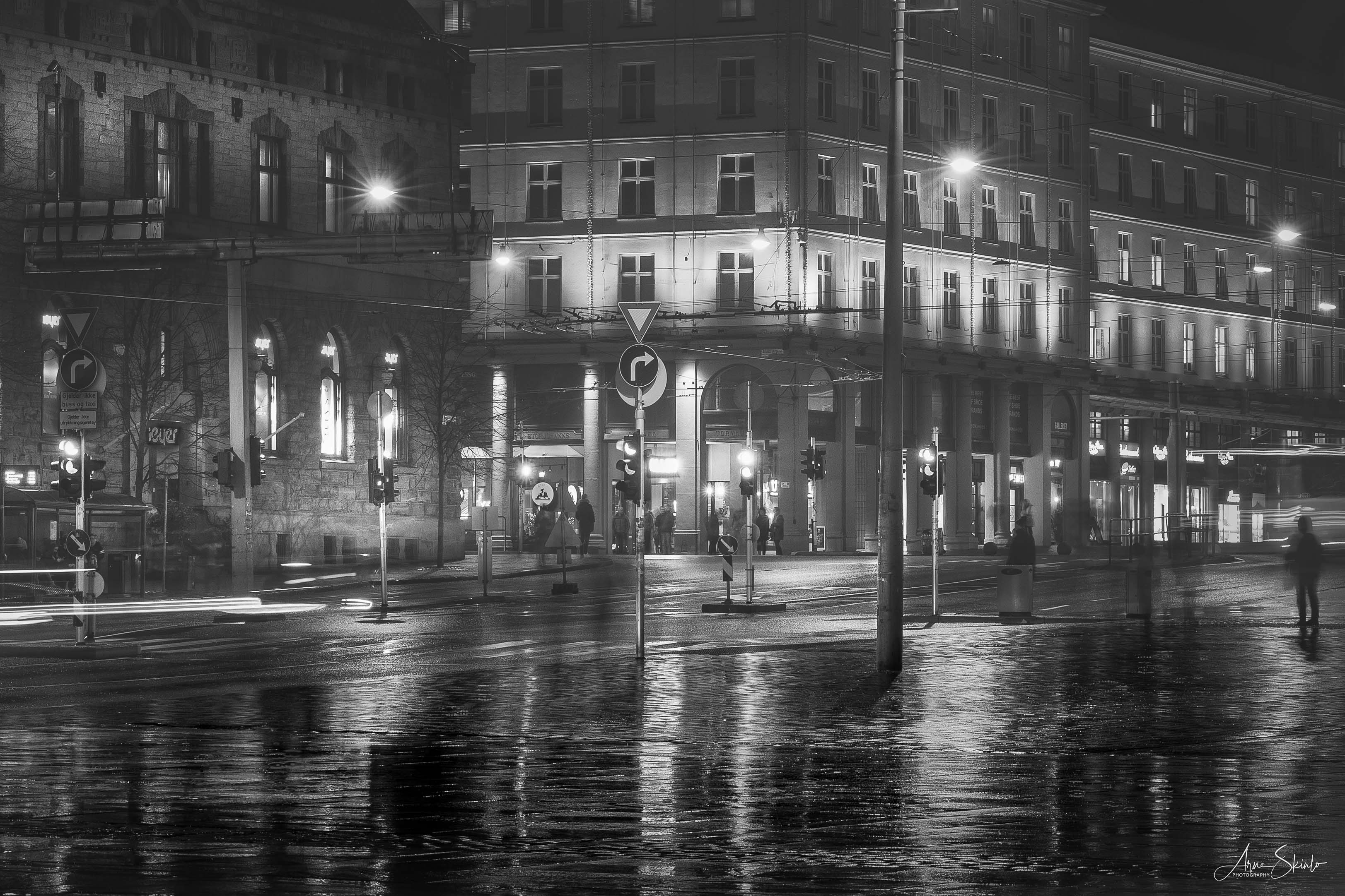
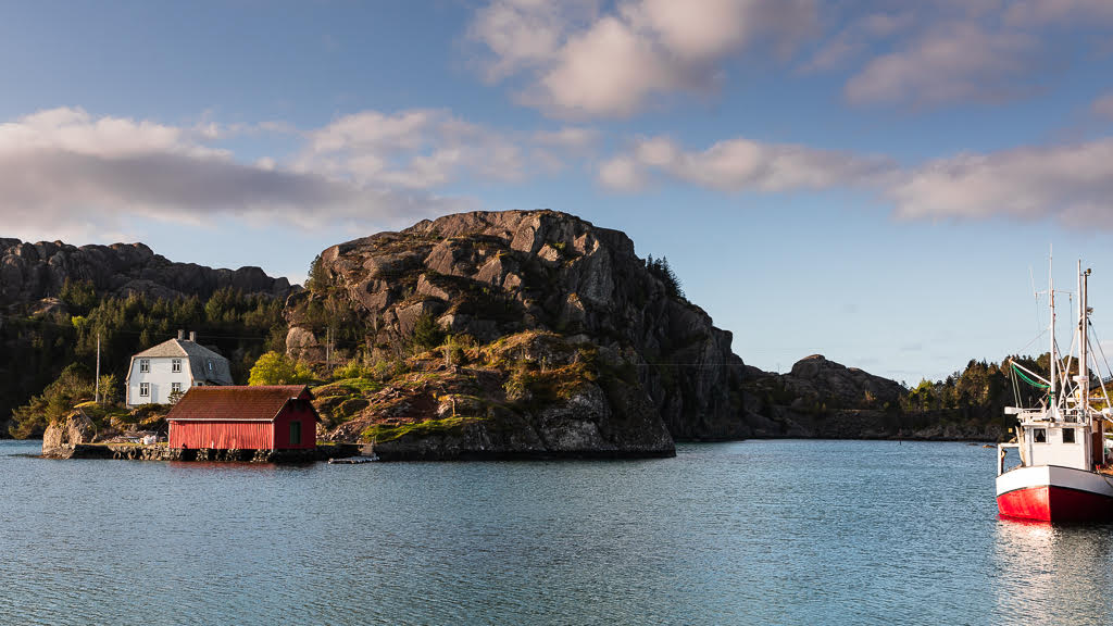
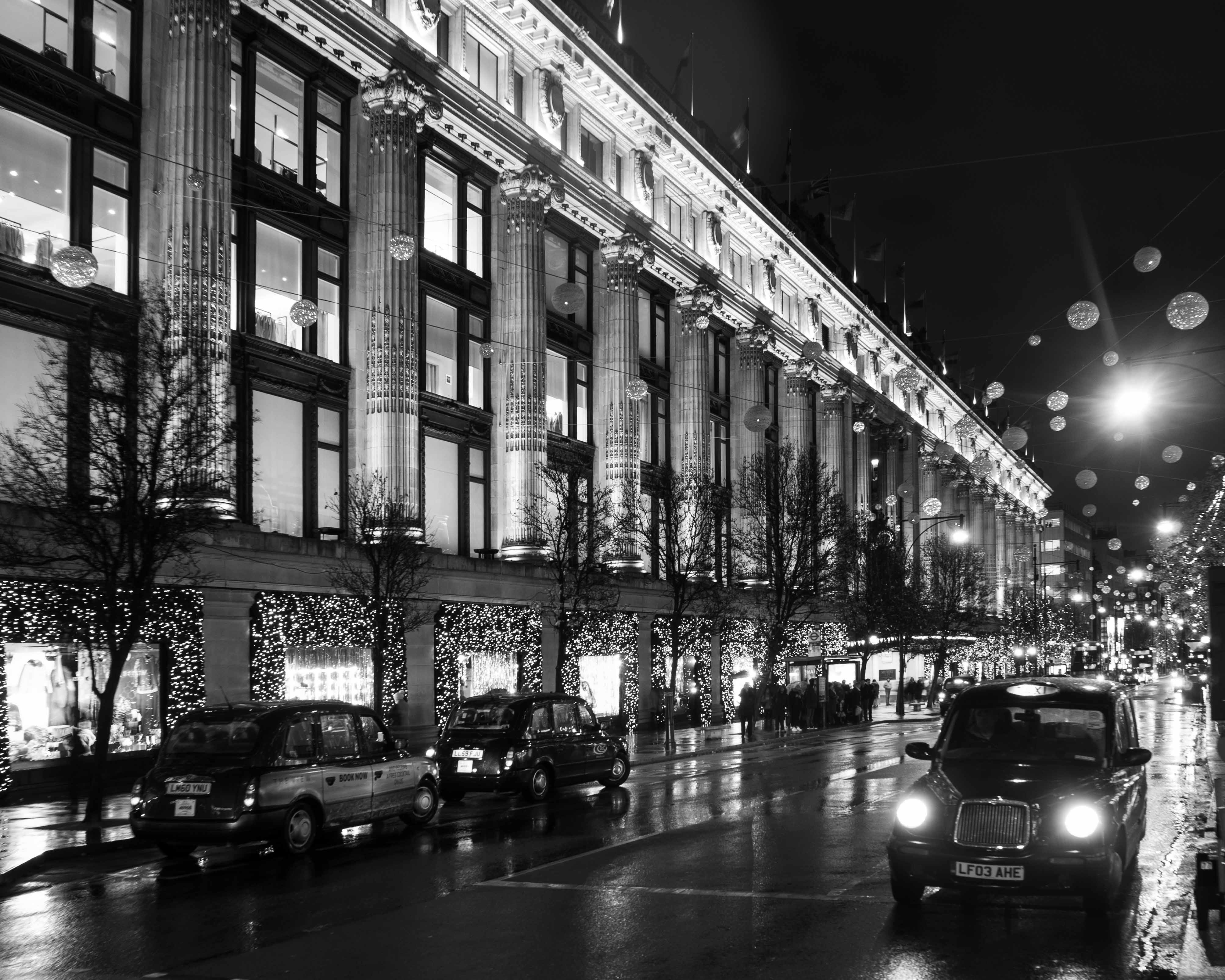
Thank you for your comment, Larry. Good to know that you enjoy my photography. The sharp boats are easy to explain: there were no waves 🙂. Normally, I use the method you describe by taking one picture with a high shutter speed. I think you have a good point cropping in from the left, about to the middle of the building. |
Jan 8th |
| 36 |
Jan 23 |
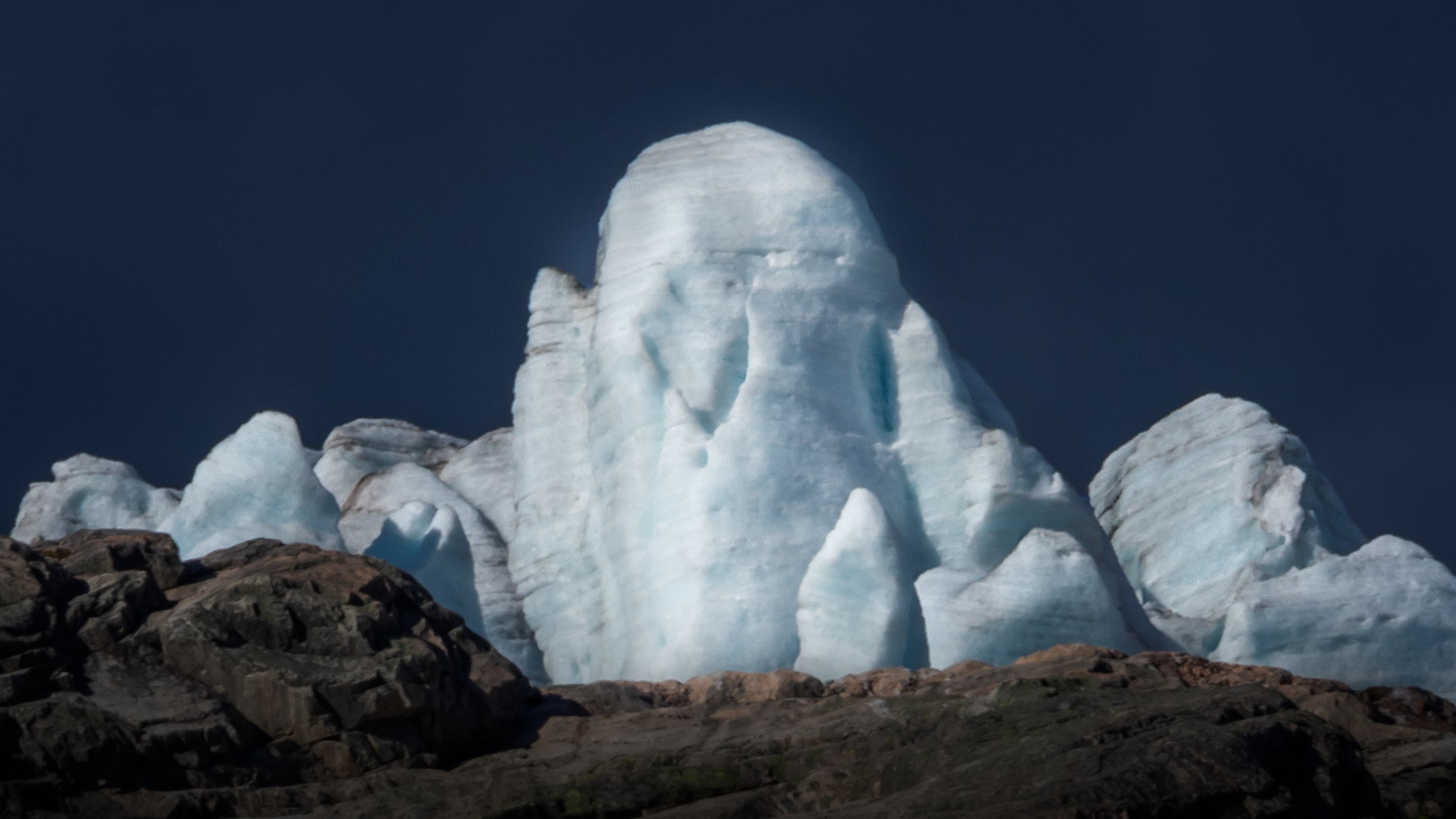
Reply |
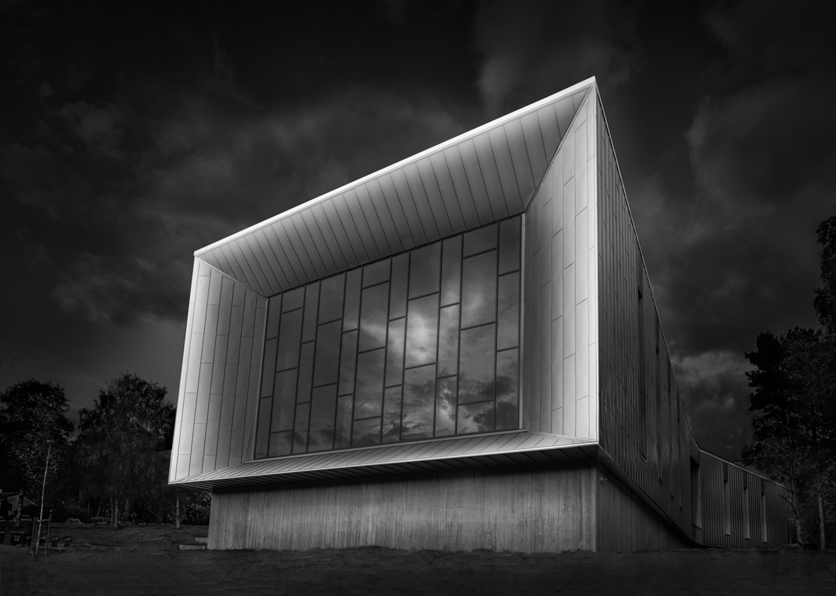
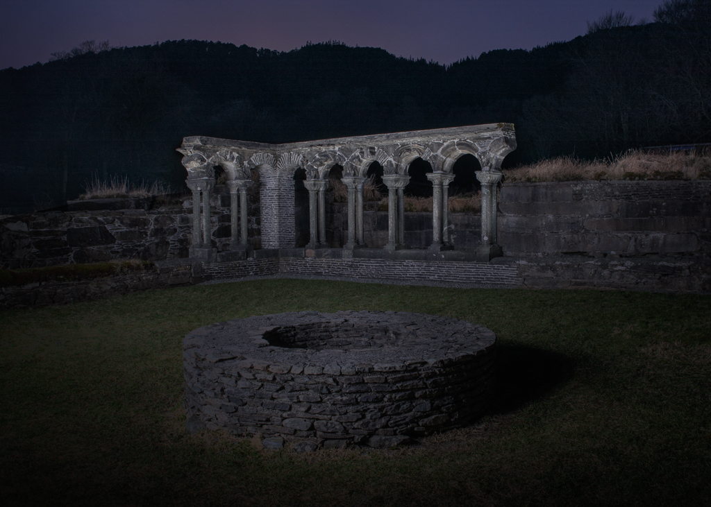
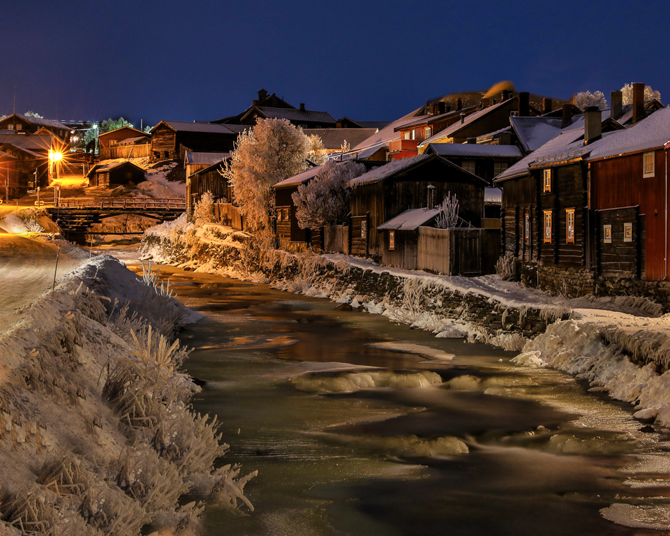
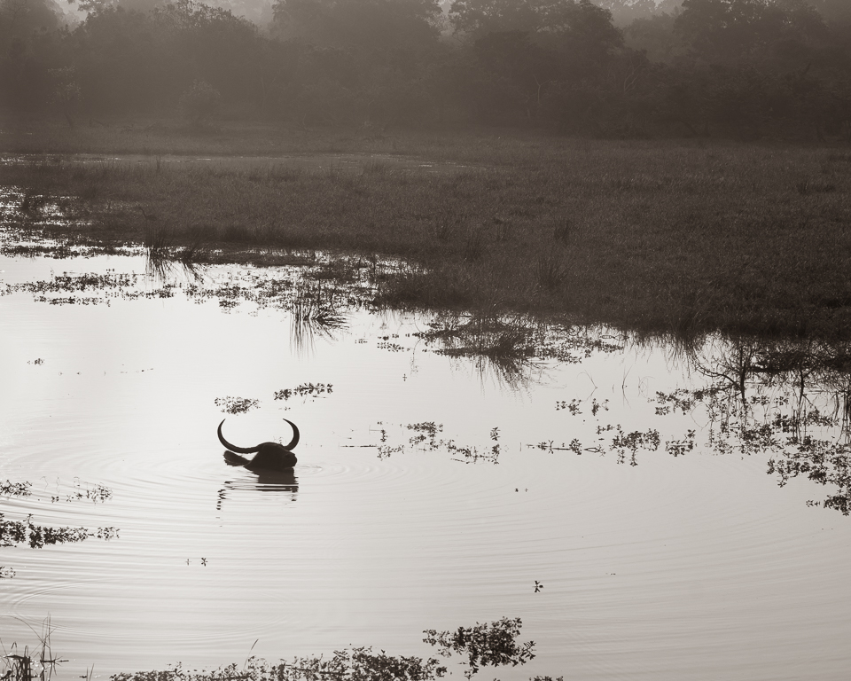
The unnatural look is intentional. The goal was to give the image a dreamy feeling and give calmness to the viewer. Although it looks a bit flat, it has a full tonal range from black to white. I haven't touched the clarity and texture sliders. It is all done with selective dodge and burn and curves. |
Jan 7th |
7 comments - 1 reply for Group 36
|
| 74 |
Jan 23 |
Reply |
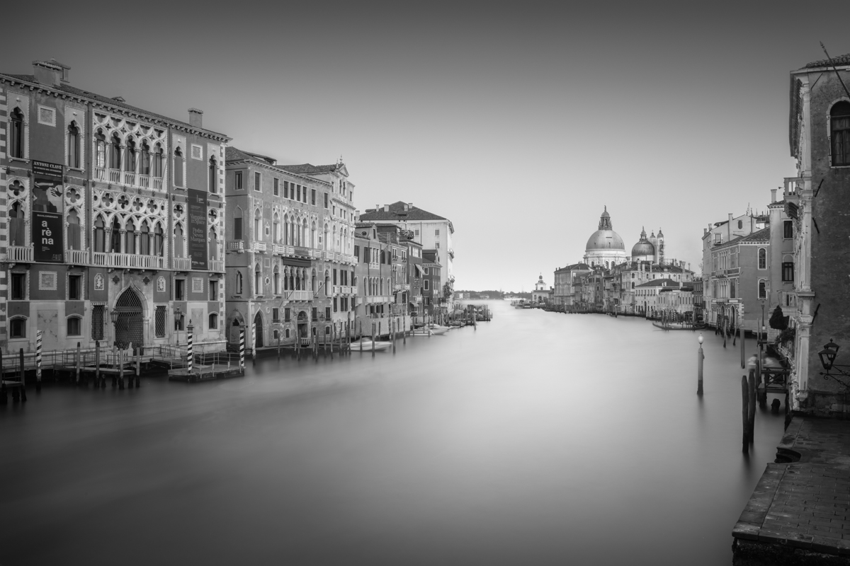
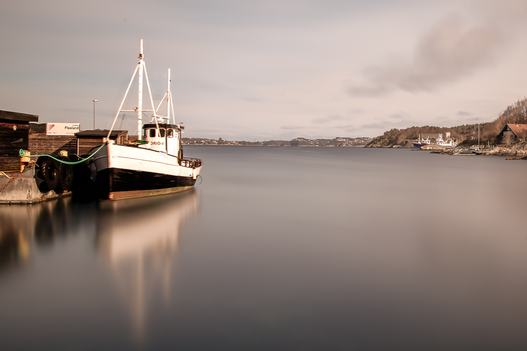
Thank you for your comment, Don. I think I agree about burning the buildings on the right. |
Jan 24th |
| 74 |
Jan 23 |
Comment |
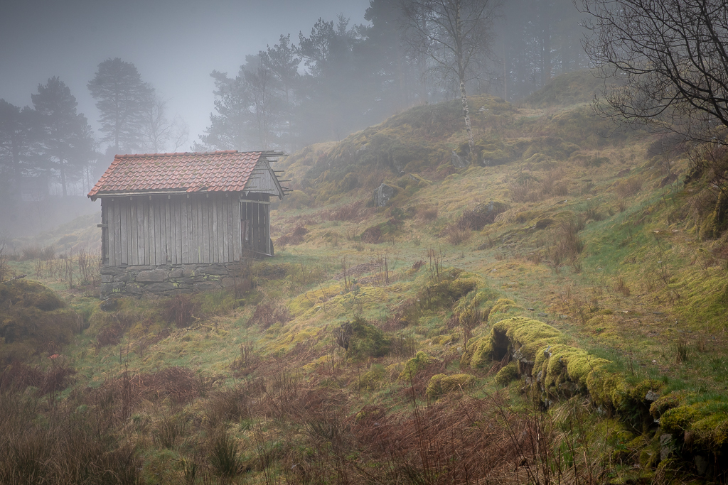
Unfortunately, my comment about the photographer was not very clear. What I meant was that it makes the viewer wonder about what is outside, just as you say. |
Jan 9th |
| 74 |
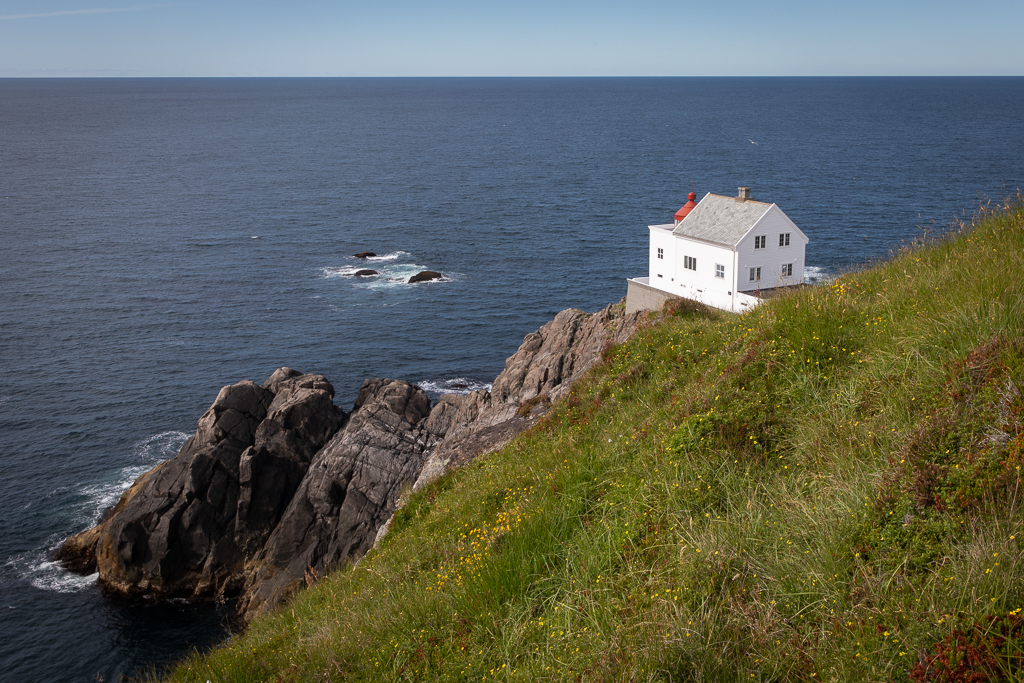
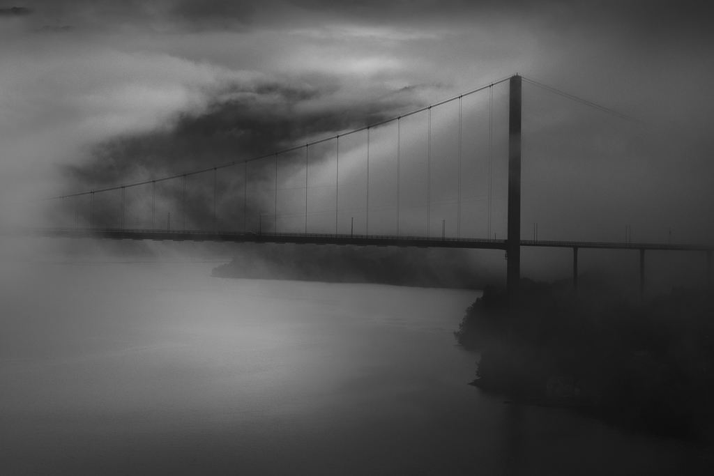
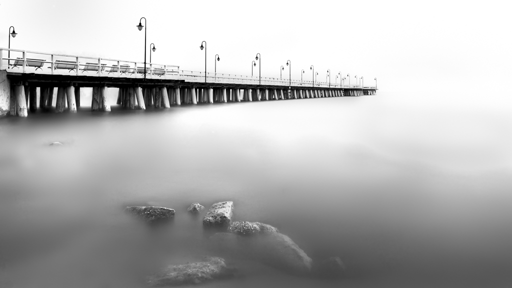
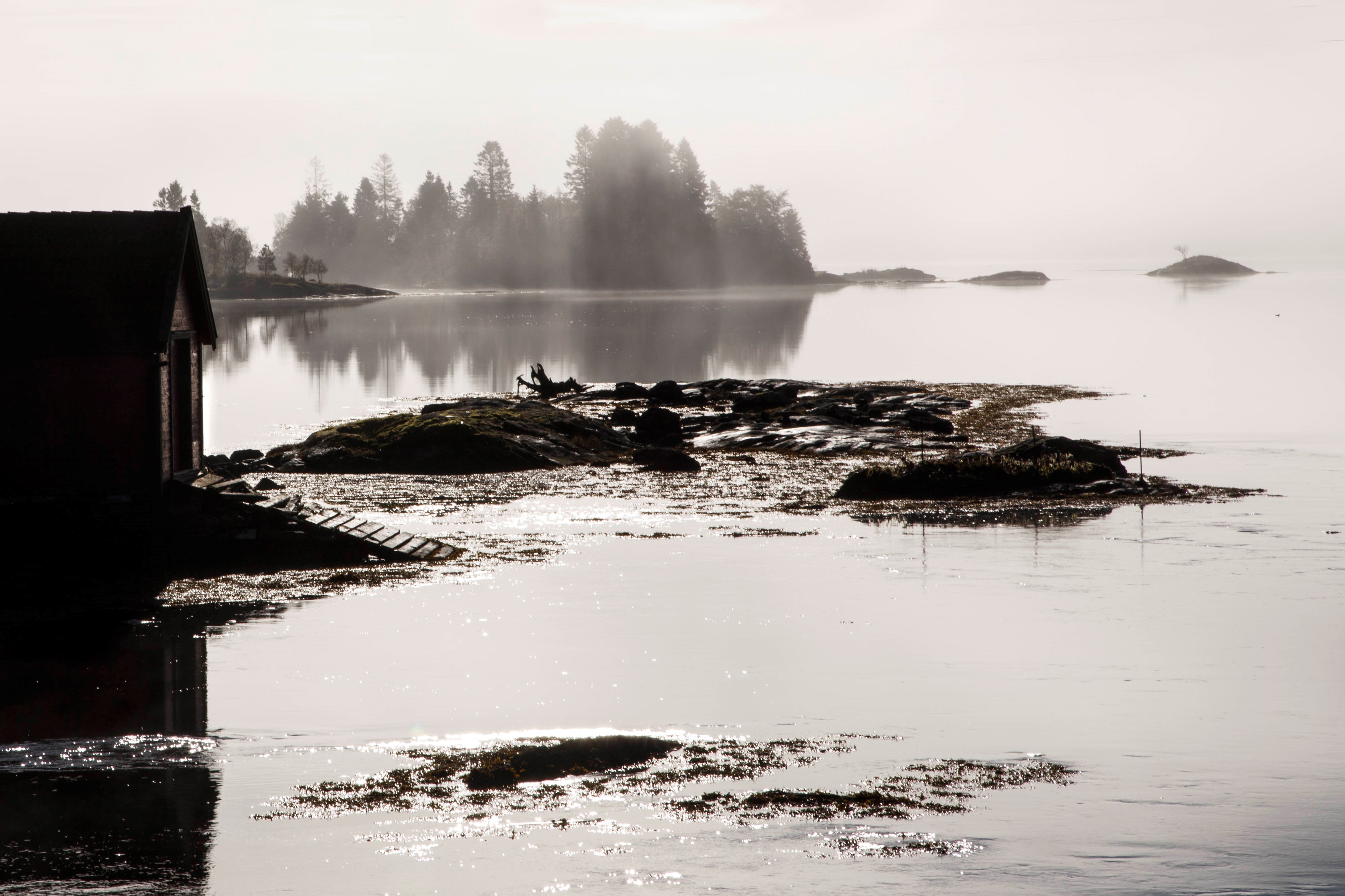
Jan 23 |
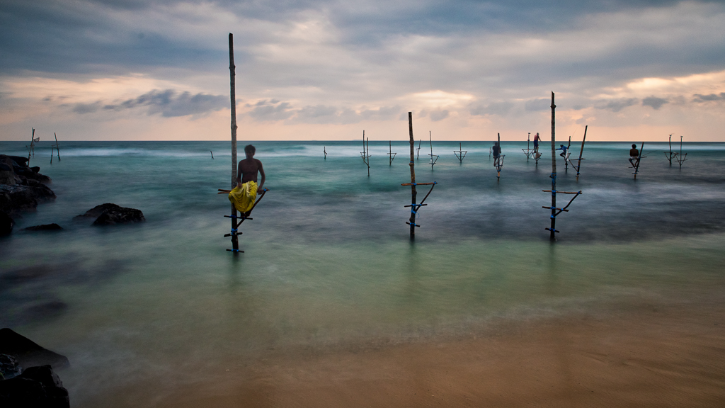
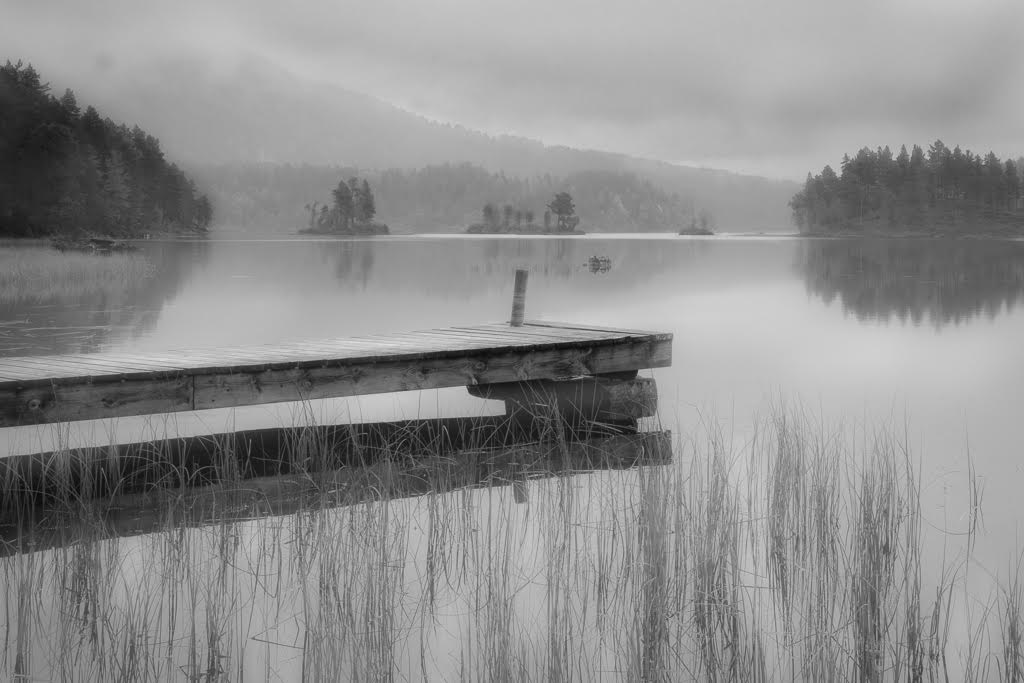
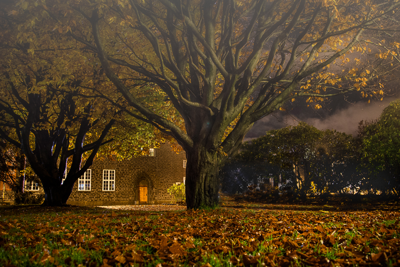
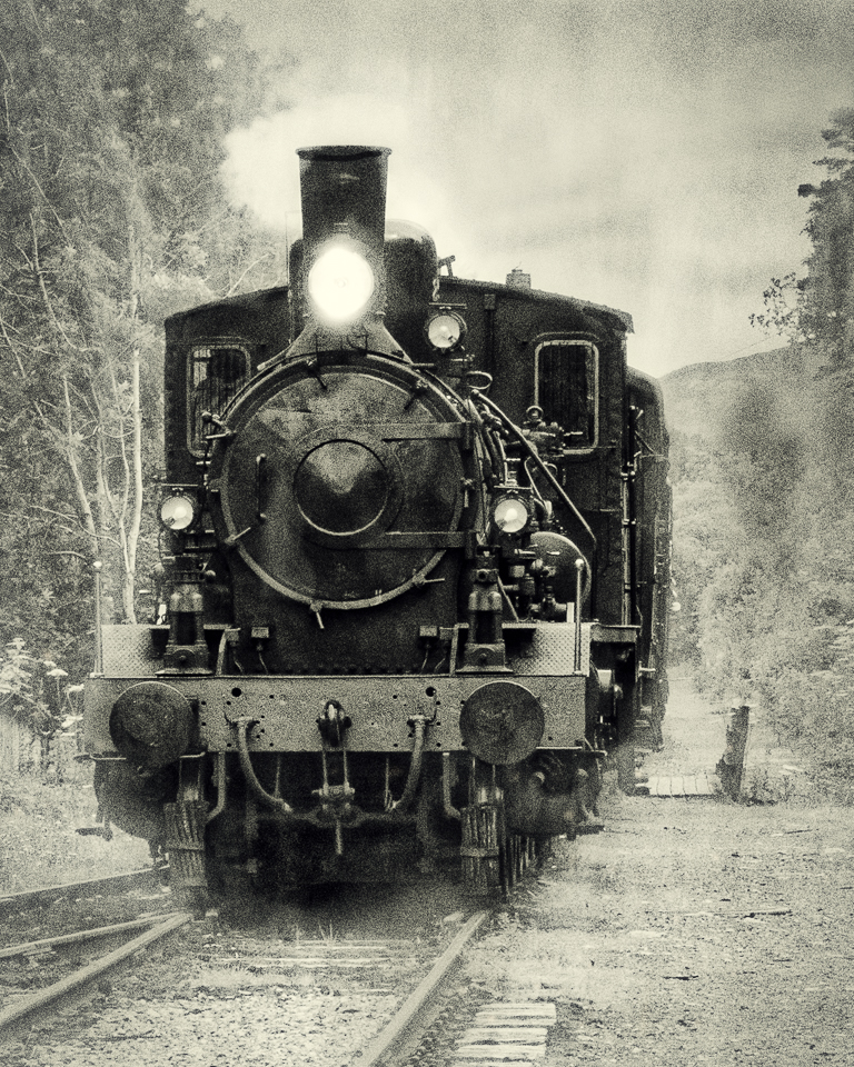
Comment |
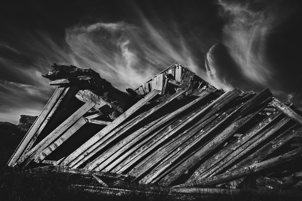
An interesting image where the photographer is turning away from the scene. The leading line of the planks are leading straight to the photographer. The question is what is he taking pictures of, straight into the fog? |
Jan 8th |
| 74 |
Jan 23 |
Comment |
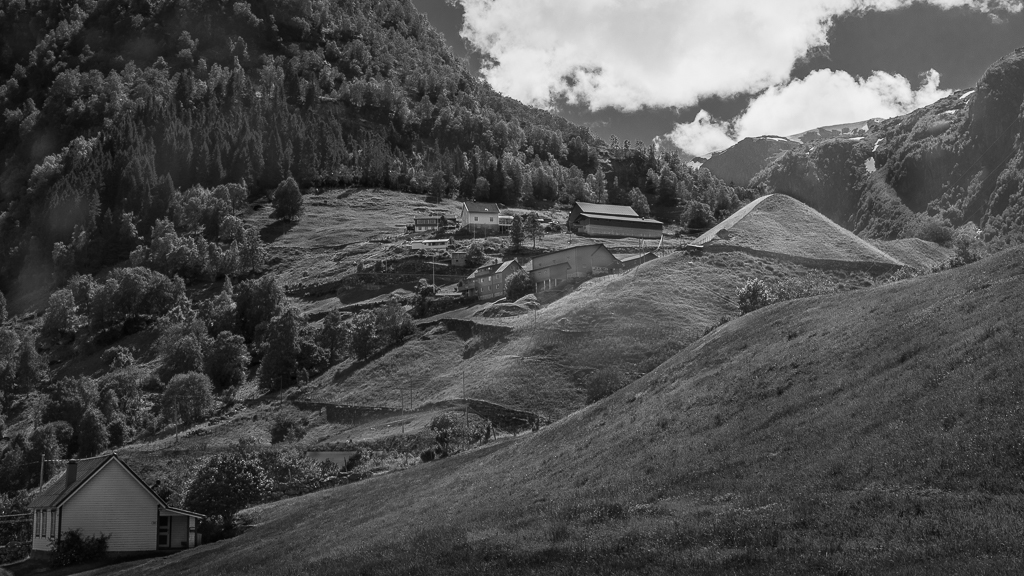
I like the mood of this image. Normally, the dog is there to move the sheep in a direction and there is tension between the sheep and the dog, but here they are all in harmony. I also liked the black sheep in front that gives contrast to the dog and the rest of the crowd. I would suggest cropping slightly from the left to avoid the half head in the lower corner. |
Jan 8th |
| 74 |
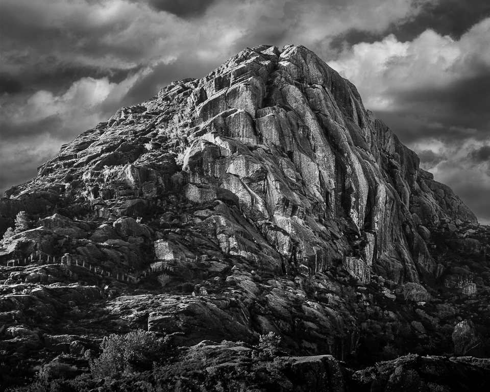
Jan 23 |
Comment |
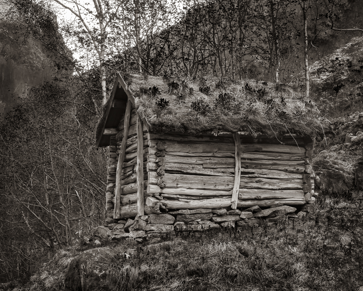
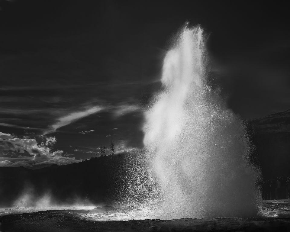
My first thought here was Ansel Adams. I like your composition and the way you post-processed the image. At the same time, I agree with Haru about the use of clarity. A beautiful picture! |
Jan 8th |
| 74 |
Jan 23 |
Comment |
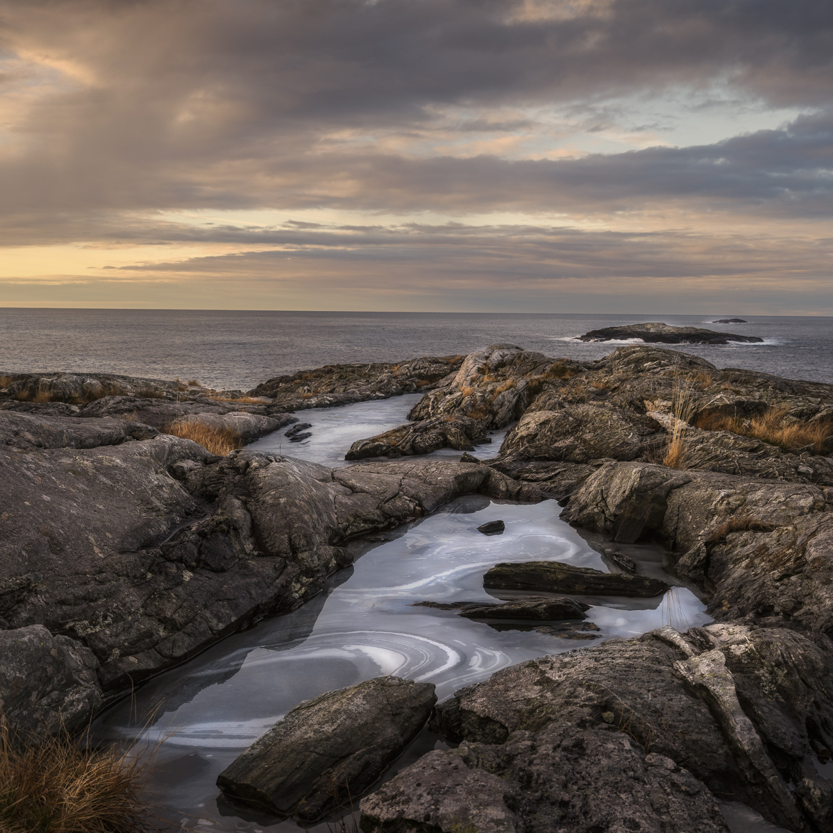
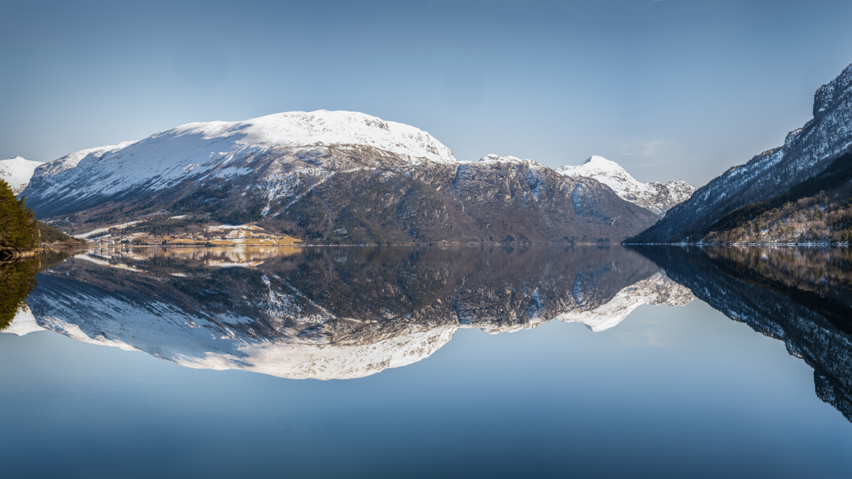
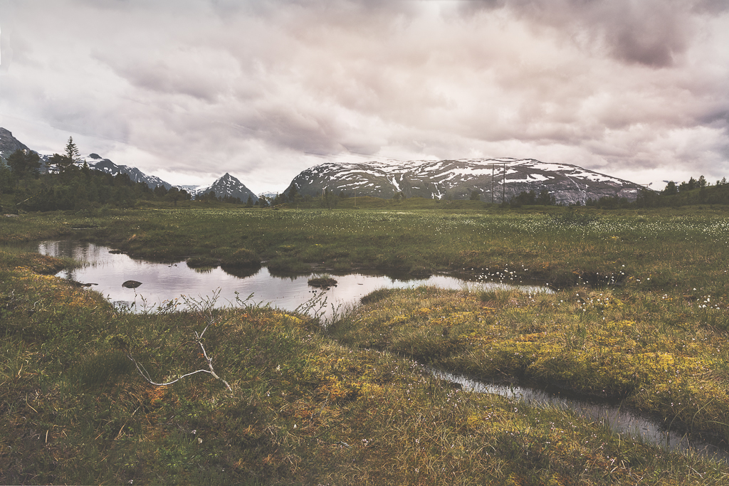
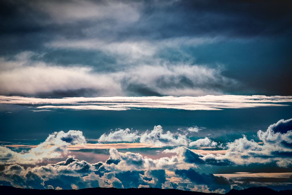
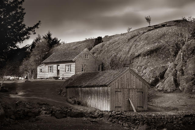
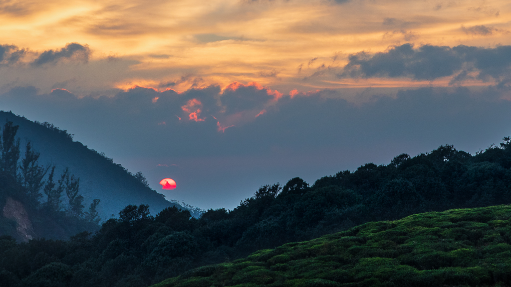
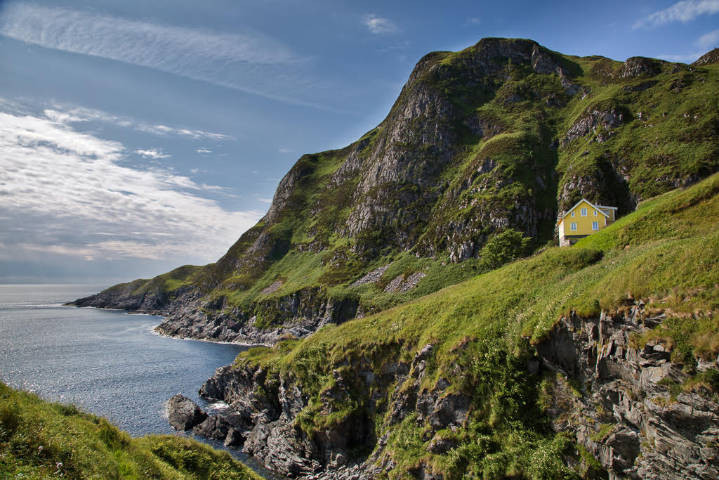
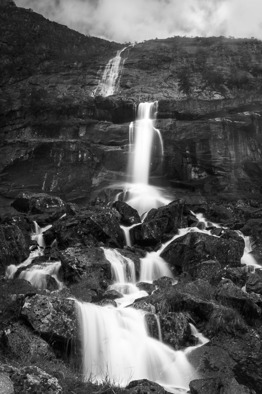
You have done tremendous work with this image. I like the composition with the leading line of the creek and the dramatic clouds. The post-production is also well done. I liked that you lightened the area in front of the mountain, giving depth to the image. If I should give any suggestions for improvement, it would be to darken the straws in the lower right corner and the nearest grass on both sides of the creek as you should go from dark to light into the picture. |
Jan 8th |
5 comments - 1 reply for Group 74
|
12 comments - 2 replies Total
|