|
| Group |
Round |
C/R |
Comment |
Date |
Image |
| 36 |
Nov 22 |
Reply |
Hi Adi,
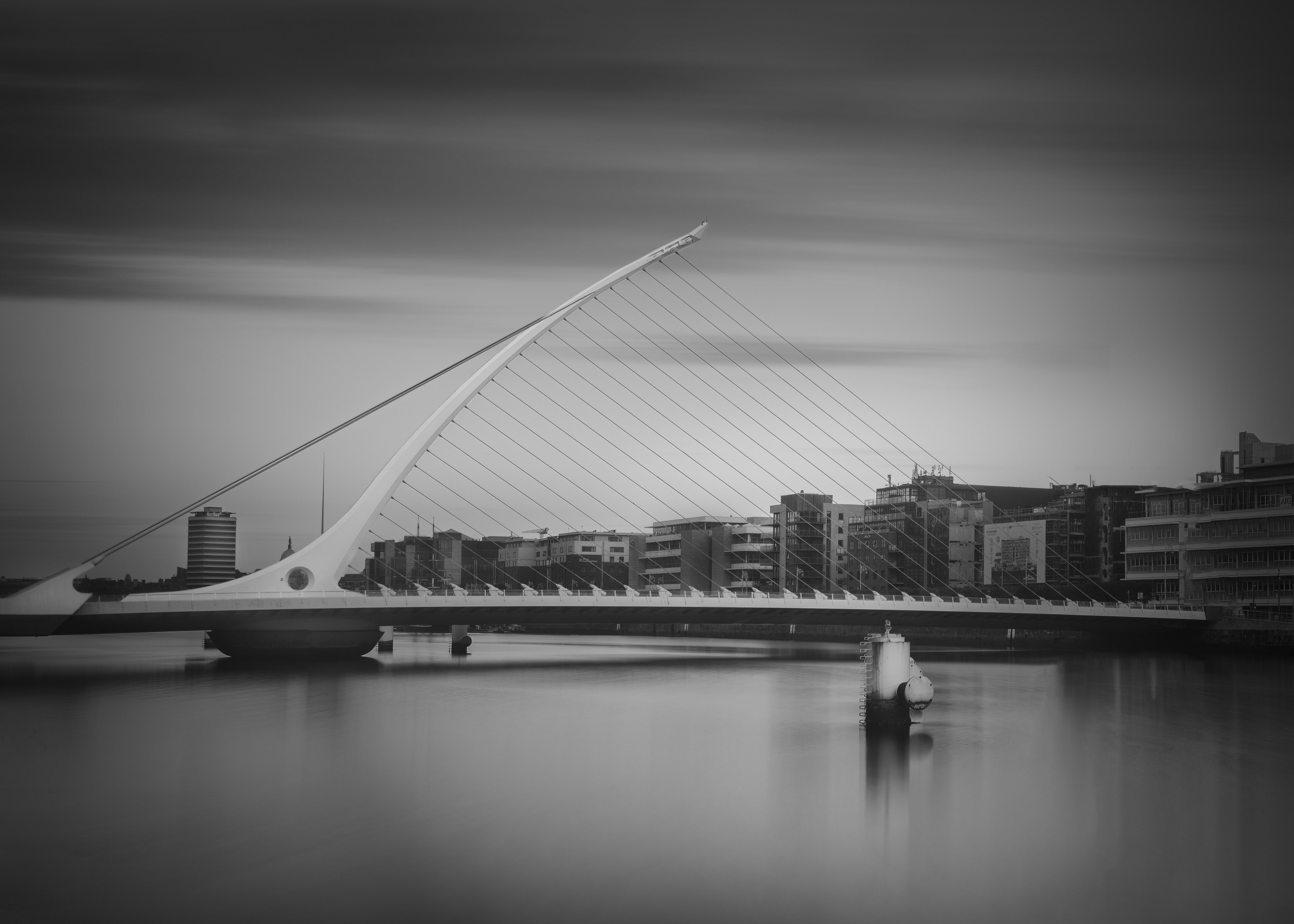
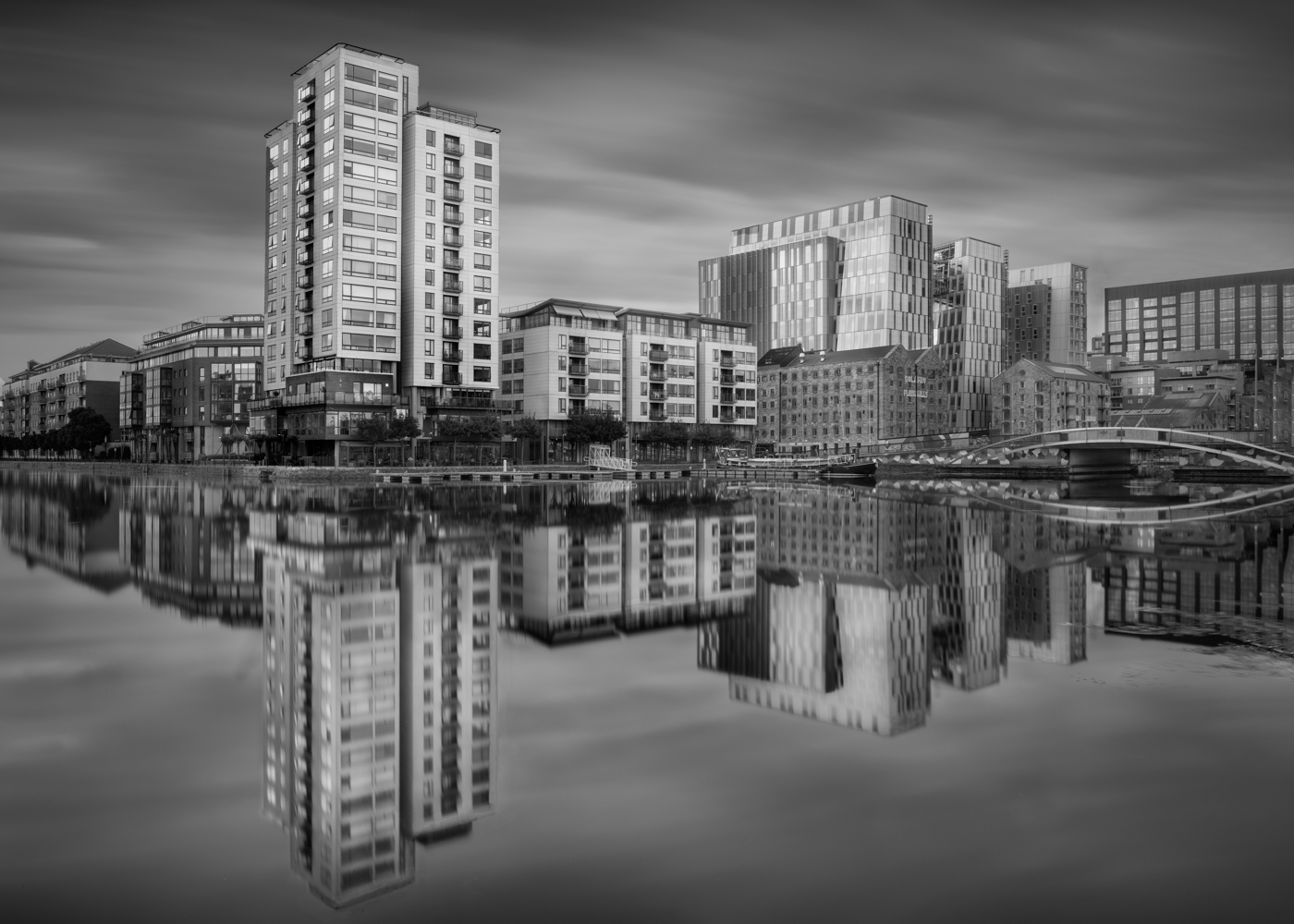
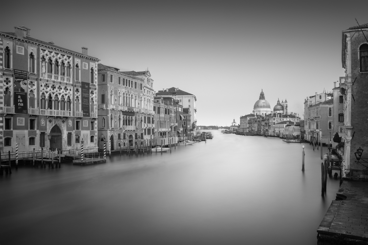
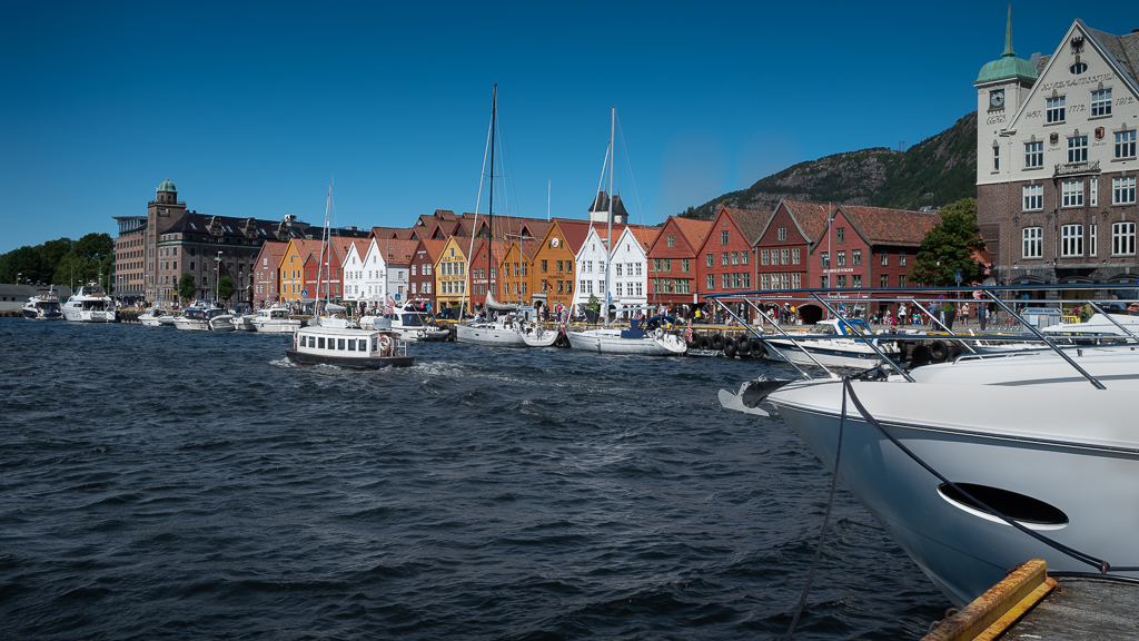
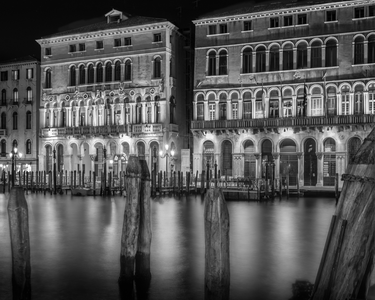
Thank you for your encouraging comment. The image is as far from reality as you can get, with people walking around and over you while trying to make a long exposure and the canal busy with all kinds of boats going in all directions. The GFX is a fantastic camera, easy to carry around and has superb picture quality. |
Nov 23rd |
| 36 |
Nov 22 |
Comment |
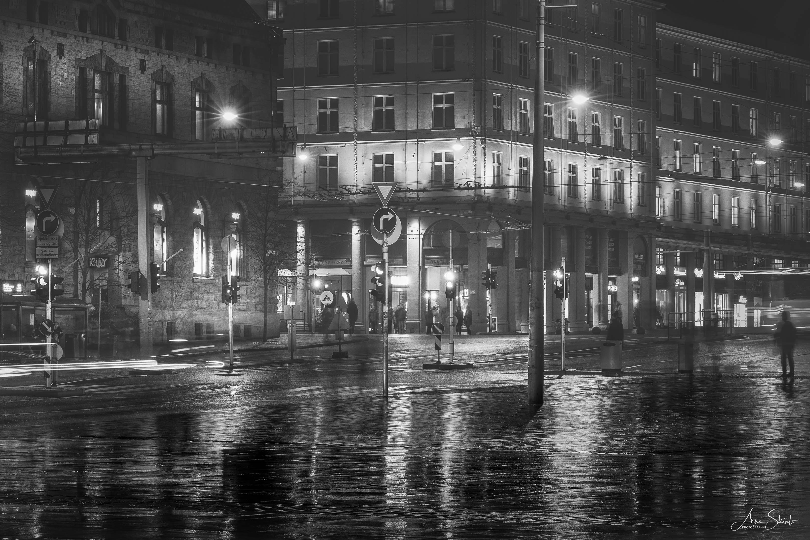
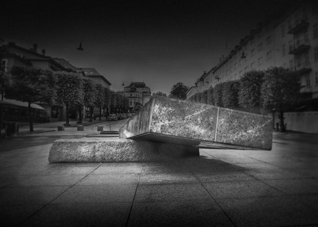
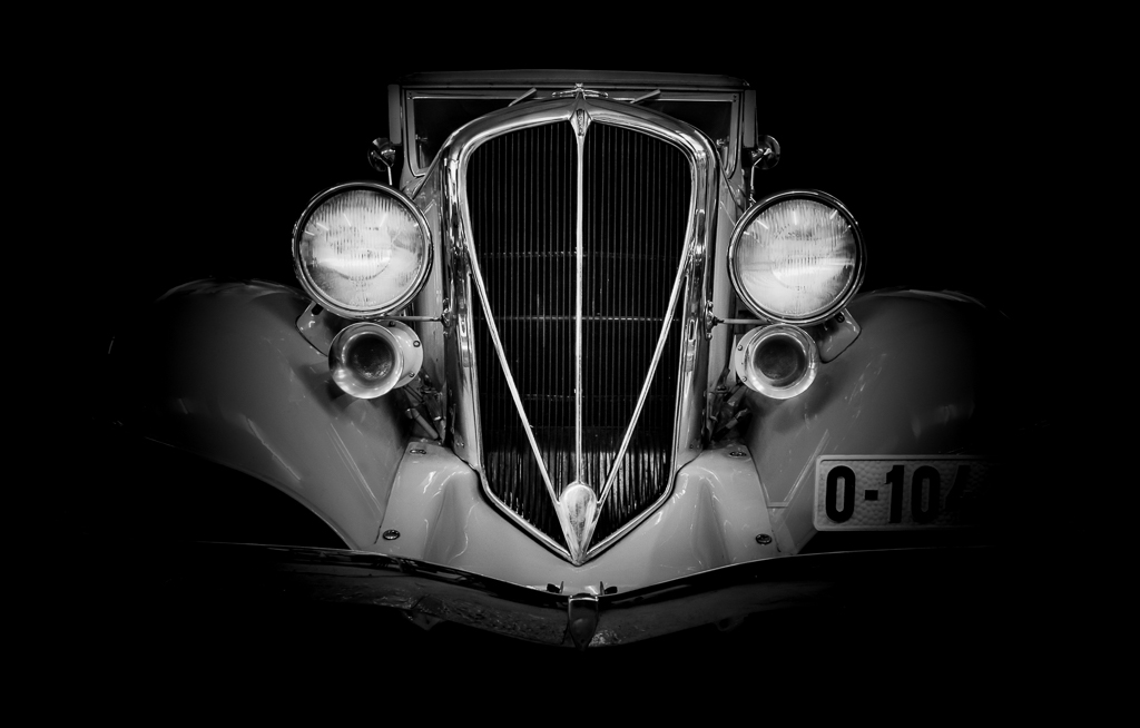
My first thought was that this is a dangerous place to take a picture. Good to know that it was on the way to the pup and not from the pub :) I like the repeating red colours on the cars and the wall. The composition with the arrowlike leading line works well. |
Nov 19th |
| 36 |
Nov 22 |
Comment |
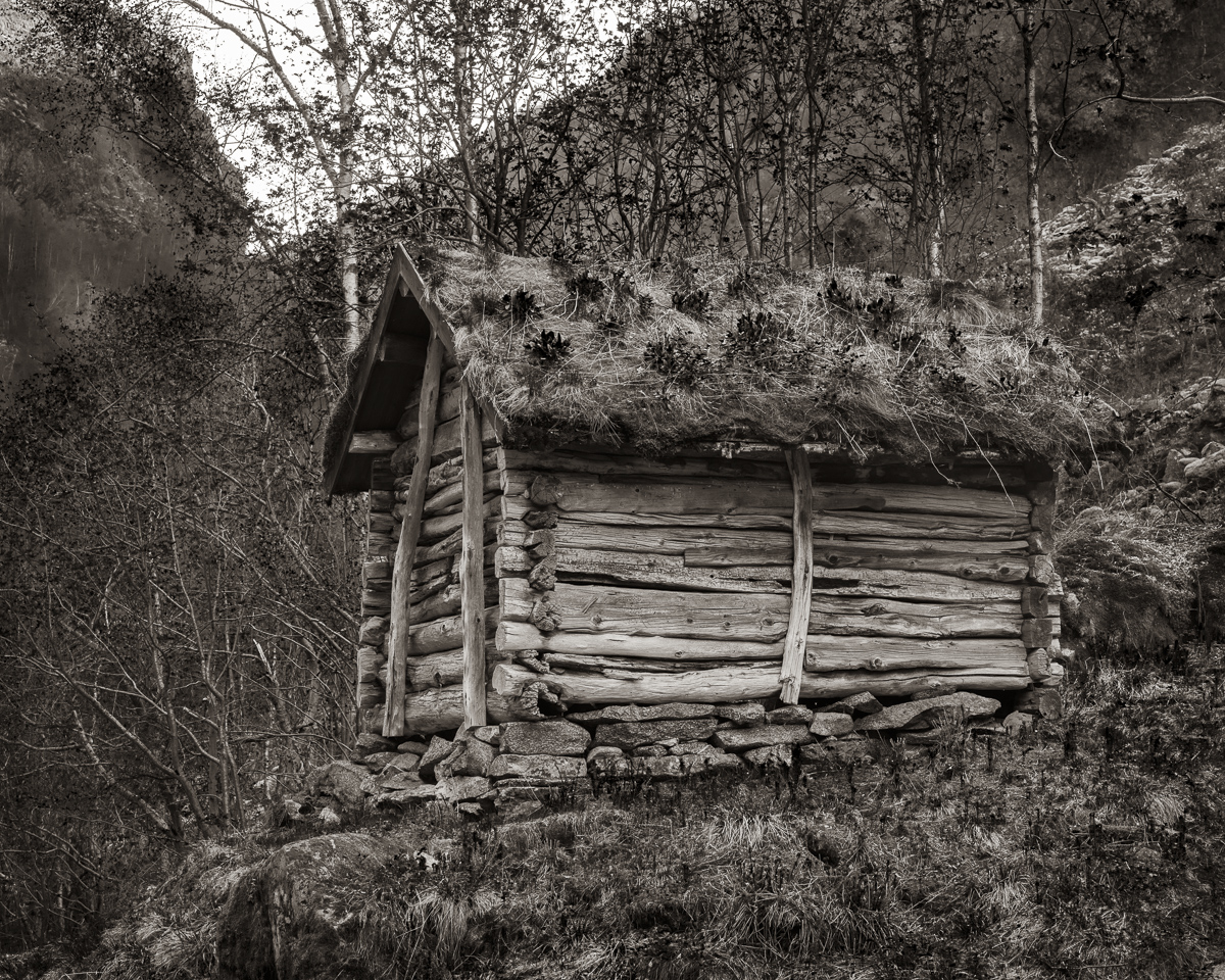
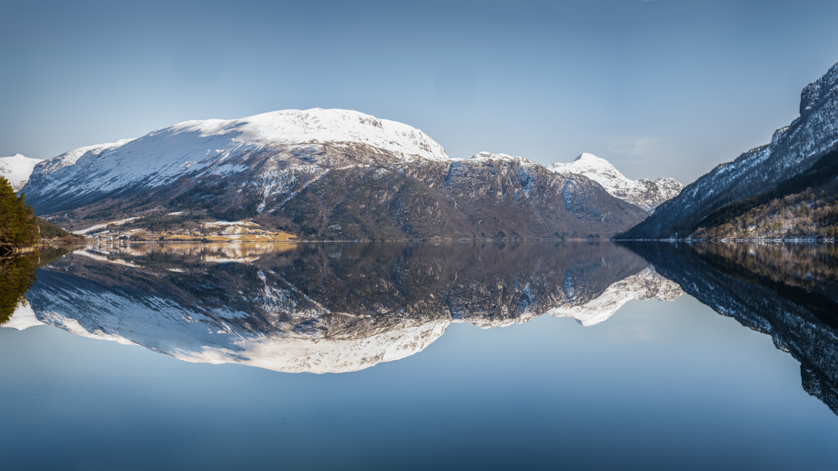
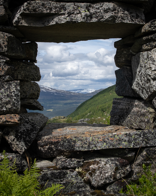
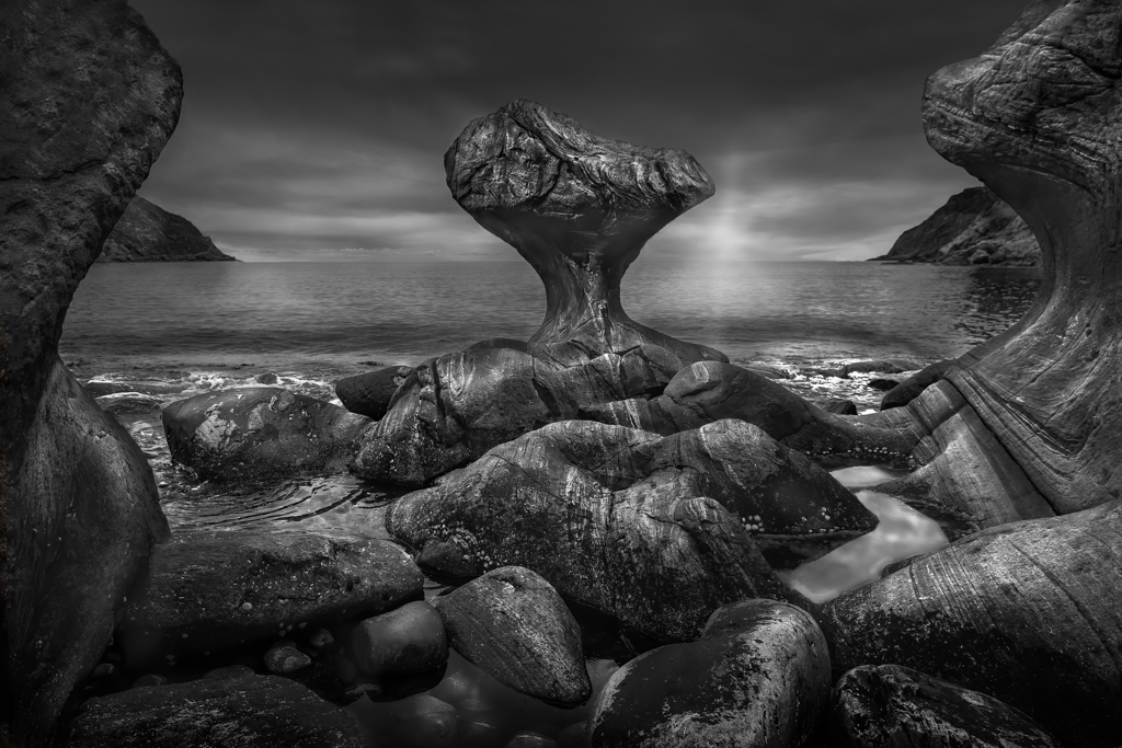
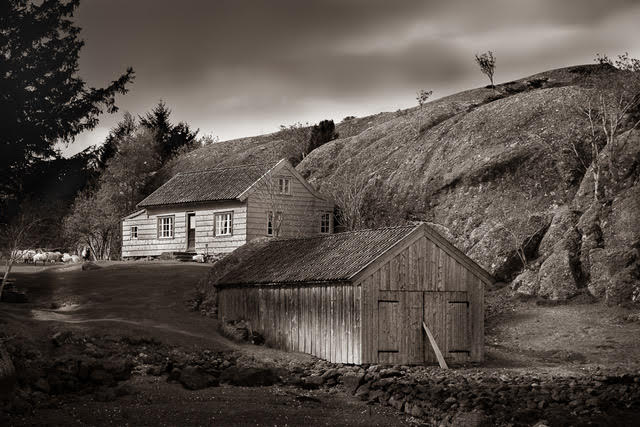
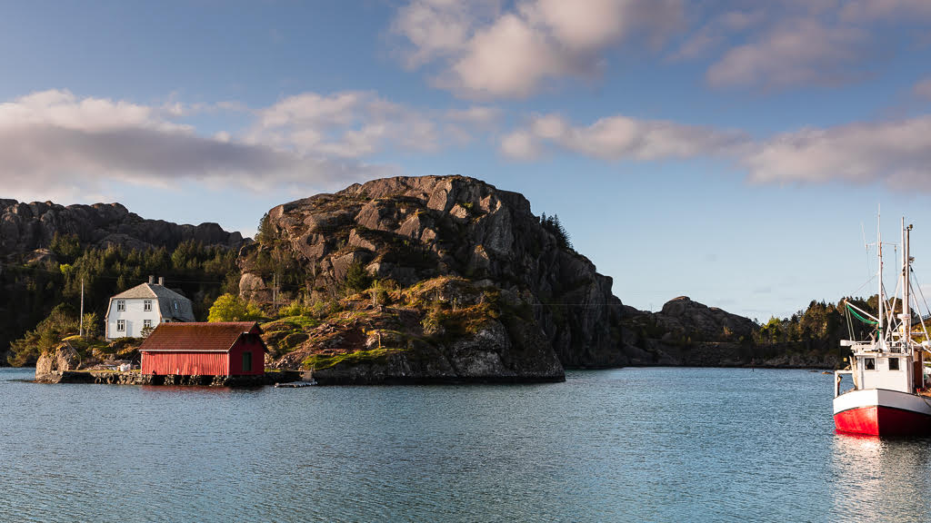
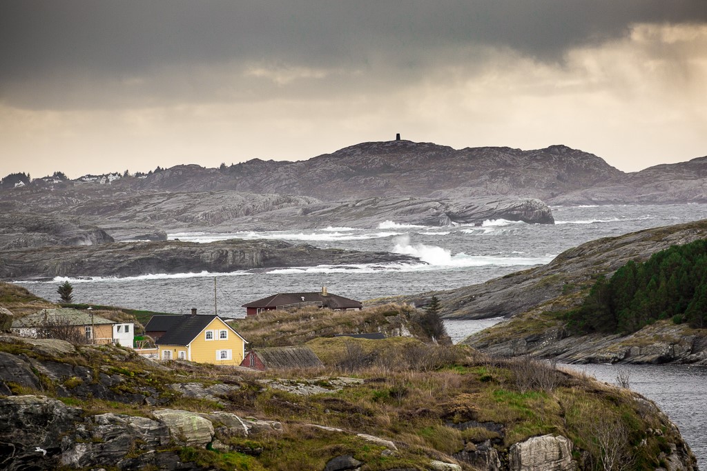
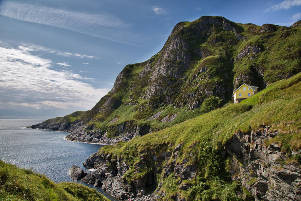
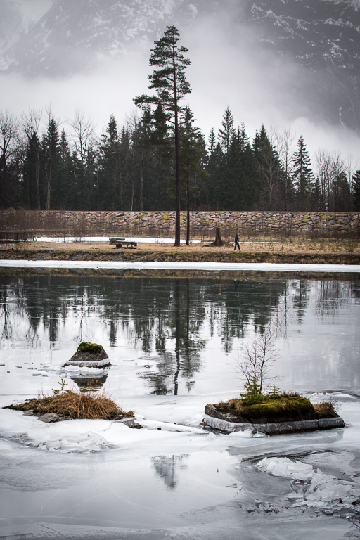
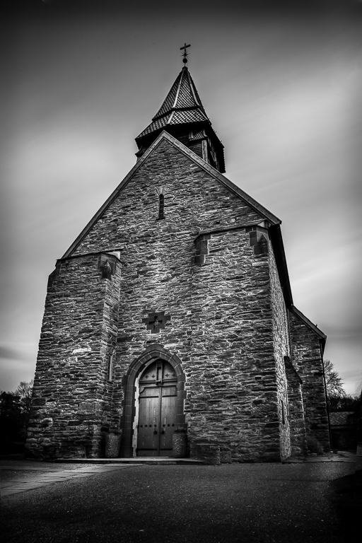
First, thank you for attaching the original photo as well. In that way, we can understand the way you have processed it. This landscape is very similar to western Norway and that could be the reason why so many Norwegians settled there in the early days, some of my relatives included.
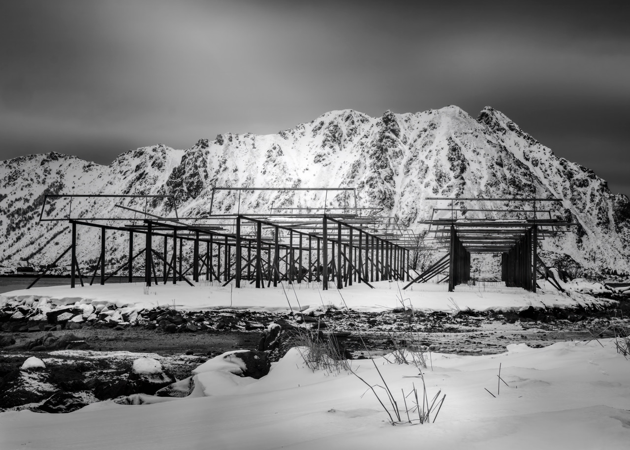
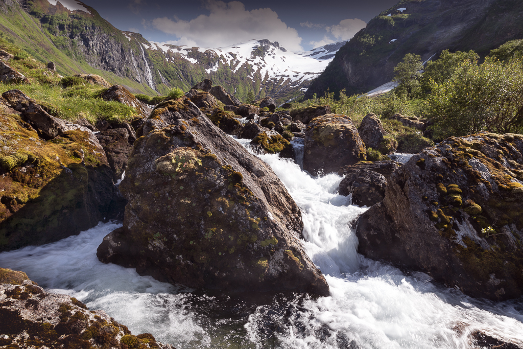
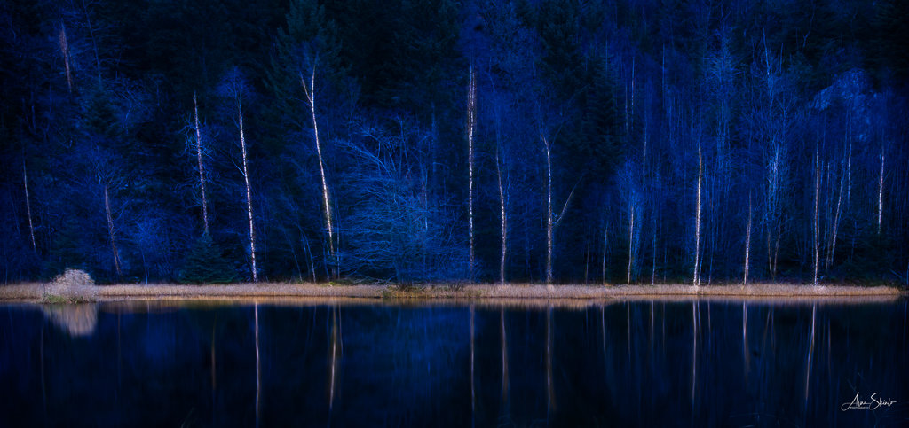
The disadvantage of pushing the exposure so much is that you lose some of the crispness in the details. Exposure bracketing is a way around it. Although the composition is in balance, I would consider cropping a bit at the top and the right side, so you get the same distance to the edge of the trees on the left and right sides. |
Nov 19th |
| 36 |
Nov 22 |
Comment |
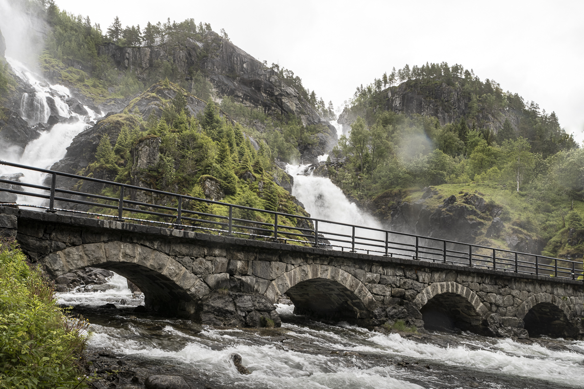
A very well-captured image in my opinion! I like the composition and the way the colours play through the picture. You let the viewer struggle a little to figure out what It really is and that makes it interesting. |
Nov 19th |
| 36 |
Nov 22 |
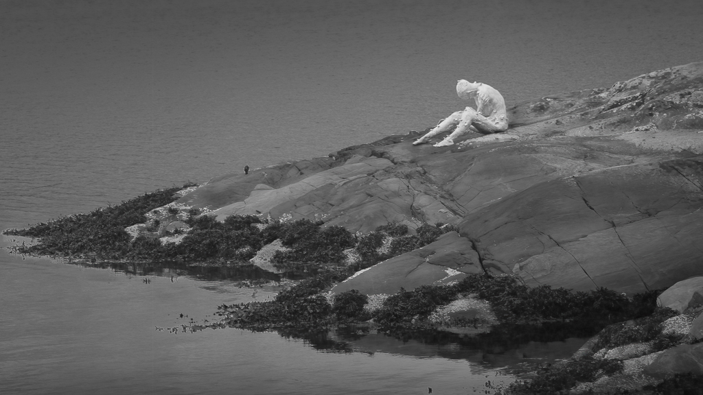
Comment |
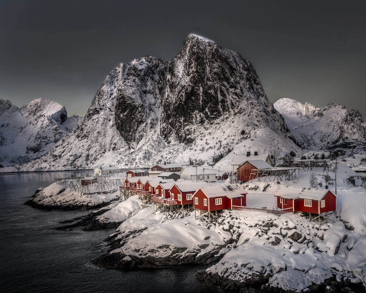
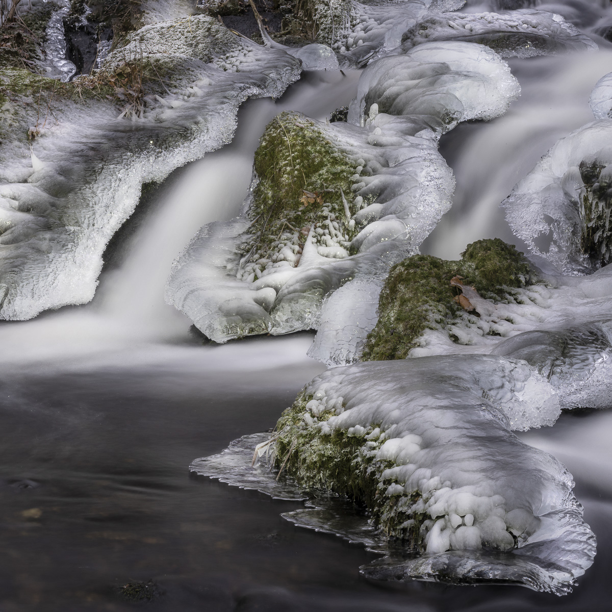
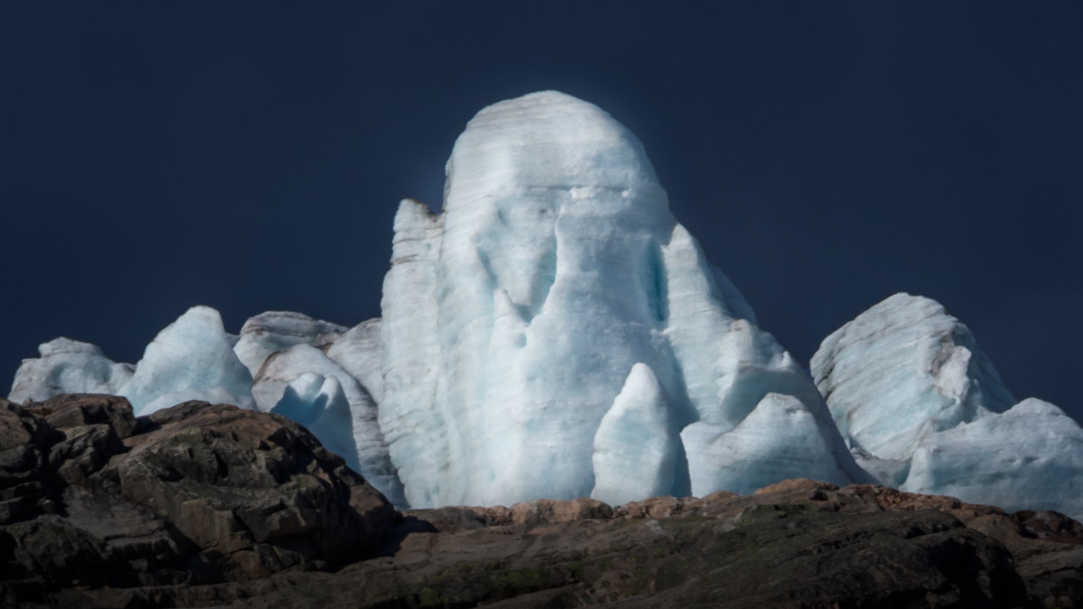
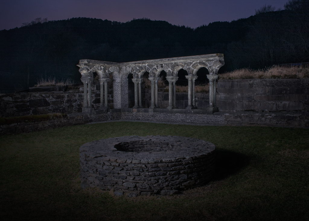
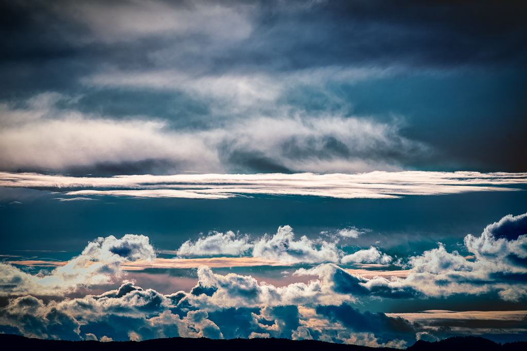
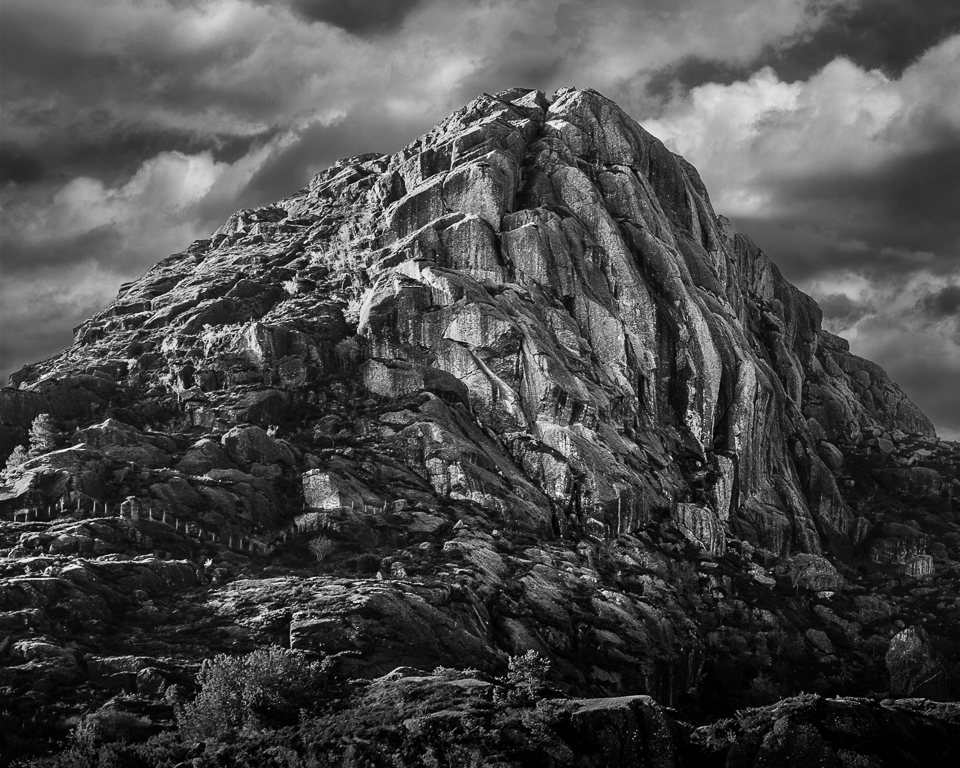
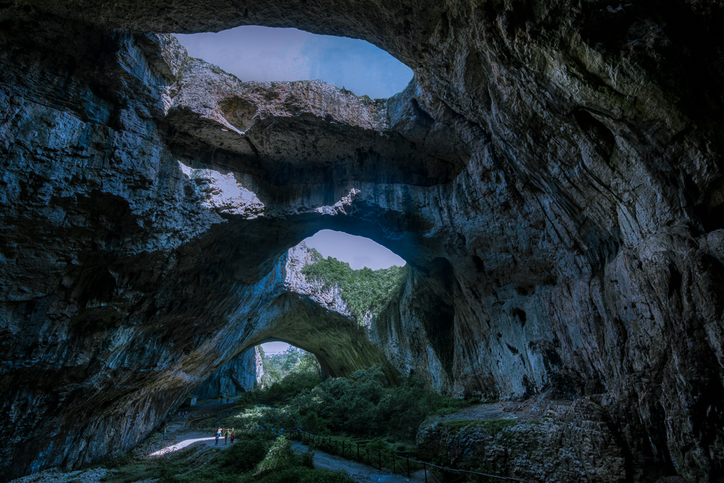
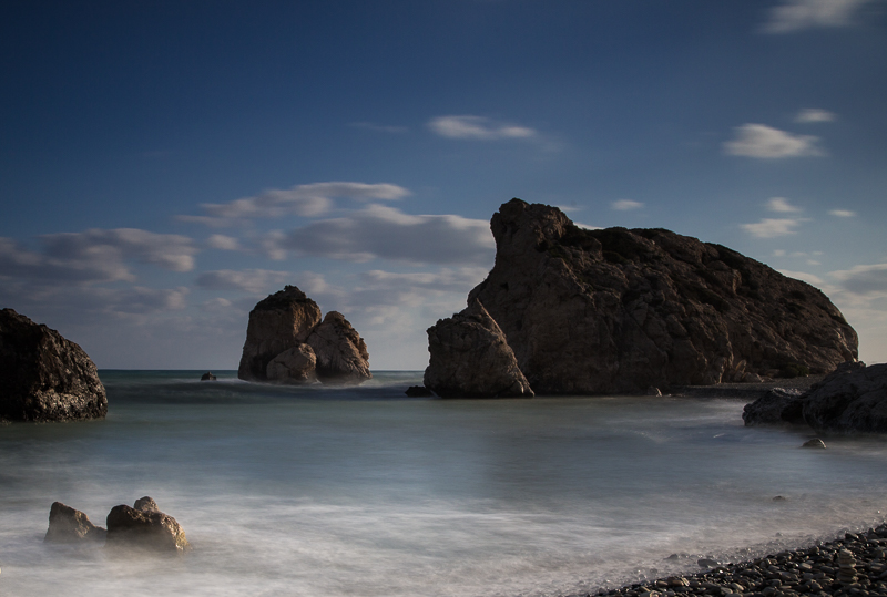
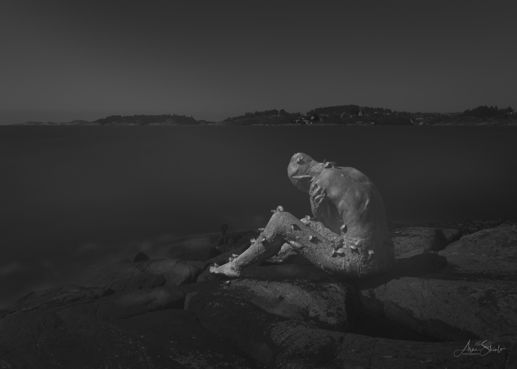
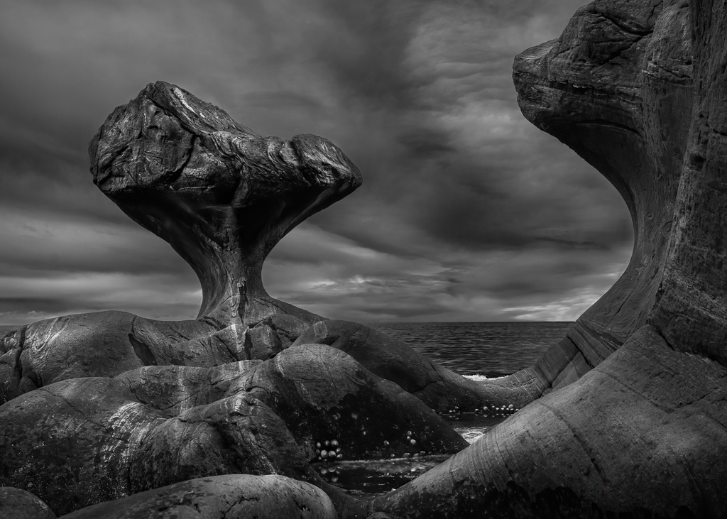
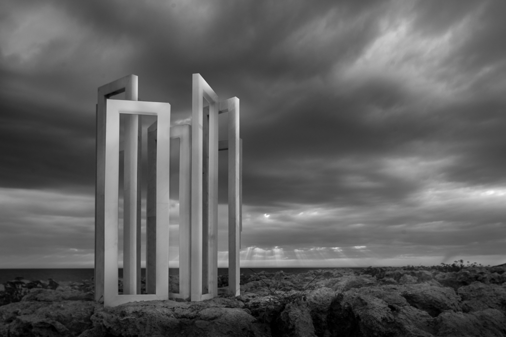
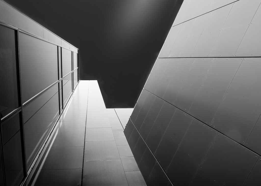
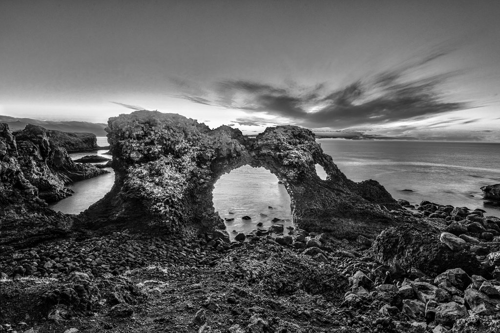
An interesting play with light and shadow. My only suggestion for improvement is to reduce the number of details by putting on a vignette. I would also open up the shadows on the rock in the centre of the image a bit to make it the point of interest. |
Nov 19th |
| 36 |
Nov 22 |
Comment |
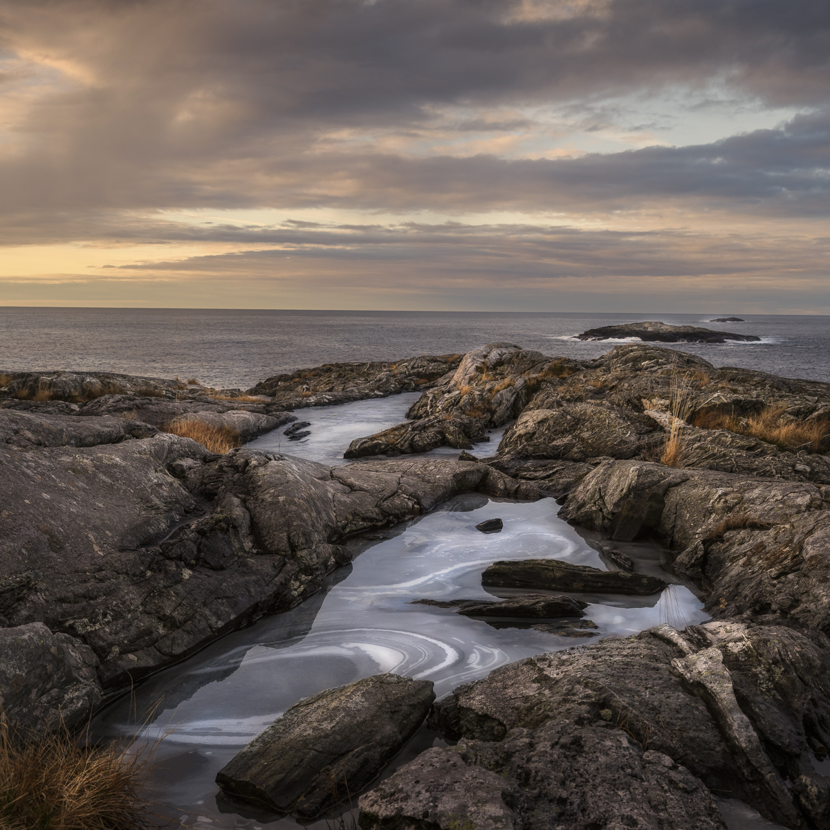
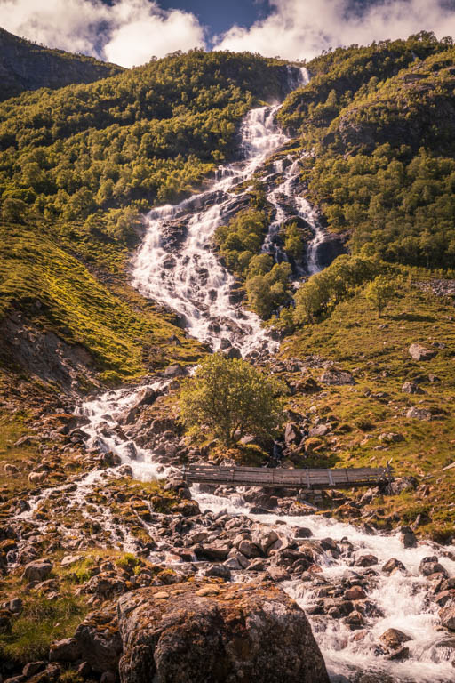
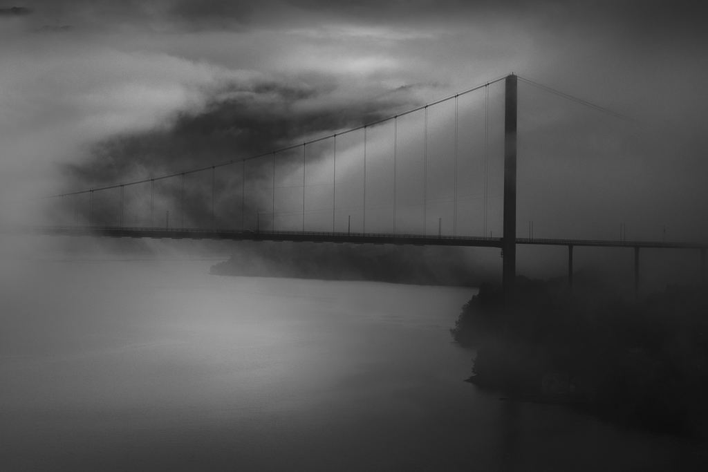
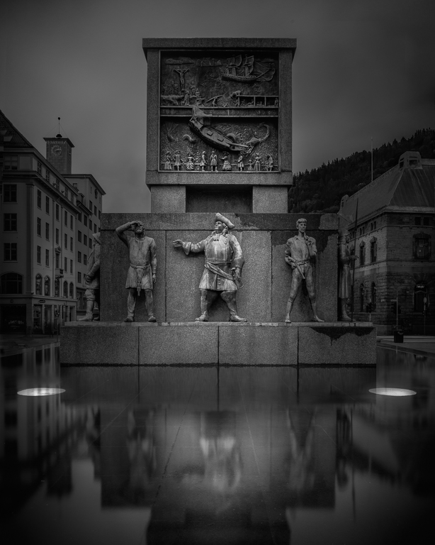
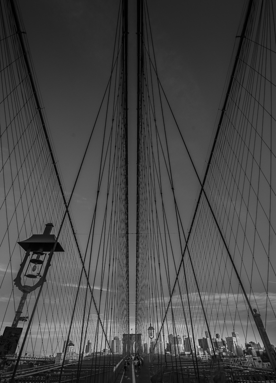
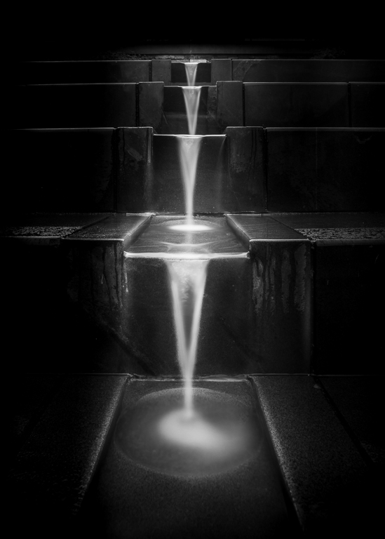
Good planning is always a good starting point, but as you point out, things do not always go as planned. I also use long exposure a lot and the most exciting part about that is you never know what you get before you see the result. The composition is spot on with the leading line pointing from the foreground into the sky. I agree with Larry that this is a candidate for the wall! |
Nov 19th |
| 36 |
Nov 22 |
Comment |
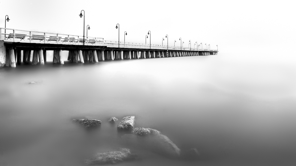
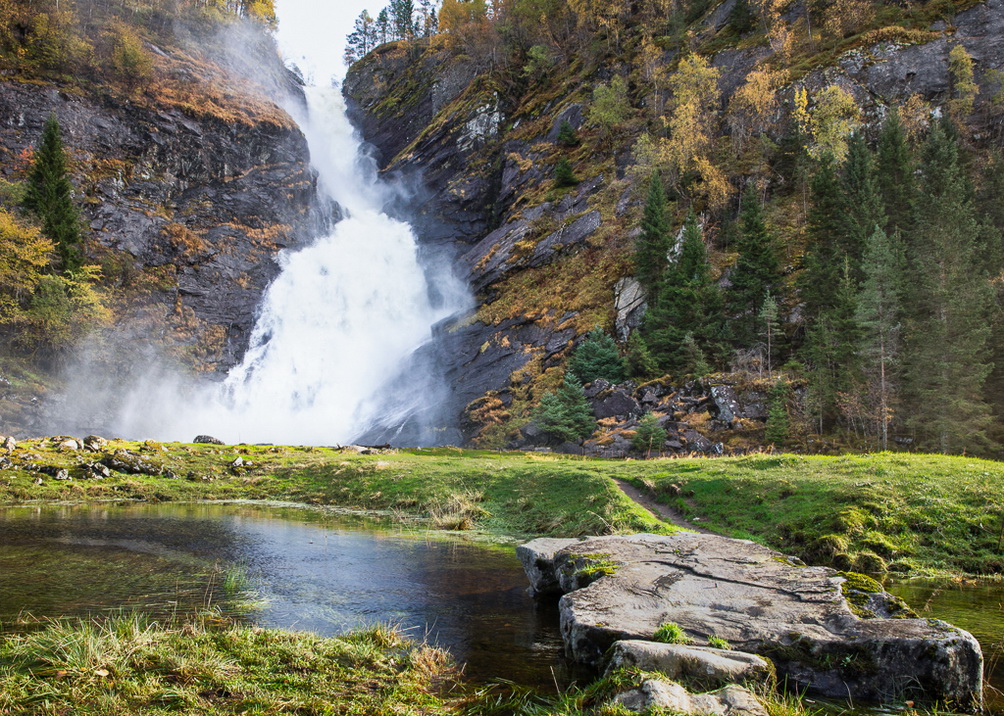
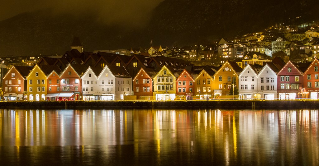
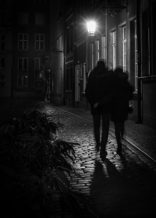
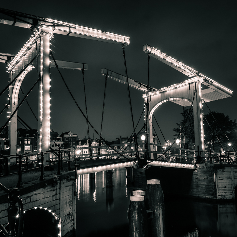
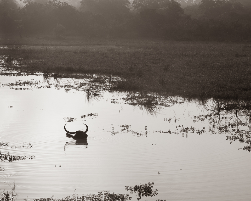
Yes, there is always a lot of traffic on Grand Canal. As long as everything is in movement it is fine, but if a boat stops for a while, you get goasting. It requires a rather long exposure time, I use 4 minutes. |
Nov 16th |
| 36 |
Nov 22 |
Reply |
Thank you, Diane. |
Nov 13th |
| 36 |
Nov 22 |
Reply |
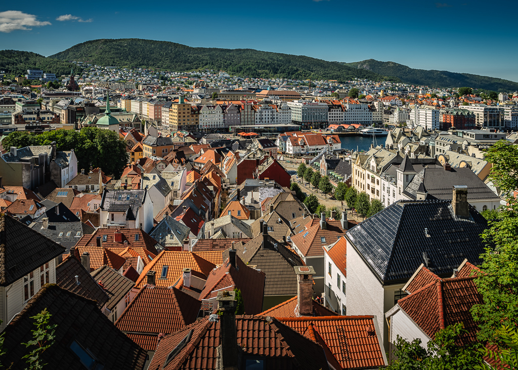
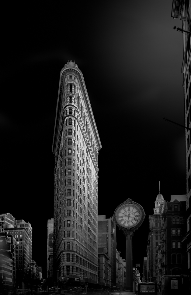
Thank you, Barbara. I do the same, put it on the screen, walk away for a while and then come back. Sometimes I make an A3 print and put it on the wall and let it stay for a day or two and watch it in a different light. Actually, I have already increased the contrast in the buildings which made pop more. |
Nov 13th |
| 36 |
Nov 22 |
Comment |
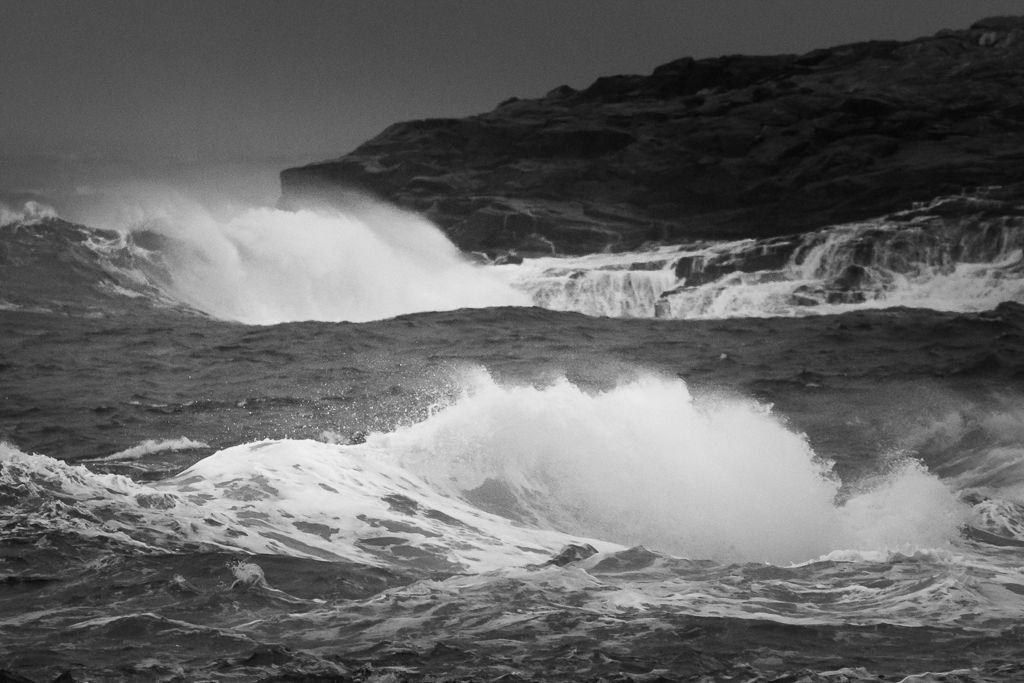
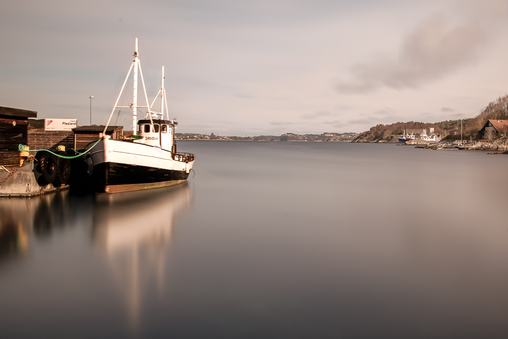
Thank you for your comment. Actually, I have already darkened the water slightly, as you say, to differentiate between sky and water. |
Nov 7th |
| 36 |
Nov 22 |
Comment |
Thank you, Larry. You are so good with words 🙂 |
Nov 7th |
8 comments - 3 replies for Group 36
|
| 74 |
Nov 22 |
Comment |
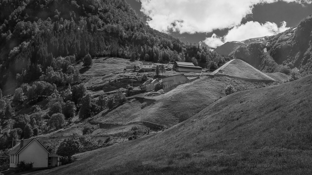
An interesting conversion to B&W. To me, the composition is not in balance, so I am leaning more toward Don`s version. You may try a version where you crop from the bottom and keep the top. |
Nov 13th |
| 74 |
Nov 22 |
Comment |
Welcome to our group, Lisa! I understand that there is lighting from behind, but there is also some light from both sides. Have you used any reflecting screens or additional light? The slight tone gives a real vintage look. Well done! |
Nov 13th |
| 74 |
Nov 22 |
Comment |
An impressive cathedral! Capturing interiors like this is not easy. I would prefer, if possible, to step further back to avoid some distortion. I know I am picky about this type of picture, but if you had stepped a little to the right, you would achieve symmetrical lines.
Regarding removing the scaffolding, there are two main approaches; Content aware, as Haru has done and the Clone tool. I normally start with Content aware and see if it works and if not, I go for cloning. Here the lines are rather straight so both methods will work. |
Nov 13th |
| 74 |
Nov 22 |
Comment |
I agree that B&W works better for this image. Moreover, I agree with Haru that the first version is better as the vertical line distracts. Focus stacking is a useful feature in cases like this. With the latest cameras, this has become much easier. |
Nov 13th |
4 comments - 0 replies for Group 74
|
12 comments - 3 replies Total
|