|
| Group |
Round |
C/R |
Comment |
Date |
Image |
| 74 |
Sep 22 |
Comment |
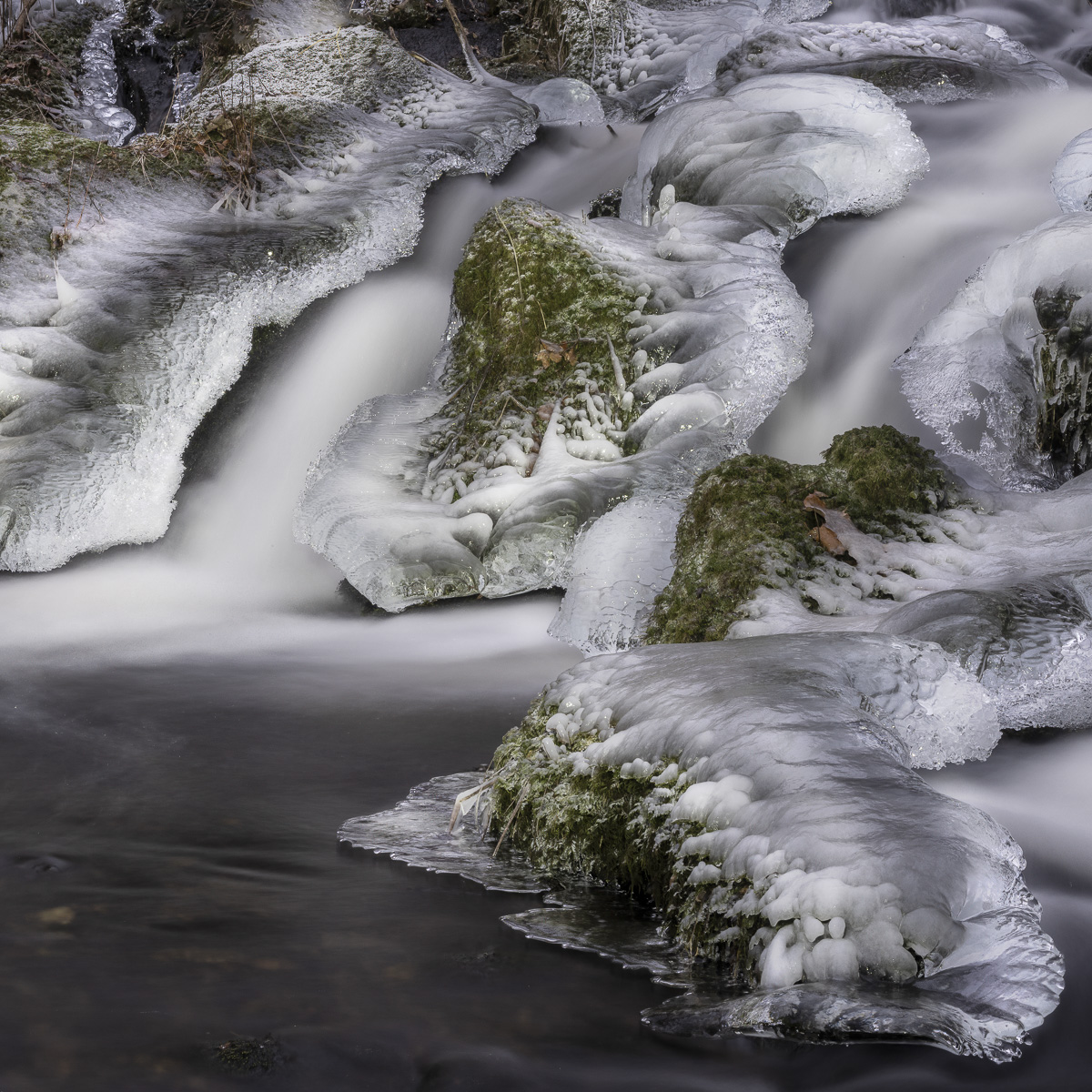
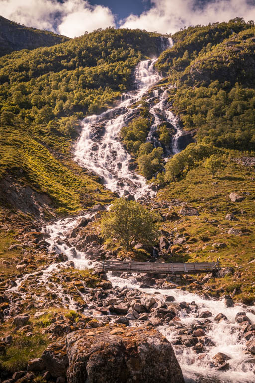
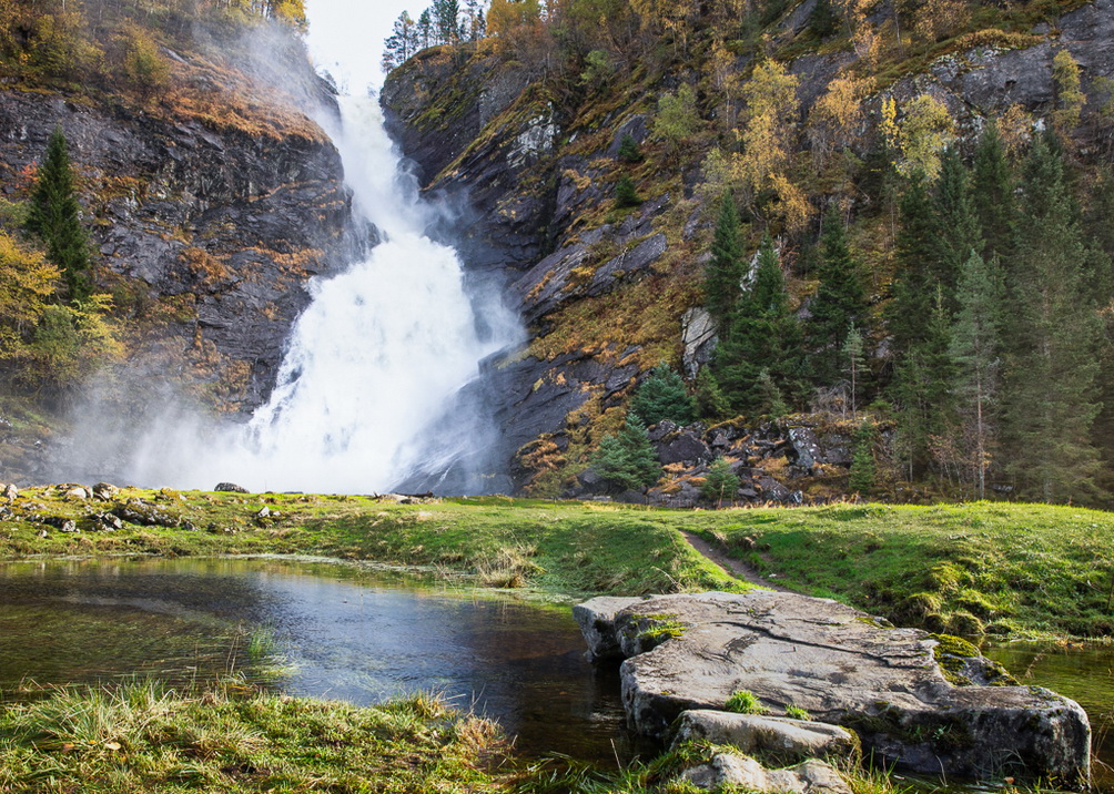
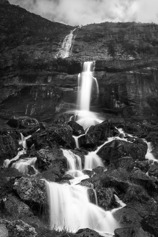
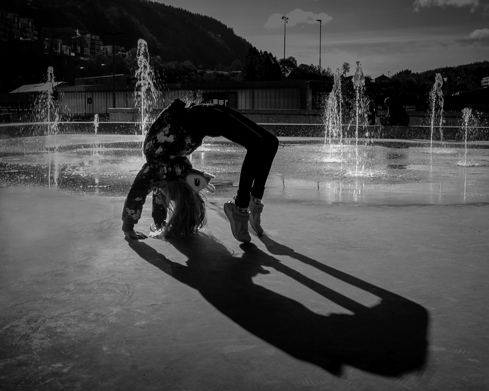
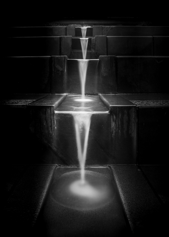
My first impression of your image was the contrasts in the splashes and I love that! I also like the low camera angle that gives an interesting foreground. The shutter speed is just enough to give a sense of motion, but not more. If I shall give any suggestion for improvement, it would be to crop to the top of the rock on the left side. That would give a better symmetry with the stream to the right. Again, a great picture! |
Sep 17th |
| 74 |
Sep 22 |
Comment |
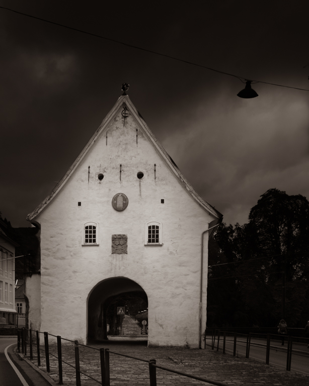
For B&W pictures grey weather is good because then you can add black and white areas as you like. I am not so sure about the sky replacement. The clouds are stealing attention from the lighthouse which is the point of interest. Maybe darkening with a gradient would do better? To make it pop more, you should try to mask one or two windows and brighten them. Moreover, I would darken the houses in the background and the rocks to the left. Then use a soft brush or a radial filter to brighten the middle of the lighthouse. |
Sep 17th |
| 74 |
Sep 22 |
Comment |
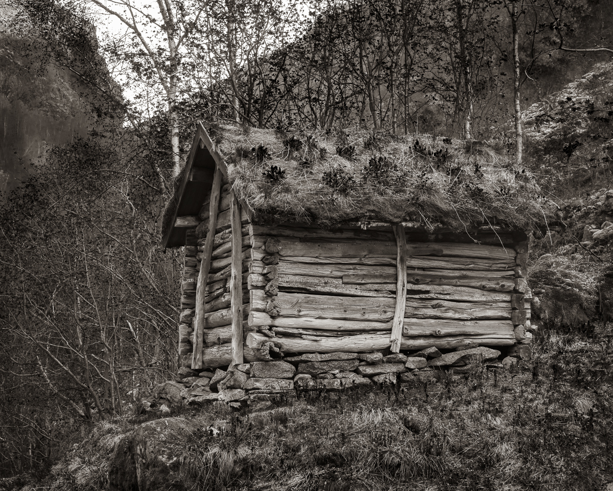
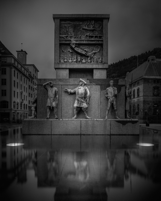
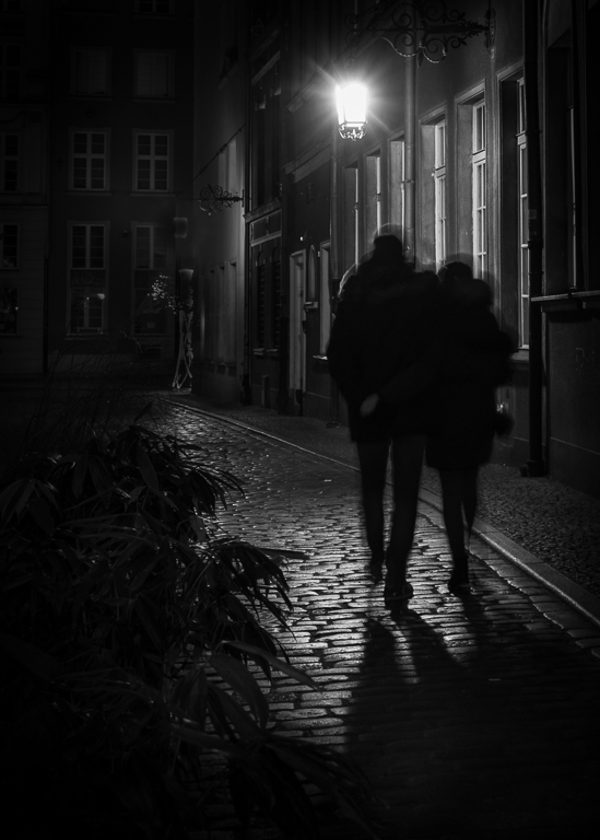
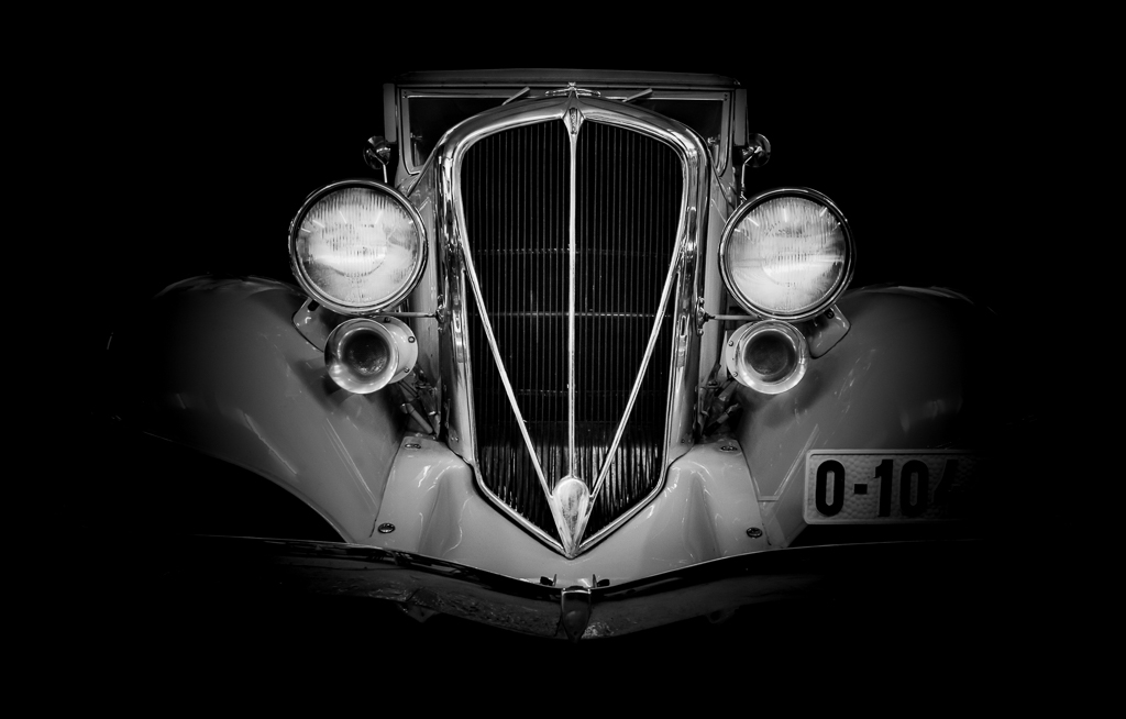
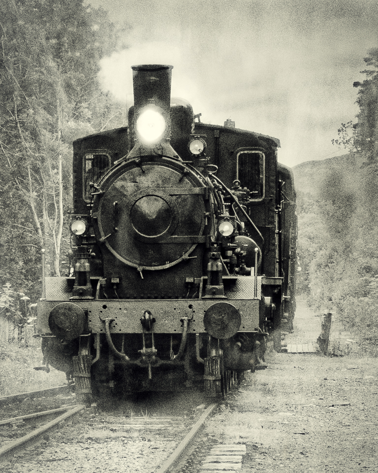
This image shows a lived life with scratches and worn-out paint. The verticals are well adjusted. A tip is to get it right in camera by shooting from a lower angle. I like the centred composition and I don't agree with the quote. A lot of well known images are dead center. I also like that we see into the other room, just enough to get a notion of the atmosphere. Well done! |
Sep 17th |
| 74 |
Sep 22 |
Comment |
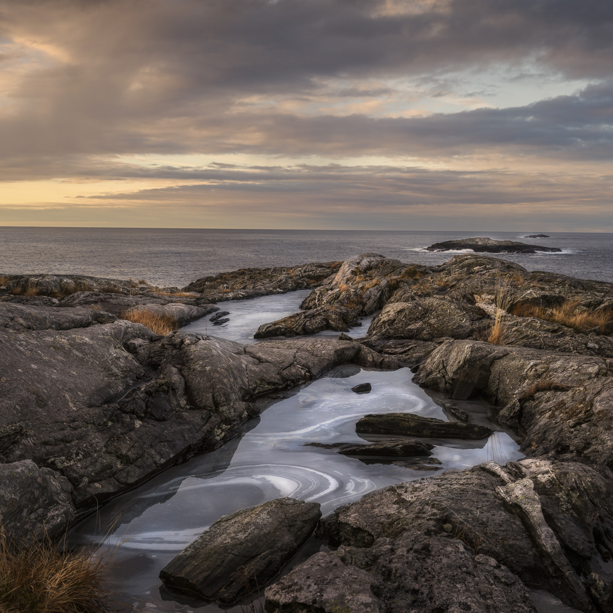
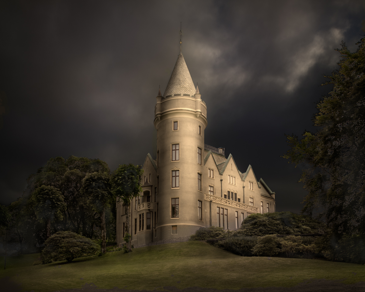
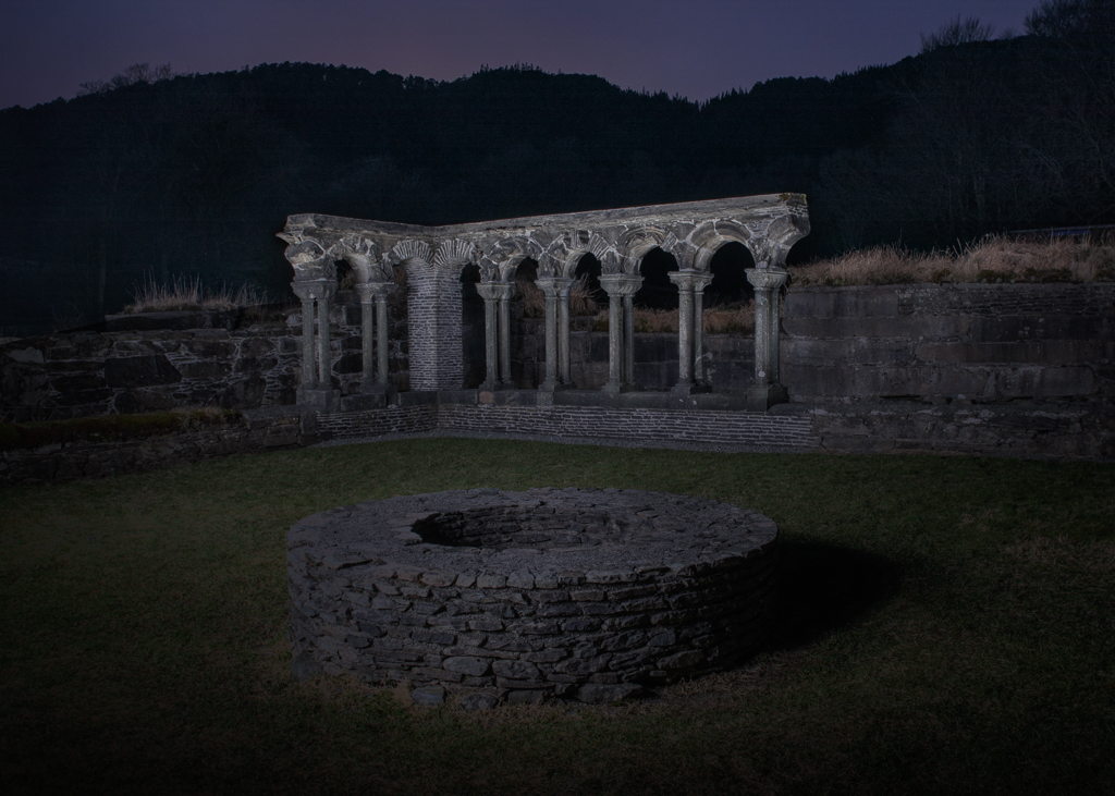
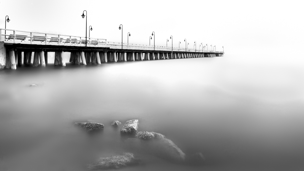
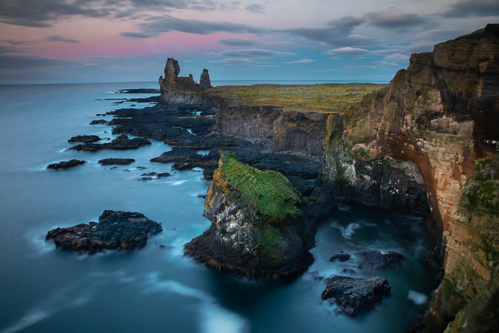
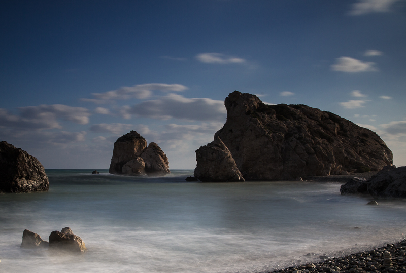
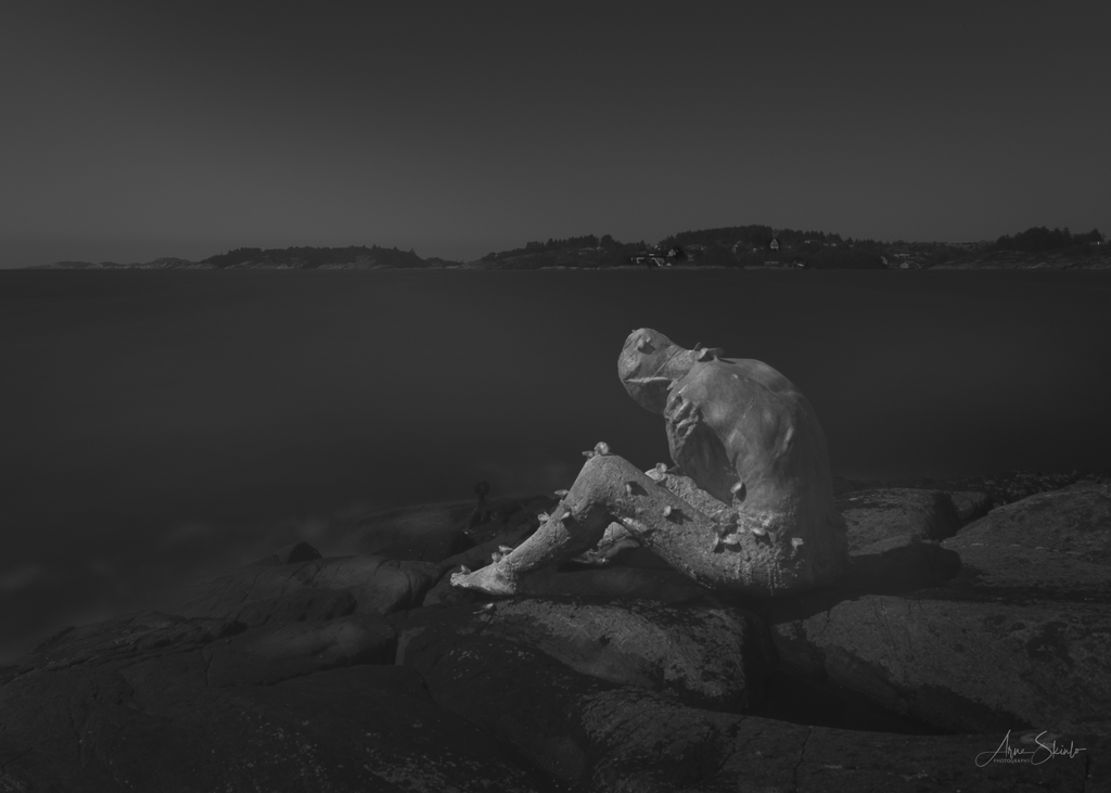
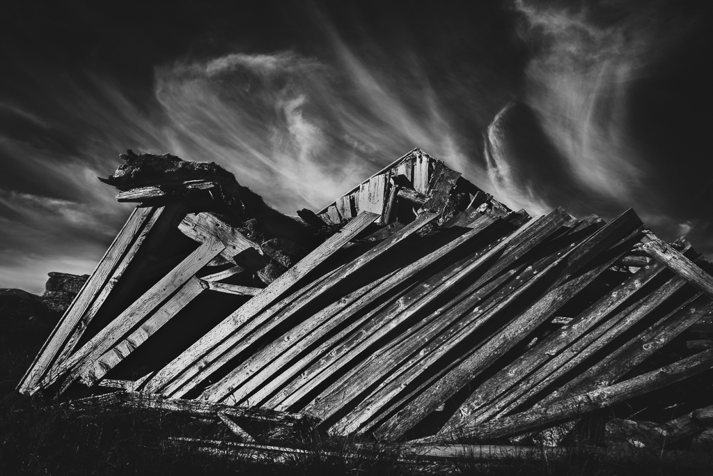
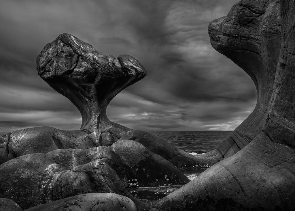
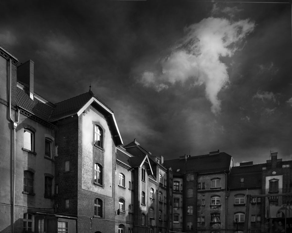
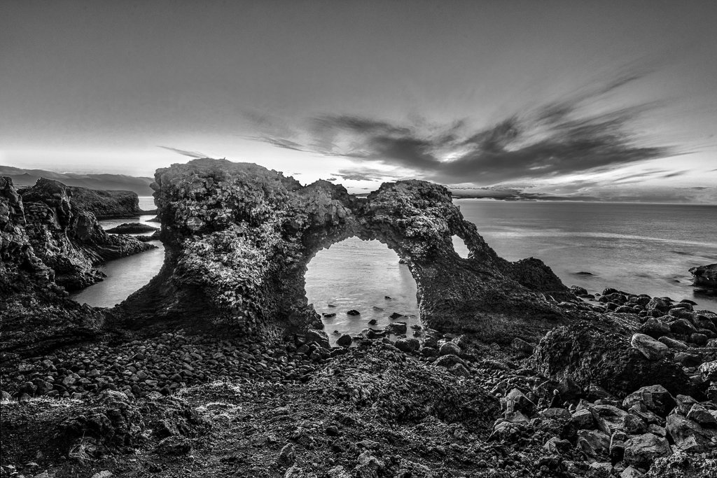
A very dramatic scene and a well-composed image. A bit more of the foreground would be an improvement, I think. The point of interest is the castle ruins, but unfortunately, they have to compete with the sky and the rock below them. My suggestion for improvement is to darken the white in the sky, remove the white spots on the rock and brighten the caste ruins. If you should go there again, I would brought an ND 10 filter with me to smooth out the sea and the clouds. Maybe also an exposure bracketing for the ruins. |
Sep 17th |
| 74 |
Sep 22 |
Comment |
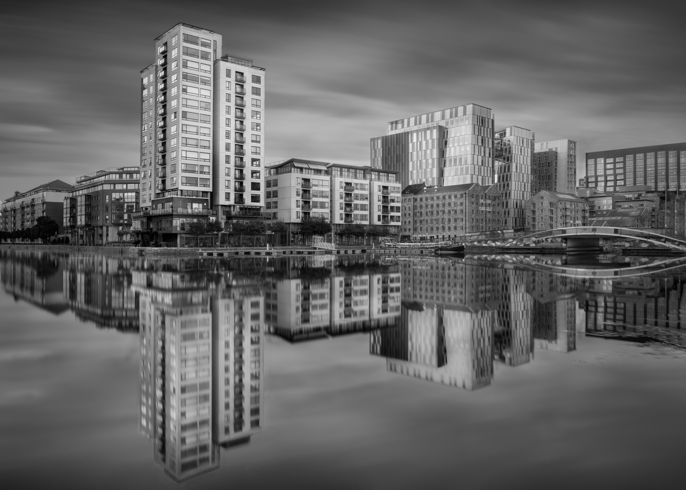
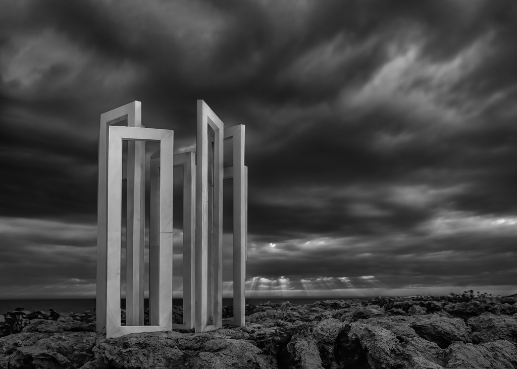
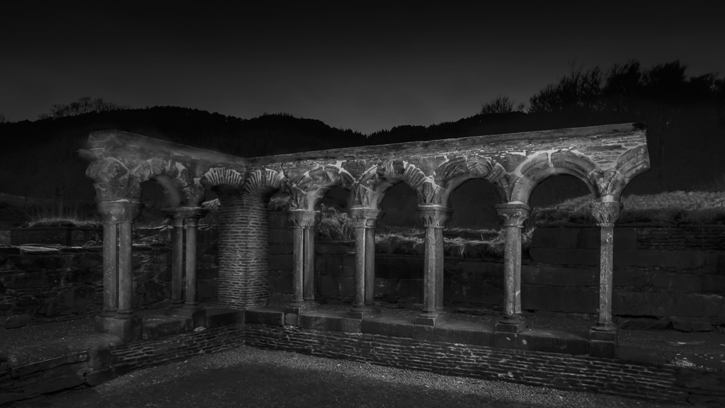
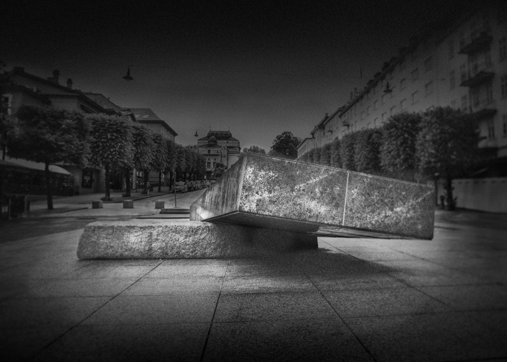
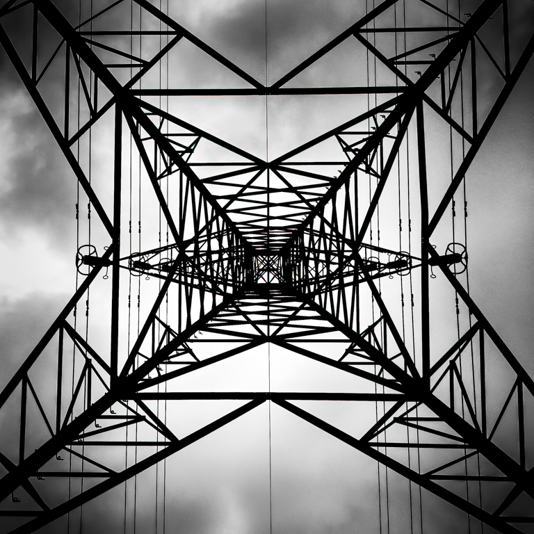
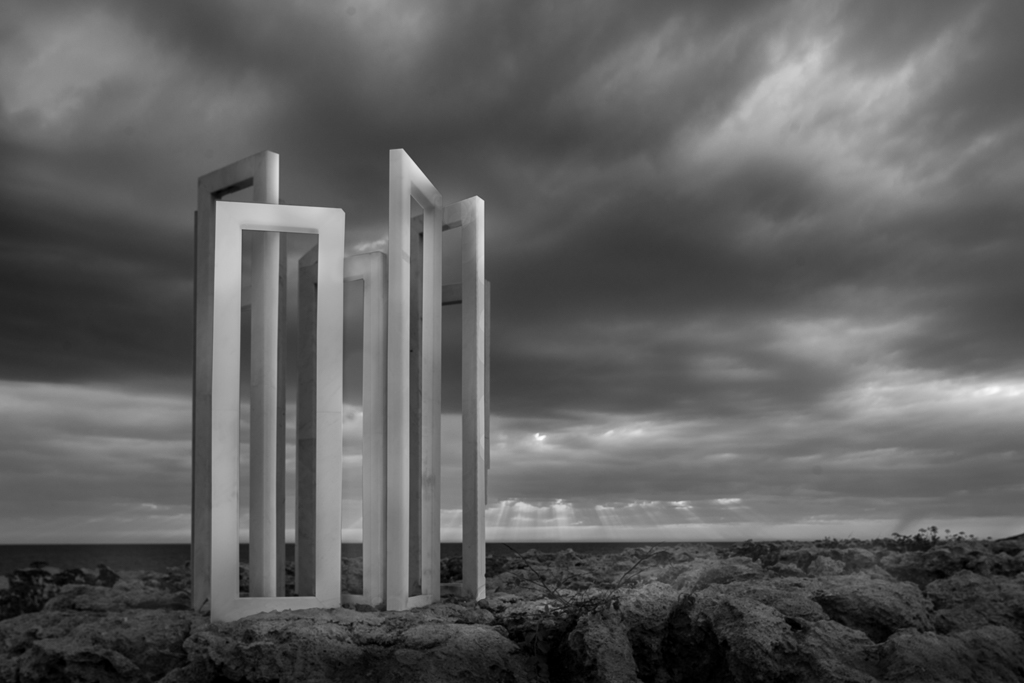
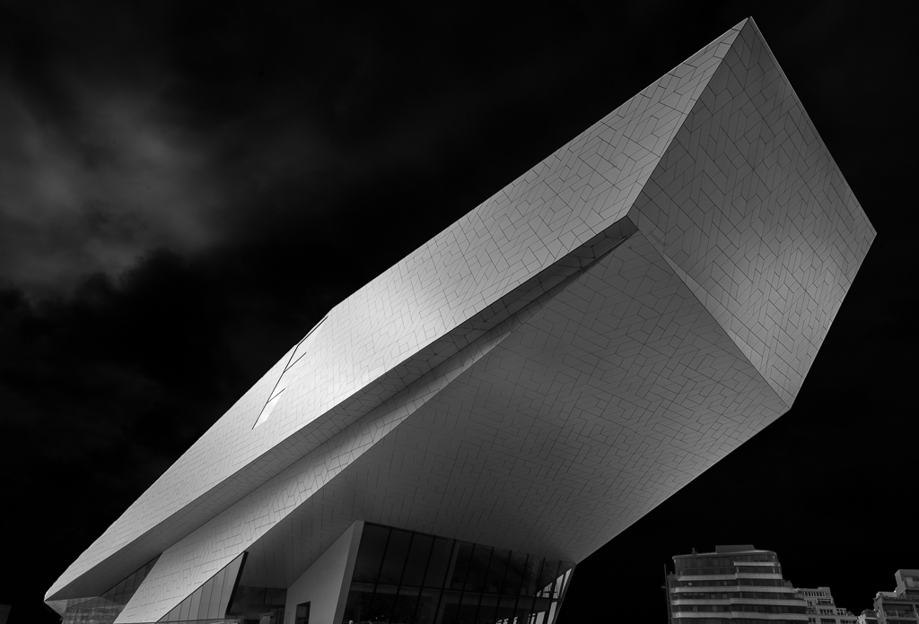
A very well-composed image. Going so close, we feel that it is a big portal. First, I would say that the picture is good enough as it is, but I have some comments for improvement. By going so close to the foreground, it is impossible to get both the foreground and background sharp. In this case, focus bracketing would solve that. A vignette would drawn the focus more to the centre of the image. By masking out the sky, you could achieve more contrast between the sky and the foreground and background. The conversion to B&W is well done with nice grey tones and good contrast. |
Sep 17th |
| 74 |
Sep 22 |
Comment |
Based on the comments I have received, I reedited the image. Thank you for your input. |
Sep 12th |
 |
| 74 |
Sep 22 |
Reply |
Thank you, Haru, for your comments and suggestion. I had done some lighting of the frame, but was not satisfied. Your suggestion was better so I have used luminosity masks to achieve something similar to what you have done. I think I will reissue the picture when I am complete. |
Sep 12th |
| 74 |
Sep 22 |
Reply |
Thank you for your comments, Dick. I am still working on this image, so I will take your comments into consideration in my further work. |
Sep 12th |
| 74 |
Sep 22 |
Reply |
Thank you for your comments which I appreciated a lot. I captured this image just a few days before I published it, so it is not quite finished. All the comments I have received are very valid and I am now working in that direction. |
Sep 12th |
6 comments - 3 replies for Group 74
|
| 96 |
Sep 22 |
Reply |
You have apparently read Julia`s book. Your image is much more appealing now. You are doing well with your masking. The light beam could start narrow and widen out and not start precisely from the corner. Alternatively, as a thin strike. I like the gradient on the left side, you could apply the same on the two to the right.
These comments are very picky. Overall, your image is great, but fine art is perfection. You are definitely on the right track. |
Sep 21st |
| 96 |
Sep 22 |
Comment |
Hi Cheryl,
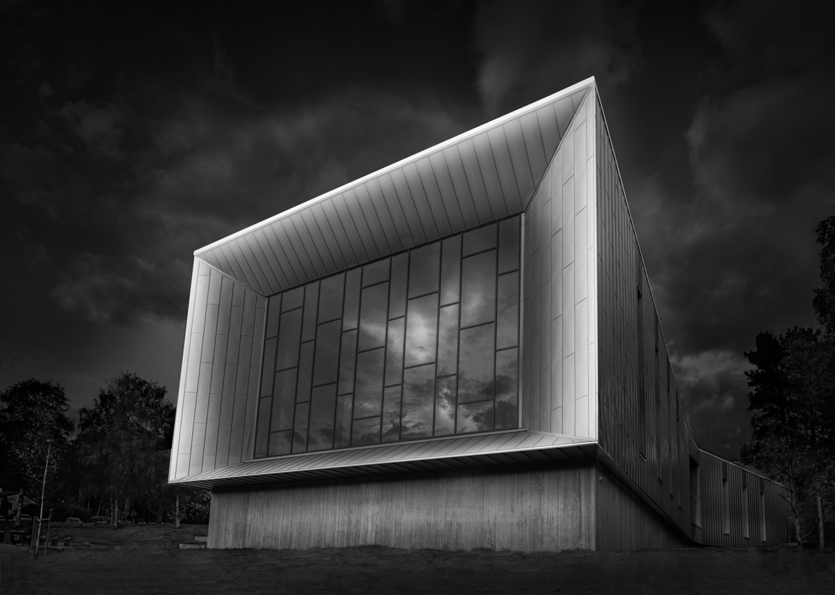
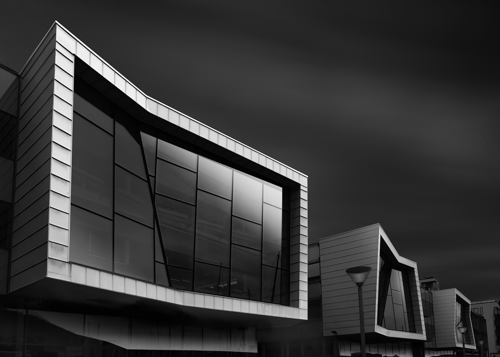
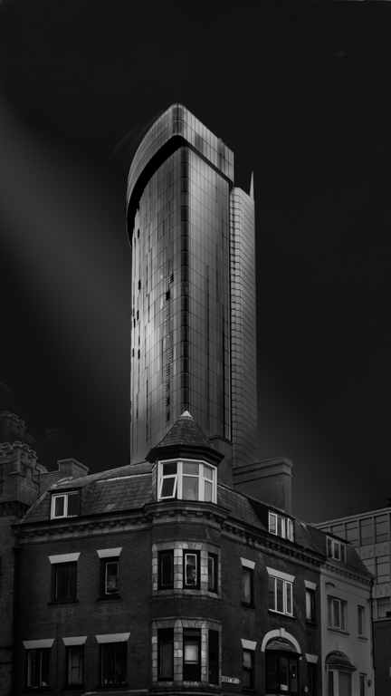
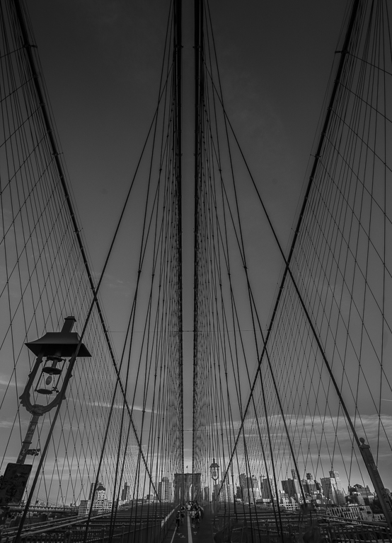
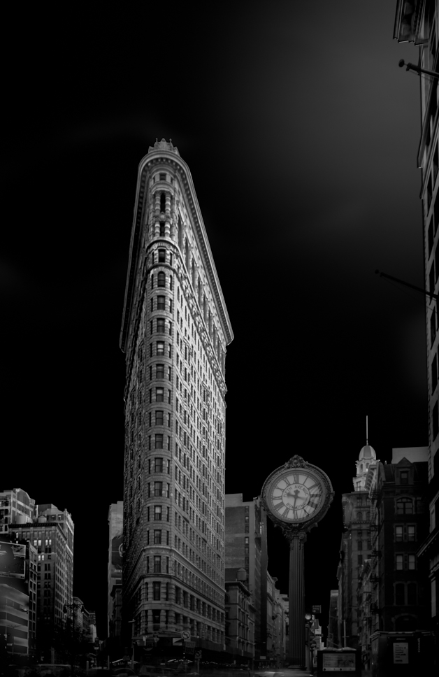
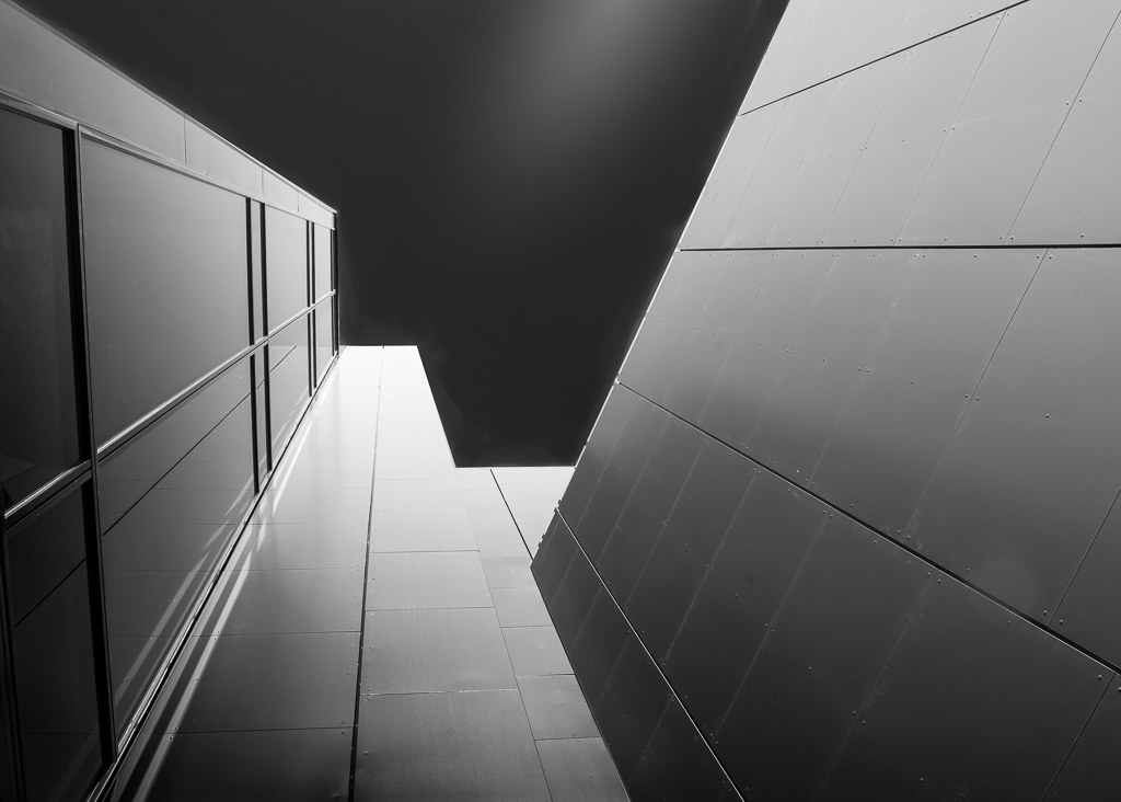
I belong to group 74 Monocrome and Haru who is also in that group, asked if I could give you some comments. There are no right and wrong, so this is only my personal opinion. The angle looks good and gives a feeling of hight. I would suggest to move the building to the right to get some symmetry. Contrast and gradients are important in this type of photography, so I would suggest to lighten parts of the Nutrien wall a bit more and make a light gradient on the left wall from top in an angle. The sky takes too much attention in my opinion, so I suggest to make a dark gradient from the top. I agree that you should use a ND filter next time as Photoshop bluring doesn't work very well. As your first attempt, I would say you have done well. I will suggest that you look into Julia Anna Gospodarou website to get more inspiration. Good luck! |
Sep 16th |
1 comment - 1 reply for Group 96
|
7 comments - 4 replies Total
|