|
| Group |
Round |
C/R |
Comment |
Date |
Image |
| 36 |
Jun 21 |
Reply |
Thank you for your suggestion. I tried out a middle way between yours and Bill`s comments. I think this works better. |
Jun 12th |
 |
| 36 |
Jun 21 |
Reply |
Since I suggested it, I have to say that it worked better 🙂. I am glad you did it in such a subtle way. |
Jun 12th |
| 36 |
Jun 21 |
Comment |
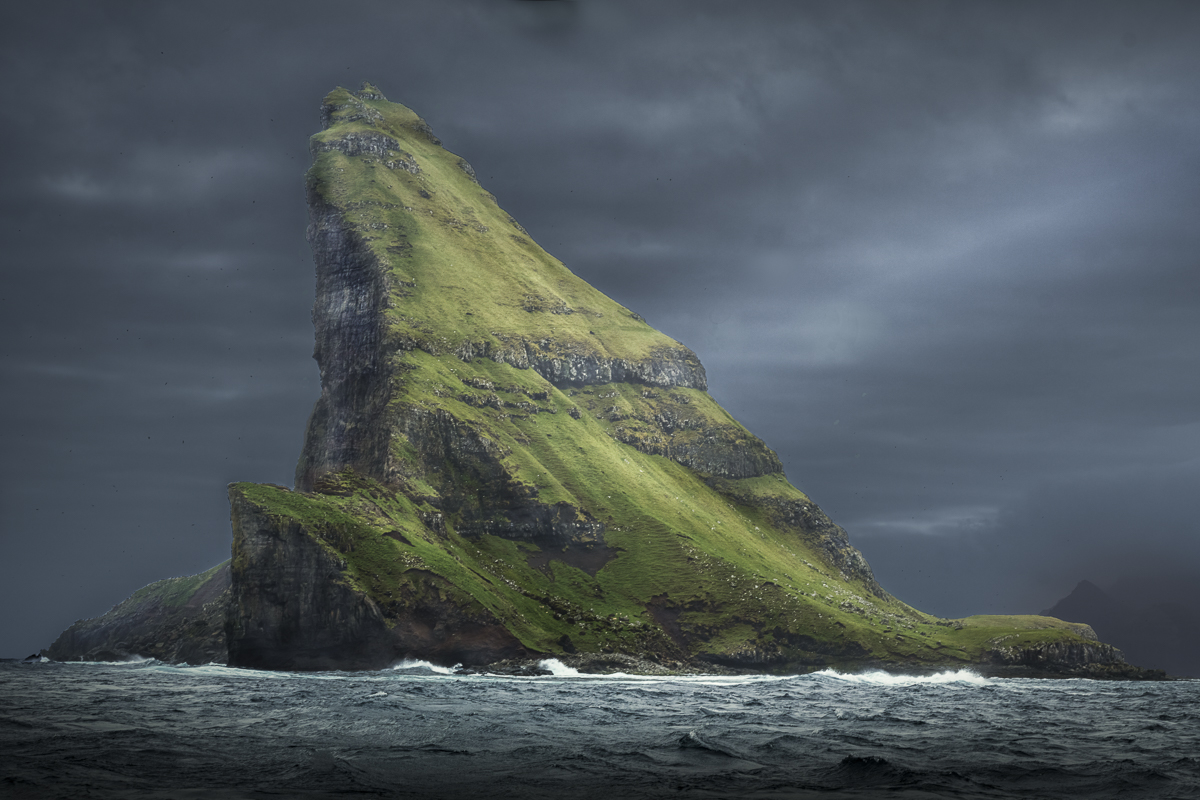
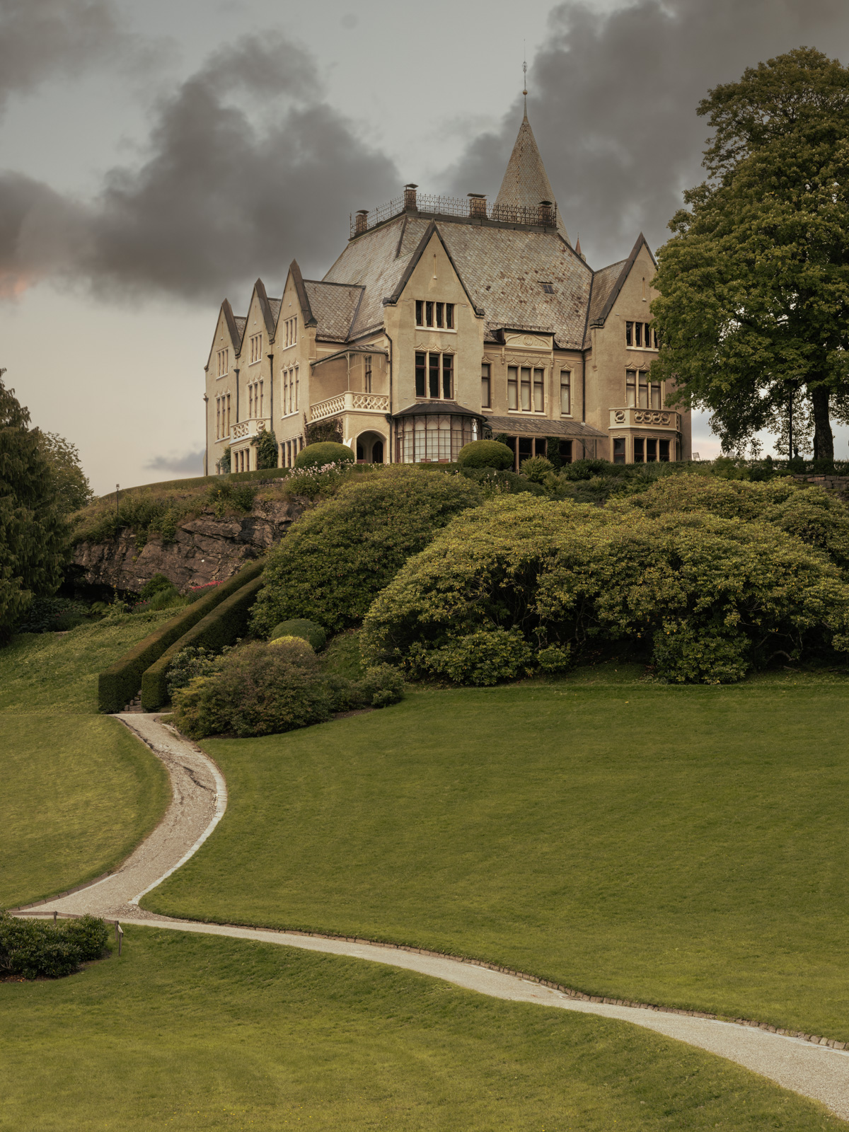
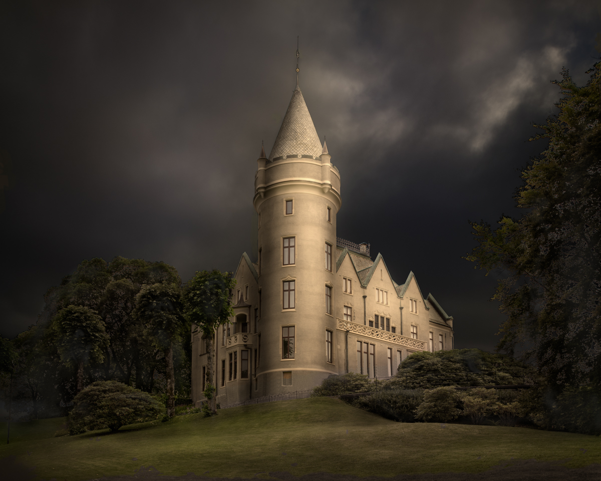
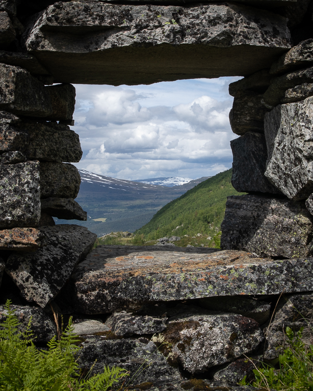
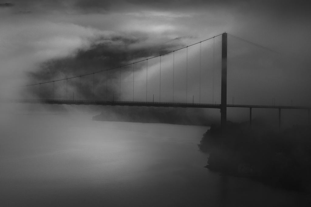
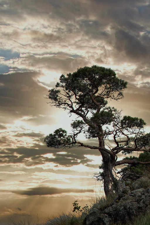
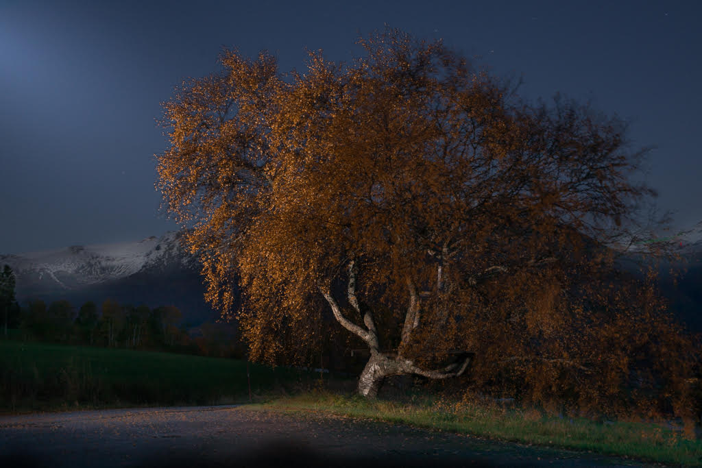
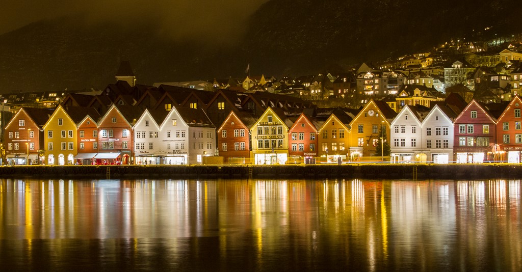
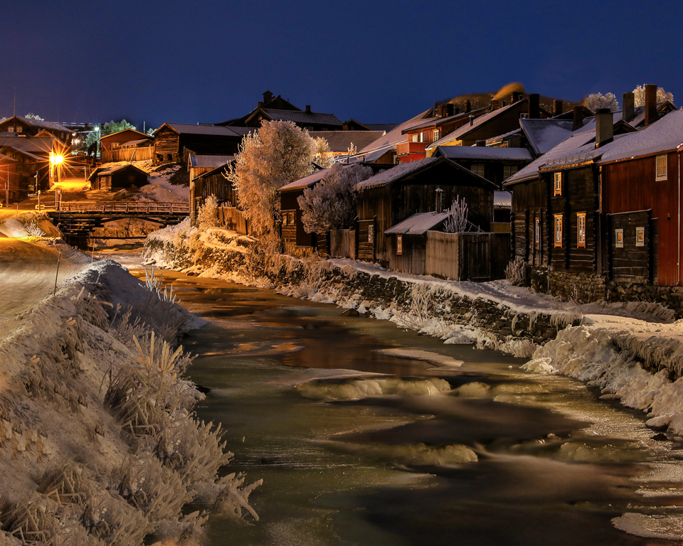
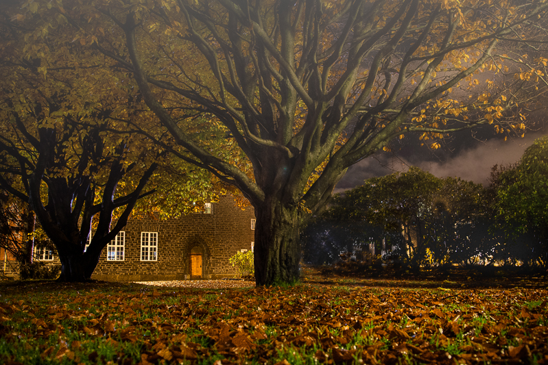
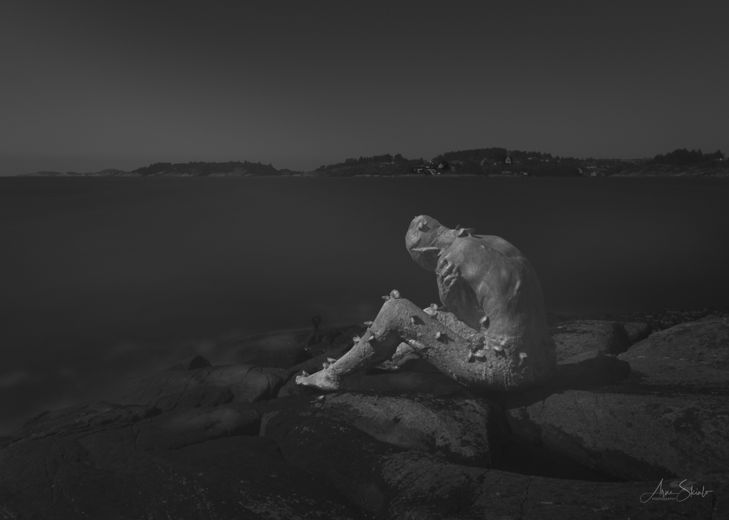
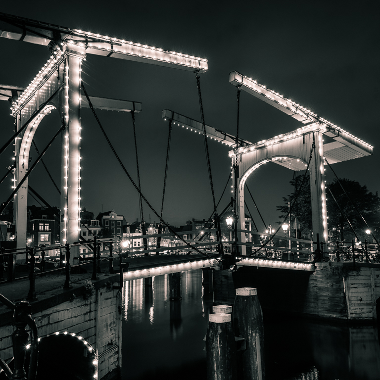
My first impression was that this is like a fairytale. Slightly unrealistic, but I a way that makes you dreaming about a Soria Moria castle. In a picture like this, I am not so focused on sharpens and technical details, it is all about mood. And here you have succeeded! Only one small detail; I would cropped or cloned the small light dot in the right lower corner. |
Jun 10th |
| 36 |
Jun 21 |
Comment |
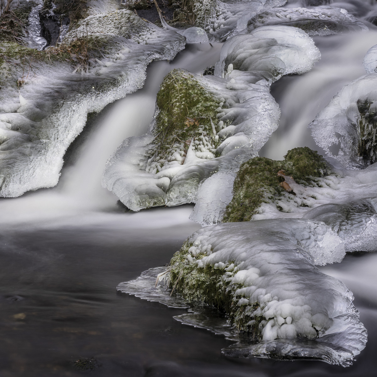
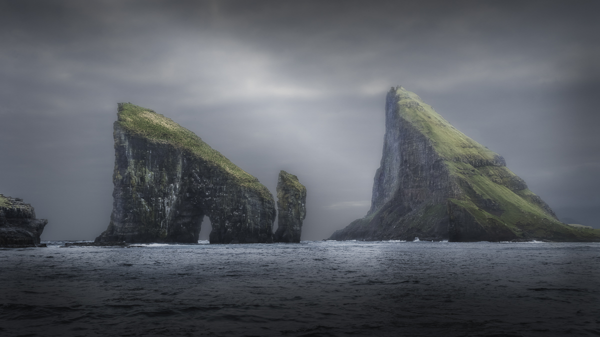
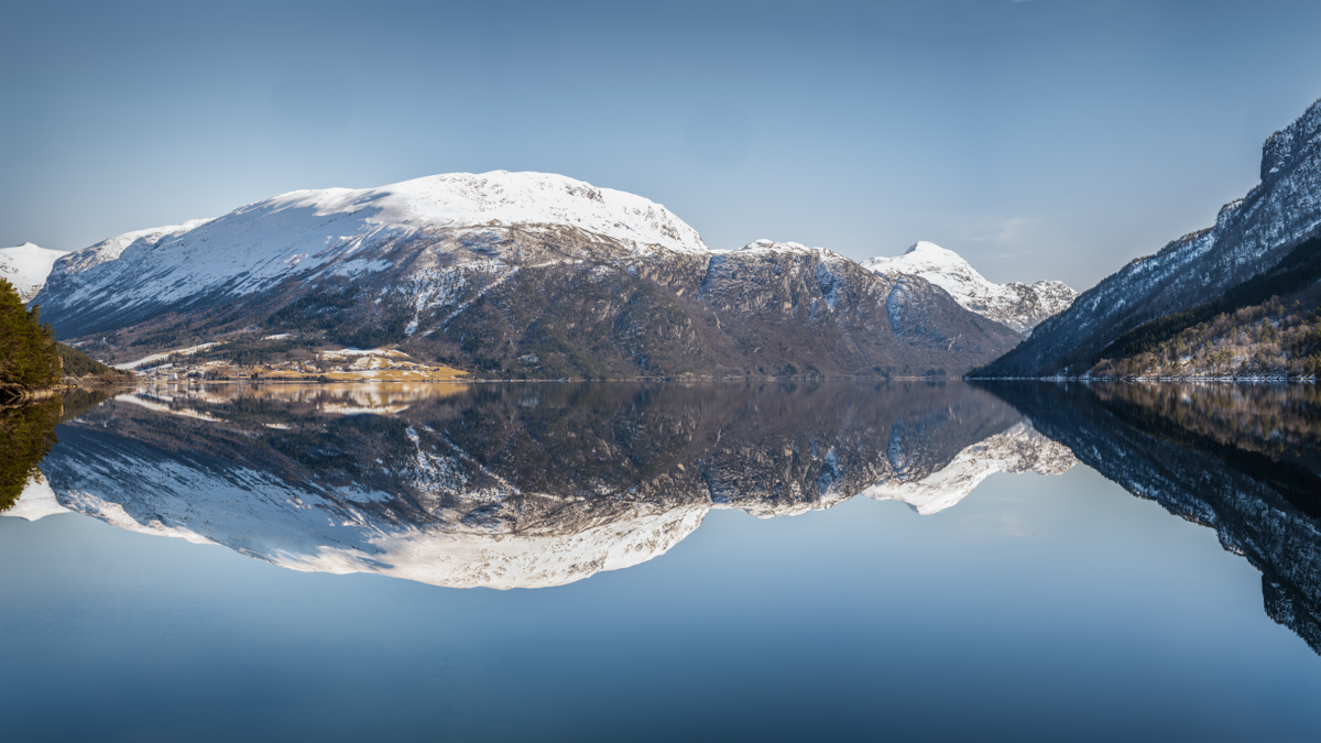
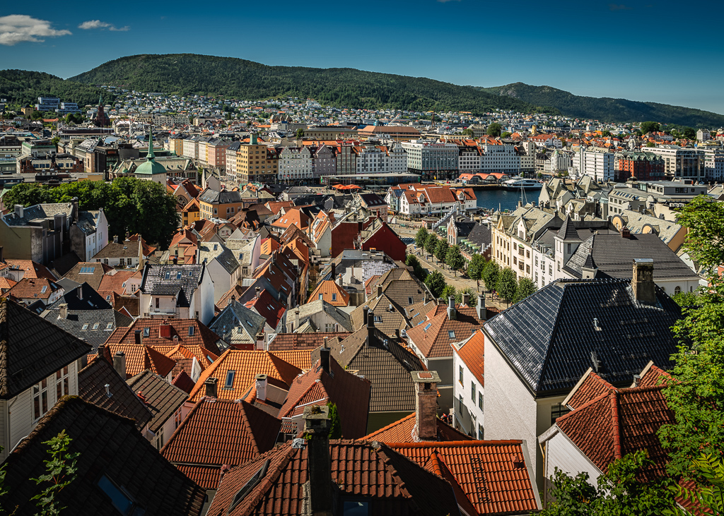
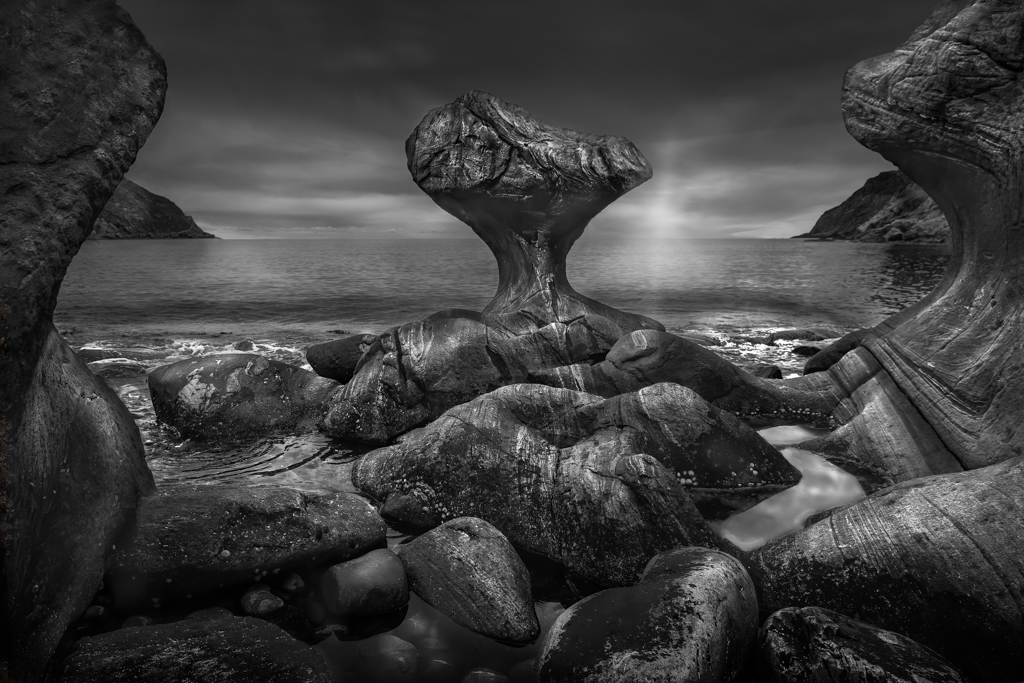
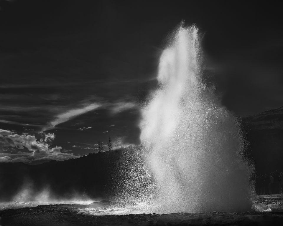
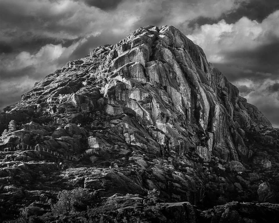
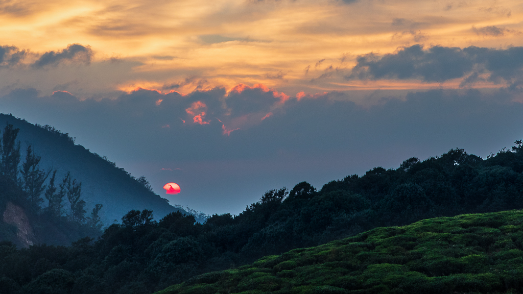
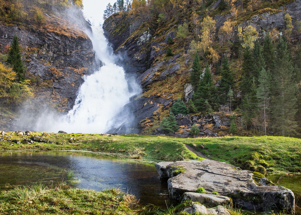
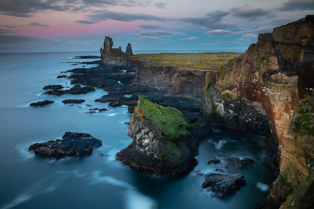
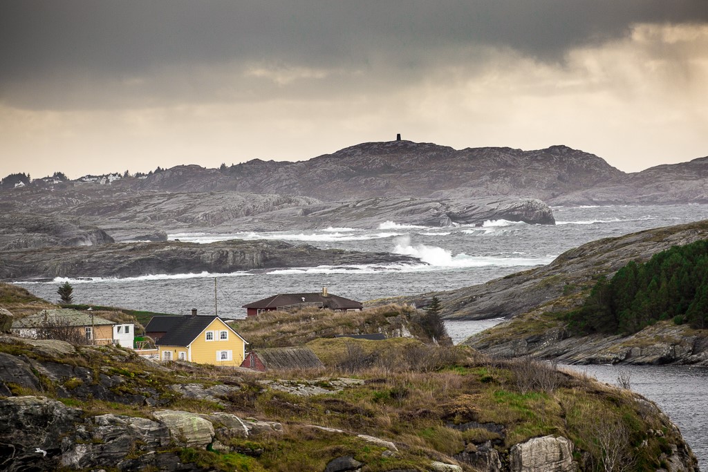
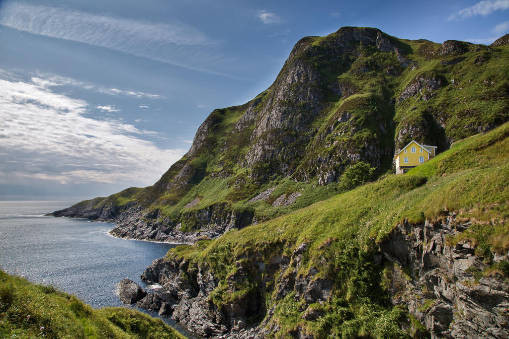
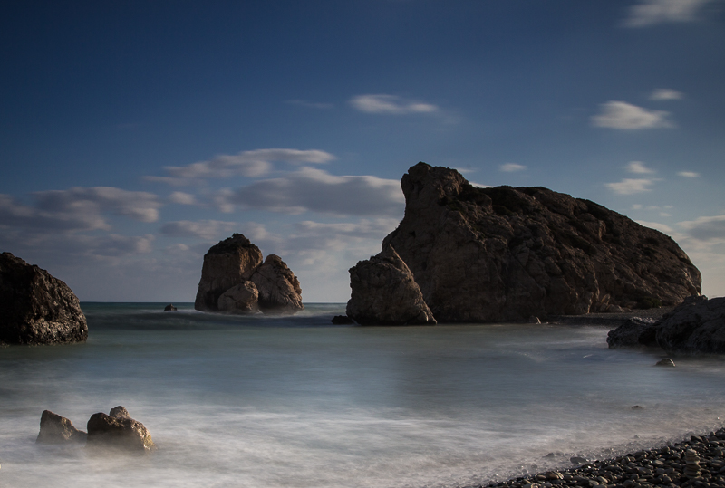
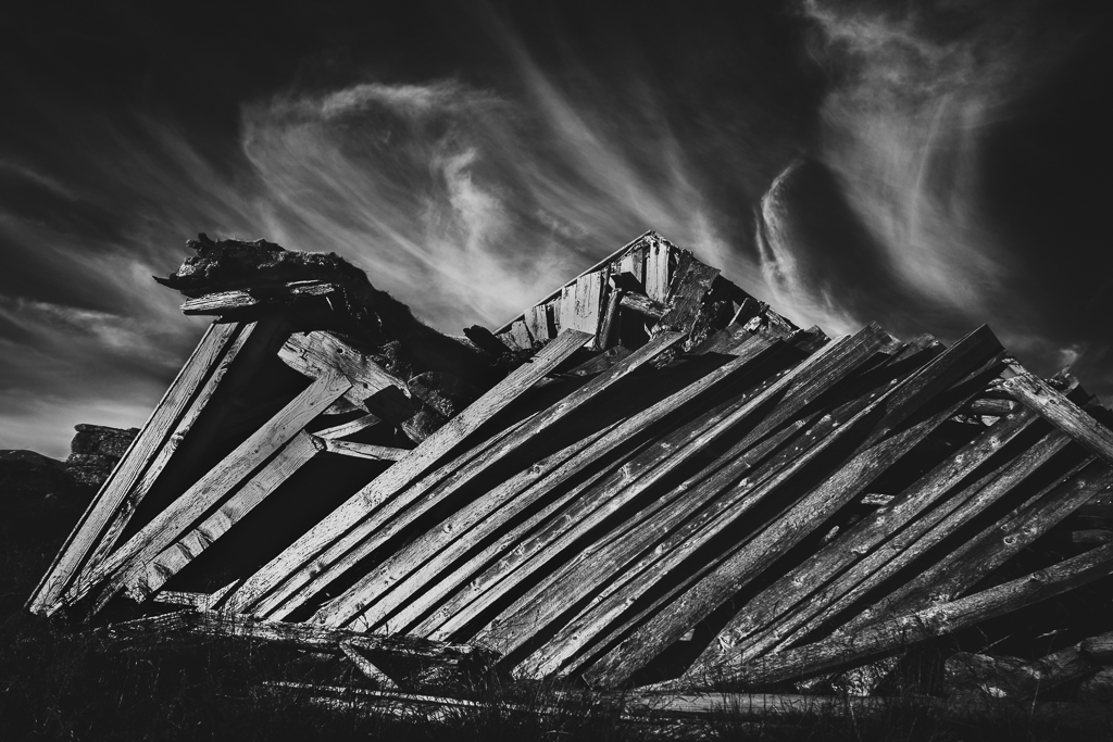
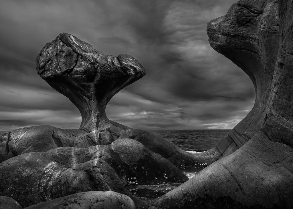
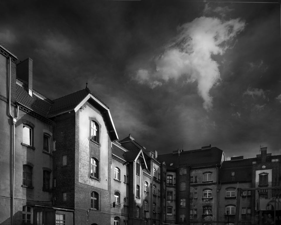
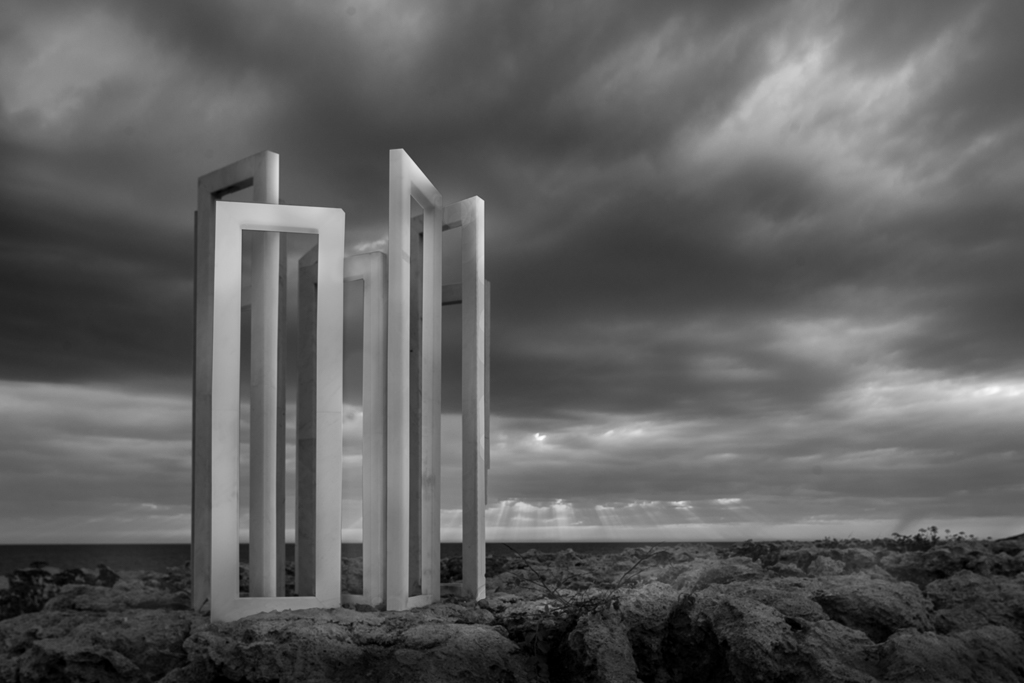
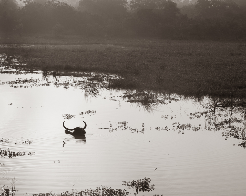
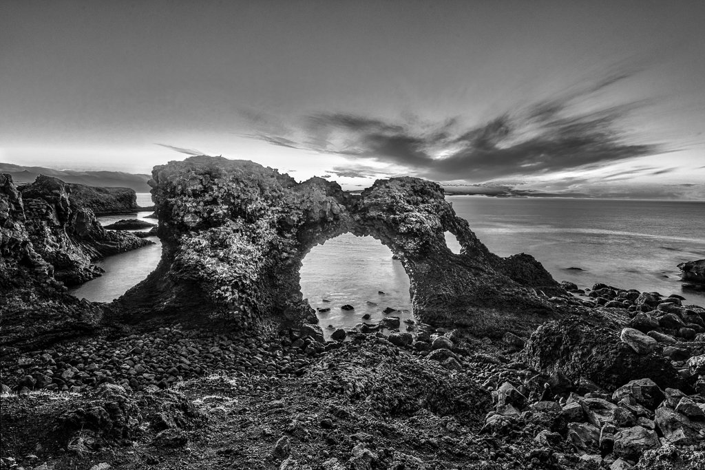
Iceland has so many interesting landscapes and lava formations that cannot be found elsewhere. I like the composition with the diagonal line in the midle.
My suggestion is to concentrate more on the rock in the foreground and lighten it up slightly. I would therefore crop from the left and just keep a portion of the cliff as a frame. In order to keep the format, I would also crop the sky accordingly.
In my opinion this would keep the rock as the main object and the rocks in the background as repeating objects. |
Jun 10th |
| 36 |
Jun 21 |
Comment |
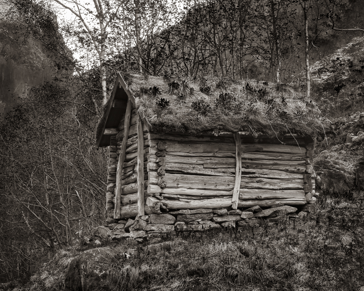
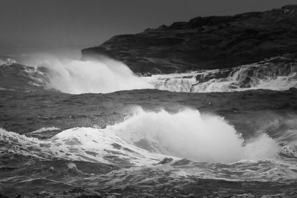
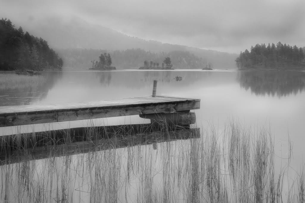
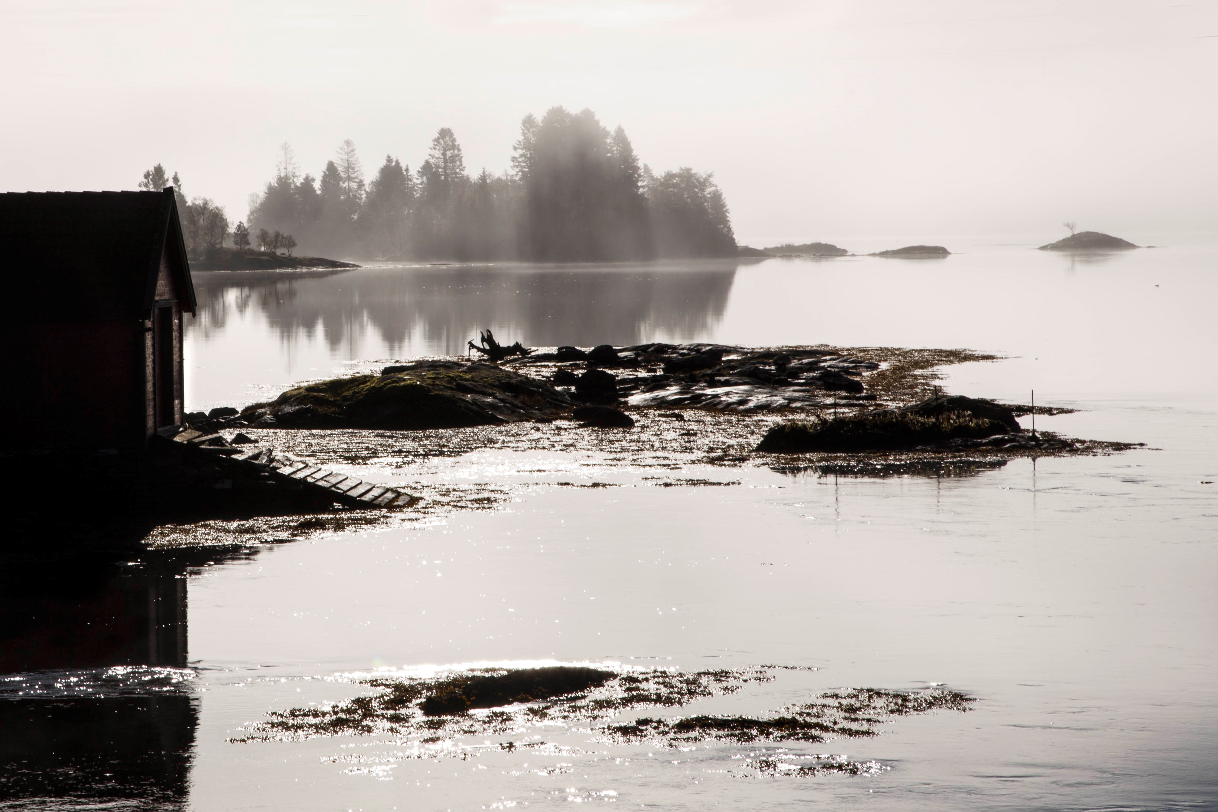
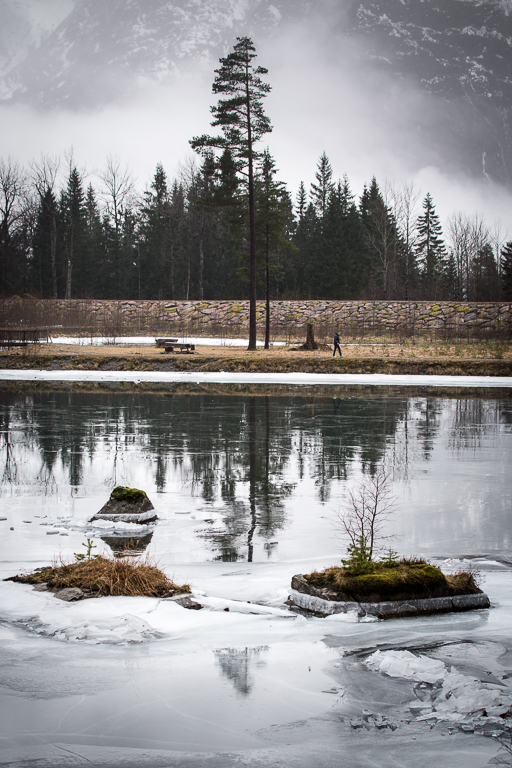
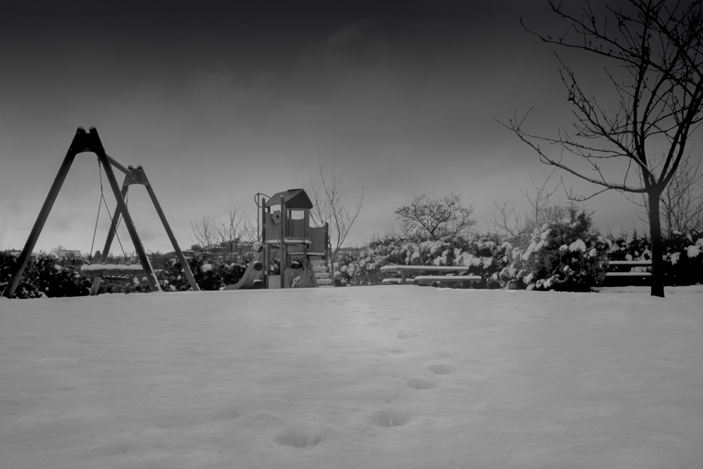
I liked the fading out from foreground to background. In my opinion, the trees should be there to express depth into the image. |
Jun 10th |
| 36 |
Jun 21 |
Comment |
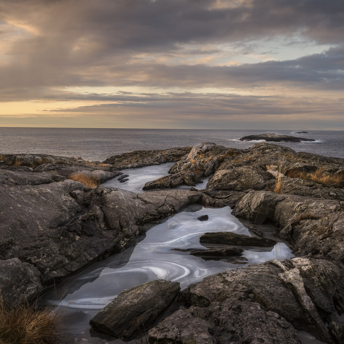
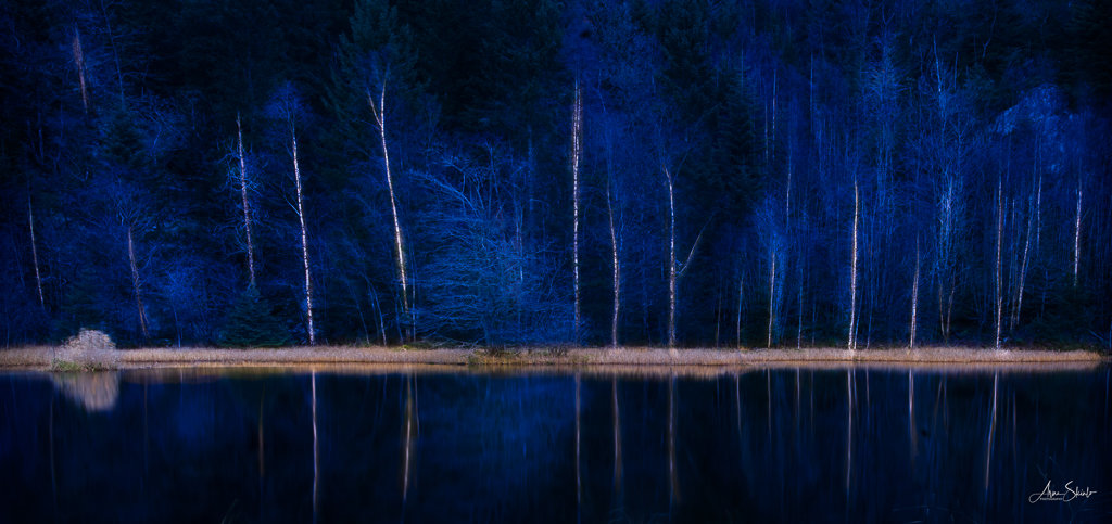
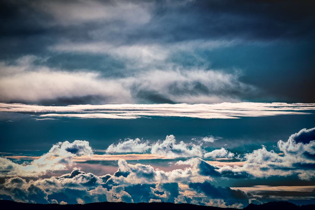
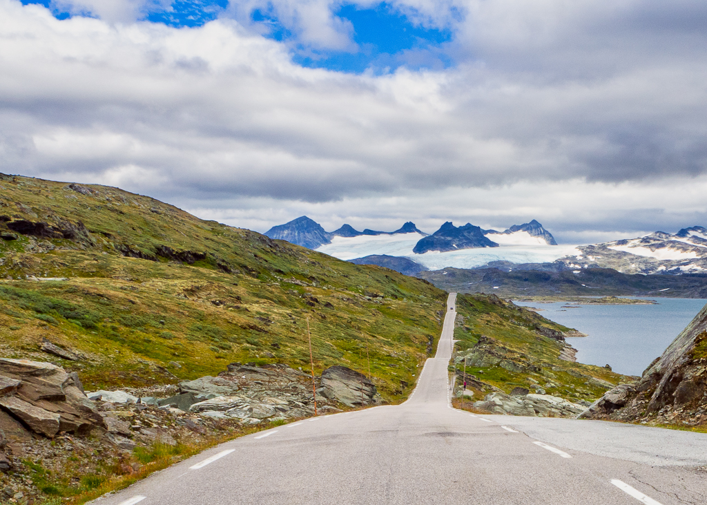
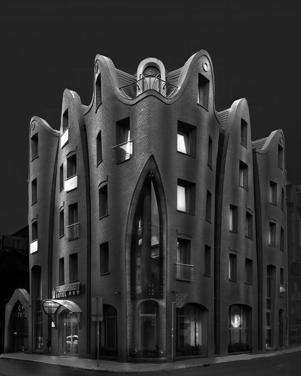
First I will express my admiration for your efforts in making a good image. I think most of us have a lot to learn from you here. The blue colour express drama and the light from the left is just what you needed to make this a masterpiece!
If I should give any advice, it would be to darken the sky slightly, which I think would made even more dramatic. |
Jun 10th |
4 comments - 2 replies for Group 36
|
| 74 |
Jun 21 |
Comment |
You have made a great challenge for yourself in this picture. Sometimes the reality is very difficult to capture on a picture and I think this is one of the instances.
To answer your questions:
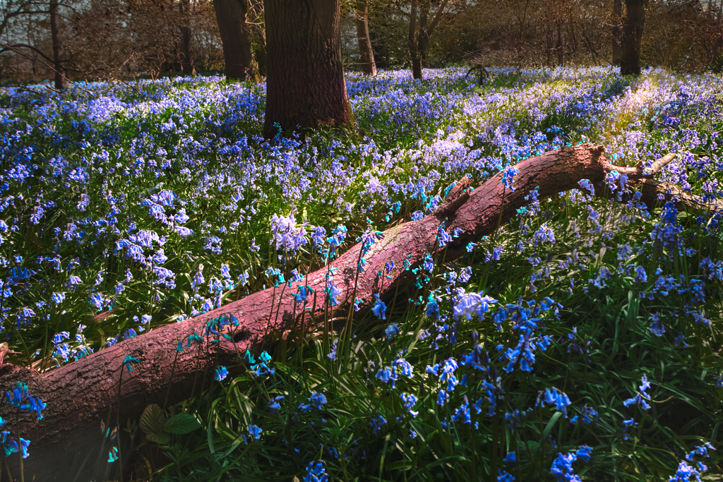
Do you think that the petal carpet with shadow can be a main subject? No, I don't think that will work as it is too uniform and has no distinct focal point.
Do you think that blurring cherry tree (foreground frame) was a mistake? Yes, I do. In my opinion the tree should be sharp and lighter and be the main object.
I like the way you are using the group to try out pictures and make specific questions. That is how we improve ourselves.
|
Jun 10th |
| 74 |
Jun 21 |
Comment |
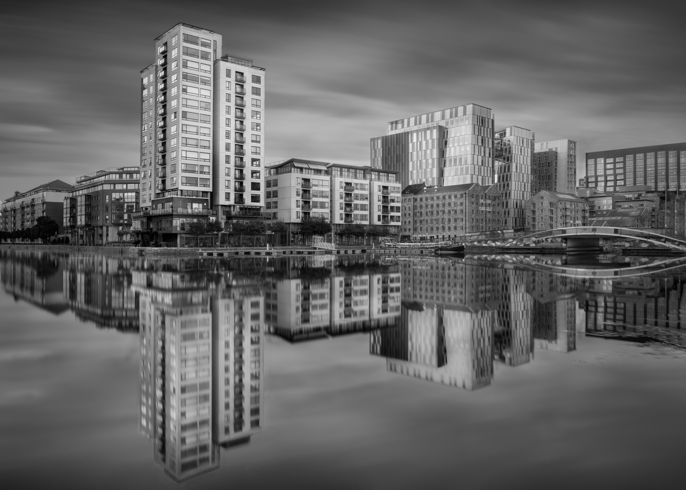
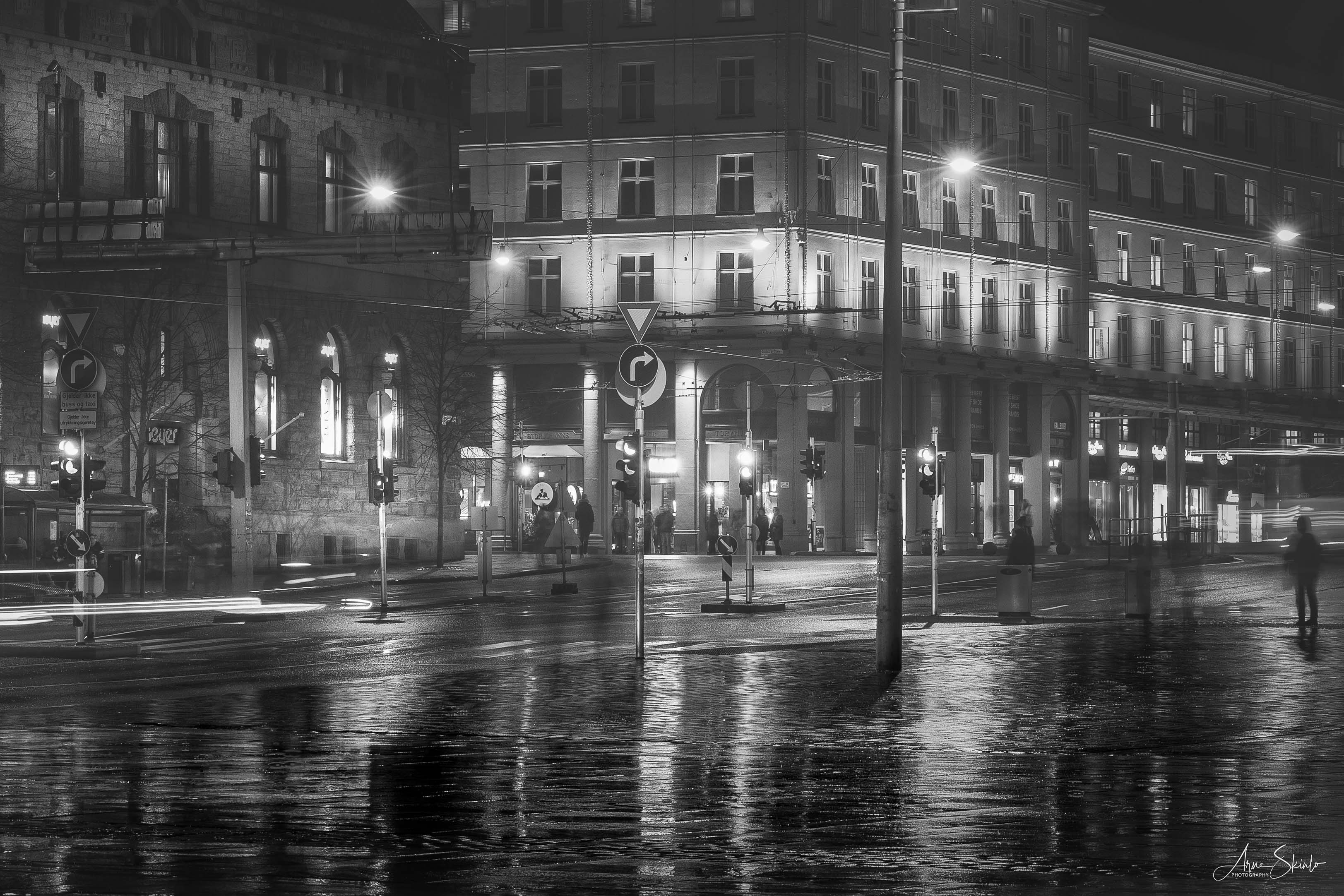
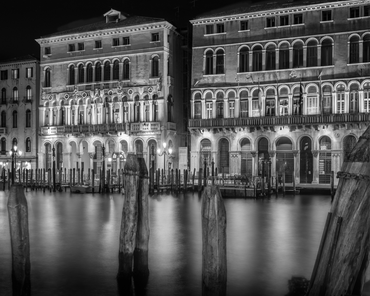
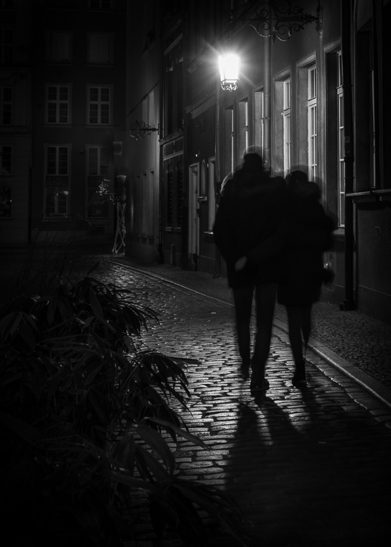
Another good street photo. I liked the objects in front that is kind of a display window for the enterprise.
My only comment is, as Haru already has mentioned, is the plastic plate that takes attention away from the subject. |
Jun 10th |
| 74 |
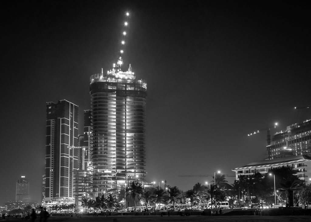
Jun 21 |
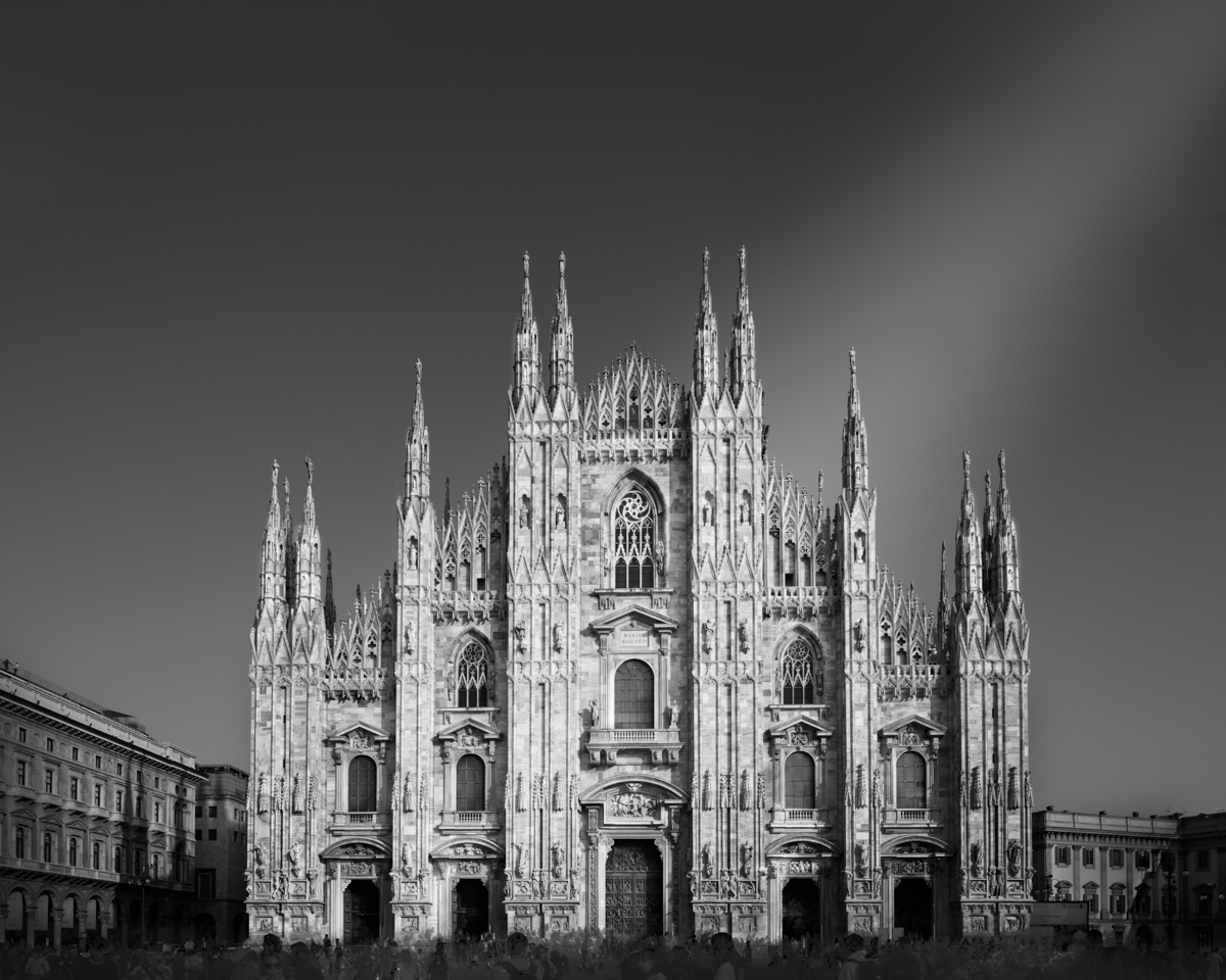
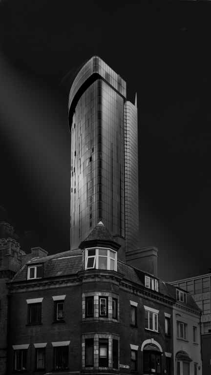
Comment |
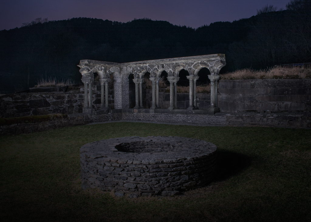
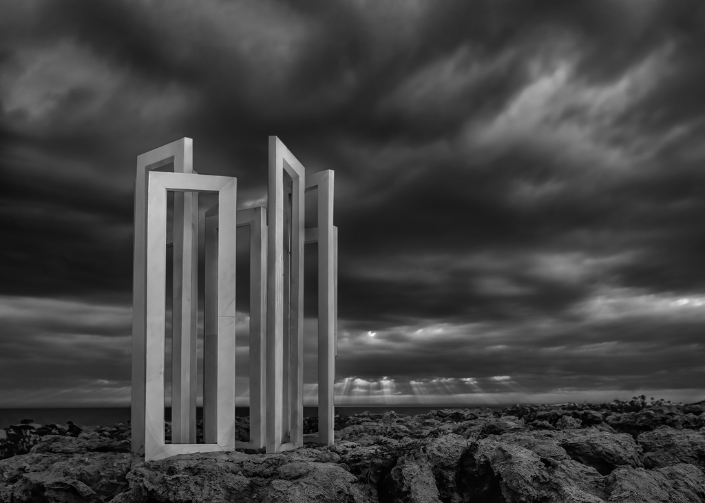
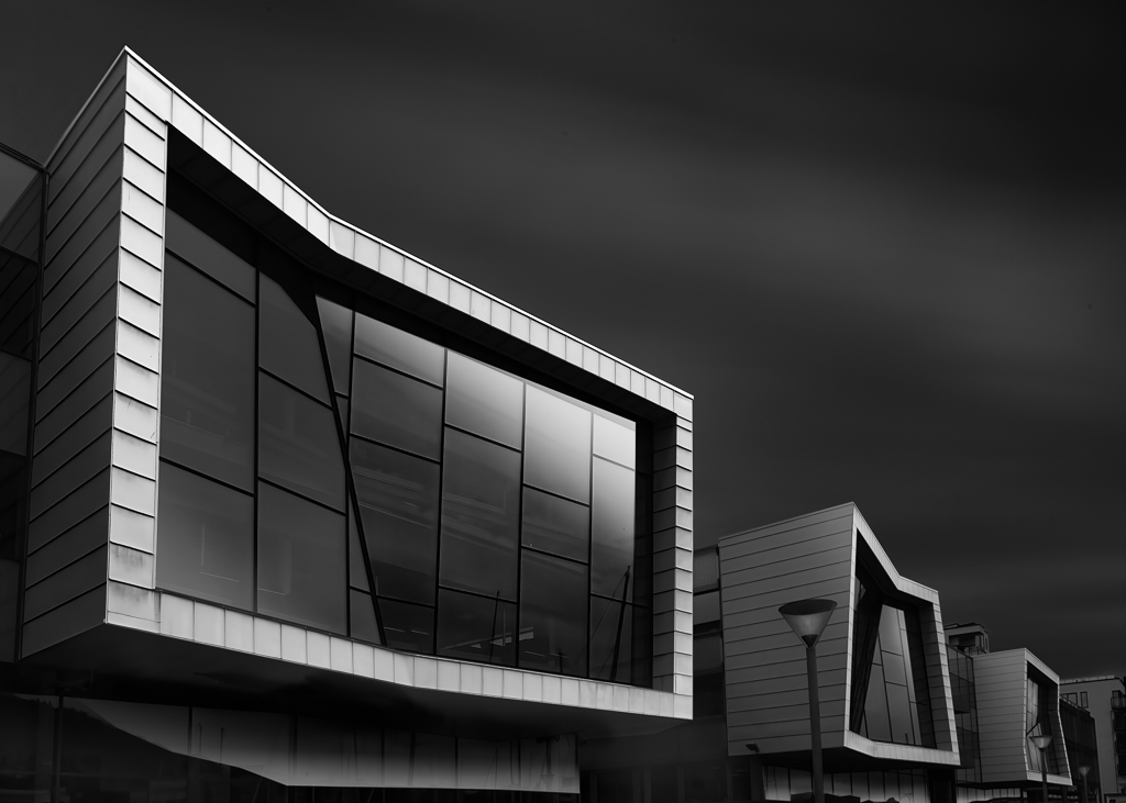
A spot on composition. Converting to B&W is tricky sometimes. The colour version have better distinction between the main object and background. I am not sure how to solve this, but I would started with lowering the contrast of the background and increasing it on the foreground to see if the would help. You could also try to give the different parts castle individual shades, which I think would make it pop more. All in all, a good picture with some potential for improvements. |
Jun 10th |
| 74 |
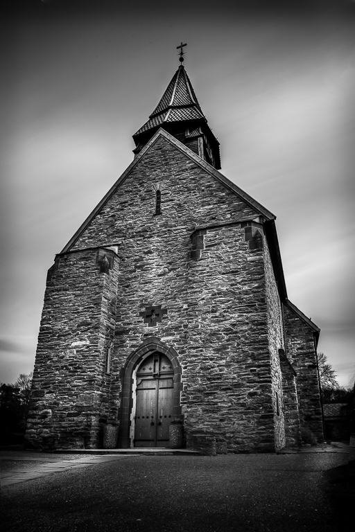
Jun 21 |
Comment |
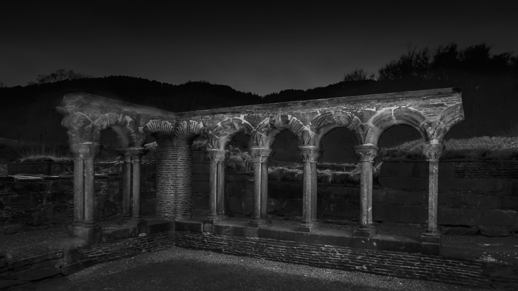
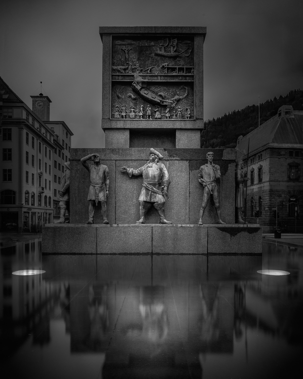
Most of my comments are already covered by Haru. It is a dramatic image, indeed and the post-processing is excellent. By dodging the temple, the main object would be more obvious. You could also experiment with a square format to simplify the composition. |
Jun 10th |
| 74 |
Jun 21 |
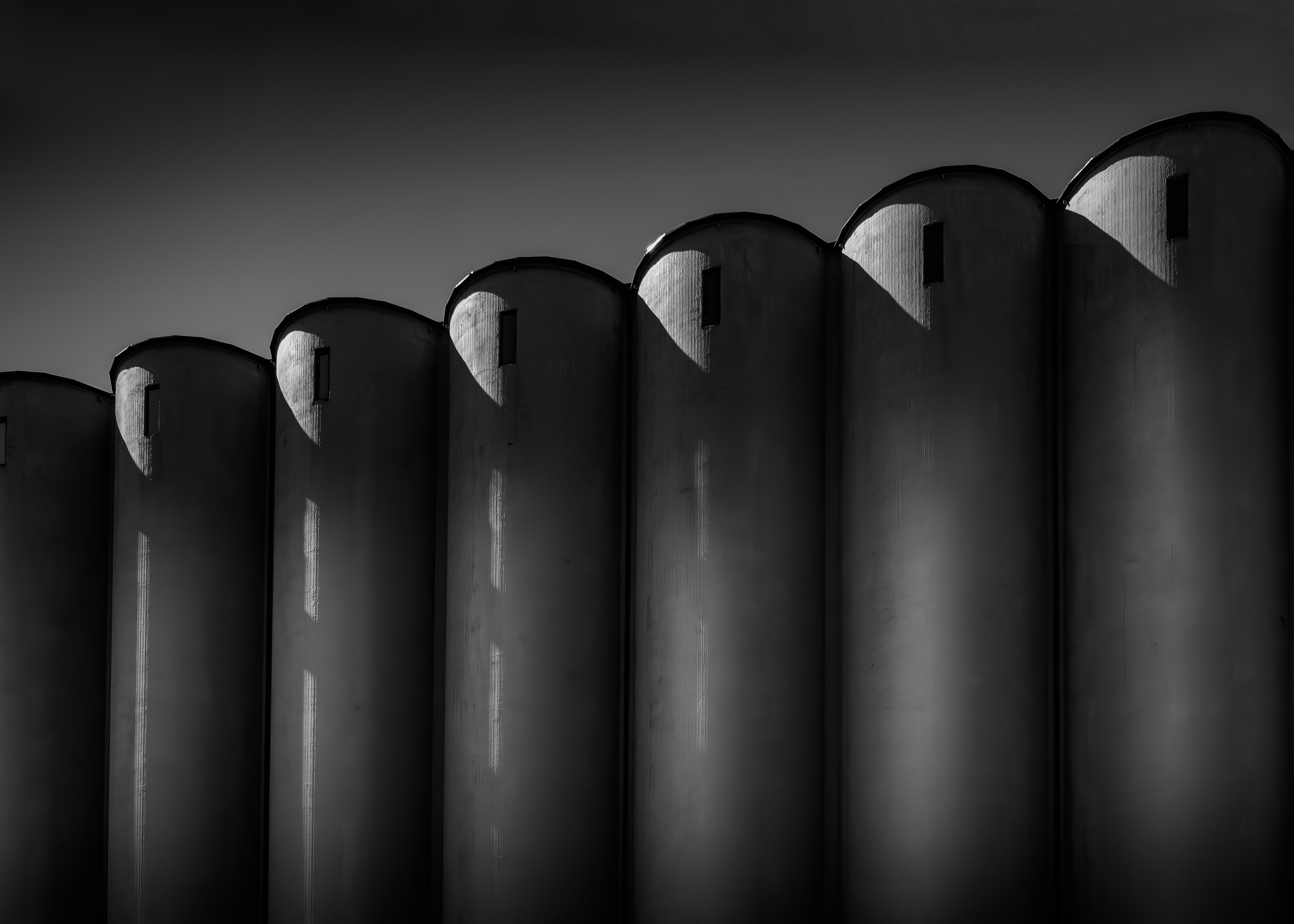
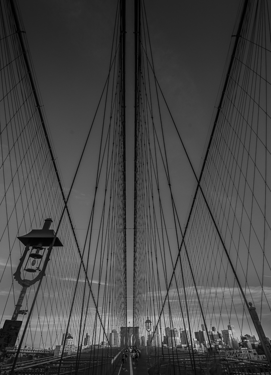
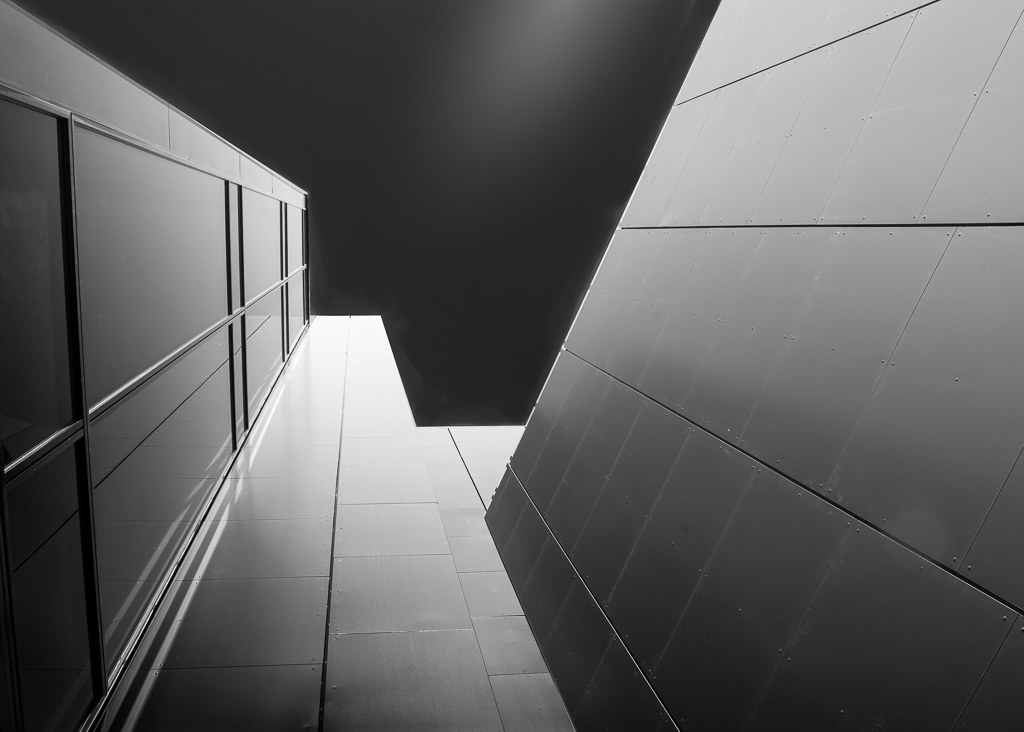
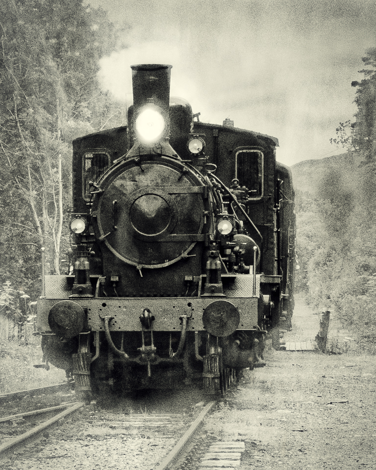
Comment |
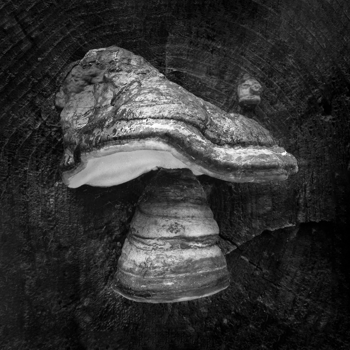
Interesting that you have used Allister Benn`s history brush technique. I tried it out some time ago and found it too complicated. Use the 50% grey method instead.
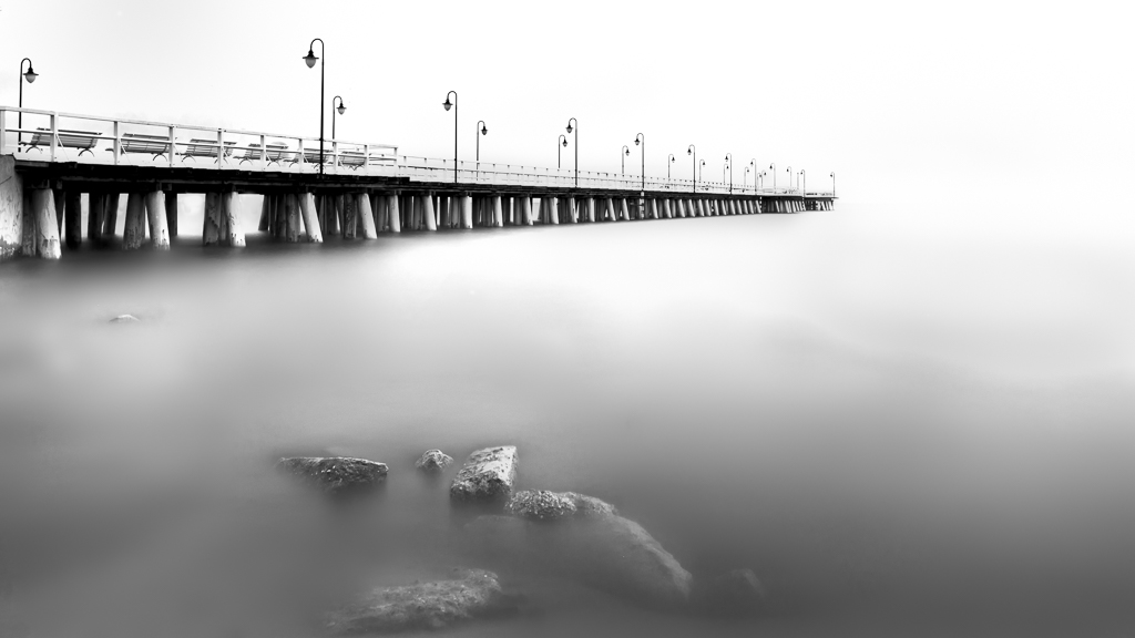
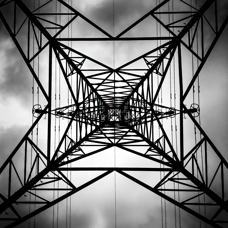
I like the abstract look, it takes some training to find motives like this as they are not very obvious when seeing them together with everything else. The work on tonality is very successful and the diagonal lines make the image interesting. The grain is slightly disturbing. By using 1/125s shutter speed, the ISO would be low enough for preventing grain. Personally, I use Topaz Denoise which does a very good job. |
Jun 10th |
| 74 |
Jun 21 |
Comment |
Thank you for your suggestions. You have a lot of good points here. |
Jun 3rd |
| 74 |
Jun 21 |
Comment |
Thank you for your suggestions. You have a lot of good points here. |
Jun 3rd |
7 comments - 0 replies for Group 74
|
11 comments - 2 replies Total
|