|
| Group |
Round |
C/R |
Comment |
Date |
Image |
| 36 |
Oct 20 |
Reply |
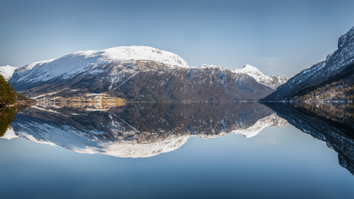
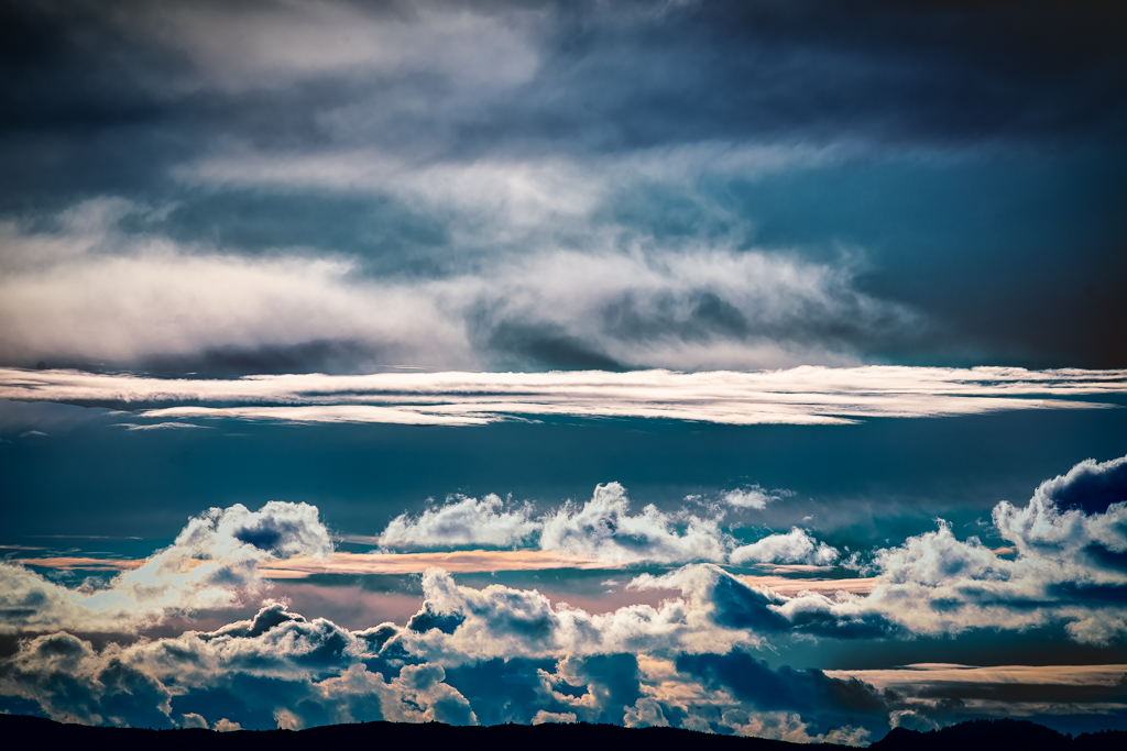
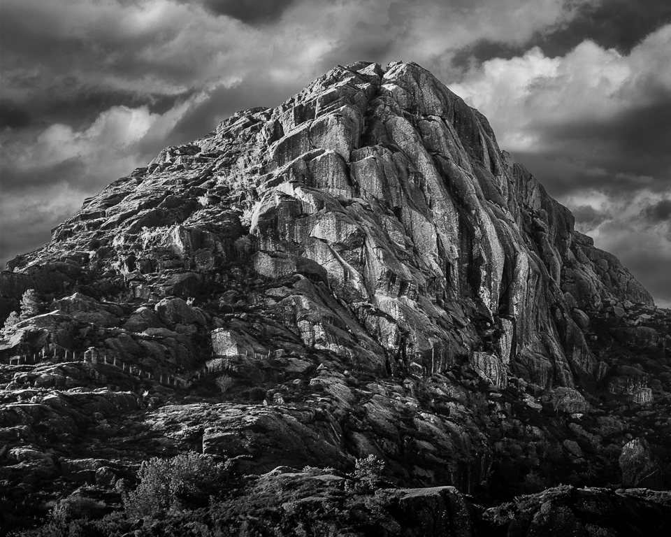
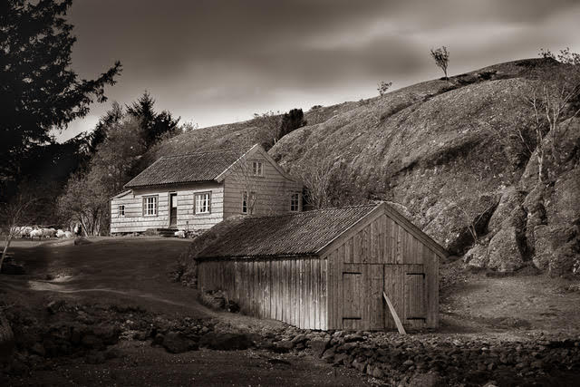
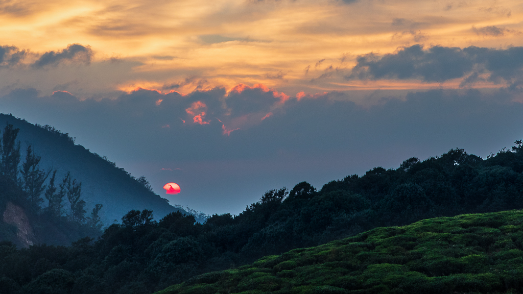
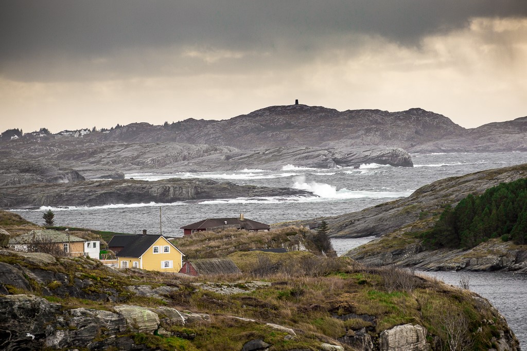
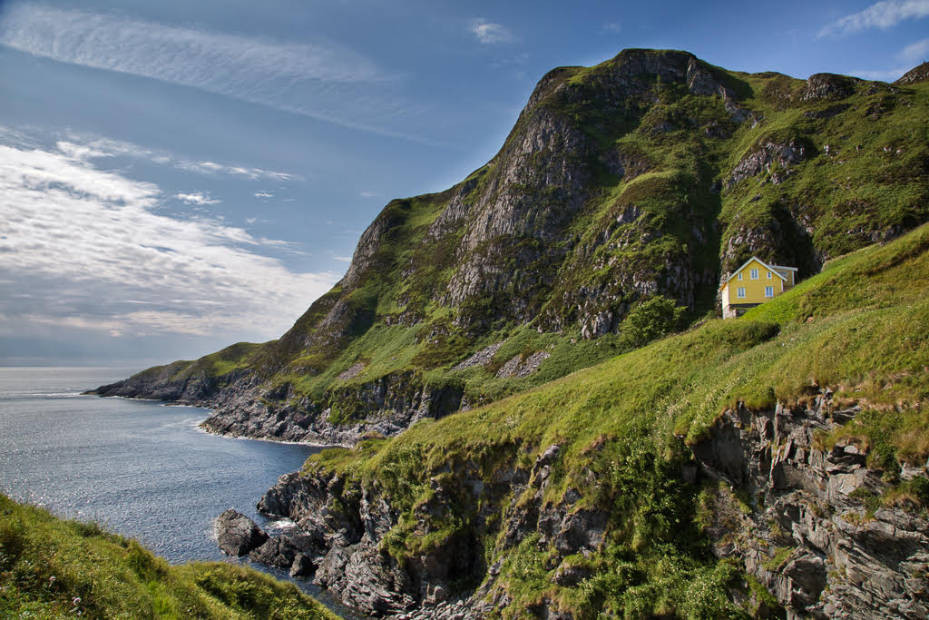
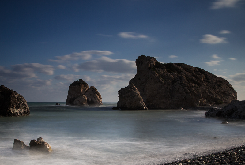
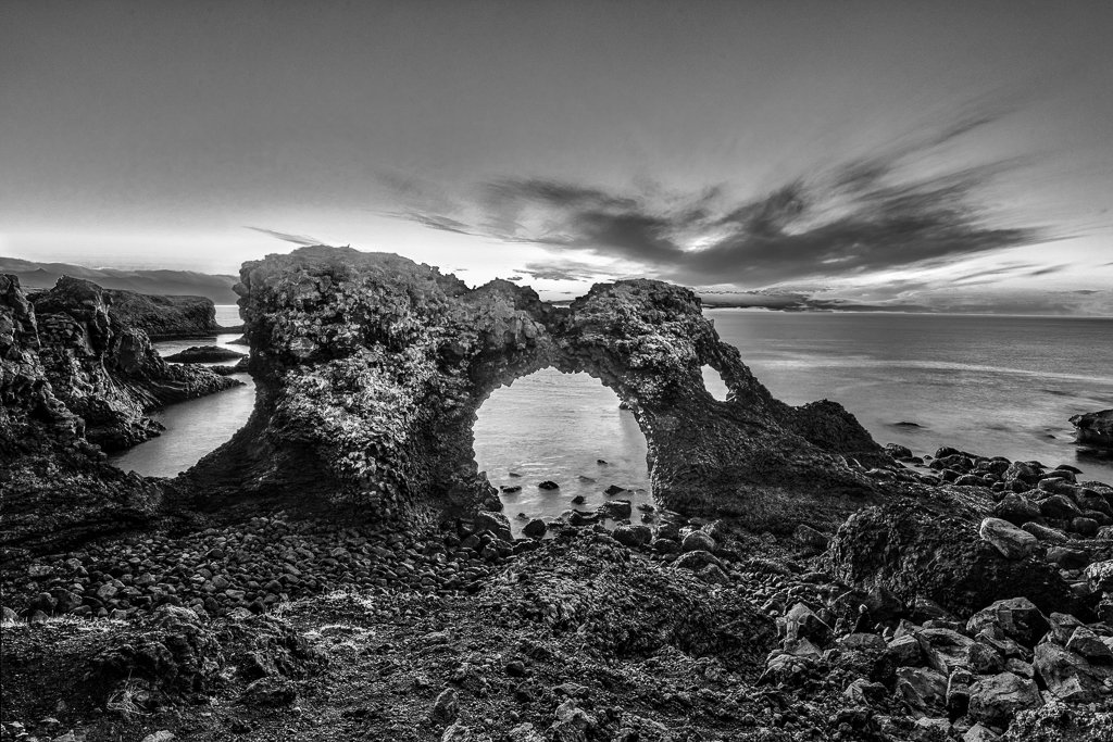
Just for fun, I extended the sky and used luminosity mask to darken the dark parts of the mountain and the slope in the middle. Without using the luminosity mask, it is difficult to hit the exact areas to darken or lighten. It is just to go on practising, no-one has started as experts. |
Oct 20th |
 |
| 36 |
Oct 20 |
Comment |
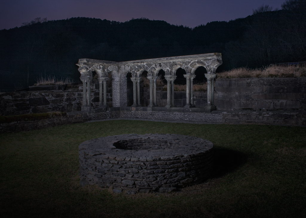
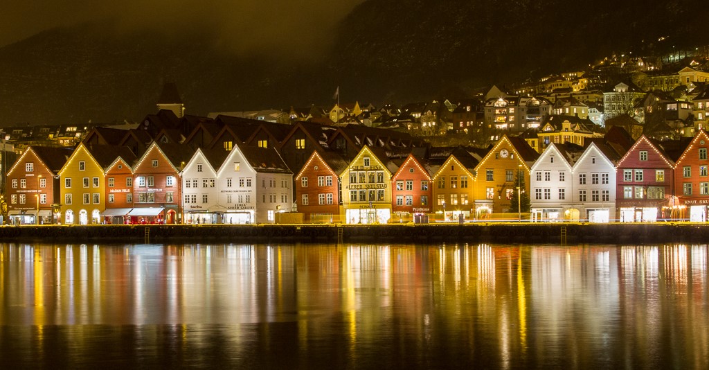
Sorry to hear about the Covid, hope everything will be fine. Being your first attempt in B&W, you are doing well. The composition has a distinct foreground, middle and background. The main area of improvement is to give the image more contrast. If you darken the slope in the middle and the dark parts of the mountain, a lot will be achieved. I feel that the mountain top "hits the ceiling". If you extend the sky and crop accordingly at the bottom, I think the composition will be better. If you want to go on with black and white photography, I will recommend that you look into using luminosity masks that makes dodge and burn easier. |
Oct 11th |
| 36 |
Oct 20 |
Comment |
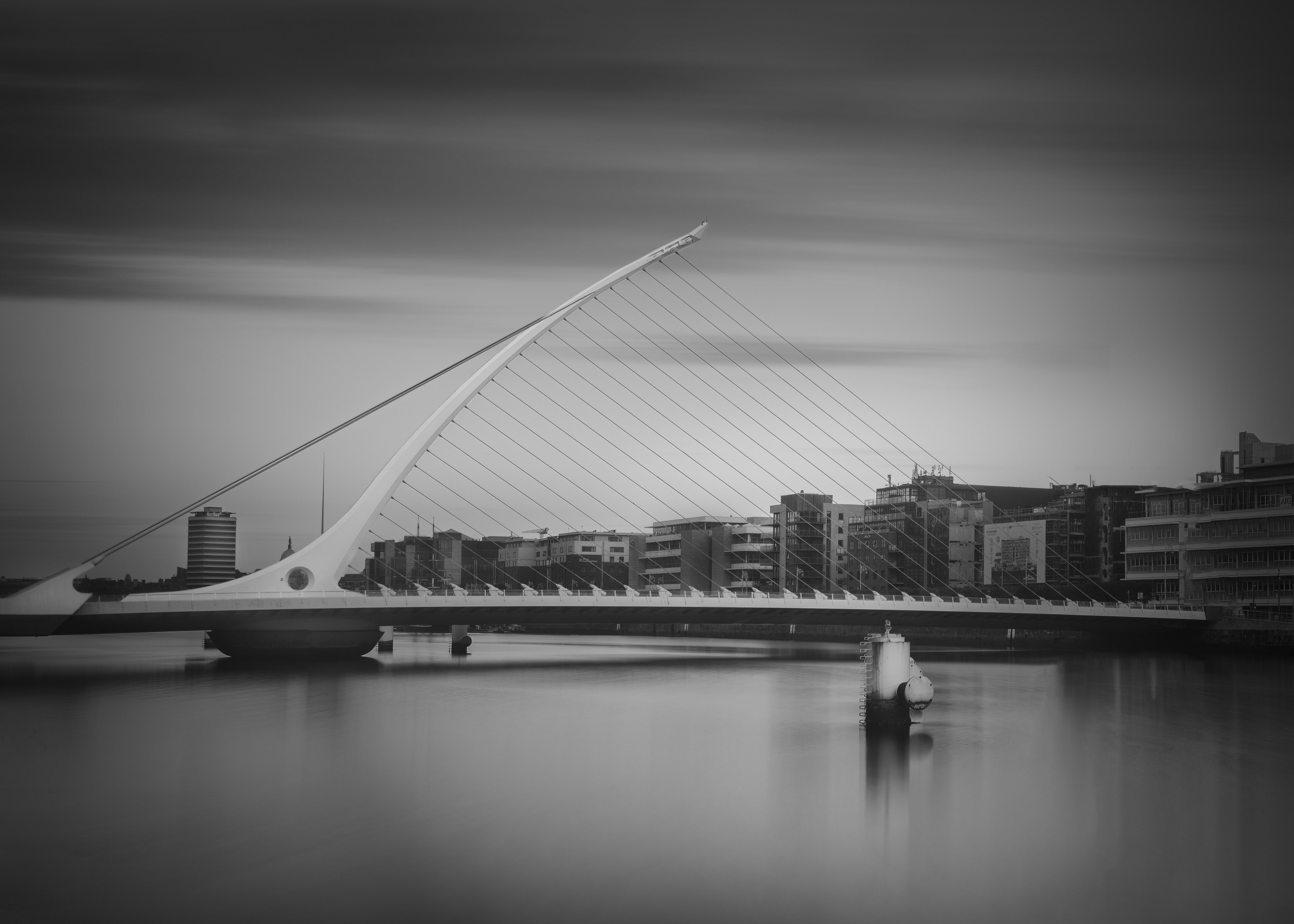
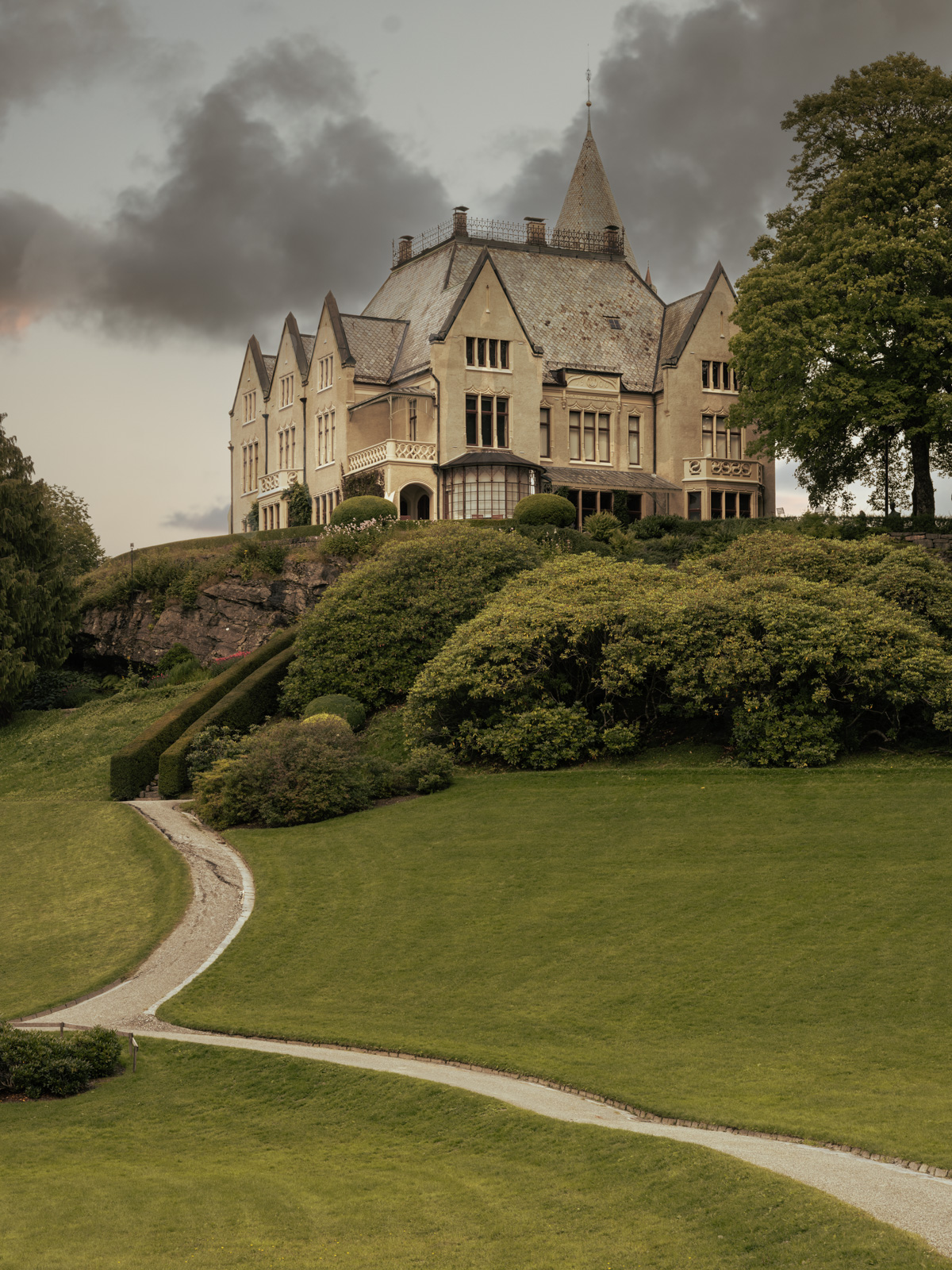
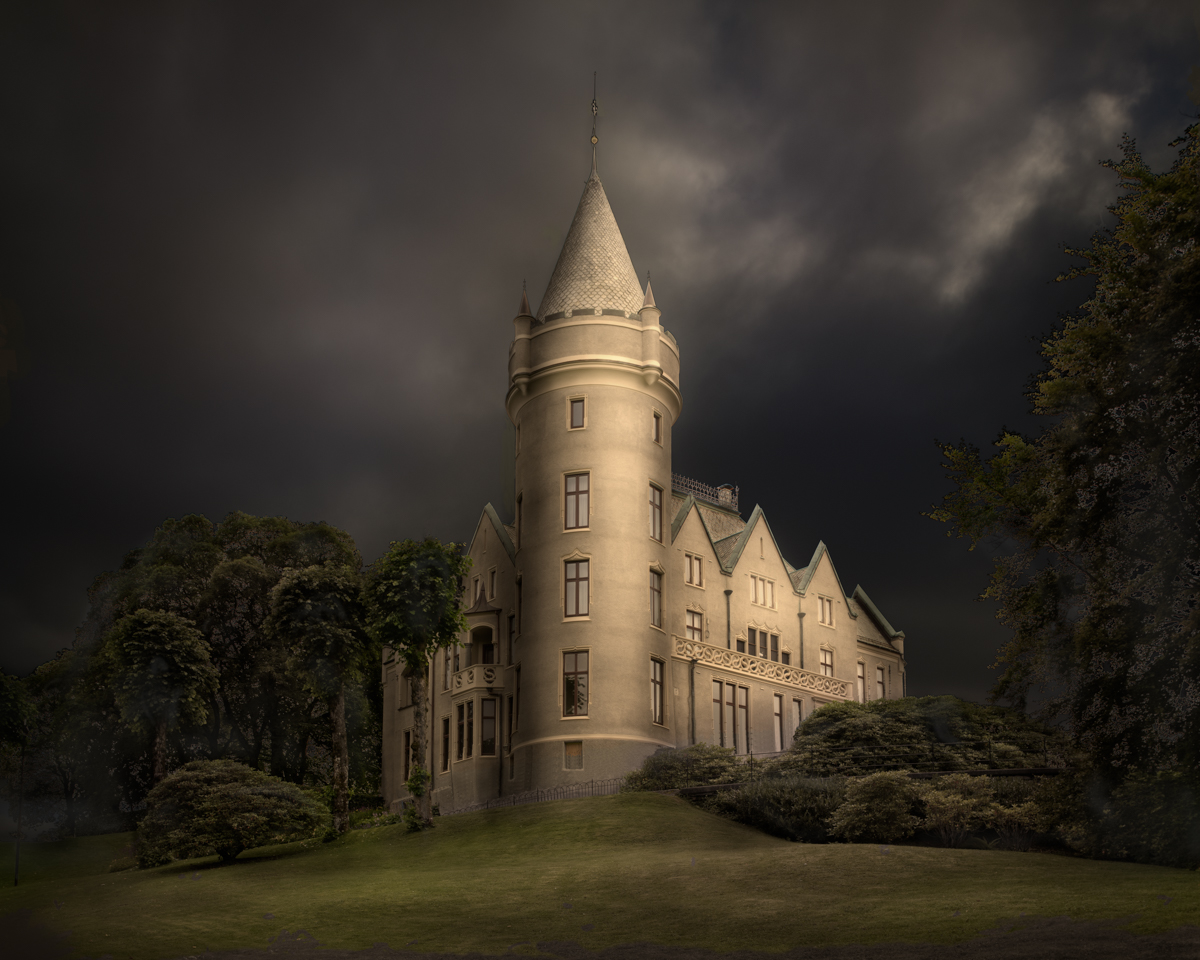
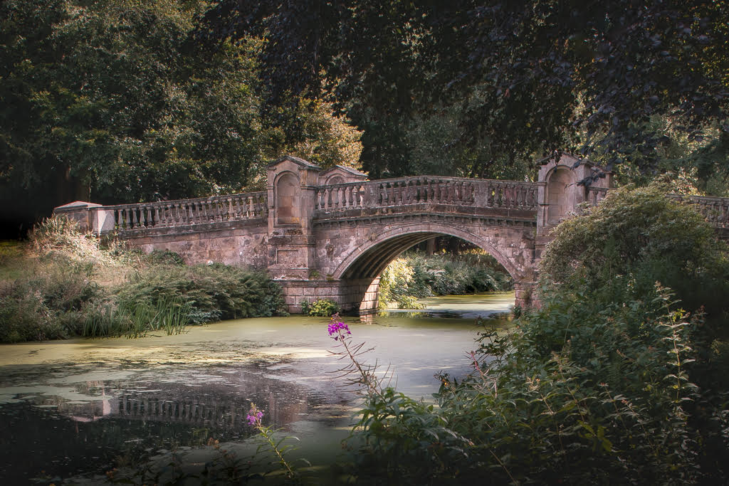
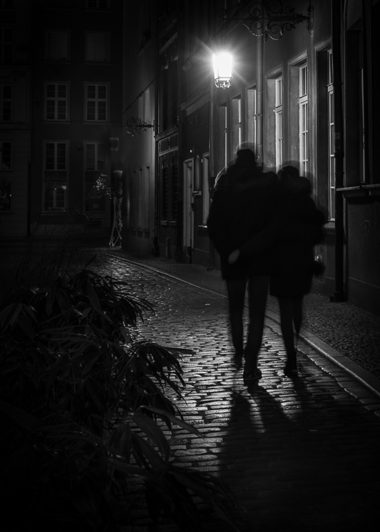
In line with the comments above, I would cropped from the right to remove the boat. By lighting the castle and darken the foreground slightly, I think the picture will be more interesting. It is, of course, too late now, but for a later occasion; if you had waited a few seconds, the lady would not have broken the leading line of the road up to the castle and the second leading line would also been undisturbed. |
Oct 11th |
| 36 |
Oct 20 |
Reply |
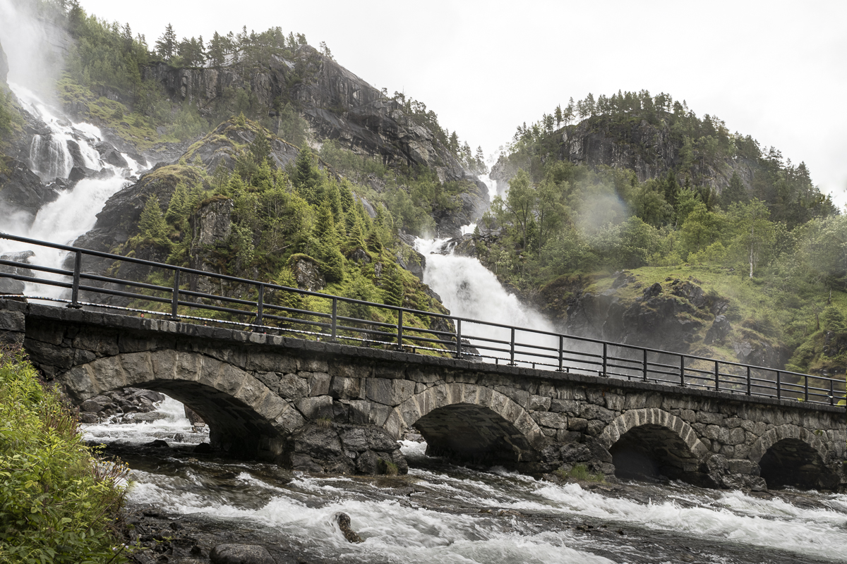
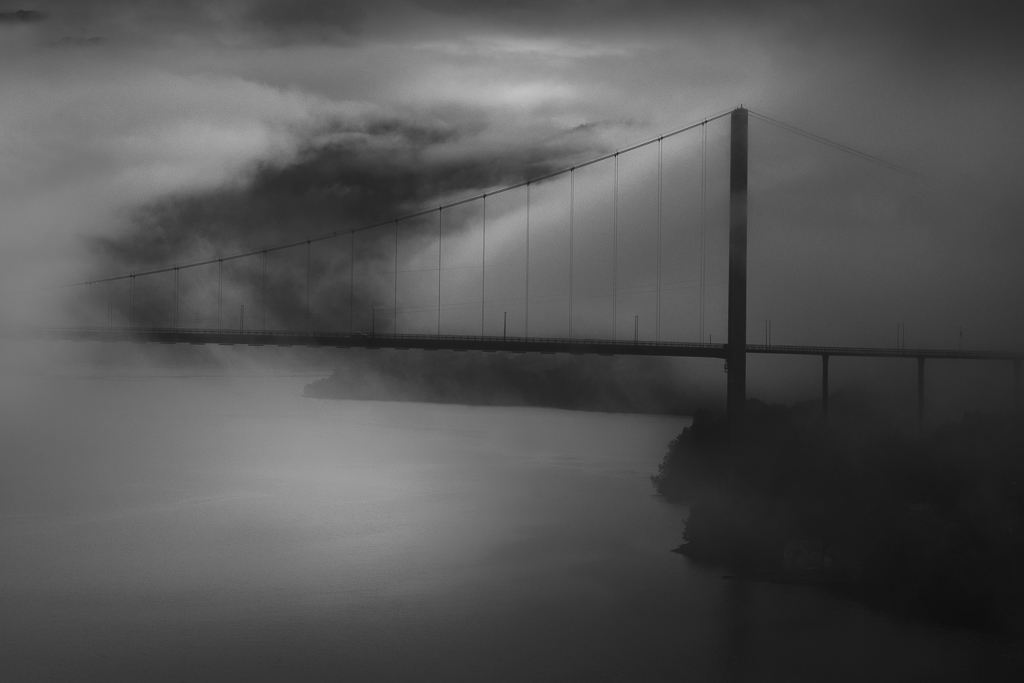
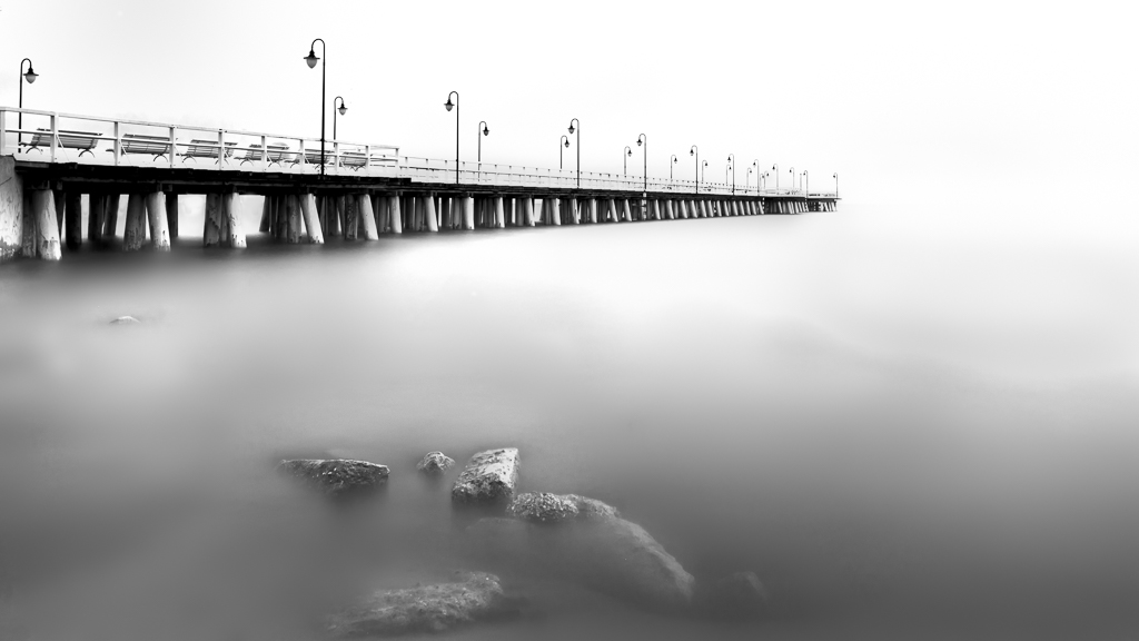
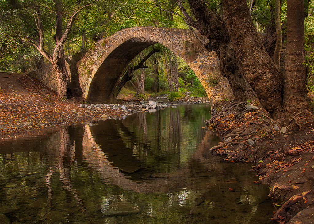
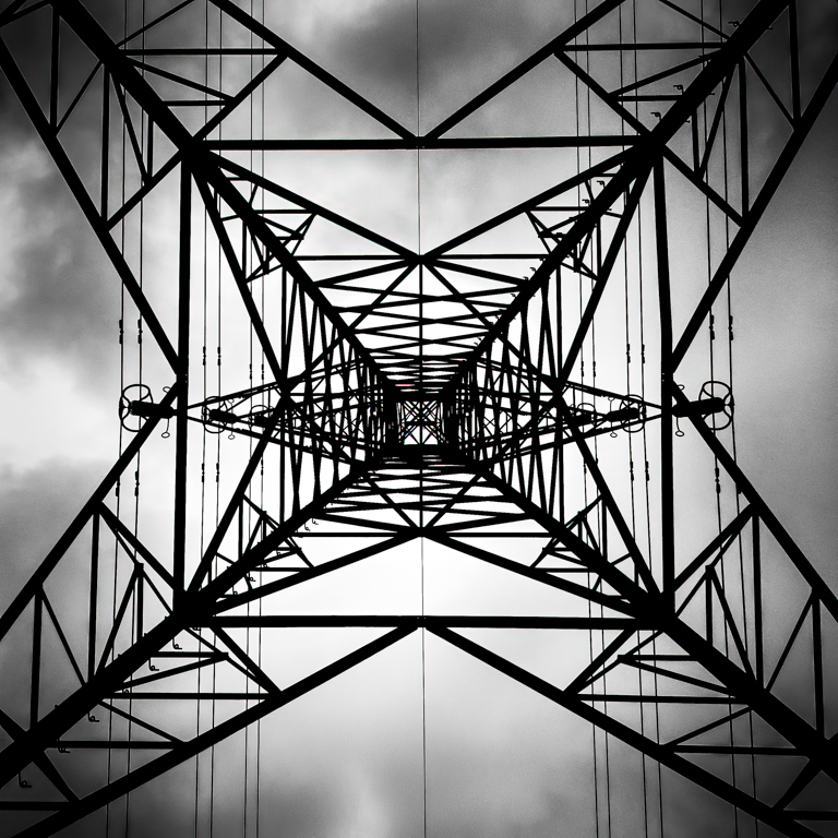
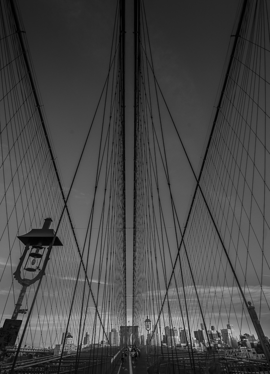
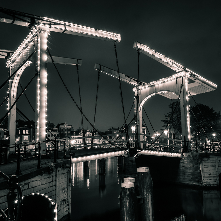
Thank you, Michael. Regarding levelling the bridge; first I was thinking like you, but if doing so, the vertical column would tilt. The bridge is built to be highest on the midle point and getting lower on each side. Therefore, it shall not be in level. I agree, though, that the bridge can be burned a touch. |
Oct 4th |
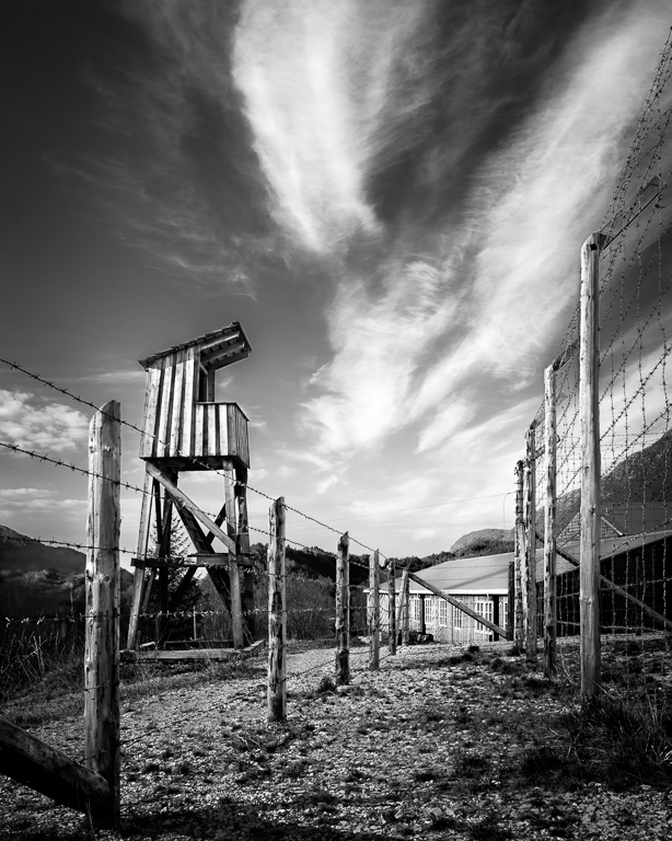
| 36 |
Oct 20 |
Comment |
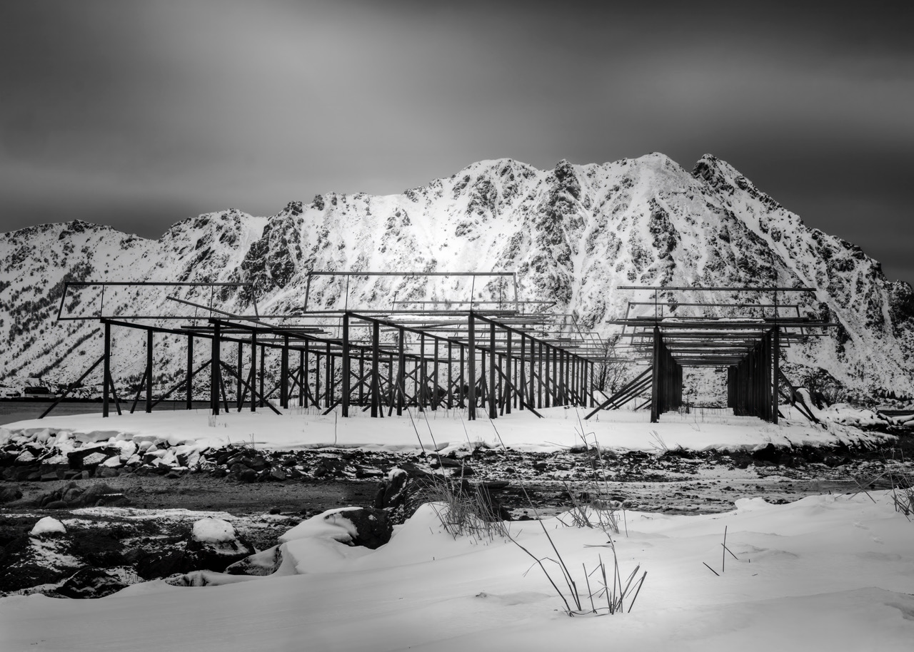
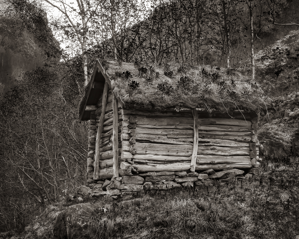
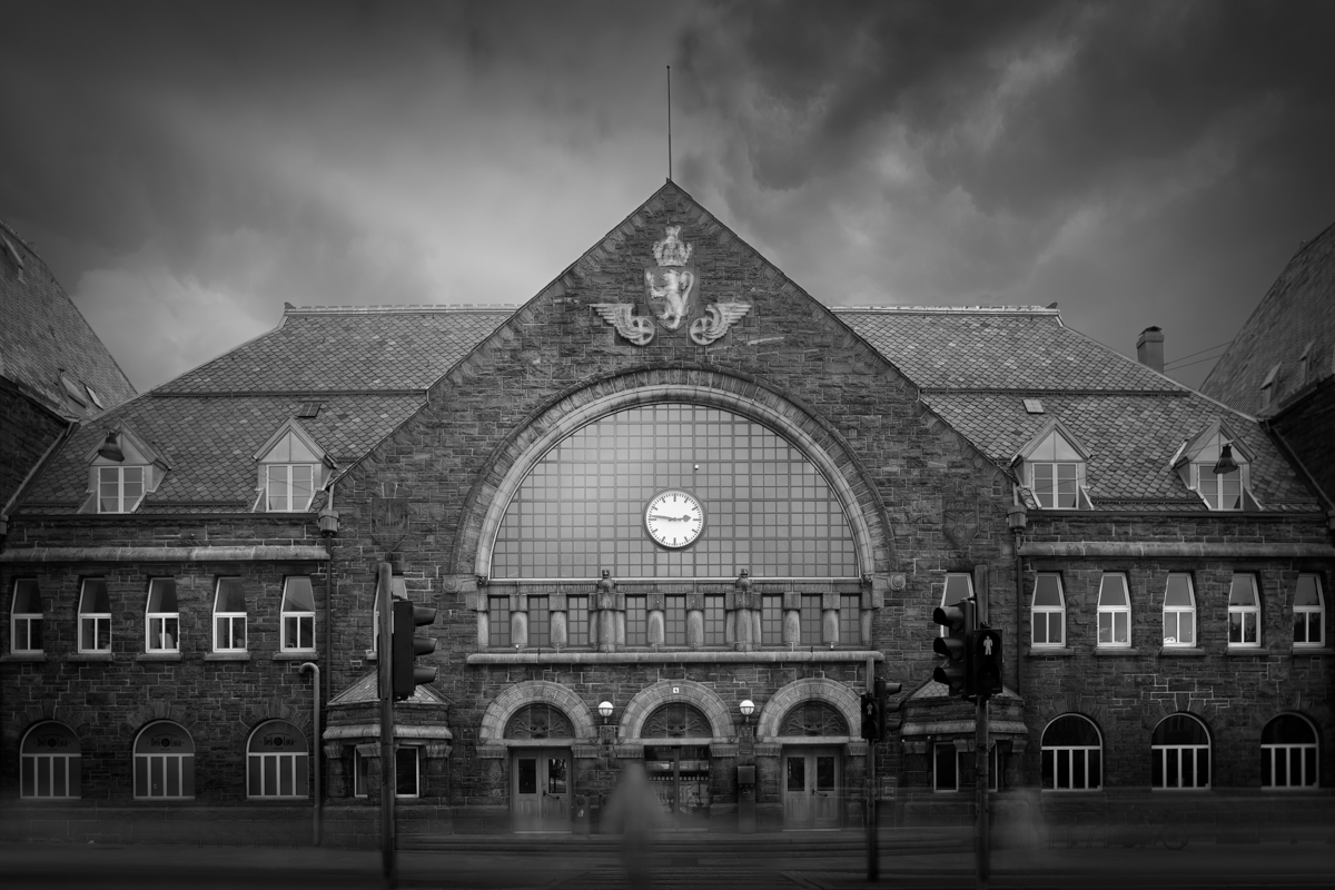
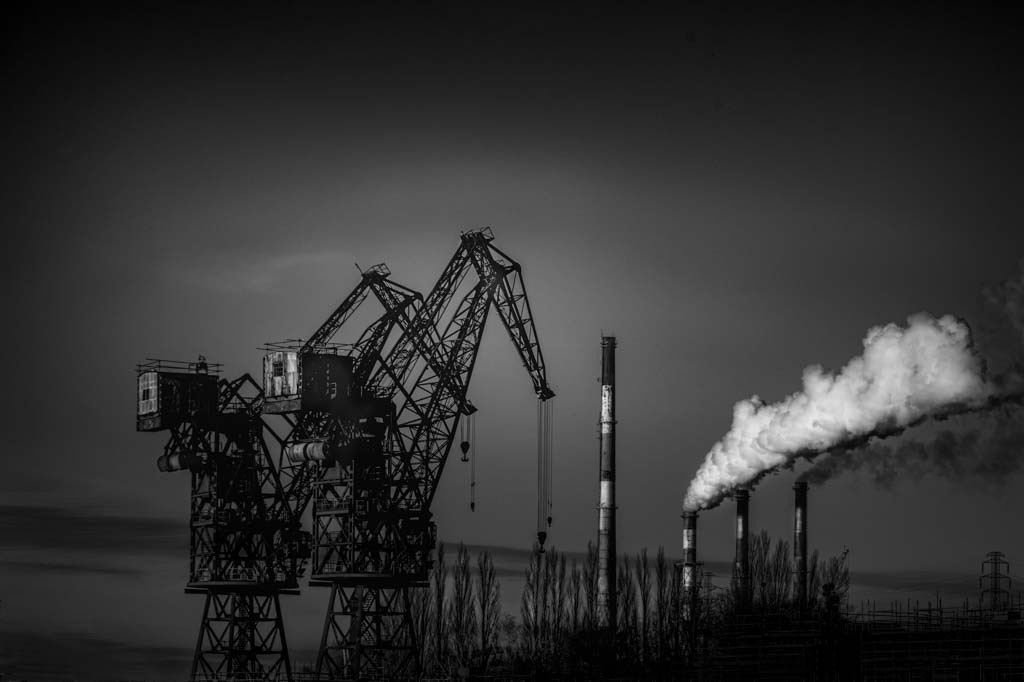
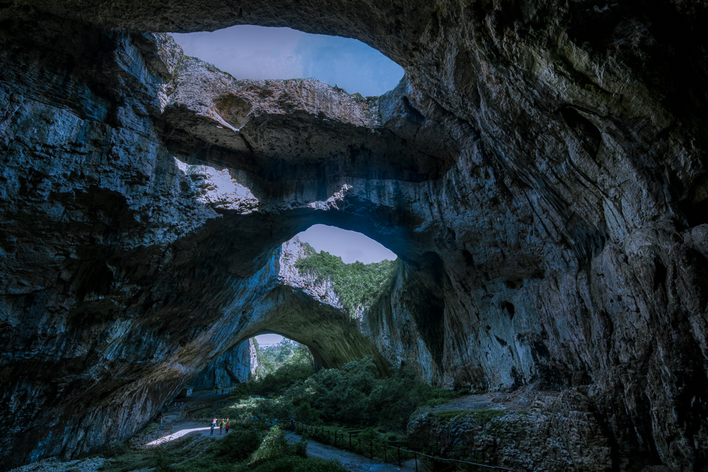
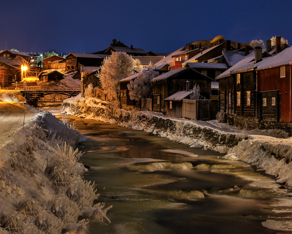
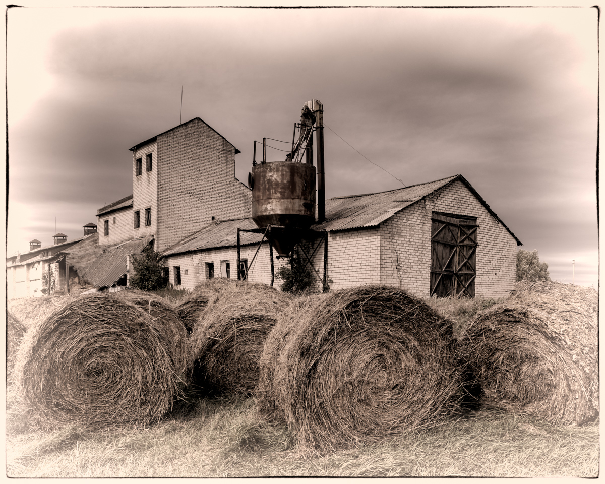
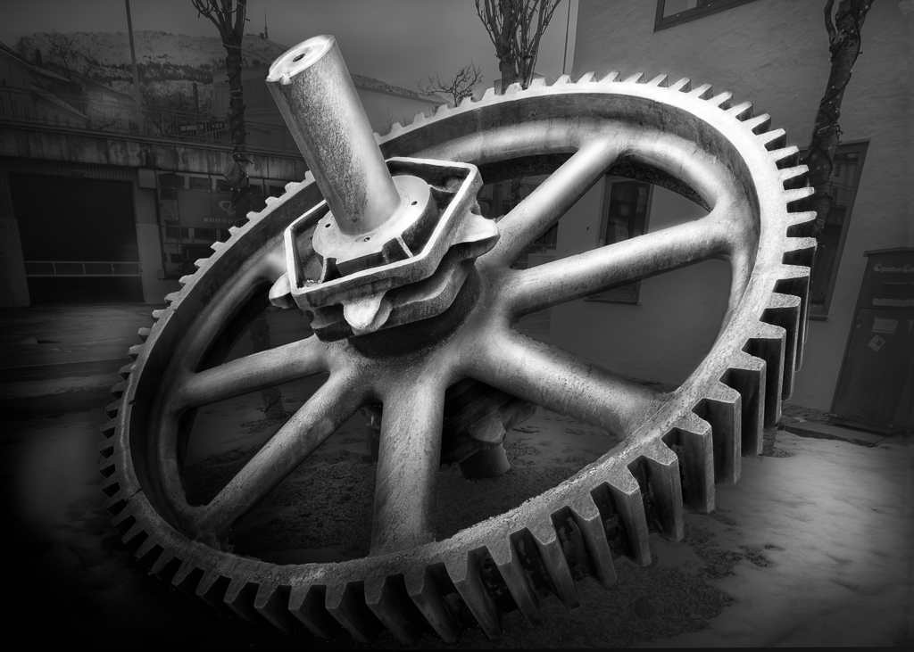
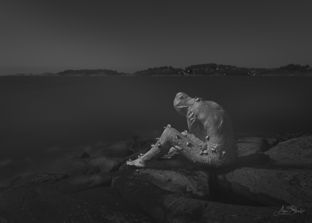
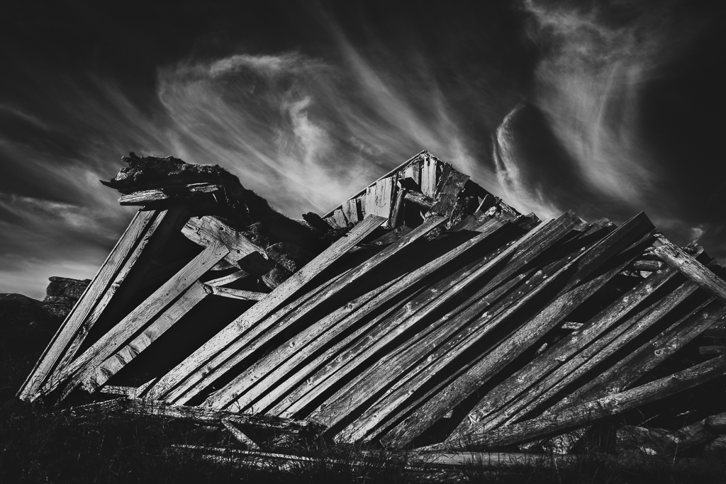
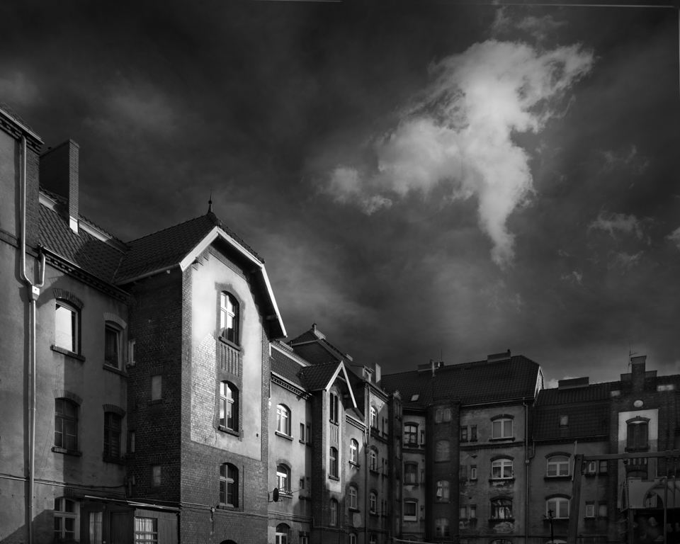
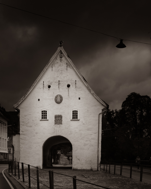
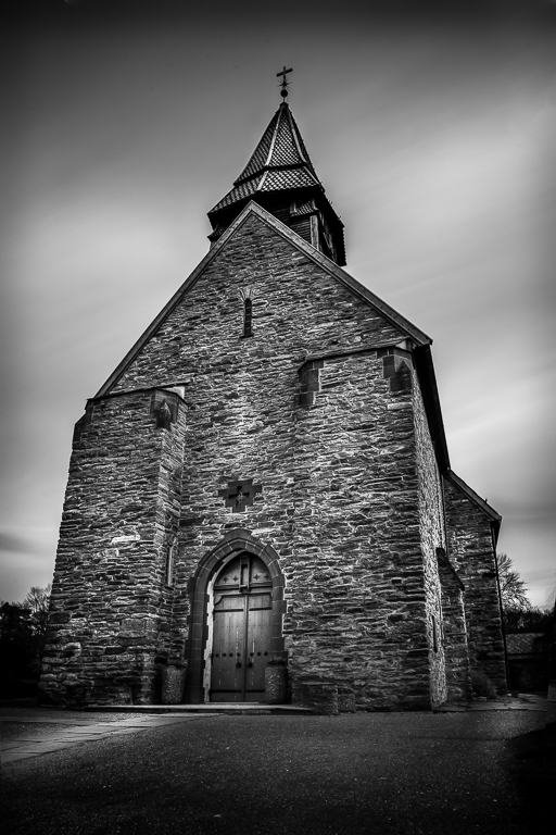
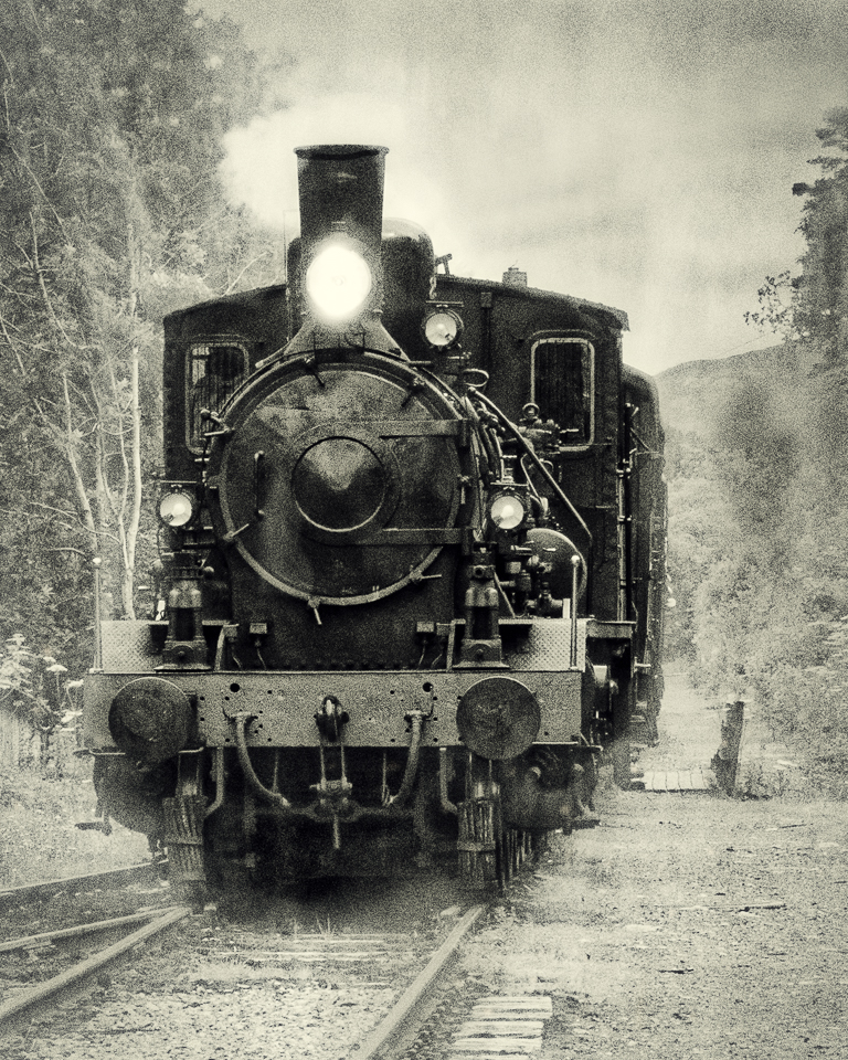
It is a good idea to capture old structures like this. One day they are history and history should be documented. I like the composition where the building create a triangle and so do the railroad tracks. I think that darkening the sky would give more attention to the buildings. May be some more contrast in the building would have given some more drama to the image. |
Oct 4th |
| 36 |
Oct 20 |
Comment |
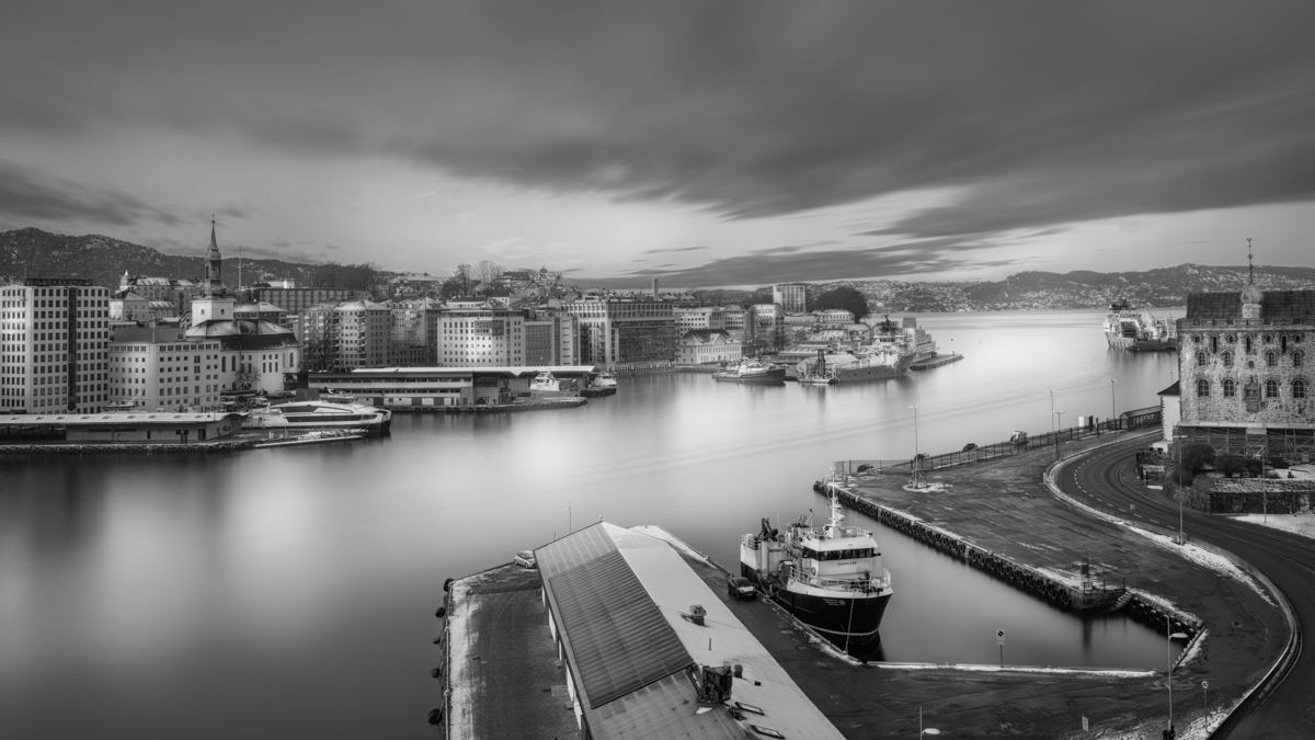
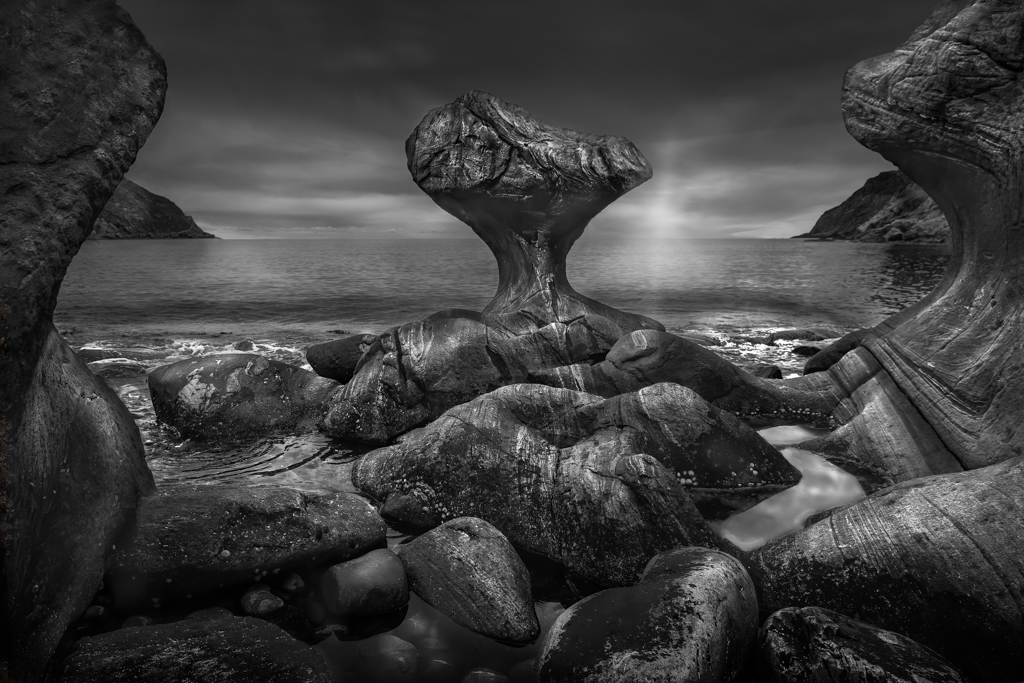
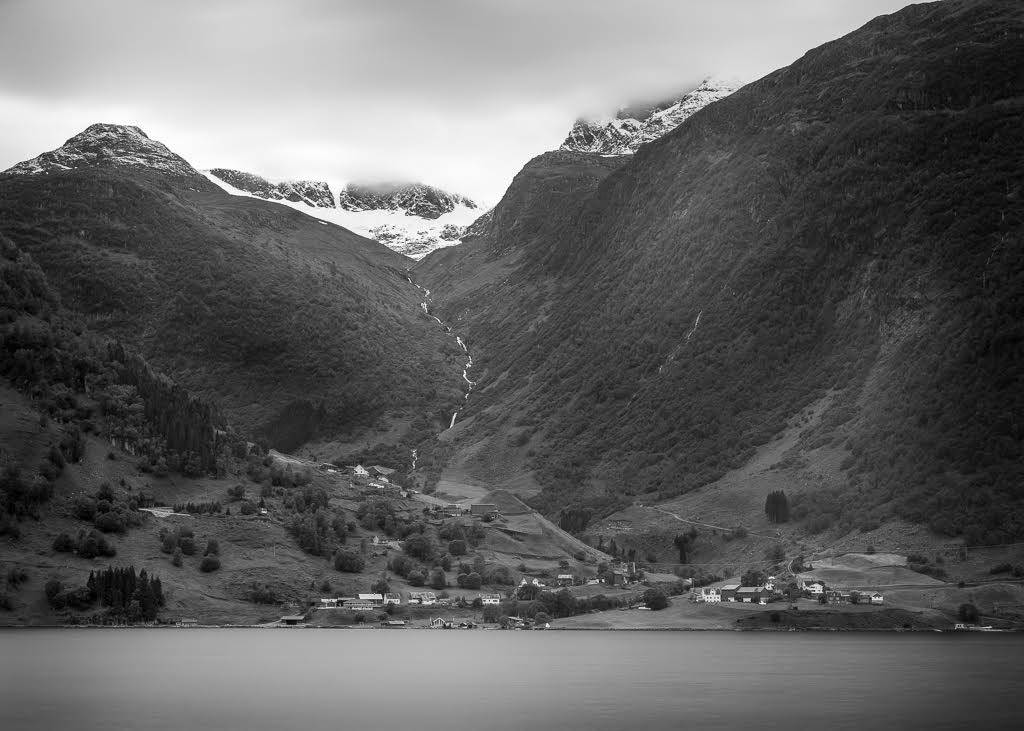
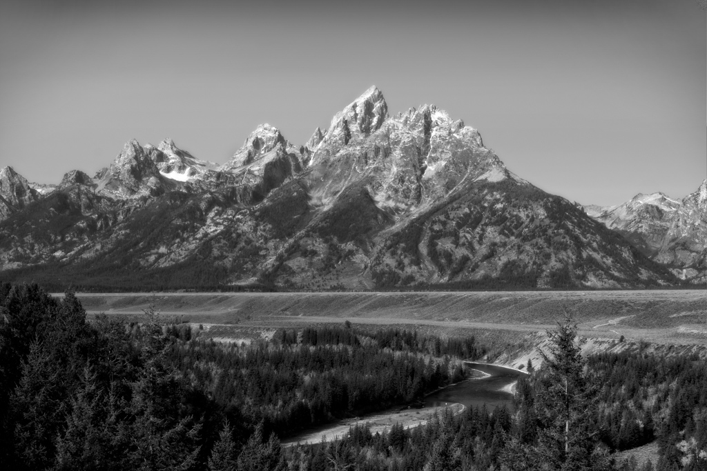
I like the tonality of this image. The depth of field is well defined by the layers of haze. Since there is no original file, it is difficult to know the effect of the LUT, but in general, LUTs are a great way to enhance the images without overdoing it. If I should recommend any improvements, it would be to darken the top slightly. |
Oct 4th |
| 36 |
Oct 20 |
Comment |
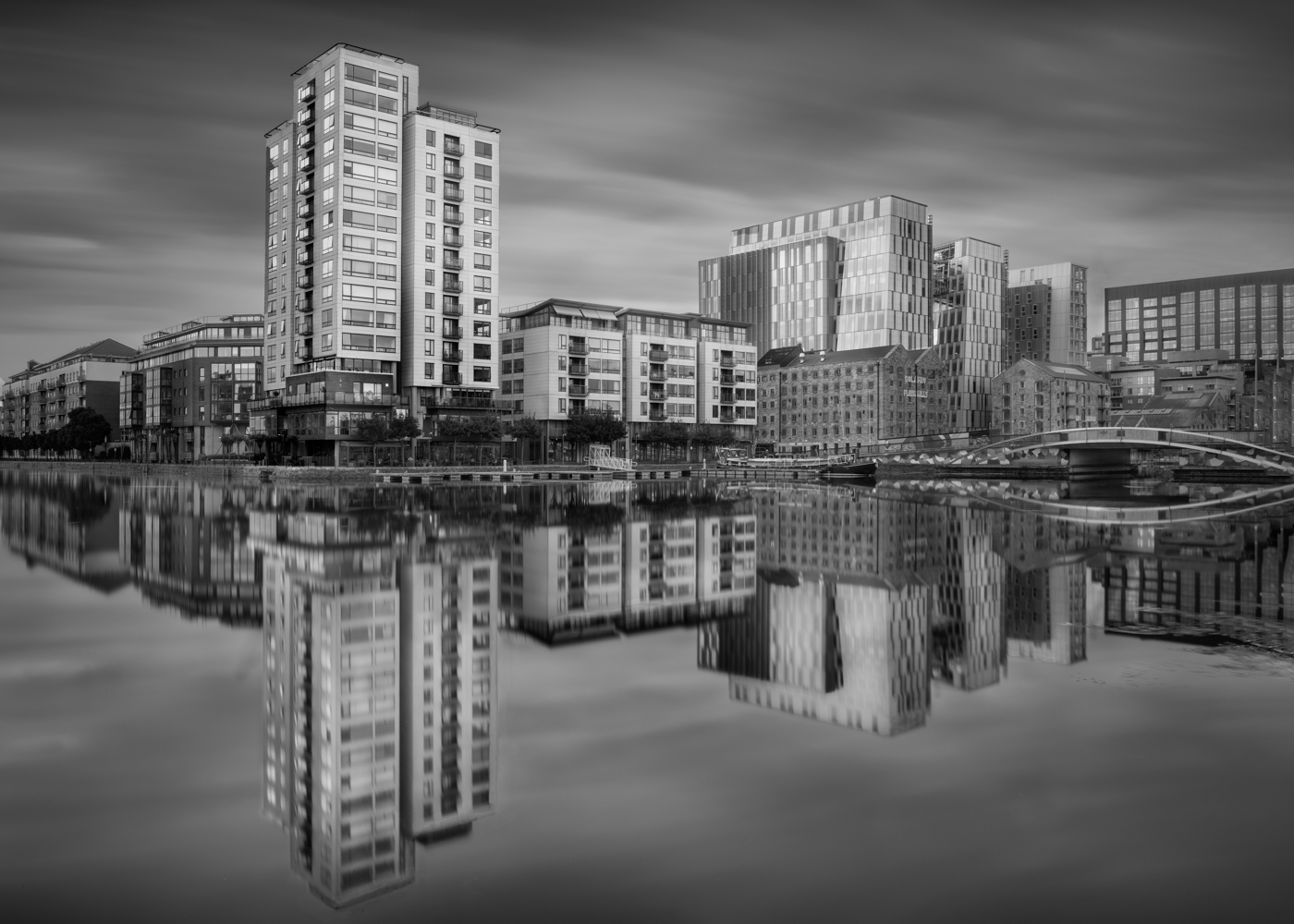
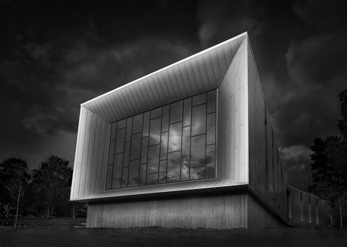
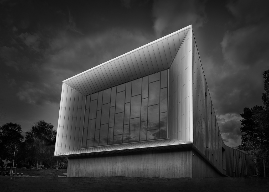
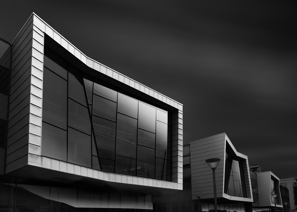
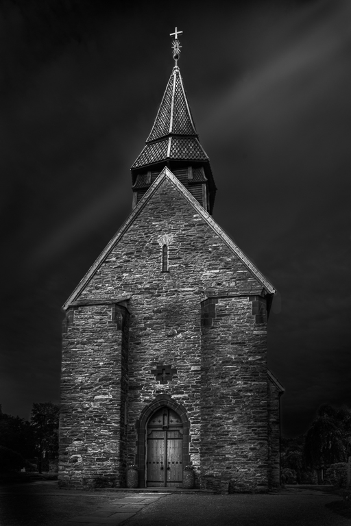
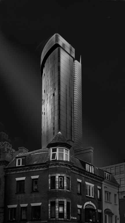
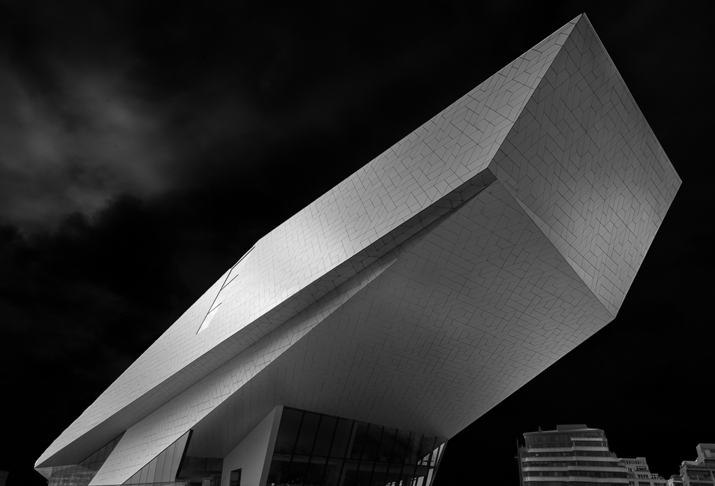
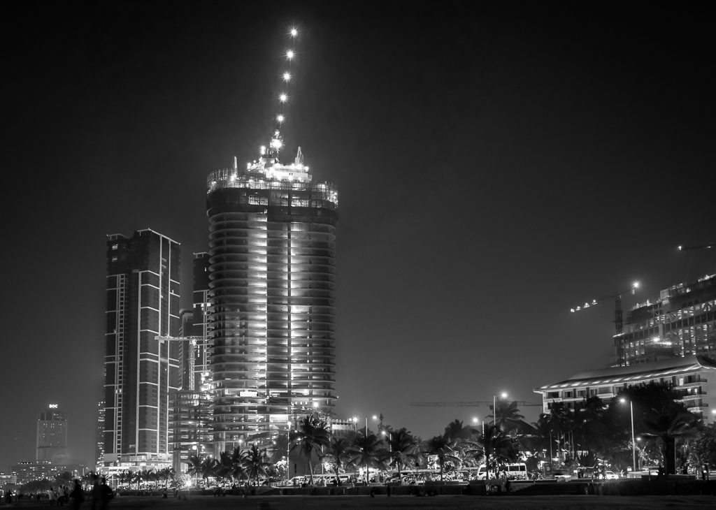
Larry, this time you have done a big leap forward on your black and white journey. I am impressed with what you have done. The exposure is perfect and it is sharp all the way through. The contrast and the gray tones in the structure are also perfect in my opinion.
What I will advice you to do before you put this image on the wall, is open up the darks so you can see some details. That applies also to the upper part. |
Oct 4th |
5 comments - 2 replies for Group 36
|
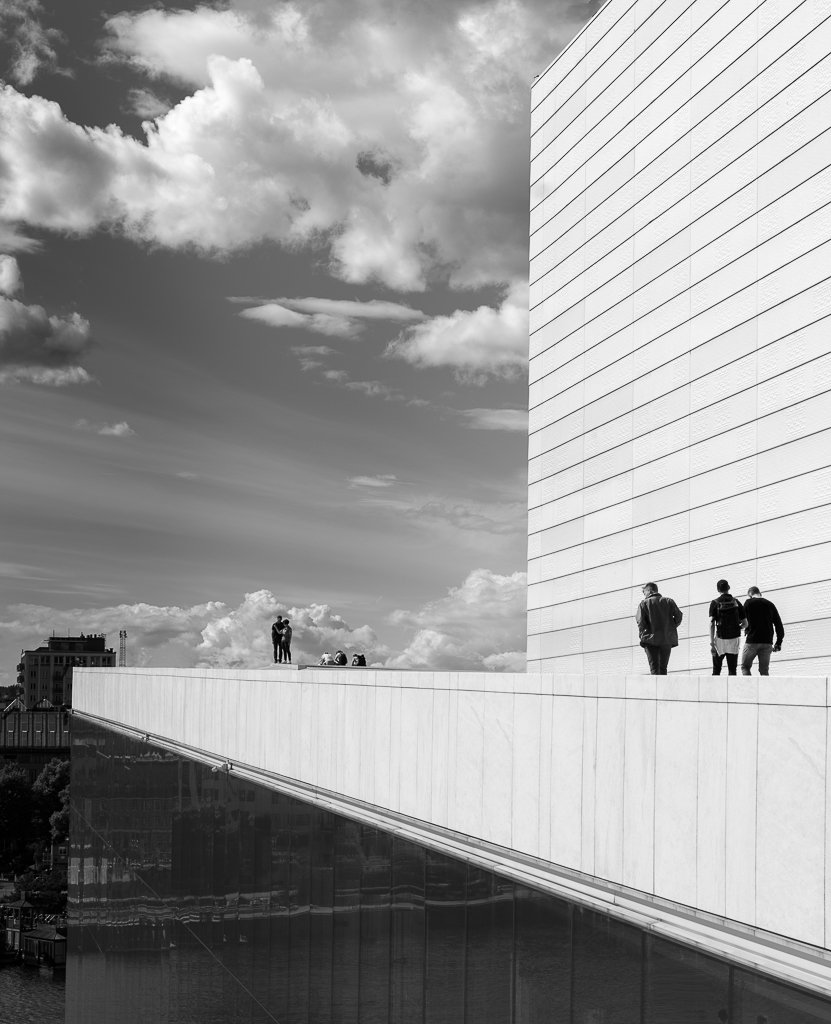
| 74 |
Oct 20 |
Reply |
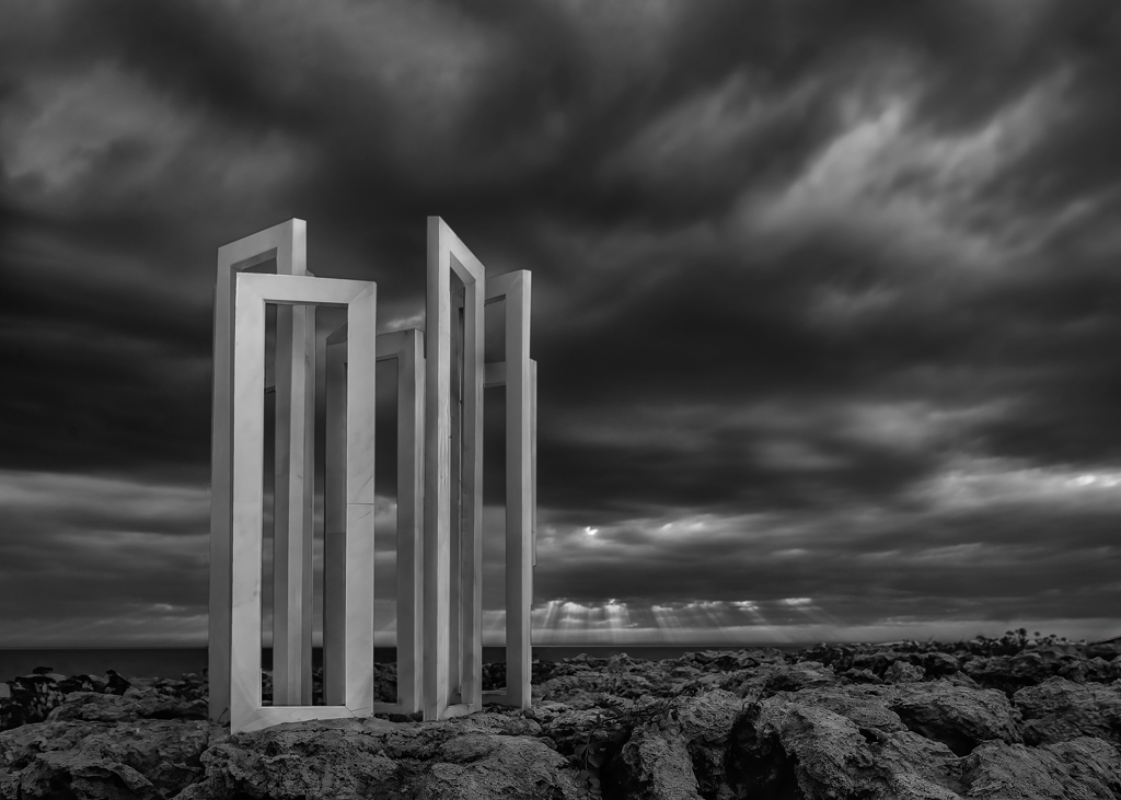
You are definitely on the right path. If you compare the first image with this one, you see it has much more drama. If you use the Gradient Tool slightly from both sides to darken, you are done. |
Oct 8th |
| 74 |
Oct 20 |
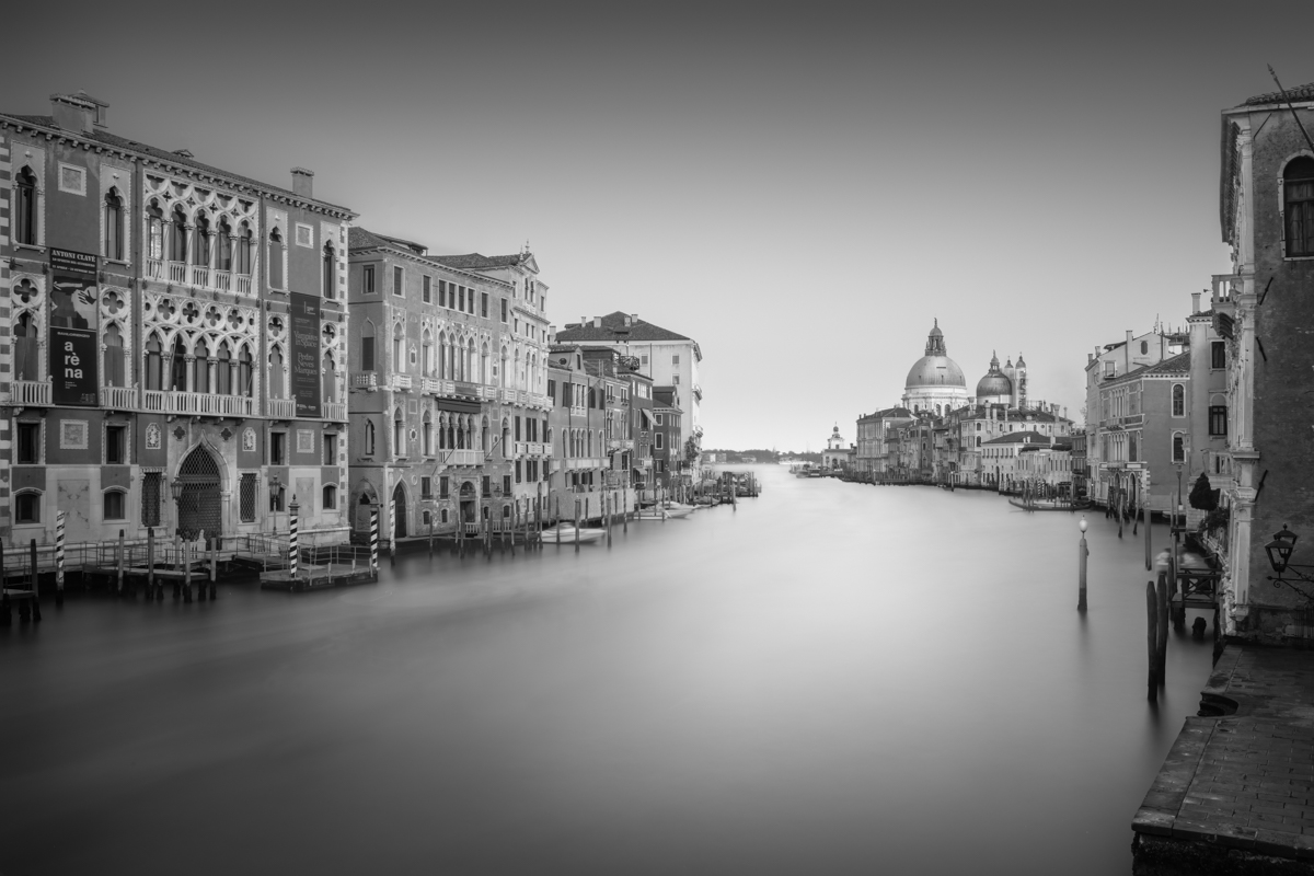
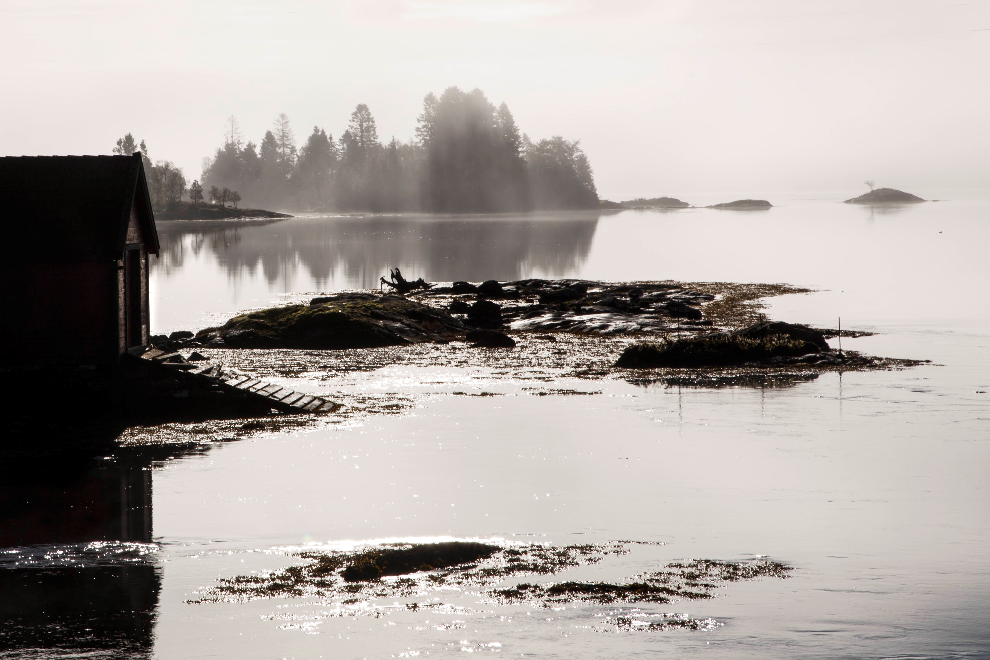
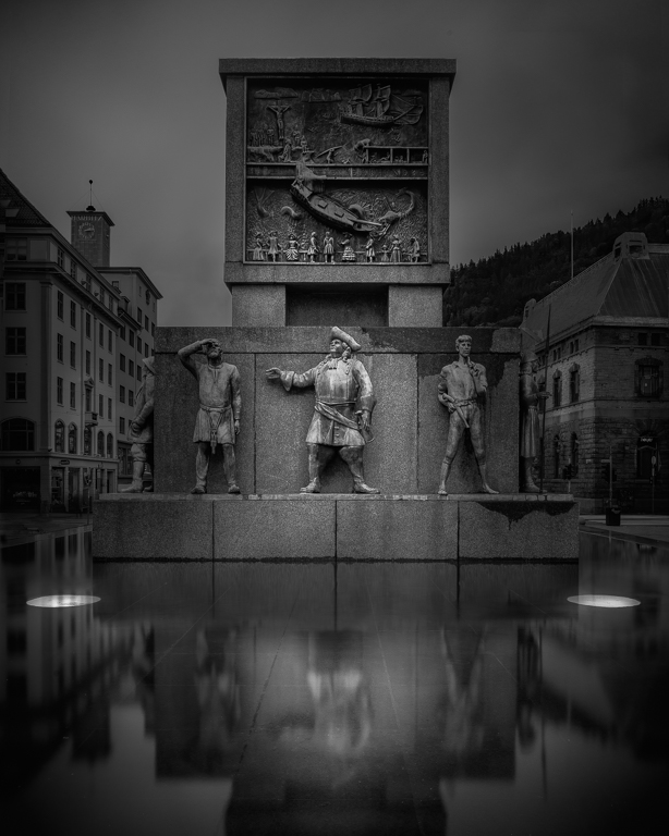
Comment |
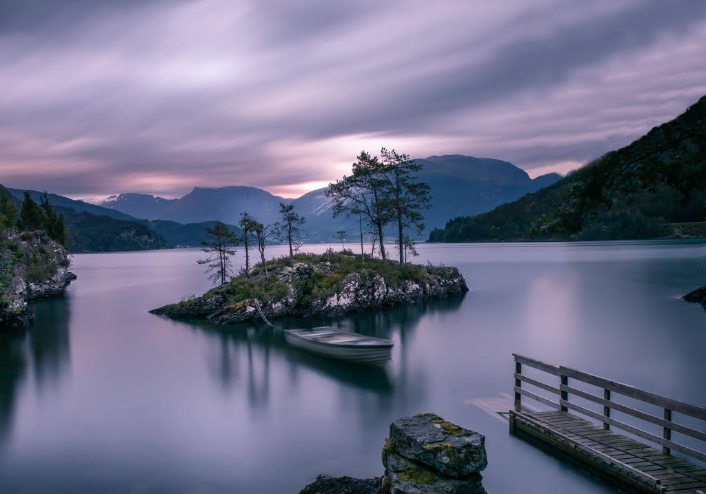
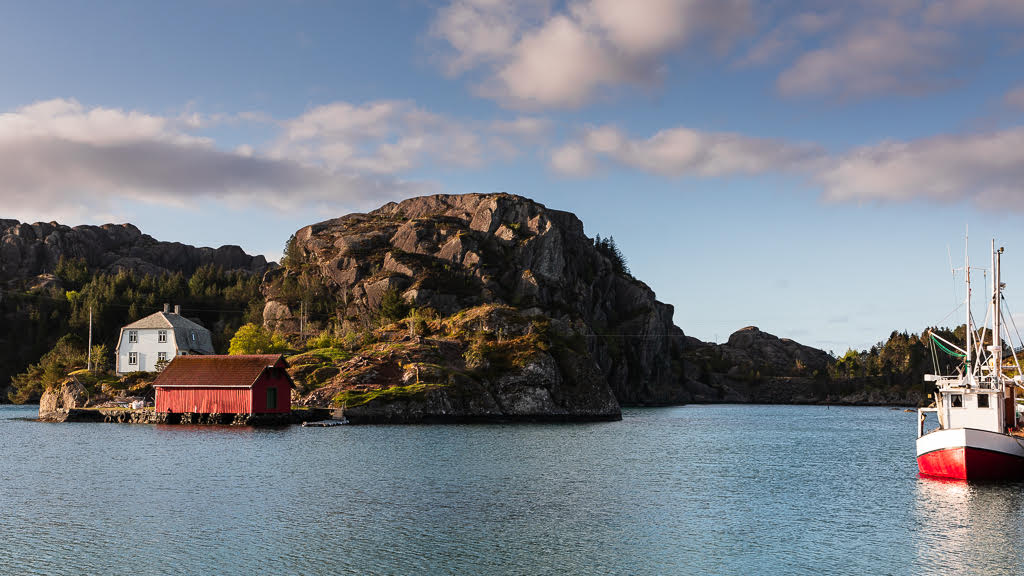
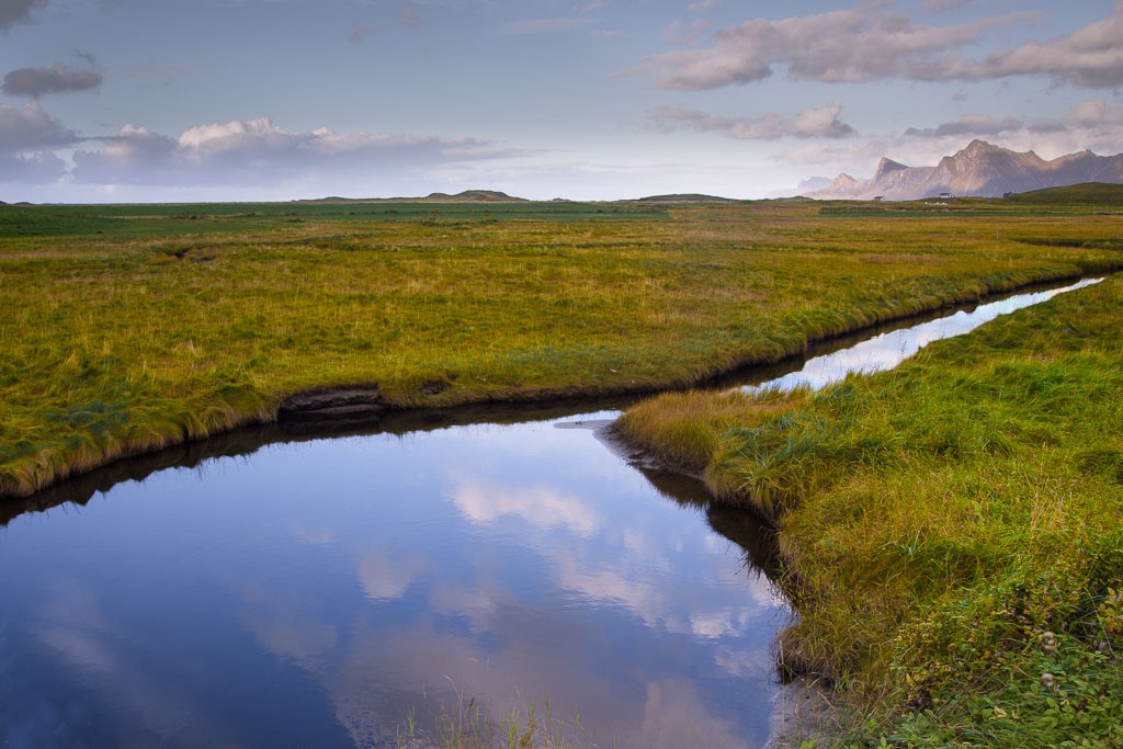
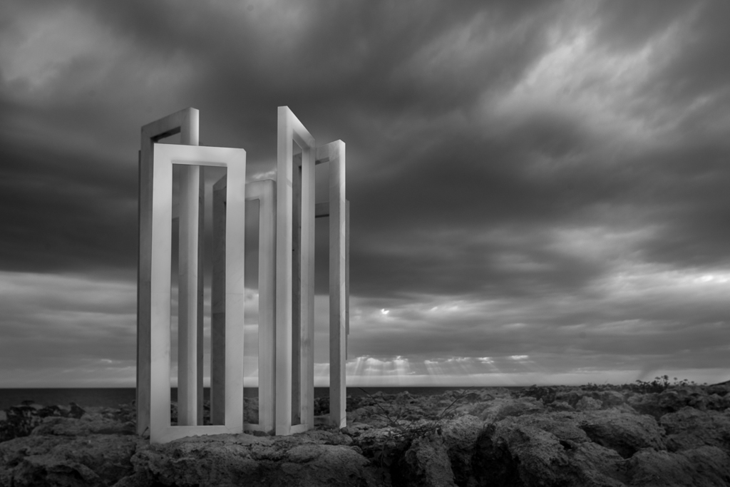
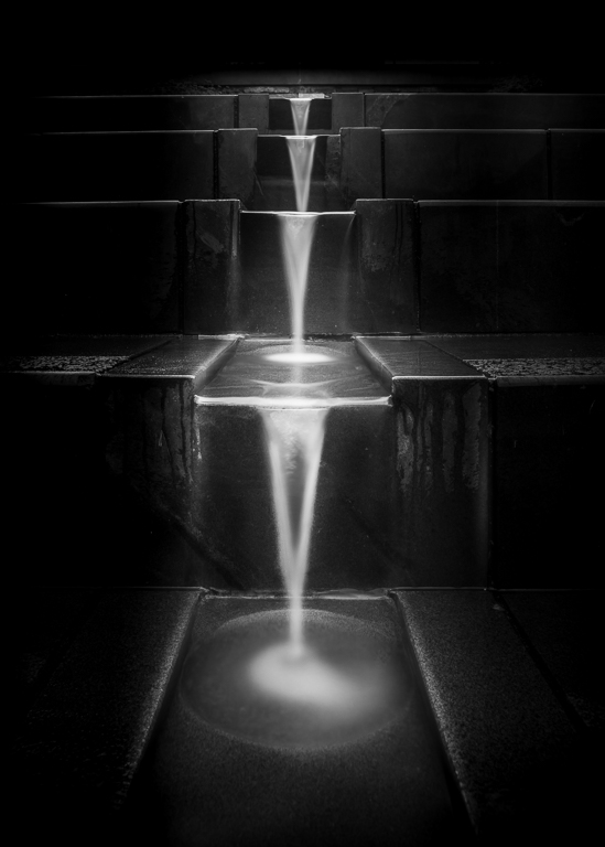
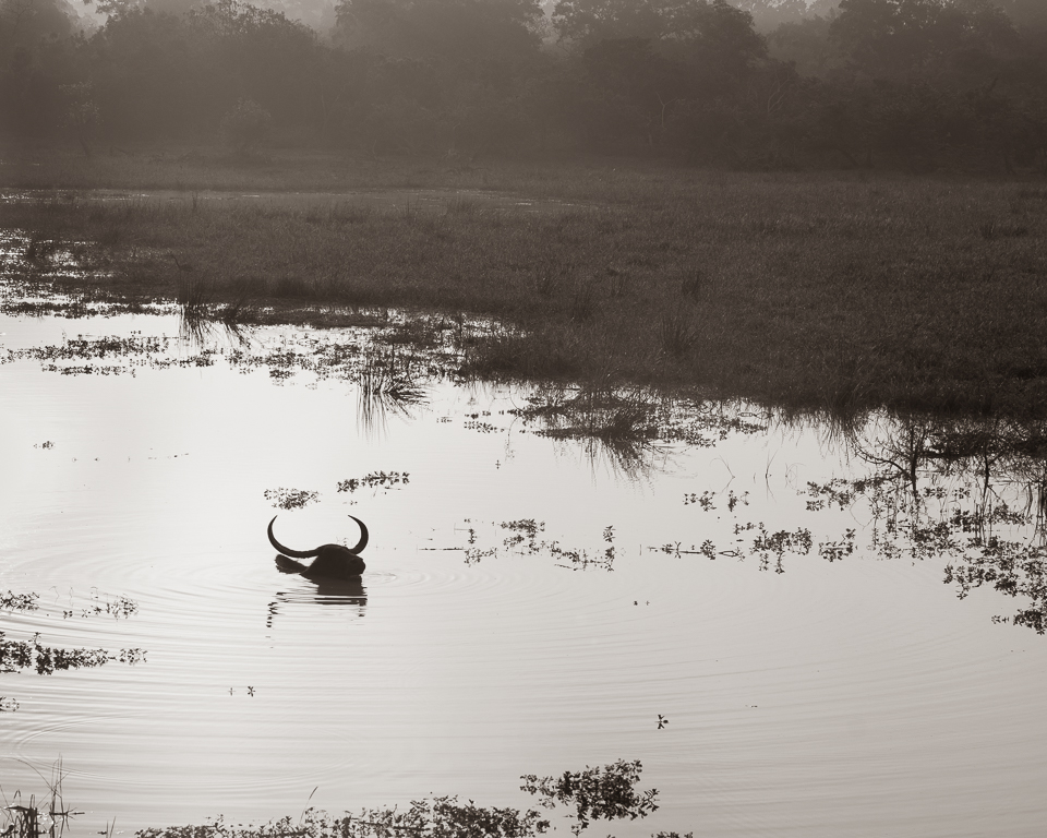
As this is one of a series of pictures about water and symmetry, water had to play a significant role. Therefore, about one third is water and reflections. The two light spots can be discussed if they are too bright or not. The reason why I lighten them was to focus on symmetry. |
Oct 7th |
| 74 |
Oct 20 |
Reply |
Light is the best way to attract attention. In this case, you may try to use dodge and burn. Burn the sides and lighten the water part. The trick is not to burn evenly, but let some parts be lighter, f.ex. the domes. This will make the image more interesting. |
Oct 7th |
| 74 |
Oct 20 |
Reply |
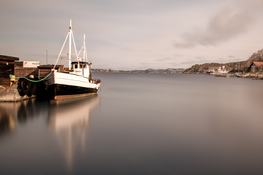
The reason for using a long exposure on this scene is to make a better reflection in the water. I use Lee square filter system, but if I should bought filters now, I would gone for round ones and bought one that fits my biggest lens and used adapter rings to fit the smaller lens diameters. The trick by using ND filters above ND6 (witch you can see through) is to do all your settings in manual mode and then use a table or app to calculate the new exposure time. Then you switch to Bulb mode and set the aperture to the same value as in Manual mode. You need a cable release to keep the shutter open. I would recommend you to go to Youtube to learn about long exposures. |
Oct 3rd |
| 74 |
Oct 20 |
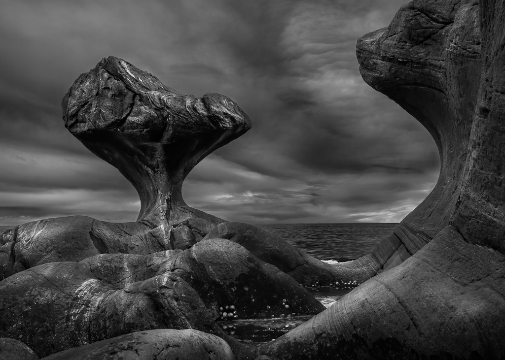
Comment |
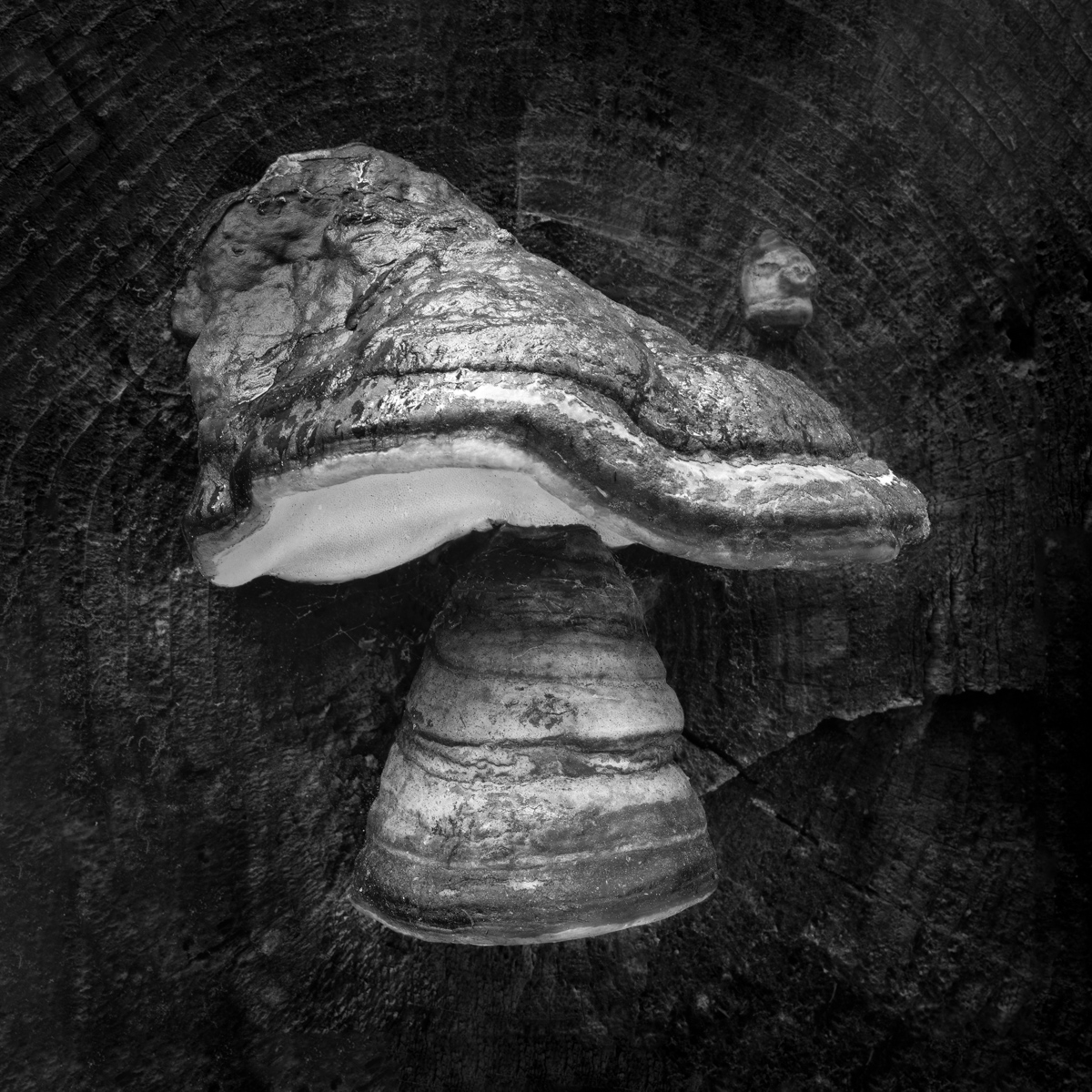
The low camera angle makes this image interesting. The lighting is good and fits the title. By using f/22 the depth of field is good. The blur at the end is only positive. My only little pick is to clone out the black dots on the right mushroom. |
Oct 3rd |
| 74 |
Oct 20 |
Comment |
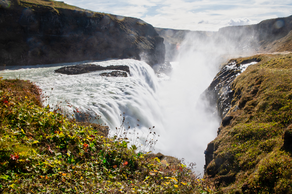
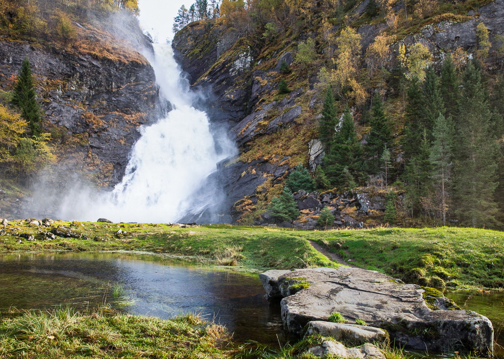
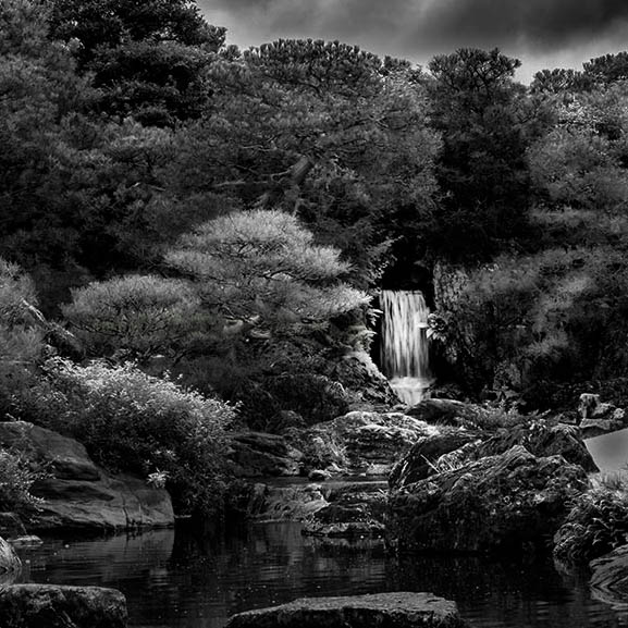
It is very easy to be carried away when seeing something beautiful like this. Often less is more. May be you find me a bit radical, but my suggestion is to consecrate on the waterfall and maybe make another picture of the domes that also are beautiful. Putting everything into one image means the elements have to compete with each other about attention.
In addition to make it square, I have also highlighted the waterfall and darken the outside slightly. |
Oct 3rd |
 |
| 74 |
Oct 20 |
Comment |
In my opinion the last image is the best. It shows the environment and tell very clearly the story of the shoe repair business. I like the repetition of heads and the triangle formed by the persons. |
Oct 3rd |
| 74 |
Oct 20 |
Comment |
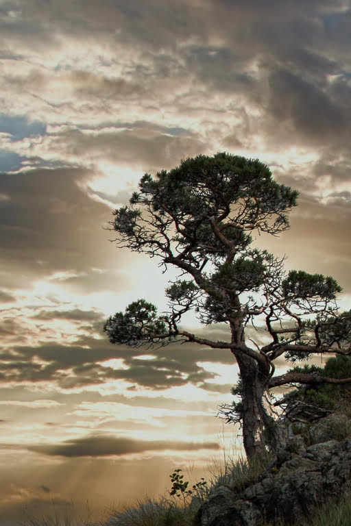
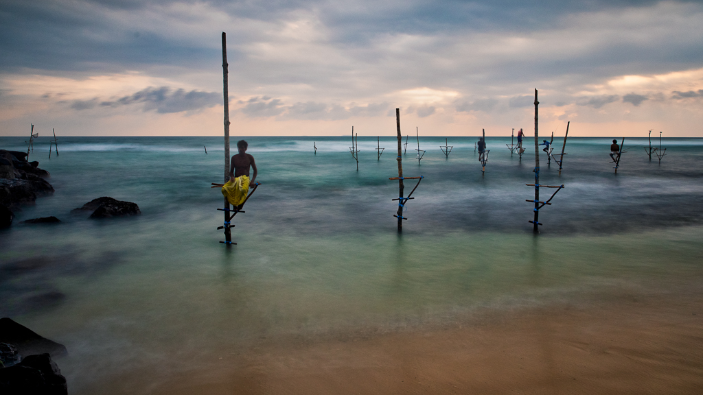
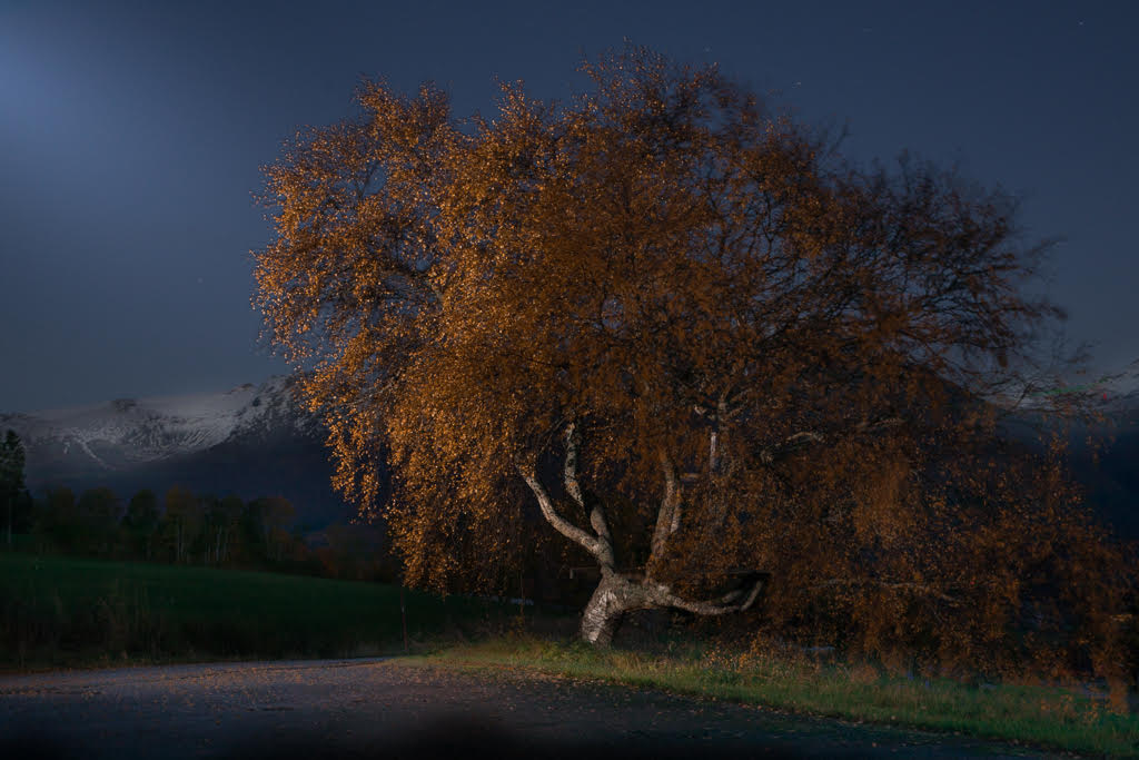
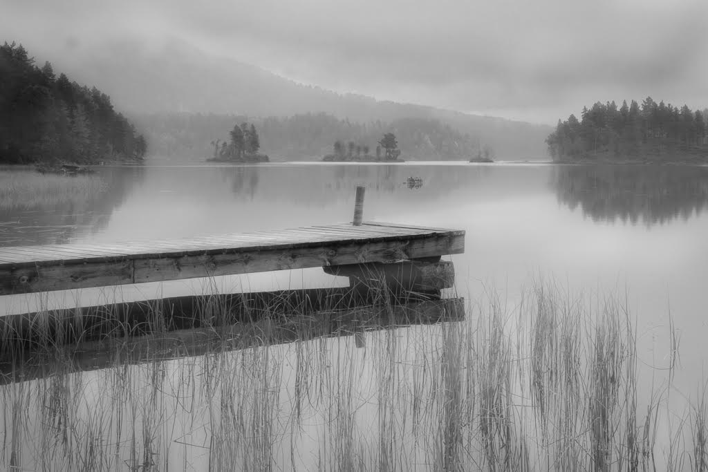
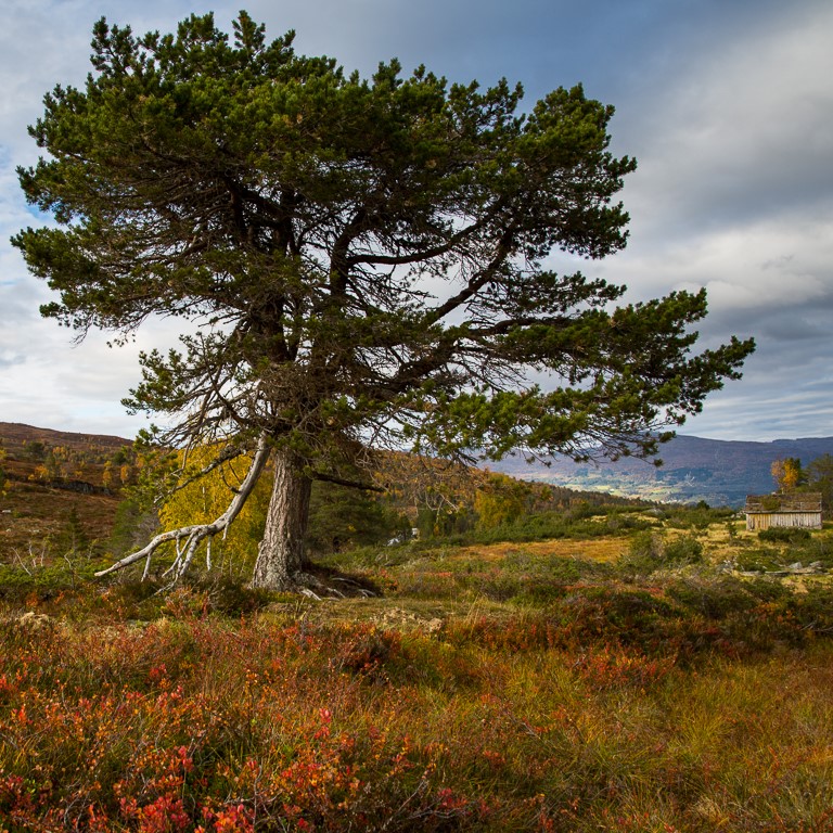
A very beautiful image. I like the use of grey tones. I also like the tension between the tree and the sun. If I should give any suggestions to improvement, it would be to darken the sky from the top about down to the sun and and a slight darkening at the bottom, using grad filter. |
Oct 3rd |
| 74 |
Oct 20 |
Comment |
I like the leading lines into the entrance. Low camera angle often gives interesting pictures, which you have achieved here. Unfortunately, the closest foreground is out of focus. This could be corrected, I think, by a smaller aperture and changing the focus spot about one third onto the scene. I would also liked to see some more contrasts in the building. I also suggest to darken the top and bottom with a graduated filter. |
Oct 3rd |
| 74 |
Oct 20 |
Comment |
Droplet photography is an interesting genre of photography. It is interesting because you never know what you get before you see it afterwards.
In this case, I agree with Ata that the original version is best because colours are part of the game in droplet photography to distinguish the different parts in the image from each other. It is a nice shot, though. The movement is perfectly frozen and the shape is beautiful. |
Oct 3rd |
7 comments - 3 replies for Group 74
|
12 comments - 5 replies Total
|