|
| Group |
Round |
C/R |
Comment |
Date |
Image |
| 36 |
Sep 20 |
Reply |
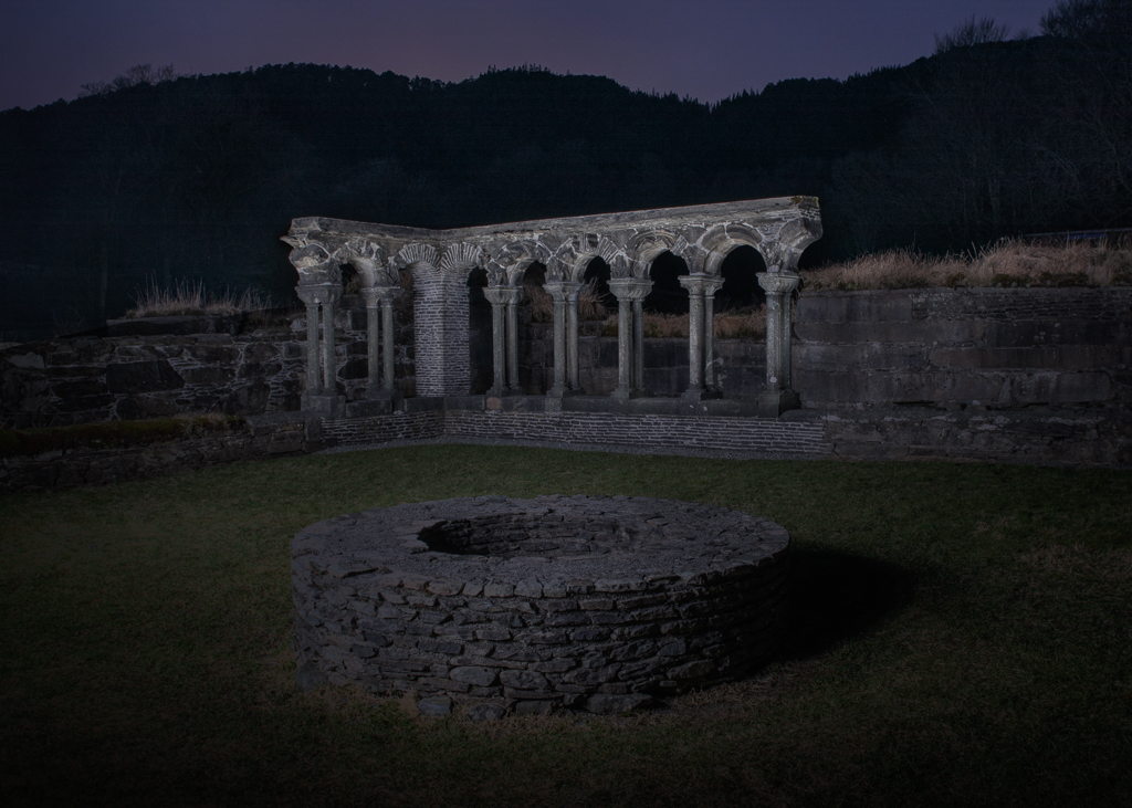
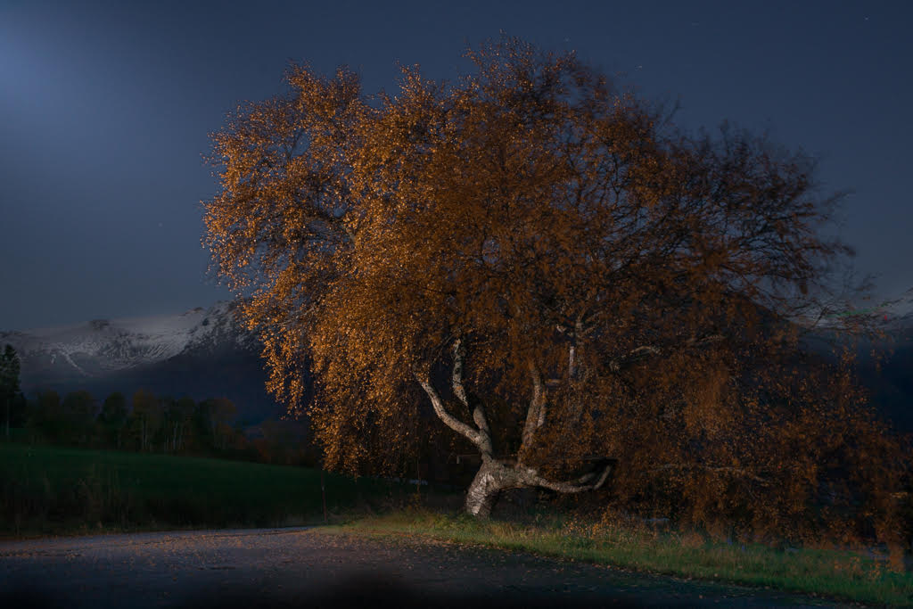
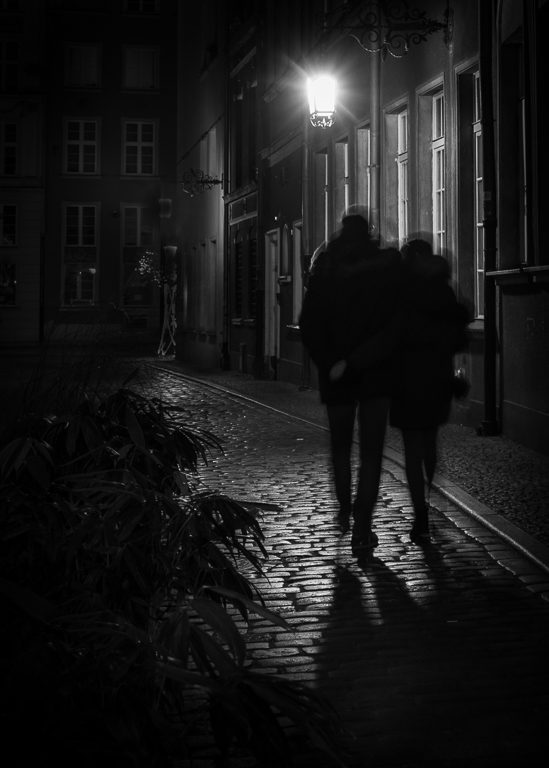
Regarding the trees, I agree with Michael. I also agree with your thinking; not leaving a black area in the corner. Here is my suggestion: Darken the tree trunks just a bit. Then dodge the complete dark spots so there is some texture. If it becomes just a grey mess, use the clone stamp tool at a low opacity and clone from a dark area. Since we now are into high polishing, I would suggest blurring the moon slightly as it looks a bit unrealistic. When done all this, I will suggest you try this image in a BW competition. Let us know the result :). |
Sep 4th |
| 36 |
Sep 20 |
Comment |
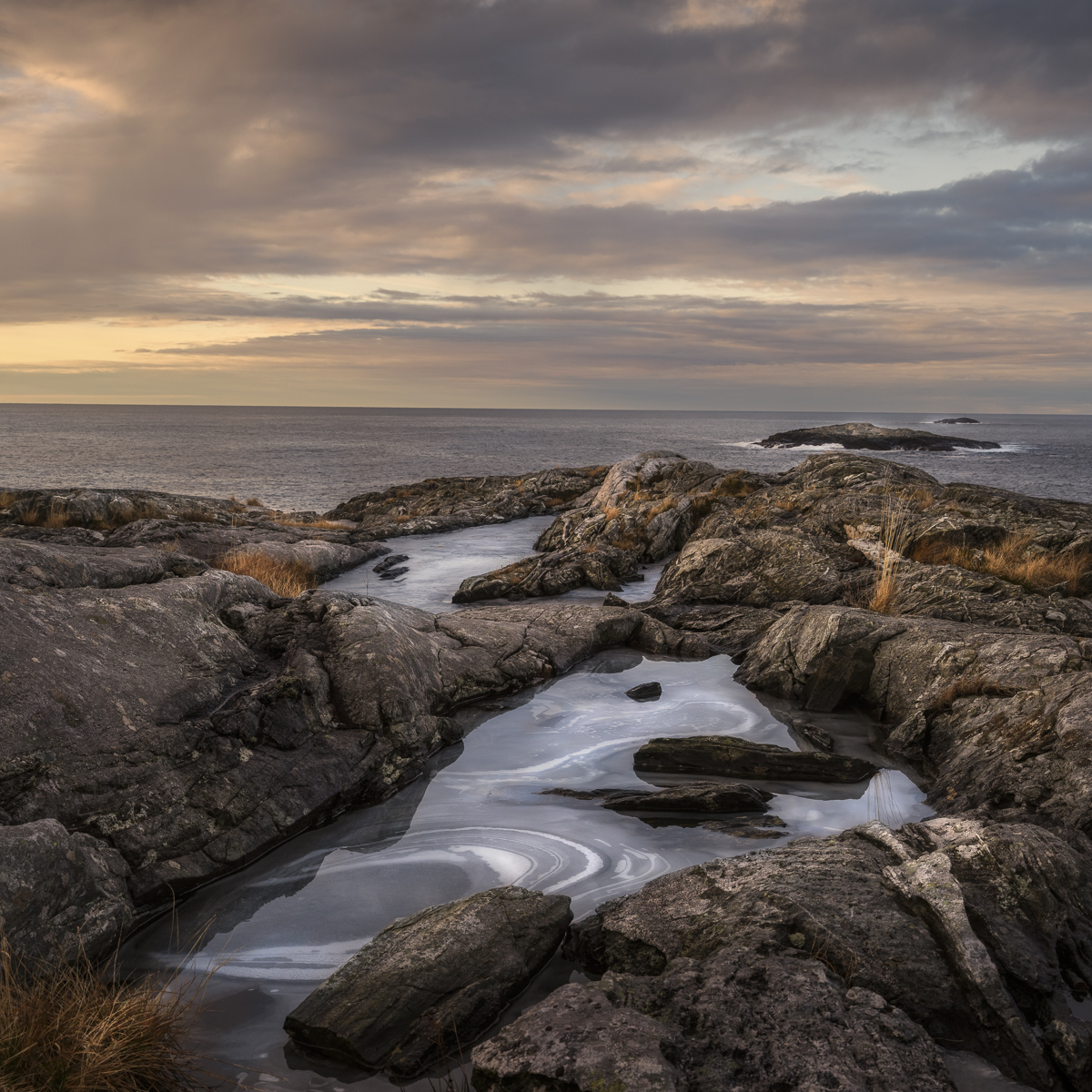
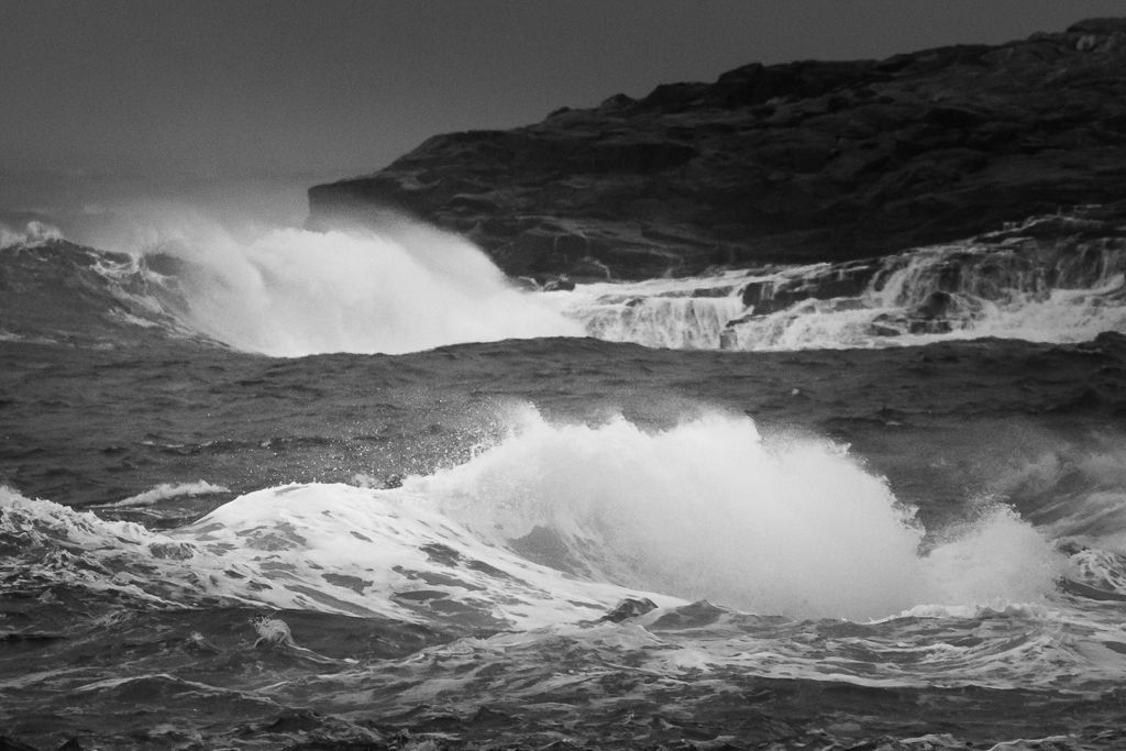
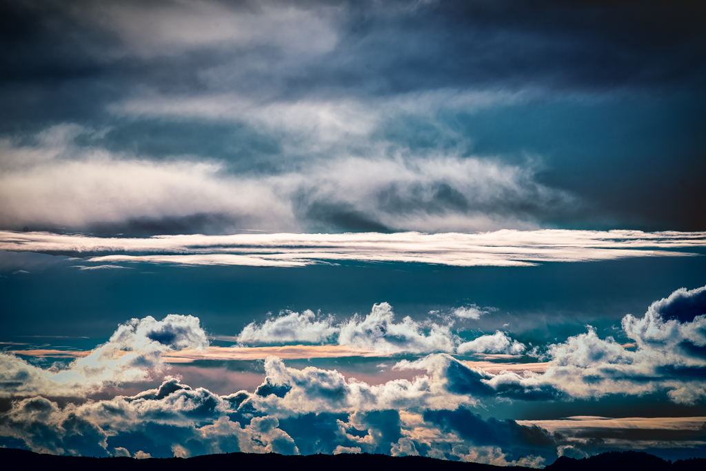
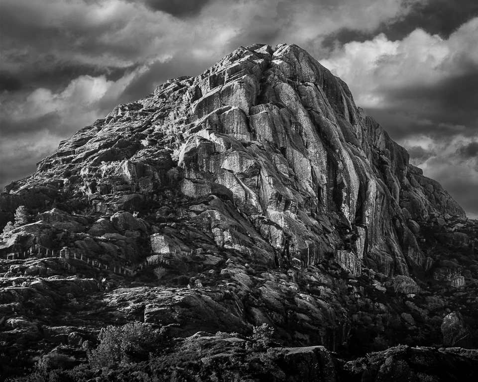
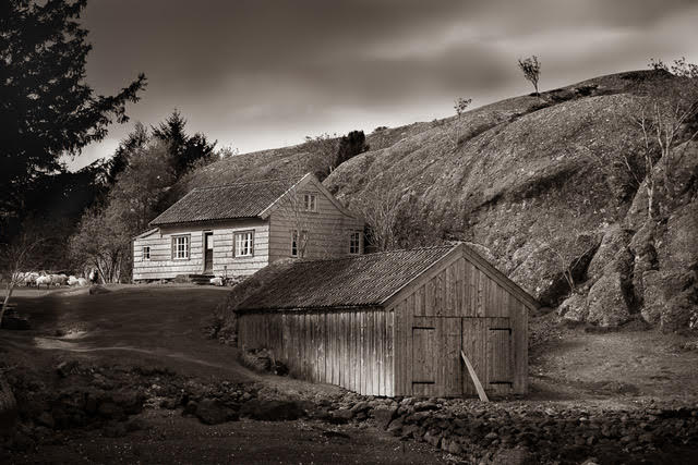
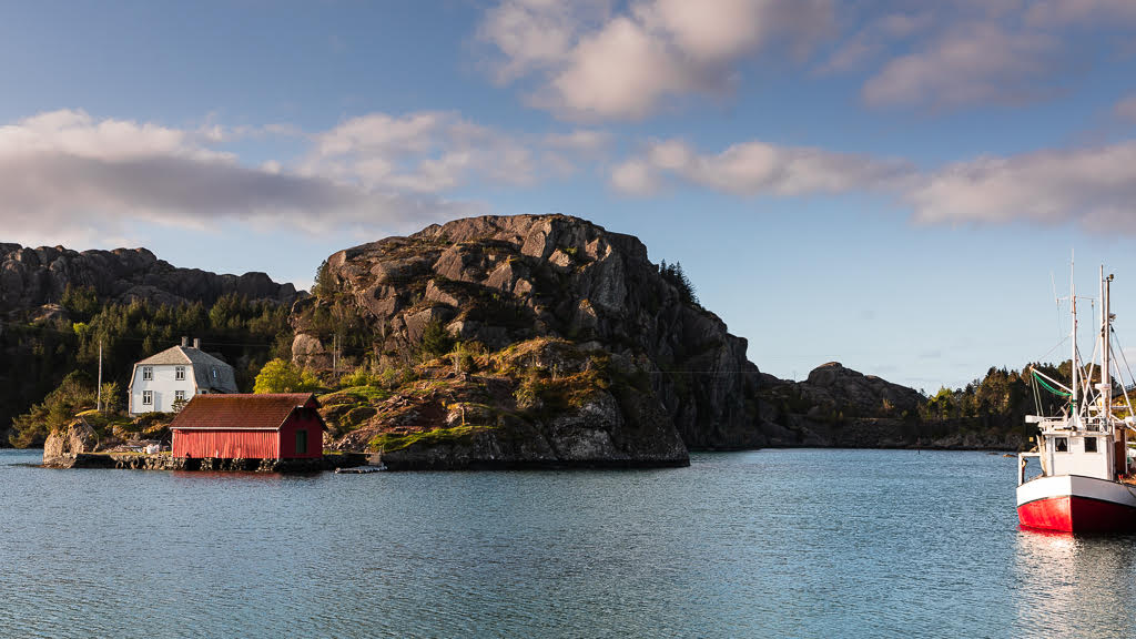
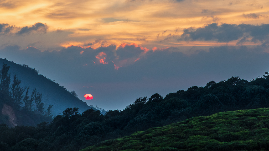
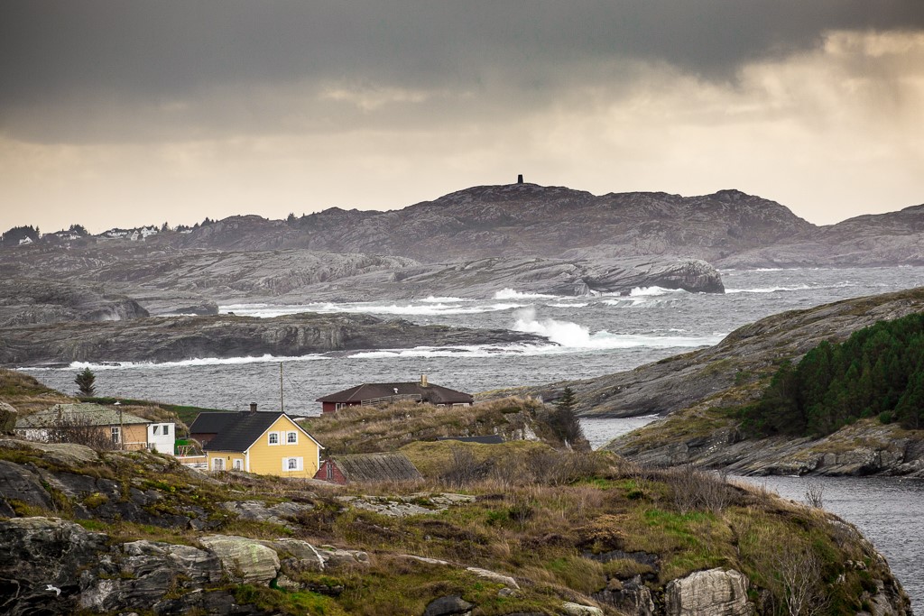
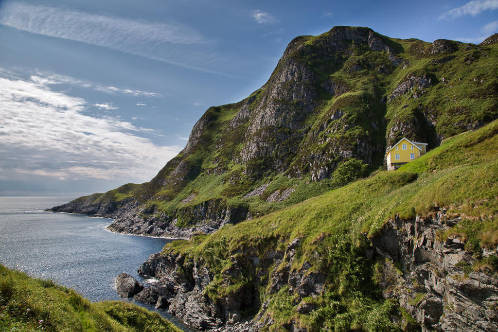
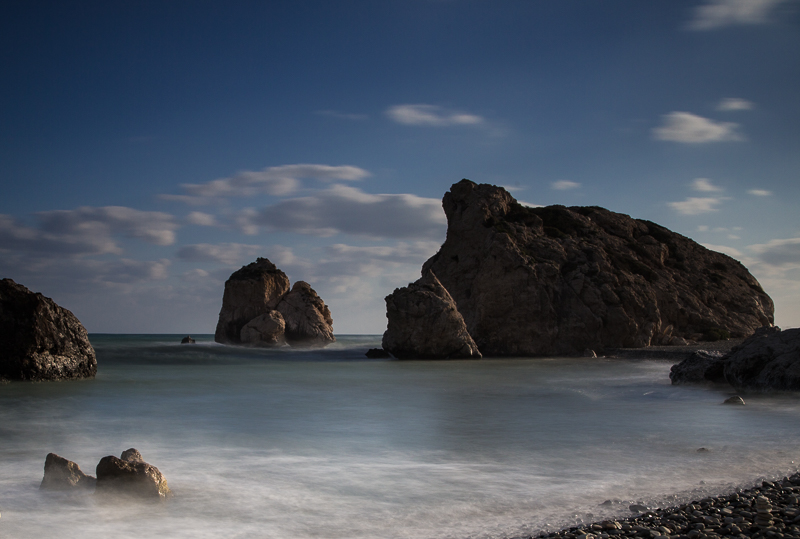
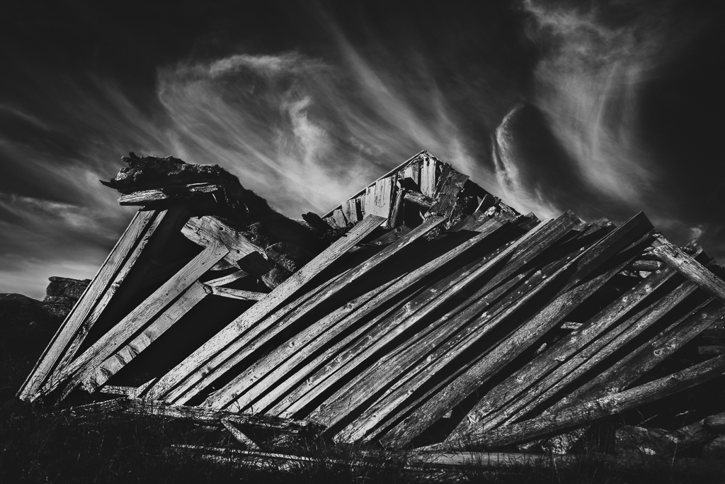
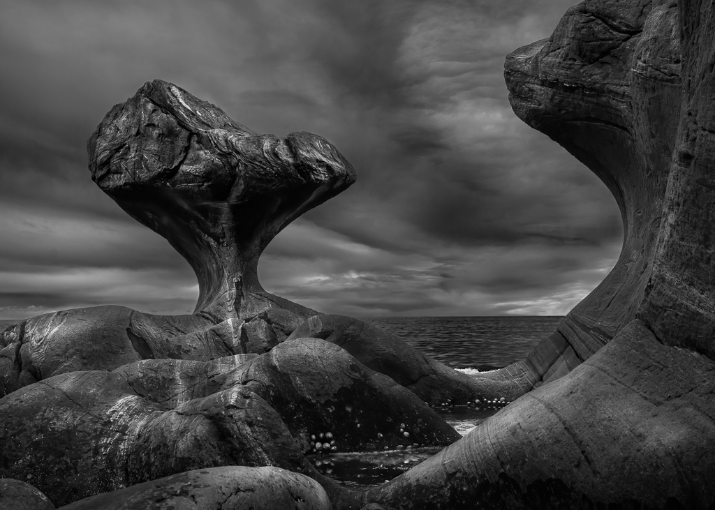
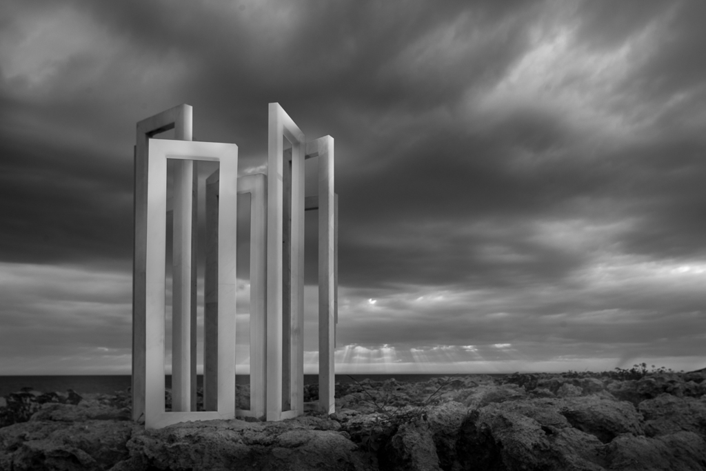
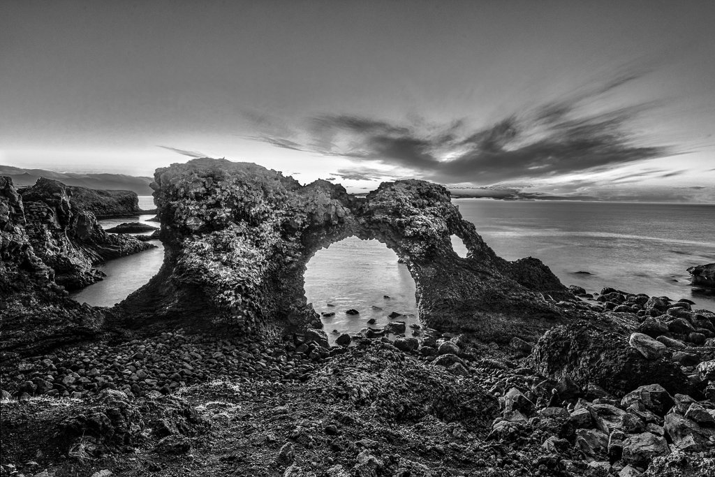
A very well captured image. I like the balance of light between the big rock to the right and the clouds and the wooden hill to the left. The clouds moving in the wind make dramatic look. Would suggest to darken the right upper corner to add more drama. |
Sep 4th |
| 36 |
Sep 20 |
Comment |
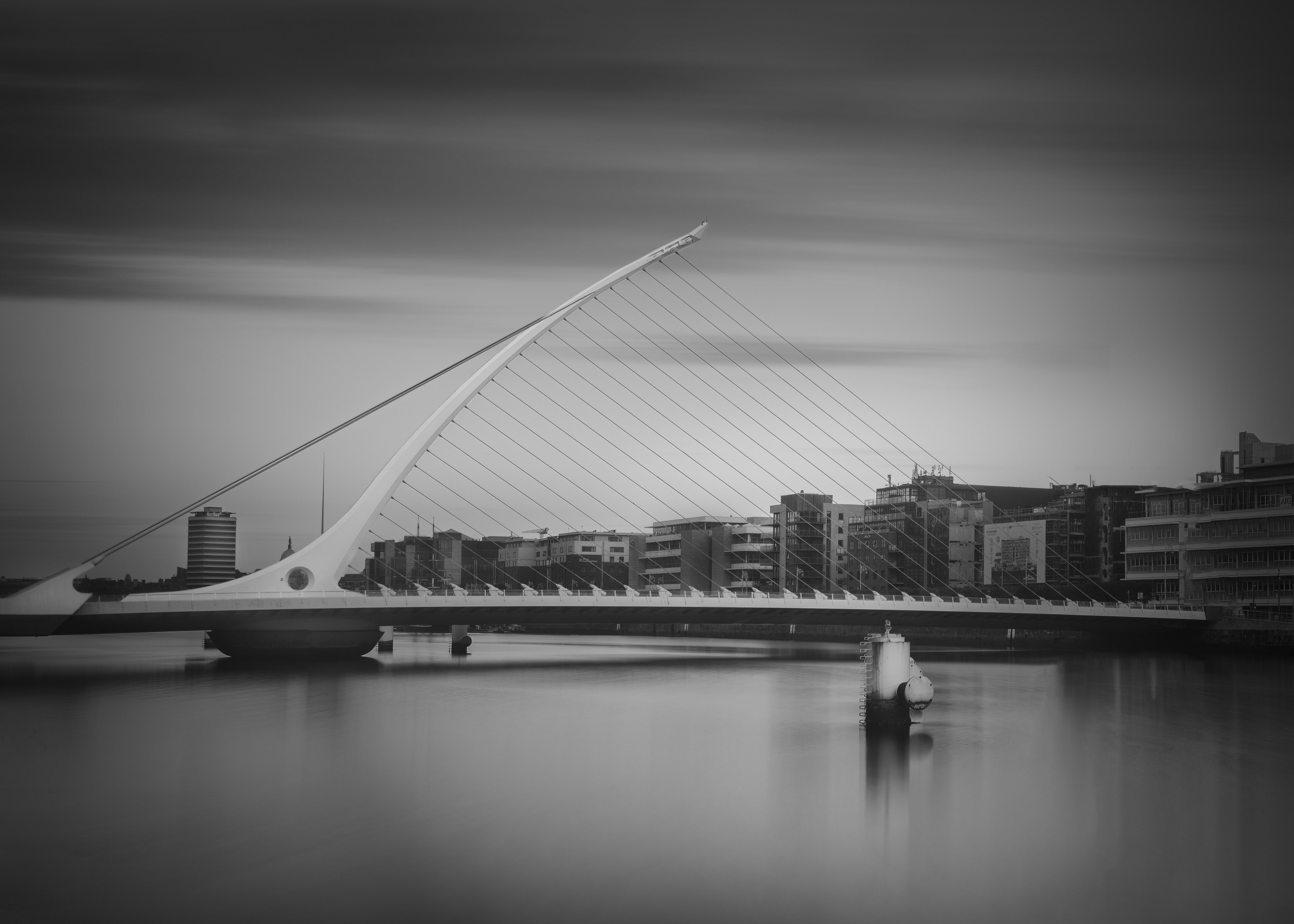
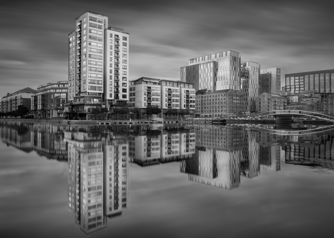
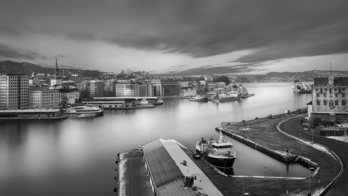
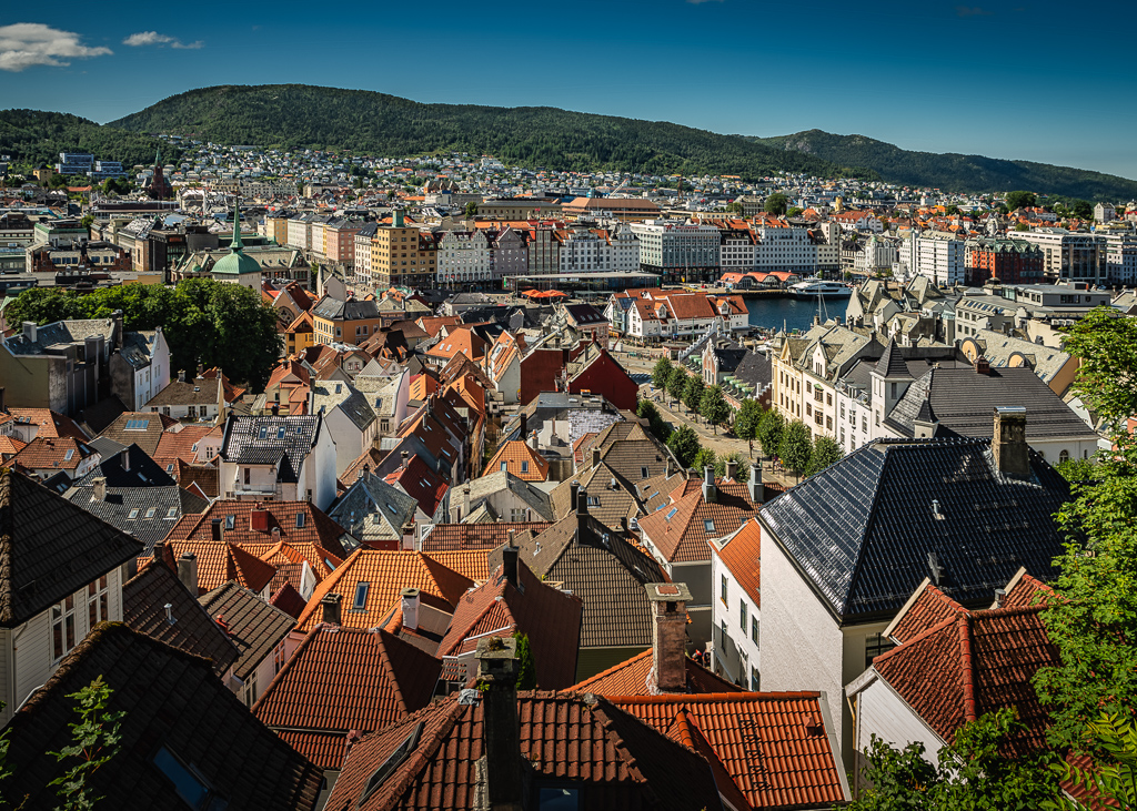
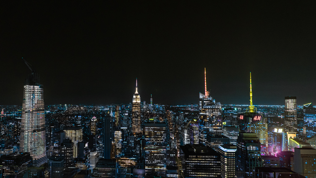
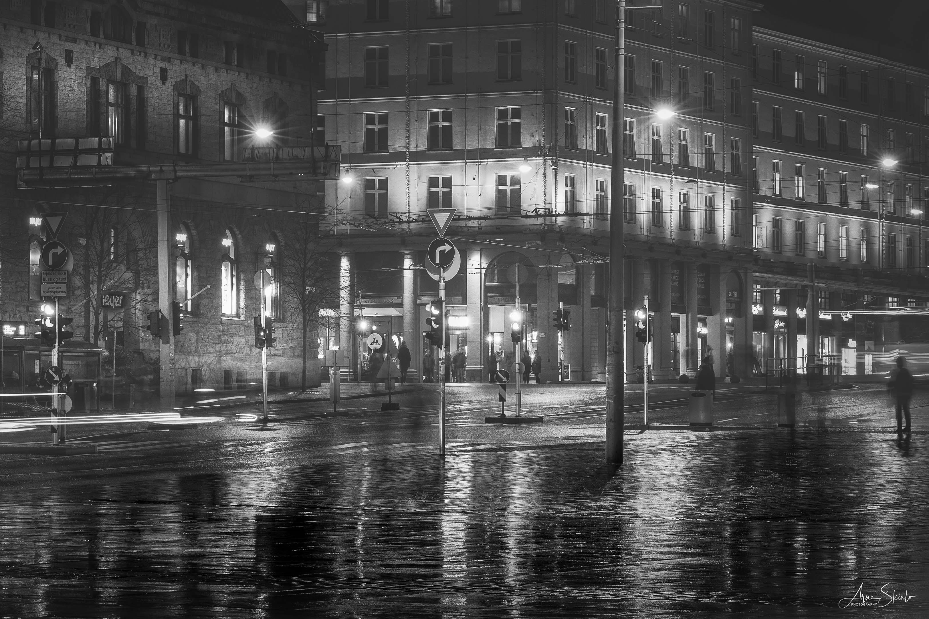
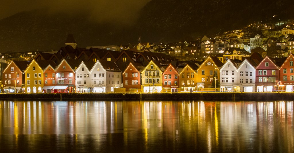
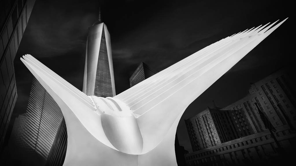
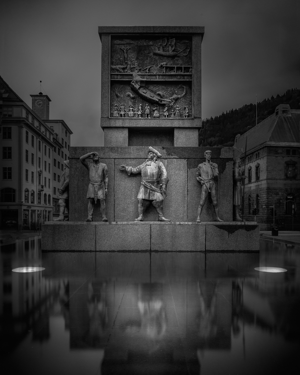
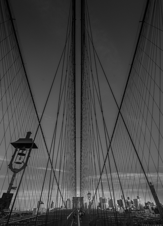
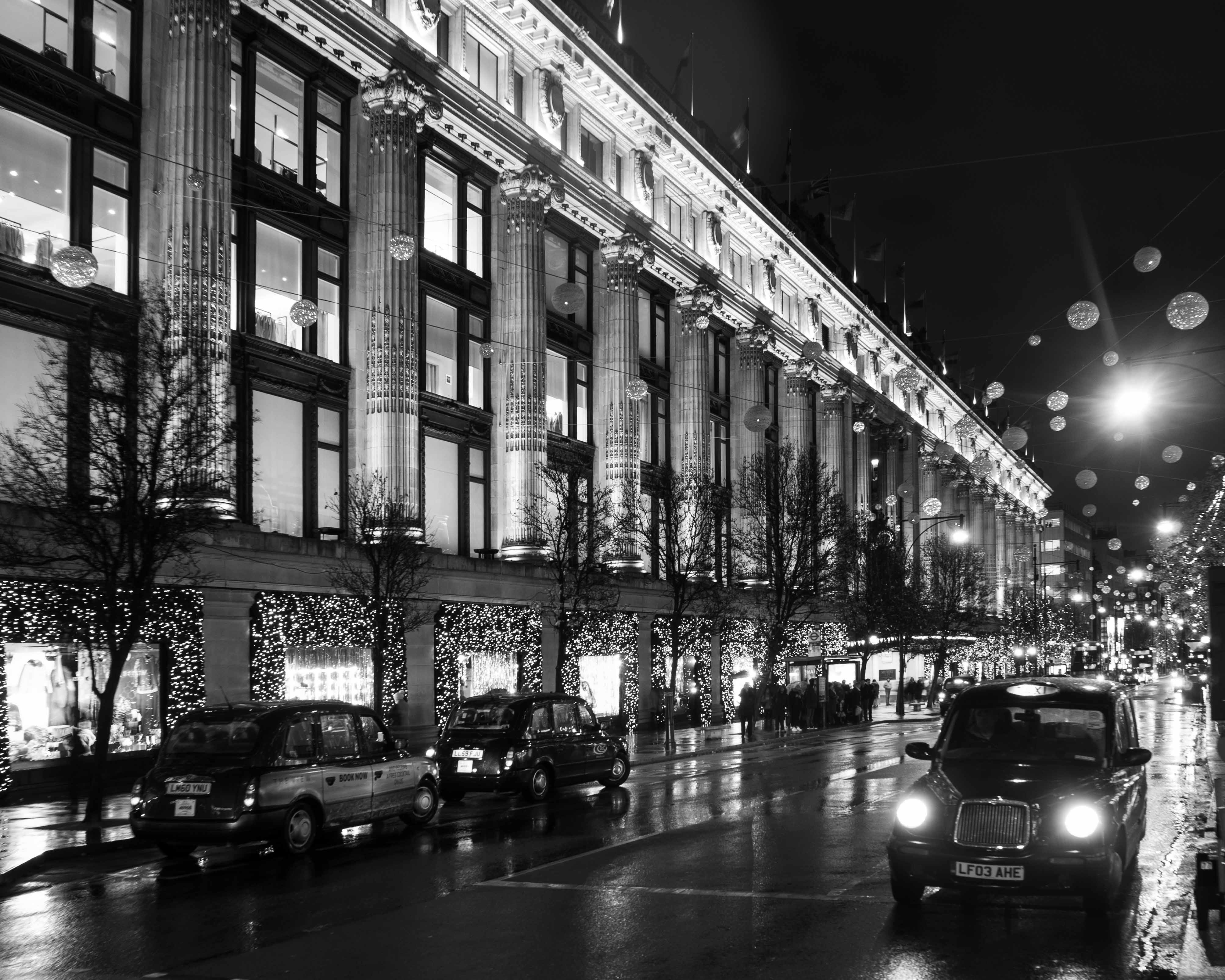
Making it into a panorama makes the image far more interesting. In order to focus more on the city, I would suggest to crop it from both sides and make it into a 16x9 format. I like what you have done with the sky. My only suggestion for improvement is to increase the highlights in the city to make it pop more. Maybe also apply a slight vignette. |
Sep 4th |
| 36 |
Sep 20 |
Comment |
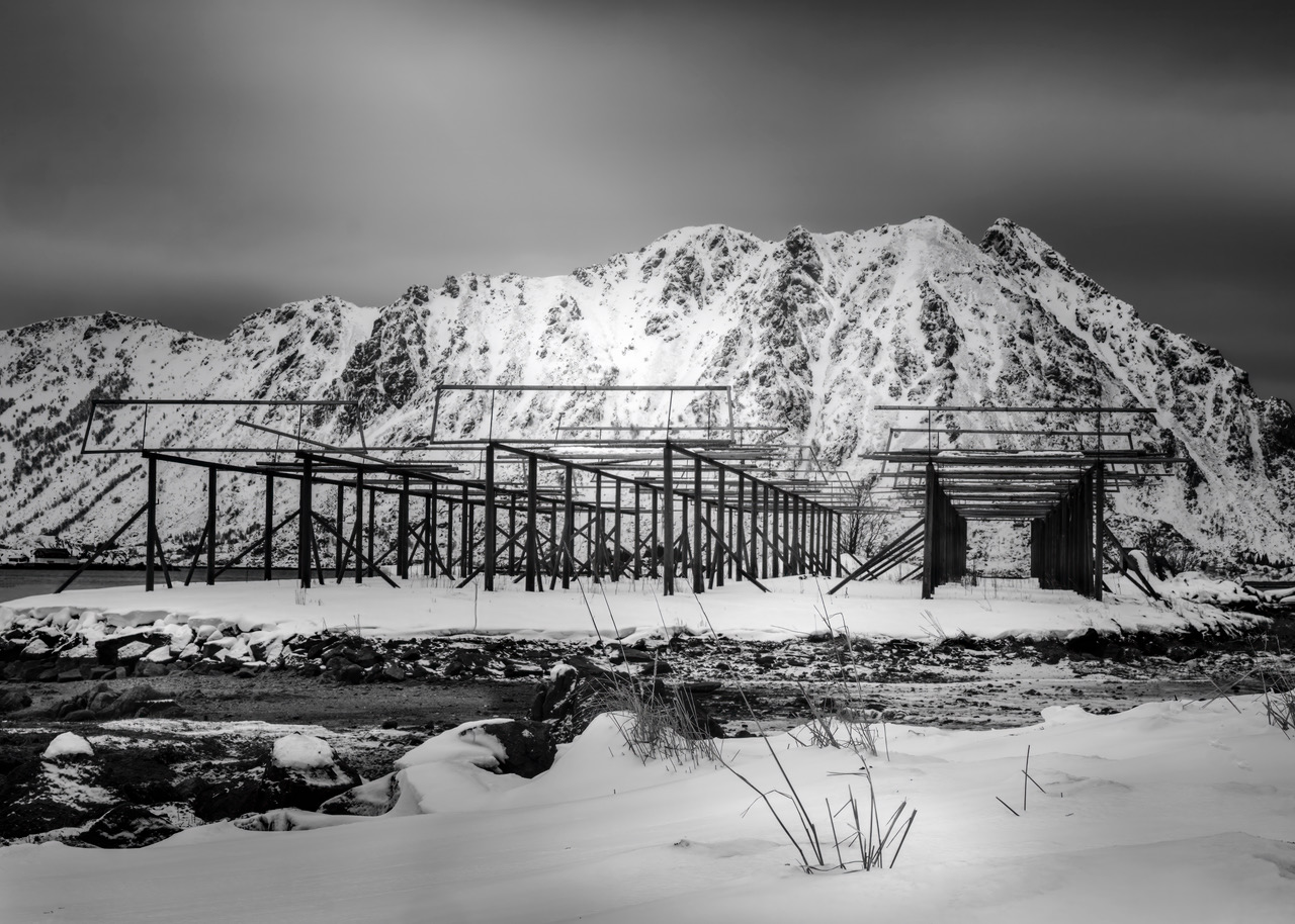
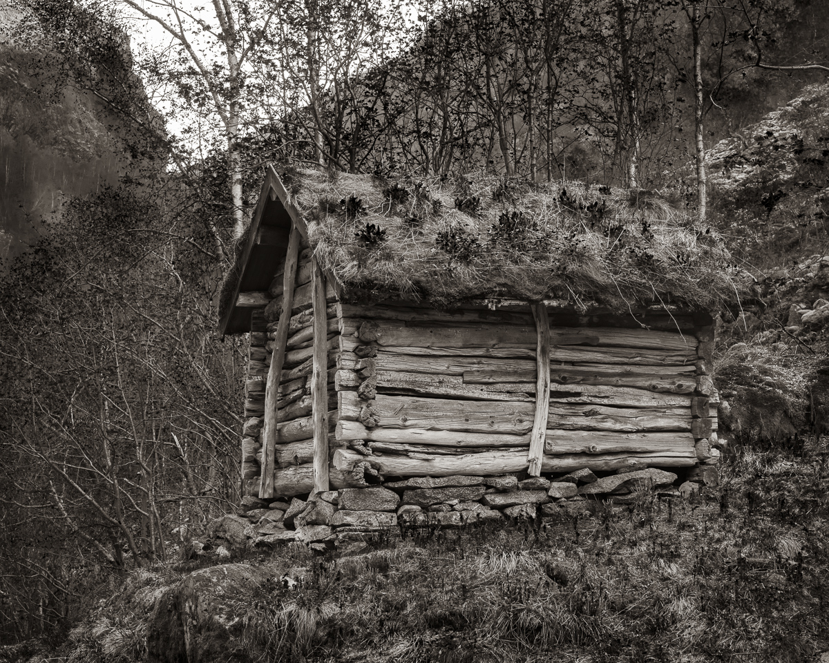
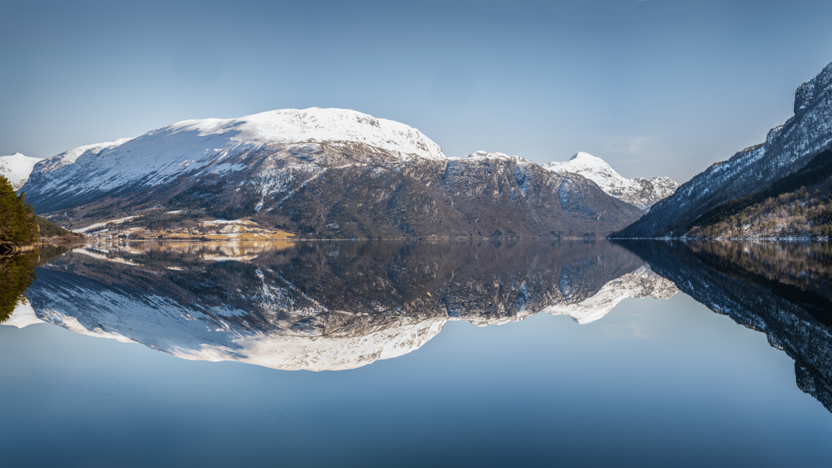
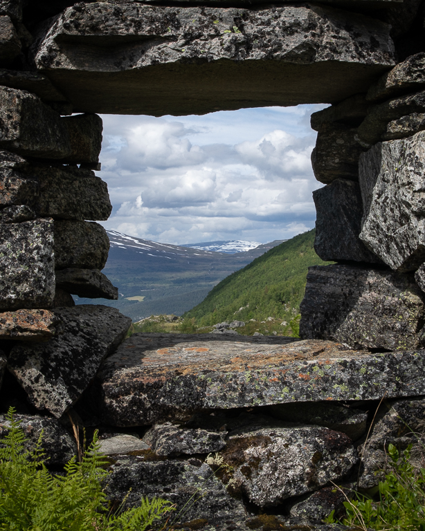
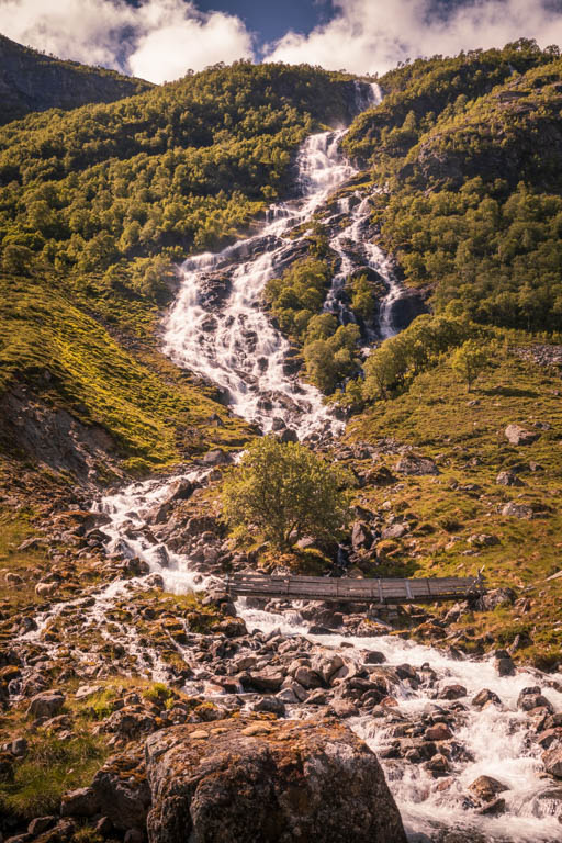
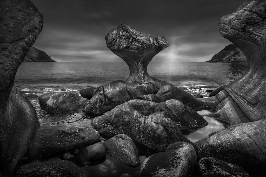
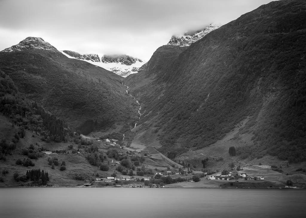
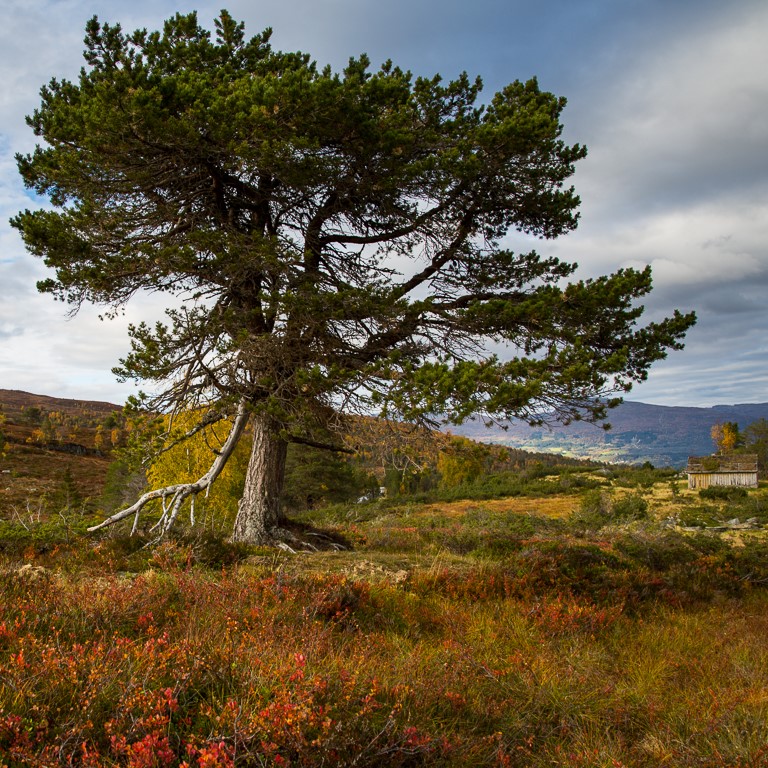
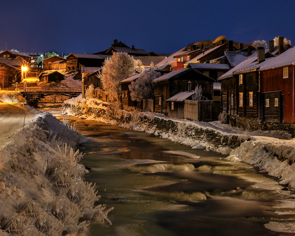
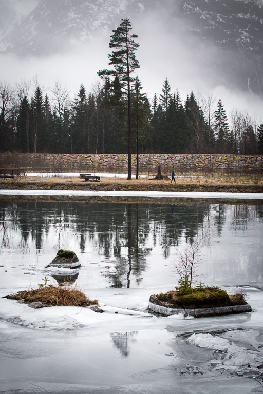
The post processing has really improved the image. Shooting in the middle of the day is rarely a good recipe for a master shot, but sometimes it is the only option you have. May be you could use the gradient filter to to darken the top and the bottom or apply some vignette to give more attention to the mountain. |
Sep 4th |
| 36 |
Sep 20 |
Comment |
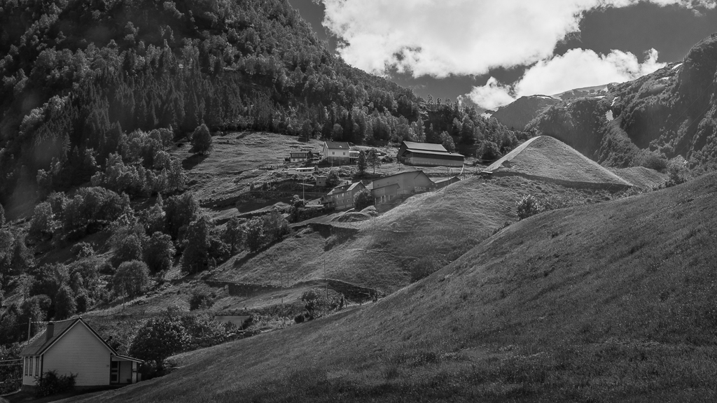
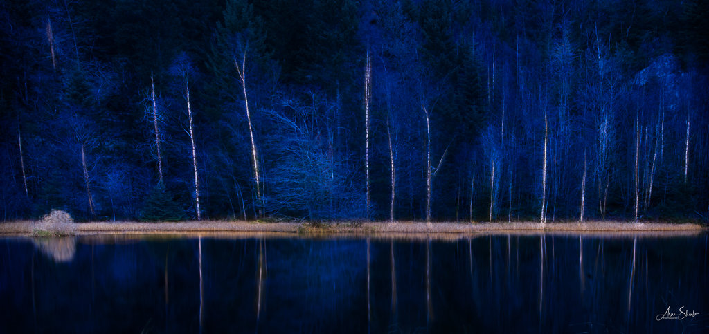
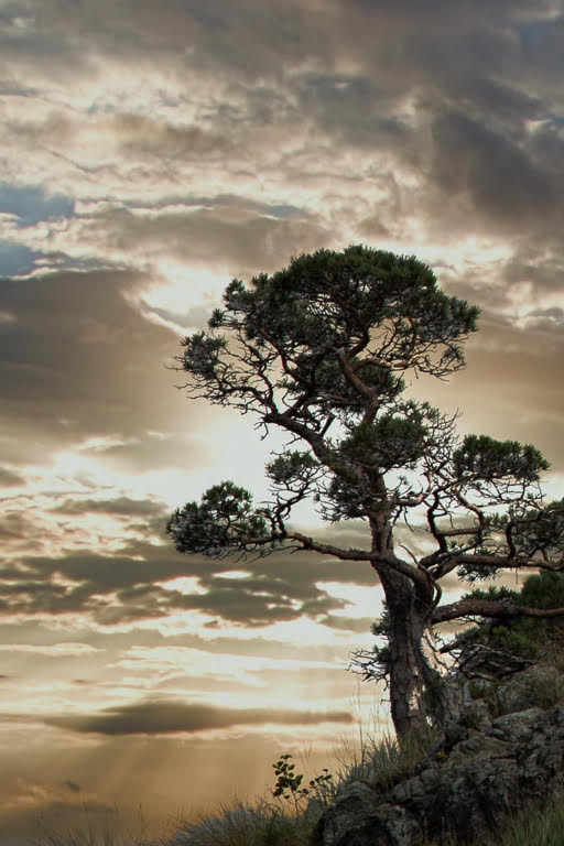
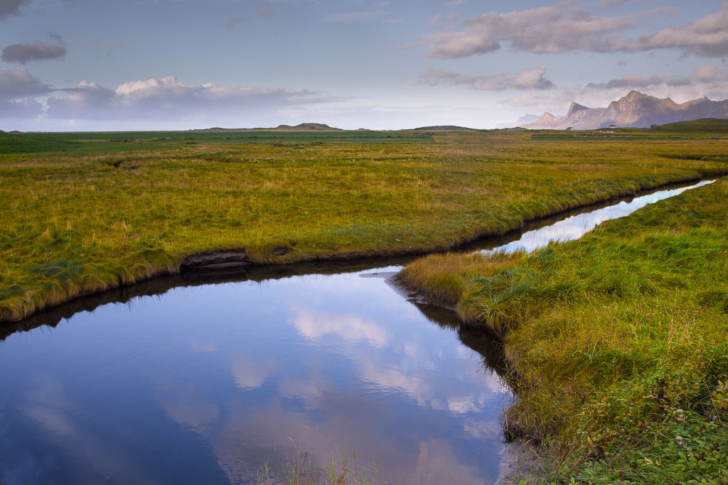
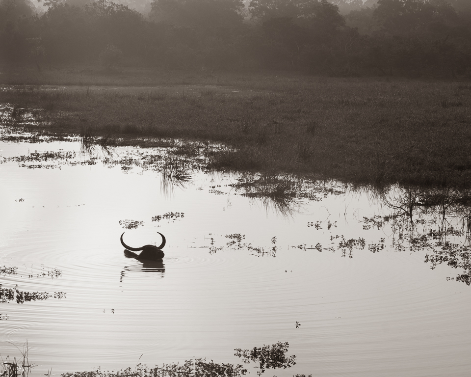
I like the diagonal line of the trees. I think the contrast is right, keeping some grey tones instead of white. Maybe you could give it some more contrast by burning the dark spots on the trees slightly. Luminosity mask is a good tool for doing that. |
Sep 4th |
| 36 |
Sep 20 |
Comment |
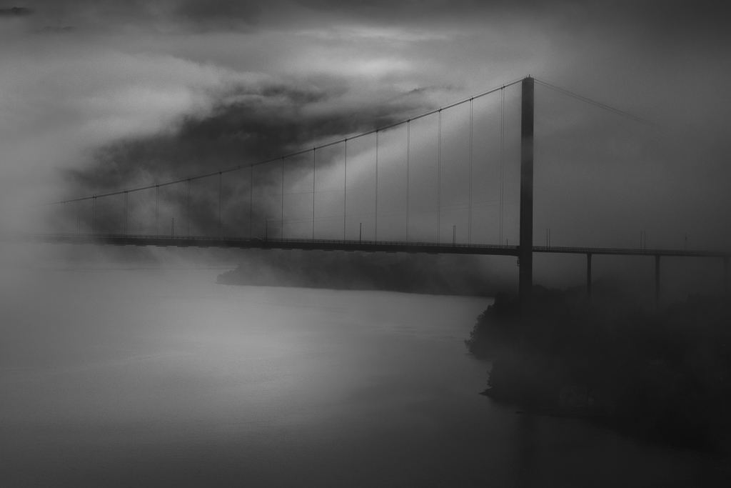
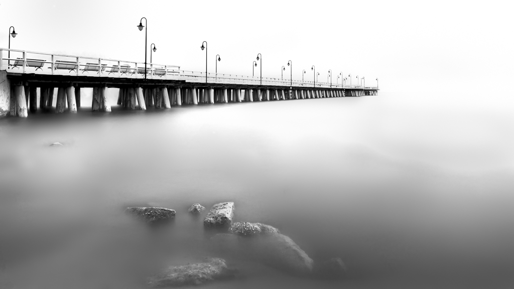
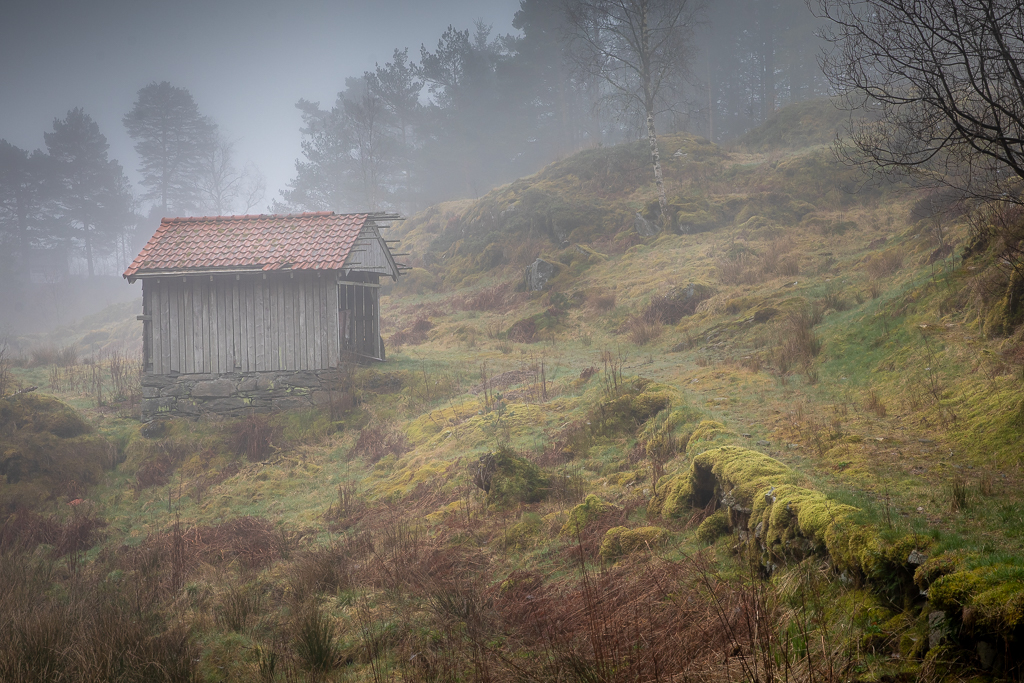
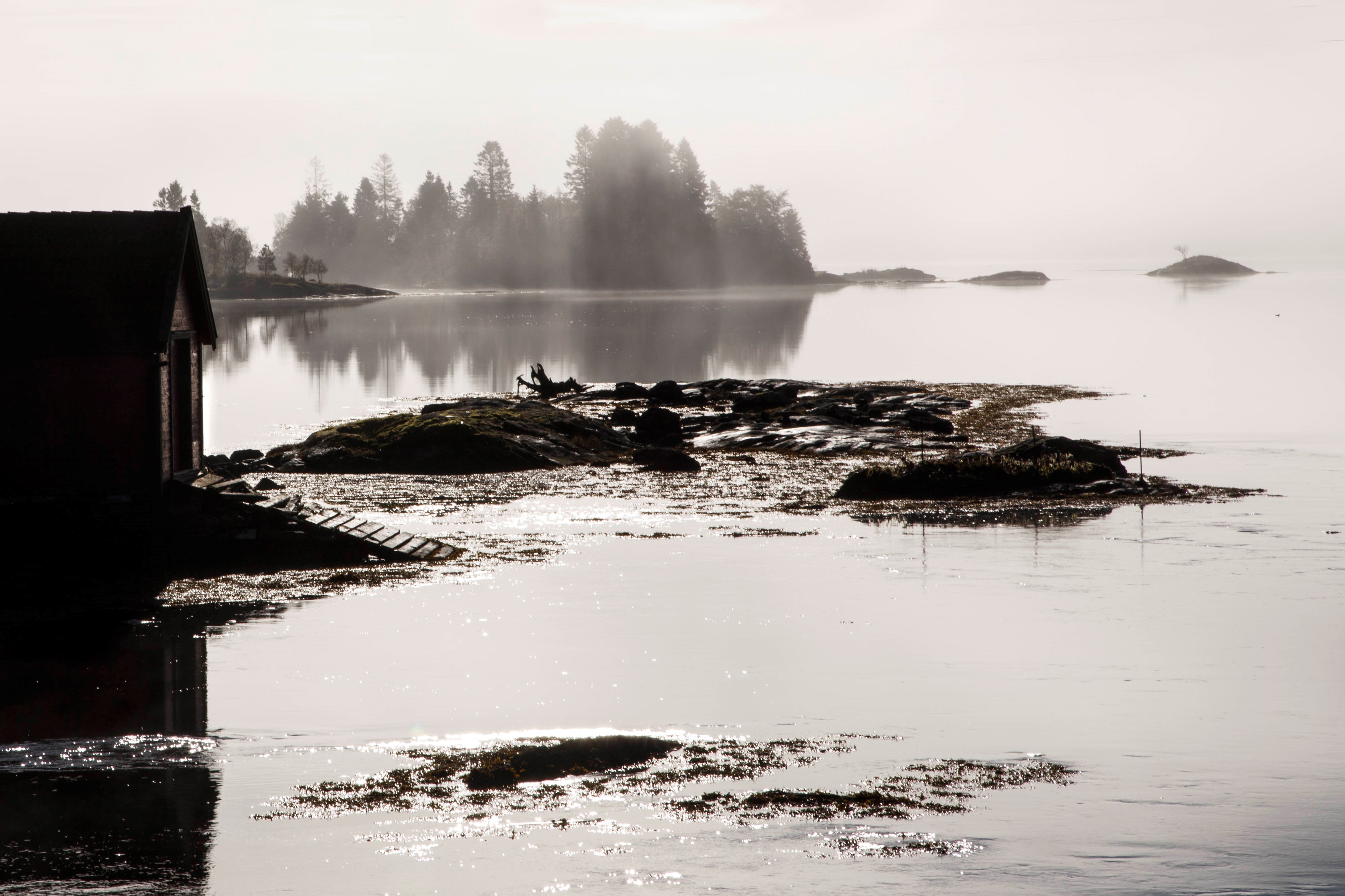
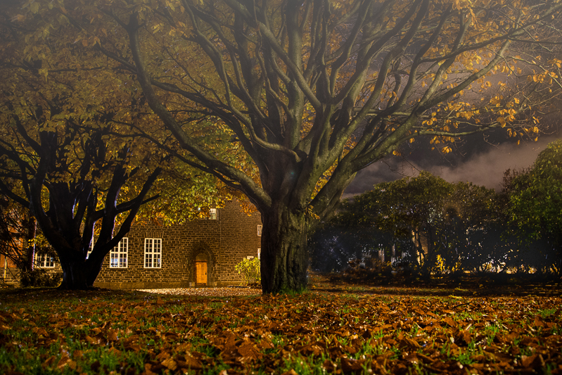
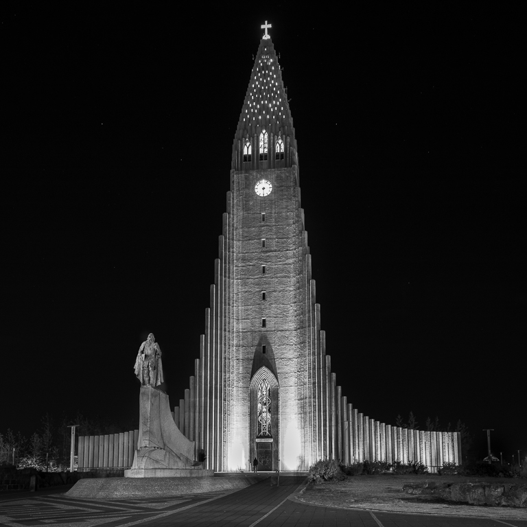
First, I am very flattered being an inspiration for you. You have succeeded very well with this picture. I has a full tonal range with makes it crisp and interesting. The contrast between the trees and the fog creates a dramatic look. I also like the depth created by the changes of tones from black to white and the subtle changes in tonality in the background.
My only suggestion for improvement is to crop the top part and darken the top a bit to draw more attention to the fog and the trees.
A very good black and white landscape image! |
Sep 4th |
5 comments - 1 reply for Group 36
|
| 74 |
Sep 20 |
Reply |
It is good enough for the wall, but I will advice you to study more Photoshop processing if you want to improve your photo work. I would start with cloning and the Gradient tool. You find a lot on Youtube about this. Piximperfect is a good channel. |
Sep 9th |
| 74 |
Sep 20 |
Comment |
You could not do anything about the reflection because it is burned out. The way to get around this, is to clone in a from a similar area. I took the liberty to redo the picture for you to show what I mean. I have used Photoshop cloning and dodge tool and Gradient tool in this process. |
Sep 7th |
 |
| 74 |
Sep 20 |
Comment |
Hi Haru, I think that is a good ida. It is much better to have a few good ones instead of a bunch of awerage pictures. I think this one will end up on your wall :) |
Sep 7th |
| 74 |
Sep 20 |
Comment |
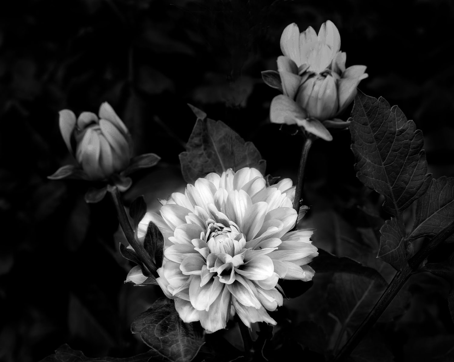
Yes, it was something like this I had in mind. If you compare your first version with this one, you see a big differance. It pays off to use time on your photos. In addition, it trains your eyes to see what has to be improved.
If you decide to proceed for (even) more perfection, I will suggest to darken the right flower so it get the same intencity as the left one. Clone out the stem that you have darkened. Fix the leaf in lower front. Fix the leef, lower front. Darken the white lines around the stem in the lower right corner. This is very picky, but it is what it takes to make a photo that stands out from the crowd. I can mention that I use an average of about 5 hours on each picture. I leave it for a few days and then often see new things to improve. Good luck, Haru. |
Sep 7th |
| 74 |
Sep 20 |
Reply |
No, you have not overdone the darkening. Now you have a triangle composition where the front flower is the focus point. If you want to improve it further, you should remove the stem that comes up behind the flower and dodge the highlights on the flower to let it stand out even more. Also darken the lower left corner. Then you may put it on the wall :)
Remember, it takes many hours to make a good picture. |
Sep 6th |
| 74 |
Sep 20 |
Comment |
Often less is more. Darkening backgrounds or not can be discussed at length, and there are no strict rules for what is right or wrong. In this case, I would darkened the two flowers at the back and increased the highlights of the main flower. At he end I would made a vignette around the flower to make it pop out. |
Sep 4th |
| 74 |
Sep 20 |
Comment |
Your photos are giving me a good understanding of everyday life in Turkey and this picture is no exception.
My suggestion for improvement is to darken the background and lighten the woman`s face and the scarf in order to give her more attention. |
Sep 3rd |
| 74 |
Sep 20 |
Comment |
A very interesting composition with the two diagonal lines crossing each other. I also like the tonal range where you have both complete black and white and nice grey tones.
For the future, I would ask you to describe a bit more about how you capture the pictures and your post processing, so we all could learn from it. |
Sep 3rd |
| 74 |
Sep 20 |
Comment |
I think this image works best in B&W sins you then can play with contrasts. My suggestions to improvement is to darken the water to make more contrast. I think I would darken the white persons in the background as they compete with the water lillys that I think should be the focal point. |
Sep 3rd |
| 74 |
Sep 20 |
Comment |
I like your composition an the mirroring of the subject. However, as commented by the others, the contrast is too low, even with the last issue. My suggestion is to use dodge and burn in Photoshop and particularly increase the highlights in the stable wall and the area in front of the stable. The roof could be either darker or lighter to give contrast to the sky. I would try with darker first and see if that works. That will attract the attention to the main subject. |
Sep 3rd |
| 74 |
Sep 20 |
Comment |
Interesting shot. You have succeeded well in getting out the texture in the surface. As you say, it is not easy to get the exposure right in moon shots, the only way is to try and err until you get the result you want. You did not say anything about using a
tripod or not, but I guess you have used one since it is so sharp at 1/125 sec. |
Sep 3rd |
9 comments - 2 replies for Group 74
|
14 comments - 3 replies Total
|