|
| Group |
Round |
C/R |
Comment |
Date |
Image |
| 36 |
Feb 20 |
Comment |
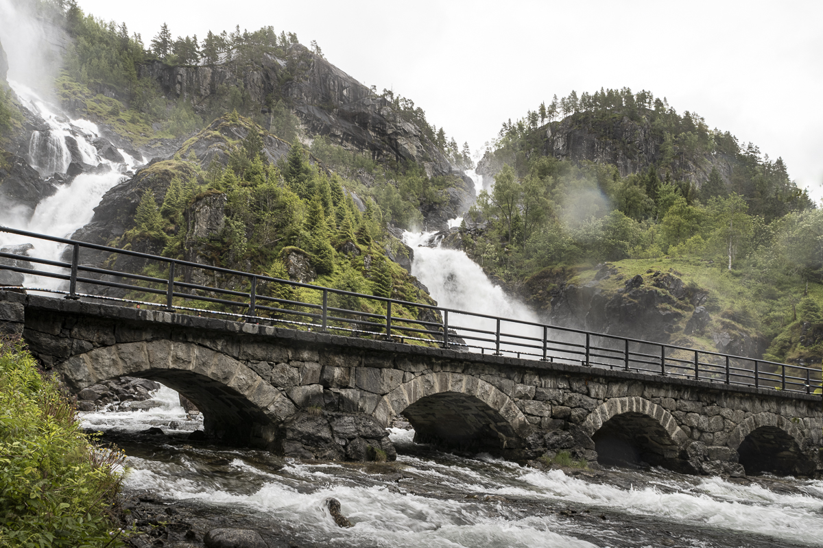
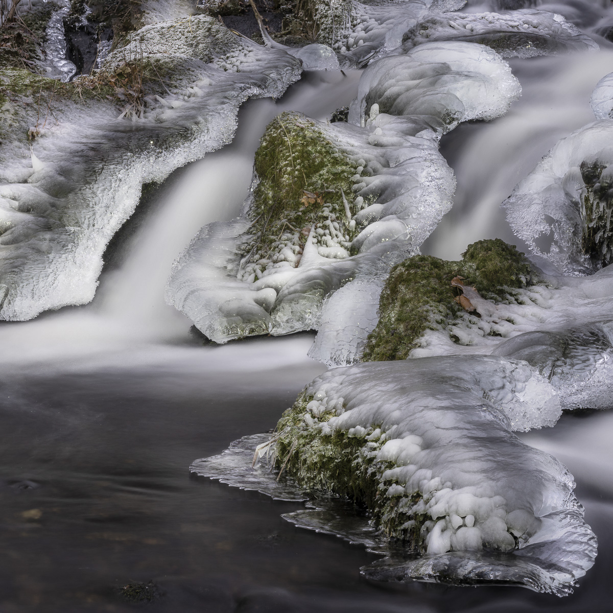
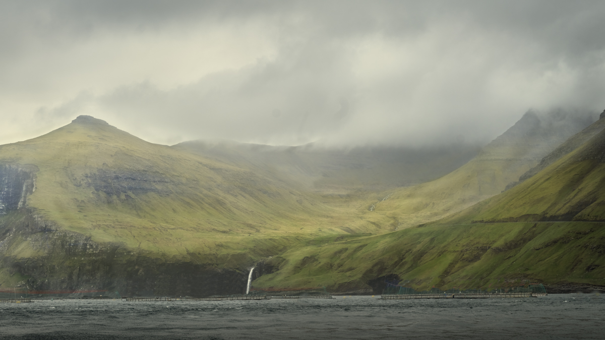
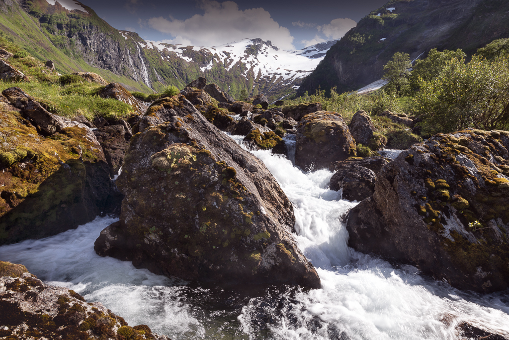
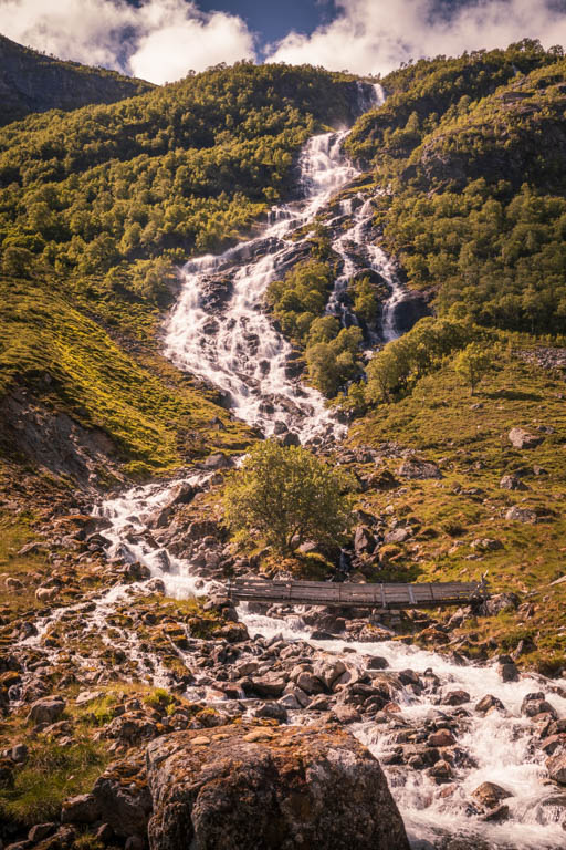
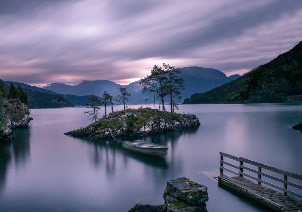
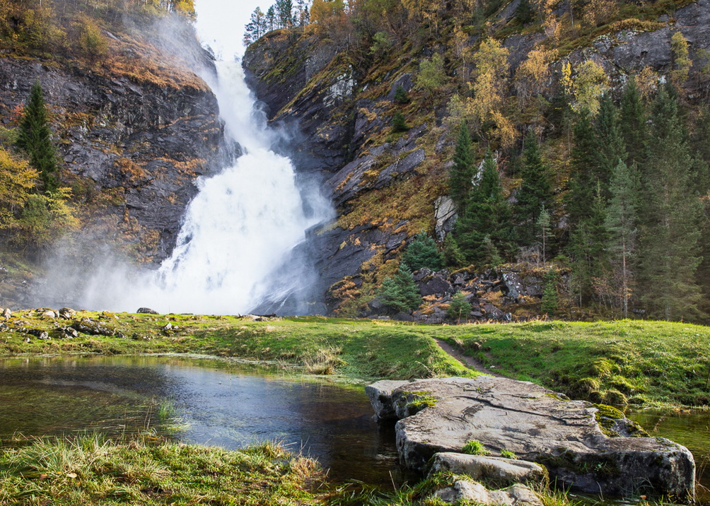
I agree with the comments on glare in the water which takes attention from the waterfall. That being said, I like the bright green colours together with the brown/yellow in the water. |
Feb 15th |
| 36 |
Feb 20 |
Comment |
Actually, Larry has already said what I would like to say. However, I will say that it is a well-done picture with good post-processing. |
Feb 15th |
| 36 |
Feb 20 |
Comment |
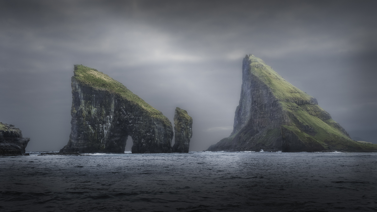
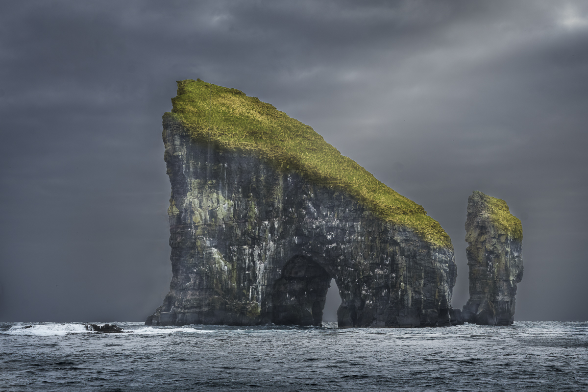
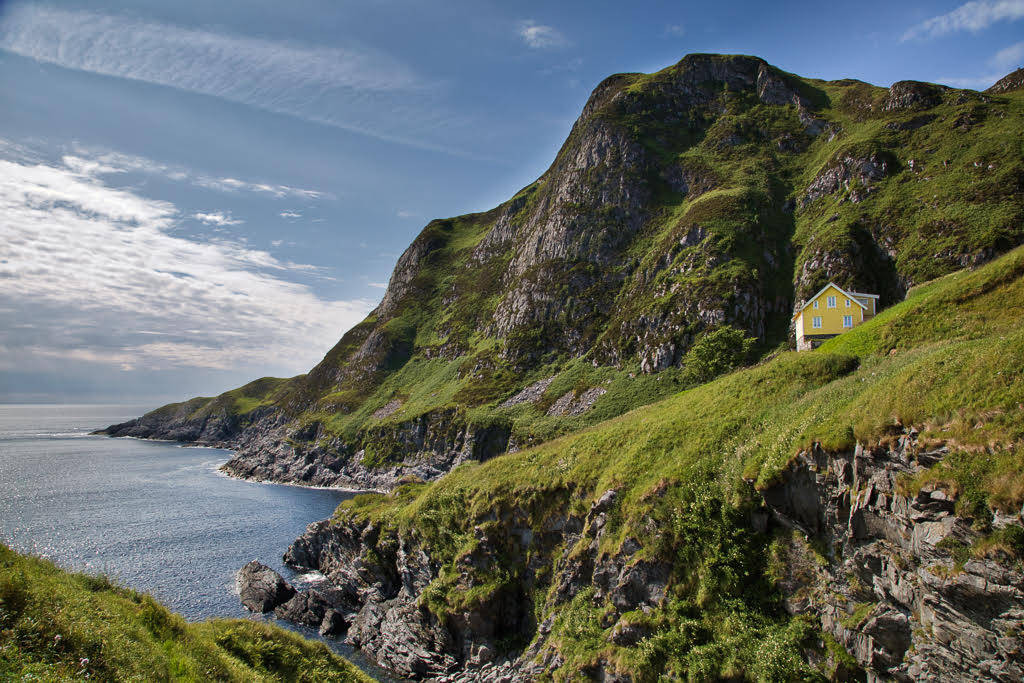
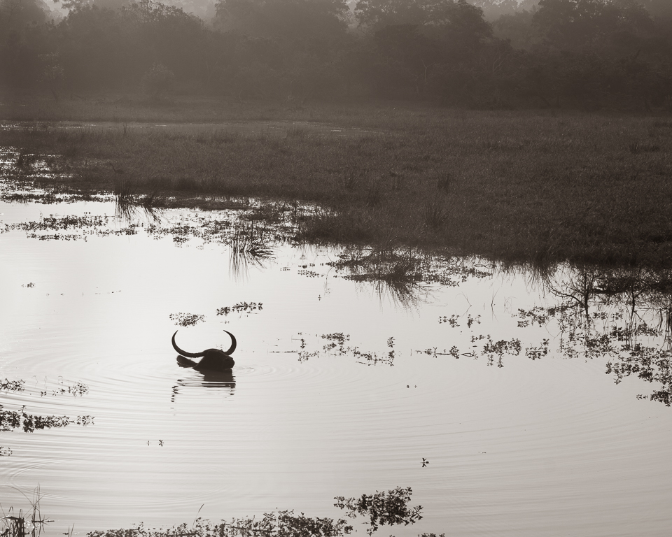
As Micael says, it is technically well done, but I liked the original better as it shows more of the environment and put it into a context of living on an edge. |
Feb 15th |
| 36 |
Feb 20 |
Comment |
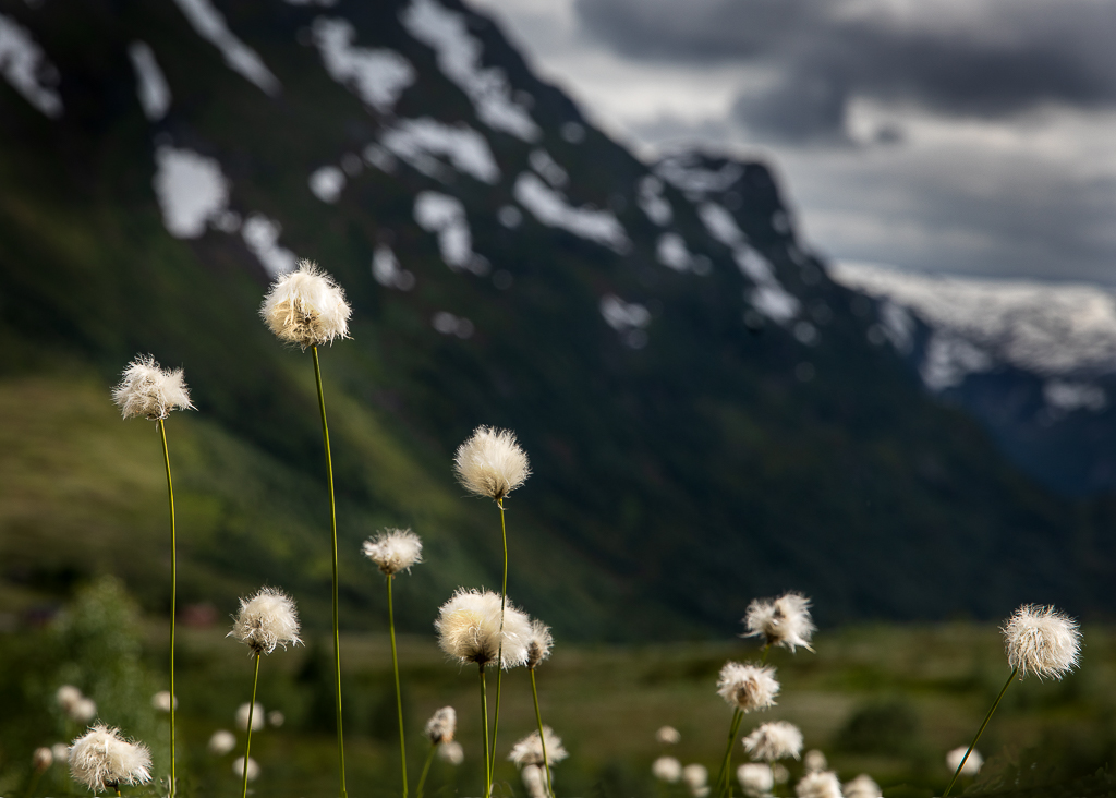
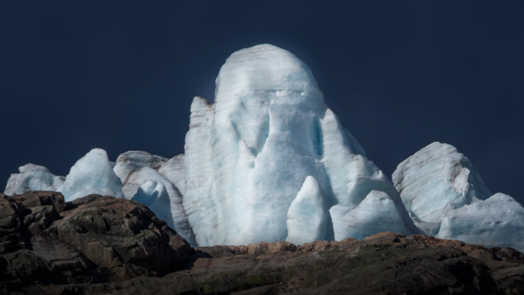
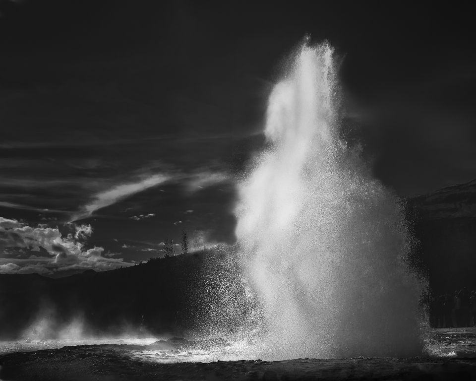
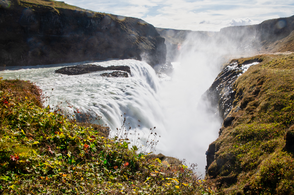
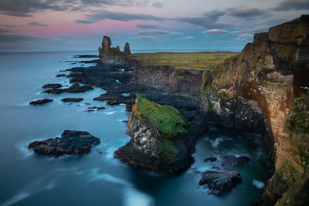
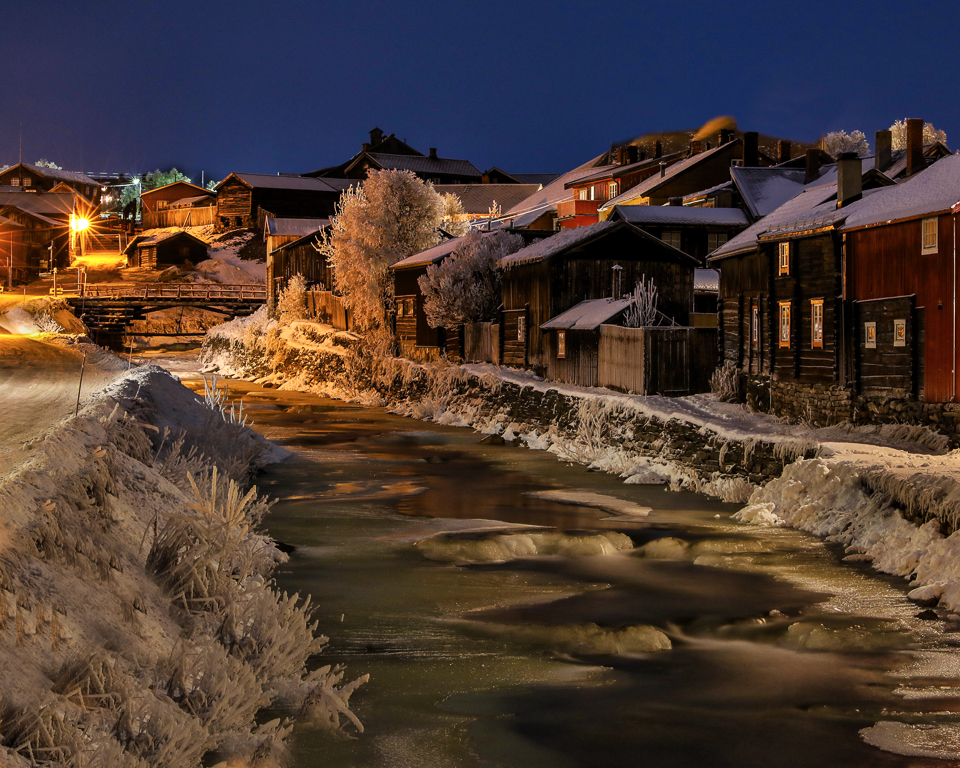
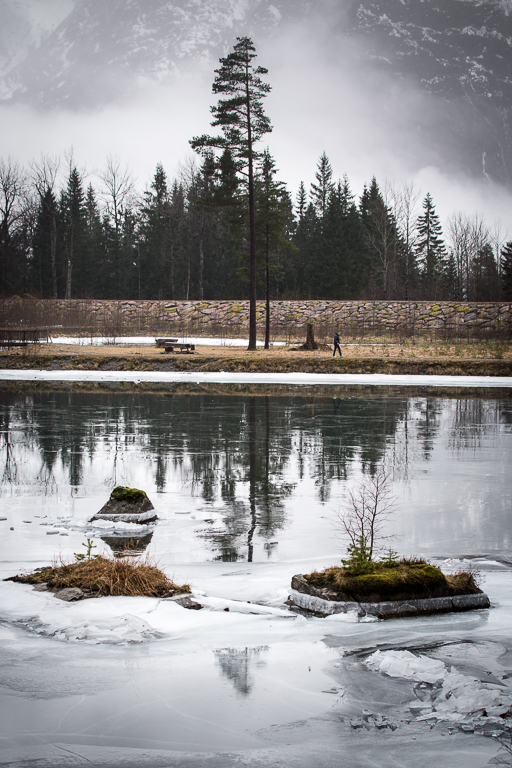
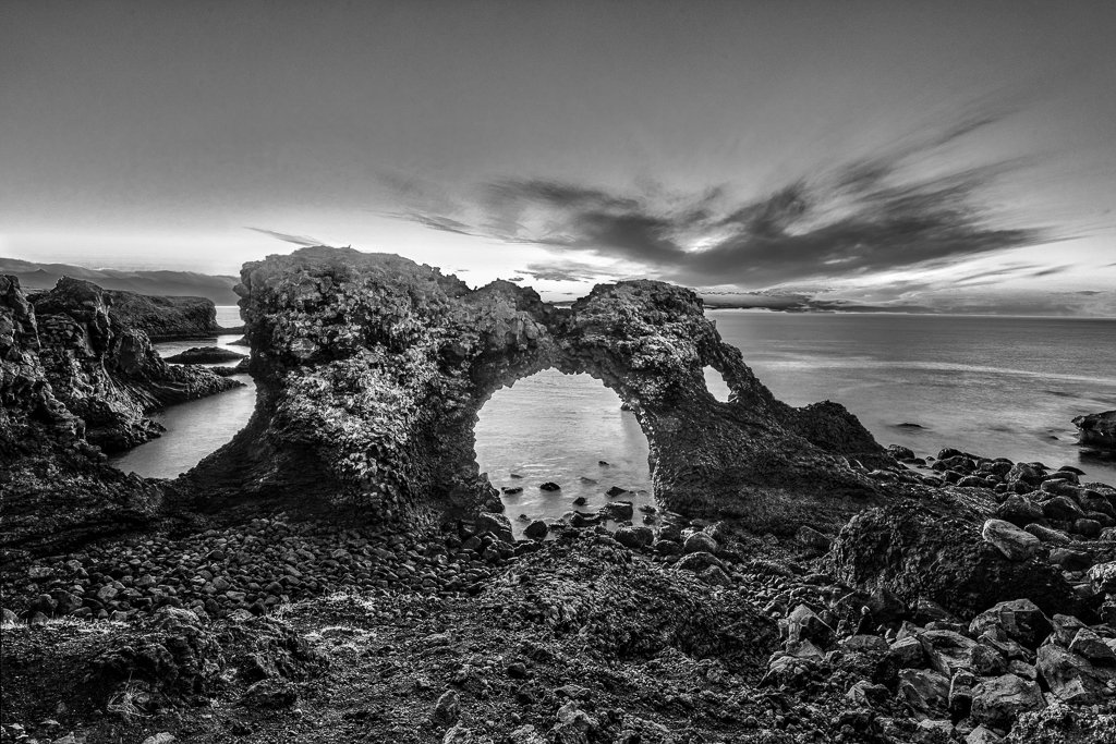
A beautiful scene, but unfortunately the eyes go immediately to the burned-out spot in the sky. My suggestion to improve this picture is: Clone out the burned-out spots. Crop some of the sky, in this case, I think placing the horizon in the middle would work. Lighten the brightest parts of the ice in the foreground to make it pop more. If you make the ice bluer, the complementary colours stand out more. |
Feb 15th |
| 36 |
Feb 20 |
Comment |
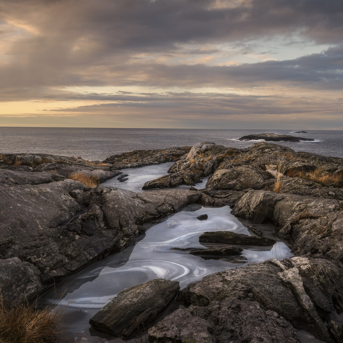
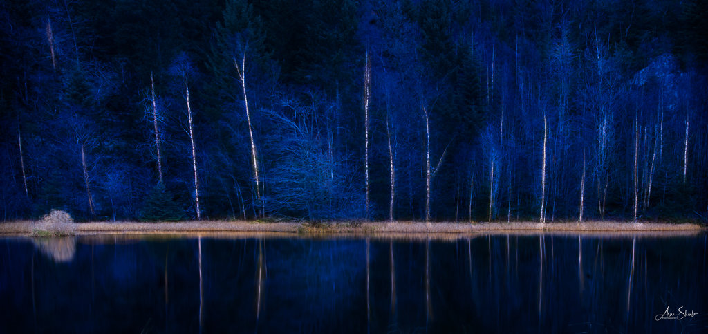
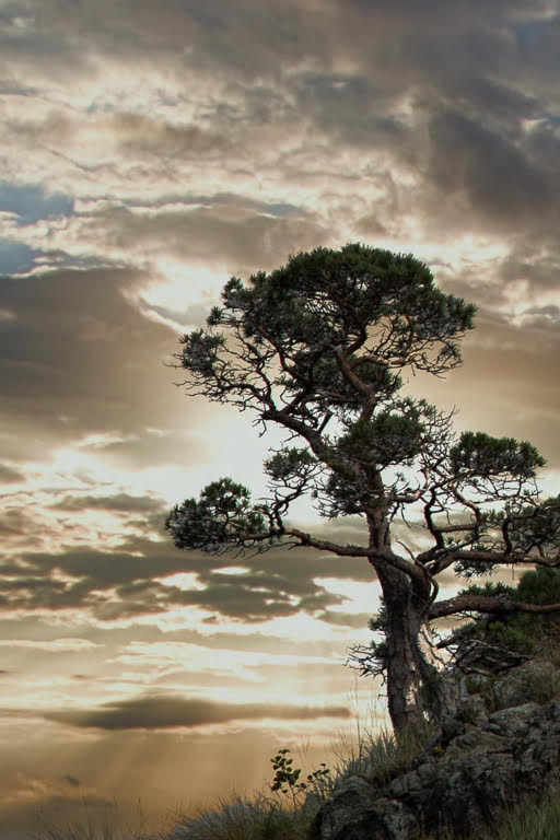
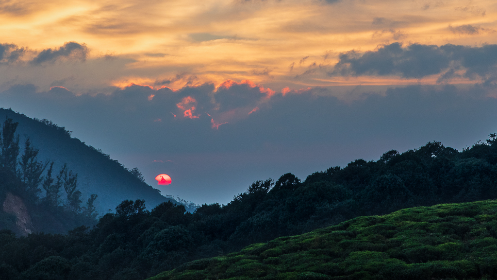
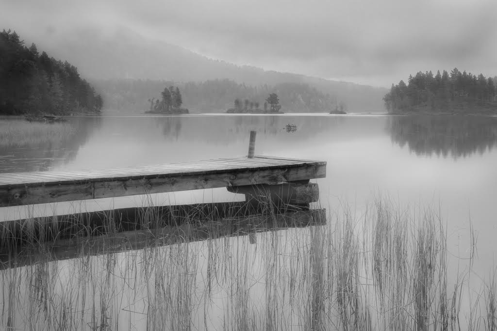
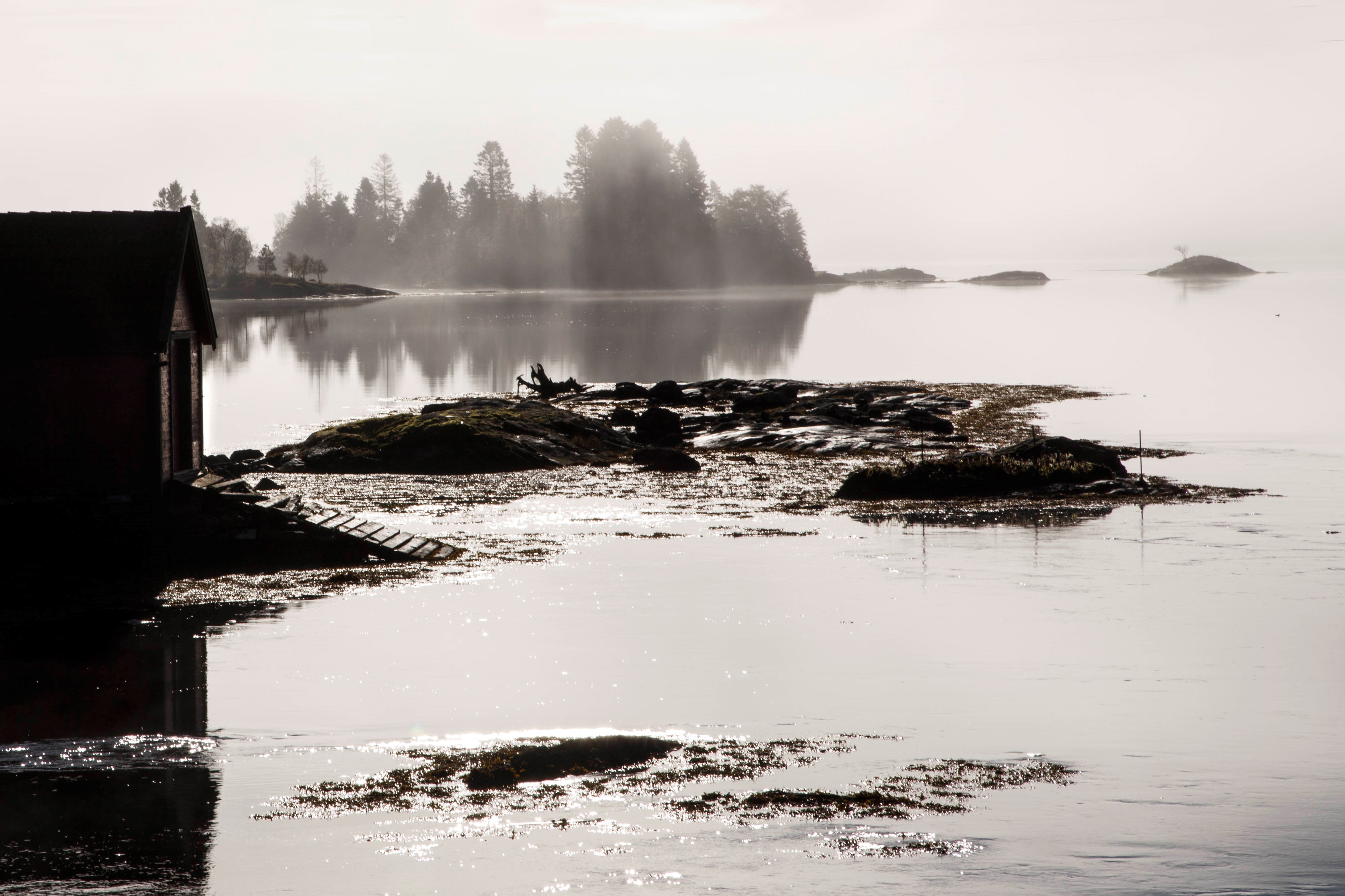
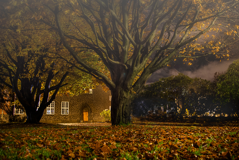
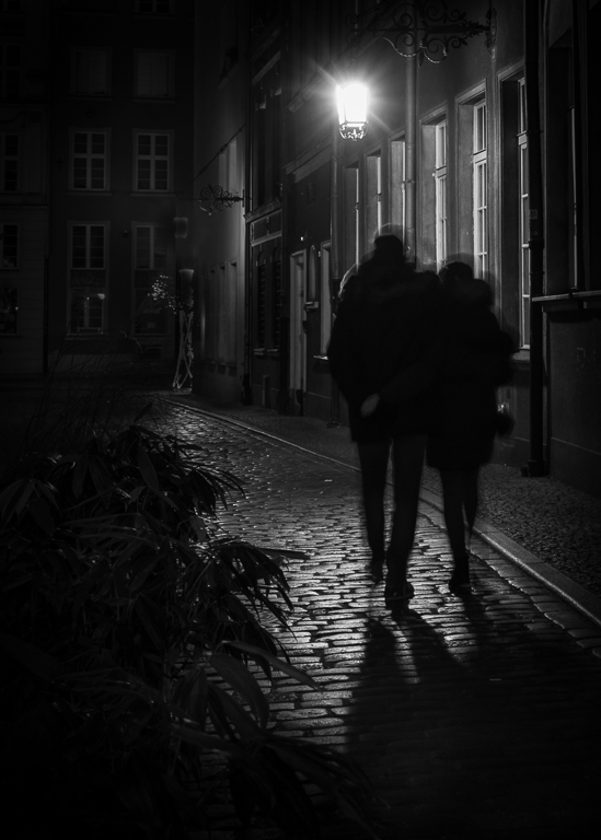
Very well captured, Larry. I liked the silhouettes of the trees against the clouds and fog. You have left some details in the dark foreground, that is very good. Your position is right, positioning the sun just beside the tree. I also like the composition with the vertical tree lines and the diagonal lines of the fog. The dark spot to the right helps to balance the picture.
You could experiment with the white balance making everything more in a blue tone. |
Feb 15th |
| 36 |
Feb 20 |
Comment |
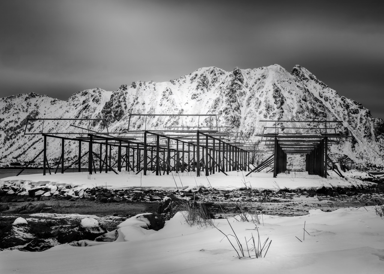
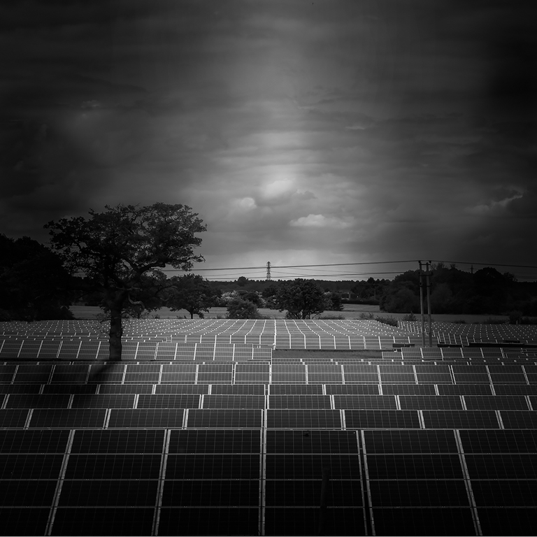
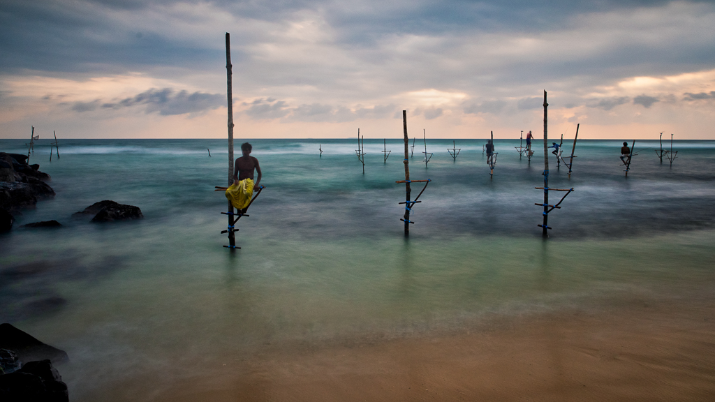
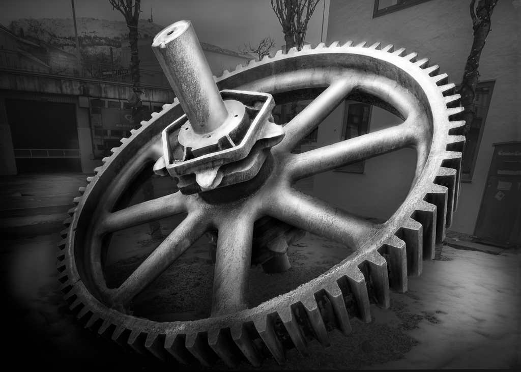
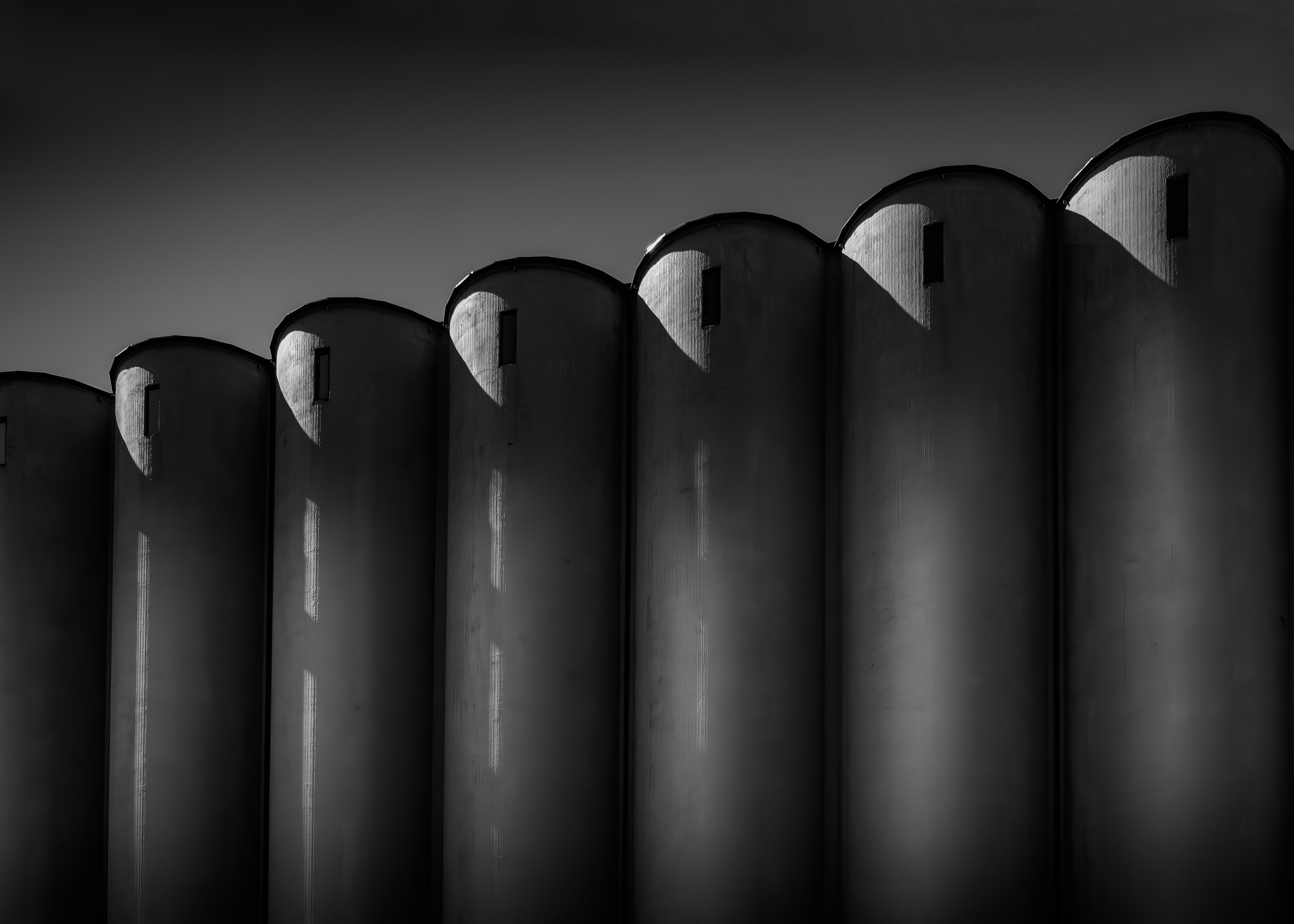
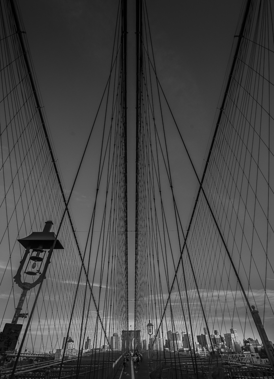
The purpose of our group is to discuss our photos and gradually improve our skills. You are certainly on that path. My first impression is that it was too flat. So by using a brush, you may paint in some darker and lighter areas to make it more interesting.
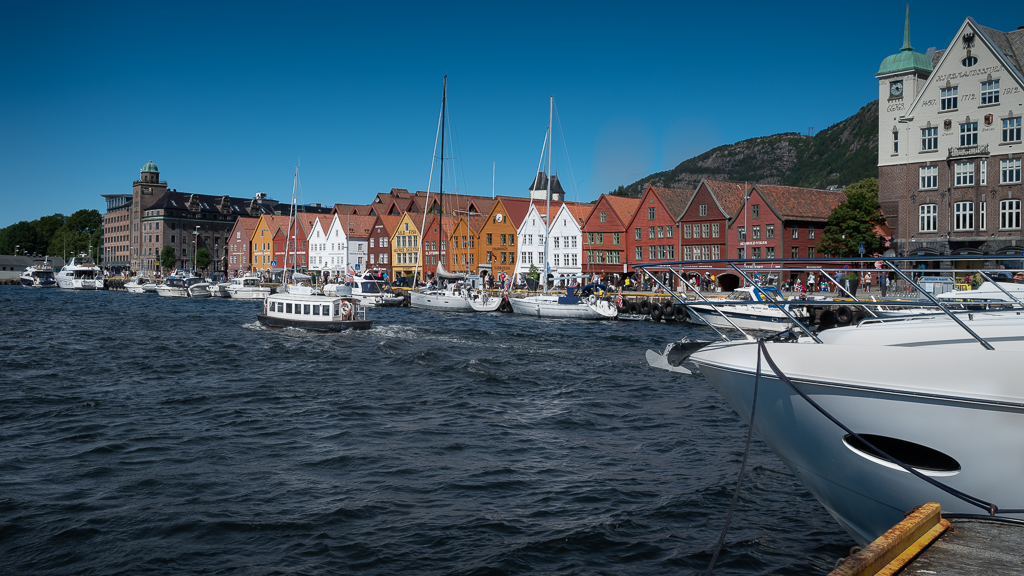
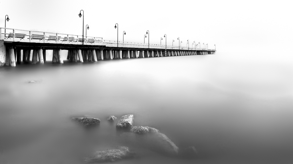
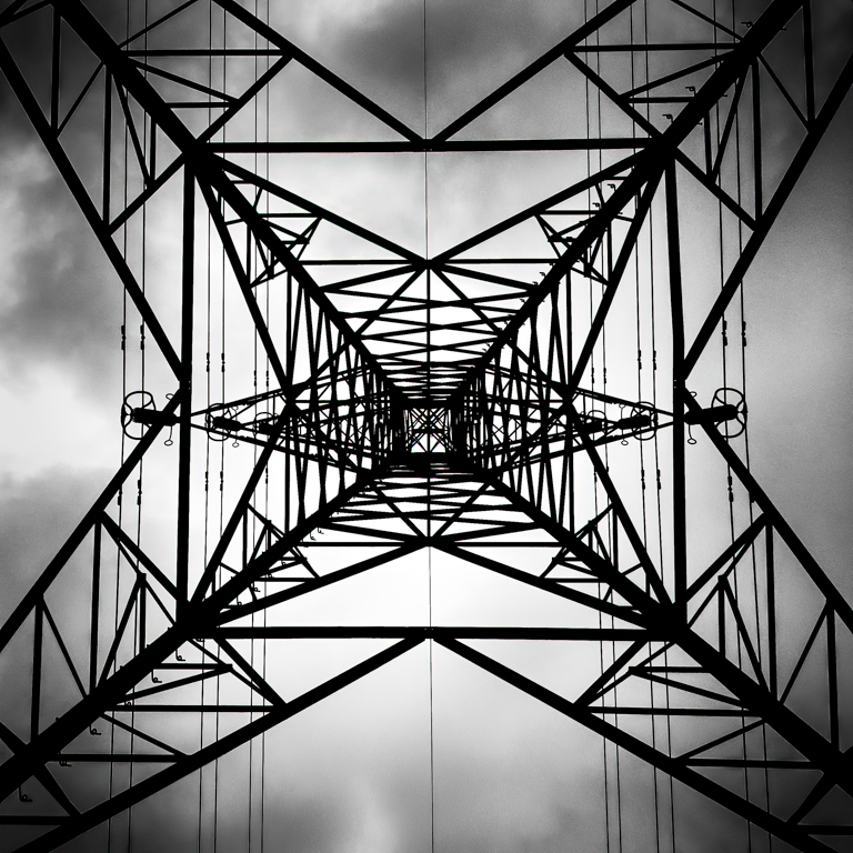
Secondly, there are two motives in one image, one is the landscape and the second is the masts. This is my opinion, and can, of course, be discussed.
My suggestion for this image is to concentrate on the masts and make a graphical impression of that. If you have the chance to go back and use a longer lens and change the position so that you get separation between the masts, I think it will be a stunning picture. |
Feb 15th |
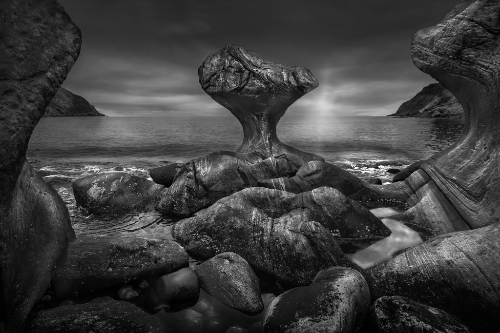
| 36 |
Feb 20 |
Comment |
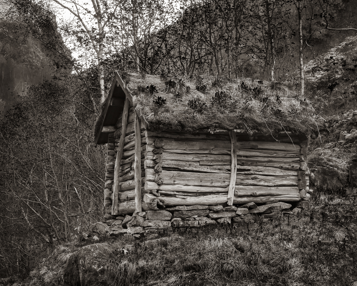
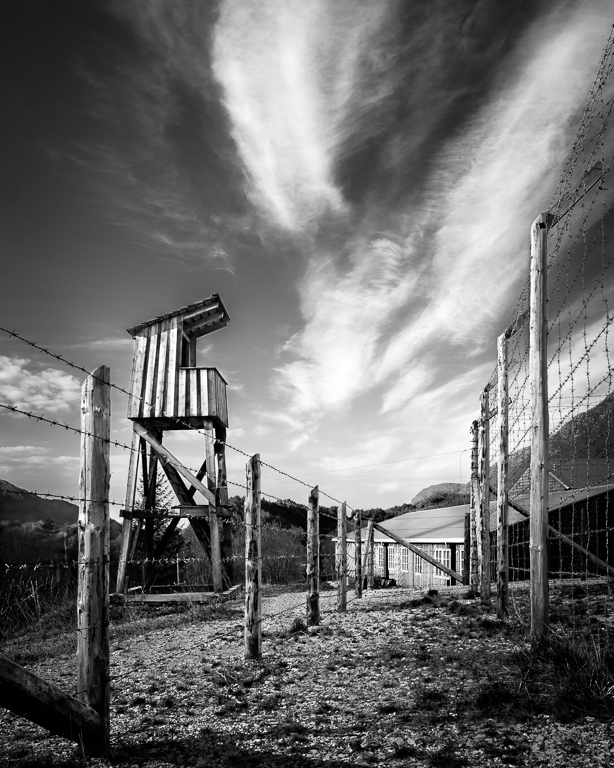
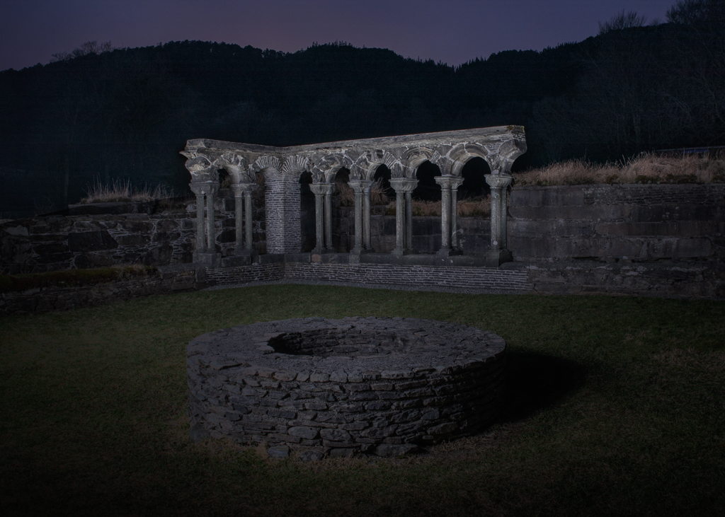
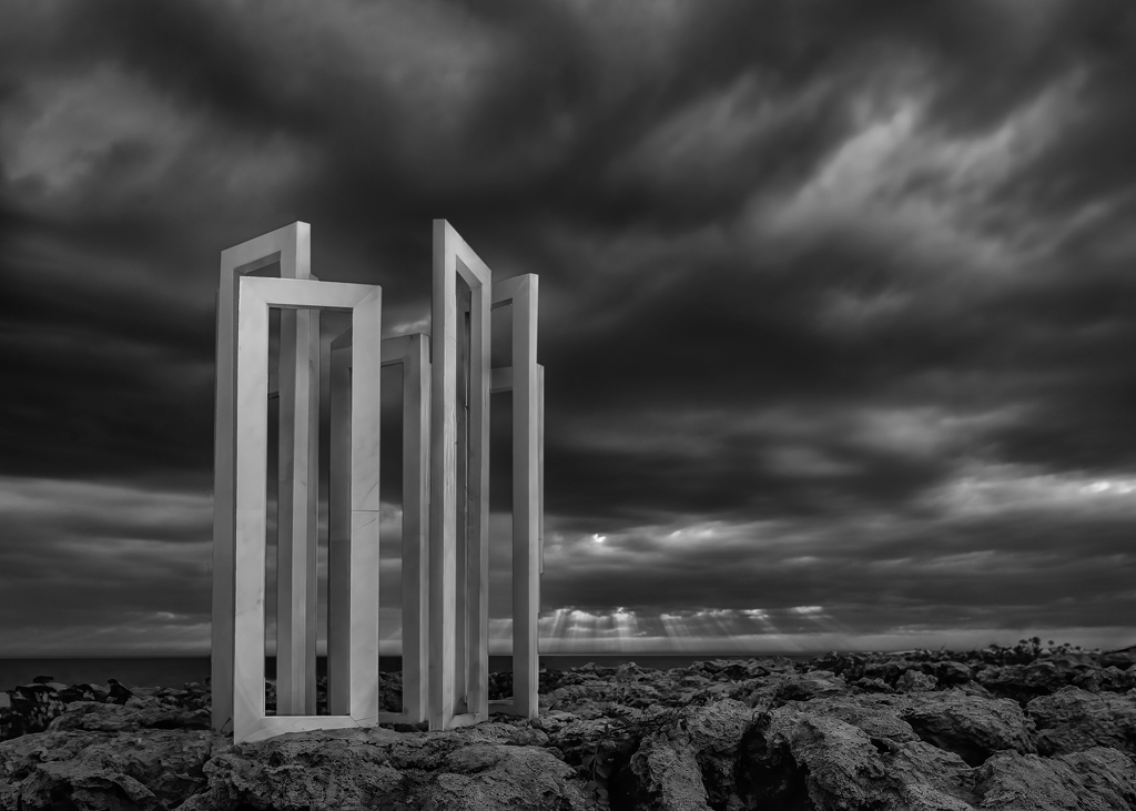
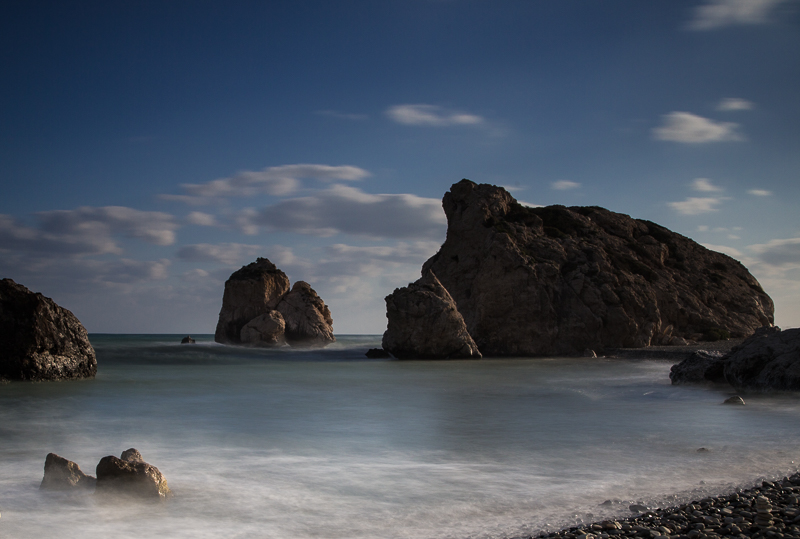
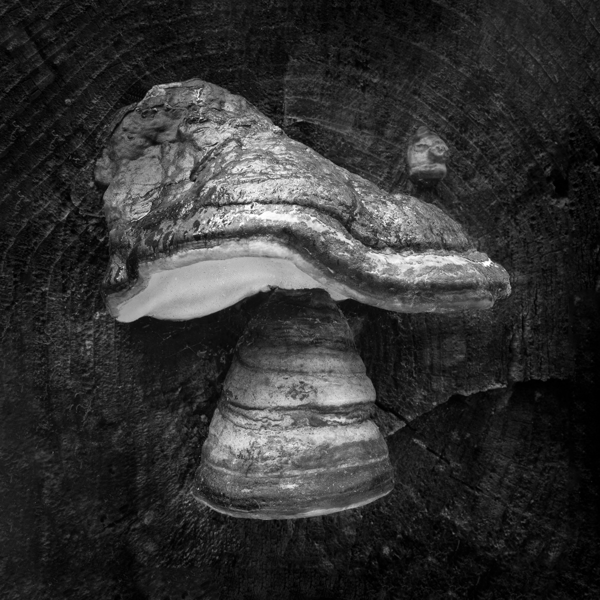
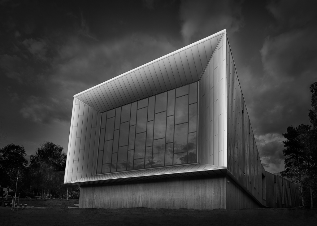
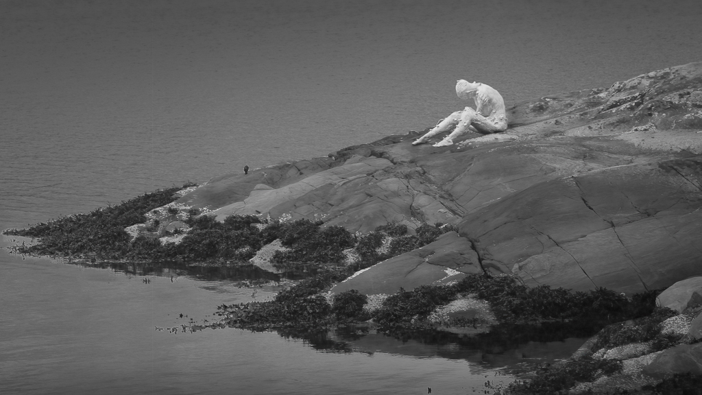
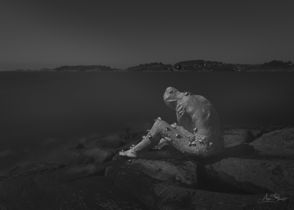
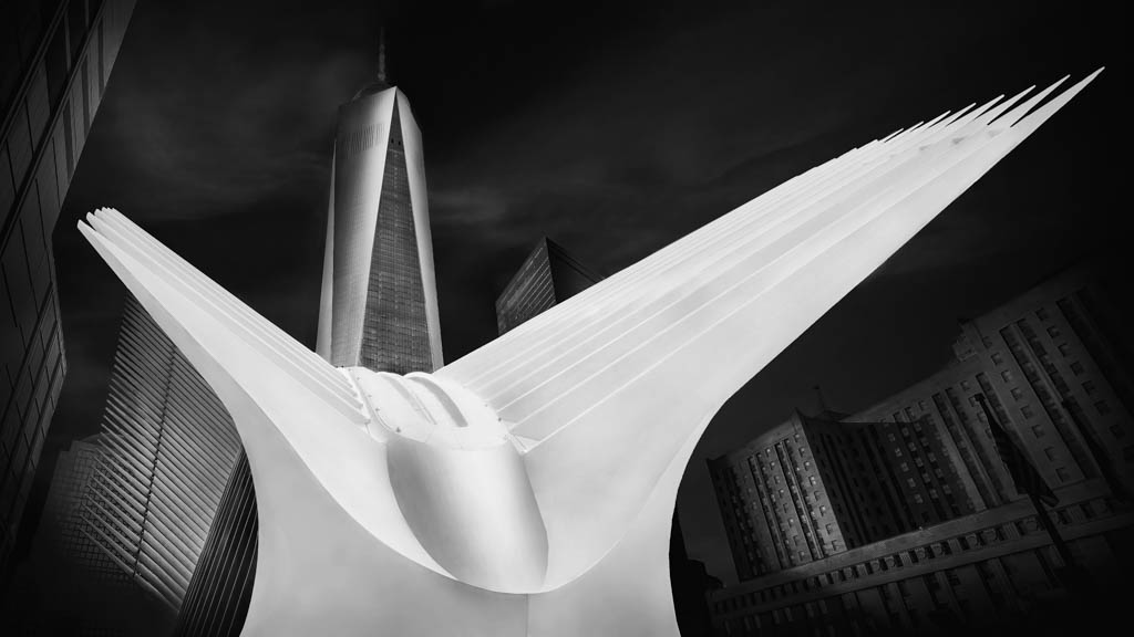
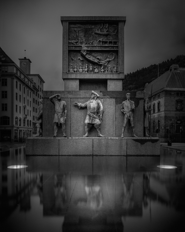
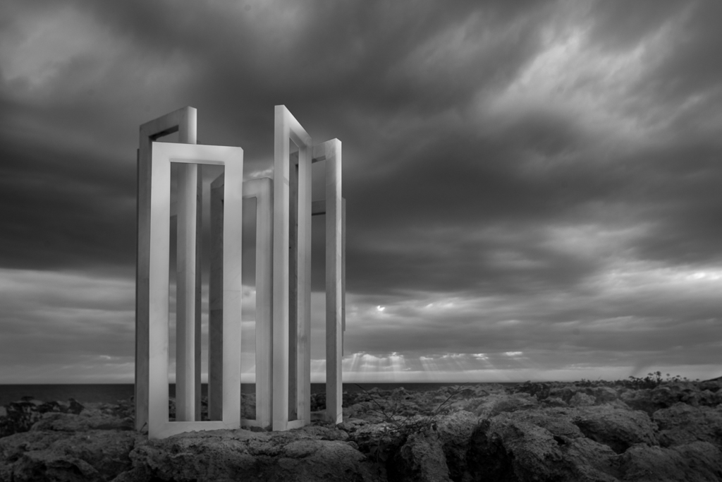
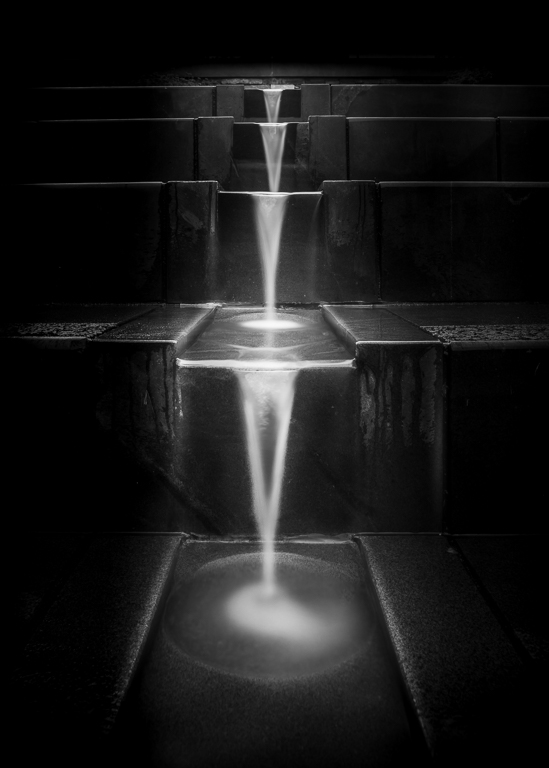
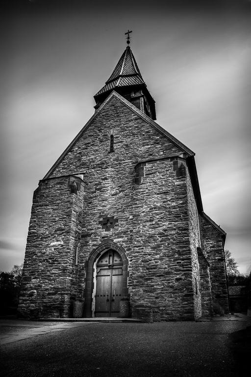
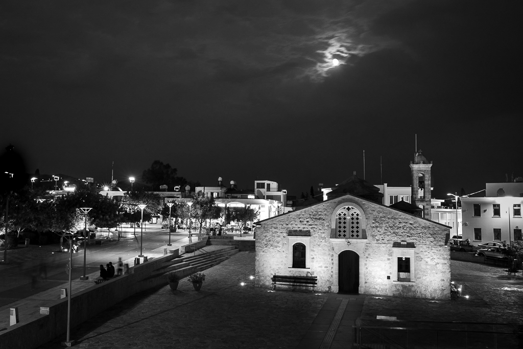
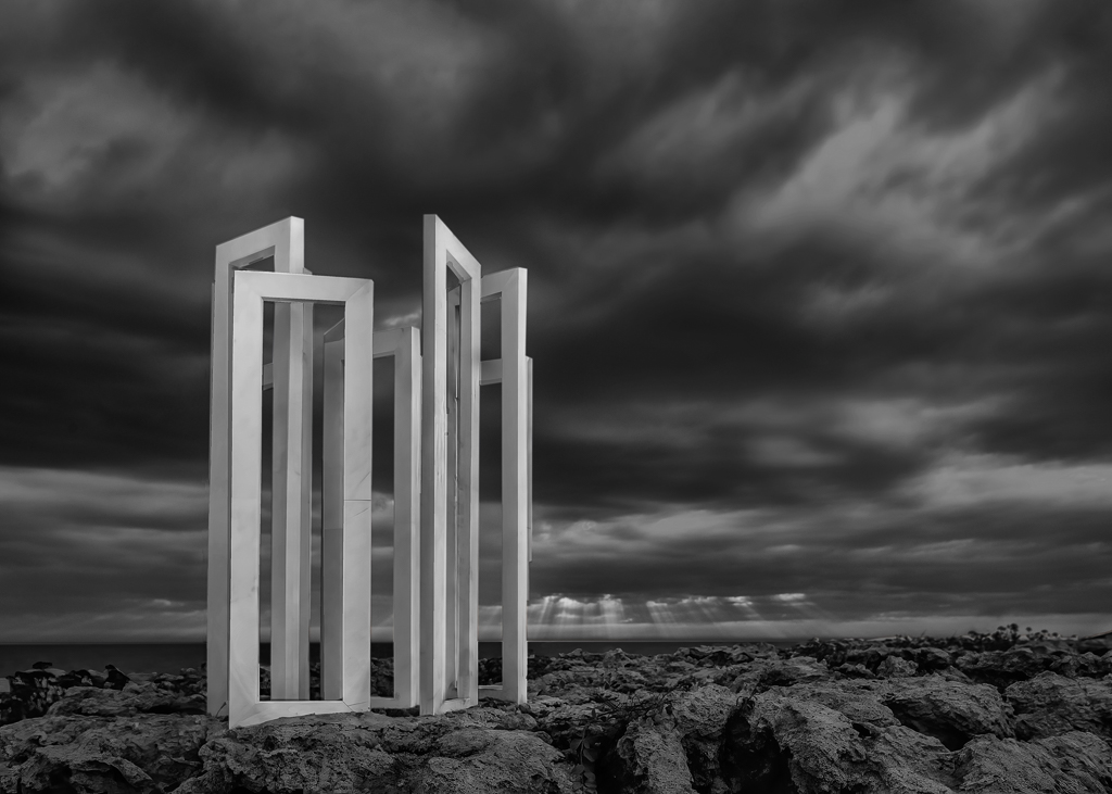
The picture is taken from a low angle, so it looks much bigger than it really is. It is approximately 3-4 metres high. |
Feb 14th |
| 36 |
Feb 20 |
Comment |
Thank you for your encouraging comments.
The name of the monument is Views of Infinity, a sculpture by Charis Paspallis, living on Cyprus. It is part of a permanent outdoor art exhibition close to the harbour of Paphos, located on the west coast of Cyprus. |
Feb 13th |
| 36 |
Feb 20 |
Comment |
I have altered the image as you suggested and here is the result. You were right, it has improved! |
Feb 9th |
 |
| 36 |
Feb 20 |
Comment |
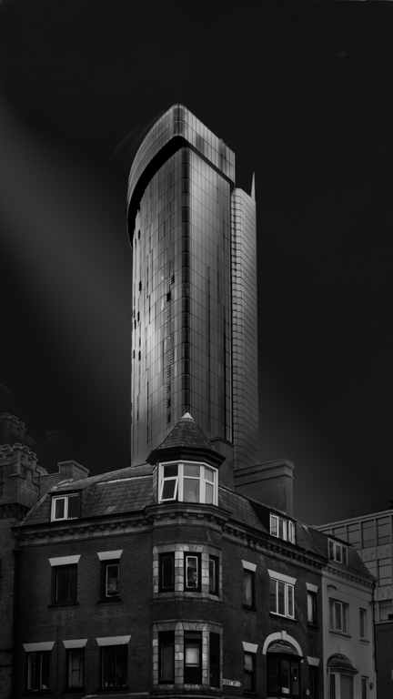
Thank you for your sincere feedback, Michael. I have not used the image in any competitions yet, but have thought about it. I will take your suggestions into account. |
Feb 7th |
| 36 |
Feb 20 |
Comment |
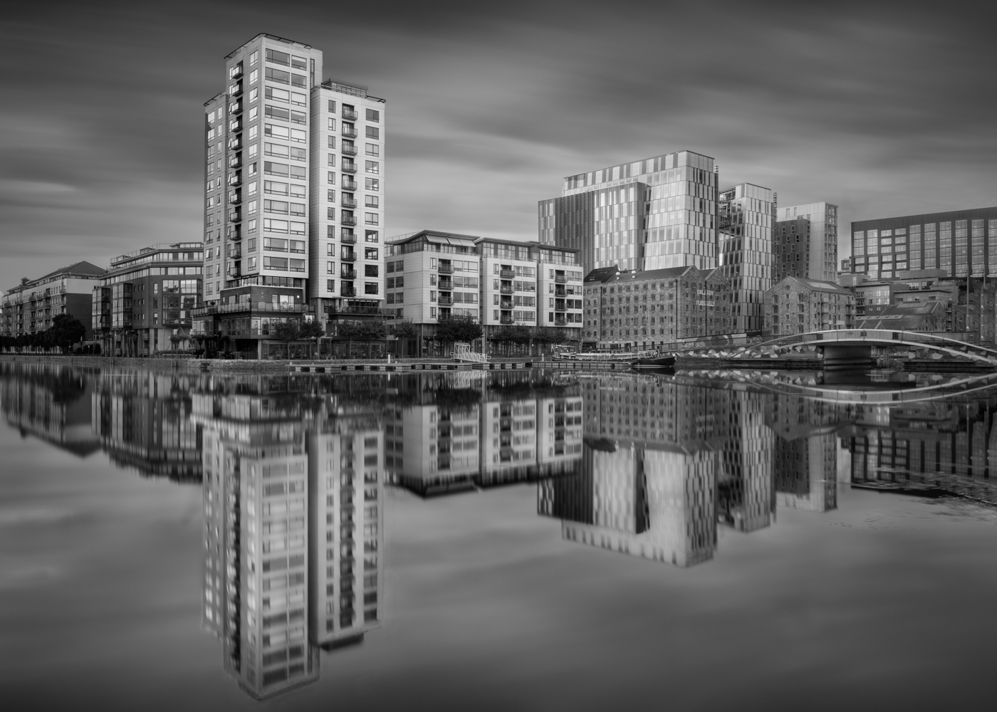
Thank you for your comments. Actually, I brought a tripod and ND filters with me and the intention was to take a long exposure shot, but when I got there, the place was crowded by people taking selfies at the monument. |
Feb 5th |
11 comments - 0 replies for Group 36
|
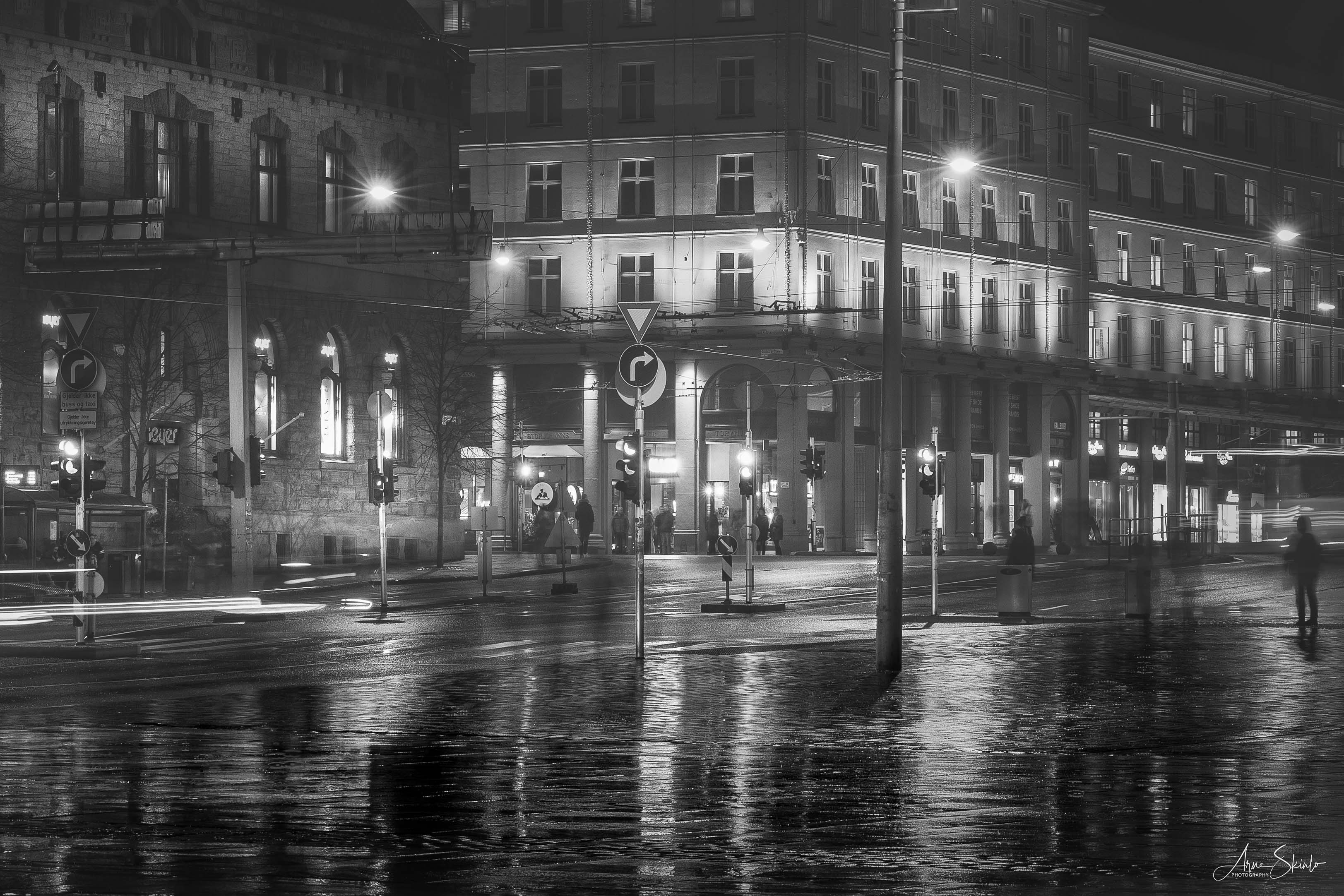
| 74 |
Feb 20 |
Comment |
This is the most common position of people these days, with a phone up in their face. I agree with David in removing the distractions in the background. I think a bit more contrast would given the image more punch. |
Feb 12th |
| 74 |
Feb 20 |
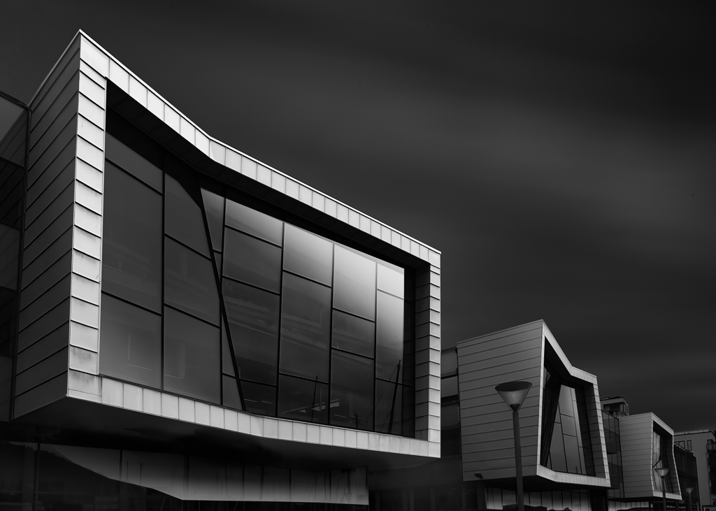
Comment |
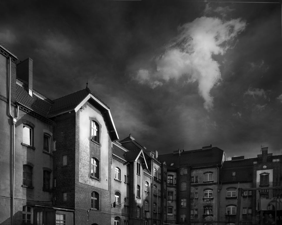
An interesting subject that you have captured very well. Good use of grey tones. My only suggestion is to darken the light from the upper windows as it draws attention from the main subject. |
Feb 12th |
| 74 |
Feb 20 |
Comment |
I really like this image. It has the calmness of a family resting on the savanna. At the same time, the two bigger ones are on alert while the youngest one sees no danger.
You have succeeded well in the conversion to BW with nice grey tones and good dynamic range from white to dark. |
Feb 12th |
| 74 |
Feb 20 |
Comment |
Droplet photography is interesting, but can be frustrating at times. I did it some years ago, myself. The picture is very well shot, it is at the right moment with a lot of "floating droplets". This makes the image dynamic and interesting.
In this case, I think the colour version is most appealing. The problem with the BW version is that, in my opinion, becomes too bleak due to the white background. My suggestion when doing this kind of photography, is to use a coloured background. I backlighted with a big diffusor and a flash with coloured gel. |
Feb 12th |
4 comments - 0 replies for Group 74
|
15 comments - 0 replies Total
|