|
| Group |
Round |
C/R |
Comment |
Date |
Image |
| 36 |
Sep 19 |
Comment |
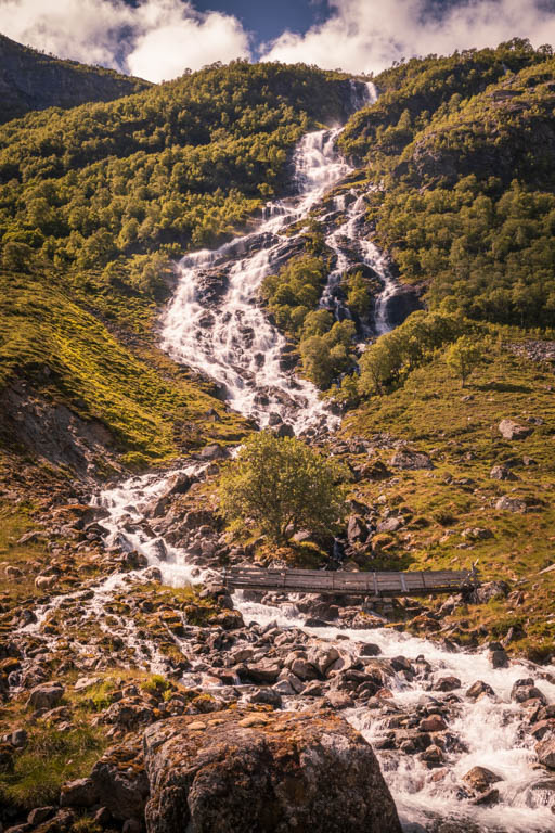
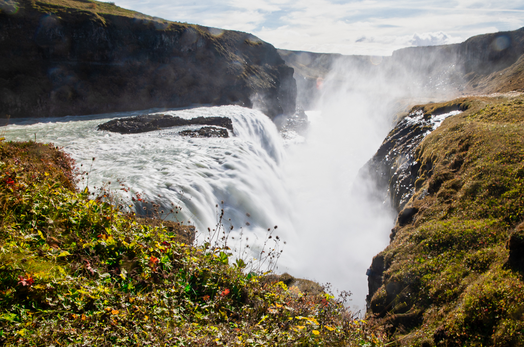
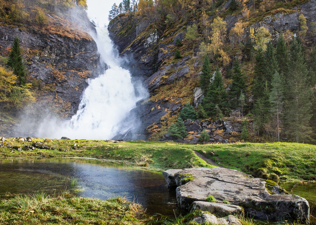
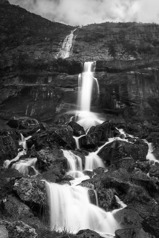
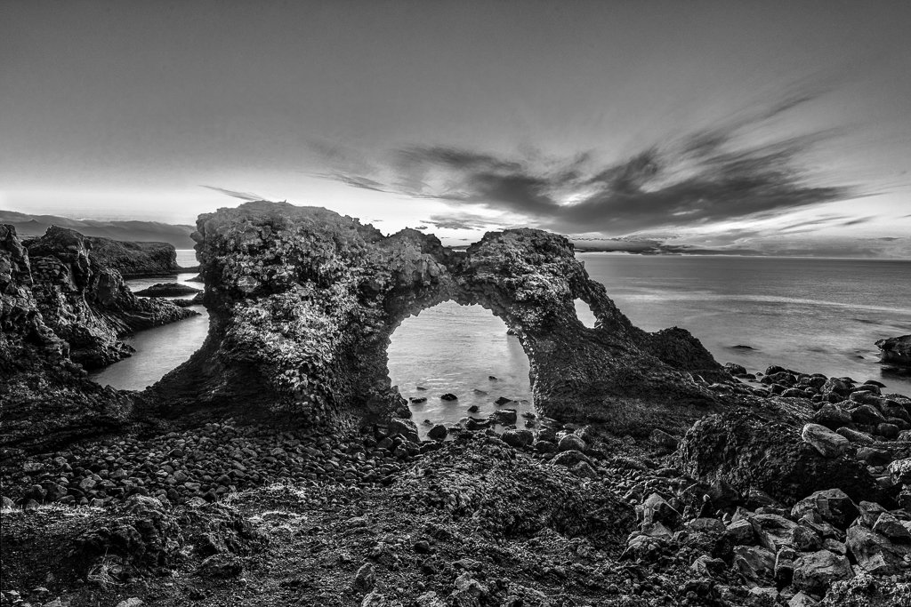
Like the repetitions of the waterfalls that give harmony. Would also, as Michael suggested, darkened the bushes to the right. Would also darken the rocks at the bottom to make more contrast to the water. |
Sep 9th |
| 36 |
Sep 19 |
Comment |
A beautiful shot from Gullfoss. I was there a year ago and I know it is not easy to make any good pictures in a limited time with crowds of people everywhere. The wind is more or less constant I think up there. I agree with the others about the cropping. Also, agree with Michael about darkening the left corner to draw more attention to the waterfall. |
Sep 9th |
| 36 |
Sep 19 |
Comment |
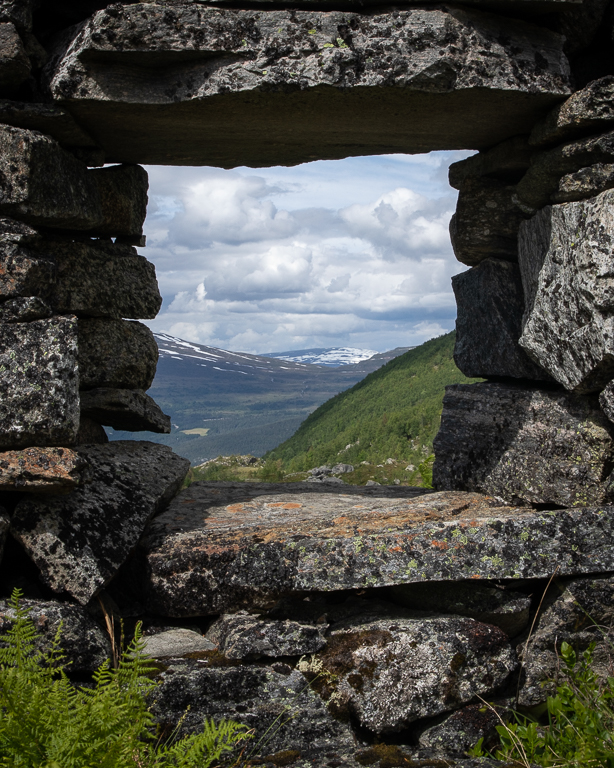
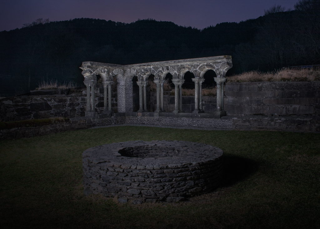
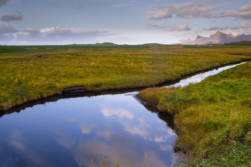
I agree with Michael about the clouds. I would suggest darkening the whole picture or at least parts of it to enhance the drama. The sign has already been mentioned. |
Sep 9th |
| 36 |
Sep 19 |
Comment |
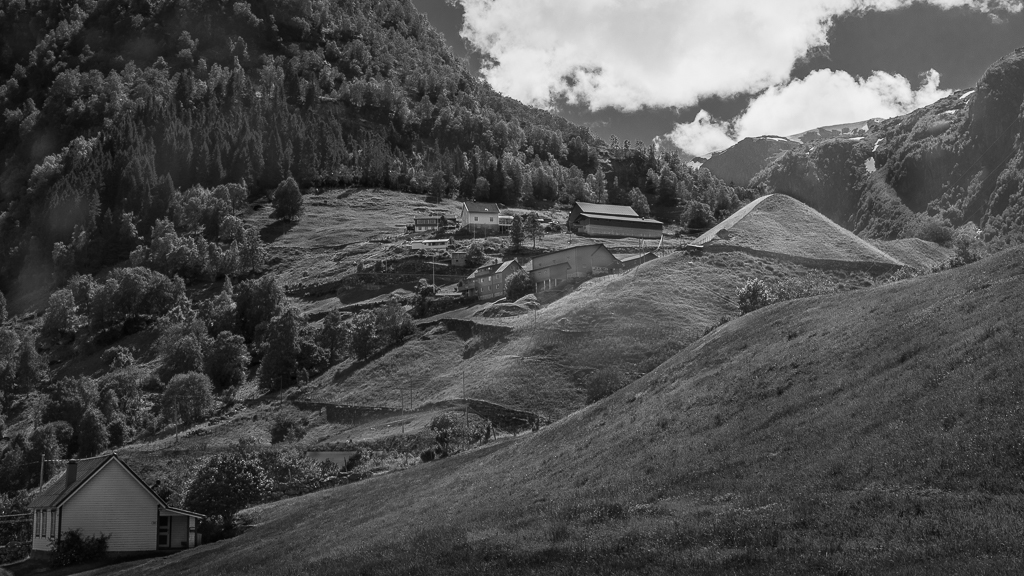
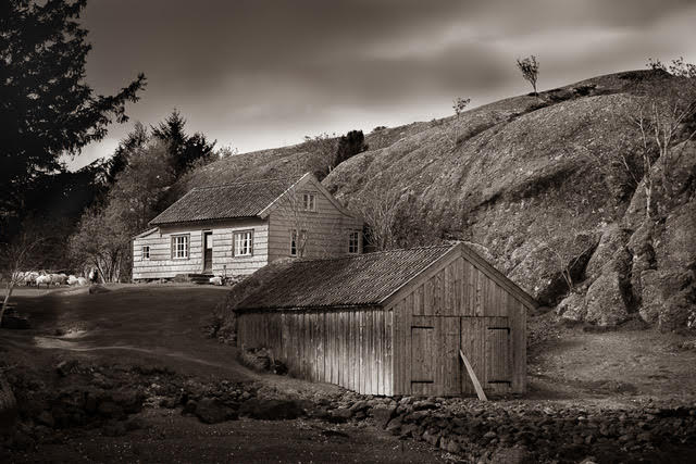
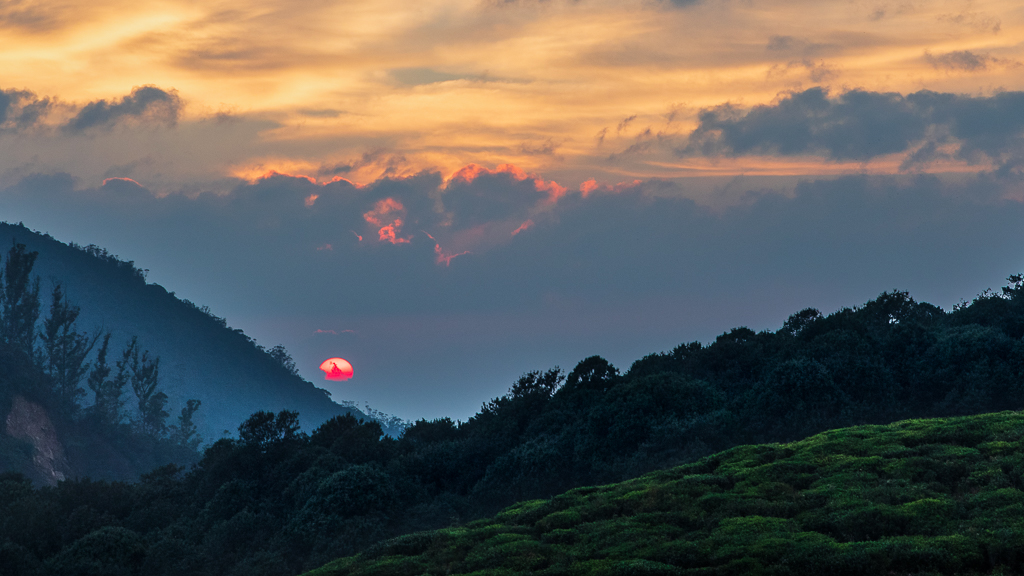
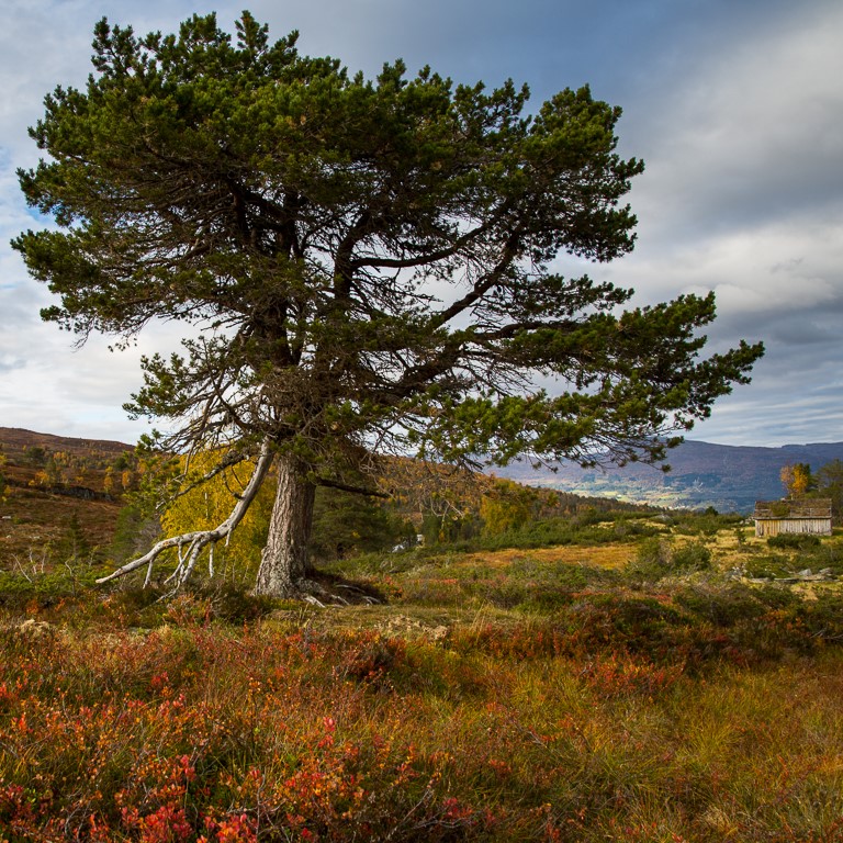
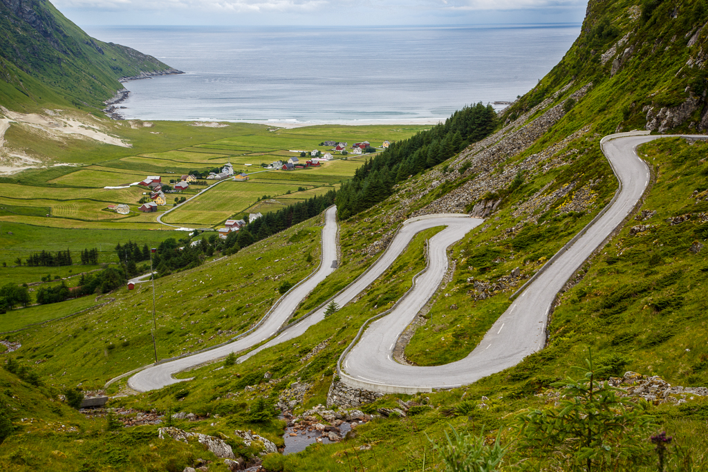
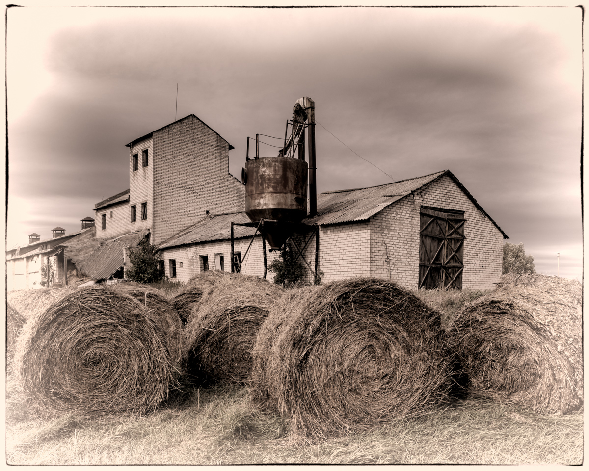
An image with a nostalgic feeling. I liked the contrasts in the fields, in particular, the yellow area to the left. The road leads the eyes from the old house into the mountains. My first attention when I saw the picture was the clouds. In my opinion, they are of secondary interest and could be toned down. |
Sep 9th |
| 36 |
Sep 19 |
Comment |
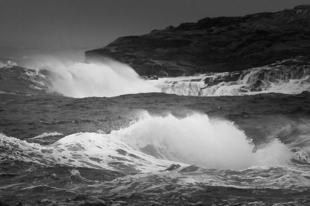
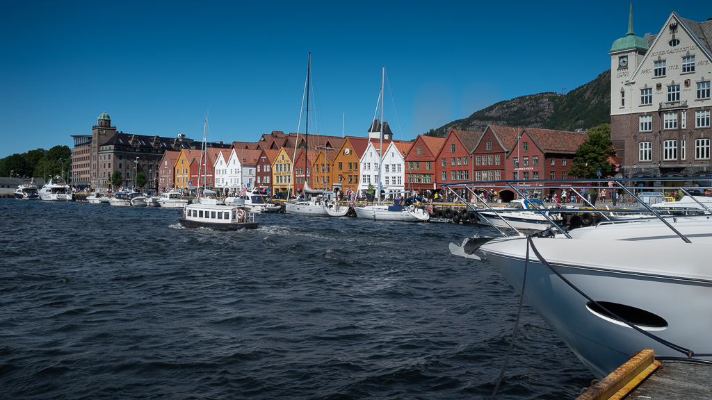
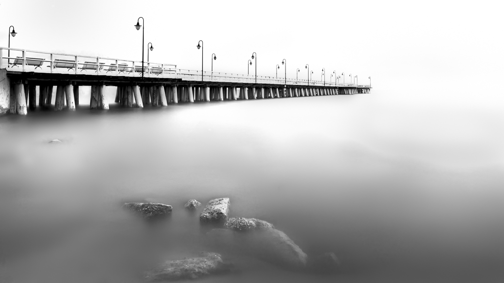
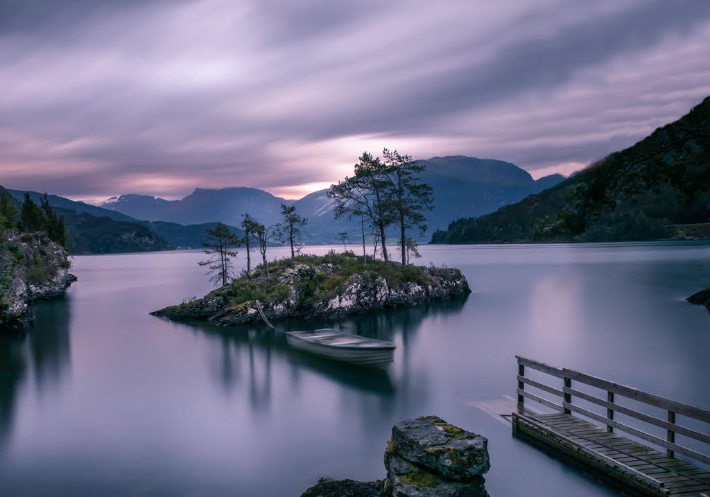
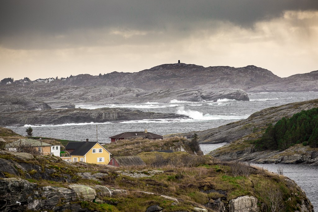
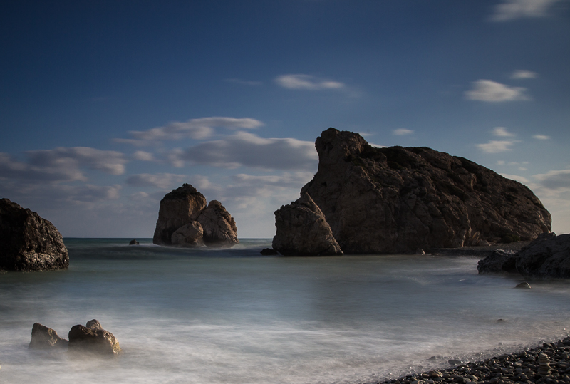
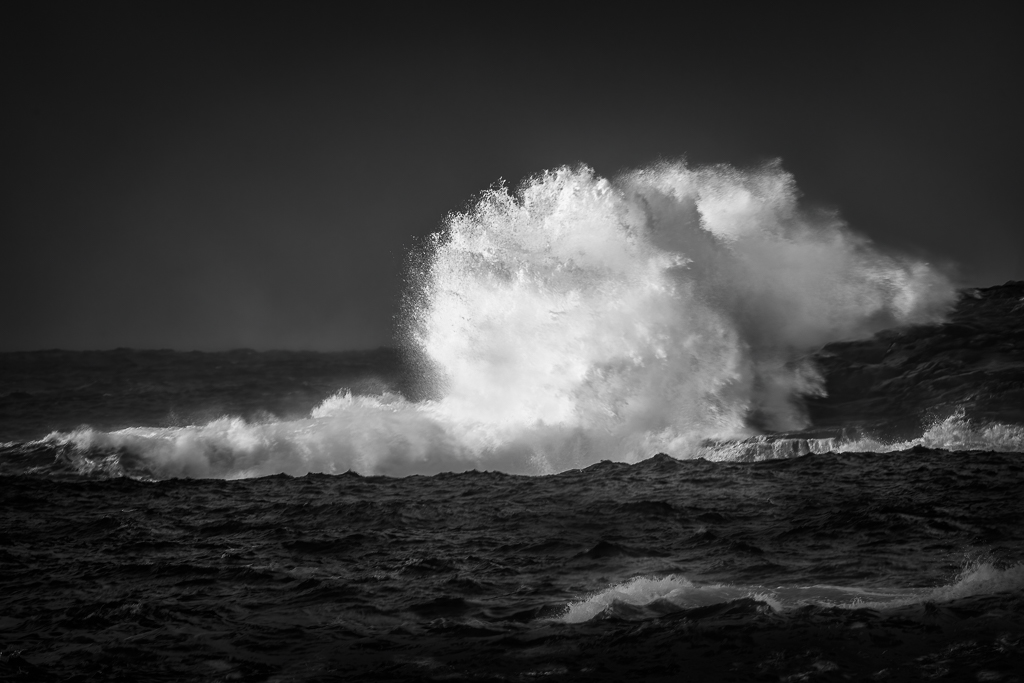
A picture to hang on the wall! Beautiful and clean colors. It is amazing that the waves are so correctly stitched together. Just love it. |
Sep 9th |
| 36 |
Sep 19 |
Comment |
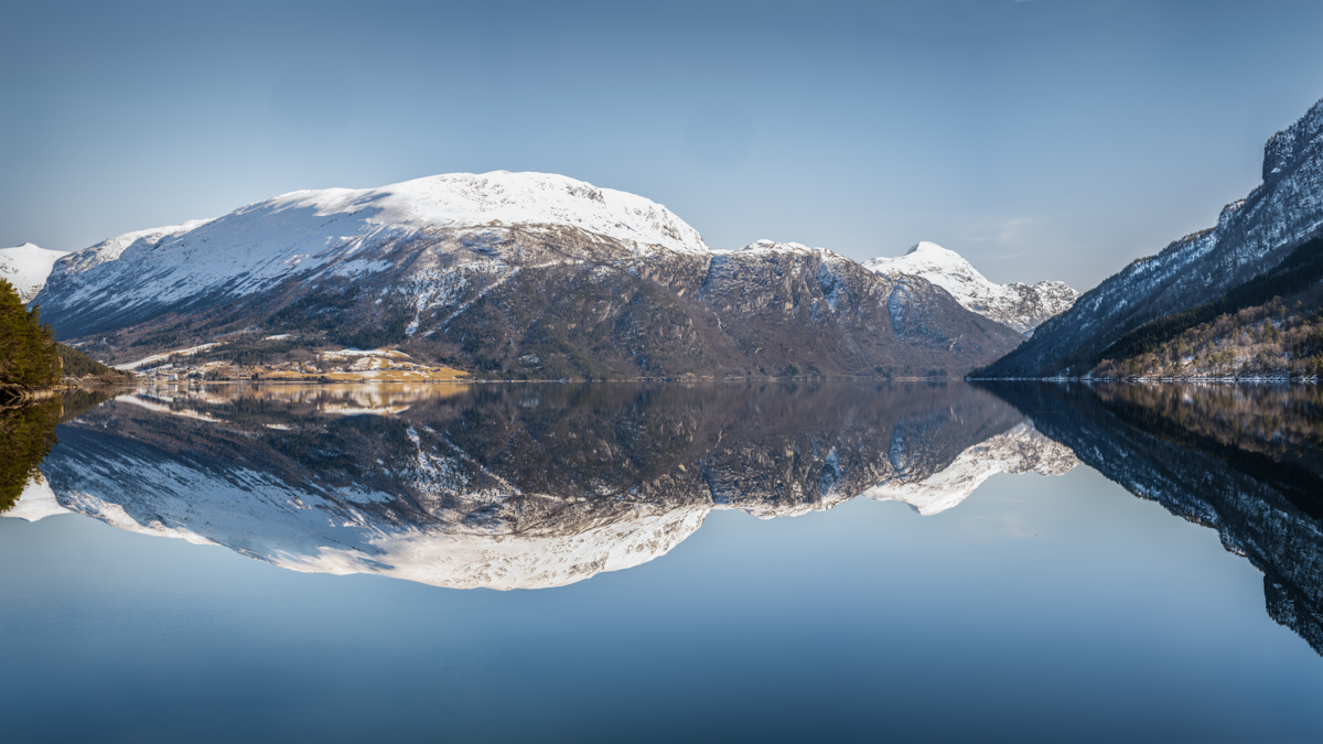
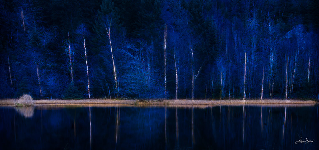
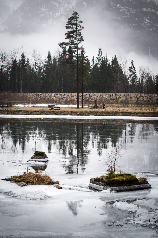
Thank you, Richard. I was on the other side of the lake. |
Sep 7th |
6 comments - 0 replies for Group 36
|
| 74 |
Sep 19 |
Comment |
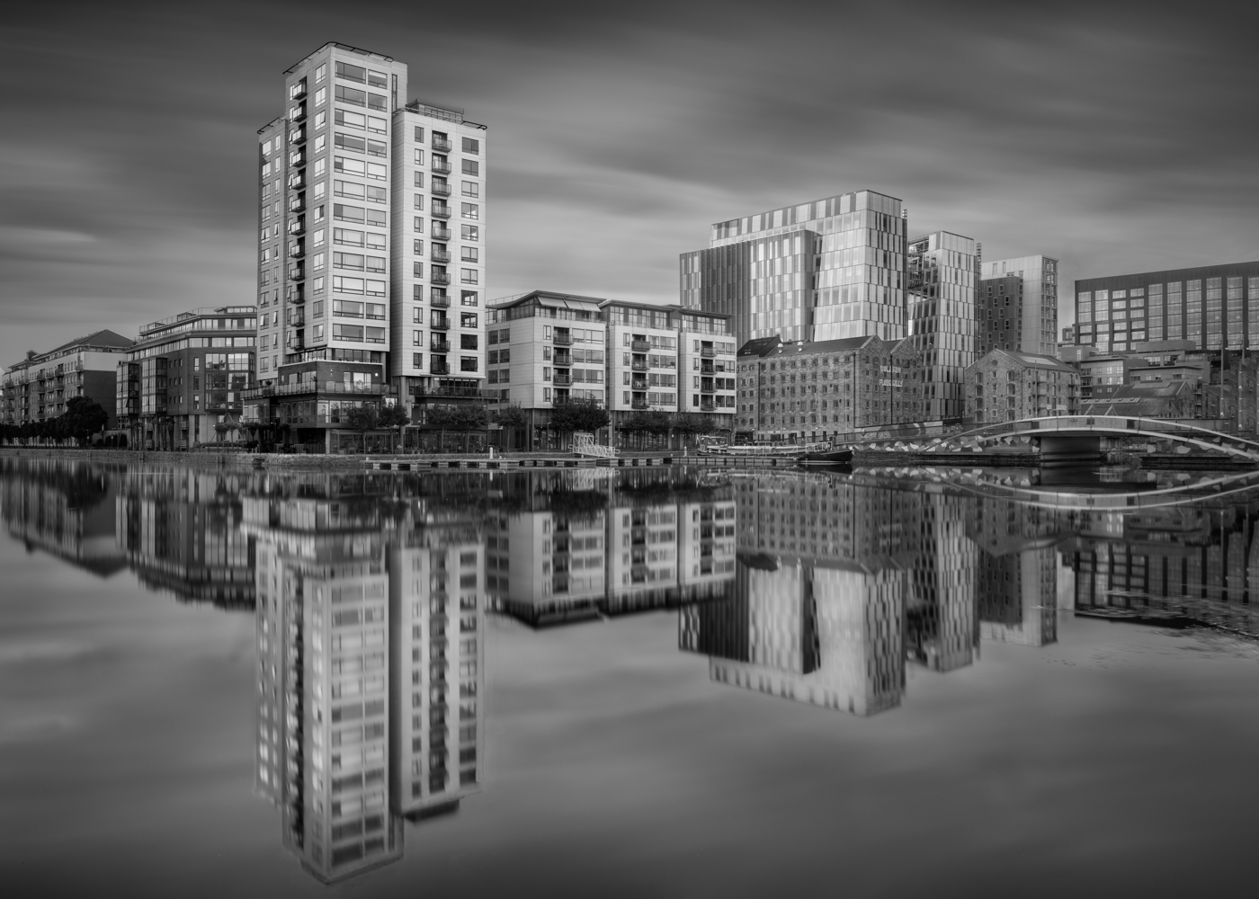
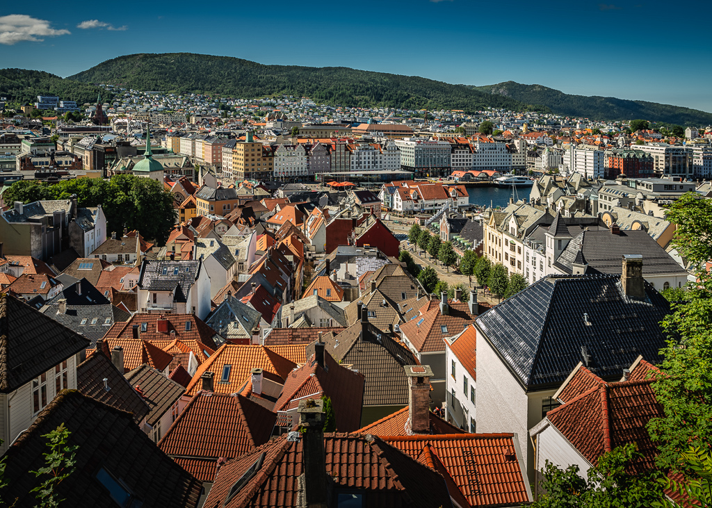
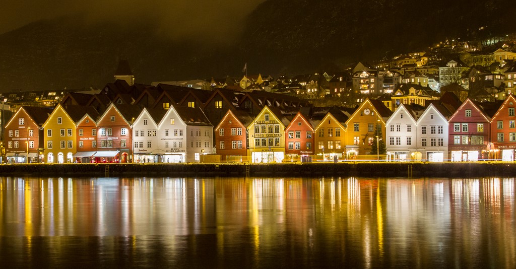
Thank you all for your comments. I have taken your advice and cropped the building to the left and darkened the tower in the background and the buildings to the left. This improved the image a lot.
This is one of the great benefits of being in a group like this and receive a sincere and constructive critique. |
Sep 23rd |
| 74 |
Sep 19 |
Comment |
A picture packed with drama and action. What will happen next? I liked the composition, but I agree with David that the background could have been more blurred. I think you could have gone down to f4 since the object is almost flat. About the post-processing, I think it is better to adjust the contrast after conversion to B&W since the colors have different luminosity. |
Sep 23rd |
| 74 |
Sep 19 |
Comment |
I agree with David and Pamela that it works better in colors. However, since you have decided to make it B&W, we shall accept that. It is sharp with good texture and the turkey stands well out from the blurred background. I see you have chosen a sepia tone. In my opinion, the image would look crisper in plain black and white. Just my preference. I like the composition. |
Sep 23rd |
| 74 |
Sep 19 |
Reply |
Thank you, David, for sharing this tip with us. I have heard about it, but haven`t used it. Now I tried it out on some of my pictures and it works fine. Experimented with different blending modes to get different effects.
For those of you not so familiar with Photoshop, here is a more detailed description:
- Make a new layer and go to Edit -> Fill -> 50% Grey -> OK
- In the Layer section, change from Normal blending mode to Overlay (you may change this later)
- Choose Brush and start painting. If you want less effect, reduce layer opacity. If you want more, copy the layer. |
Sep 8th |
| 74 |
Sep 19 |
Comment |
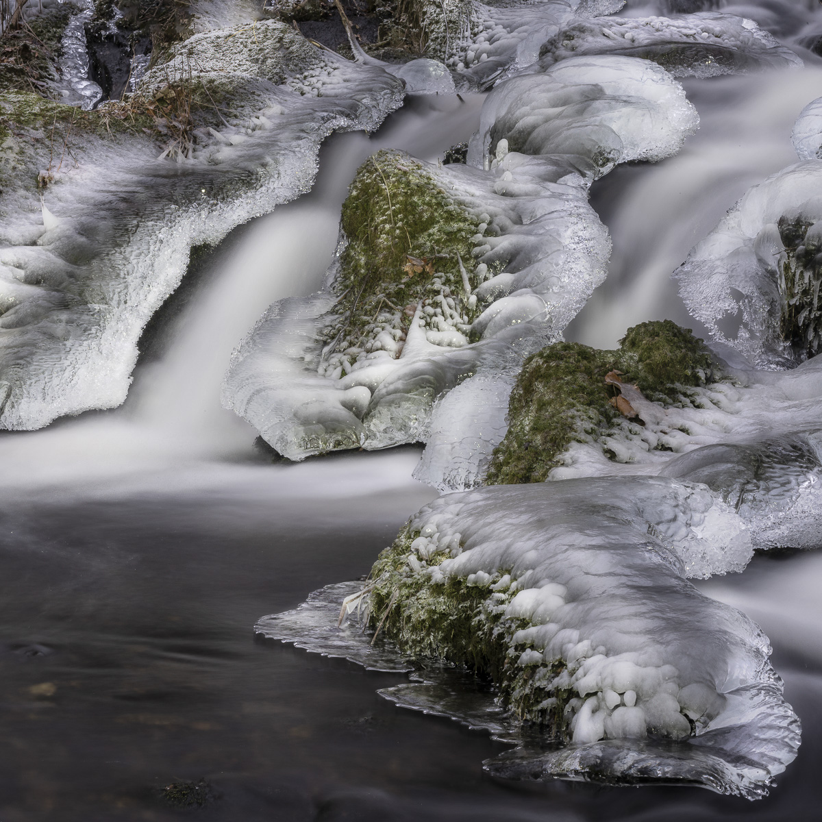
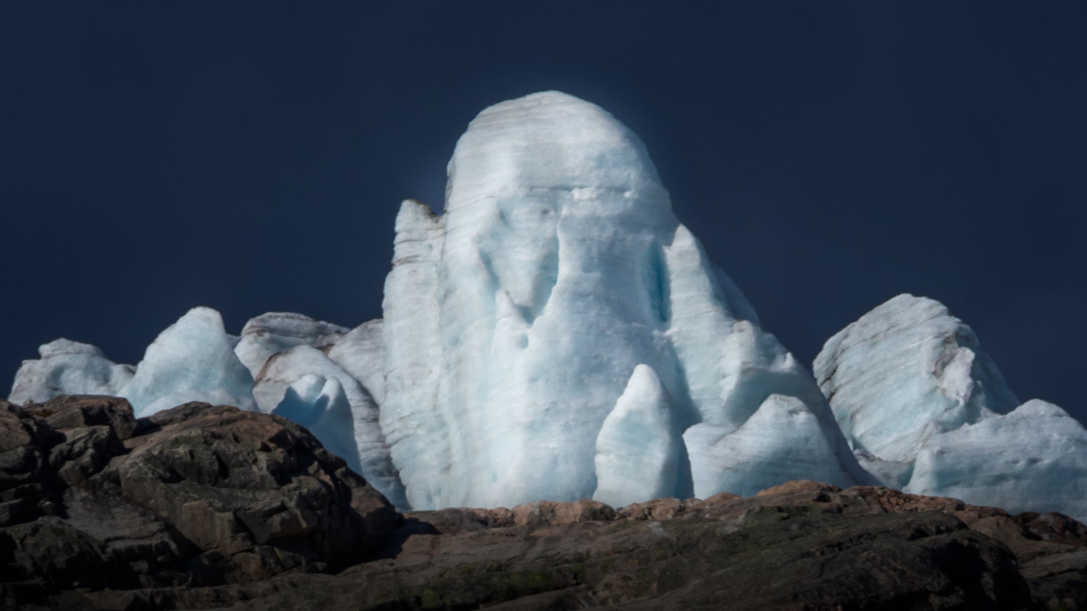
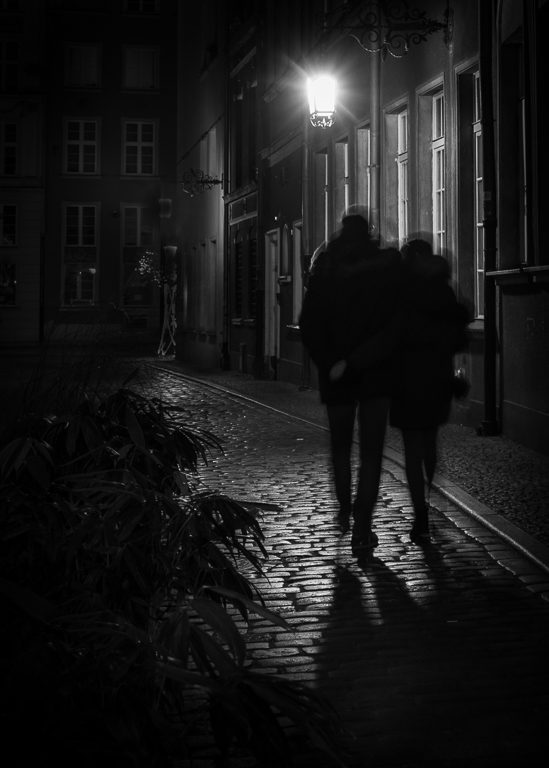
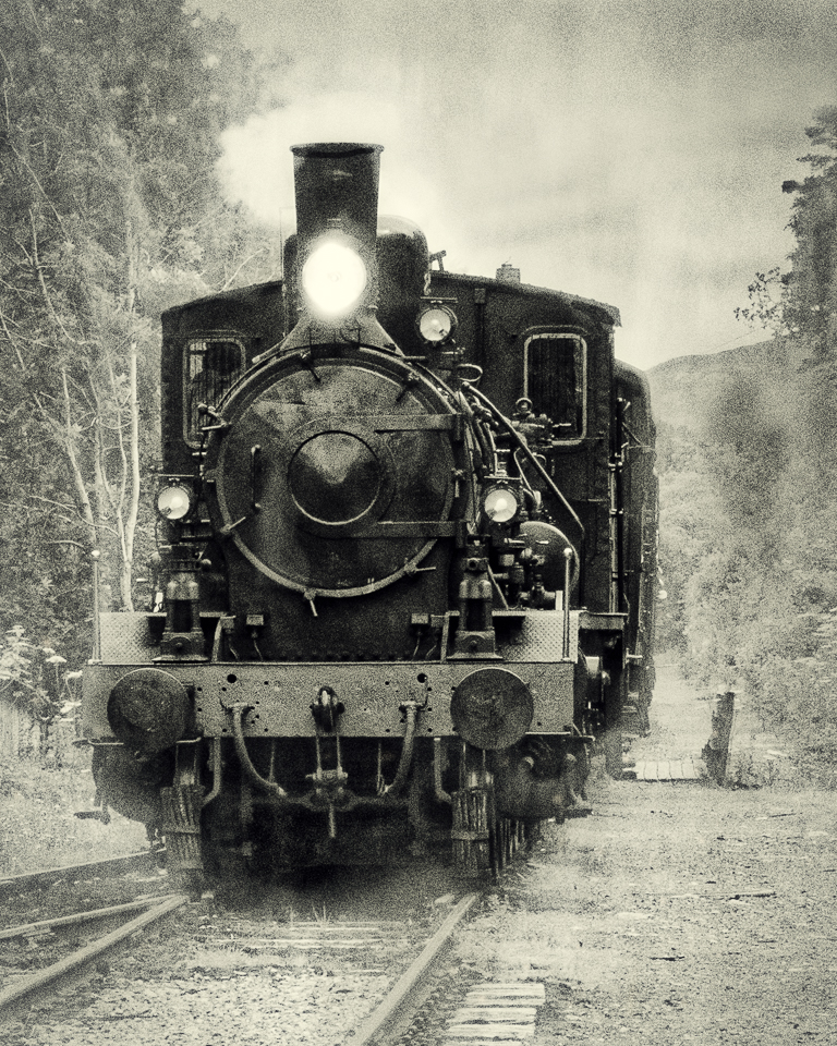
This image has a lot of mystique. A man in black walking on a forbidden drive in dramatic light.
I am a bit in doubt about the foreground. It is too dark to see any details and not completely black. In my opinion, most of the dark foreground could be cropped out. I have not tried it out, but I think that lighting the icicles slightly would added drama to the image.
|
Sep 3rd |
| 74 |
Sep 19 |
Comment |
A very well captured picture, David! I like the expression of the two, the mother on the alert and the child more relaxed. It has a good distinction between the object and the background and a good tonal range. Looking at it purely as a picture, I would clone out the bush beside the child as it takes some attention. If it is a nature picture, that is not allowed as far as I know. Only a small detail anyway.
A very good start. Look forward to seeing more from you! |
Sep 3rd |
| 74 |
Sep 19 |
Comment |
I think you have done remarkably well with this image, Angela. The depth of field is good with the completely blurred background and the insect sharp. The contrast in the wings is good.
If I should point out any improvements, it would be to darken and blurred the leaf and the branch in the foreground that competes with the attention of wings.
All in all a very good picture!
Whether you should change the green before or after conversion is of academic importance to me. To me it makes sense to do like you have done since then you see what happens. |
Sep 3rd |
6 comments - 1 reply for Group 74
|
12 comments - 1 reply Total
|