|
| Group |
Round |
C/R |
Comment |
Date |
Image |
| 36 |
May 19 |
Comment |
At first sight, I thought it was from Norway, but New Zealand has much of the same nature. I like the gradient from the top and down and also the V-shaped framing. |
May 15th |
| 36 |
May 19 |
Comment |
Agree with the others about cropping to 16:9 and lighten the dark cliffs. Apart from that, well-captured beautiful scenery. |
May 15th |
| 36 |
May 19 |
Comment |
Agree with the others about cropping to 16:9 and lighten the dark cliffs. Apart from that, well-captured beautiful scenery. |
May 15th |
| 36 |
May 19 |
Comment |
Well exposed, it is always trials and errs about how long shutter speed to use in cases like this, but I think you have succeeded well. Good framing between the posts. To me, it is OK with the slightly blown out flames. |
May 15th |
| 36 |
May 19 |
Comment |
The focal point is simple and very clear. I think the tractor is from the 50s, so it seems that time has been standing still in this area. That gives me a relaxing mood. |
May 15th |
| 36 |
May 19 |
Comment |
Very good use of colors. I like the composition. For some reason, my second attention was the fence on the left side, so I agree with Richard in cloning it out. |
May 15th |
| 36 |
May 19 |
Comment |
Being the last one to comment, most is already said. I agree with cropping the sky. I find the sign a bit distracting, but on the other hand, it is part of the scene, so I think I would let it be. |
May 15th |
7 comments - 0 replies for Group 36
|
| 74 |
May 19 |
Comment |
I tried first with Content-Aware that did not work out well. Then I used the Clone-Stamp tool that did the trick with about 60% opacity. |
May 19th |
 |
| 74 |
May 19 |
Comment |
Hi Alicia. I was thinking of using the Clone Stamp tool, or Content Aware in Photoshop. Just a minor adjustment. These are very useful and easy to use tools. If you have not used them, I would suggest going to Youtube to find out. |
May 15th |
| 74 |
May 19 |
Comment |
A minimalistic composition that works well. I think you should do it even more contrasty by making the snow brighter. I am in doubt about the sky, but I think it could also be brighter, it is a balance between the contrast between the sky and the trees and the sky and the clouds. |
May 13th |
| 74 |
May 19 |
Comment |
The feelings are very genuine and I understand very well that the boy didn`t like to be photographed in this situation. The light situation is not optimal. I have tried to use some light painting on his face using a brush in LR making the light parts lighter and the dark darker.
|
May 13th |
 |
| 74 |
May 19 |
Comment |
I like all the choices you have made here, Alicia. I also like to use auto ISO in situations like this. Very sharp and crisp even with rather heavy cropping.
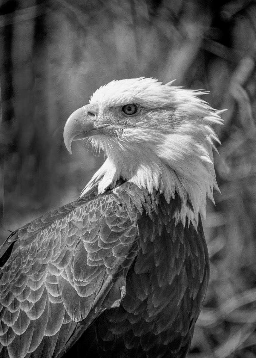
If I should give any advice on improvement, it would be to remove the white branches in front of the bird, that I find a bit distracting. |
May 13th |
| 74 |
May 19 |
Comment |
A very pleasant and well-done image. It is amazing what phones can do these days. Liked the curvey lines made by the river. My only pick is that the branches covering the roof should be removed. |
May 13th |
| 74 |
May 19 |
Comment |
I agree with your choice to make it black and white. It has a great tonal range from black to white that makes it interesting. My first impression, though, was that it has too many details, so I agree with Pamela that the original is a better composition.
A general comment is that the original should be an out of camera version without any post-processing, cropping included, so we can see the improvements you have done. |
May 13th |
7 comments - 0 replies for Group 74
|
14 comments - 0 replies Total
|