|
| Group |
Round |
C/R |
Comment |
Date |
Image |
| 86 |
Oct 19 |
Reply |
Thanks Laurie, I do like your edit of the sky, it does help. I will have to play with it. Separating the blues is a great idea. |
Oct 17th |
| 86 |
Oct 19 |
Reply |
I don't know why some images show so large, I will have to look into that. We had this issue with another member a month or so ago, it viewed normal size for me but for her it was large like my original shows. |
Oct 11th |
| 86 |
Oct 19 |
Reply |
Thanks Belinda, I will work on the shadow and although I like the black and white, my favorite part is the people and they do blend in. They do show up better in the color version. |
Oct 11th |
| 86 |
Oct 19 |
Comment |
Interesting image. It's so easy to try to read into what may be going on. Whether or not there was a lot of emotion, your image certainly helps create the feeling. I like the crop but as Belinda mentioned, the gentleman in the suit is blurry in your edited version but not the original. The three people in the image all add to the energy. It looks like you were very near the action. |
Oct 9th |
| 86 |
Oct 19 |
Comment |
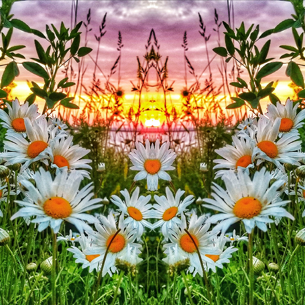
Very interesting image. Experimenting and trying new ideas is fun. I stared at this for a few minutes and I like it. If the writing on the bottom wasn't there for me to focus, I don't think the sharpness would matter. It's a fun image with potential. I could see a series of these hanging on a wall with different colors. |
Oct 9th |
| 86 |
Oct 19 |
Comment |
The amount of critters in your yard continues to amaze me. I like the placement of the lizard, off center but looking into the empty space on the left helps balance it for me. I like your edits as well. I have had to go back many times and look at the email to make sure the title is correct. |
Oct 9th |
| 86 |
Oct 19 |
Comment |
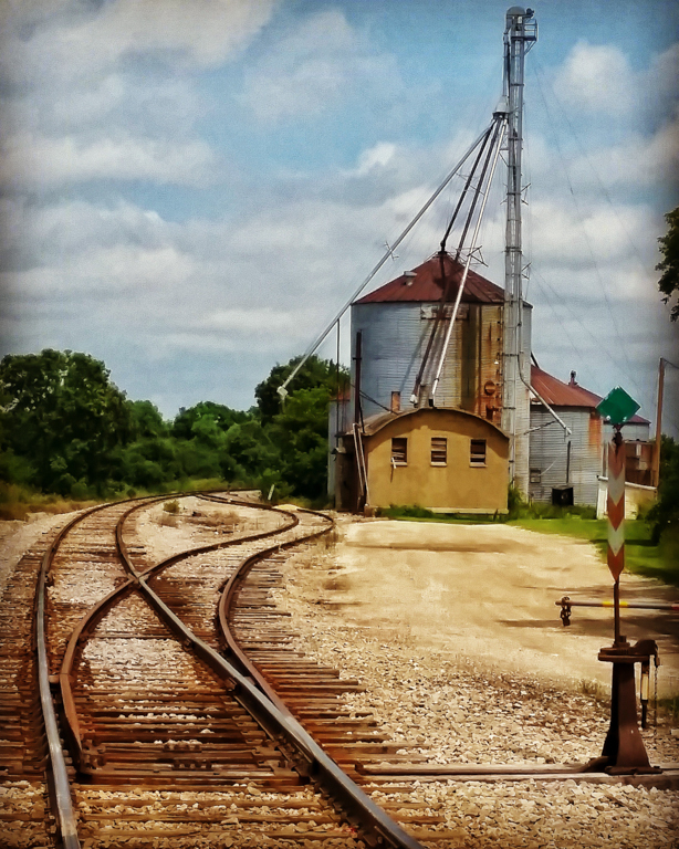
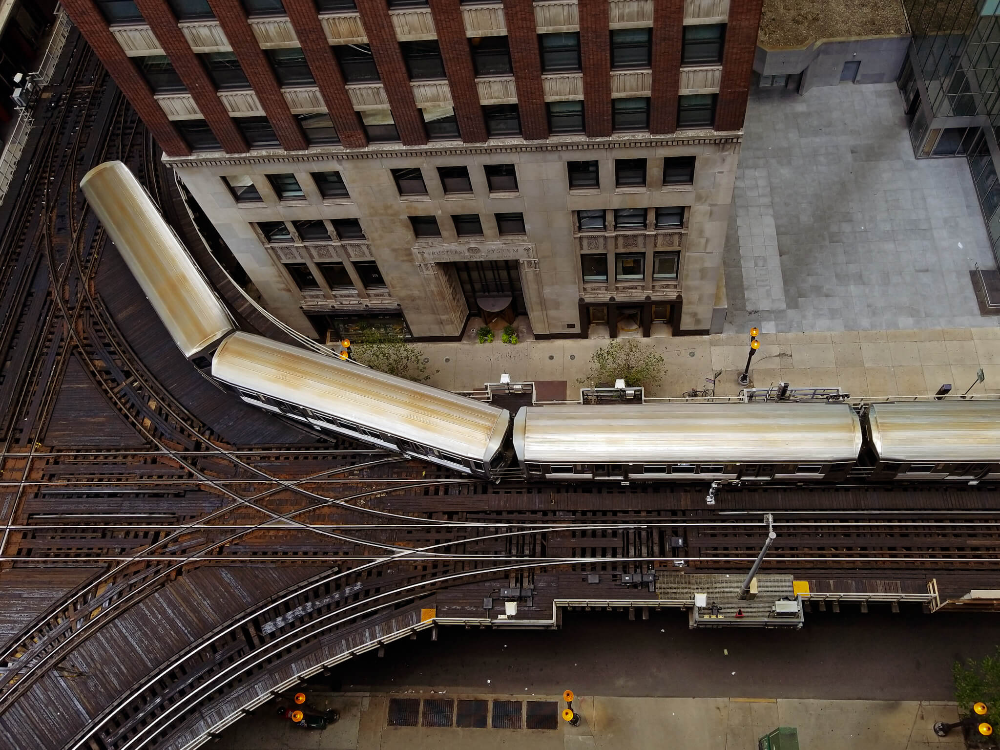
Your edits worked very well. I like it as is without straightening. I think it adds to the look, I like the ionic capital in the top right. If it was straightened I think you would loose that. |
Oct 9th |
| 86 |
Oct 19 |
Comment |
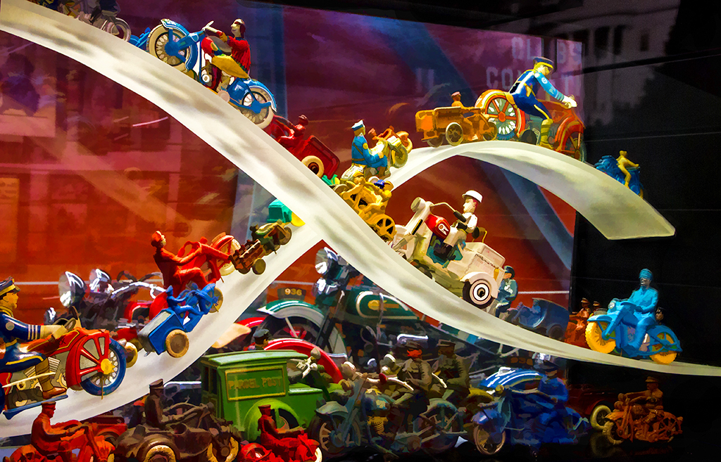
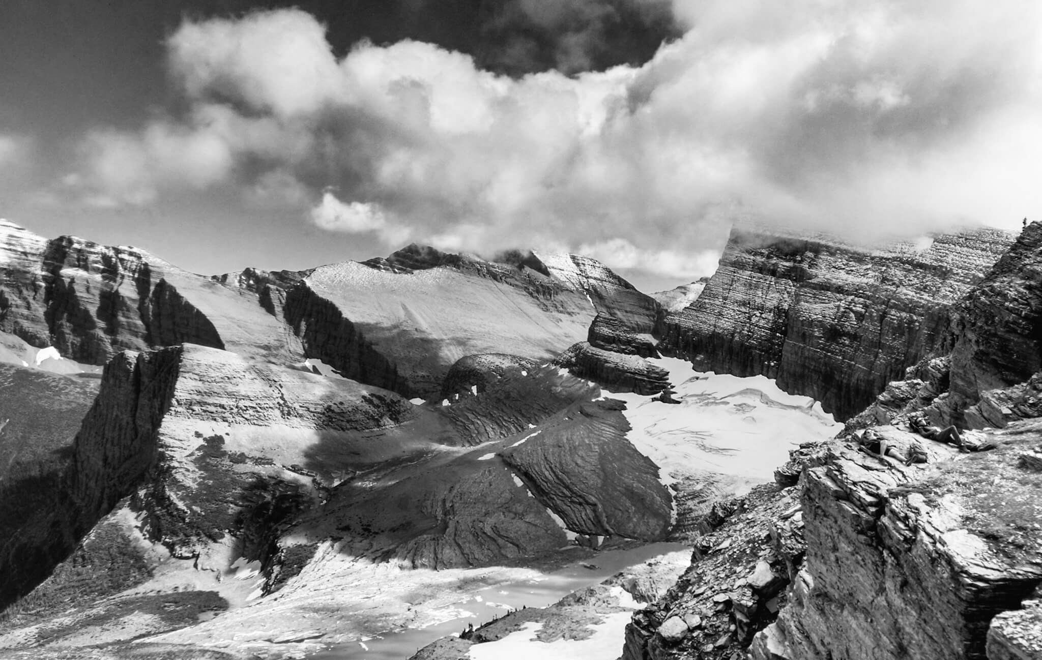
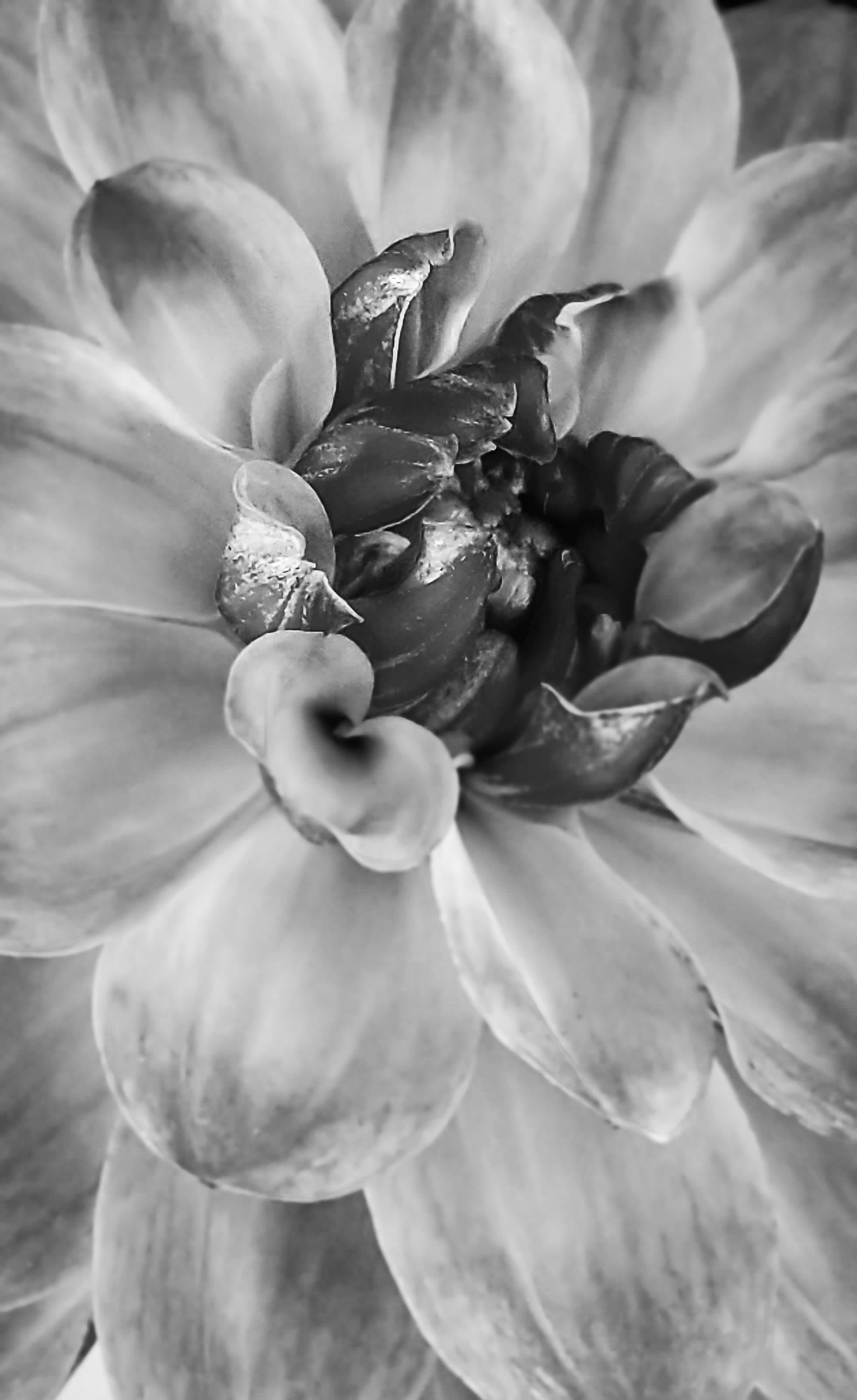
This is really interesting and well done. My preference is the one in color, it's fun and upbeat but the black and white version I find has spooky, sinister feeling for me. |
Oct 9th |
5 comments - 3 replies for Group 86
|
5 comments - 3 replies Total
|