|
| Group |
Round |
C/R |
Comment |
Date |
Image |
| 86 |
Jul 19 |
Reply |
I have been toying with the idea but probably not. I have never been to this conference. I would appreciate hearing your thoughts on it. I know people who have gone for years. I'm still not sure what it's all about. |
Jul 16th |
| 86 |
Jul 19 |
Reply |
Janet I love your choice of words, "Some photos stay in my memory just like good friends". |
Jul 16th |
| 86 |
Jul 19 |
Comment |
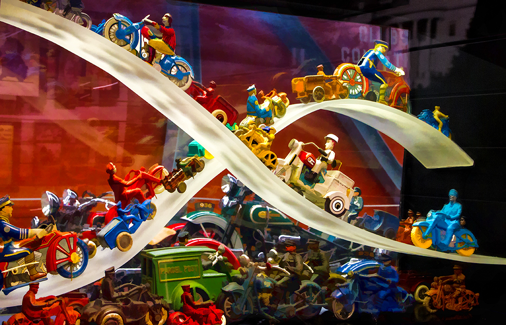
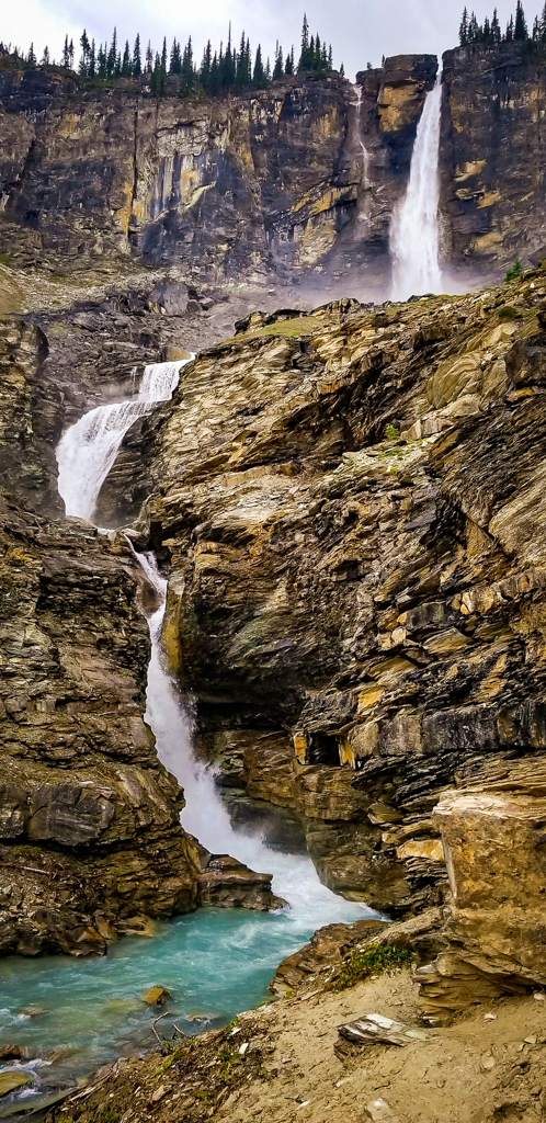
Beautiful. I have never been there but I may have to put this on a list of places to visit. The amount of work you did is amazing and your final image is amazing as well. I think they should consider adding another tower. The original image was very nice other than the angel being cut off.
|
Jul 13th |
| 86 |
Jul 19 |
Comment |
Very creative, and a good eye for you to see this. I like your edits. reversing the image really helps to slide my eye all the way through. Janet's idea of adding an object is a great idea, if possible. |
Jul 13th |
| 86 |
Jul 19 |
Comment |
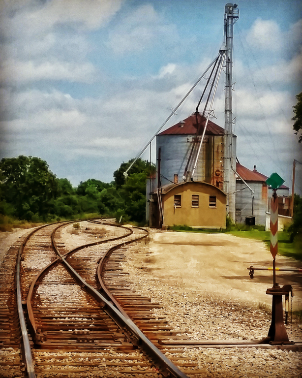
Rotating the image was a good choice. I do like the detail of the armour. It's hard for me to picture these roaming through the yard. |
Jul 13th |
| 86 |
Jul 19 |
Comment |
Interesting edits, I think they are well done other than a little soft on the edges for me. I agree with Ruth, this would look good large. I tried some edits myself but I prefer yours. |
Jul 11th |
| 86 |
Jul 19 |
Comment |
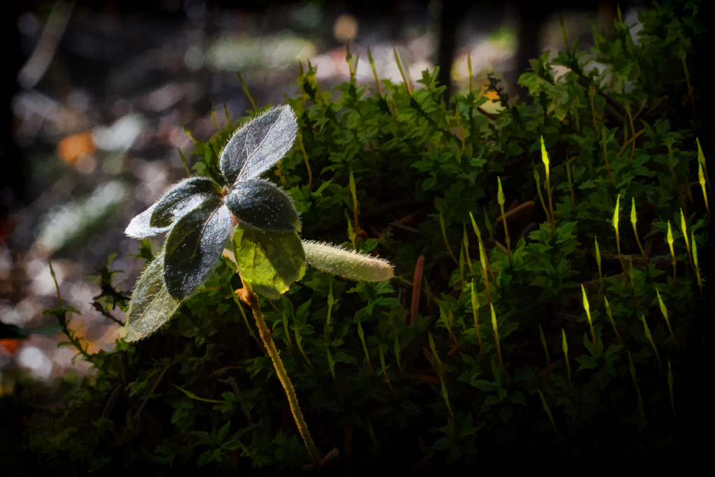
Your original edited image is nice, I like the different patterns and textures of the pavement and the shell. I really like the version you shared using the apps waterlogged and icolorama. I haven't heard of these I will have to look for them. |
Jul 11th |
| 86 |
Jul 19 |
Comment |
The dirty window at first bothered me but I think it does work. In hind site I could have just brought with me an old window sash and held it any way I wanted it. |
Jul 11th |
| 86 |
Jul 19 |
Reply |
Thanks for the suggestion on the light streak, I will play with that. |
Jul 11th |
| 86 |
Jul 19 |
Comment |
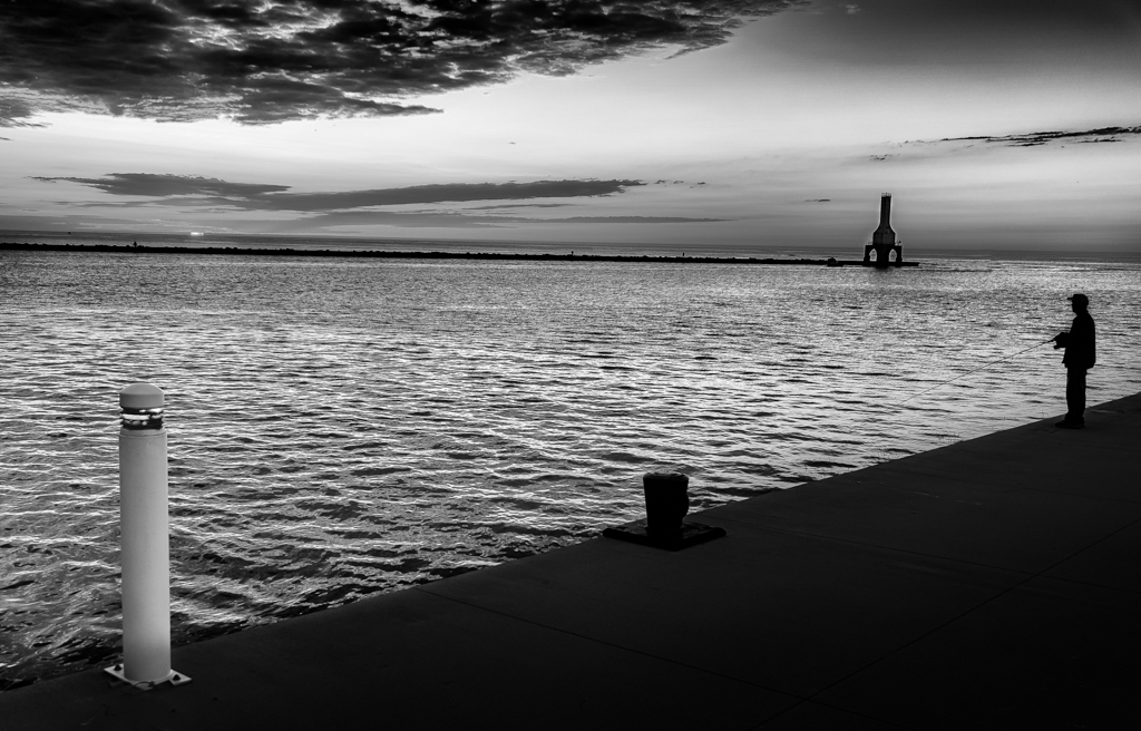
I find this image fascinating, even though some parts are blurred. I do like this. I think it has good balance and the horizon line works for me. The blurred woman help make the male the main subject.
I keep thinking that in the empty area on the lower left there should be a gin advertisement. I'm not sure what to do to improve other than it is very interesting. |
Jul 8th |
7 comments - 3 replies for Group 86
|
7 comments - 3 replies Total
|