|
| Group |
Round |
C/R |
Comment |
Date |
Image |
| 22 |
Jun 17 |
Reply |
I used instructions from an online source (don't remember where) and this is what they suggested. I did not create the box in the same way that you did.
1. Use the Rectangular Marquee Tool to draw a box around the part of the picture that stays in bounds. Then Right Click anywhere on the picture.
2. Options box pops up. Click on Stroke. Create a 20px stroke, inside, white. Then Right Click anywhere and choose Deselect.
3. Click on Edit, Transform, Perspective.
4. Click on the upper right square of the box. Drag the square down. It creates the angled shape. Hit Enter.
That's it! Then you go through the process of erasing the part of the frame that goes across your picture, creating a background to put the picture on, etc. |
Jun 17th |
| 22 |
Jun 17 |
Reply |
Yes I think all of your comments are valid. I will probably do this over again to incorporate your suggestions. |
Jun 15th |
| 22 |
Jun 17 |
Comment |
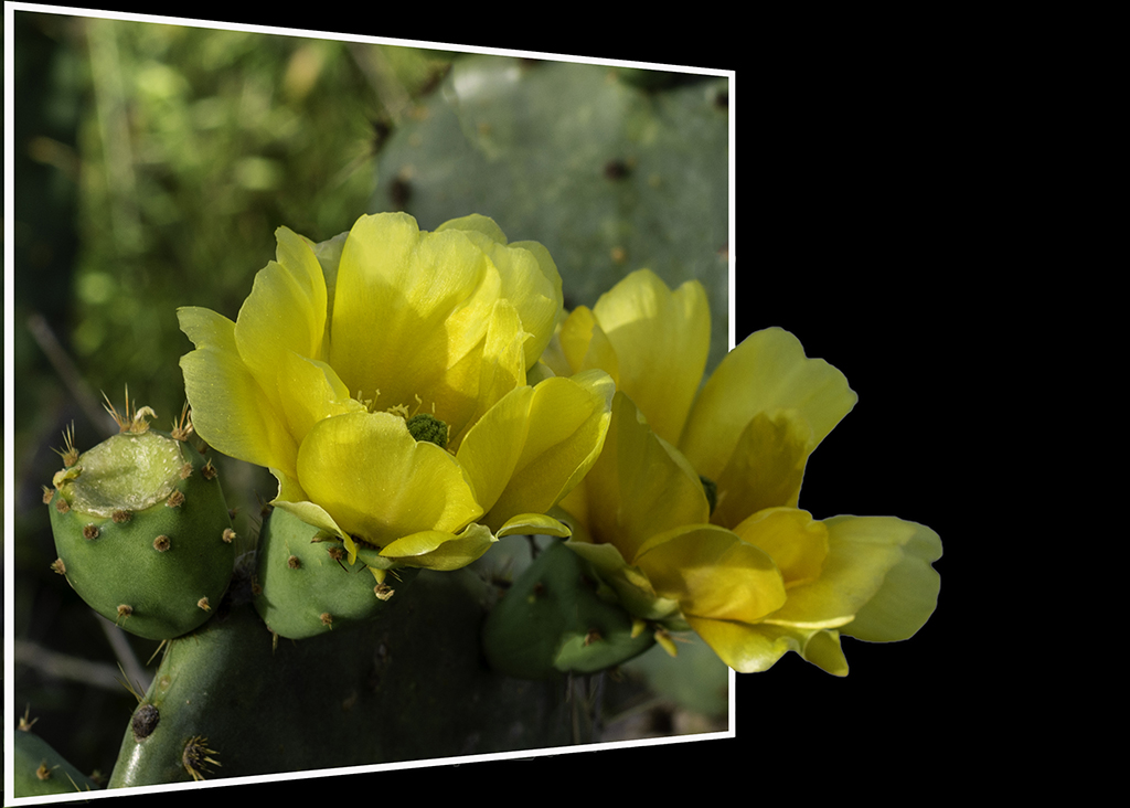
Jerry, this is really good. My only suggestion would be to change the angle of the frame - maybe angling the sides closer together at the top - to create more of a perspective. Very nice. |
Jun 11th |
| 22 |
Jun 17 |
Comment |
Vicki, I thought this was great. Great subject, great angle, and it all worked. Marti's addition of the white frame really defines the technique and makes your subject stand out much more - but your version is equally impactful. |
Jun 11th |
| 22 |
Jun 17 |
Reply |
Ok Marti, this is something I had a lot of trouble with. When you say "Delete" the inside of the frame - how do you do that? With the Delete key? I couldn't get that to work. I fiddled around and eventually something worked - and I don't remember what - but I felt like I was missing a step or misunderstanding what to do. |
Jun 11th |
| 22 |
Jun 17 |
Comment |
Your revision is much better. The first one troubled me because it cut off the player at all the wrong places. I would extend the rest of his guitar out of the frame as well - as Marti has suggested. The original guitar player was cropped a little too close for this use apparently. But overall it is a nice combination of subject and frame. |
Jun 11th |
| 22 |
Jun 17 |
Comment |
John, I think that this image needs to have more of the ground - whether gravel or grass - showing underneath the car. The car appears to be floating in mid-air, and that is not a natural look. Also I'd try to clone out the drop cloth that is on the ground under the car. I agree with you that it can be difficult to find just the right image for this technique. Nice job for first effort. |
Jun 11th |
| 22 |
Jun 17 |
Comment |
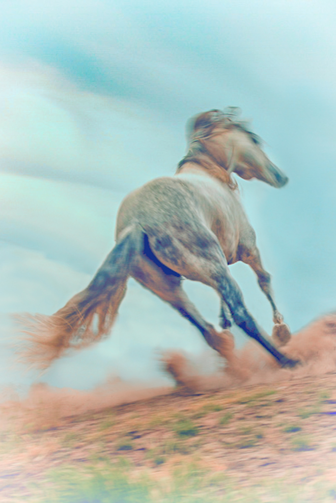
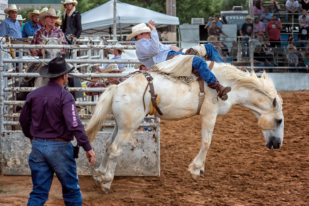
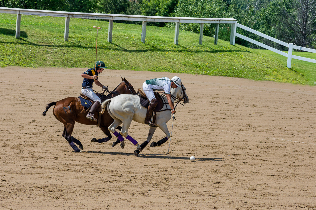
I think that an angled frame would have made the image pop out of the frame more. And I agree that a different color background would have helped distinguish the horse. But I admire your tackling and overcoming the difficulty of this particular picture. Simple edges and straight edges are so much easier, and this picture is much more complex.
Do you think pictures like this are suitable for competitions? Or would they be considered too gimmicky? I don't know the answer to that, but I think that they are very creative and dramatic. |
Jun 11th |
5 comments - 3 replies for Group 22
|
5 comments - 3 replies Total
|