|
| Group |
Round |
C/R |
Comment |
Date |
Image |
| 60 |
Apr 24 |
Comment |
Thanks Rita. |
Apr 19th |
| 60 |
Apr 24 |
Comment |
Thanks Tim; I'll try the remove tool in PS. |
Apr 4th |
| 60 |
Apr 24 |
Reply |
Yes, good candidate for BW conversion. |
Apr 4th |
| 60 |
Apr 24 |
Comment |
Keep shooting. |
Apr 3rd |
| 60 |
Apr 24 |
Comment |
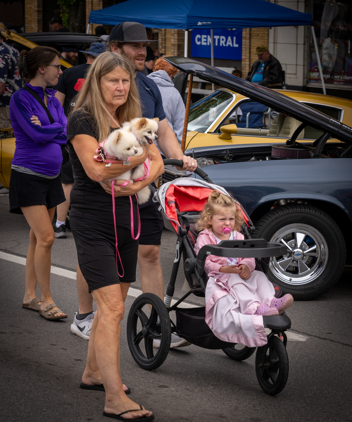
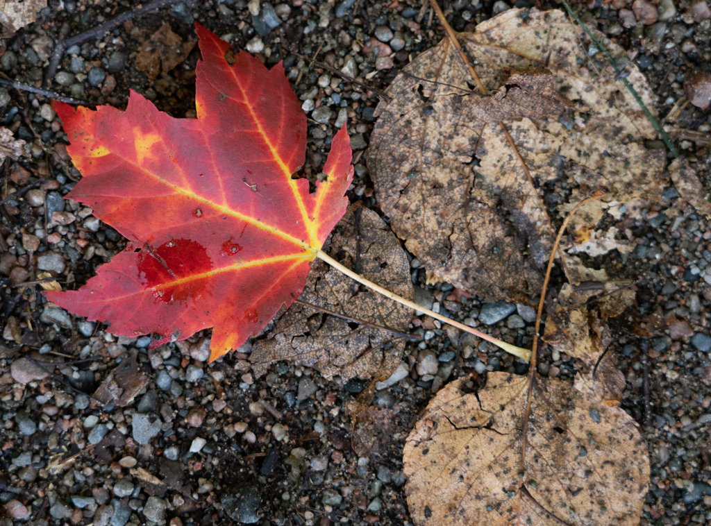
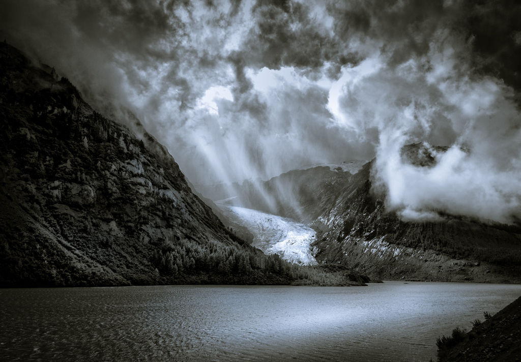
Robert,
I think this image "works", partly because it required me to think about why (which is good). Of course, the cloudy/stormy sky with the mountains in the background is dramatic. But then there is the lone basketball hoop in the parking lot with the rusty white pole and the pattern on the backboard. Where children playing here a moment before? Did they leave because of the impending storm? It provokes questions.
Removing the light pole in the background makes the basketball pole the center of the foreground. Of course, you could have done the same by changing your position but I understand you were in a bit of a hurry. As noted in your comments re: framing, I wish you had left a bit more room in front of the bottom of the pole on the ground. Basketball poles need to be anchored. |
Apr 3rd |
| 60 |
Apr 24 |
Reply |
Yes, no "right" answer to cropping usually. |
Apr 1st |
| 60 |
Apr 24 |
Reply |
Yes, they can see the color original. |
Apr 1st |
| 60 |
Apr 24 |
Reply |
Thanks for that perspective Lance. |
Apr 1st |
| 60 |
Apr 24 |
Comment |
Another crop. |
Apr 1st |
 |
| 60 |
Apr 24 |
Comment |
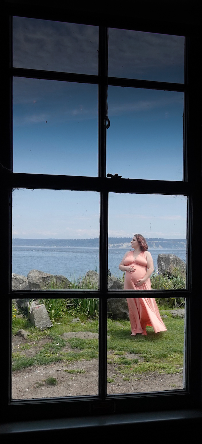
Rita,
I think the subject has a commanding human interest in this photo and therefore would be a good candidate in the people contest category.
Since we live in Michigan, I have taken many photos inside old lighthouses looking out through a small window. Usually, I try to include something interesting inside, like a curved stair rail or stone wall. However, with this image I think the real visual interest is outside, so cropping out nearly all of the inside works well. The question then is which crop works best. Yours is fine; others are possible (see attached). Somewhat to my surprise, I like the crop which includes the total vertical height of the window. The pink pregnant lady has lots of weight (both literally and figuratively) in this image so having more window to balance that visual weight works for me. I darkened the upper sash to reduce the brightness on top. Cropping, as always, is a dark art. |
Apr 1st |
 |
| 60 |
Apr 24 |
Comment |
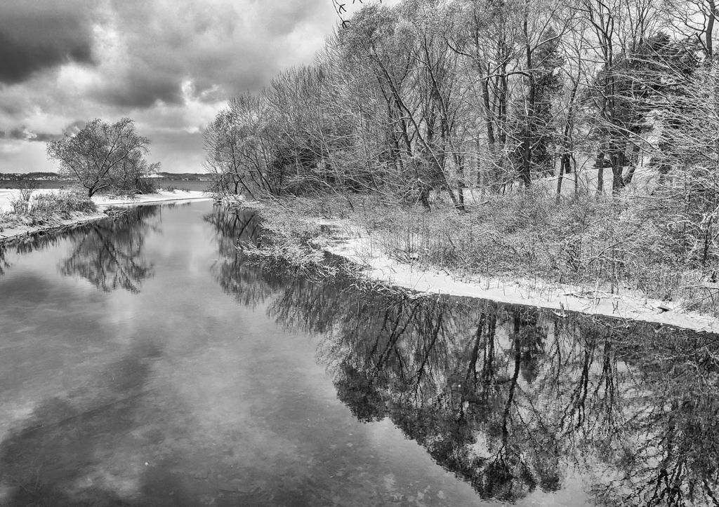
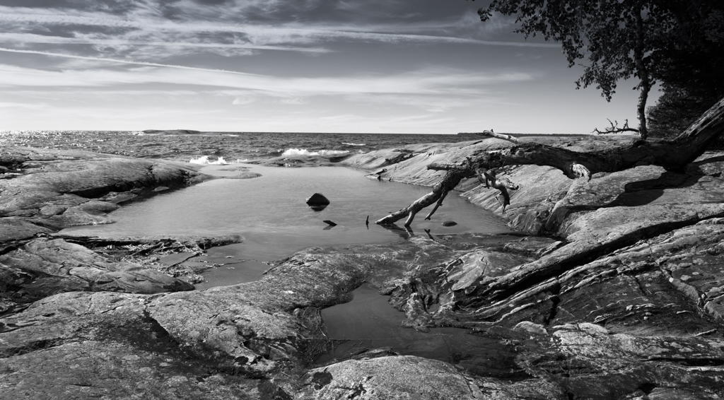
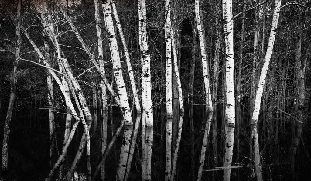
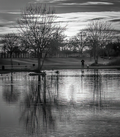
Anne,
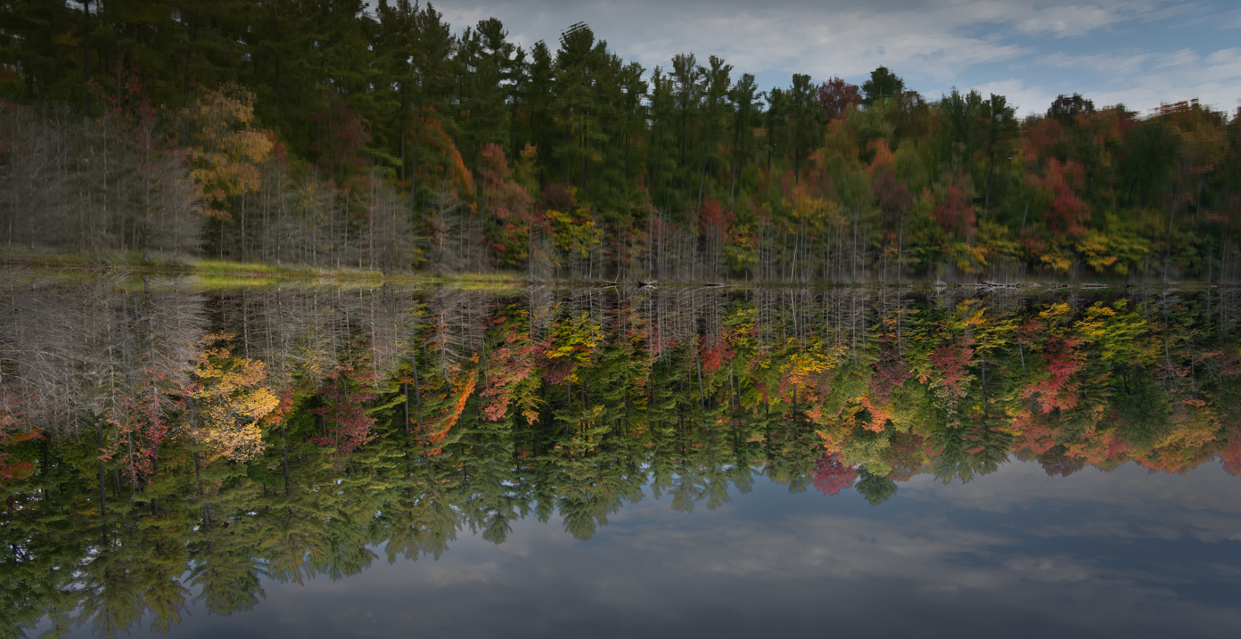
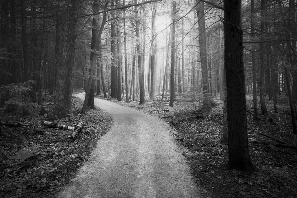
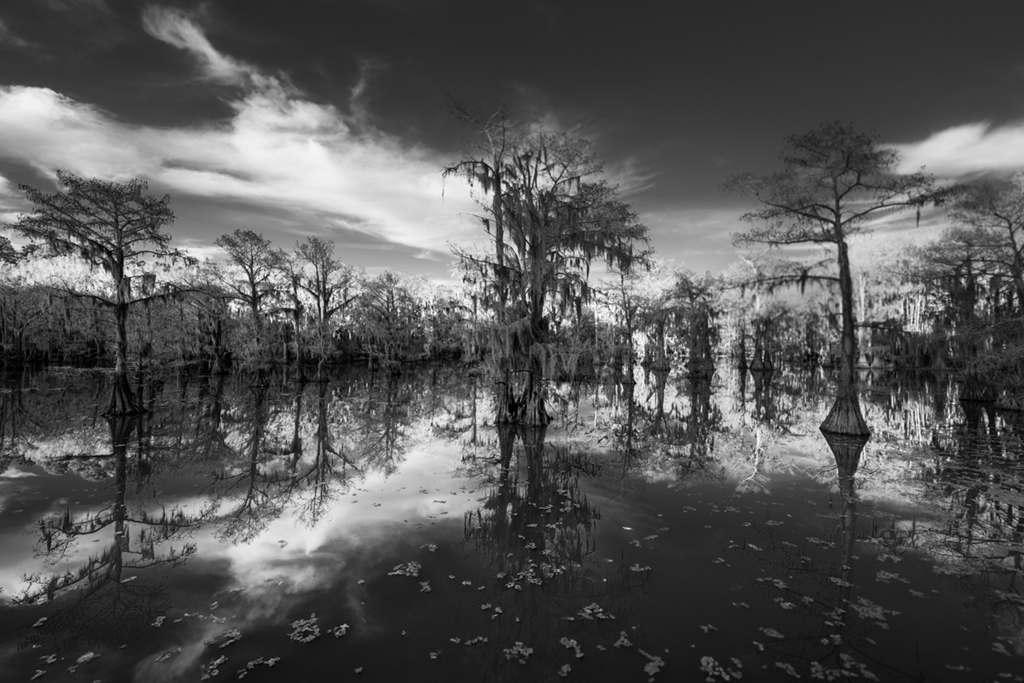
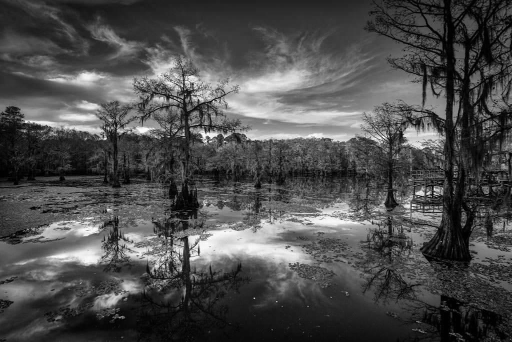
I am partial to bw images and I think you made a good choice to convert this image. Good bw images have a range of grays from dark to light with interesting contrast, as does your image. The soft clouds in the sky and the reflected bare trees enhance this image. The challenge I see in this image is how to best frame it. The tree(s) on the left and right are truncated, which can be undesirable. Stepping back possibly would have allowed this to be avoided but it also might have introduced some unwanted objects - one would have to have been there to know. There is an image within this image which avoids the truncations and may or may not be better (see attached). |
Apr 1st |
 |
| 60 |
Apr 24 |
Comment |
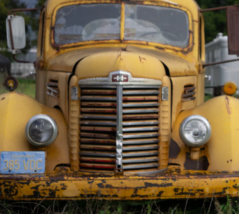
Michelle,
I have many photos of old cars and trucks. I particularly like the pre-war trucks like this one sitting outside. Often the most effective image of an old car/truck in not the entire vehicle but some more visually interesting part or section. I think there are lots of interesting sub-images and angles to be explored with this vehicle because of its patina, color, rust, plate, and age.
I understand you purposely included the weathered shed/garage behind the truck to provide some local context. Unfortunately, there is a lot of junk in the right foreground and the shed is truncated on the right. And, as you note, the sky is blah. Cropping in on the image might produce a better image but the image becomes soft and somewhat out of focus (see attached) with a crop so that doesn't work very well. |
Apr 1st |
 |
| 60 |
Apr 24 |
Comment |
Tim,
Thanks for the detailed description of how you created this image, particularly the PS and LR processing. The only photo more difficult to evaluate than a pet dog is that of a grandson or granddaughter. We all tend to think that our dogs and grandchildren are the most lovely and photogenic of subjects.
However, in the case of your image, that may indeed be true. The long haired, multi-colored, and lovely eyes of Tosh make for a fine doggy portrait. And I think she/he appears to be an experienced and patient subject. All parts of the face, nose, ears, and eyes are in focus and I like the soft lighting and the blurred flowering background. I appreciate the subtle way the background colors blend into the brown/orange palette of Tosh's fur. I think you cropped out some of the out of focus foreground which is helpful but I might crop up even further to remove more of it or maybe darken it with a gradient. |
Apr 1st |
9 comments - 4 replies for Group 60
|
| 69 |
Apr 24 |
Reply |
Thanks Diane.
|
Apr 18th |
| 69 |
Apr 24 |
Comment |
Thanks Jaswant. Getting down low with my camera isn't so easy these days or maybe it's getting back up. |
Apr 16th |
| 69 |
Apr 24 |
Reply |
Thanks Jacob. |
Apr 11th |
| 69 |
Apr 24 |
Reply |
Thanks Pierre. |
Apr 2nd |
| 69 |
Apr 24 |
Comment |
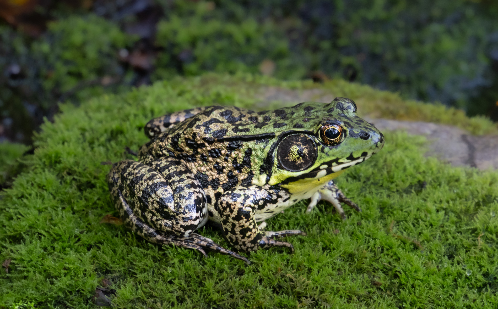
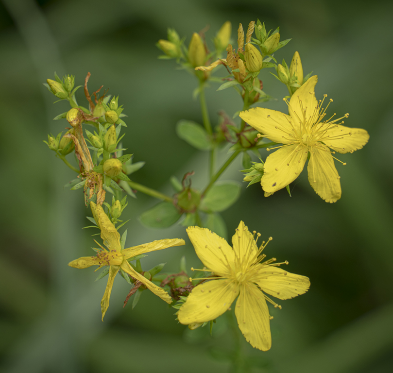
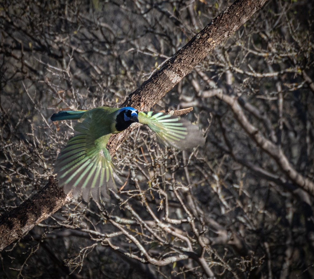
Pierre,
I like the colorful strips on the lizard and the diagonal formed by its body. The texture of the root provides good context. I think you could darken and maybe blur the background a bit. |
Apr 1st |
| 69 |
Apr 24 |
Comment |
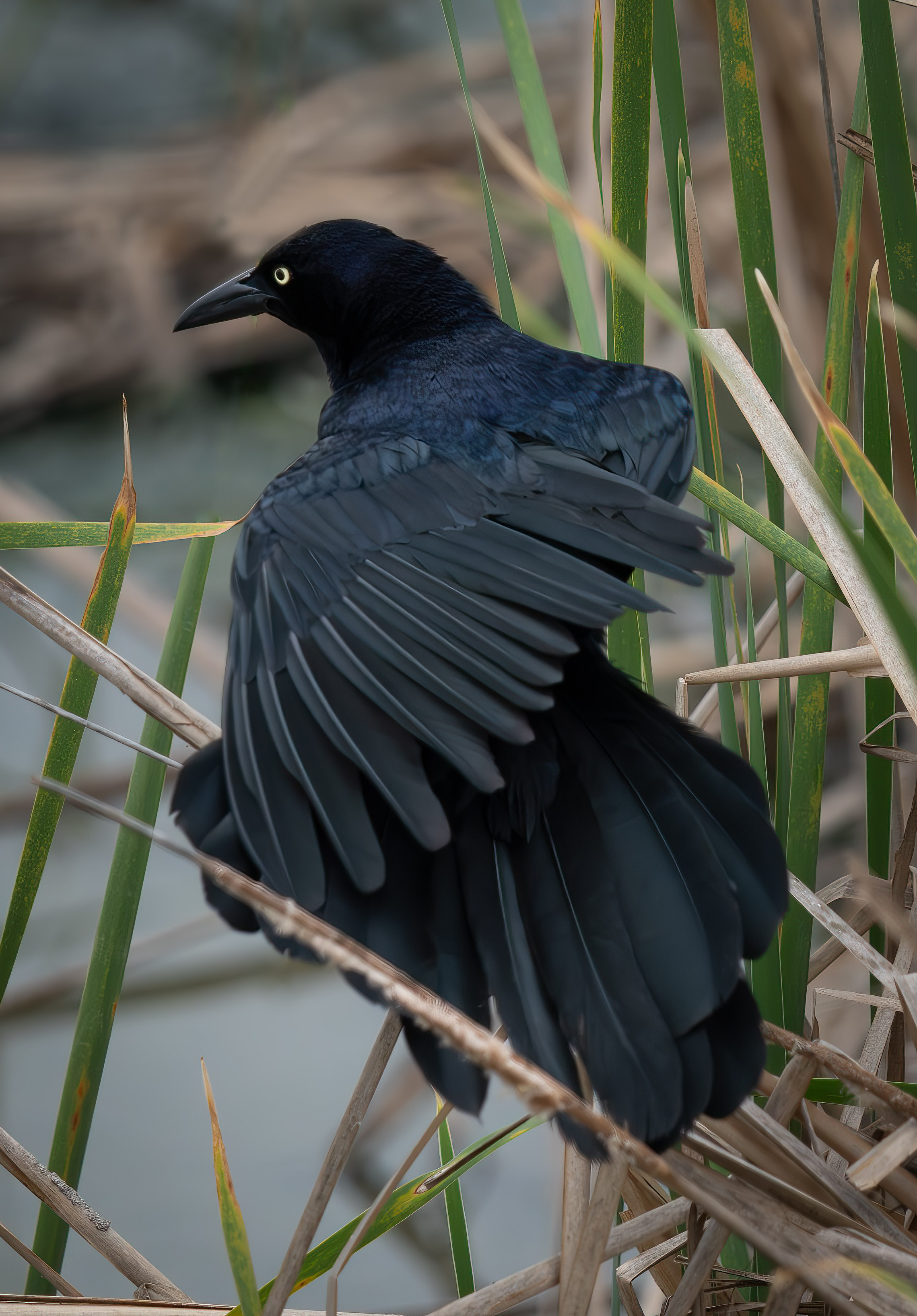
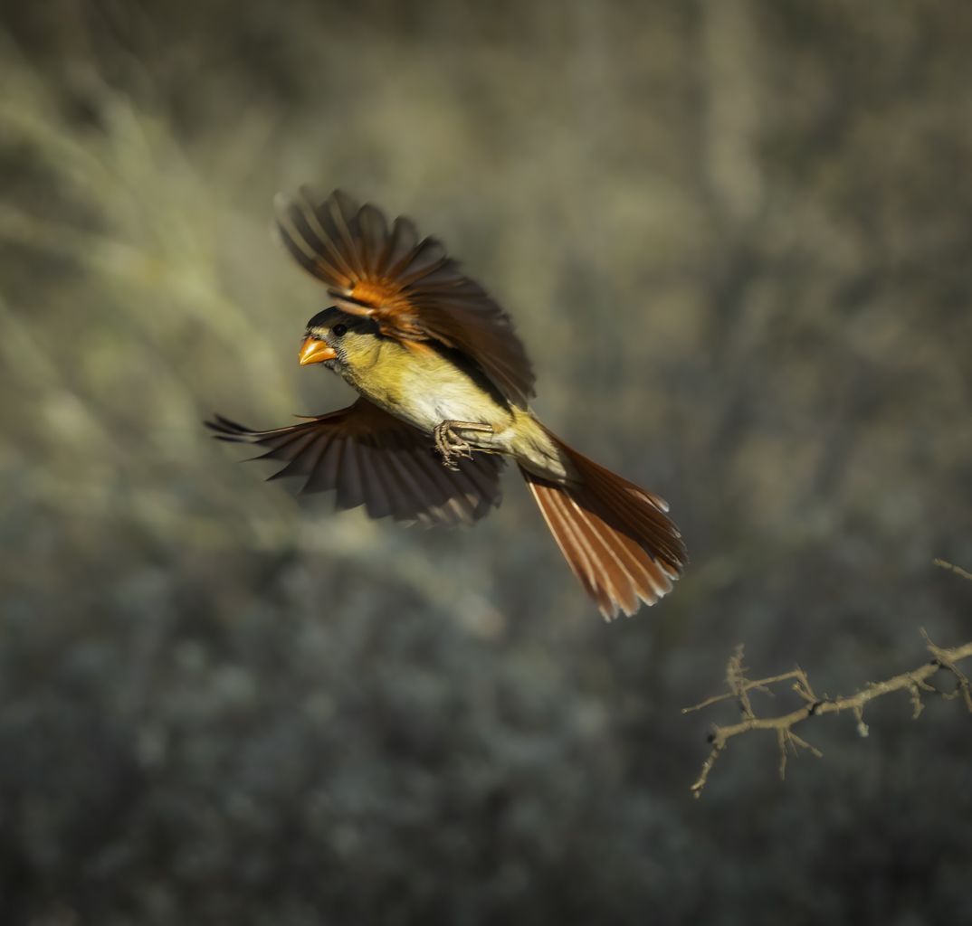
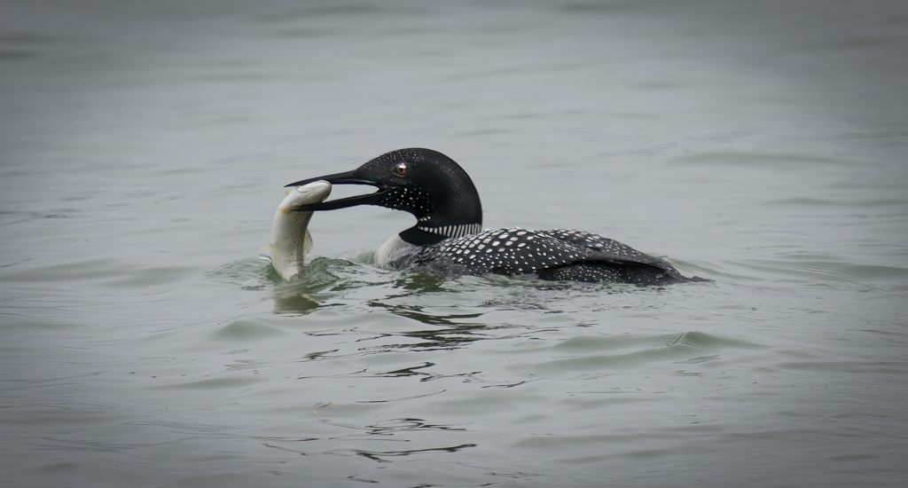
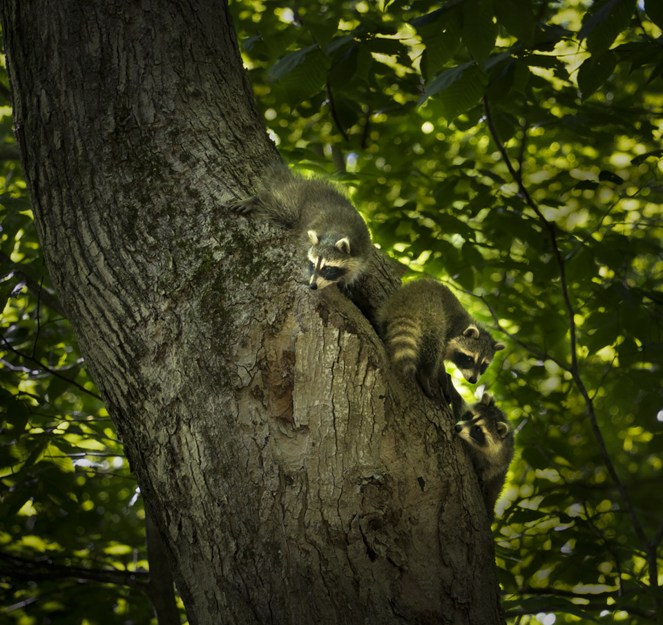
Mervyn,
Good editing of the background. Darn birds often seen to put their backside toward the camera. What makes this image is that you were able to get the head rotated looking back with focus on the yellow beak and eye. And I like the pattern and layers of feathers which are being exposed in this view. |
Apr 1st |
| 69 |
Apr 24 |
Comment |
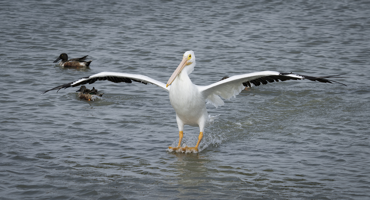
Diane,
I like the angle of view you selected. The Roo does indeed look quite laid back. The background is very bright and to my eye the face is a bit soft (not in crisp focus).Increasing the contrast a bit and decreasing the exposure might help somewhat. |
Apr 1st |
| 69 |
Apr 24 |
Comment |
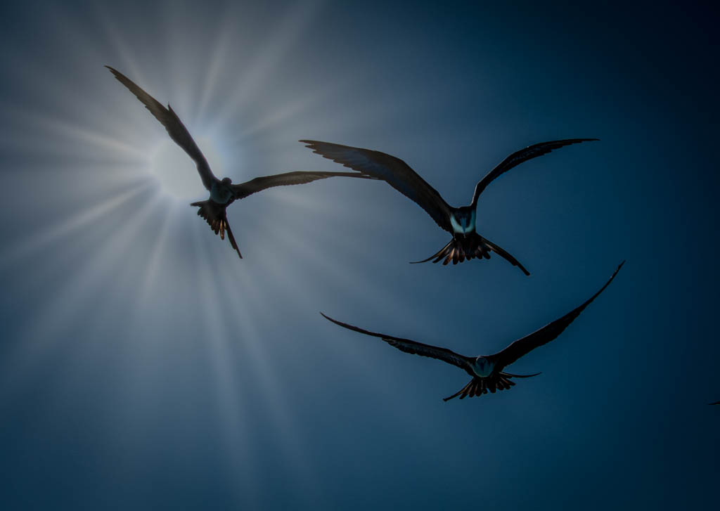
Jaswant,
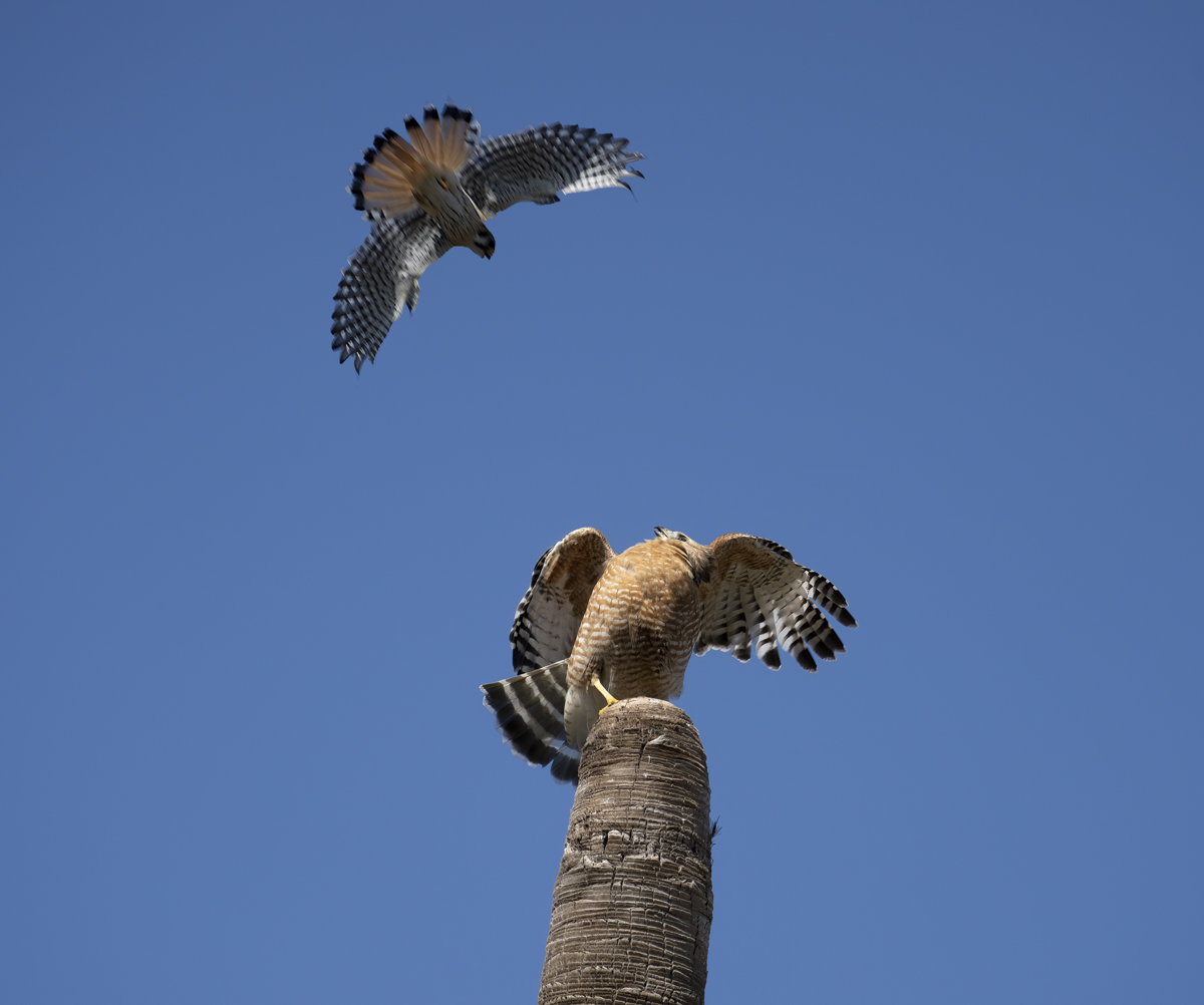
I think you have been holding the best back? That's a very striking and amazing image. Other than adding a bit of a vignette, I can't think of how it might be better. I expect it would be a contender in most nature/wildlife competition events. |
Apr 1st |
| 69 |
Apr 24 |
Comment |
Jacob,
I think your crop and editing of the background greatly improved this image. Nice work. |
Apr 1st |
| 69 |
Apr 24 |
Comment |
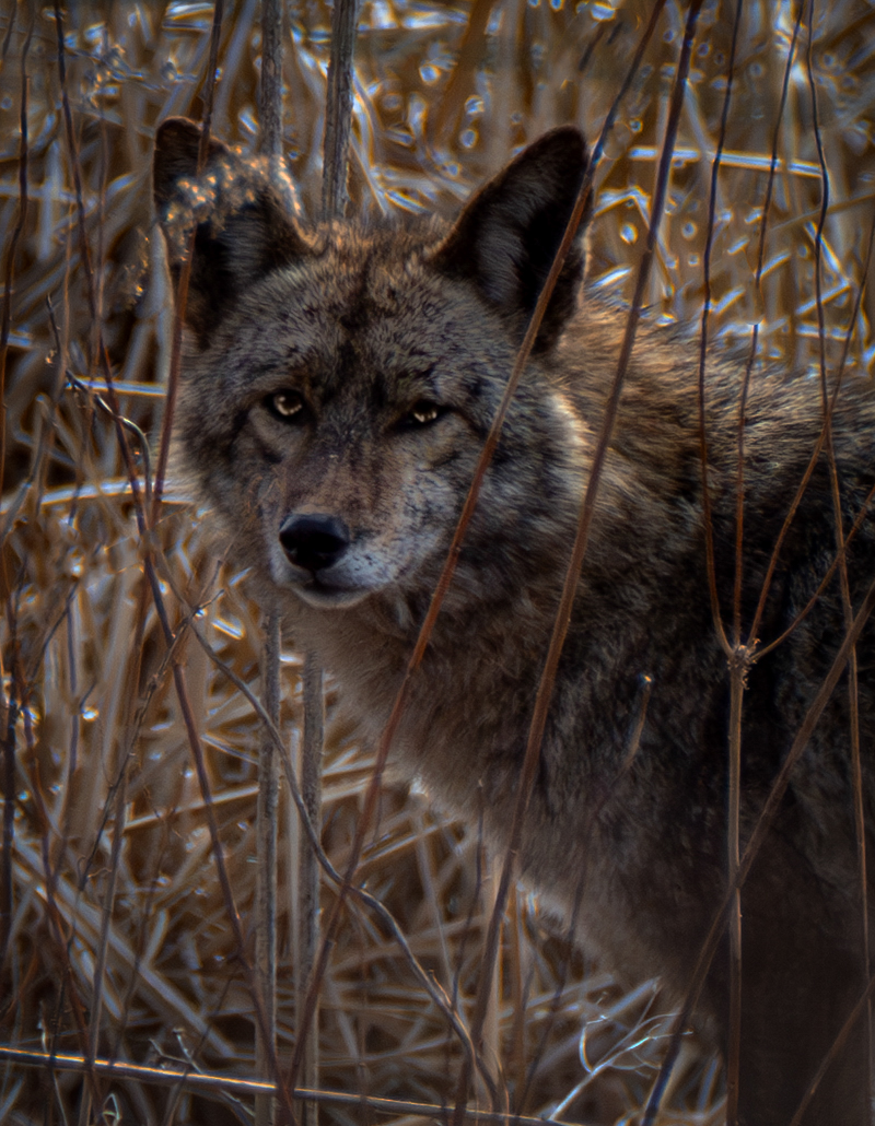
Cindy,
It isn't often that one even sees a cayote more less gets a good image like this. The crop is well selected. I like that you were about to get the face unobscured by the grass but that animal was still within in it. I would brighten the entire image, maybe then add a vignette, and also lighten the face a bit. |
Apr 1st |
 |
7 comments - 3 replies for Group 69
|
16 comments - 7 replies Total
|