|
| Group |
Round |
C/R |
Comment |
Date |
Image |
| 60 |
Mar 24 |
Comment |
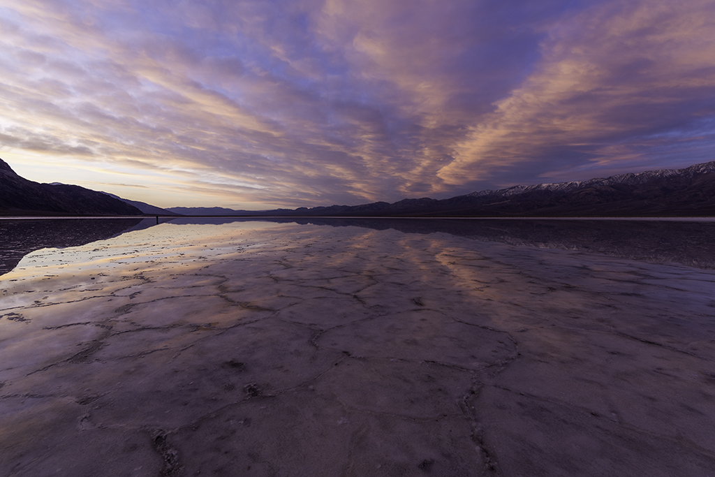
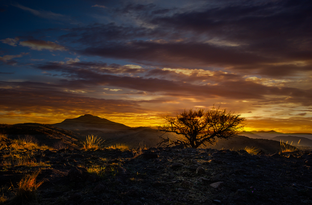
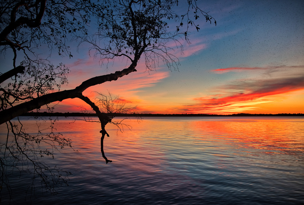
Blair,
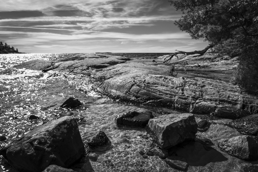
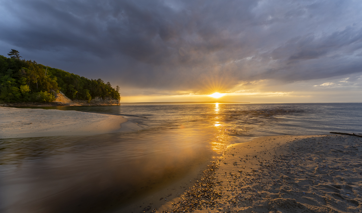
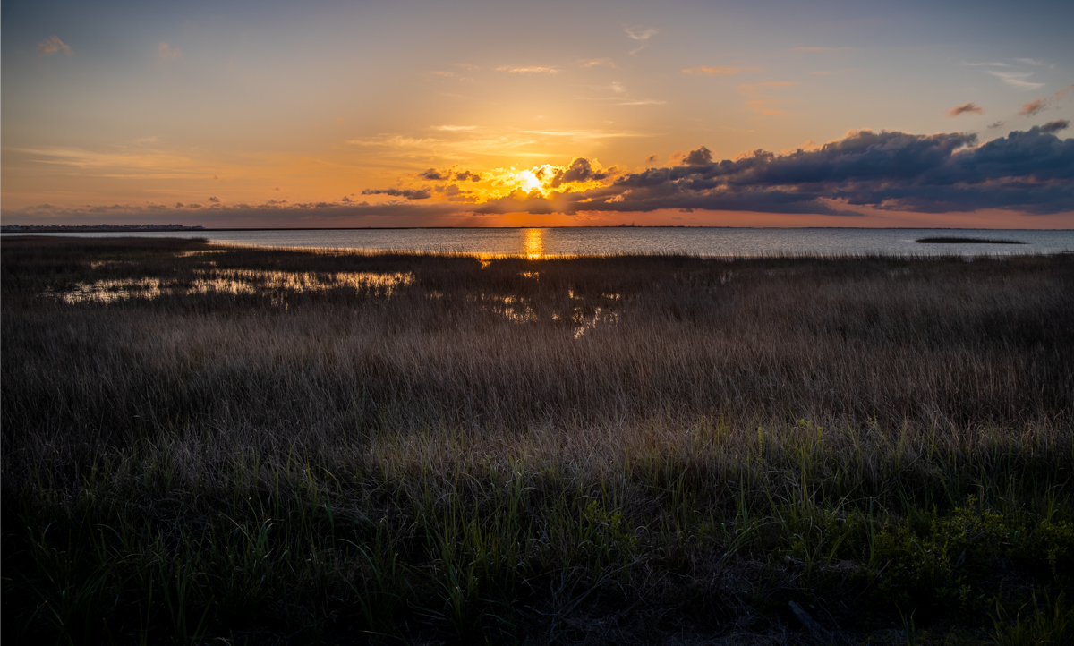
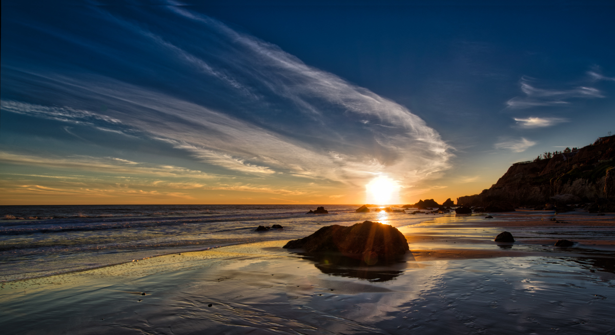
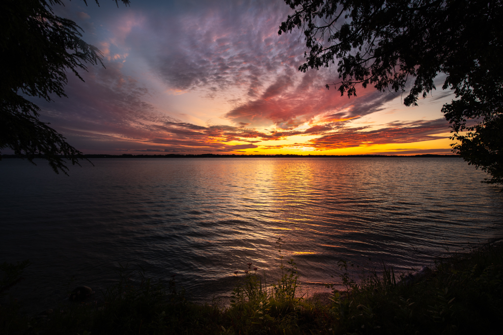
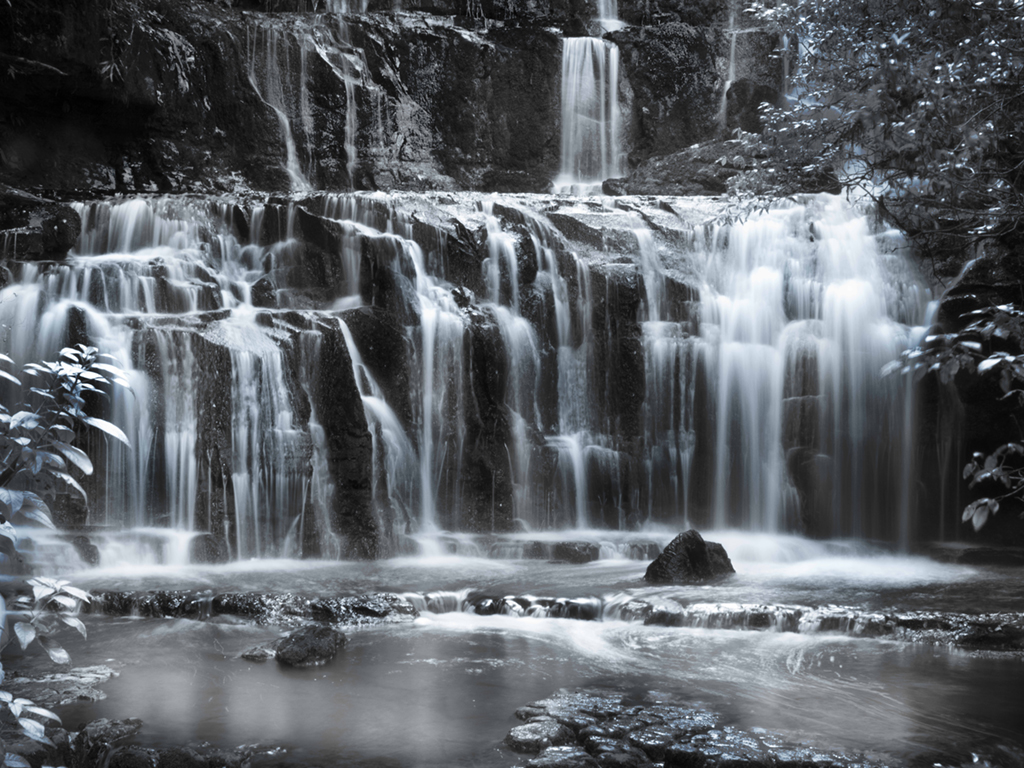
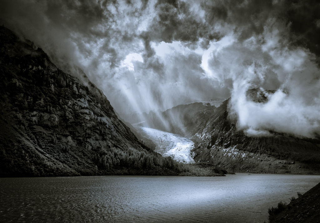
I like the soft colors of the sunset and the contrast between the blue and pink sky. To my eye, the sky area above the pink is largely nonde and adds little but space to your image. Attached is a crop of your image which gives more emphasis to the color in the sky and uses the rocks to direct the viewer's eyes to the center. As always with a crop it is about what you want to emphasize and what you want to delete; this is one option. |
Mar 11th |
 |
| 60 |
Mar 24 |
Comment |
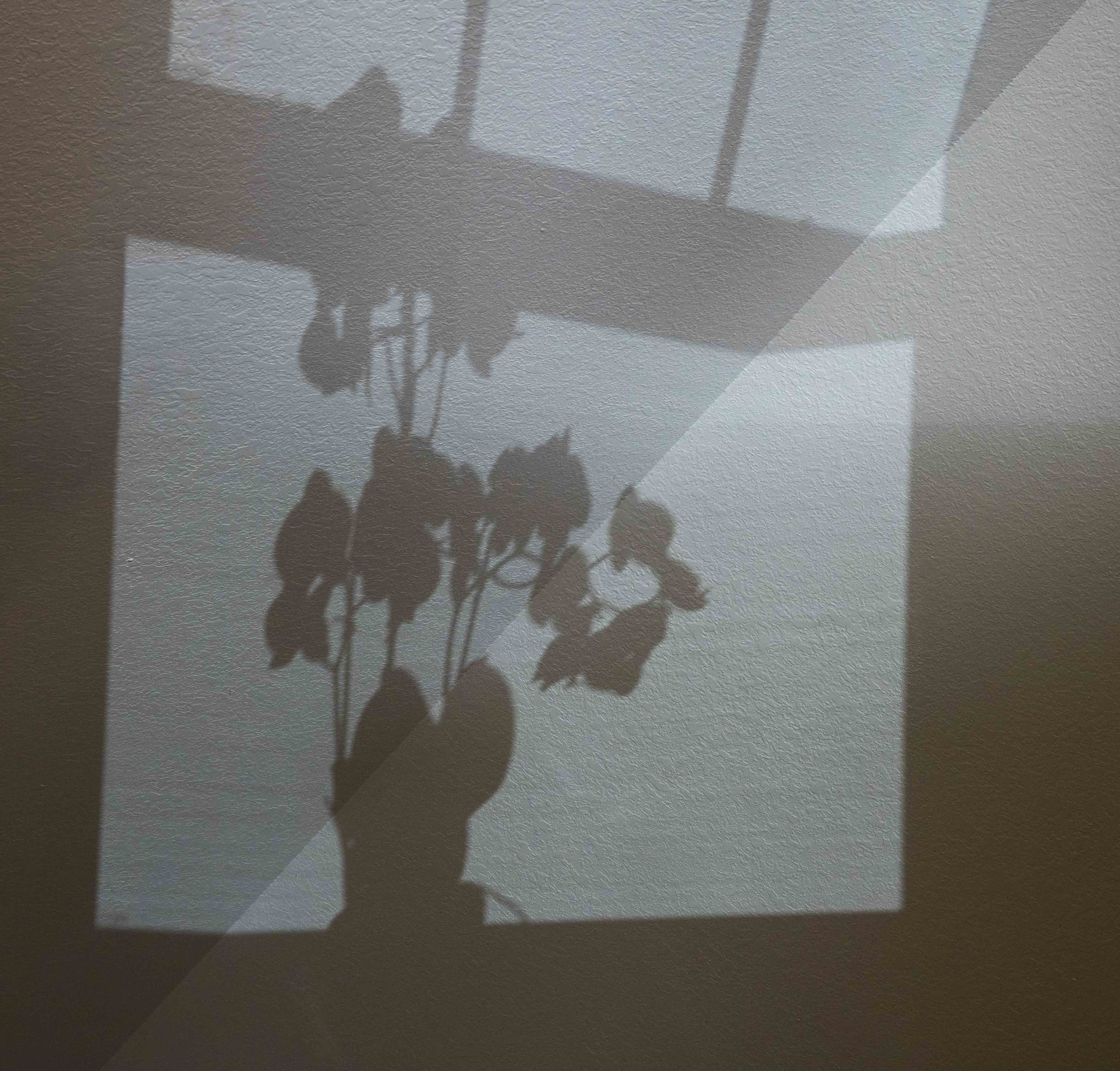
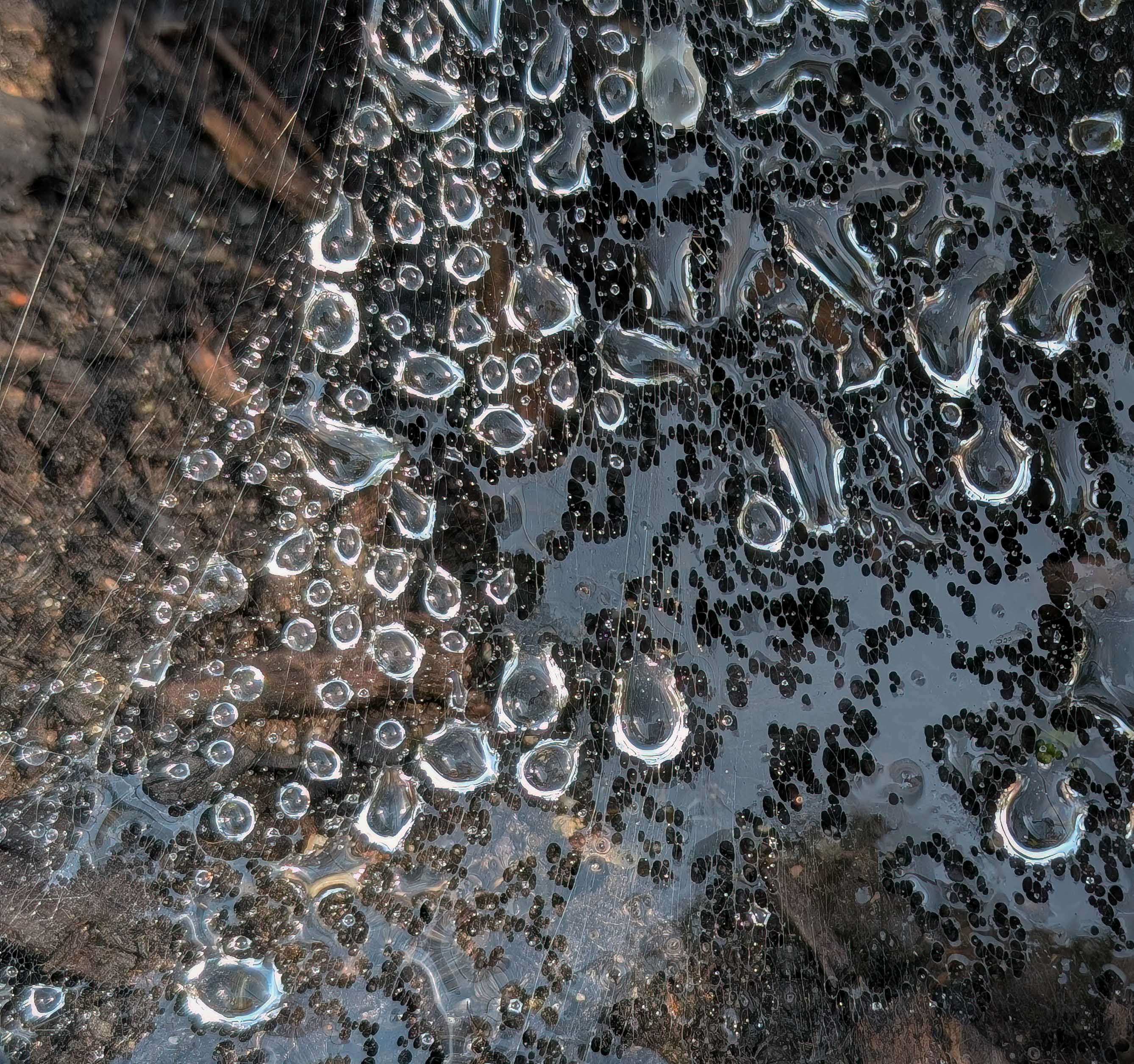
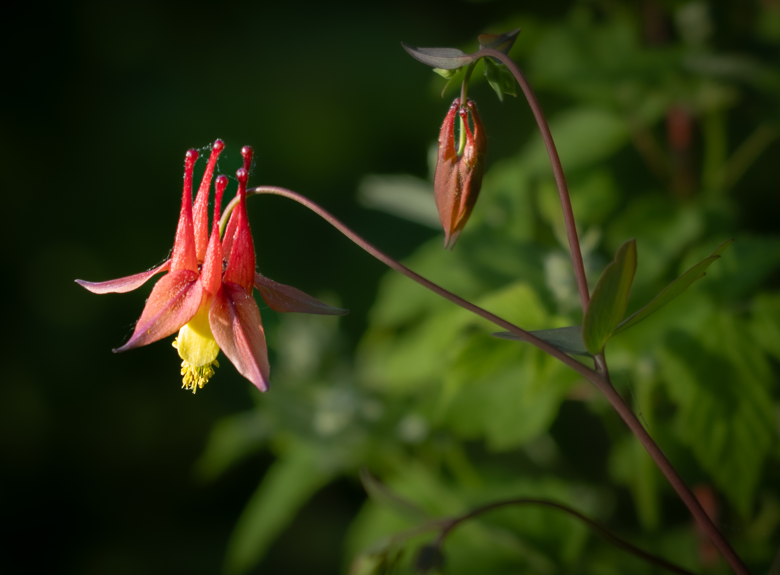
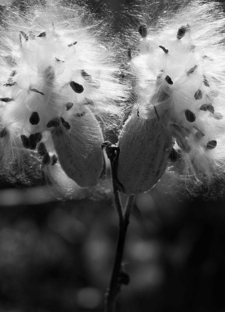
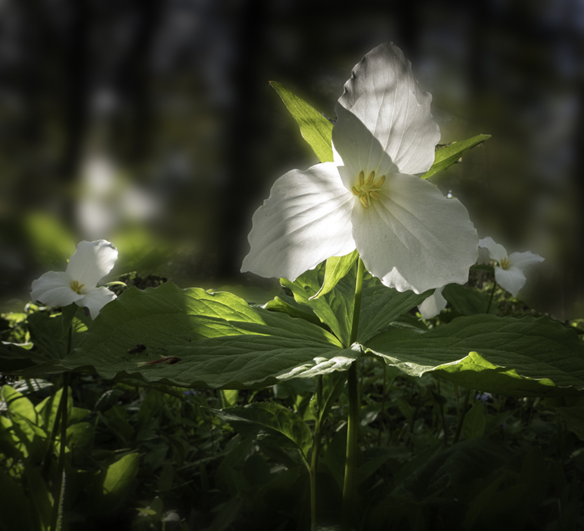
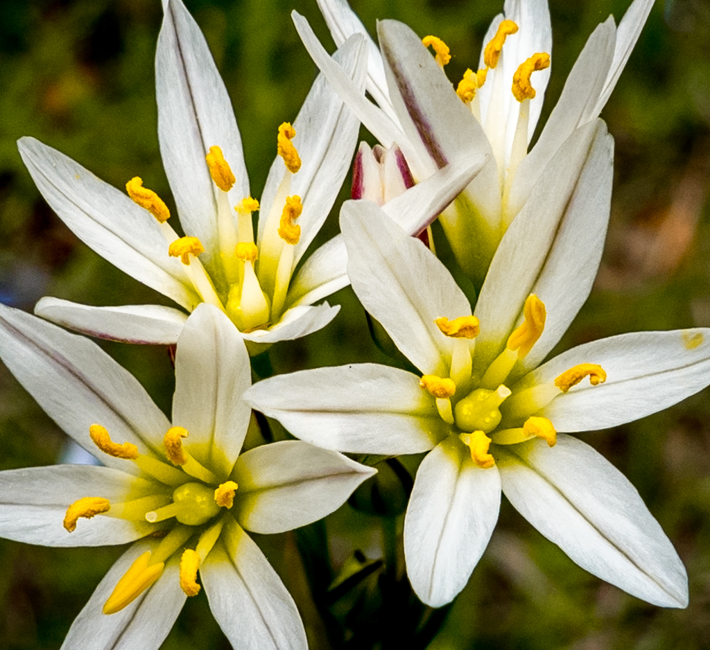
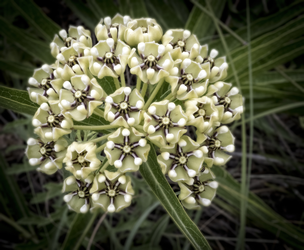
Michelle,
I like the off center placement of the stamin; the color contrast, the soft texture of the white petals, and drops. The image is well exposed with good depth of field and just a hint of maybe a leaf in the background (which is not distracting). |
Mar 11th |
| 60 |
Mar 24 |
Comment |
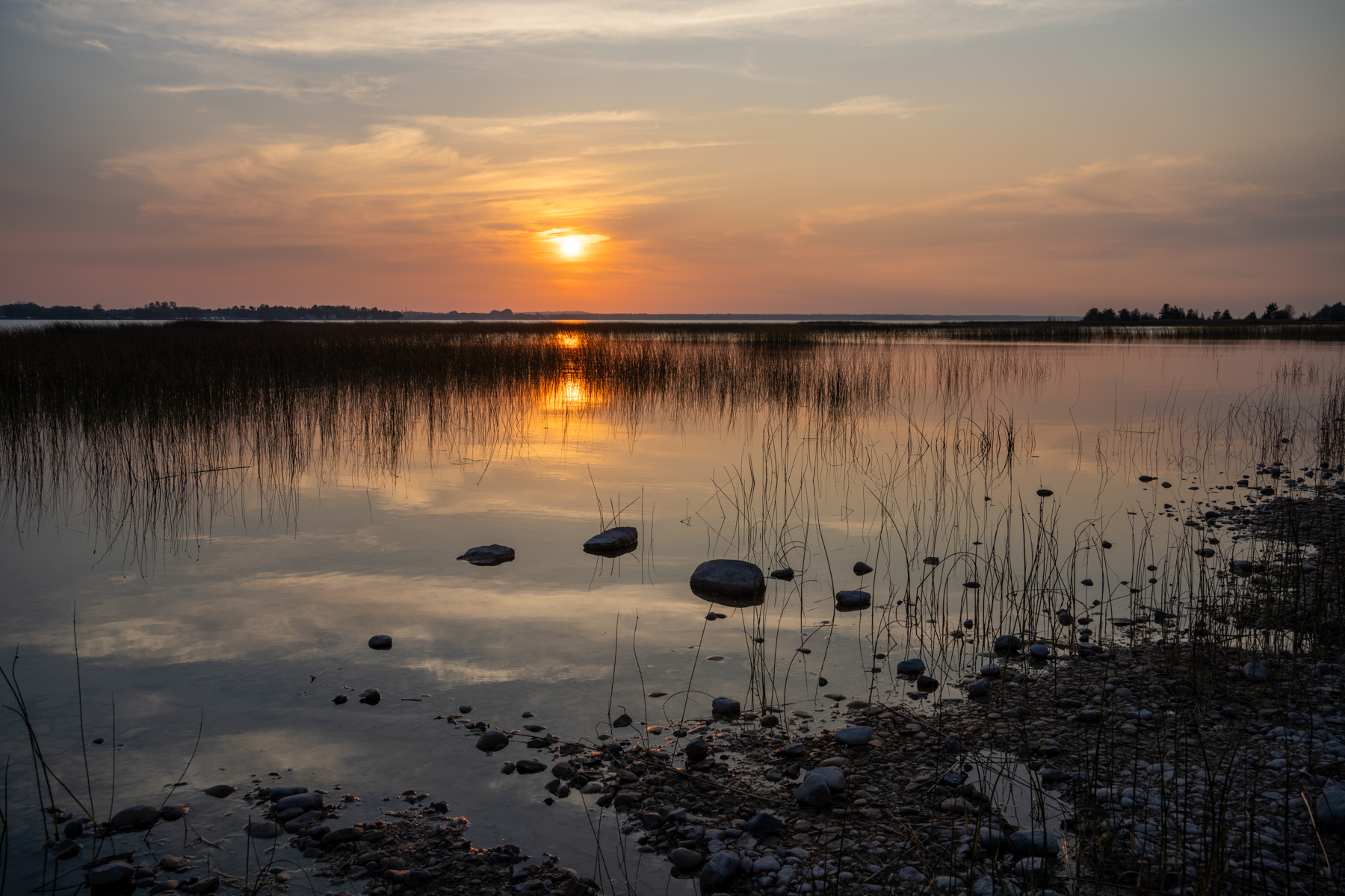
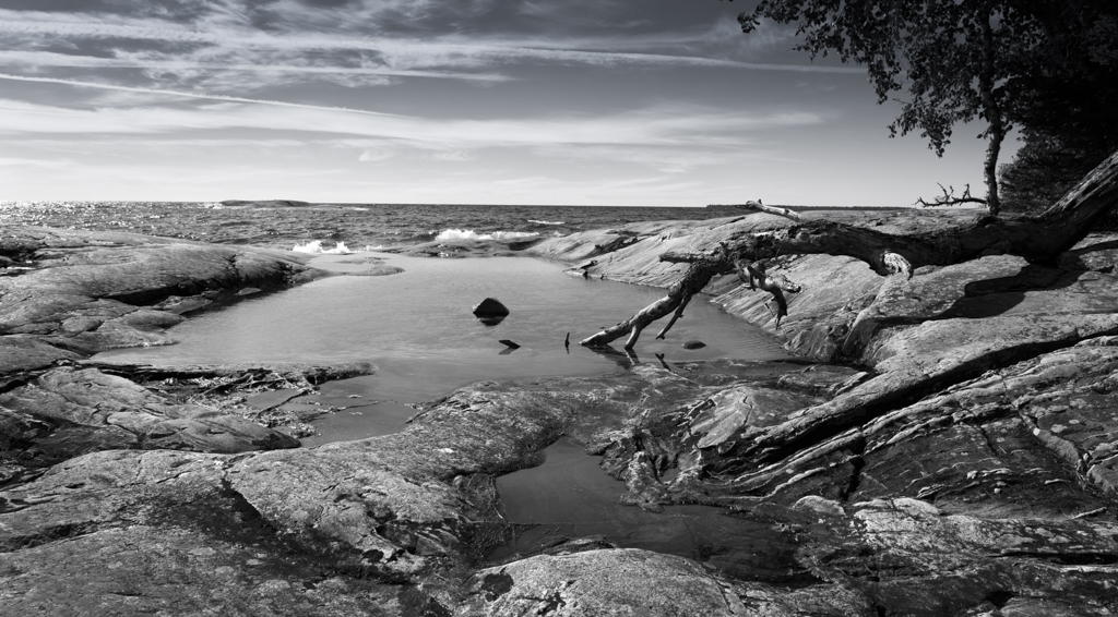
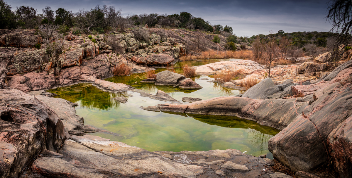
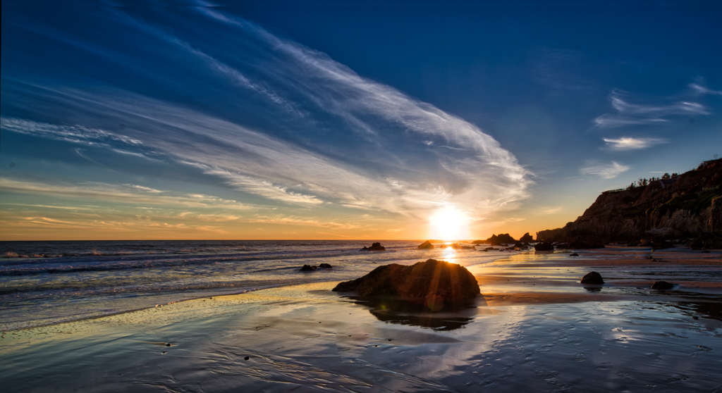
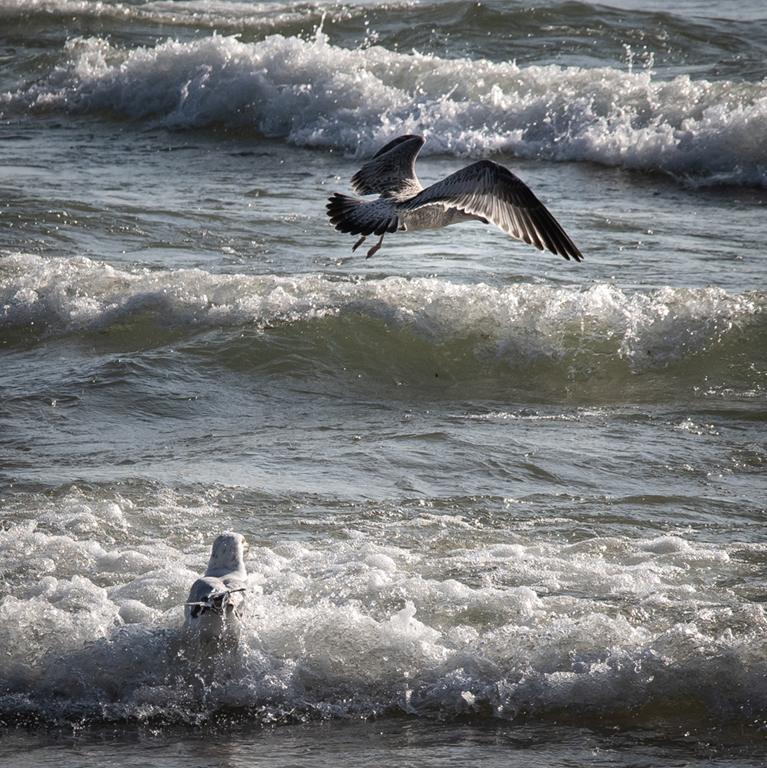
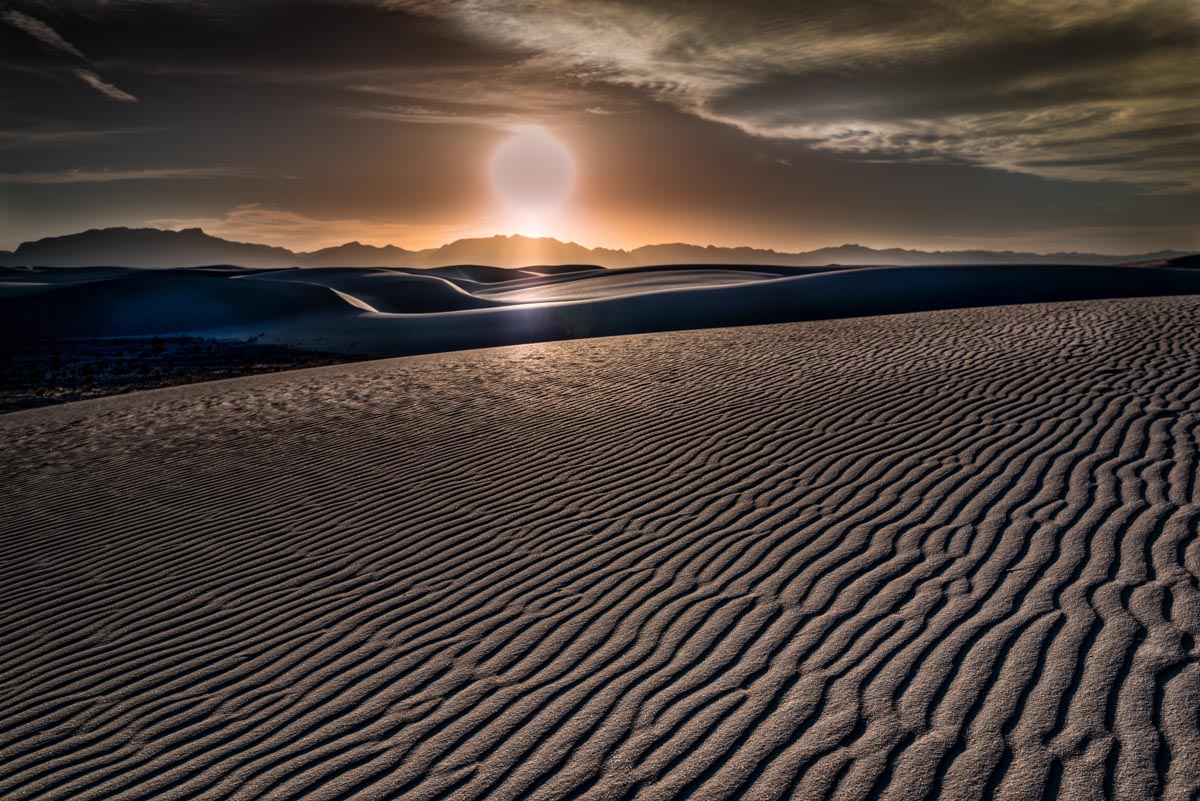
Rita,
Nice landscape with a strong foreground element and interesting background. If you want to keep the same framing, the only thing you could do to affect DOF was use a larger f stop and you were already maxed out at 2.8 so you couldn't do that. You could have moved back and used a smaller f stop to maintain the same framing but the dof would not change. As Damon suggested you could move closer and change the framing (more flower in the foreground) and you would have had less dof. It is all a bunch of trade offs which may or may not change the apparent dof. Put your camera info into the simulator below and mess around with it to see what happens to DOF as you change the things you can change (distance, f stop, focal length). Sensor size and diameter of the lens also can affect DOF but you can't change either of those unless you change the camera. https://dofsimulator.net/en/ |
Mar 6th |
| 60 |
Mar 24 |
Comment |
Damon,
I have a potter friend and have taken many images of him turning and firing Raku pots. This image captures the concentration and the careful manipulation required to throw a pot. The gaze, loose hair, and necklace move the eye from top to the hands at the bottom of the image. I like to slow the shutter speed down to get more of a motion effect on the perimeter of the spinning wheel. |
Mar 4th |
| 60 |
Mar 24 |
Comment |
Anne,
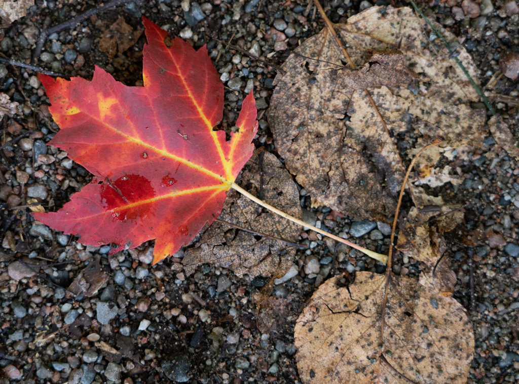
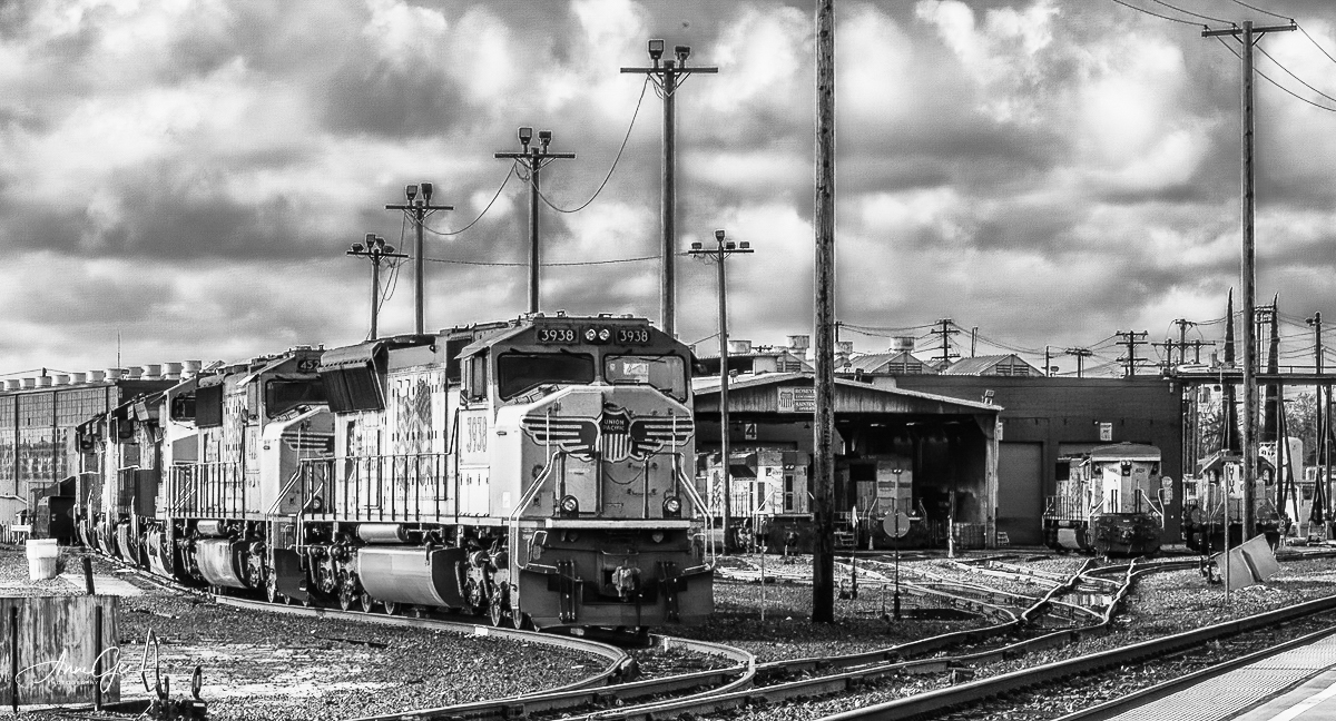
I really like this image. There are lots of elements in this image that work well together to form a cohesive composition: the converging rails and approaching engines lead the eye to the center of the image; the vertical poles, particularly on the left, do the same; the vibrant yellow of the engines; and the background with the repeated yellow engines in various positions. There are lots of repeated elements in this image which could lend to being "busy" but in this case I think they tie together to make a strong composition. The use of Colorefex certainly increased the contrast in the clouds and saturation to the image but I might dial that effect down a bit since it is approaching a bit artificial looking to my eye. I don't usually pixel peep but I think there is some type of fringing or halo around the telephone poles (from Color Efex?) and you may have a large dust spot just above the second pole to the right starting from the foreground. This is where seeing the original for comparison would be helpful. I think this also would make an effective bw image (see attached). |
Mar 4th |
 |
5 comments - 0 replies for Group 60
|
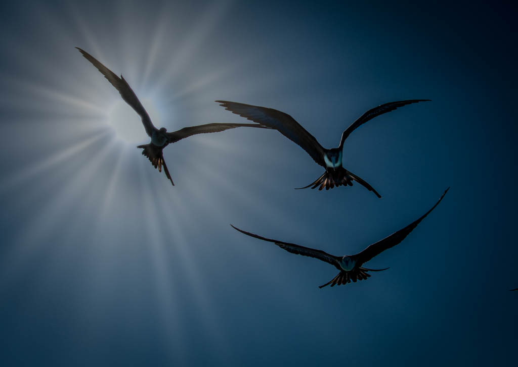
| 69 |
Mar 24 |
Reply |
Yes, I think the same thing. There is no strong center so the eye wanders from bird to bird. And it certainly has a Gothic feel to it. |
Mar 11th |
| 69 |
Mar 24 |
Reply |
Thanks Mervyn. |
Mar 11th |
| 69 |
Mar 24 |
Comment |
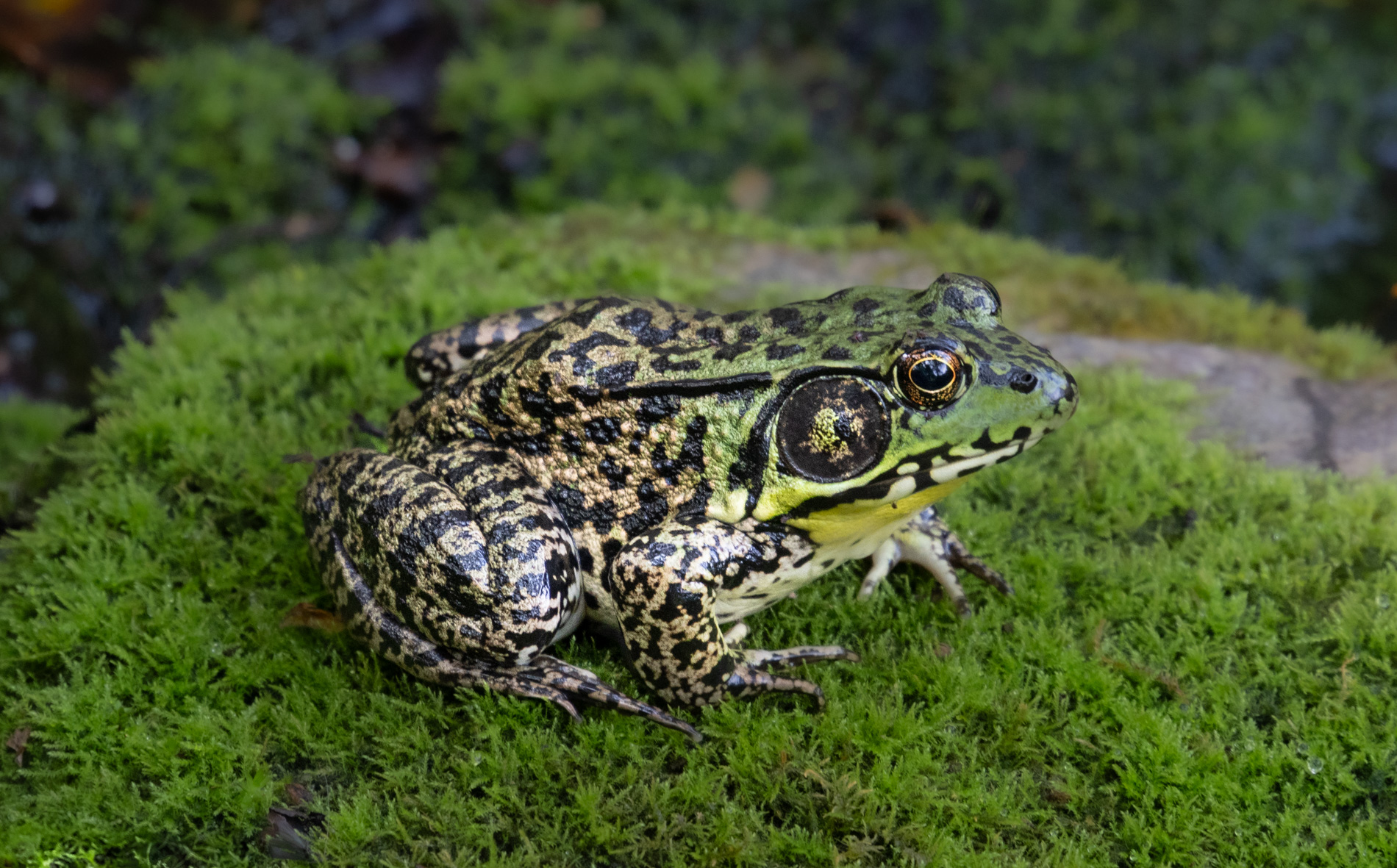
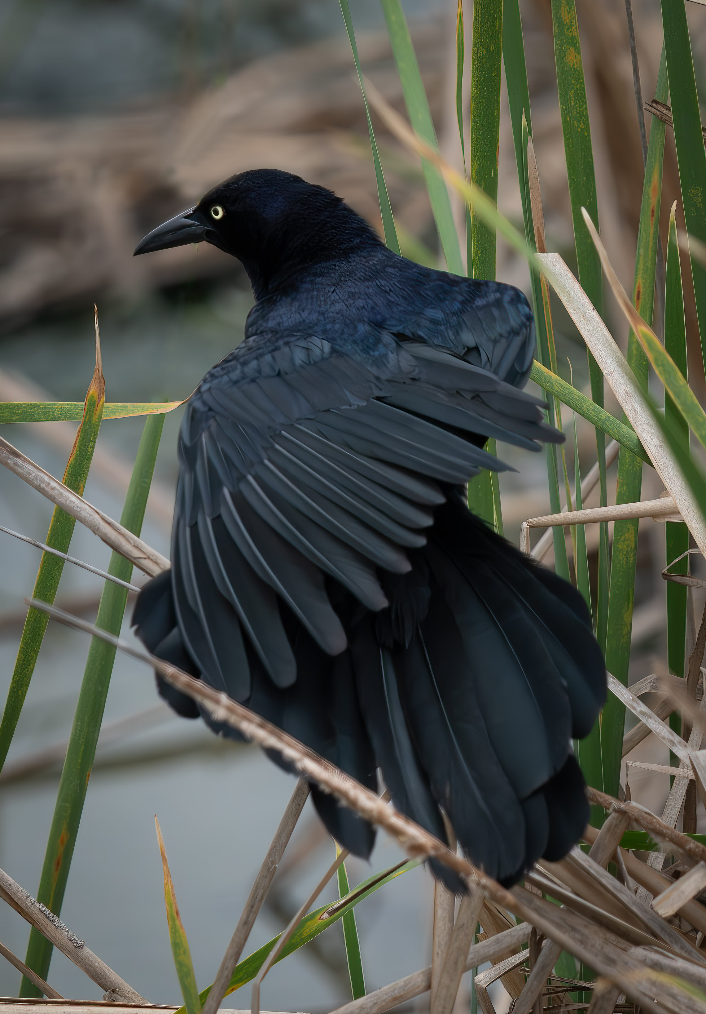
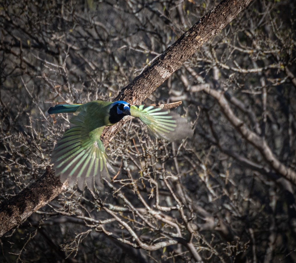
Jacob,
This is one of your better images. I like that the subject fills the frame and that there is a diagonal line leading from the tail to the head. I agree with Pierre that the image appears a bit over processed. Also, there appears to be a spot of some kind just above the rock in the background in both images. |
Mar 11th |
| 69 |
Mar 24 |
Comment |
Pierre,
Yes, a Grackle sounds right. They were noisy and often form swarms around Texas parking lots and urban areas.Thanks. |
Mar 11th |
| 69 |
Mar 24 |
Comment |
Thanks Cindy. |
Mar 6th |
| 69 |
Mar 24 |
Reply |
Yes, I have the same issue with trying to eliminate the artificial background of the structure. |
Mar 5th |
| 69 |
Mar 24 |
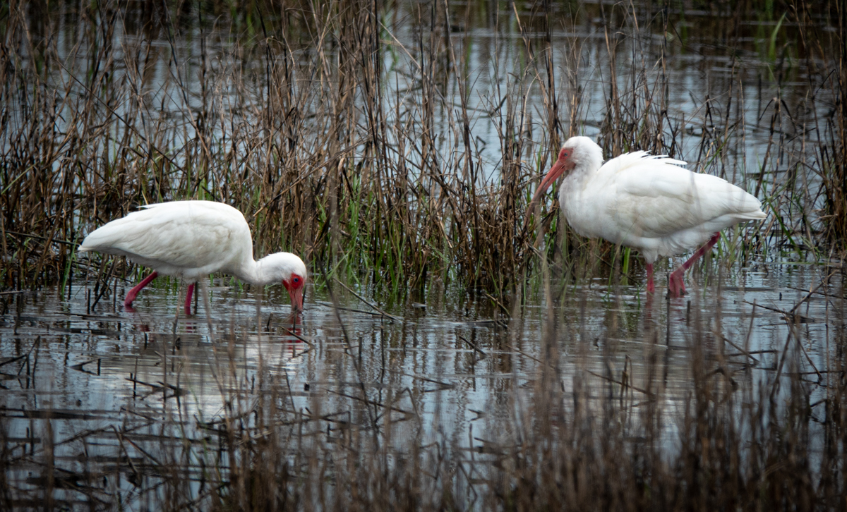
Comment |
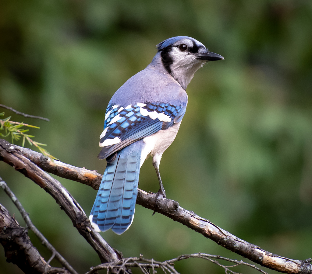
Diane,
I like the image just the way it is. Such a colorful bird and the focus is crystal clear. I like that the beak has a bit of backlighting. Nice bokeh too; clear backgrounds in zoos can often be distracting. |
Mar 4th |
| 69 |
Mar 24 |
Comment |
Jaswant,
Quite a lovely and interesting composition. I particularly like the soft light highlighting the cub's fur and face. The buffalo is kind of a dark blob; I would bring the exposure up a bit on the foreground/face of the buffalo to make the context visually more clear. |
Mar 4th |
| 69 |
Mar 24 |
Comment |
Cindy,
Nice silhouette. Yes, I would crop out most of the highlights in the upper half of the image and/or tone then down more, if possible without making the flat. |
Mar 4th |
| 69 |
Mar 24 |
Comment |
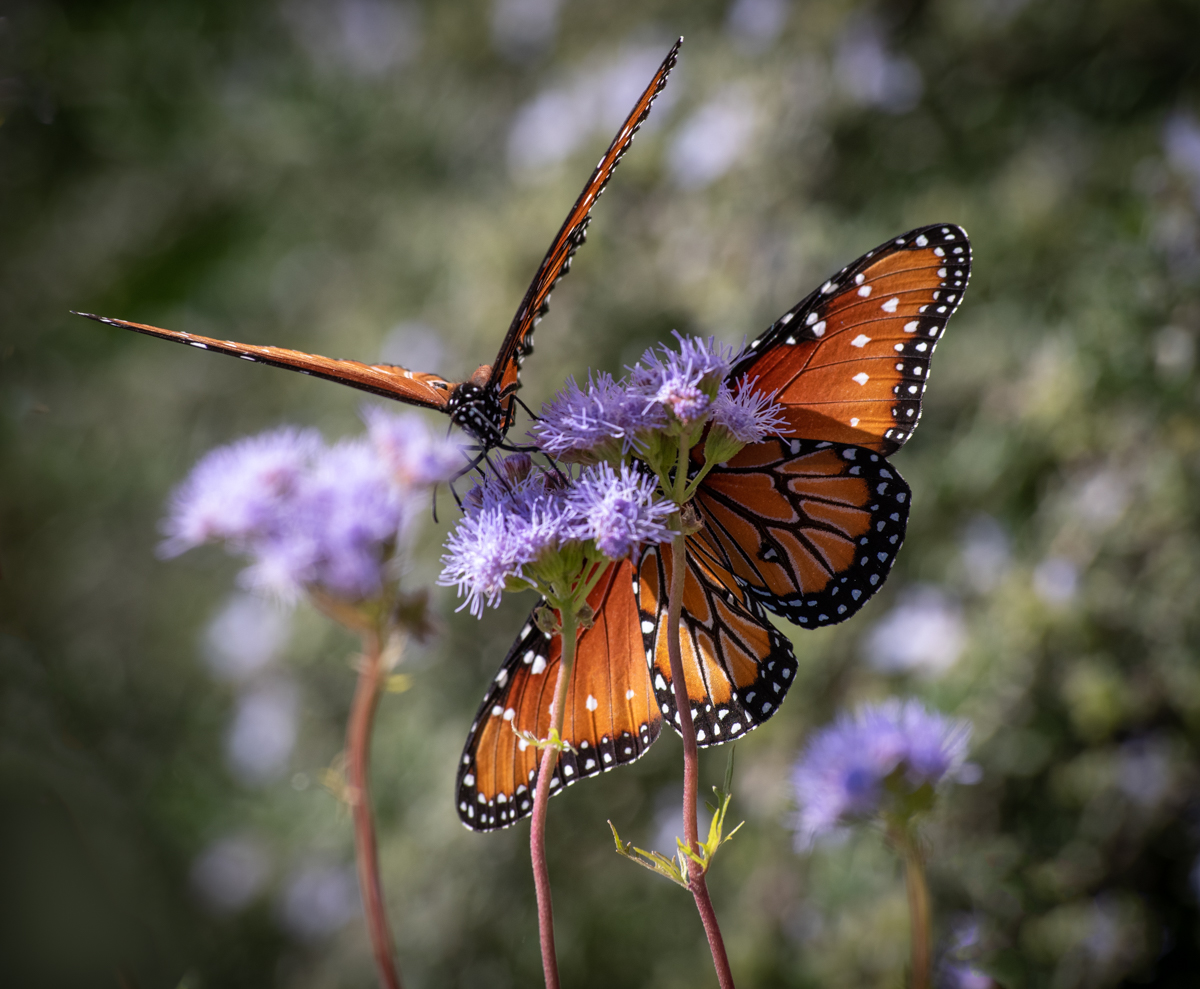
I like going to the butterfly house (conservancy) near our home. It is so much easier than chasing the butterflies around in the open and there are many different varieties to shoot and some are really big and colorful. While the butterfly in this image is interesting and clear the real star of the image is the striking color. My guess is that the interior (top) of the wings were more colorful than the bottoms but they don't often keep their wings spread apart waiting for us photographers to get a photo. |
Mar 4th |
| 69 |
Mar 24 |
Comment |
Mervyn,
No question you caught the antelope in a very unexpected position. I particularly like the sheen to its hide and the well defined musculature and tenons. |
Mar 4th |
8 comments - 3 replies for Group 69
|
13 comments - 3 replies Total
|