|
| Group |
Round |
C/R |
Comment |
Date |
Image |
| 5 |
Feb 17 |
Comment |
Thank you Nick. |
Feb 19th |
| 5 |
Feb 17 |
Comment |
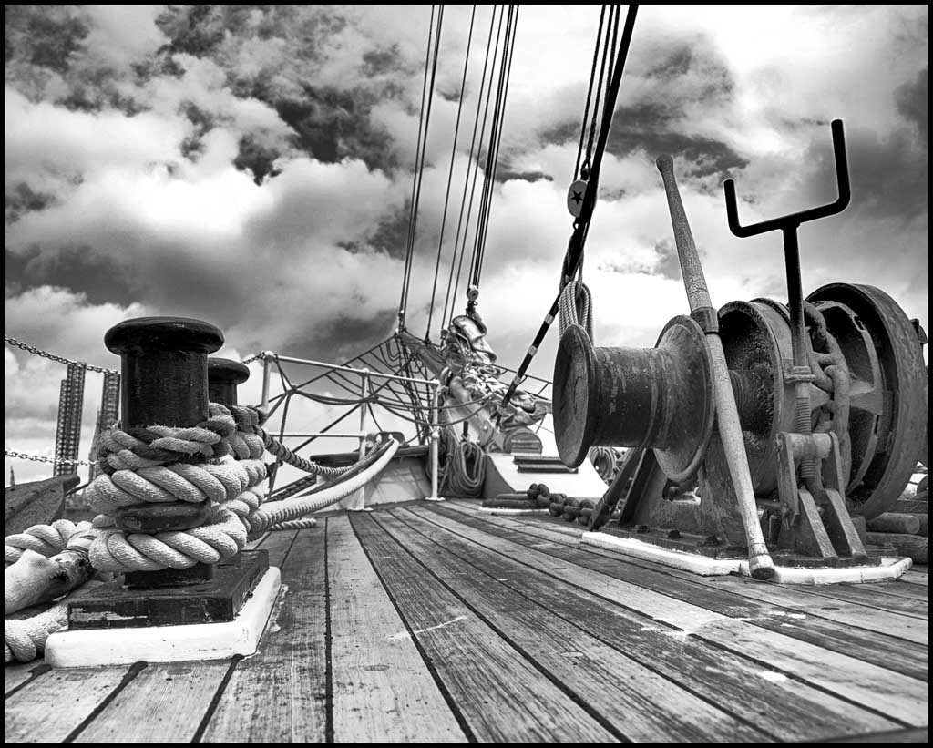
I like what you did with this photograph. I like the antiquing of the photo also. Maybe a little more work on the top left where you took the tree branch out might be one way to improve it a bit but I think that probably wouldn't be noticed by most people since it has the antiquing all over the picture. Good job and good imagination. |
Feb 16th |
| 5 |
Feb 17 |
Reply |
Thanks John. |
Feb 16th |
| 5 |
Feb 17 |
Comment |
Thanks Richard. I felt it was ok to break the rules now and then. |
Feb 15th |
| 5 |
Feb 17 |
Comment |
I personally really like what you did with this photo. It is as though he is pointing the gun right at me and is going to shoot. It is a highly emotional photo. Good job. I can't make any suggestions to make it better. |
Feb 8th |
| 5 |
Feb 17 |
Reply |
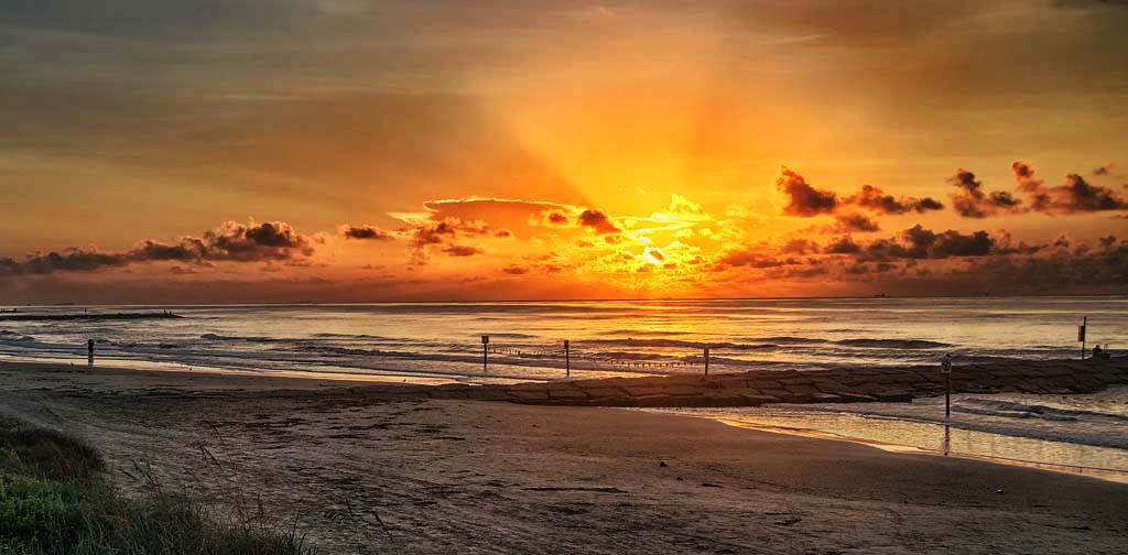
I cropped it to put the horizon on the third but decided I like the sky and took your advice to give the clouds more excitement in the picture instead of being so flat. I did about as much as I could without having pixels show up and I do like it better. What do you think?
Thanks for your advice. |
Feb 7th |
 |
| 5 |
Feb 17 |
Reply |
I put the horison on the third to improve the picture. Thanks. |
Feb 6th |
 |
| 5 |
Feb 17 |
Comment |
My suggestion is to bring the size of your wife down. She seems out of proportion to everything else. I would also suggest trying to get some of the noise out of the picture. Otherwise it is a interesting picture. |
Feb 4th |
| 5 |
Feb 17 |
Comment |
Very arty for sure. Good going and I hope you win with this one. I can't suggest anything to make it better. It is your art and I appreciate it. |
Feb 4th |
| 5 |
Feb 17 |
Comment |
I would lighten the shadow on the left side of the lighthouse so it is the main object of the picture. It will stand out more and really catch the eye of the viewer. The yellow wave crest on the left I would also be lightened a little. Otherwise I think it is a great picture. |
Feb 4th |
| 5 |
Feb 17 |
Comment |
I like the shadow and the background taken out. Only suggestion I can think of is that it looks like it is floating in air. Maybe if it looked like it was siting on something it would be better. You are really handy with photoshop to be able to do what you did. |
Feb 4th |
8 comments - 3 replies for Group 5
|
8 comments - 3 replies Total
|