|
| Group |
Round |
C/R |
Comment |
Date |
Image |
| 12 |
May 25 |
Comment |
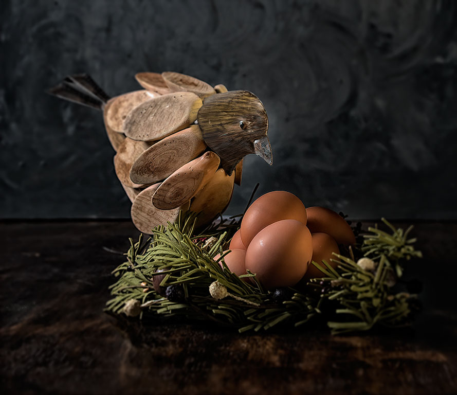
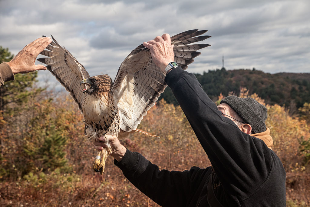
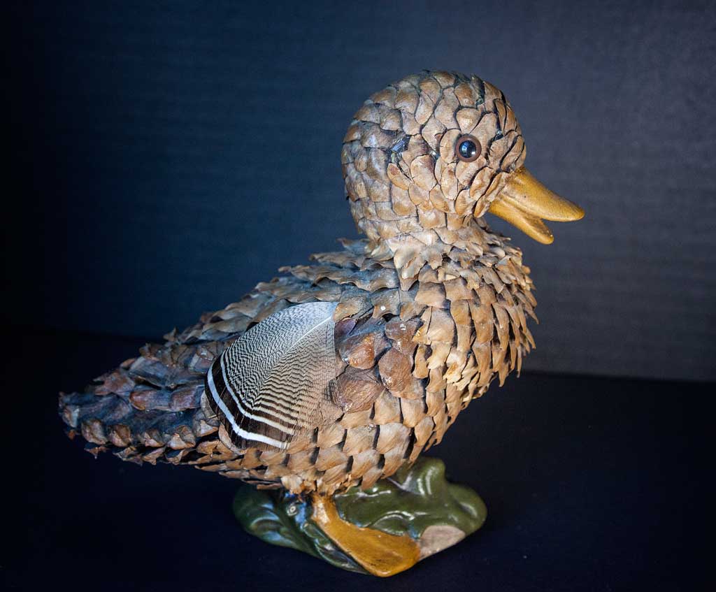
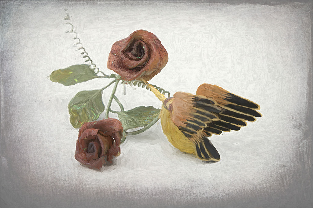
Thank you all for your comments. Depth of field is one of my biggest challenges when taking still life photos. You'd think I would have figured it out by now. I left that little bit of shading in the background to keep the birds from floating in a black void. Sometimes that works, but I didn't wat it here. The leaves were, indeed, picked for their color and their size. That leaf in the second bird's mouth is a gift to the other bird - kind of a mating behavior. |
May 25th |
| 12 |
May 25 |
Comment |
Yum. That looks delicious. The depth of field is good, emphasizing the texture of the pineapple, the nice little leaf, and the raspberries. Exposure is very good. The dark leaves in the background are bothersome - they are in soft focus, but very dark making them distracting. The little red berries in the bottom right corner don't bother me. Since this was taken at a restaurant, you could hardly rearrange things. Therefore, good job. I feel the dark pineapple shell helps the fruit slices stand out. |
May 25th |
| 12 |
May 25 |
Comment |
The depth of field bringing the words "Holy Bible" into sharp focus while softening the rest of the image is spot on. The texture of the old book binding adds a lot of interest as well as feeling. The only thing bothering me is that vertical line (bookshelf support?). I agree with the others about cropping. This is worth working on. Can you move the Bible to another shelf, stand it vertically, add some companion pieces? |
May 25th |
| 12 |
May 25 |
Comment |
The soft backlighting on the chess pieces is very good. The pieces themselves are arranged without bad line mergers - well done. Your exposure was a challenge with the bright window and the dark chess pieces, but you nailed it. When I first looked at the image I saw the bright window area first. You probably wanted to keep that whole lovely tree in the frame. But cropping from the top keeps the outside (part of the assignment) while adding more emphasis to the chess set. |
May 25th |
 |
| 12 |
May 25 |
Comment |
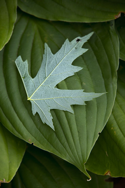
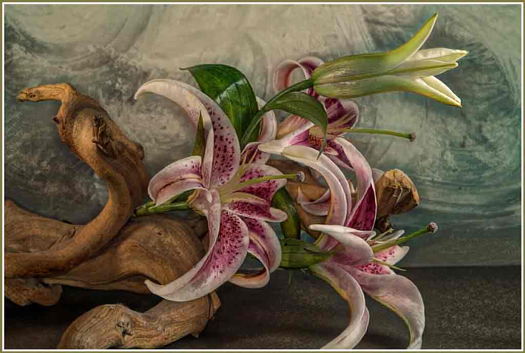
Very pretty. There are lots of colors in the leaves. The small green pieces add a nice contrast. This could be framed and hung on a wall. |
May 25th |
| 12 |
May 25 |
Comment |
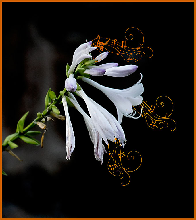
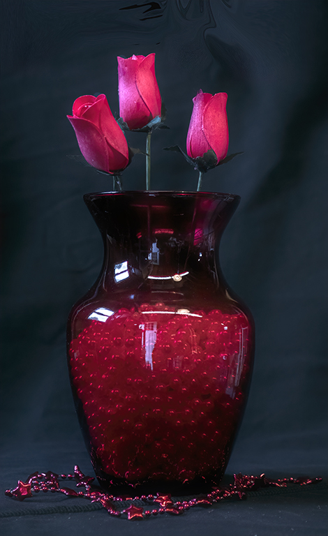
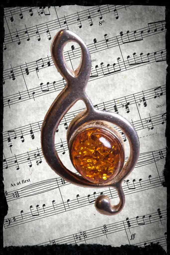
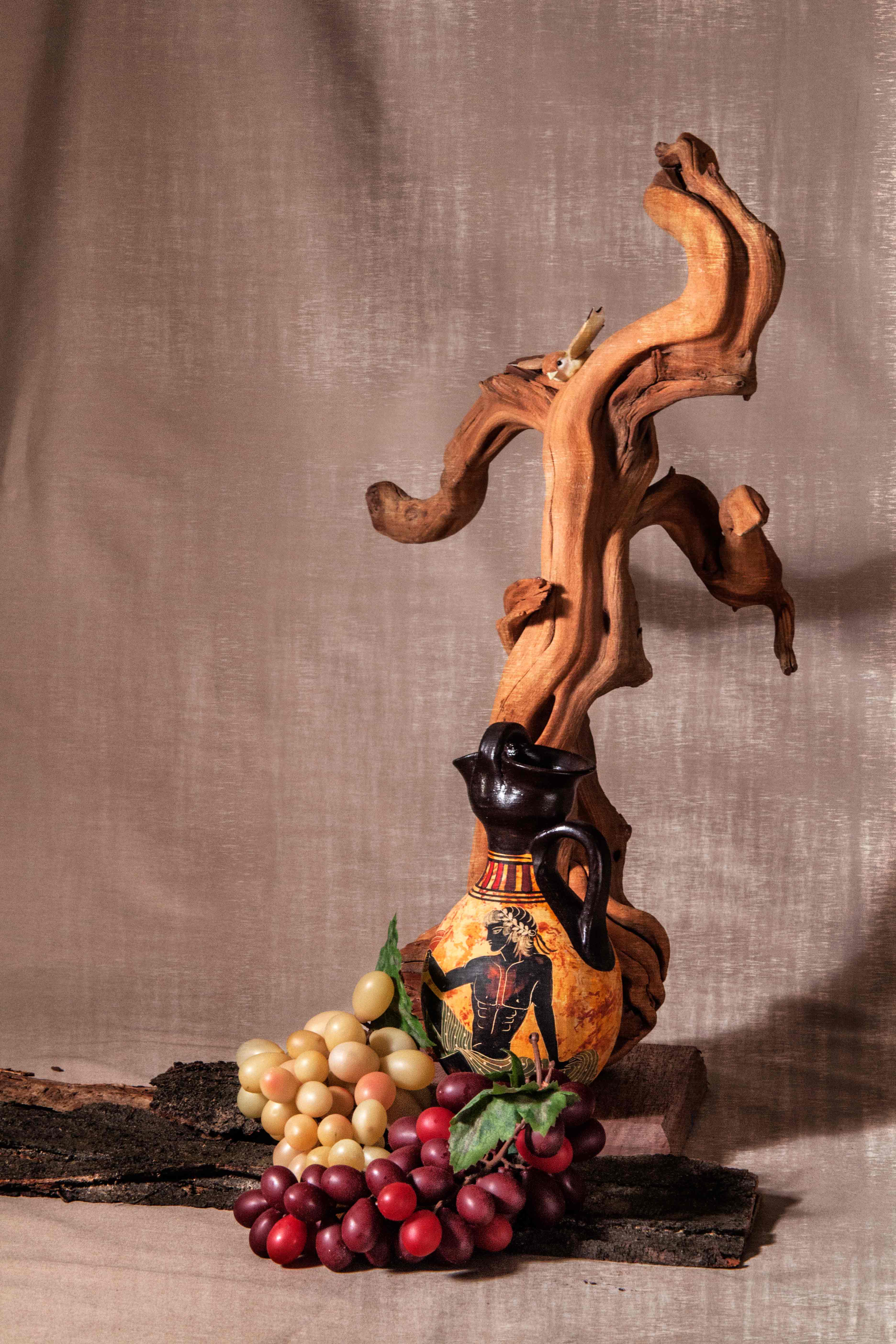
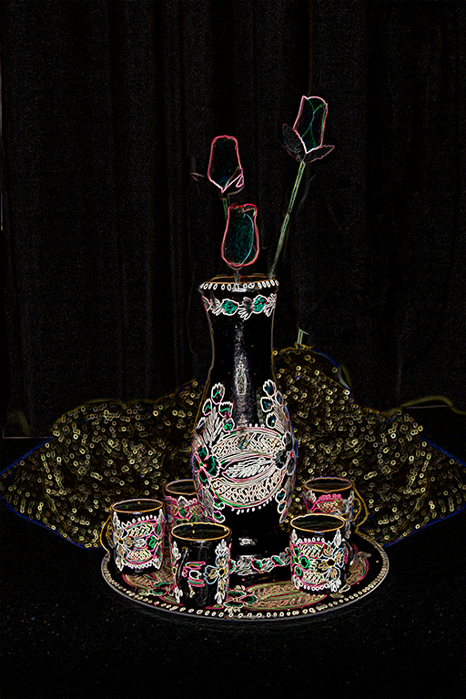
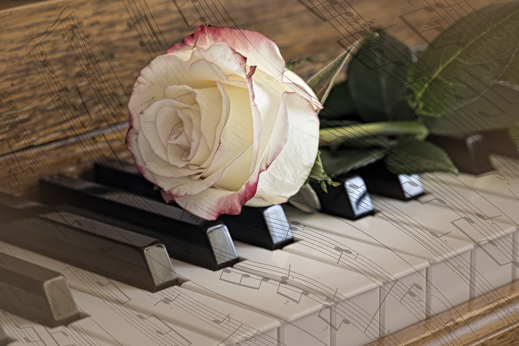
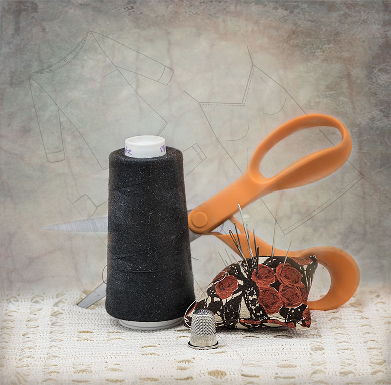
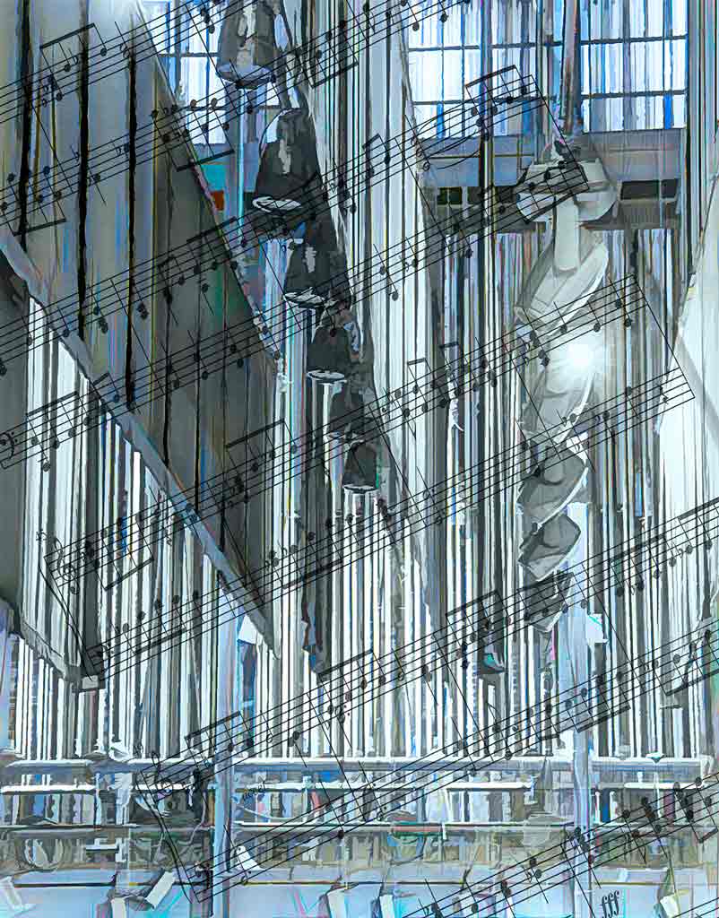
I love music, and I really love your setup. The exposure is perfect; the subtle texture keeps the objects from floating in a black void. All the objects and their colors compliment each other very well. The vase of flowers is a nice touch. Quite well done. Are you a musician? |
May 25th |
| 12 |
May 25 |
Comment |
The exposure here is very good - the whites are not blown out (that could easily have happened). The hot pink yarn as a background really helps the purse stand out, and adds to the story. Your good and faithful reflector did the job. Truthfully, you didn't need the skein of yarn; we may not know what a crochet hook is, but we know what yarn is. Try cropping from the top. BTW, excellent work. Your stitches are very even. Also, this certainly qualifies as a still life because it isn't moving. I never noticed the couch in the lower left, either. |
May 25th |
7 comments - 0 replies for Group 12
|
| 77 |
May 25 |
Reply |
I never paid attention to the foil. My bad. |
May 25th |
| 77 |
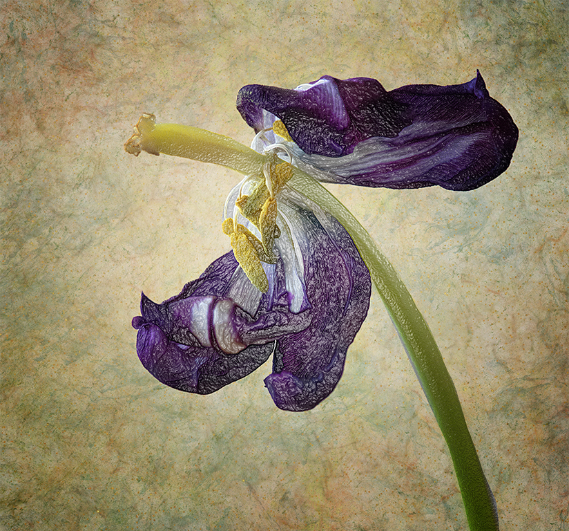
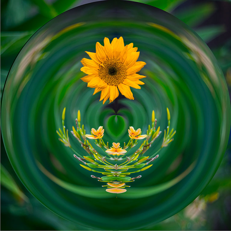
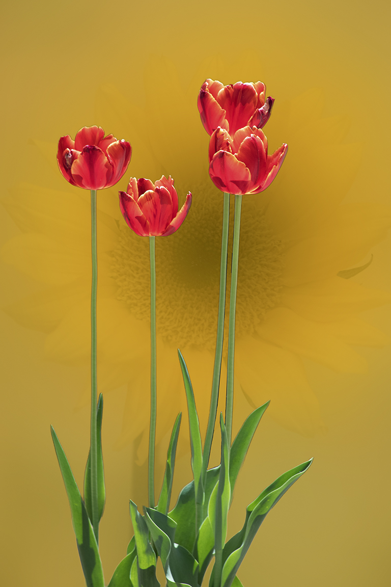
May 25 |
Comment |
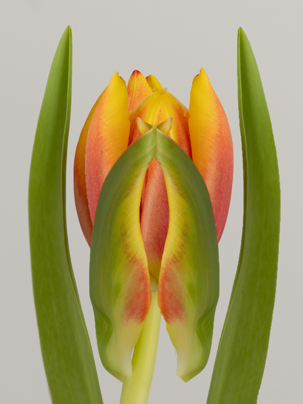
What fun. How very creative. This is a very surreal image, even though we know that it is a tulip. There are so many cool things you can do to this image once you get inspired. Like you said - a rabbit hole. |
May 25th |
 |
| 77 |
May 25 |
Comment |
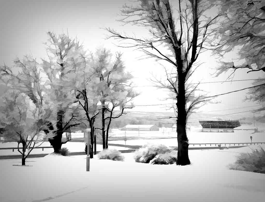
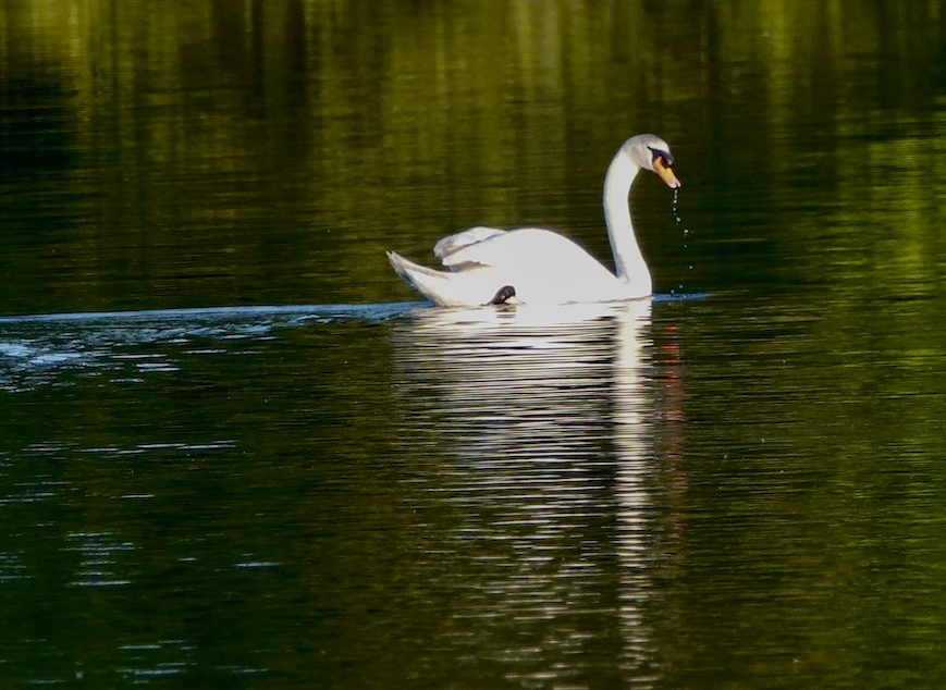
Swans are beautiful birds and good subjects for photographers. The swan is well placed in the frame, not quite centered. But the white feathers in the original are burned out, and there is really no way to correct that. The swan in the final version is a flat gray; the original whiteness would have been better. The blue water and the red in the reflection look very neon, but perhaps that was what you wanted. The reflection in the water is far more interesting than the far shore of the lake. Try cropping that out. It seems that the others agree with cropping. |
May 25th |
 |
| 77 |
May 25 |
Comment |
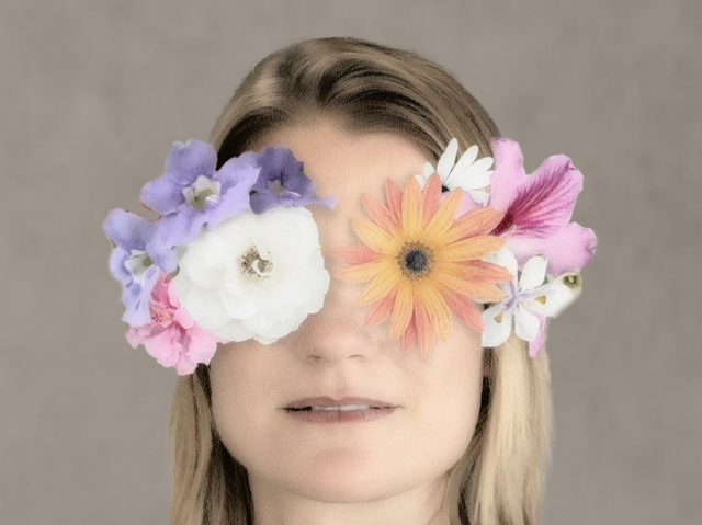
This is a clever idea. I love the way you arranged the flowers, as they work together instead of just being plunked onto the image. The soft tones are very pleasing. But the flower mask is a little too big and overpowers the face. I tried to remove some on each side to bring the proportions to what I see as a better balance. The new background isn't as good as yours, but this is just an example of another version. |
May 25th |
 |
| 77 |
May 25 |
Comment |
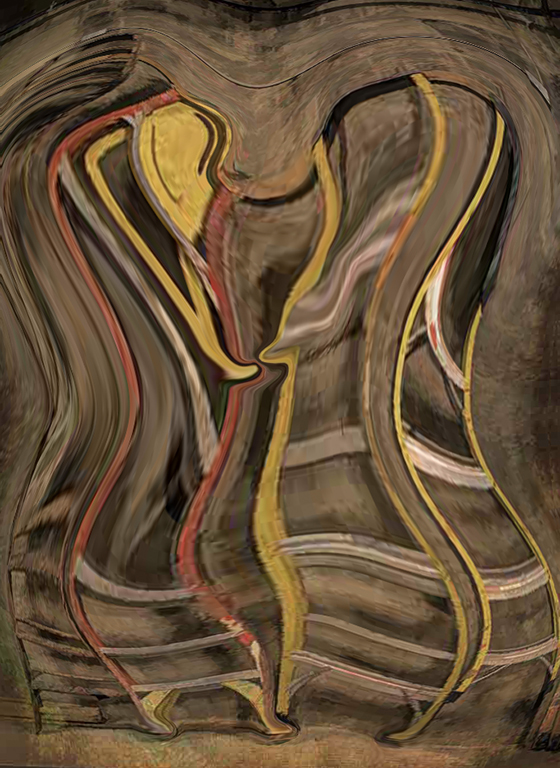
You have created a very exciting image. In the original, the lady looks posed. In the final version she does, indeed, seem to be hacking her way through tangled branches. One can almost feel the motion. Your efforts to control the shadows and highlights also add depth to the image. I would mask the tangled branched off of her face, but that's just me. Like Jan, I didn't realize that the moon was the moon. Perhaps you could brighten that up a bit or clean some of the texture away. |
May 25th |
| 77 |
May 25 |
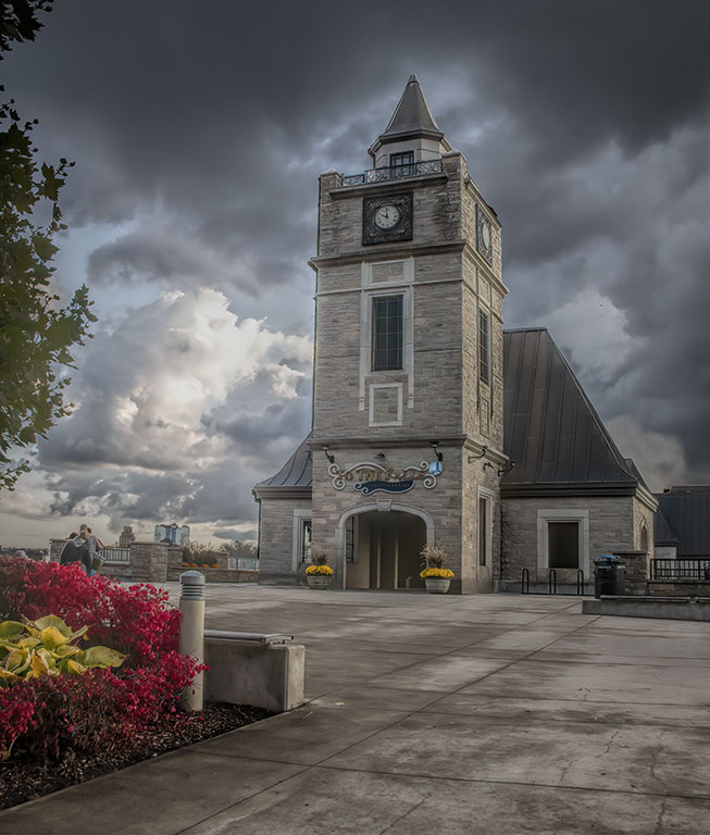
Comment |
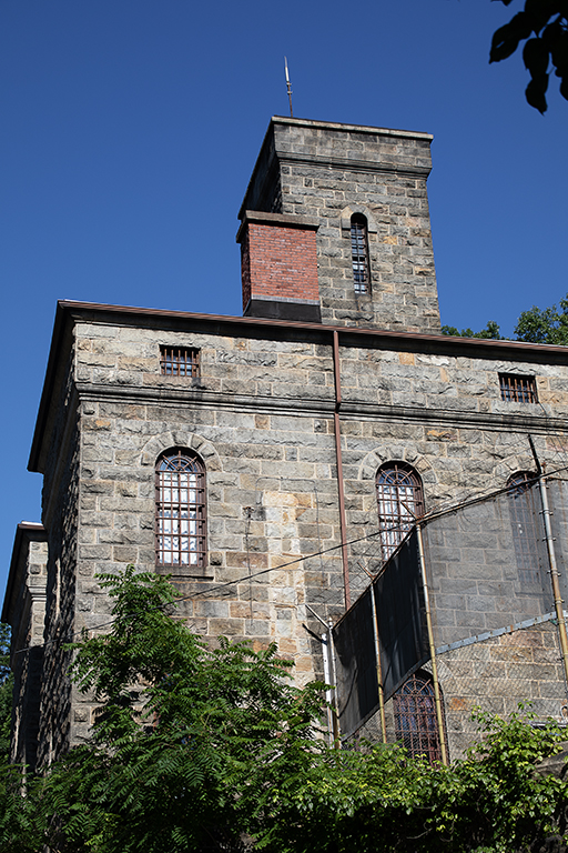
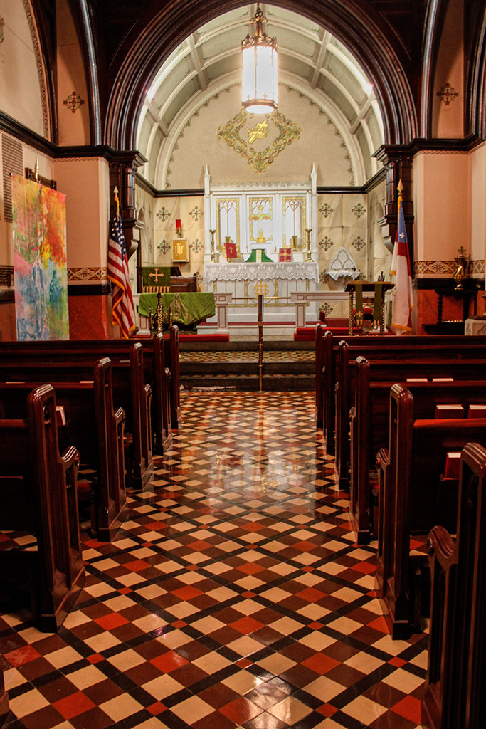
You turned a nice record shot into an amazing image. Converting to B&W was the right choice, as the colors and contrast in the original are rather bland. Removing the lamppost and the buildings in the background (even though they are hardly noticeable) made a big improvement. The adjustments to the church are well done, adding contrast, interest, and a feeling of dimension. This is beautiful. The final touch is the shadow of the cross telling the story of this unusual building. |
May 25th |
| 77 |
May 25 |
Comment |
Oh. I see what you mean. That would make it more natural. Thanks. |
May 7th |
6 comments - 1 reply for Group 77
|
13 comments - 1 reply Total
|