|
| Group |
Round |
C/R |
Comment |
Date |
Image |
| 12 |
Sep 24 |
Reply |
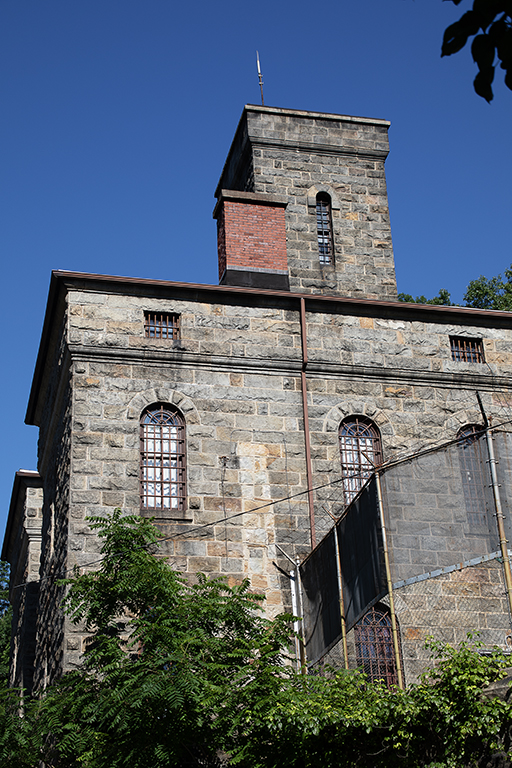
Thank you for straightening the building. It looks good that way. The tower with the narrow window was the guard tower overlooking the exercise yard. The solitary confinement cells were in the basement, six cells with a hard bed and no light. It was creepy down there. |
Sep 16th |
| 12 |
Sep 24 |
Reply |
The jail is right on the main street of town, and hard to separate from the surrounding buildings. But you are right about one thing to focus on before exploring the rest of the image. That red brick chimney might do, but it is more of a distraction. |
Sep 16th |
| 12 |
Sep 24 |
Reply |
Ooops. I never noticed the wires. That's what happens when you see a scene often. |
Sep 16th |
| 12 |
Sep 24 |
Comment |
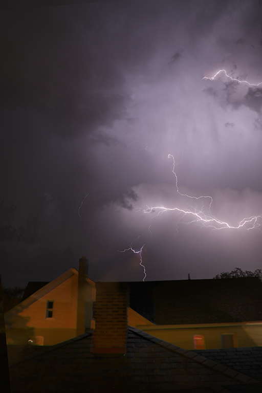
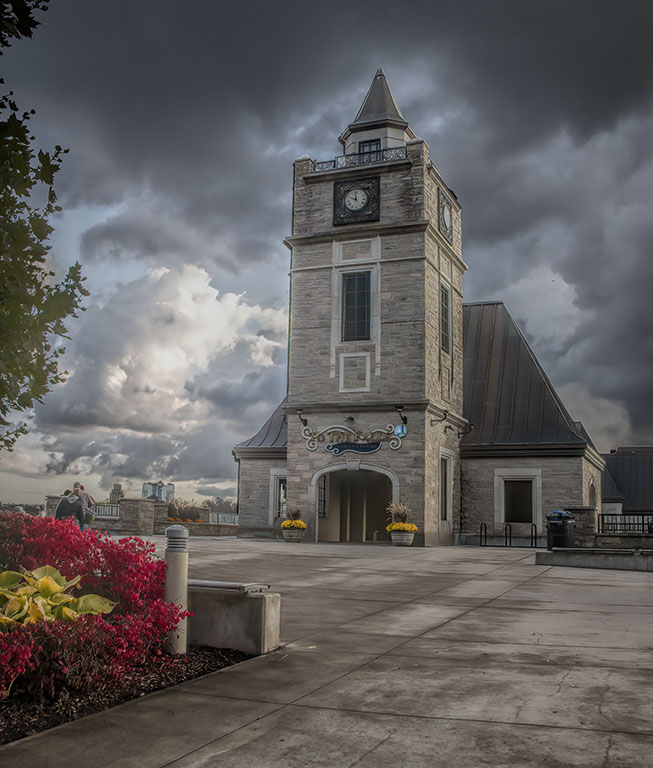
The dirt path leads dramatically to the front entrance. The centered composition is just right for this image. Exposure and DOF are spot on. Congratulations for not running form the storm. This is exactly the right sky for this old castle. The curb seems to invite the viewer to take a step up and walk to the entrance. Sometimes I find that perspective correction still doesn't fix the problem, or crops too much from the image. Edit/Distort often works better. |
Sep 16th |
| 12 |
Sep 24 |
Comment |
Wow, Srijan. You certainly achieved your goal. I wouldn't change anything. |
Sep 16th |
| 12 |
Sep 24 |
Comment |
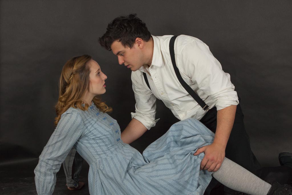
This is an excellent photograph technically. But it also has a great deal of interest. The boarded up green windows, the new replacement windows above the arched doorways, the new business on the first floor of the tan building with what looks like an empty apartment on the second floor. These things tell a story; it seems a melancholy one. These buildings seem to be empty, almost abandoned. Adding people would change that mood. |
Sep 16th |
| 12 |
Sep 24 |
Comment |
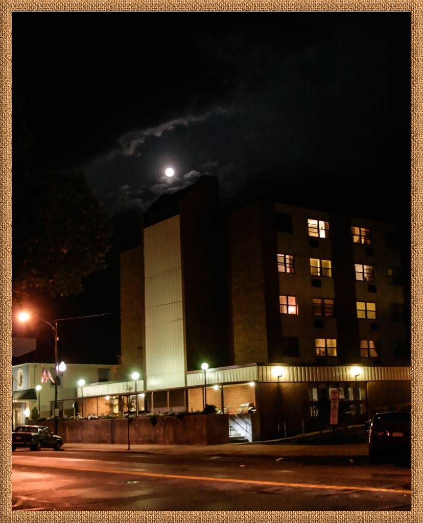
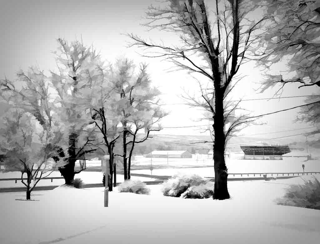
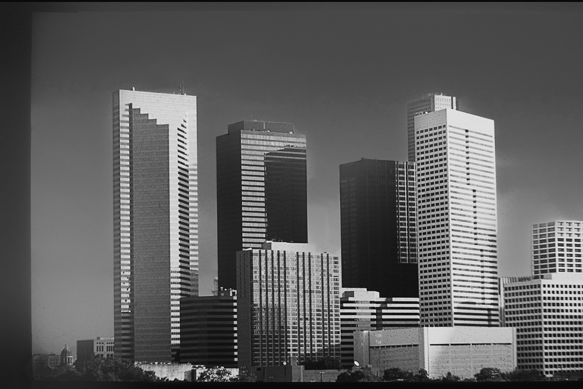
I'm sure there were lots of sections of this skyline to choose from. This one is quite attractive. There is enough overlapping of the buildings and good sidelight to add depth to the shot. The new sky seems a bit bright, but it does match the lighting on the buildings. Actually< I like the original sky because it provides a dark background to the light buildings. I played with this in Silver Effects. The original sky had a lot of dirt spots, so it ultimately had to be replaced. |
Sep 16th |
 |
| 12 |
Sep 24 |
Comment |
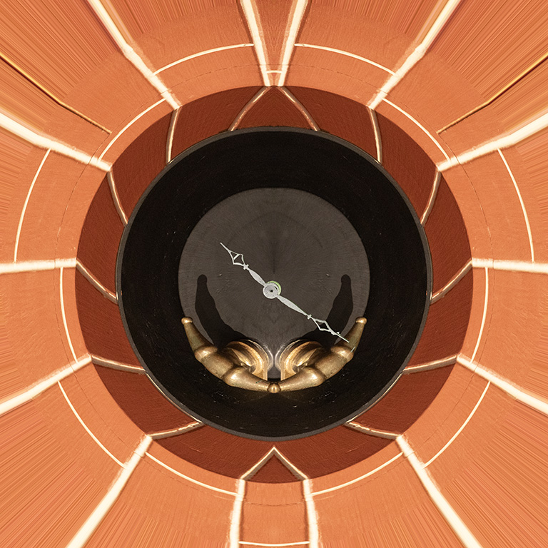
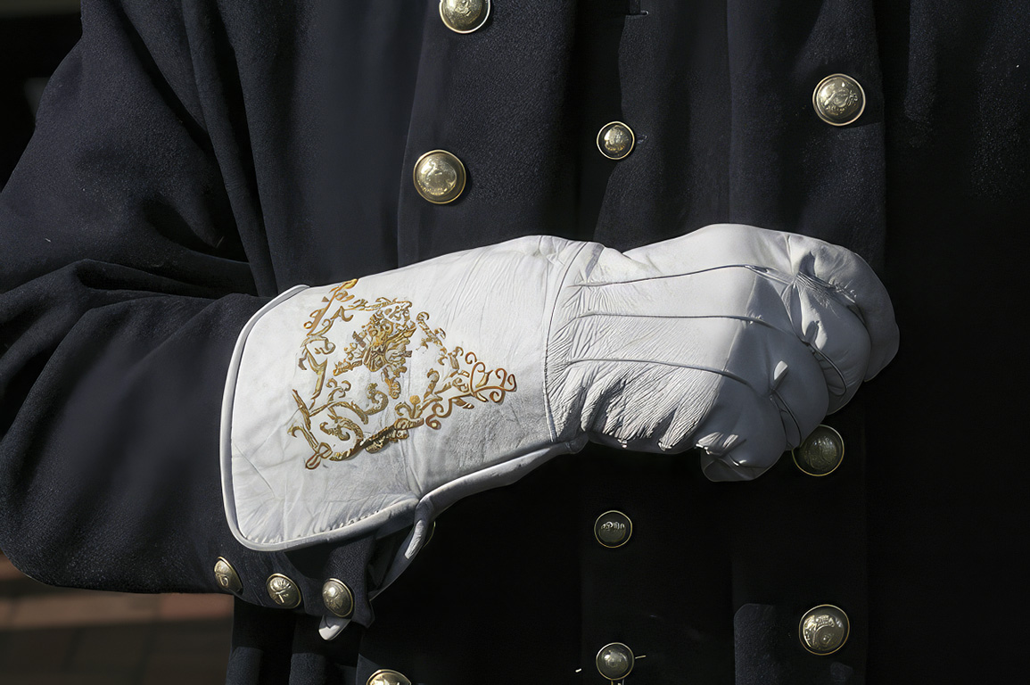
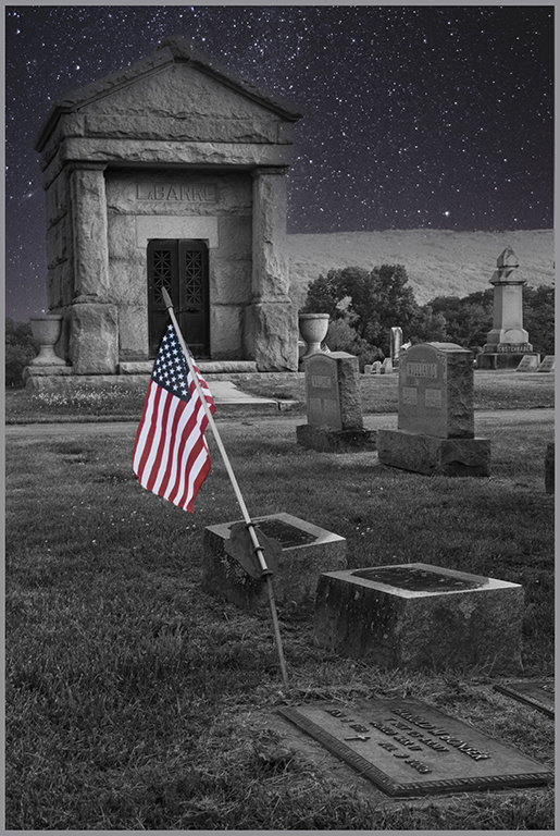
This may be a documentary shot of this memorial, but it is very well done. The angled view is much more interesting than a straight-on shot. You handled the high contrast light very well. There are hot spots on the left sailor's uniform, but that helps the viewer understand the story. These men had to stand still for a long time on a hot day with bright sun, perhaps glaring in their eyes at times. Adding a little blue to the sky helps the viewer focus on the subject. |
Sep 16th |
| 12 |
Sep 24 |
Comment |
This may be a documentary shot of this memorial, but it is very well done. The angled view is much more interesting than a straight-on shot. You handled the high contrast light very well. There are hot spots on the left sailor's uniform, but that helps the viewer understand the story. These men had to stand still for a long time on a hot day with bright sun, perhaps glaring in their eyes at times. Adding a little blue to the sky helps the viewer focus on the subject. |
Sep 16th |
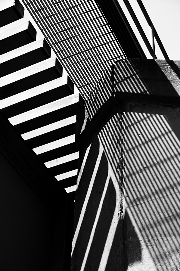
| 12 |
Sep 24 |
Comment |
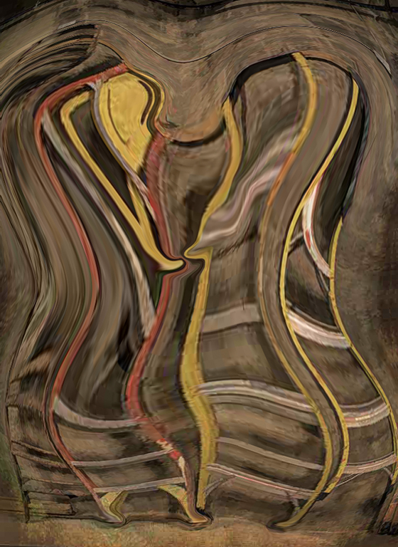
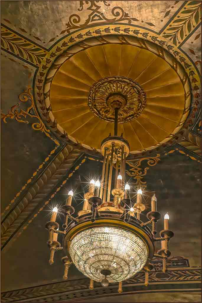
This is a visually interesting pattern shot. The colors, focus, exposure are perfect. Kudos to you for exploring many different angles on this structure. Architectural details are always interesting and often overlooked by the casual viewer. Very nice. The original 2 shot has a 3-D feel to it because of the curving lines. The final image is more of a graphic. The viewer wouldn't necessarily know that this is a ceiling. The square framing is fine with me. |
Sep 16th |
7 comments - 3 replies for Group 12
|
| 77 |
Sep 24 |
Reply |
Removing that small corner of the platform does make this look more like a real person. Nice job. Thank you. |
Sep 16th |
| 77 |
Sep 24 |
Reply |
This does, indeed, look good in B&W. That slight softening also adds to the nostalgic mood. Thank you. |
Sep 16th |
| 77 |
Sep 24 |
Comment |
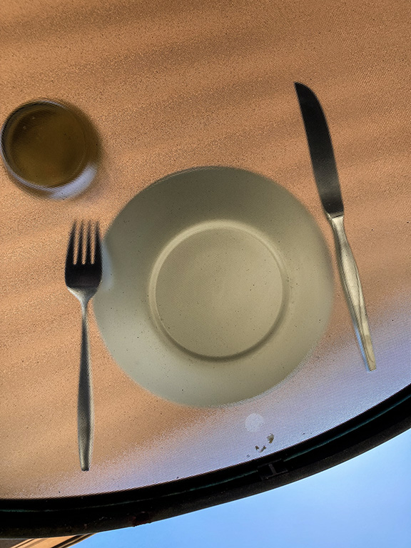
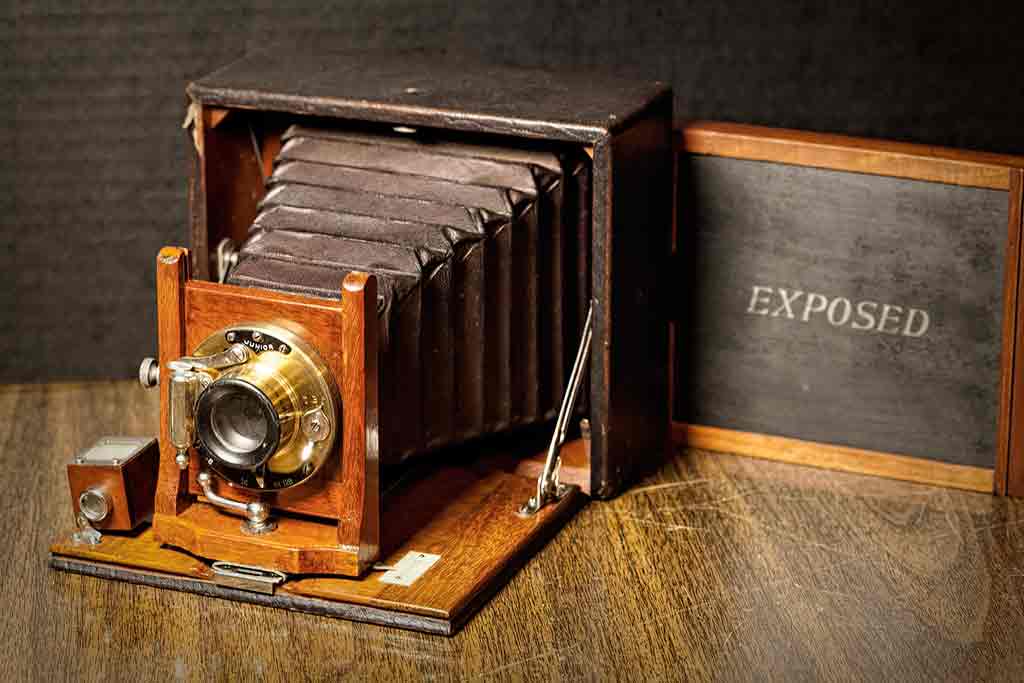
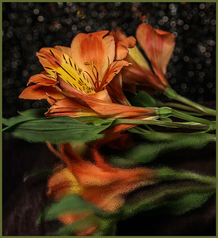
Your shadows look good. This still has an old world look to it. I like the reflection, but on comparing the two images your final version is much better. There is still enough brightness on the table to give the lock something to sit on. Removing them completely would make the lock seem to be floating in blackness. Incidentally, backing off slightly from your subject gives you enough room to crop for composition afterward. |
Sep 16th |
| 77 |
Sep 24 |
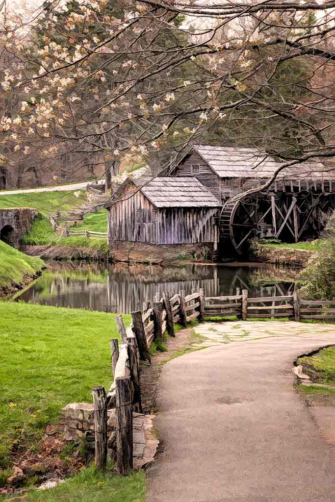
Comment |
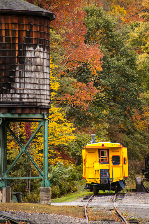
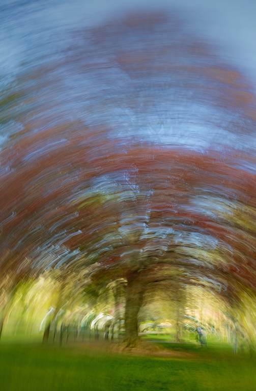
This may come down to personal preference. I personally like the sweeping upward movement of the trees in the May 2024 image. It gives the eye a focal point. Congratulations on your win.
well deserved. |
Sep 16th |
| 77 |
Sep 24 |
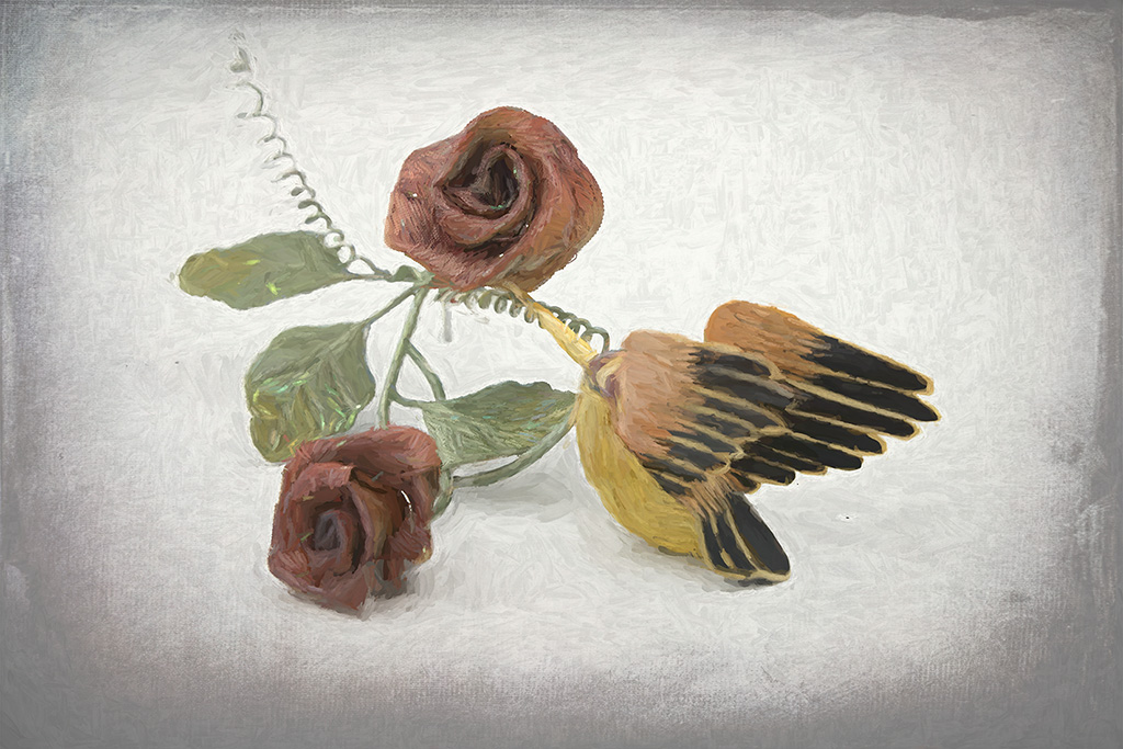
Comment |
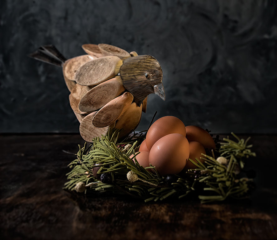
Wow, a lot of work. This is an amazing image, certainly qualifying as fine art. Don't worry about the bird being too large; this image is almost fantasy anyway. What was your process with this image? You started with the mailboxes. You did an excellent job of separating the bird from that busy background. You must have had to separate the mailboxes too. This is beautiful. |
Sep 16th |
| 77 |
Sep 24 |
Comment |
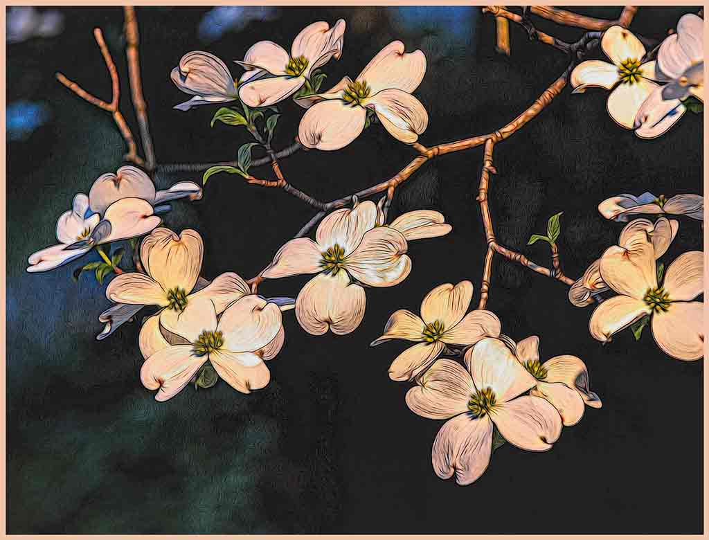
I usually do not like a color tint on a B&W image, but this green tint works very well here. In fact, I tried it as an untinted B&W, and it wasn't nearly as nice. The colors in the original distract from the shapes of the buildings. It could be a little alpine town. Well done. |
Sep 16th |
4 comments - 2 replies for Group 77
|
11 comments - 5 replies Total
|