|
| Group |
Round |
C/R |
Comment |
Date |
Image |
| 12 |
Aug 24 |
Reply |
I really like the ladders, too. But, alas, the hand-held camera failed them. |
Aug 20th |
| 12 |
Aug 24 |
Reply |
I never though of equating the color scheme to humans, but you are correct. Perhaps this should not hang in an eye doctor's office. |
Aug 10th |
| 12 |
Aug 24 |
Reply |
Oh, that extra space on the right is so much better! Thank you. |
Aug 10th |
| 12 |
Aug 24 |
Reply |
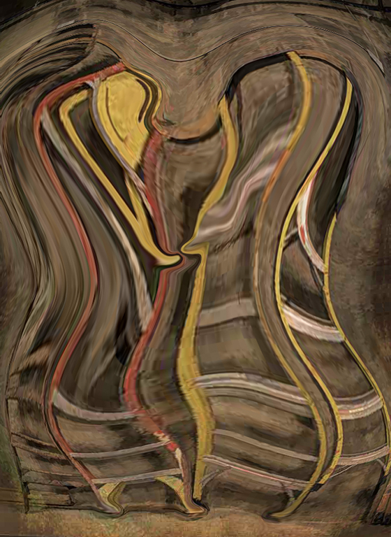
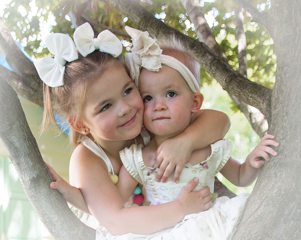
The ladder rungs in the final version are sort of a skeleton for the blobs. The one on the left is obviously the girl; she has bleached blonde hair. |
Aug 10th |
| 12 |
Aug 24 |
Reply |
The posture and shape of the blobs was a happy accident; but the possibilities were quickly recognized. Thank you. |
Aug 10th |
| 12 |
Aug 24 |
Comment |
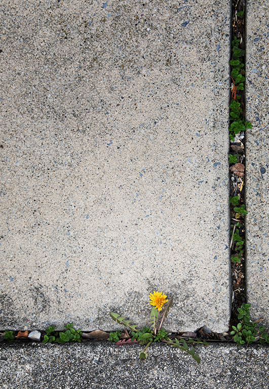
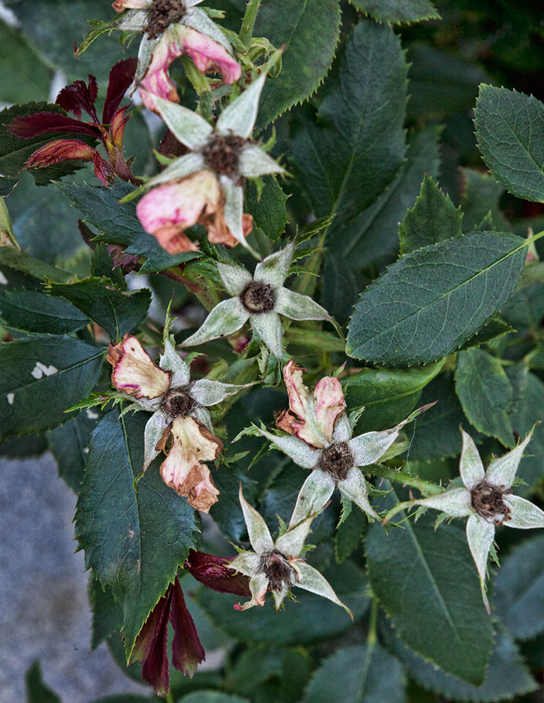
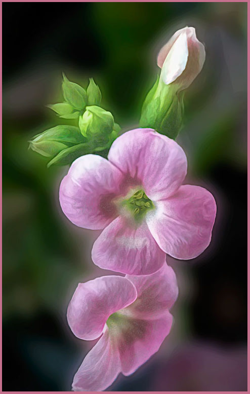
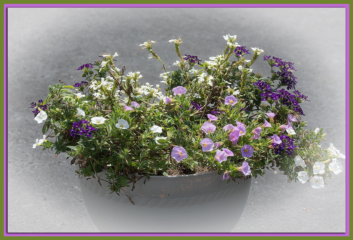
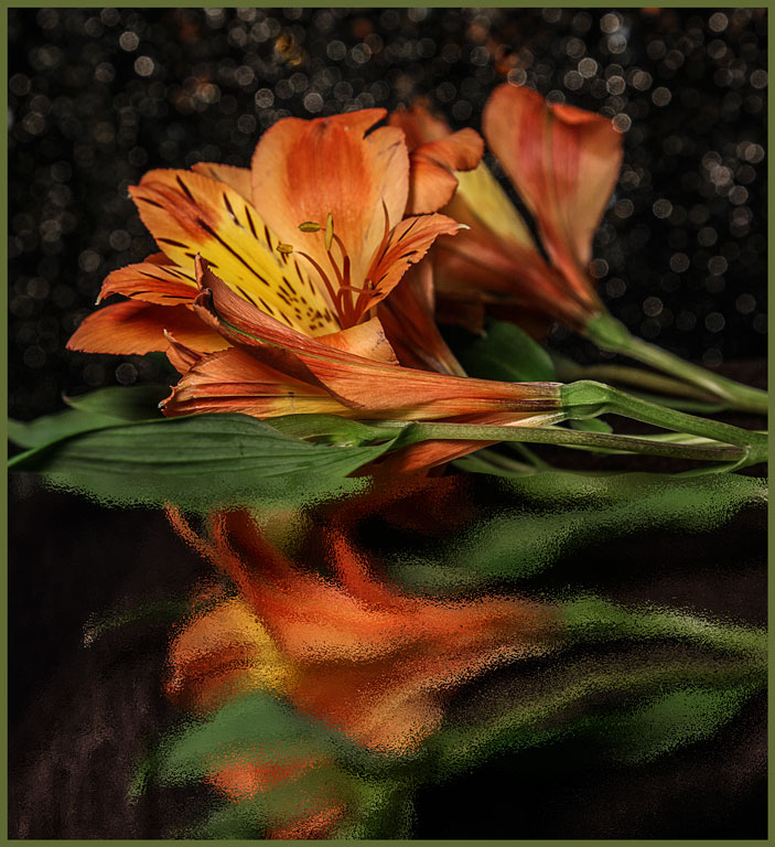
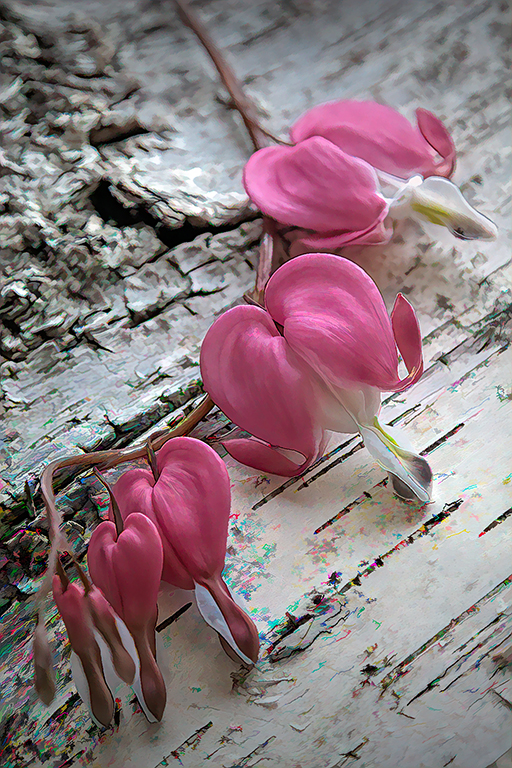
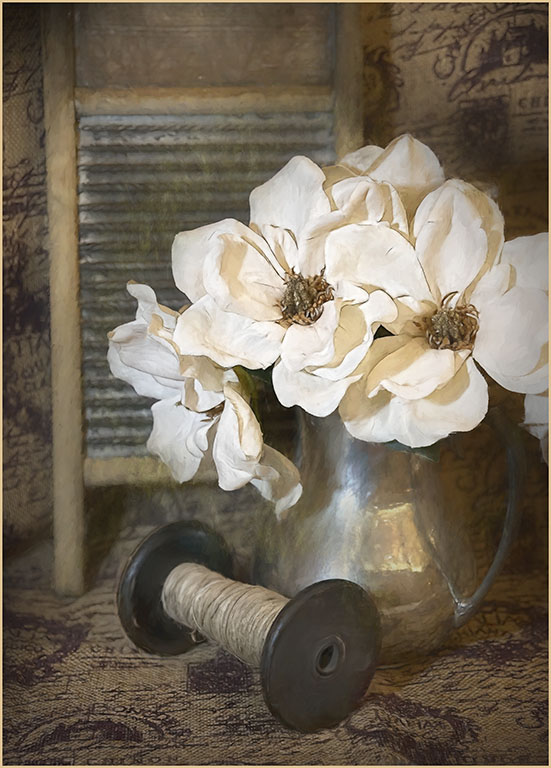
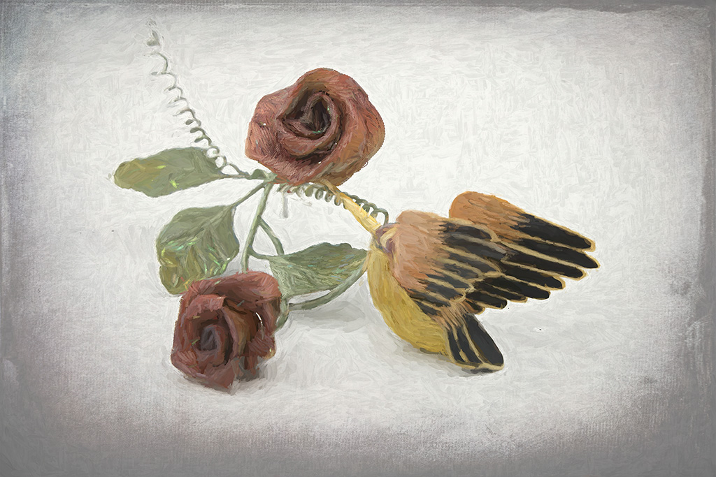
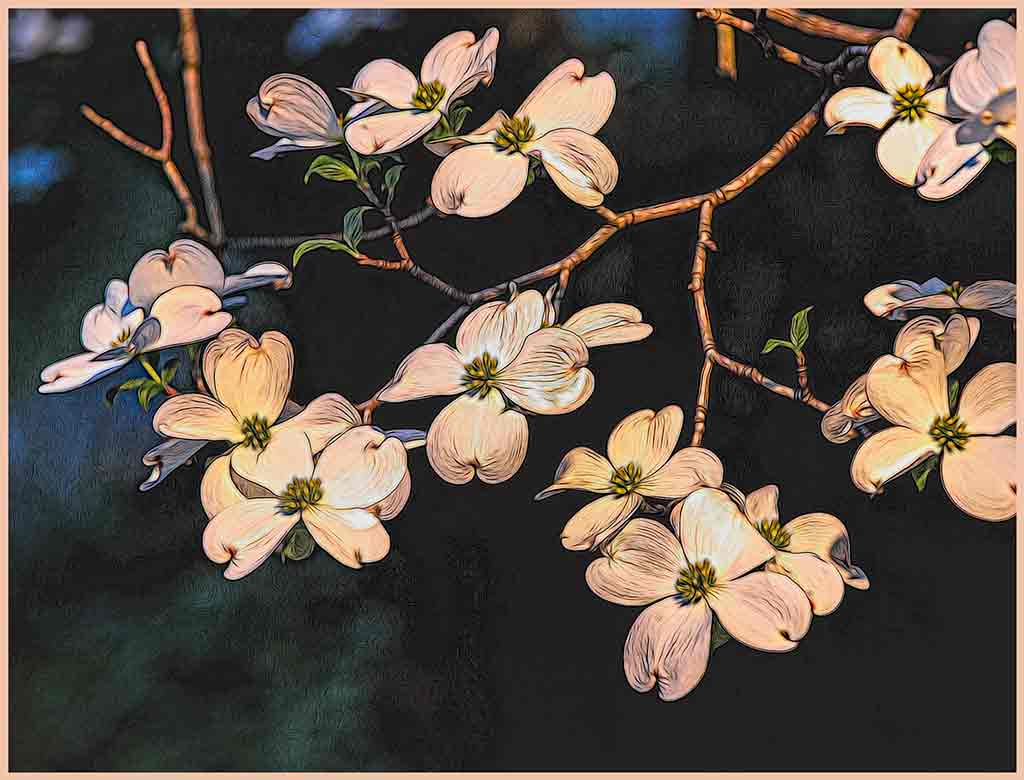
This is a lovely treatment for these pretty flowers. The original has some depth of field issues. You have resolved these quite well. The flowers now have a fantasy look about them. I like the circular composition. I would hang this in my home, too. I just Googled 'abstract artists' and found that some of these images have very recognizable subjects; but, yeah, this is more impressionism. |
Aug 10th |
| 12 |
Aug 24 |
Comment |
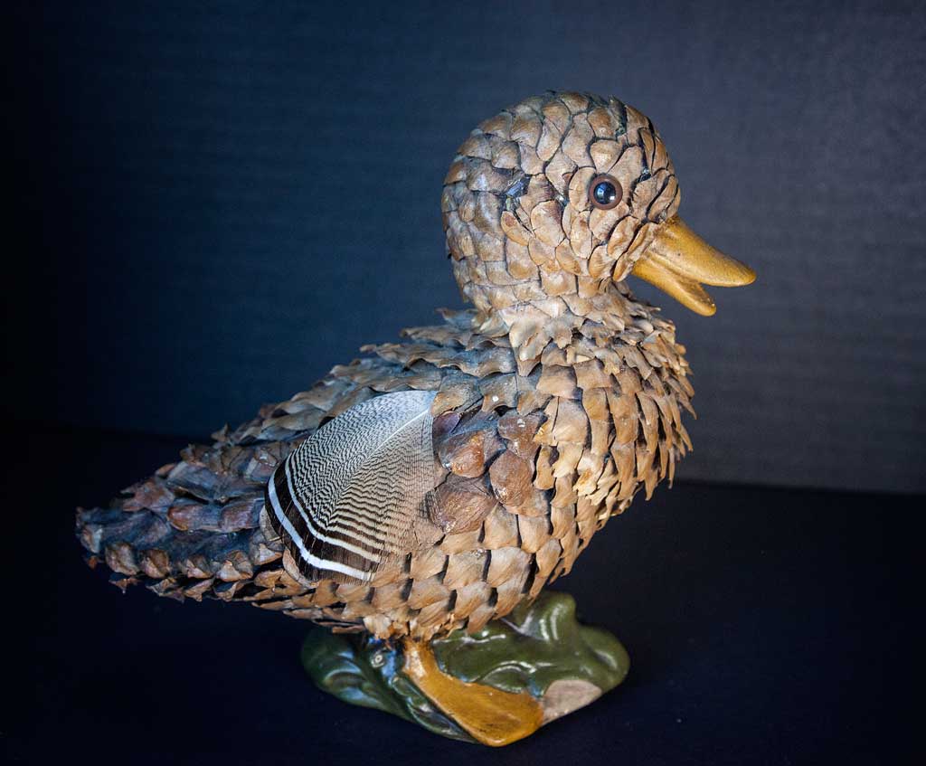
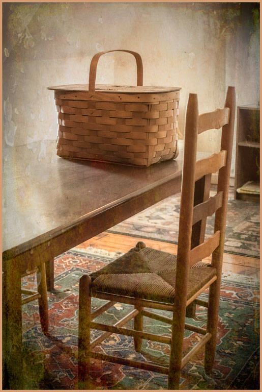
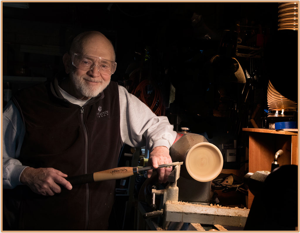
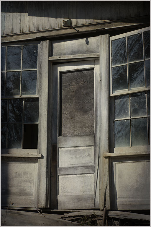
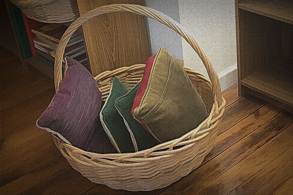
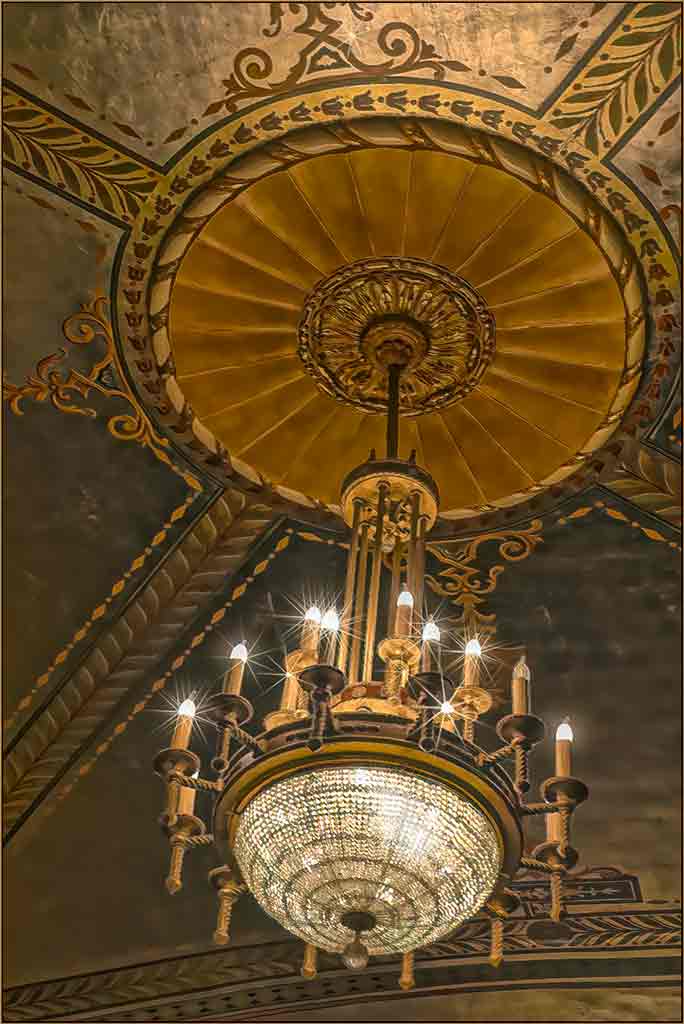
These old workshops or small museums with exhibits crowded together are hard to work in. It is difficult to separate the subject from the necessarily cluttered background. This workshop looks very interesting. Your processing turned a record shot into a WOW shot. Fur and feathers is a good title. The earth tones of the color palette work very well here. We all seem to be trying to find the original image in the final image; but the abstract should be its own image with a whole new personality. |
Aug 10th |
| 12 |
Aug 24 |
Comment |
Great colors; good exposure in the original, giving you a solid base to work with. I like Original 2 because it is somewhat symmetrical. But the total randomness of the final image really grabs my imagination. Beautiful. |
Aug 10th |
| 12 |
Aug 24 |
Comment |
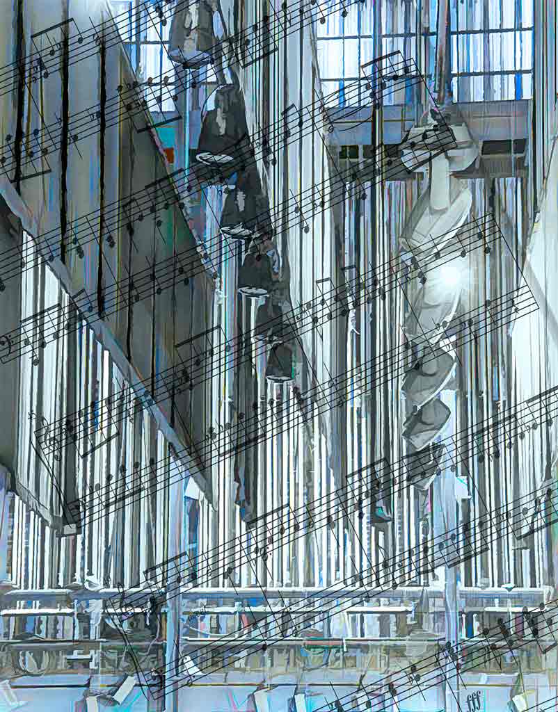
The colors are great! The diagonal lines add movement and excitement. Jackson Pollack, move over! I can see a dragon, a white rocket ship, a seagull with a red beak snitching a piece of paper from under the dragon's nose. What fun. |
Aug 10th |
| 12 |
Aug 24 |
Comment |
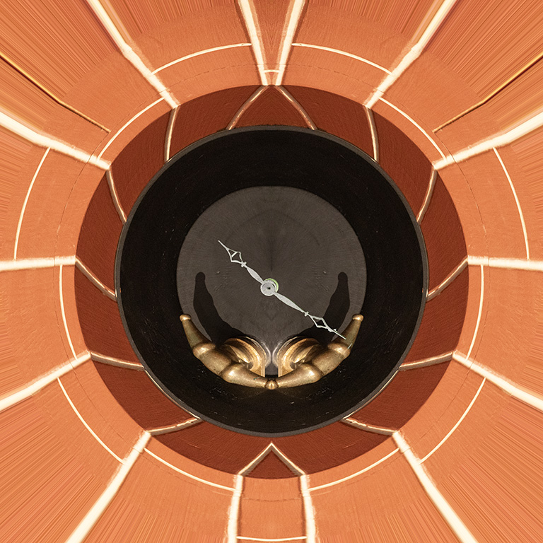
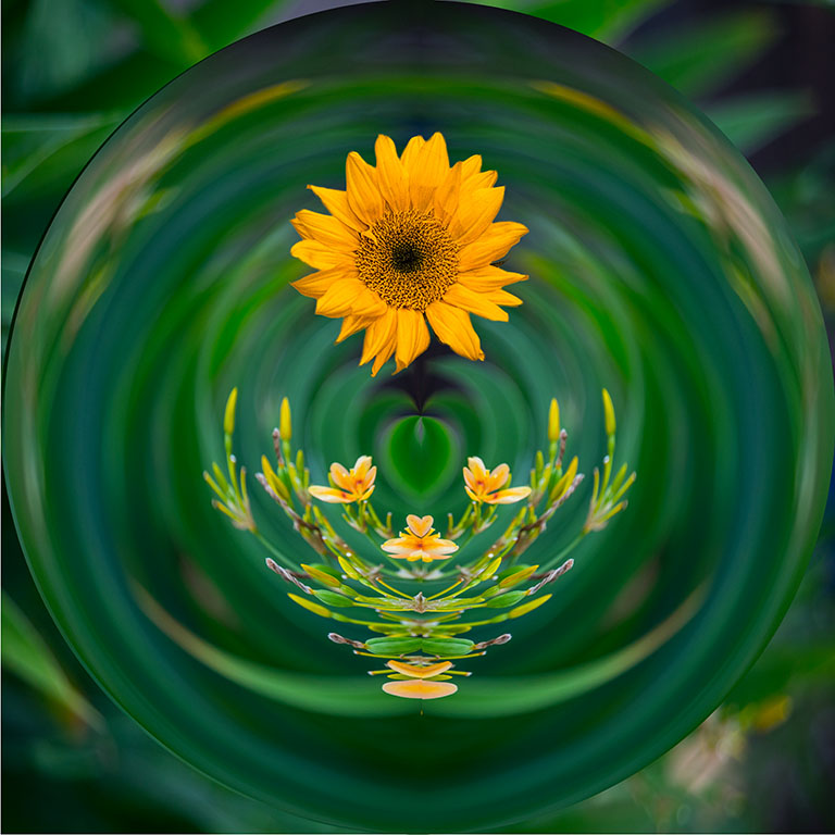
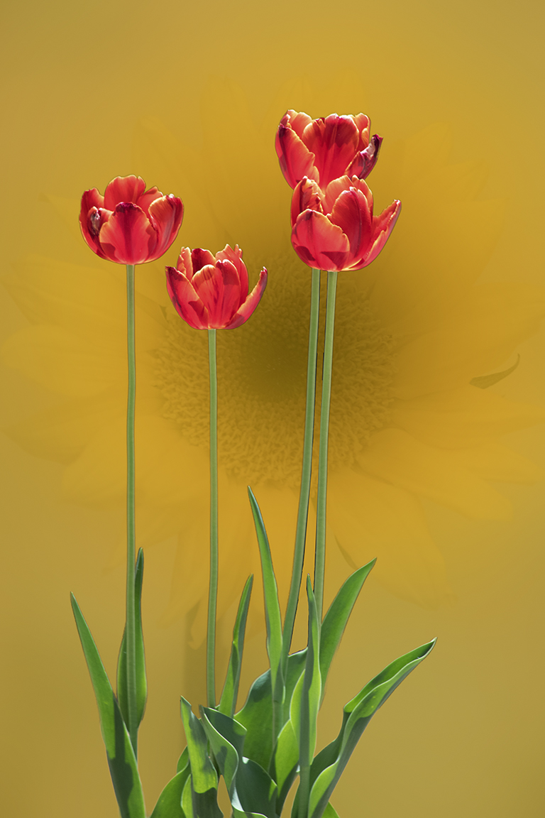
Polar Coordinates is a fun filter; and you never know what you will get! I like the added painterly look. You chose the corner well. The center that you call "tulips" looks like scales on a butterfly's wing. How to tell if your image is abstract art or just a bunch of colors and lines? Who knows? But I like this, too. The general diagonal sweep of the colors adds motion and interest. It is interesting that we tend to find familiar shapes within an abstract (butterflies, birds, flowers); perhaps humans are programmed to make sense out of what we see. |
Aug 10th |
| 12 |
Aug 24 |
Comment |
Polar Coordinates is a fun filter; and you never know what you will get! I like the added painterly look. You chose the corner well. The center that you call "tulips" looks like scales on a butterfly's wing. How to tell if your image is abstract art or just a bunch of colors and lines? Who knows? But I like this, too. The general diagonal sweep of the colors adds motion and interest. It is interesting that we tend to find familiar shapes within an abstract (butterflies, birds, flowers); perhaps humans are programmed to make sense out of what we see. |
Aug 10th |
6 comments - 5 replies for Group 12
|
| 77 |
Aug 24 |
Comment |
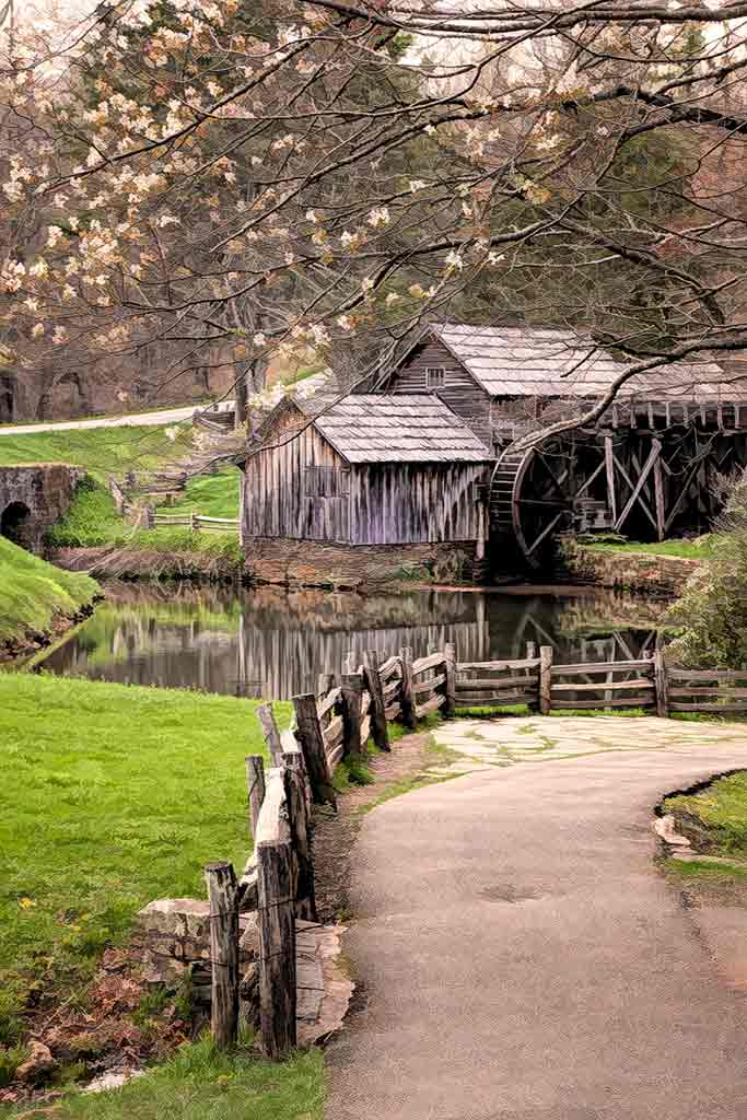
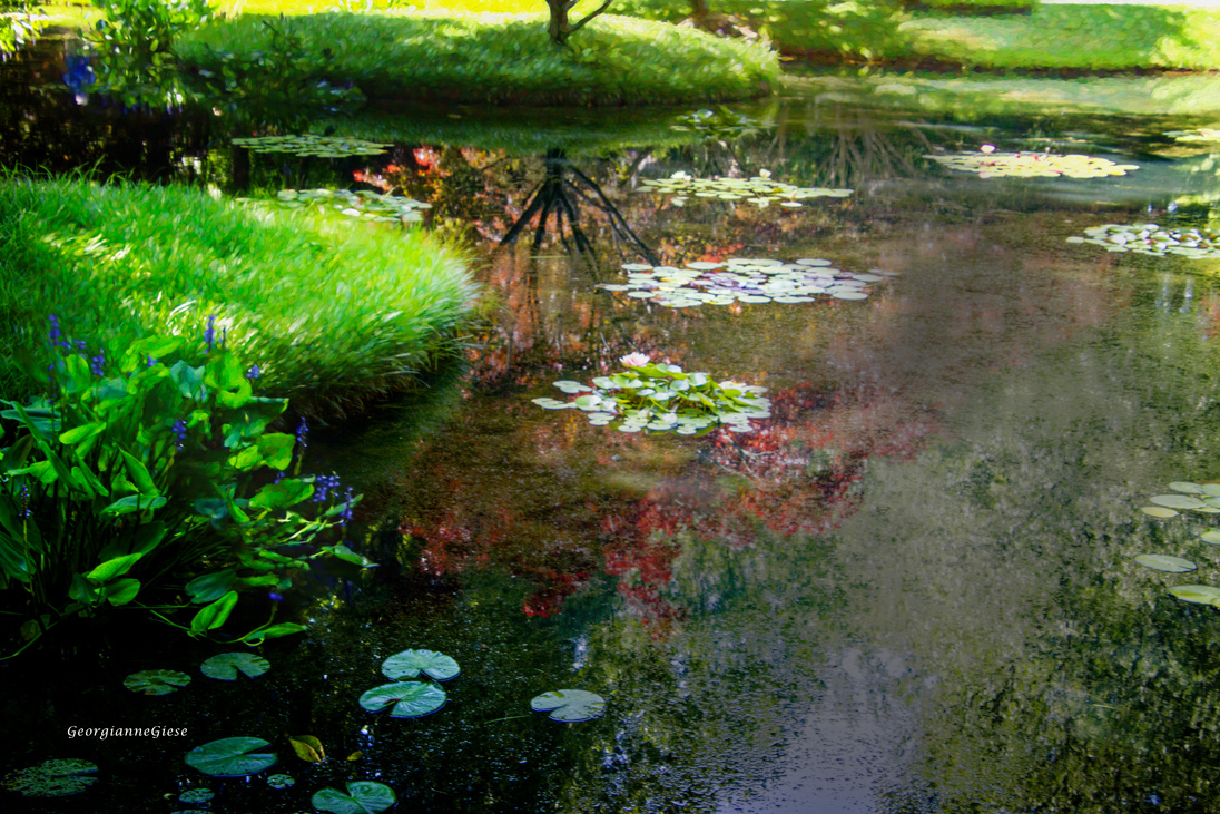
This imager is certainly reminiscent of Monet. But I find that the reflections are very busy making it hard to distinguish the lily pads that seem to my eye to be the subject. I used the burn tool to darken just the watery areas. It is a pretty scene, one just begging to be photographed. |
Aug 22nd |
 |
| 77 |
Aug 24 |
Comment |
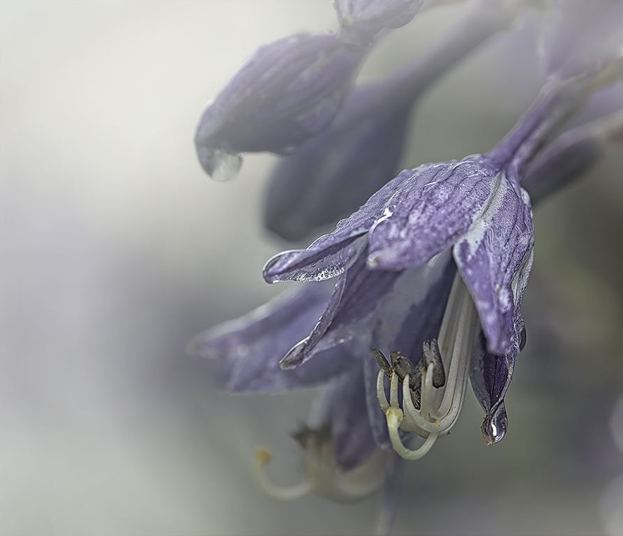
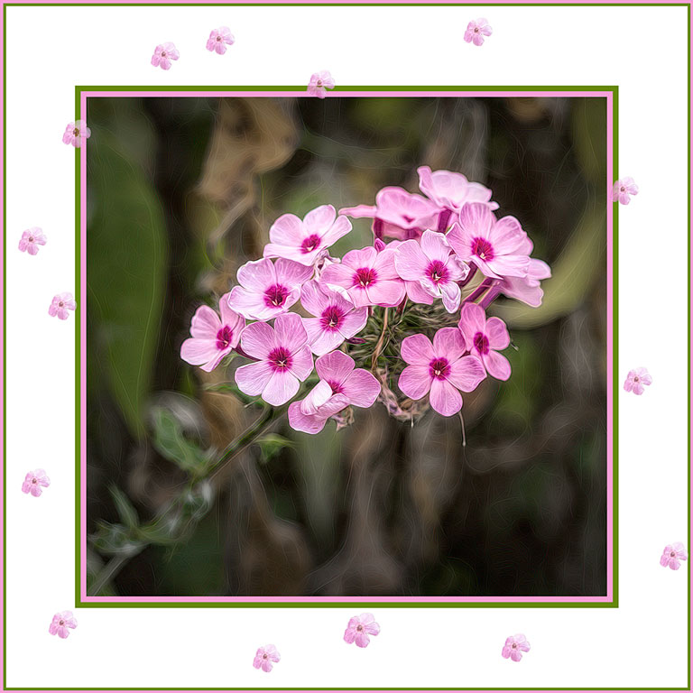
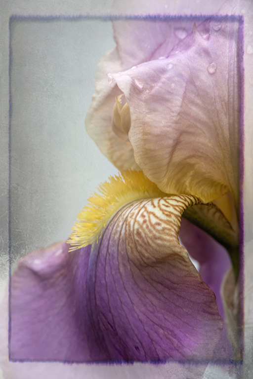
You certainly didn't go overboard with your edits. There is still some detail in the background. The dark vignette is well done. The detail and clarity adjustments were done well; the flower still looks soft and lovely. Also love the tiny dew drop. |
Aug 20th |
| 77 |
Aug 24 |
Comment |
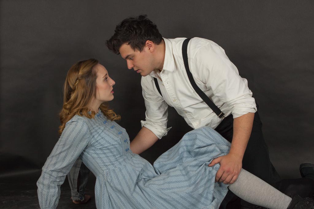
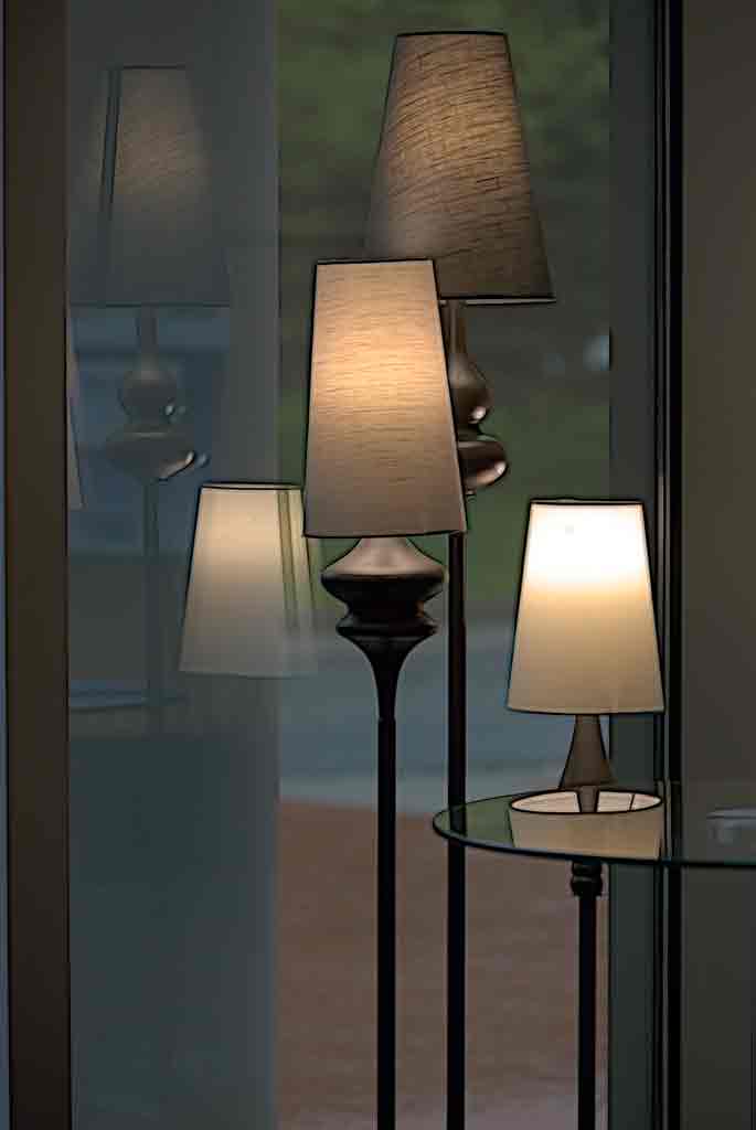
Very nice effect keeping the people sharp and the rest of the image burred. It almost looks like a long exposure. It has a dreamlike quality. The color palette is very calming. Composition is quite good with the placement of the people. The interaction between the people adds a great deal of interest. I can see this hanging on the wall of a beach house. After reading the other comments, this probably would do better as an abstract or a 'negative space' image. Jan's treatment would probably fit the seascape theme a little better. |
Aug 20th |
| 77 |
Aug 24 |
Comment |
This is adorable. The cloud is a nice touch (maybe make it a little more noticeable to better balance the camper). I would like to see a little bit of that blue beneath the tire to keep the camper from slipping off the bottom of the frame.
all that said, this is a fun image! |
Aug 20th |
| 77 |
Aug 24 |
Comment |
This is an excellent photograph of a spectacular cloud formation. Your post processing brought the image back to what you saw when first looking at the clouds. I like the dramatic colors. I have never tried blending a B&W image with a color image to bring out contrast; thanks for the tip. As to the hills in the foreground - it appears that the sun is rising behind the hills, thus putting the hill in shadow. But a little detail won't hurt. |
Aug 20th |
| 77 |
Aug 24 |
Comment |
The conversion to B&W was well-advised. the upholstery on the seats is very distracting in color. At first I did not like the expression on the model's face -perhaps too sarcastic? But that very expression is what sets this apart from an ordinary portrait. So, yes, the expression is good. The vignette darkened that lower left corner just enough; there is detail, but the brightness of the original does not distract. I also like Denises's version. But would tone down the color in the upholstery (not the lips) just a bit. |
Aug 18th |
6 comments - 0 replies for Group 77
|
12 comments - 5 replies Total
|