|
| Group |
Round |
C/R |
Comment |
Date |
Image |
| 12 |
Jun 24 |
Reply |
I tried going back to the original and added a blue texture on top of the image. Then I masked out the subject area. But the subject's edges are so vague that the result was pretty terrible. However, that might be the way to go; just need more practice. |
Jun 27th |
| 12 |
Jun 24 |
Reply |
Thank you, Melissa. Looking at the image on this page, the vignette is too noticeable. What do you all think? |
Jun 14th |
| 12 |
Jun 24 |
Reply |
Yes, it would look better with center of the flags in sharper focus. How can that be done? Perhaps take a still photo of the arrangement and blend it into the final version? We know what you mean about blurry! |
Jun 14th |
| 12 |
Jun 24 |
Comment |
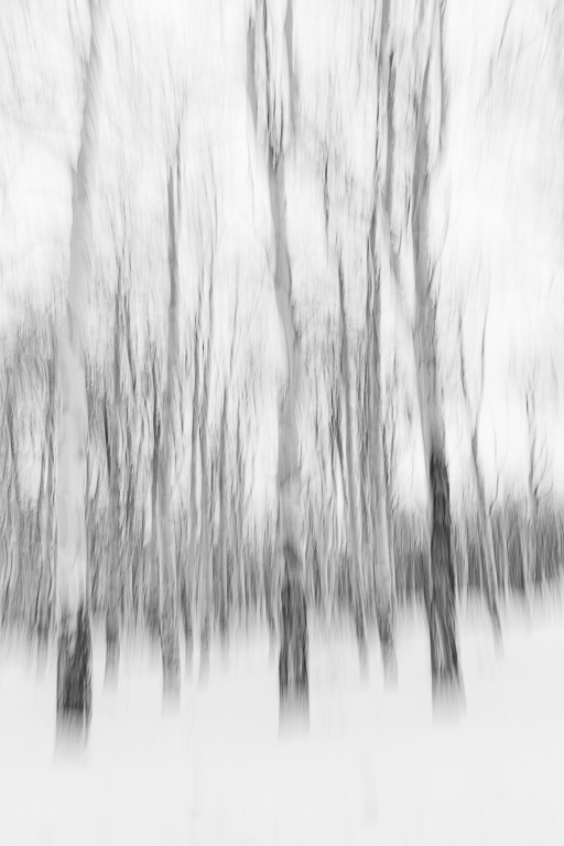
These vertical swipes of trees are very appealing. You picked a good grouping. I like the warm tones. The crop is good with the snow forming a solid base and the branches reaching up to the sky. Just for S&G's I converted to B&W. I like your version better; the color gives it more personality. |
Jun 14th |
 |
| 12 |
Jun 24 |
Comment |
The subject of this image might well be "wind". The sky and ocean seem unaffected by the camera motion, as one would expect on a windy day. The diagonal slope of the dune countered by the straight horizon makes for a very nice composition. This would look very nice on a living room wall. |
Jun 14th |
| 12 |
Jun 24 |
Comment |
Indeed, this looks like a waterfall or a heavy rain. The objects along the bottom give a nice base to the image. The colors suggest peace and serenity. Very well done. But don't look to me for tips; I'm not good at ICM. |
Jun 14th |
| 12 |
Jun 24 |
Comment |
Nice study in experimentation. Every photographer should do this once in a while. You picked the right area of the original for your crop. In ICM I prefer to the able to understand what the image shows (personal preference). This is obviously petals of some kind. The colors are excellent. The layering from front to back reminds me of mountains fading into the distance. The vertical and diagonal lines add tension and thus, interest. This is very good, |
Jun 14th |
4 comments - 3 replies for Group 12
|
| 77 |
Jun 24 |
Reply |
Actually I like less of the sequined fabric. It was there, so I just shot. We should always be mindful of personalizing these Camera Club setups. |
Jun 27th |
| 77 |
Jun 24 |
Reply |
Yeah, we really should have done that. Those tri-fold presentation boards make good backgrounds. Of course, I left them at home. |
Jun 18th |
| 77 |
Jun 24 |
Reply |
Thank you, Georgianne. I really like your improvements. |
Jun 18th |
| 77 |
Jun 24 |
Comment |
Something emphasizes those red petals. It is the smudge filter? If so, then you definitely should have used it. While the original is quite good, the final version is several steps better. |
Jun 18th |
| 77 |
Jun 24 |
Comment |
I like your final image better than the original because: The area in the upper left blends better with the rest of the image; the grey-blue color in the original makes me want to crop it away. The detail in the sand ripples is more prominent than in the original. You were right not to sharpen it further, as that might make it look over-processed. Did you convert to B&W before adding the sepia filter? |
Jun 18th |
| 77 |
Jun 24 |
Comment |
Wow! You took an ordinary snapshot and turned it into fine art. Thanks for the tips. I need to explore these options in PS> |
Jun 14th |
| 77 |
Jun 24 |
Comment |
The hills in the background seem to be in focus, so you did well, The colors are very pleasing. The placement of the farmhouse makes for a good composition. I like this, even though I am not a fan of ICM. |
Jun 14th |
| 77 |
Jun 24 |
Comment |
There is a lot going on here. This is a good overall image of the garden. And your editing did bring out the irises. I hope explored other compositions; the little stone stool with the red tree in the background; the reflection of the sky in the pond; a closer crop on just the irises and their stems. This looks like a beautiful place, worthy of many return visits. |
Jun 14th |
| 77 |
Jun 24 |
Comment |
This is beautiful. The original is quite good, but your post-processing really improved on a good thing. I have tried window light and always end up with too much contrast between the bright side and the shadow side. You did an excellent job removing the tattoo. Perhaps you could also remove the of hair near her left shoulder. That caught my eye immediately. |
Jun 14th |
6 comments - 3 replies for Group 77
|
10 comments - 6 replies Total
|