|
| Group |
Round |
C/R |
Comment |
Date |
Image |
| 12 |
May 24 |
Reply |
Ooops! I meant that the crop eliminated the PLANT. Need to pay more attention to the spell checker. |
May 24th |
| 12 |
May 24 |
Comment |
Thank you all for your comments. Dandelions have always been one of my favorite flowers - probably because I did not det scolded for picking them. People often don't 'get' my photos; thank you for your encouragement. |
May 24th |
| 12 |
May 24 |
Reply |
Dandelions are all over our lawn. They sprout up in the most unlikely places. Soon the family will attack the patio and all these tiny flowers will be gone. But they will come back next spring. The concrete squares have been there a long time and have developed that nice gravelly texture that old concrete often has. |
May 12th |
| 12 |
May 24 |
Reply |
I felt the background might be a little over-processed. Thank you for your comments. |
May 12th |
| 12 |
May 24 |
Comment |
Welcome, Melissa. We're glad to have you aboard. This is a very good example of negative space. The diagonal lines of the floor lead right to the subject. Some might suggest cropping that large black area on the right, but it also stops the eye from sliding out of the picture. The low key presentation creates the right mood. The focus seems a little soft, but I think that also helps create the mood. The placement of the man is very good.I |
May 12th |
| 12 |
May 24 |
Comment |
The conversion to B&W made this image far better than the original with its mostly blue tones. Well done. The angles add tension, and, thus, interest. The crop eliminated the plane (another possible subject) and that bright sunlit patch on the ground - both distractions. Very well done. |
May 8th |
| 12 |
May 24 |
Comment |
The subject is the roll of hay. It is proportionately small and low in the image. So, yes, this certainly qualifies as a negative space image. The sky is a good mood setter rather than a distraction. Your conversion to B&W added a dark atmosphere, one that goes quite well in an area that is prone to tornadoes. Very well done. |
May 8th |
| 12 |
May 24 |
Comment |
The gentle shading in the sky helps to focus attention on the tree and the gravestones. The perspective of the lines of the stones leads the eye to the tree. It almost looks like a faithful sentinel. I experimented with flipping the image horizontally, but that didn't work so well. The eye came to the tree and stopped there, not wanting to look at the rest of the image. Besides, this is such a well-known spot that some viewers would know that something was amiss. |
May 8th |
5 comments - 3 replies for Group 12
|
| 77 |
May 24 |
Comment |
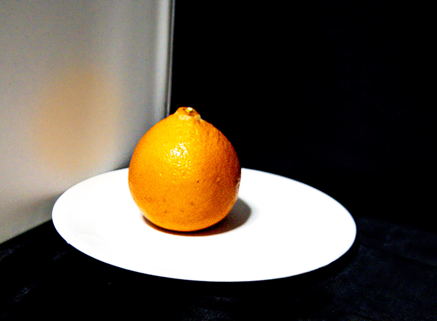
The orange really stands out well in your final version. But the overall image seems too bright for my taste. I rather like the bold graphics of the original. I cropped from the right, then added a suggestion of an orange reflection to the light area on the left. |
May 24th |
 |
| 77 |
May 24 |
Reply |
Perhaps I should try focus stacking. These blossoms will be out again in the next few weeks. Not often we get a second chance. |
May 24th |
| 77 |
May 24 |
Reply |
Focus has always been my bug-a-boo. You'd think I would have learned by now. |
May 24th |
| 77 |
May 24 |
Comment |
I tried several crops. The right side of the image has interesting texture, so I cropped from the left. Then flipped horizontally so that the rust could lead the eye to the circle. That didn't look right. You have just the right crop here. When cropping you can try every version. Save them separately and compare them. Some will say "eh", some will say "Yes!!" Just play. That takes a lot of time, but there's not much on TV anyway. |
May 8th |
| 77 |
May 24 |
Comment |
While not a fan of ICM, I like this shot, It looks oversaturated, but that is what gives it that wow affect. I bought it up in PS and played with hue/saturation. That was not an improvement. Then I added a gaussian blur to the foreground. Kinda okay, but your title is "Forest Floor", so that didn't work. You should enter it as is. |
May 8th |
| 77 |
May 24 |
Comment |
Wow! what a great abstract. This image really pops. "Seat of the pants" processing often yields amazing results. |
May 8th |
| 77 |
May 24 |
Comment |
Intentional camera movement is not my favorite technique, but I rather like this one. You did a lot of work and git good results. I have never used LUTs and am not good with textures, so I am very impressed. Just for fun I cropped your original image to try to get to your final crop. But then a completely different image popped up. Isn't it interesting that we can get so much out of one shot? |
May 8th |
 |
| 77 |
May 24 |
Comment |
The original shot is quite nice. But your edits have raised this image to fine art. The alcove is well done. All your textures work well with the delicateness of the flower. Perfect. |
May 8th |
6 comments - 2 replies for Group 77
|
11 comments - 5 replies Total
|