|
| Group |
Round |
C/R |
Comment |
Date |
Image |
| 12 |
Apr 24 |
Reply |
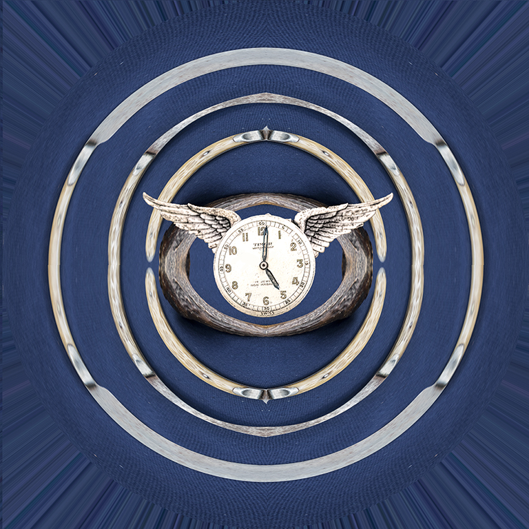
I made another one from some old silverware on a blue tablecloth. Our daughter loved it and asked if I could add a clockface. This clock was at a macro setup; it already had the wings, she hung it in her office because, as we all know, time flies. |
Apr 22nd |
 |
| 12 |
Apr 24 |
Reply |
Polar coordinates is under 'filters/distort'. It really is fun to use. And I never seem to get the same image twice. In fact, I tried, but never succeeded. Under consideration for this month was a set of gears in primary colors that yielded a clown face and a ser of brass knobs that became a little critter's face. Try it. |
Apr 8th |
| 12 |
Apr 24 |
Comment |
Love the colors and textures. With the shoes pointing the wrong way, one can believe that this is the morning after the night before. You could have zoomed in to just the bottle and shoes, but your composition tells a more compelling story. Very well |
Apr 8th |
| 12 |
Apr 24 |
Comment |
Indeed, this is a more interesting composition. A fancy folding door, maybe. The exposure, depth of field, and tonal range are quite good. The pattern on the stair treads is so much better than plain stairs. This is excellent. |
Apr 8th |
| 12 |
Apr 24 |
Comment |
This is very interesting. There is certainly a story here - where did the feet come from? Where are they going? Can they get past the debris? Will they go back the way they came? I experimented with image rotation. But your positioning is probably the best. We scan pages from left to right, and that's the way the feet are headed. The viewer feels more like a traveling companion than an observer. I second Nancy's comments. |
Apr 7th |
3 comments - 2 replies for Group 12
|
| 77 |
Apr 24 |
Comment |
Thank you all for your comments. Indeed, there is too much noise, and the handkerchief does need to be toned down. I only added the border to make it stand out from our background, but it could be toned down also. I have learned a lot from these Digital Dialogue groups and the B&W Study Group. Thank you all for helping me hone my skills. |
Apr 22nd |
| 77 |
Apr 24 |
Comment |
Is the background too busy? Well, the white areas are obviously more dandelions. As such they belong to the scene. Sticks or stray leaves would be different. I tried to remove the large light areas using a soft healing brush. It was very tedious. Again, this is two different versions of the same image. But I really like yours. |
Apr 8th |
 |
| 77 |
Apr 24 |
Comment |
A beautiful portrait of an exquisite flower. I have never tried focus stacking but will do as soon as the yard has enough flowers blooming. Just for kicks I tried toning down that bright green background using textures and blend modes. But you can't fix what ain't broke. Nice job. |
Apr 8th |
| 77 |
Apr 24 |
Comment |
This kind of scene often grabs my attention, too. You gave this a nice painterly look. You just inspired me to look up 'graphic pen filter.' I like this shot. And thank you for the explanation. |
Apr 8th |
| 77 |
Apr 24 |
Comment |
This is a lovely portrait of a very special lady. Your edits really improved her hair and face. I like that you did not push her but let her be herself. I also love that you kept that natural feeling in your edits. To my eye, the skin tone is a little too warm, but that may be the mood you wanted. I toned down the reds and yellows a bit - not better, just a different interpretation. |
Apr 8th |
 |
| 77 |
Apr 24 |
Comment |
The original shot is quite nice; a good example of 'get it right in the camera.' The soft light through the curtains, the details on the fruit and the bowl, and the details in the shadows are well done. Your final edits take this to a very high level. Well done. |
Apr 8th |
| 77 |
Apr 24 |
Comment |
This is absolutely beautiful. Your attention to detail really paid off. The hooks and the eyes are tiny areas, but critical. You set the mood with your textures and the background editing. |
Apr 8th |
7 comments - 0 replies for Group 77
|
10 comments - 2 replies Total
|