|
| Group |
Round |
C/R |
Comment |
Date |
Image |
| 12 |
Nov 23 |
Reply |
I have tried product photography, but other areas are more interesting. But that field is far more demanding than one would think when looking at catalog photos. |
Nov 26th |
| 12 |
Nov 23 |
Reply |
Thank you, Lee Ann. There were several compositions, but the diagonal seemed the best. Thank you for your many helpful and encouraging comments. Check once in a while to say "Hello". |
Nov 26th |
| 12 |
Nov 23 |
Reply |
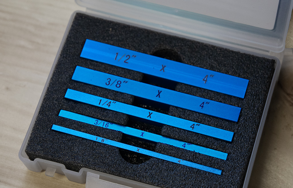
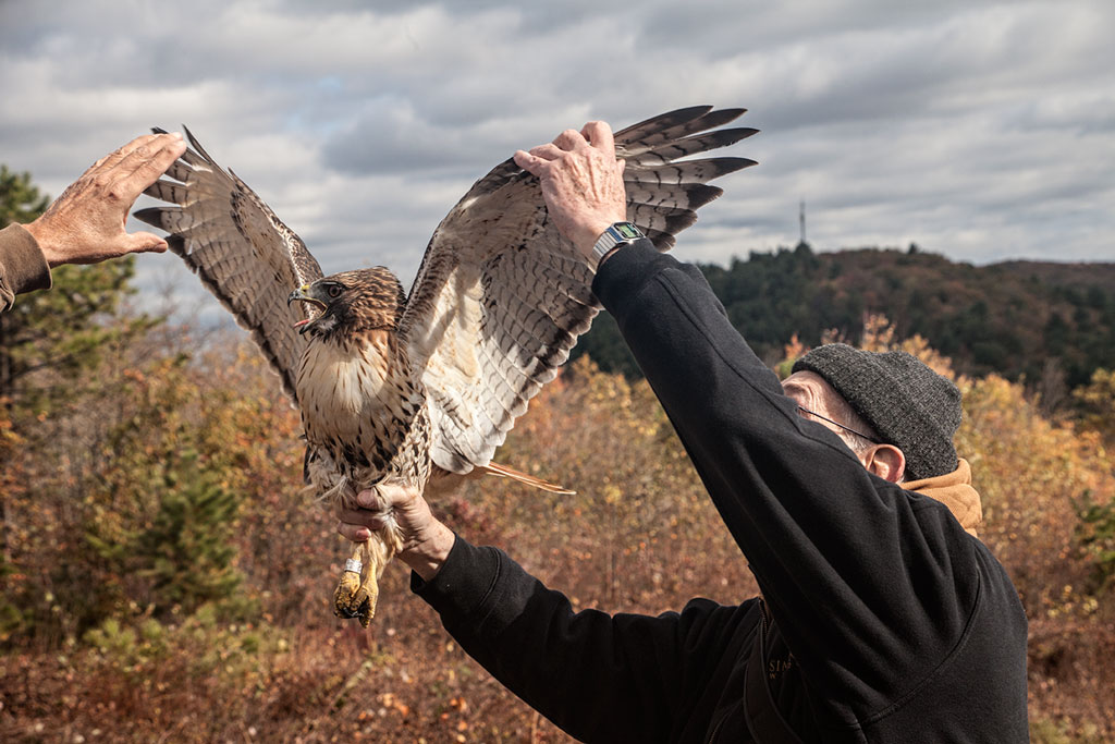
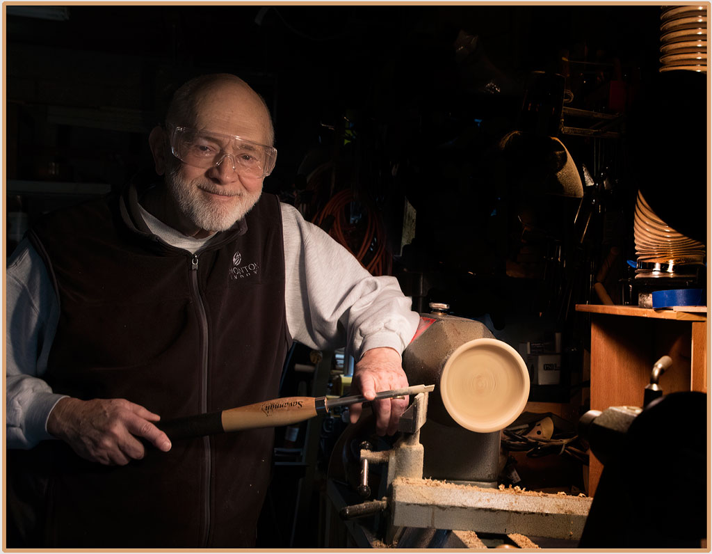
My husband is a woodworker. I have always been fascinate with these bars, but never knew what they were used for. There are times when a very precise cut must be made, and these are much better guides than uncalibrated rulers. Glad to have stimulated your interest and encouraged research. That was really my aim for this image. |
Nov 26th |
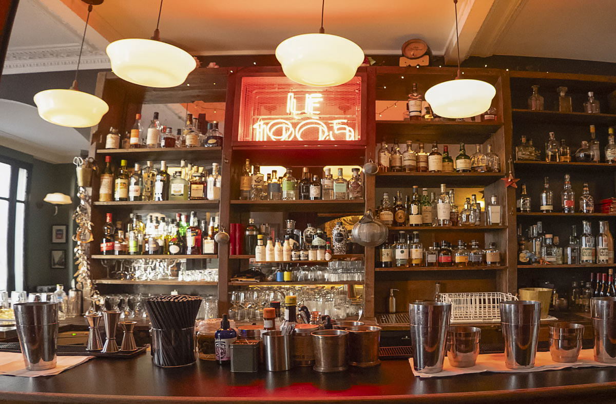
| 12 |
Nov 23 |
Comment |
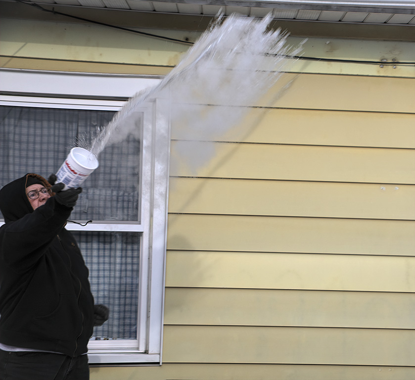
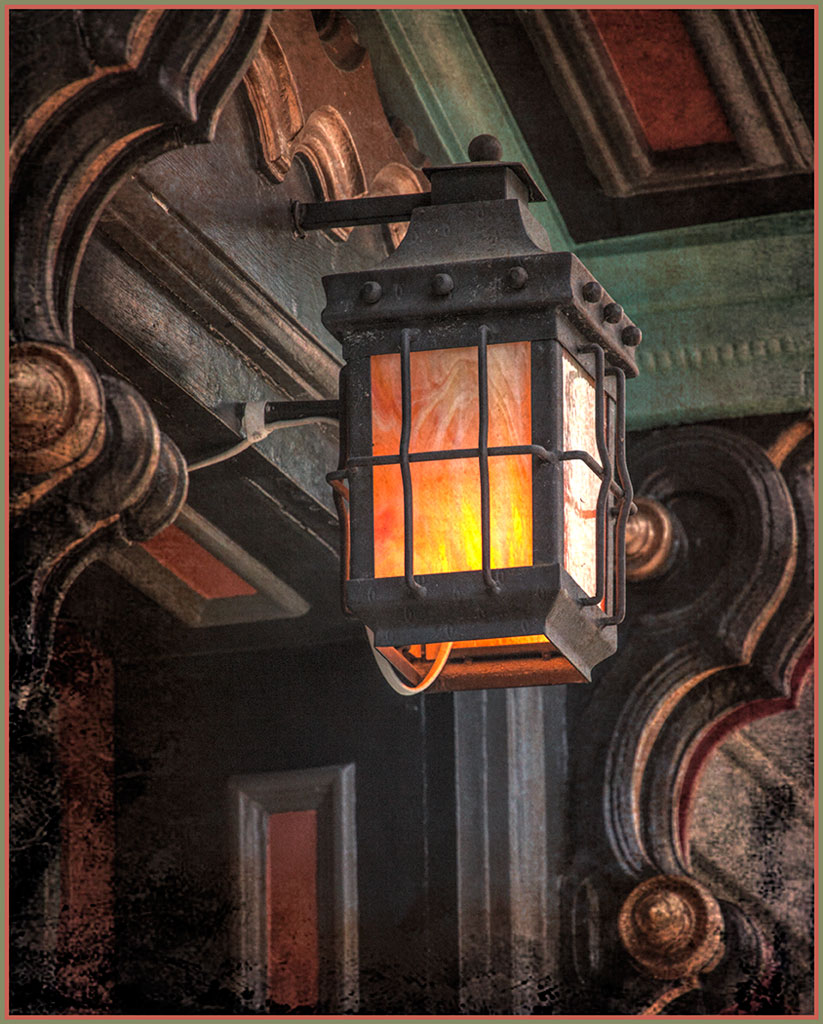
Actually, I like the fish-eye view. Perhaps that is the way it looks to customers at closing time. The image is great for advertising for the bar. The picture makes it look like a good place to unwind. The focus seems a little soft, just a little. I tried NIK Define and a high pass filter on soft light blend mode. Don't know if it helped. |
Nov 26th |
 |
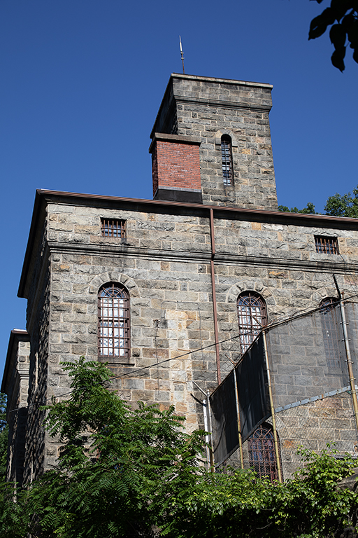
| 12 |
Nov 23 |
Comment |
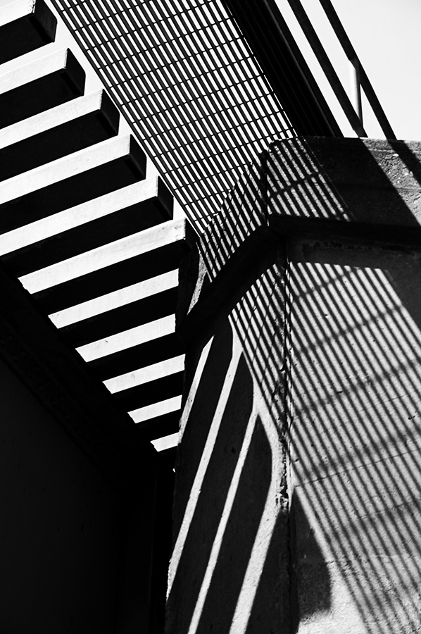
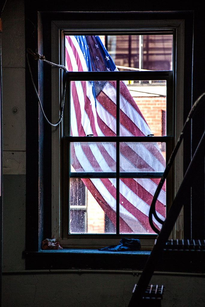
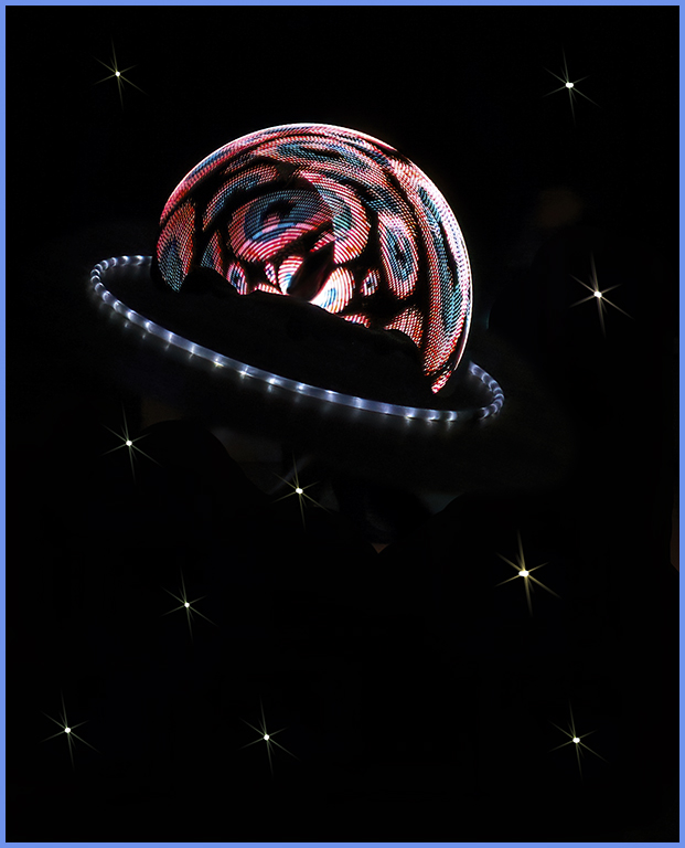
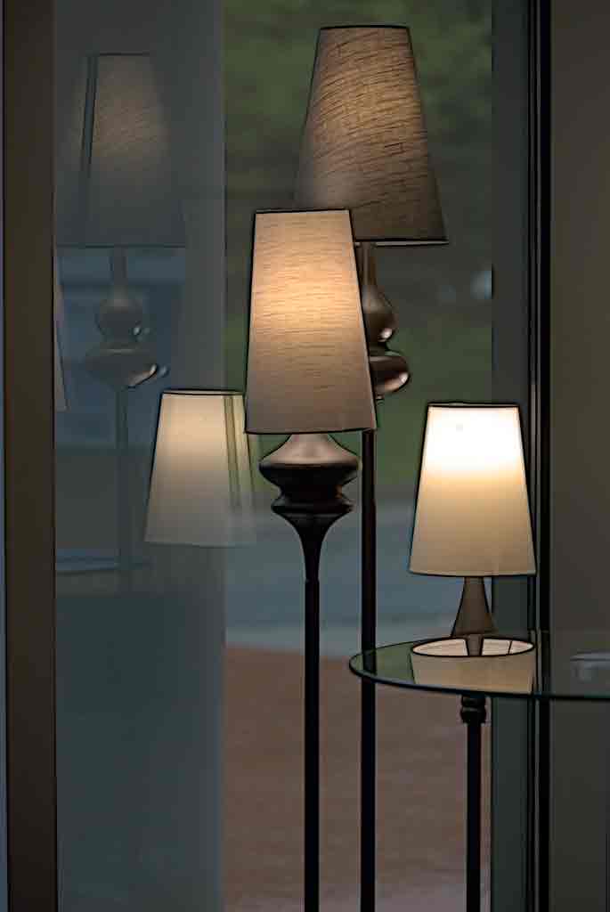
This is a powerful image. The person inside seems like a prisoner behind two layers of bars. The low key lighting adds mystery. The interesting textures on the wall of the building adds to the mood created by the lighting. I tried reversing the image just because 'they' say that we notice the light areas first, and that dark areas block the path of the eye. So, should the image show darkness leading to hope for the person inside or hope fading away for him? |
Nov 26th |
 |
| 12 |
Nov 23 |
Comment |
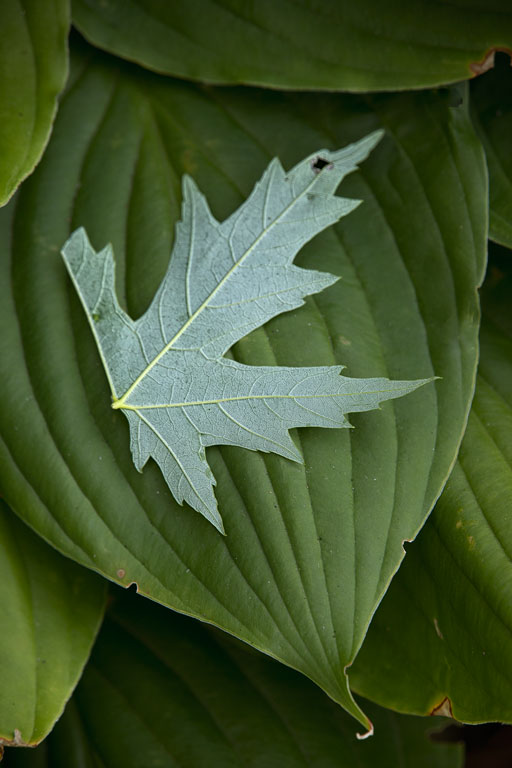
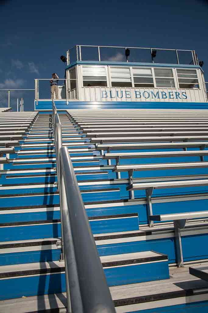
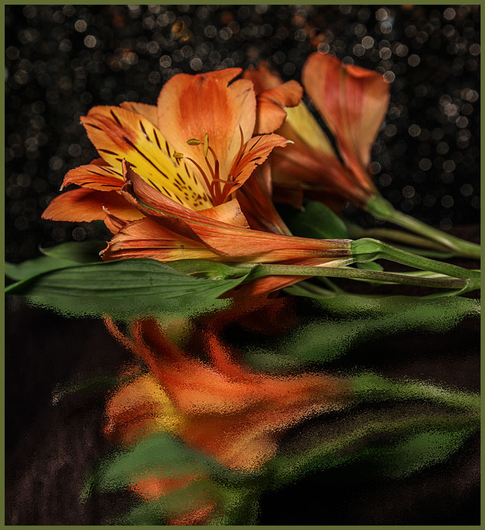
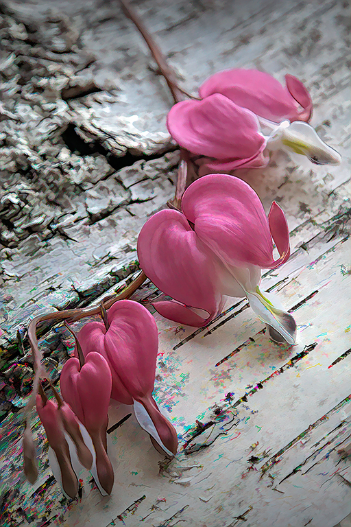
Very nice. The 'bars' of the shadows lead the eye through the image allowing the viewer to see each group of leaves. The exposure is good; the dark part of the leaves is not blocked and the white sand is not burned out. All the debris in the sand adds to the story. I love the crawdad claw. Yes, it would be better placed toward the top; but that's not the way you found it. Good luck Lee Ann on your future photographic adventures. You will be missed here at Group 12. |
Nov 26th |
| 12 |
Nov 23 |
Comment |
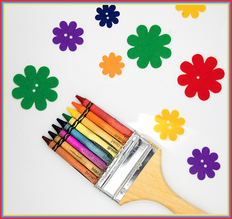
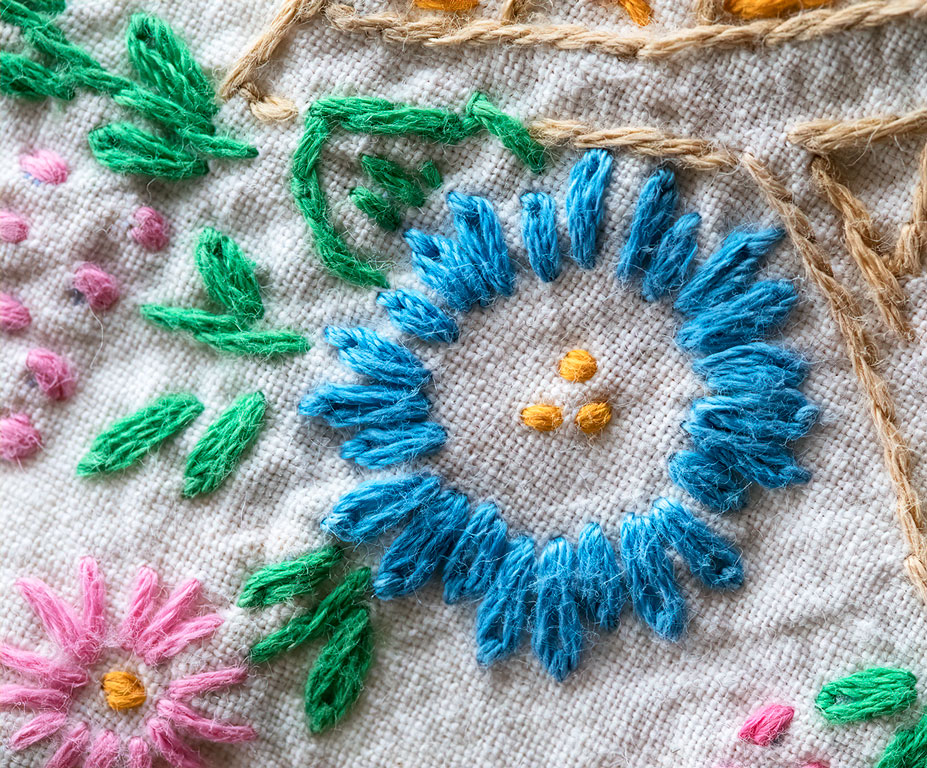
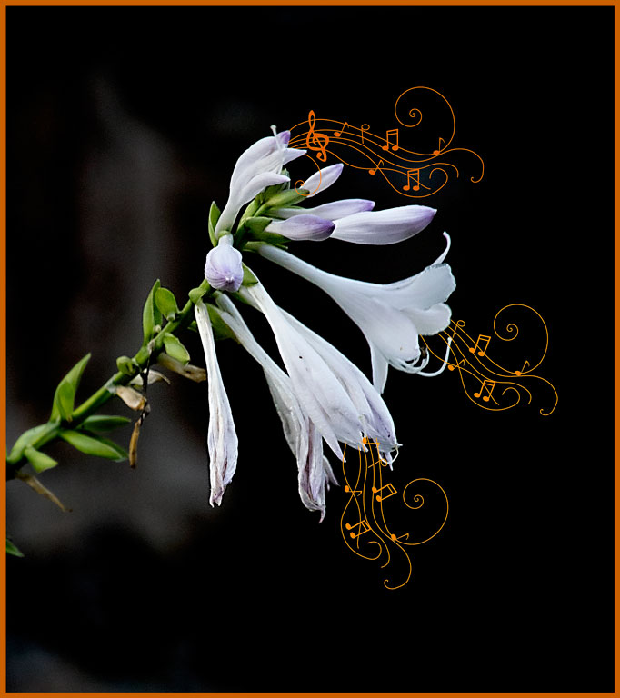
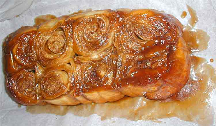
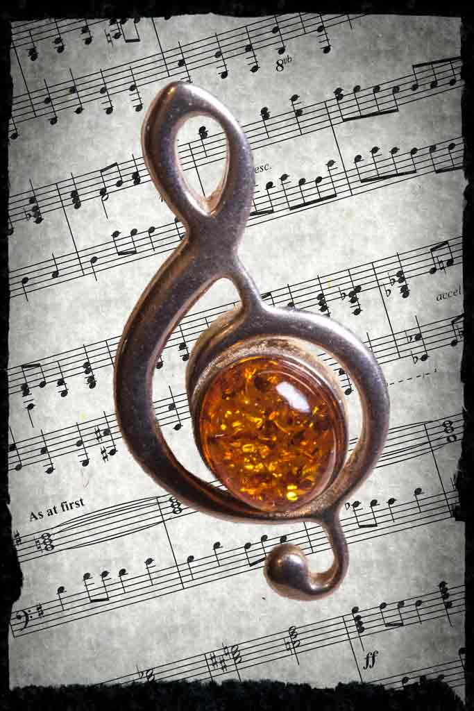
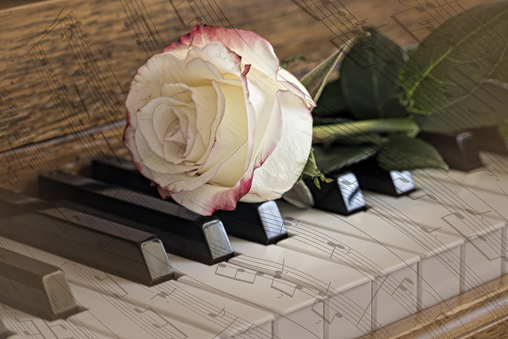
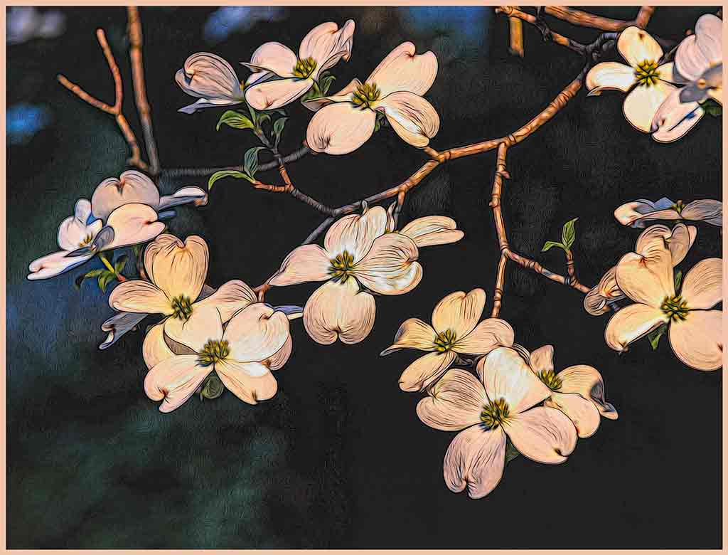
What a creative idea to use the piano keyboard as a border. The diagonals add interest and movement. Exposure is perfect. There is a ghost image of the notes on the reverse side of the music page, but that's the way music books are. The lighting on the keys really works well. The shadows and highlights are just the way you would expect on a square keyboard. (Hmmm, Interesting concept) Oh, I just noticed the large key that LeeAnn commented on. Great photo. It would make a good gifd for a fellow music lover. |
Nov 26th |
4 comments - 3 replies for Group 12
|
| 77 |
Nov 23 |
Comment |
I just added the border to make the image stand out against our background. But, yes, it should be smaller. We traveled north that day toward some state parks, hoping for good color. But fall was probably two weeks further along toward winter than in our backyard. It was a pleasant day, however. We did have some very nice walks. |
Nov 26th |
| 77 |
Nov 23 |
Reply |
Spot healing does a good job. I probably was feeling too rushed to take the time. You all have inspired me, so spot healing will be part of future versions. |
Nov 26th |
| 77 |
Nov 23 |
Reply |
Oh Linda, this is much closer to what I perceived. Thanks. You and Denise have given me inspiration to keep working on this. |
Nov 26th |
| 77 |
Nov 23 |
Reply |
Hmmm. I like this. Maybe a little overdone, but that is personal taste. Thank you for this idea. Meanwhile, the less than perfect leaves are part of the changing seasons, so that doesn't bother me. But you are right; most people prefer nicer leaves. |
Nov 26th |
| 77 |
Nov 23 |
Reply |
I like the finished version that you submitted better. The light areas of the pumpkin appear greyed out here. |
Nov 26th |
| 77 |
Nov 23 |
Comment |
Removing the background is not easy, but you have done it perfectly. Increasing the shadow of the pumpkin would never have occurred to me, but you are right. It keeps the subject from 'floating' on the background. The added textures give this an oil painting look. It's lovely. |
Nov 26th |
| 77 |
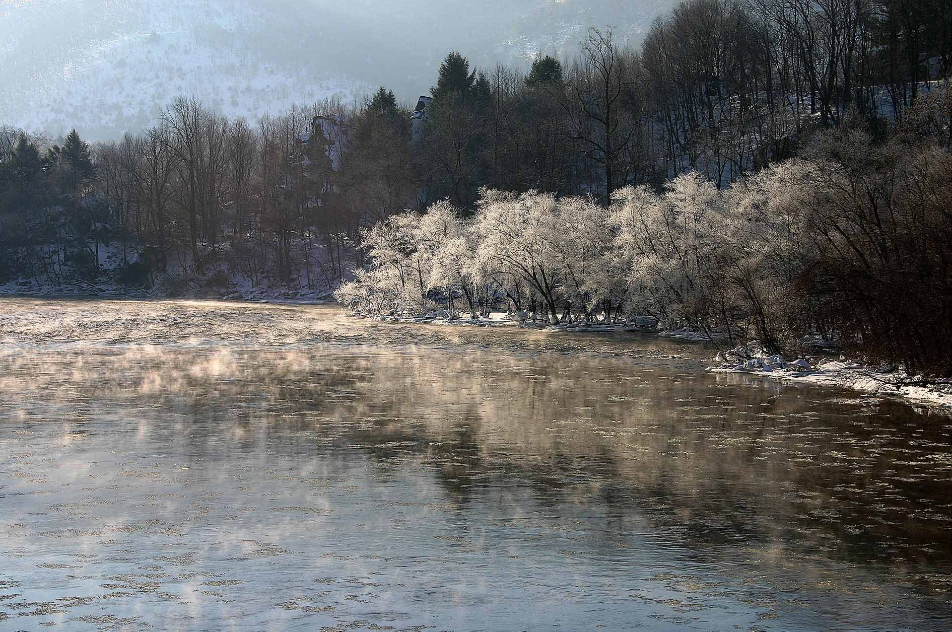
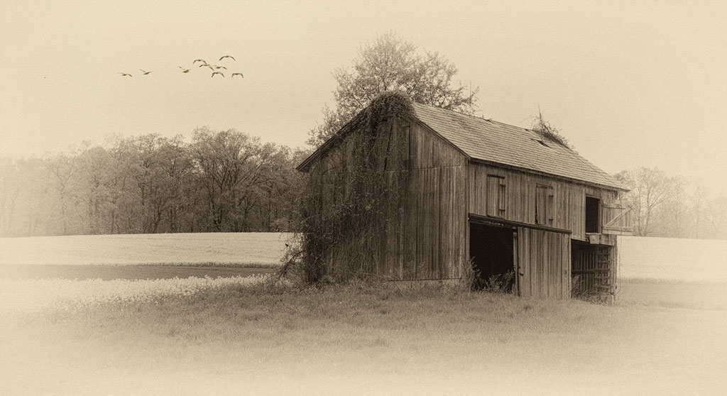
Nov 23 |
Comment |
I love fog pictures, and have never gotten a good one. This is perfect. |
Nov 26th |
| 77 |
Nov 23 |
Comment |
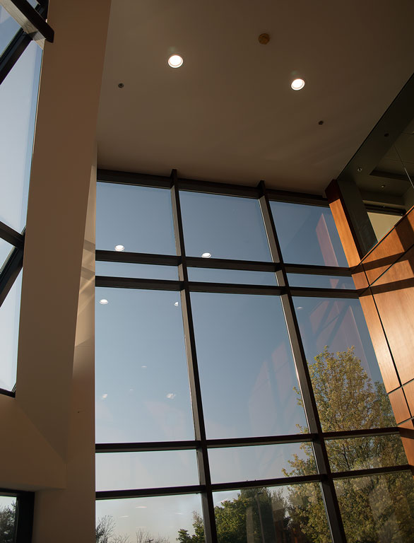
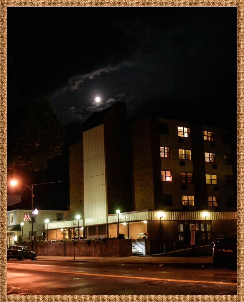
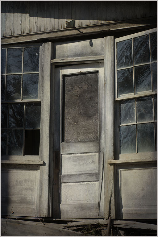
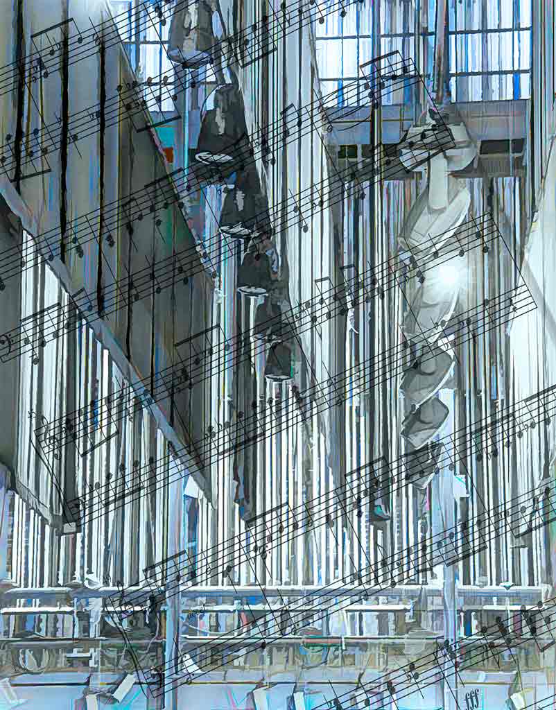
You turned a nice snapshot into a lovely image. Sometimes that 'looking up' perspective works, but straightening the image really works well here. The eye comes in from the left, hits the tree branches and returns to explore the details of the windows. One can certainly imagine this as a painting, and you have done an excellent job. Seems you also did some work on the branches coming in from the upper left. Well done. |
Nov 26th |
| 77 |
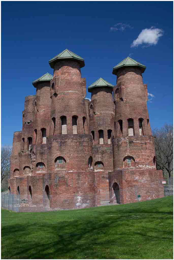
Nov 23 |
Comment |
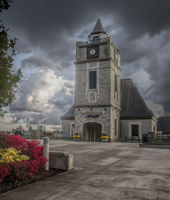
This is a very dramatic image of an ordinary subject. The clouds are amazing. Bad weather does, indeed, make for good photographs. It is interesting that the triangles at the top of the pylon echo the shapes of the hills and clouds in the background. Your work with the blues and yellows paid off. This is almost a statement about man vs. nature. |
Nov 26th |
| 77 |
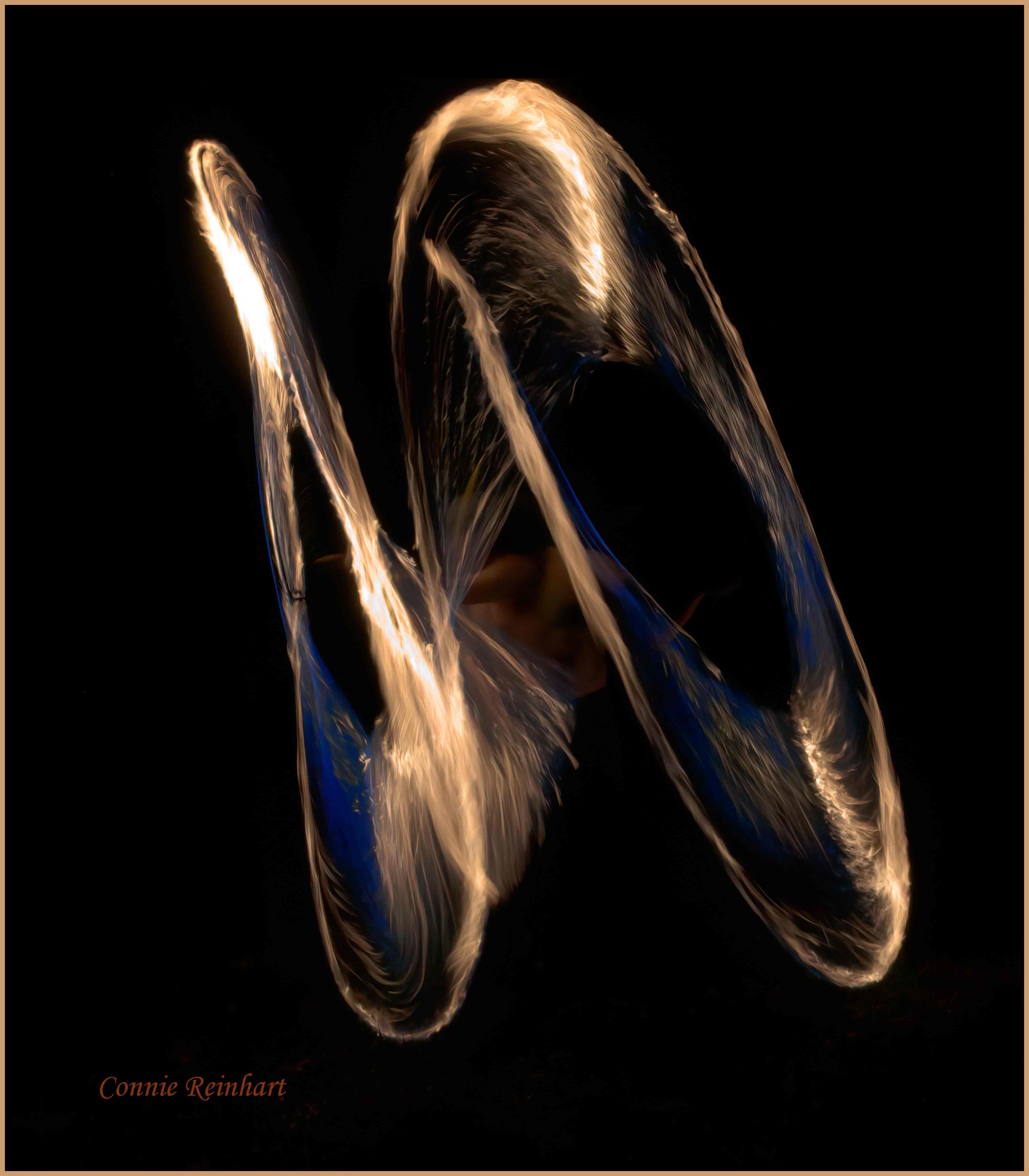
Nov 23 |
Comment |
The angle is very good - looking up as the bubbles rise to the sky. The colors are good. Whatever you did makes the bubbles the subject instead of the building, even though it is a very interesting building. This is unexpected and a bit whimsical. I really like it. |
Nov 26th |
| 77 |
Nov 23 |
Comment |
Your original photo is lovely, but your post-processing took this to a much higher level. The figures do, indeed, add dimension. The are some tower-like structures that would be good for scale, but the people really bring it home. Well done. Okay, never noticed the lens flare either. People? The towers look small compared to the mountains. The people look small compared to the towers - keep them both. |
Nov 26th |
7 comments - 4 replies for Group 77
|
11 comments - 7 replies Total
|