|
| Group |
Round |
C/R |
Comment |
Date |
Image |
| 12 |
Oct 23 |
Reply |
Thank you, Joan. |
Oct 22nd |
| 12 |
Oct 23 |
Comment |
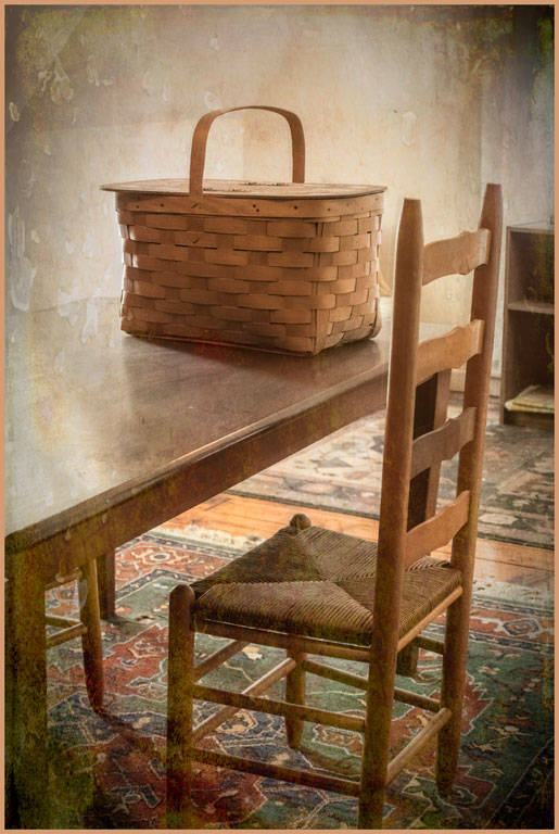
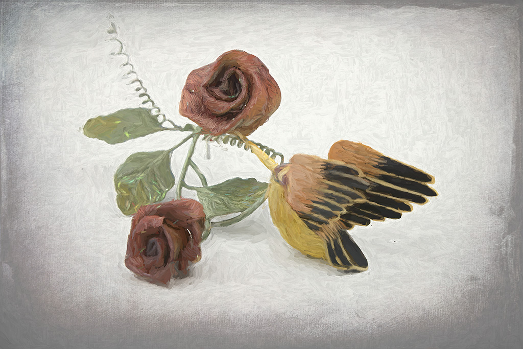
As I recall, this was a brunch with a nice egg bake. Or not. Yes, the table is a pebbled glass. |
Oct 22nd |
| 12 |
Oct 23 |
Reply |
I will try Denoise. The texture of the glass isn't really important to me. Good idea. |
Oct 22nd |
| 12 |
Oct 23 |
Reply |
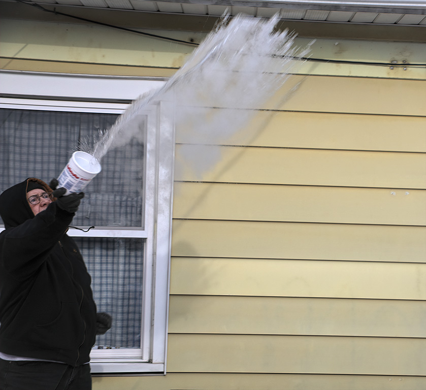
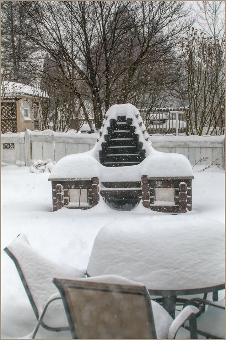
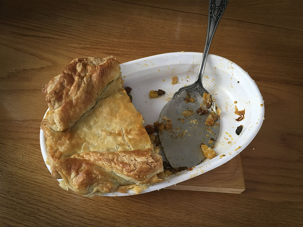
I didn't notice the dirt on the table. In fact, I thought I had cleaned it completely. We were setting up for a family picnic. Hmmm. Good thing my kids are not too demanding. |
Oct 22nd |
| 12 |
Oct 23 |
Reply |
I did arrange the place setting on purpose. But the final composition had more to do with finding a place to lay between the legs of the table. |
Oct 22nd |
| 12 |
Oct 23 |
Comment |
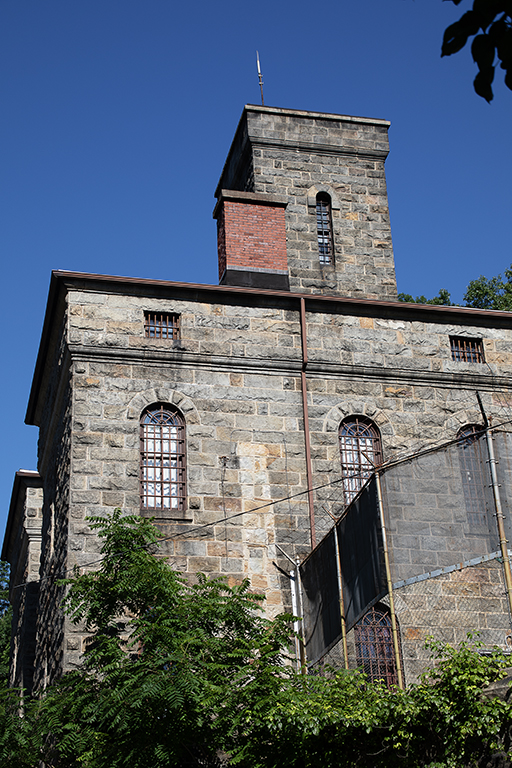
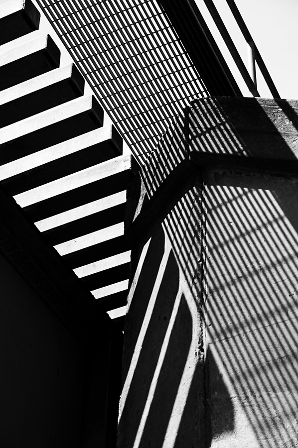
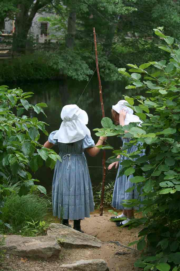
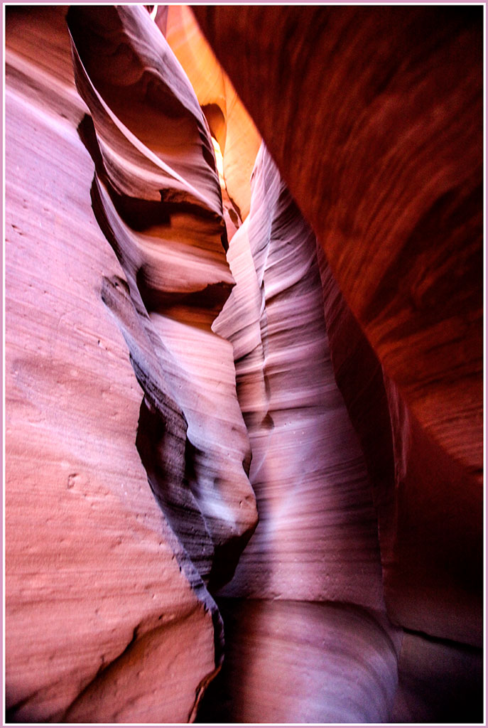
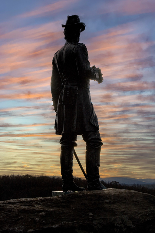
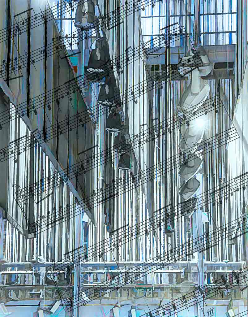
Definitely the B&W. This looks like an Escher print. How in the world did that lady get on to that catwalk? "Interesting" is an understatement for this image. Without the lady, it would just be a bunch of lines. |
Oct 9th |
| 12 |
Oct 23 |
Comment |
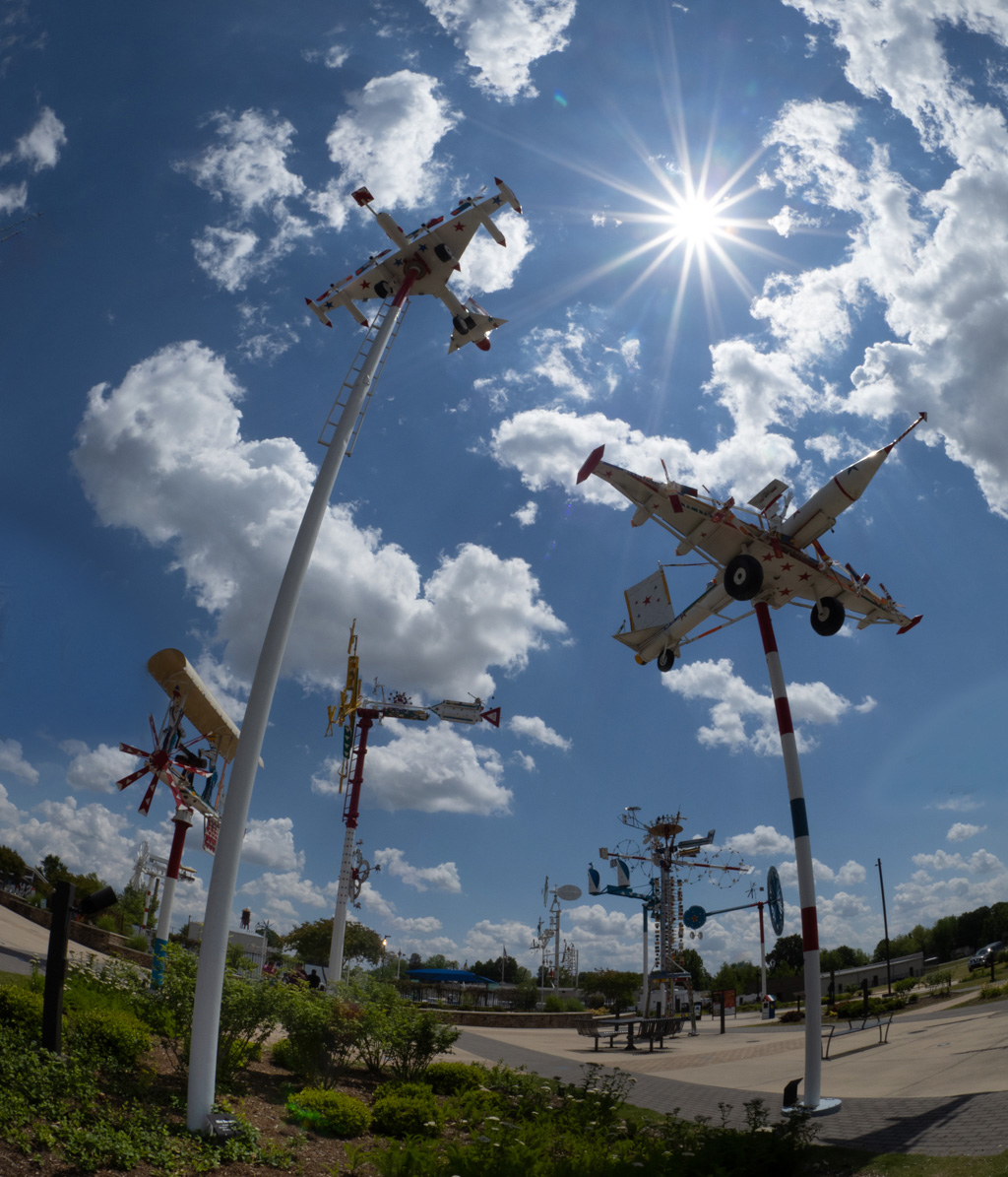
I try to comment before looking at the other comments, so please forgive any repetition. Love the sky, the sunburst, the curved poles. I thought they were real planes at first. The vertical composition makes the planes look like they are high in the sky (and tethered, too. Hmmm.) The only thing I would suggest is to somehow clone out those partial planes on the right and left edges. I didn't do a very good job. I also used Viveza to brighten up the lower left corner. But some might rightly criticize that as distracting from the subject. |
Oct 9th |
 |
| 12 |
Oct 23 |
Comment |
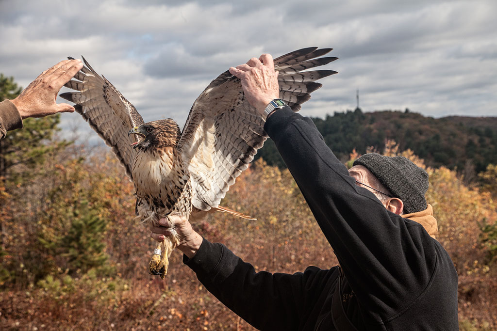
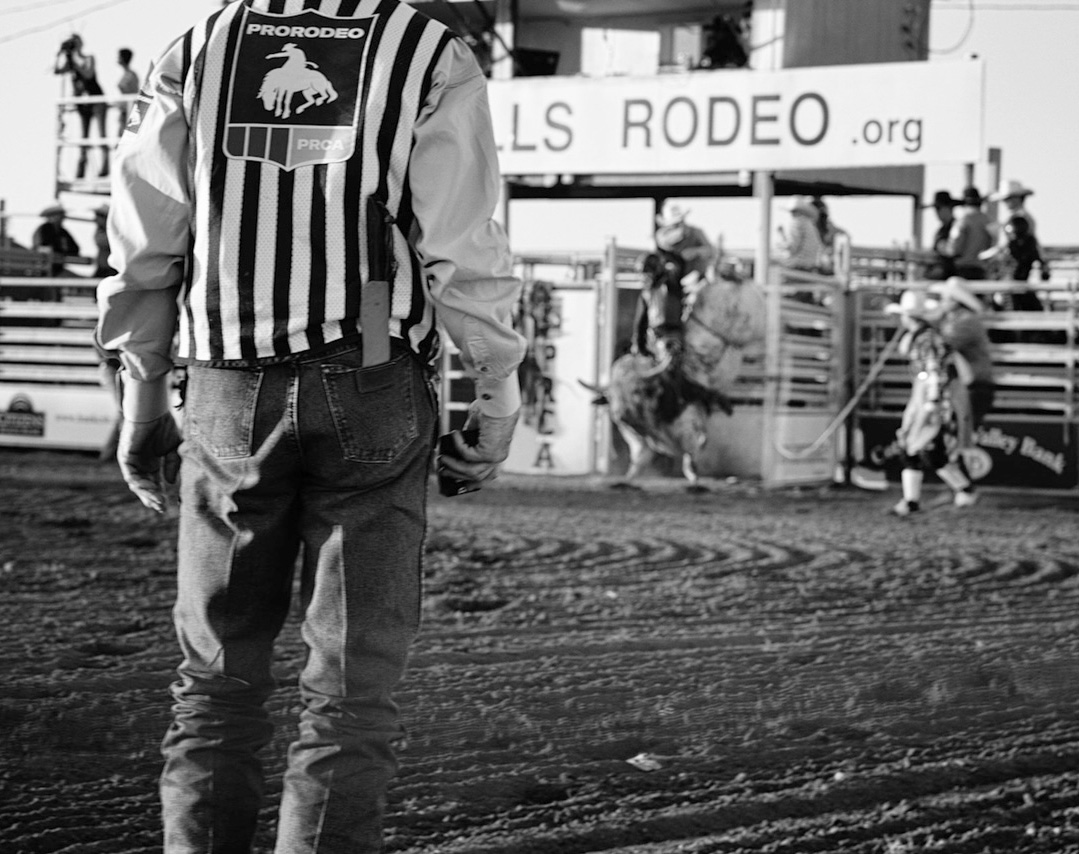
Welcome, Nancy. Glad to have you aboard. My goodness, you are brave! Were you in the ring with the action? Black and white is the right choice for this image. Bright colors in the background would have distracted from the subject. I would suggest cropping from the left just to eliminate that sign on the fence. That puts the judge in a nice rule-of-thirds position. I also lightened the midtones a smidge - but that's personal preference. |
Oct 9th |
 |
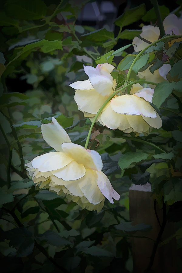
| 12 |
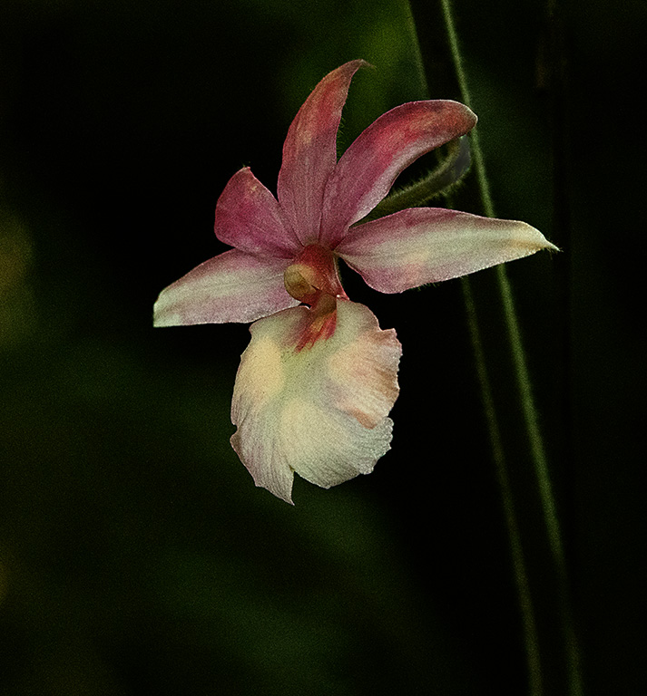
Oct 23 |
Comment |
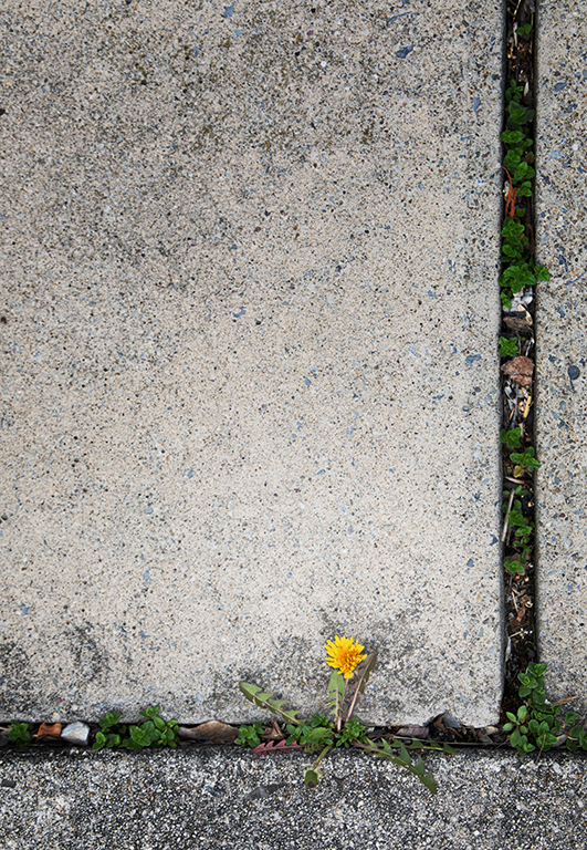
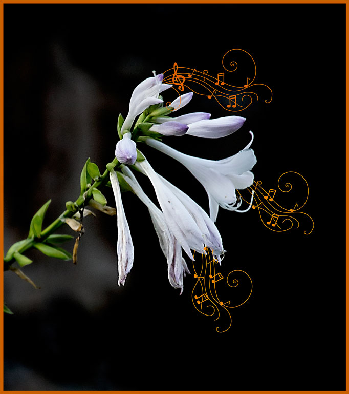
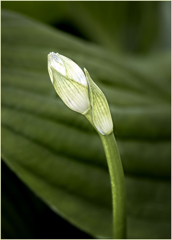
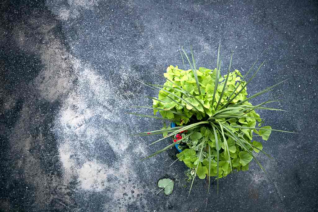
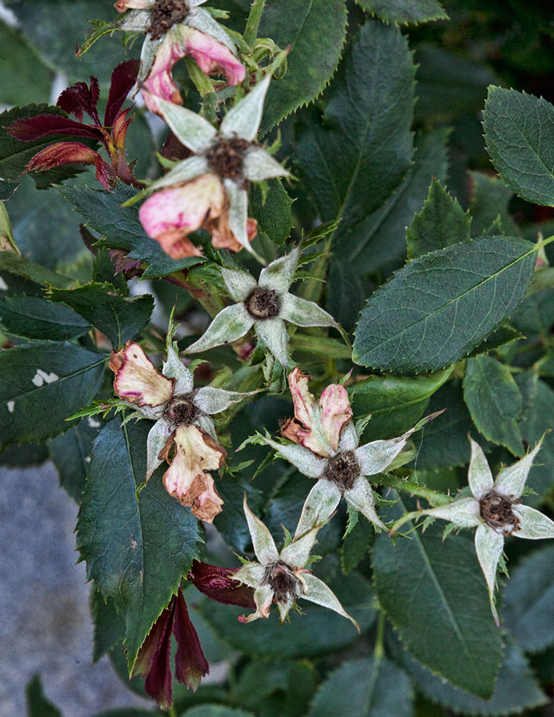
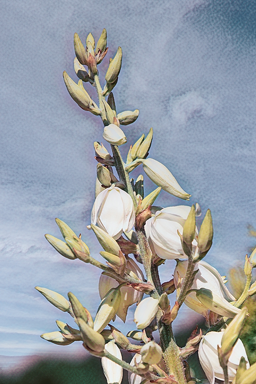
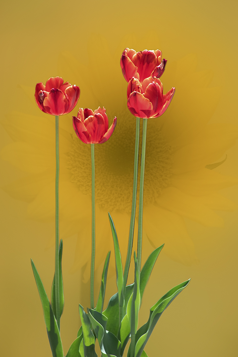
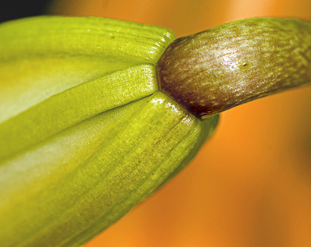
The unnoticed detail of plants is always a surprise to me. I like the diagonal placement of the subject leading the eye from left to right, the direction we read. The focus is a little soft; it looks like camera shake. I added a high pass filter, but that had little effect. The yellow background does not show off the subject very well. I separated the subject, then used hue/saturation to change the background. Orange looked better than other colors. Ok. I just read the other comments - I like the square crop. |
Oct 9th |
 |
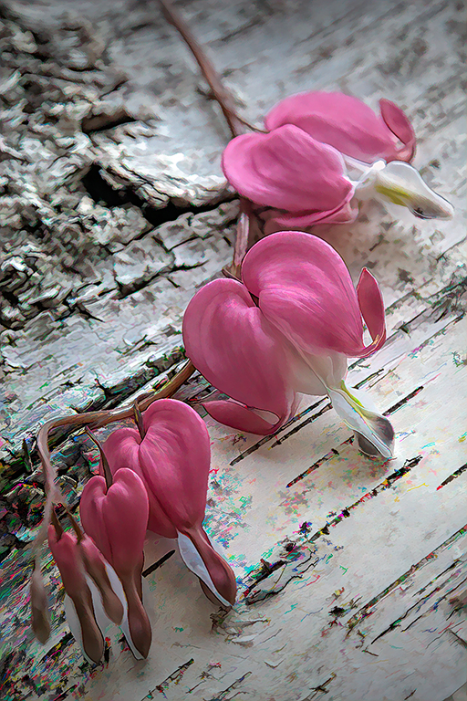
| 12 |
Oct 23 |
Comment |
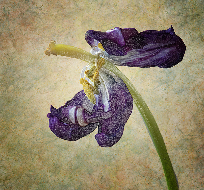
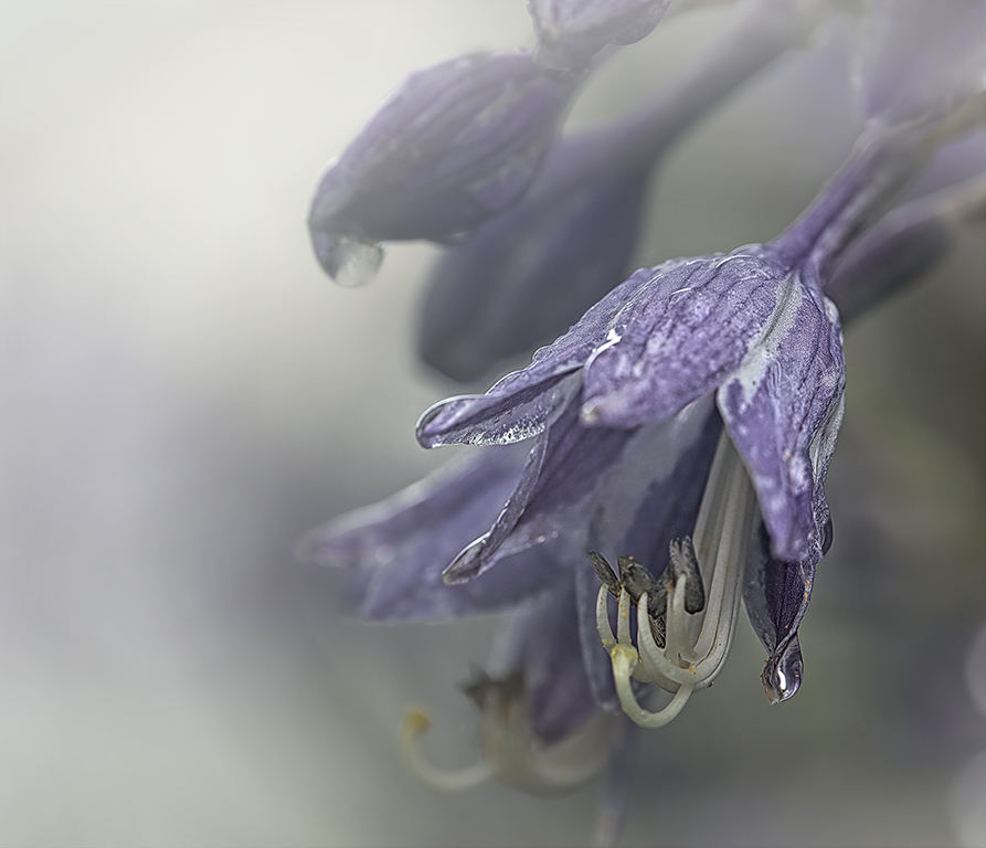
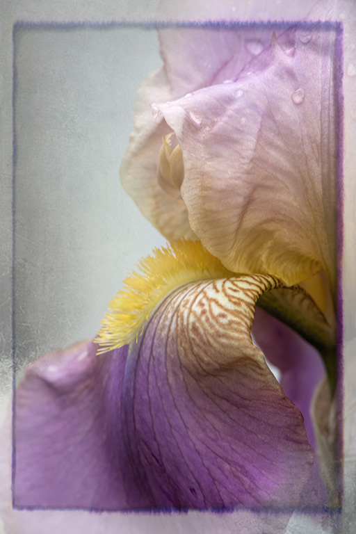
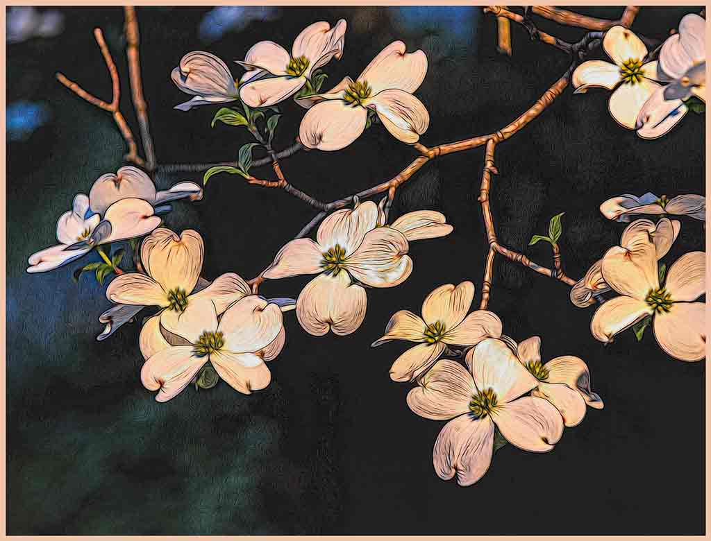
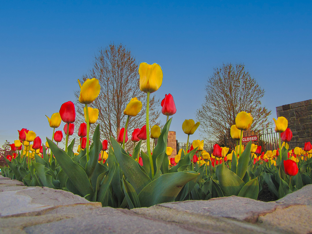
I think the colors are perfect. The angle adds a great deal of interest. If taken from the usual vantage point this would just be another nice flower picture. The diagonals of the composition suggest a diamond shape (the apex of the flowers on top, the corner of the wall on bottom.) I tried PS sky replacement using a nice deep blue sky. But that sky had to ne masked off of the subject, and that was very tedious. I think your sky is good. Removing the closed sign is a little too intimidating to me. |
Oct 9th |
 |
6 comments - 4 replies for Group 12
|
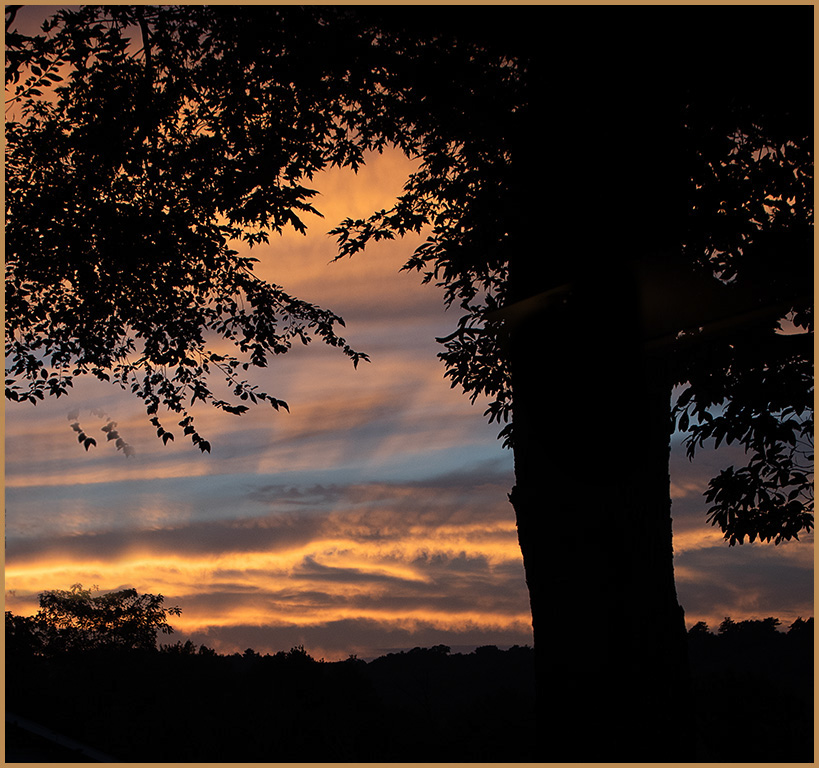
| 77 |
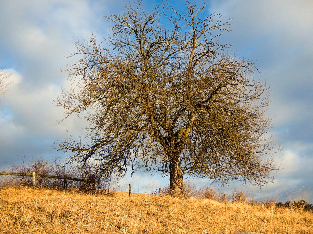
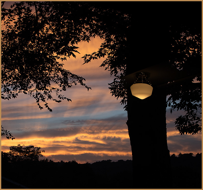
Oct 23 |
Comment |
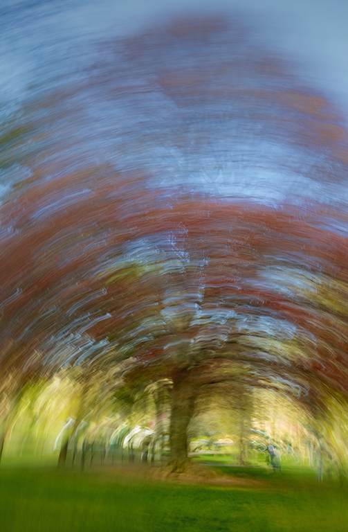
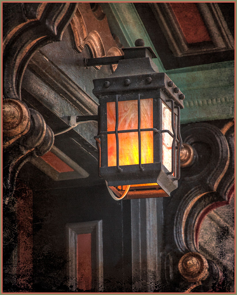
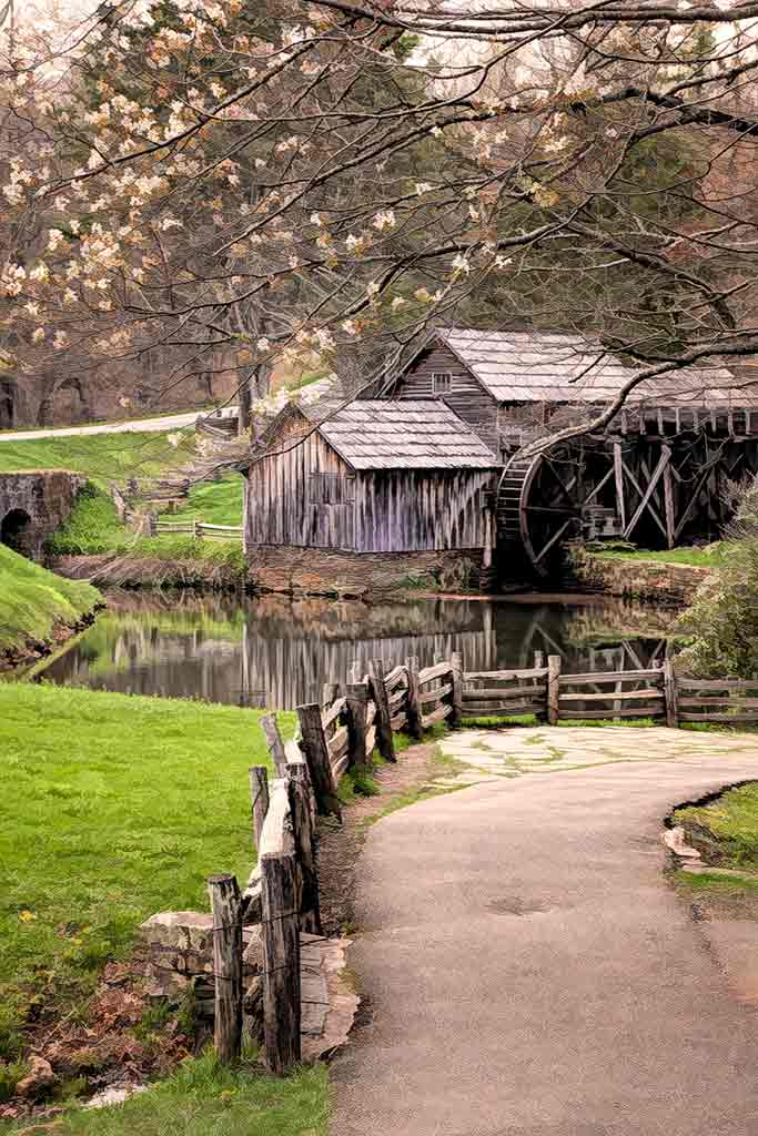
Thank you all for your comments. The perfect alignment of the light with the tree trunk fascinates me. But you are all right about removing it. Here is a version without the lamp and the small branch on the left side. Thank you for getting me out of my pre-conceived notions. |
Oct 22nd |
 |
| 77 |
Oct 23 |
Comment |
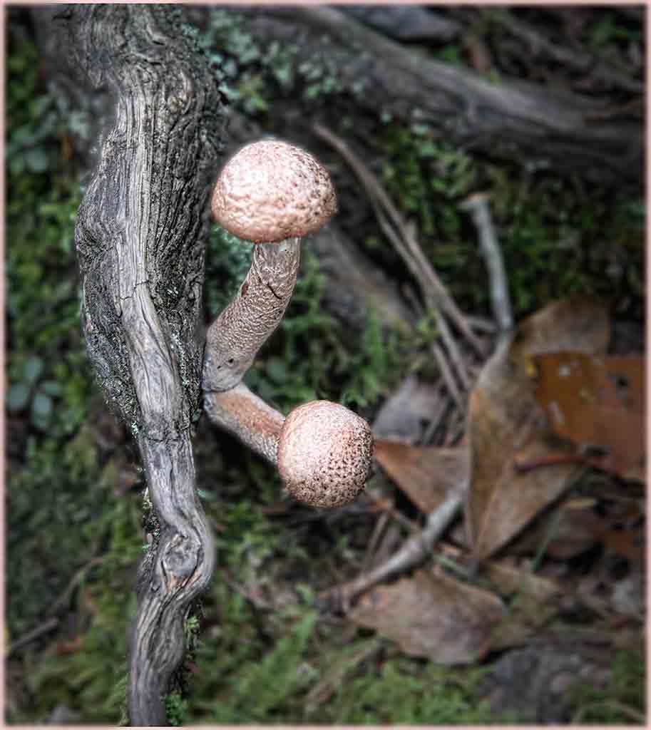
These are very interesting mushrooms. Perhaps it is the pose that intrigues me. They seem to be sharing a secret. The background in the original image is quite nice, but the new background seems to add to the intimacy that these mushrooms are sharing. Should we use AI filters? Purchased textures, frames, skies, and backgrounds have been used for years. Hazel Meredith does warn people that using purchased textures, etc. might disqualify an image from certain competitions; but for personal use, including selling the images, is OK. So perhaps the use of this generative fill tool is fine under the same guidelines. Just as long as AI doesn't create the whole image. |
Oct 22nd |
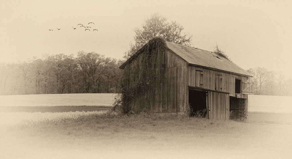
| 77 |
Oct 23 |
Comment |
The crop is very good. The horizon is along the bottom third. The ducks have enough room to continue flying. The colors and textures of the foreground are very pleasing with nice contrast. There is enough detail in the sky to be interesting, but not enough to become a subject in itself. This would hang very nicely on a hunting cabin wall, or a man cave wall. |
Oct 22nd |
| 77 |
Oct 23 |
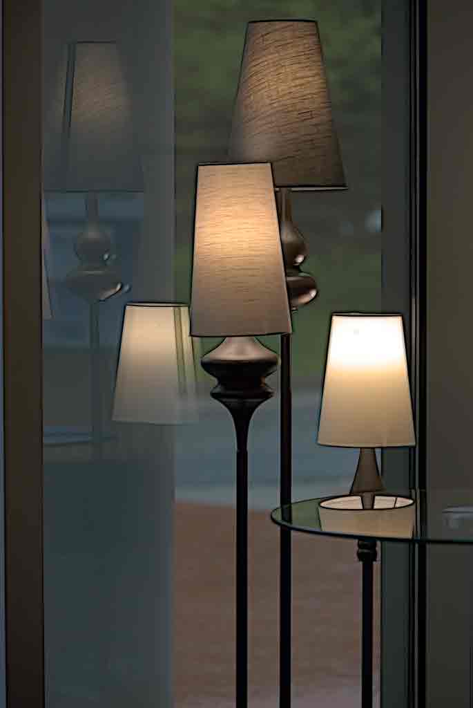
Comment |
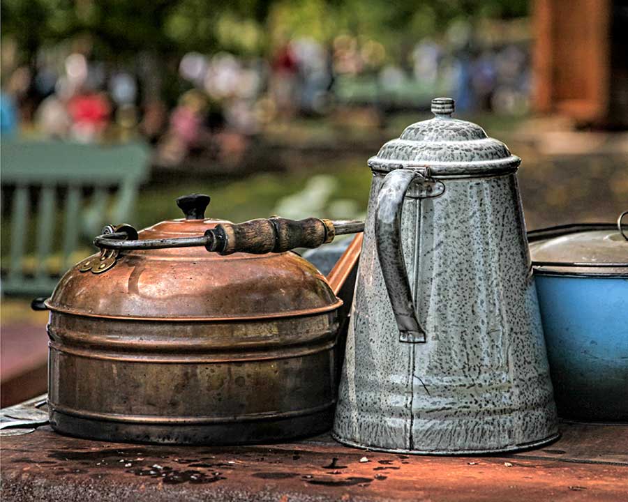
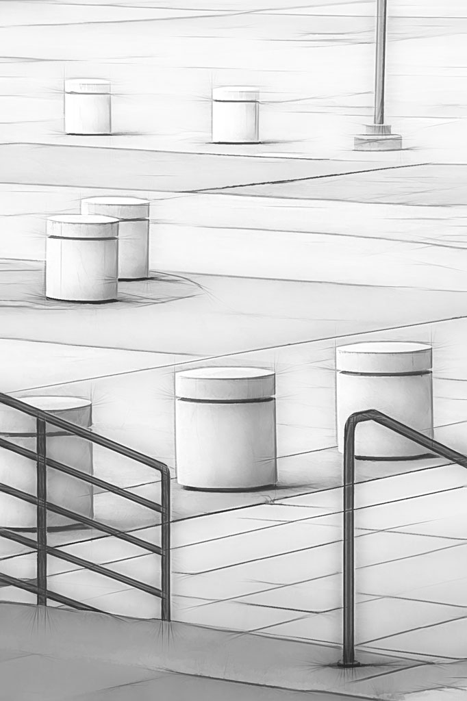
Minimalist and high key photography is not as easy as you make it seem. White on white is difficult to expose. Your use of the burn tool adds just enough shadow to give shape and texture to this image. This is really quite beautiful. |
Oct 22nd |
| 77 |
Oct 23 |
Comment |
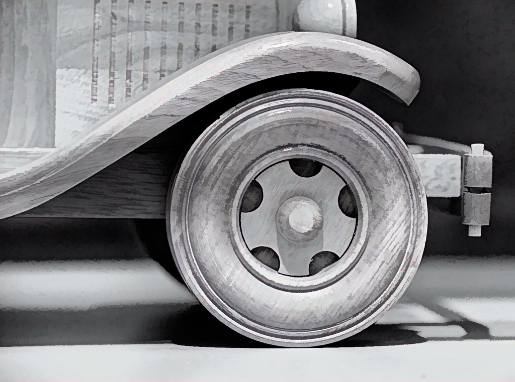
You got amazing detail on that car! Looking at the original, I probably would have given up. The celebratory hands tell so much more of the story than just the car itself would. I never thought of gradient filters. Thanks for the tip. The driver should be proud to print and frame this shot. |
Oct 22nd |
| 77 |
Oct 23 |
Comment |
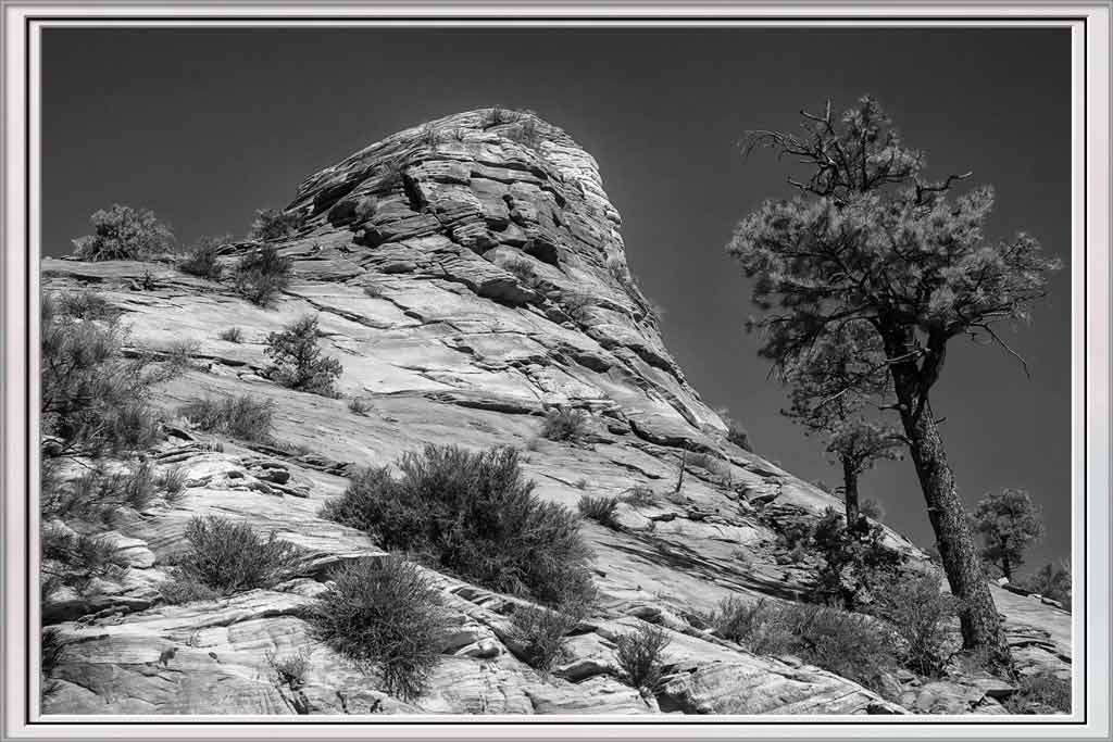
Wow, you got a lot of detail out of those trees and clouds. Kudos on having the patience to scout a location and wait for those vehicles. They turn a record shot into a prize winner. There is good focus front to back. There is good tonal range. B&W is the right choice for this shot. The crop is good as it removes extra sky and grass that don't really contribute, It also helps focus the viewer's eye to the vehicles. |
Oct 22nd |
| 77 |
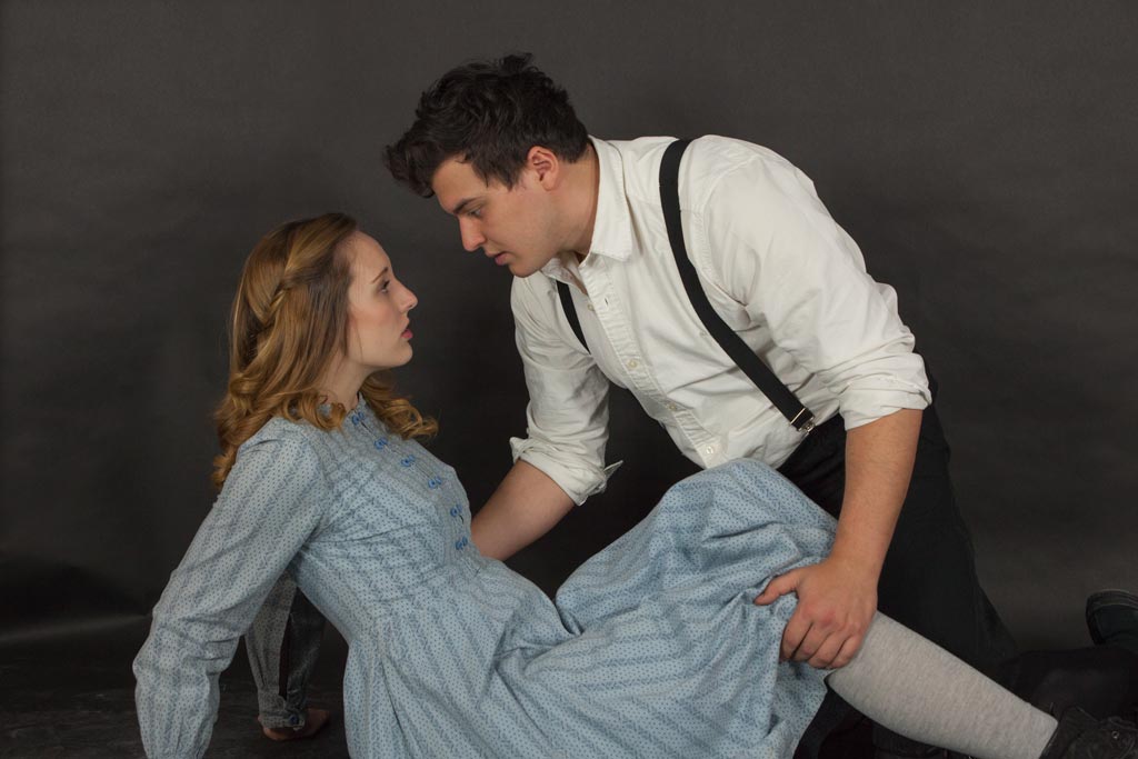
Oct 23 |
Comment |
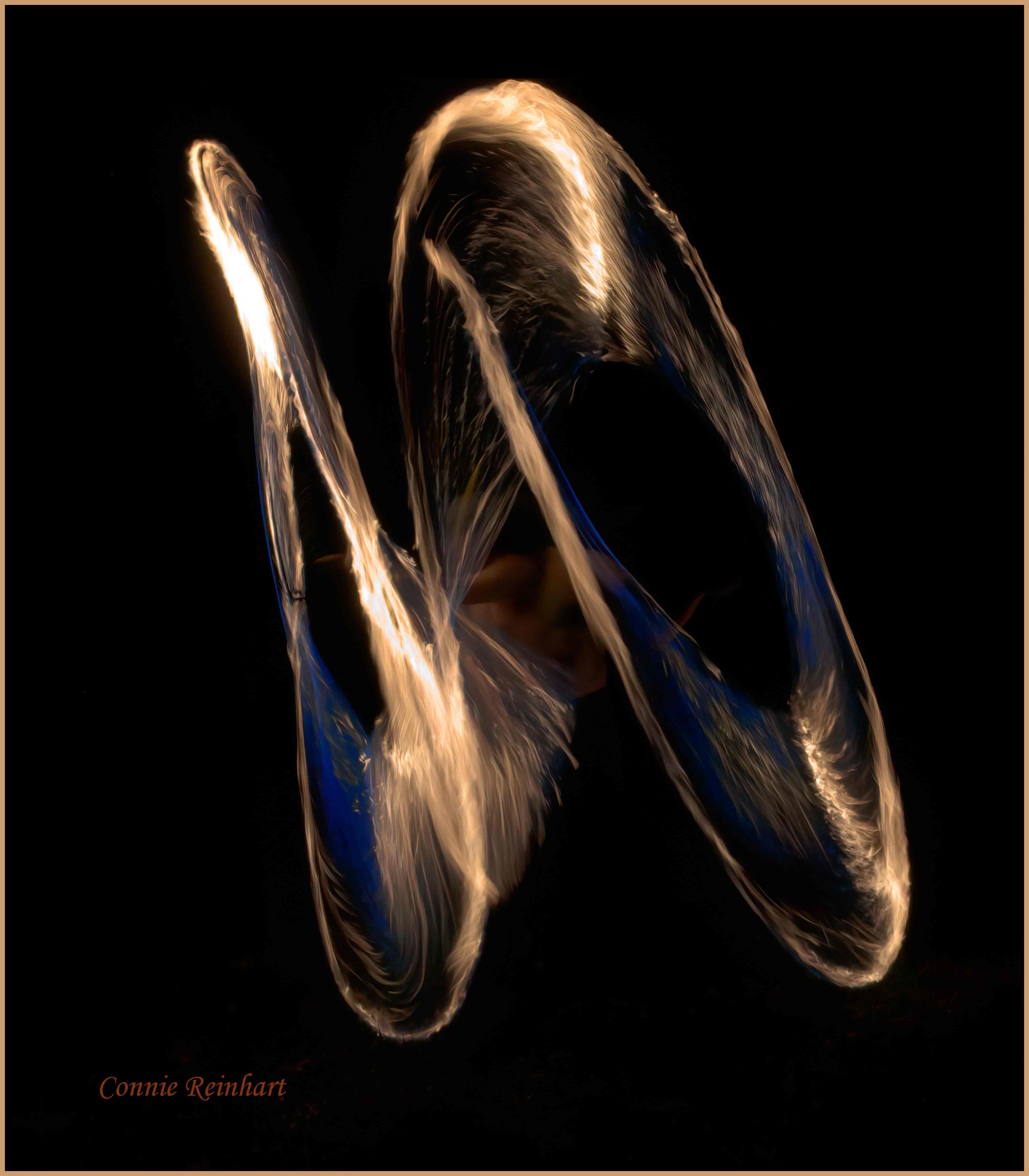
Everything you did works perfectly here. You put the emphasis on the dancers. The pose creates interest and tension. The dancers themselves have intense expressions on their faces. Perhaps that is not under the control of the photographer, but capturing it is. The light rays are a good touch. |
Oct 22nd |
7 comments - 0 replies for Group 77
|
13 comments - 4 replies Total
|