|
| Group |
Round |
C/R |
Comment |
Date |
Image |
| 12 |
Sep 23 |
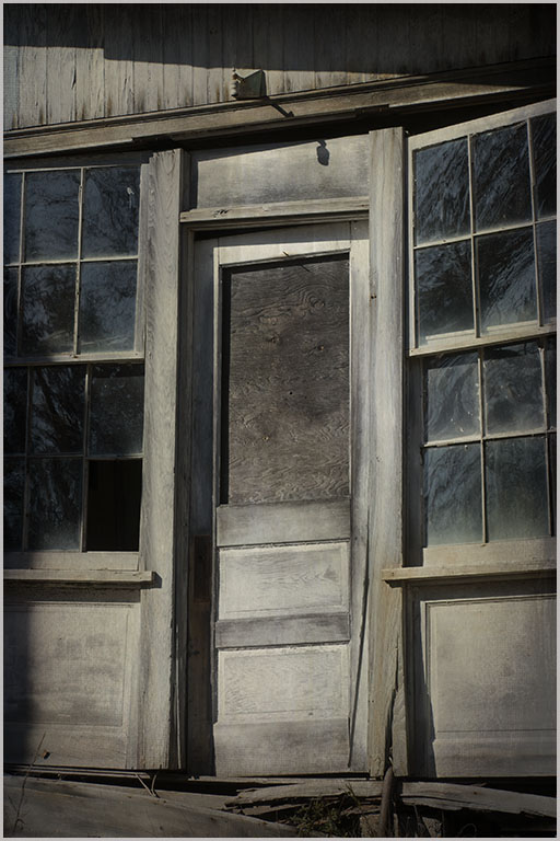
Comment |
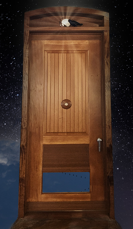
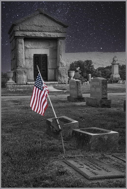
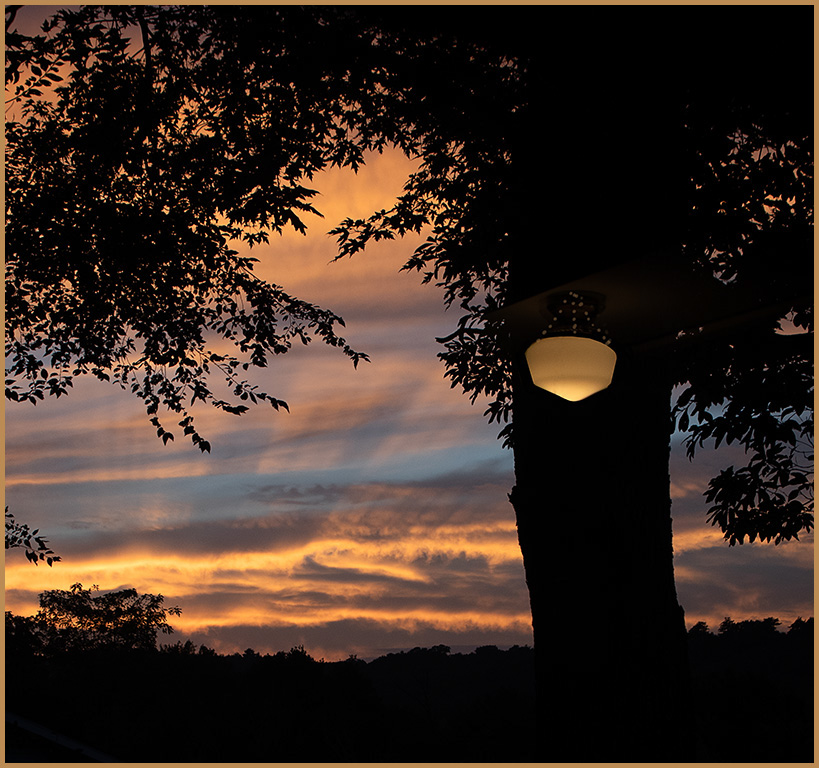
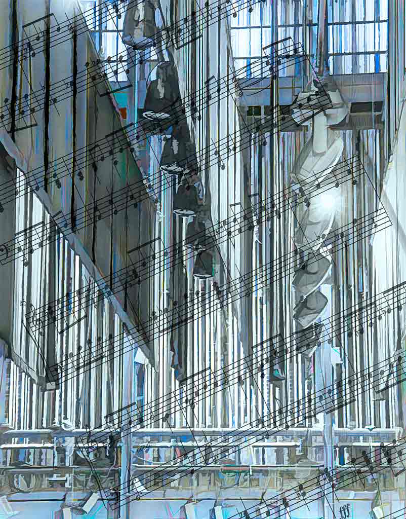
Some images just beg to be played with. This was one. The title is "Door to the Stars". That was because of the sky. But in retrospect, it is also the door between the music room and the musicians. |
Sep 18th |
| 12 |
Sep 23 |
Reply |
I originally put one of my own blue sky/white cloud images behind the door. If you look through the bottom window of the door you will see some geese flying. It was pretty, but not what I was looking for. So I downloaded replacement skies for Photo Shop and chose this nice starry sky. What I didn't realize is the sky replacement tool treated the sky like a gradient, fading it out towards the bottom. So I just darkened the blue sky. |
Sep 18th |
| 12 |
Sep 23 |
Reply |
The owner of the door wants to somehow shine a light on the crow. That's why the starburst was put there. But I agree that it is a bit much. |
Sep 18th |
| 12 |
Sep 23 |
Comment |
Curiouser and curiouser. It's a very pleasant scene. Your exposure and DOF is very good. There is good detail in highlights and shadows. Catching the texture in the window area is a plus. The straight on view of the door makes me want to open it and walk through. If you had angled the door it would have been just a flat green board. |
Sep 18th |
| 12 |
Sep 23 |
Comment |
You handled a difficult lighting situation beautifully. There is detail in the dark interior rocks as well as the bright background. The light falling on the wooden walkway leads the viewer right through the door to the road beyond. I like what you have done; but this picture just begs for special treatment. Carole's example is good. But that is an entirely different image. Perhaps there are uses for both. |
Sep 18th |
| 12 |
Sep 23 |
Comment |
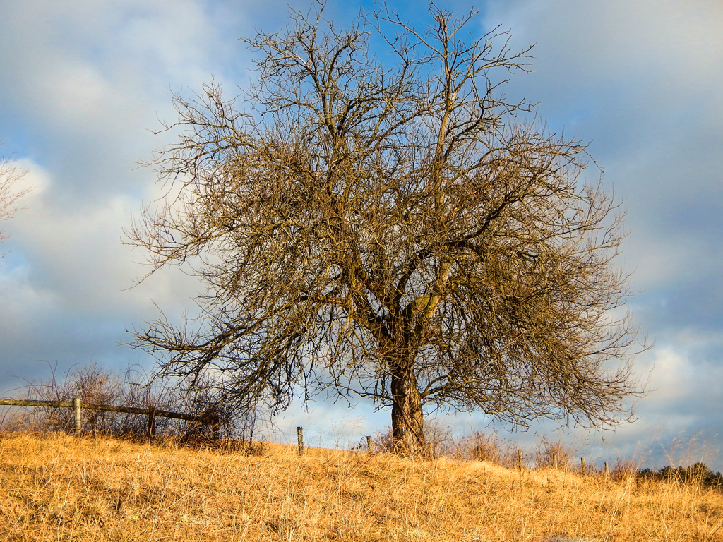
Ah, time marches on. This looks like a crop from a larger image (the proportion of width to height). I tried cropping, but your composition is best. The only suggestion is to play with hue/saturation. Darken the greens and yellows; saturate the cyan, blue, and magenta to make the doors more dominant. Barbara, you have always been a very helpful commentor for Group 12. I have learned a lot from you. We all wish you well in the future. |
Sep 18th |
 |
| 12 |
Sep 23 |
Comment |
This is indeed an interesting door. The three locks make one curious, especially because the two at the top look relatively new. Obviously someone is paying attention to this shop. If by "white spots" you mean the chips in the wood frame, you handled them very well. They look very natural. I agree with Carole's vignette. |
Sep 18th |
| 12 |
Sep 23 |
Comment |
Hi Aaron. Welcome aboard. You exposure, color balance, and framing are very well done. The door is not quite square within the frame, but perhaps you wanted it that way. I like leaving the steps in the frame because one can imagine walking through the door and into the building, I hope you got to see inside. The darkness at the top of the door adds depth. There is enough light to show the beautiful detail. Oh, I just had to play with this. Sorry. |
Sep 18th |
| 12 |
Sep 23 |
Comment |
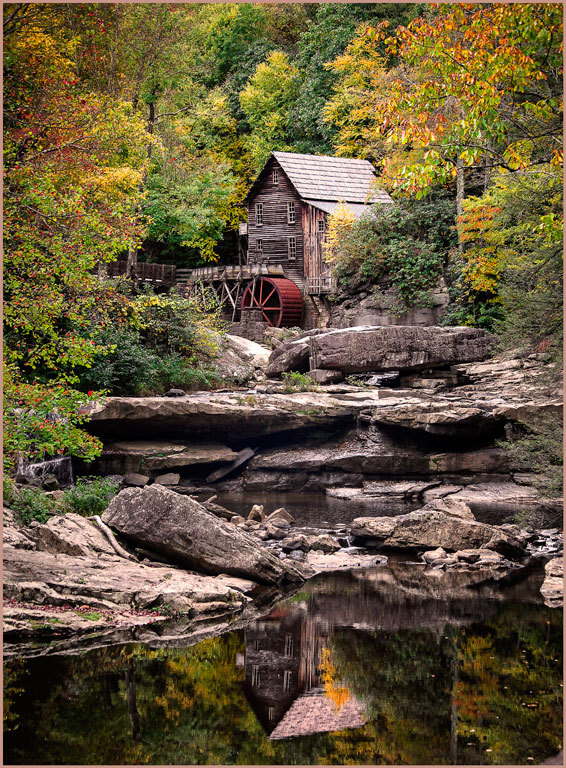
How lucky you all were to visit this stable. There must have been innumerable photo opportunities. You did an excellent job straightening and adjusting the original. We can almost read the fine print on the door. This fits the assignment perfectly. I agree with Joan that the lighter area on the right side of the door adds a feeling of depth. |
Sep 18th |
7 comments - 2 replies for Group 12
|
| 77 |
Sep 23 |
Reply |
Very nice. I like this version, too. Thank you, Linda. |
Sep 18th |
| 77 |
Sep 23 |
Reply |
There were trees overhead, thus the shadows. That 'lonely' leaf was what drew me to the scene. Thank you for your comments. |
Sep 18th |
| 77 |
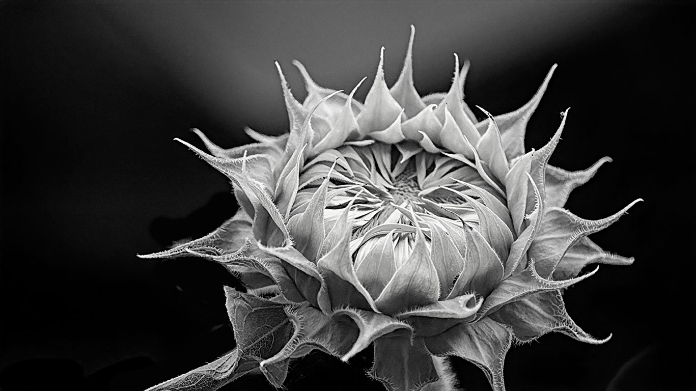
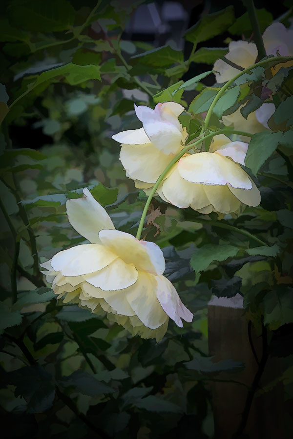
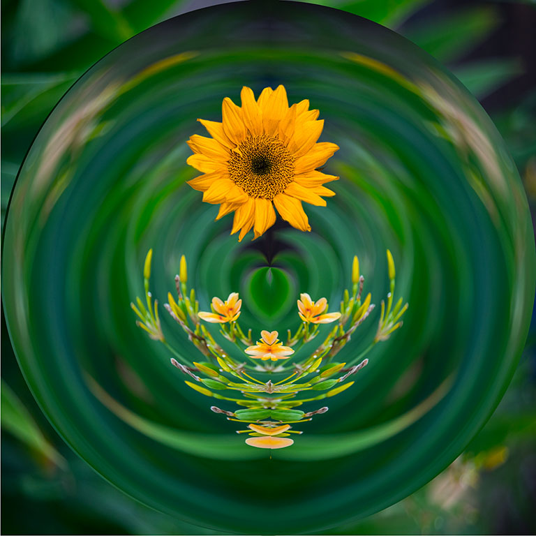
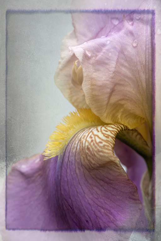
Sep 23 |
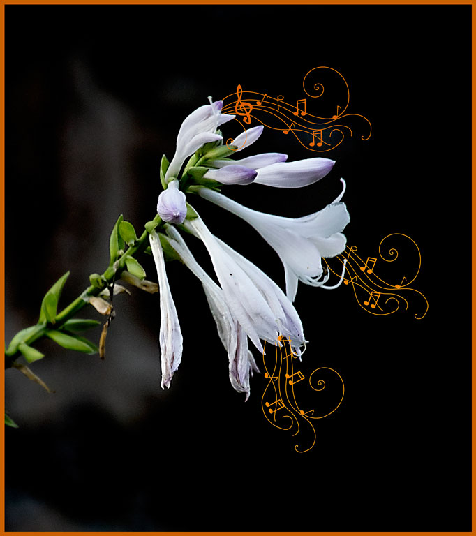
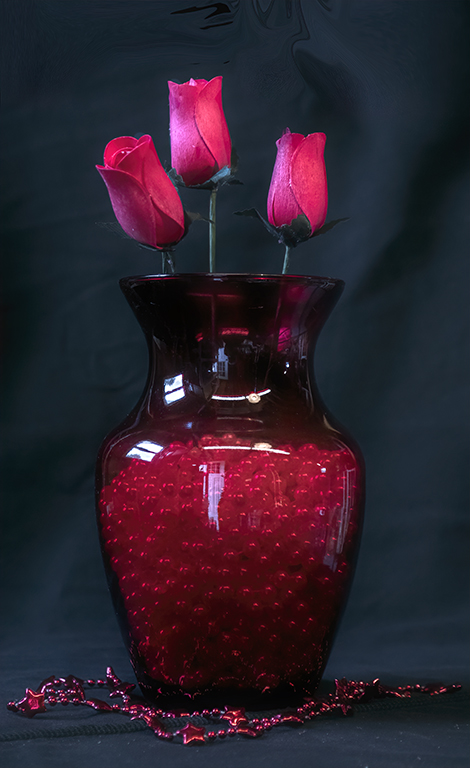
Comment |
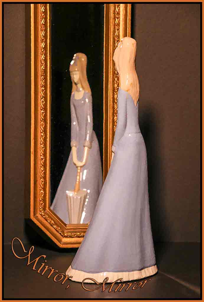
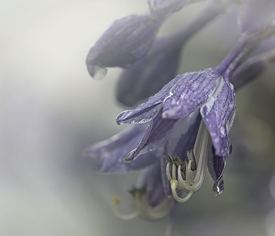
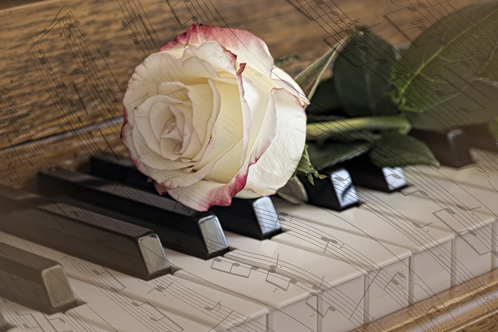
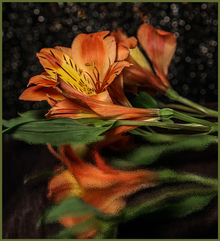
This is like looking down on a twirling flamenco dancer. Your edits are very well done. The highlights on the s of petals do, indeed, give the flower depth. The background is okay with me. A plain background gives no sense of place, just a flower plopped down on some black velvet. Sometimes that's okay, but not here. |
Sep 18th |
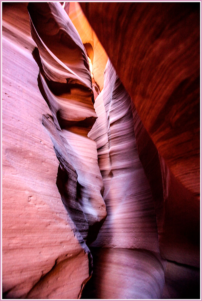
| 77 |
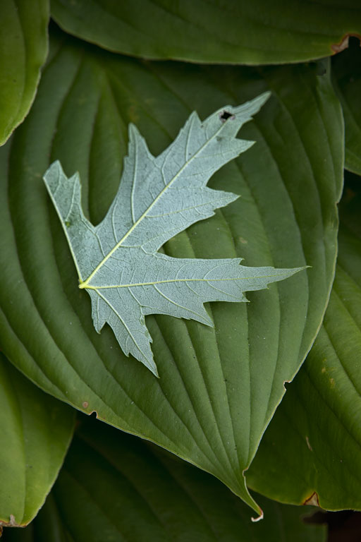
Sep 23 |
Comment |
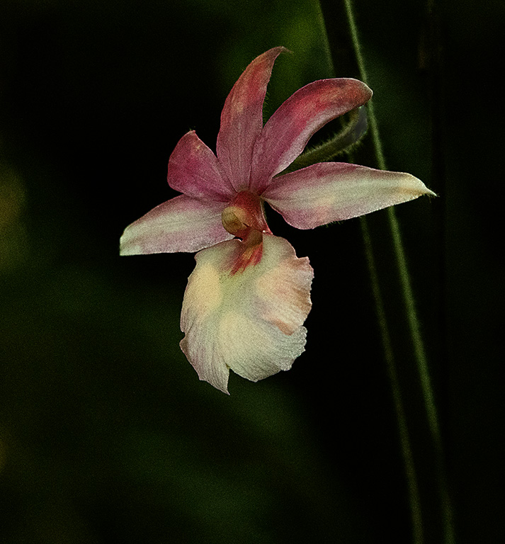
These slot canyons are truly beautiful. You got amazing detail out of that hot spot in the lower right of your final edit. I tried to duplicate it just now and couldn't get it as good as you did. Then I used Viveza to try to bring out the detail in the large dark triangle in the bottom right. But comparing the two, I find your version better. My lightened area just looks whimpy. |
Sep 18th |
 |
| 77 |
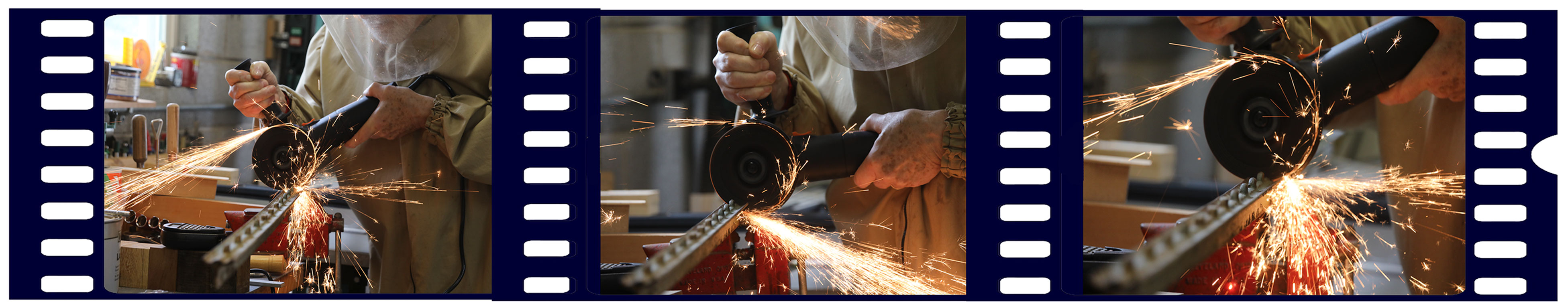
Sep 23 |
Comment |
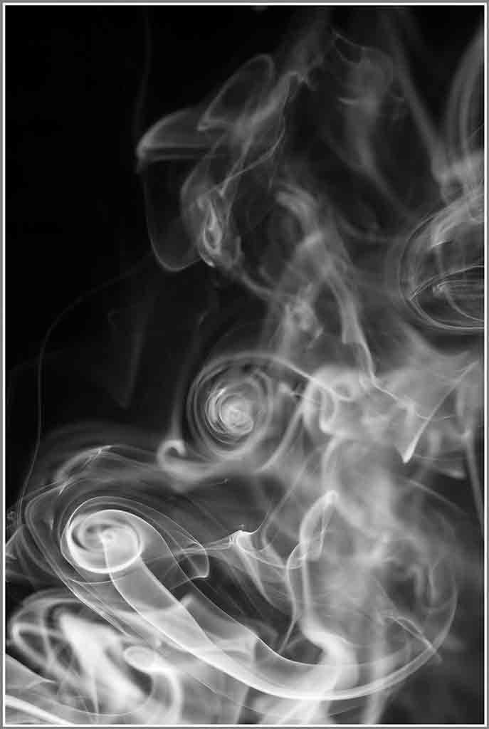
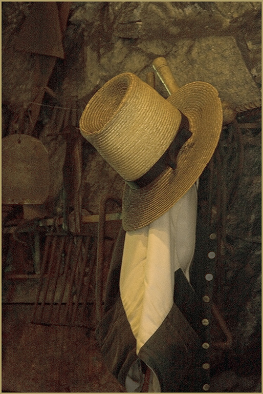
Choosing B&W for this image was a wise decision. That orange apron demands all the viewer's attention. Plus the cigarette smoke doesn't really show in the color version. It is a tiny, but important part of the story. Your cropping focuses in on the subject matter very well. The retouching was expertly done and cleaned up the background very well. Linda's reversal looks good, too. |
Sep 18th |
| 77 |
Sep 23 |
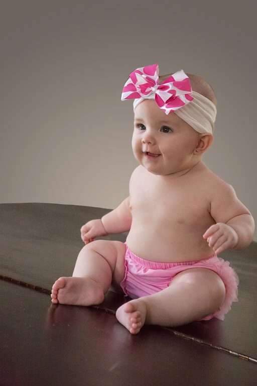
Comment |
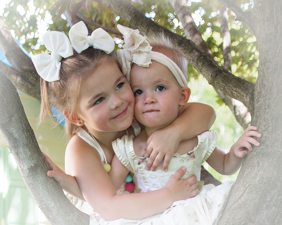
Wow, you got a beautiful final image from that original. I like both versions. But I find the blue tone on the B&W is a bit cold for children. I added a photo filter #85 at about 20% to neutralize the blue. As to printing, I would try something like a fine art water color paper that has a nice matte finish for either version. The color version would look very nice as a canvas wrap. We put most of our prints on a semi-gloss or luster. But truthfully, once a picture is behind glass, the paper makes little difference. |
Sep 18th |
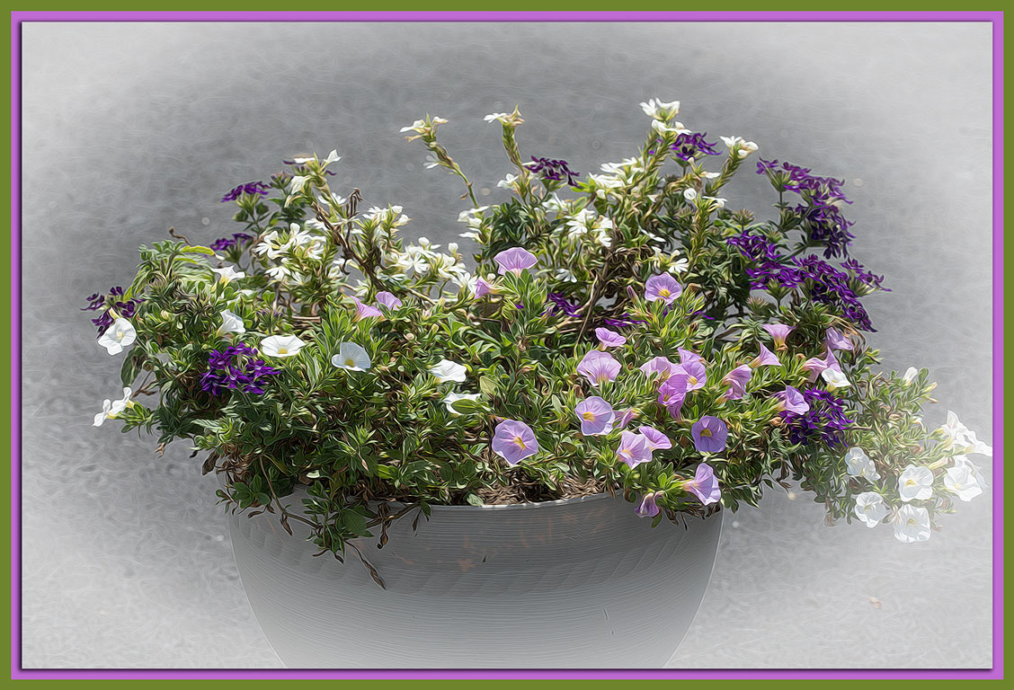
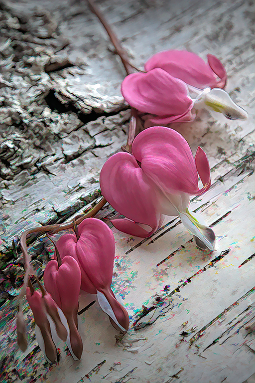
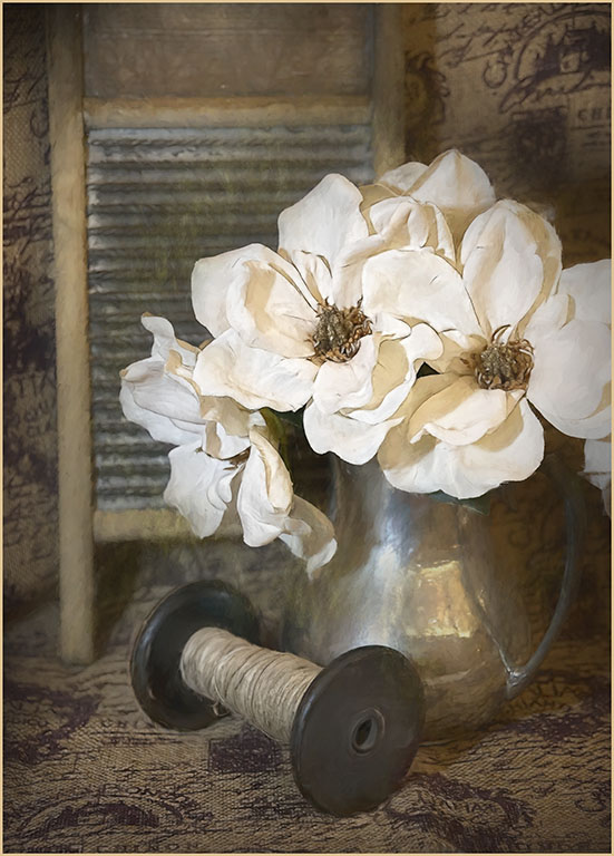
| 77 |
Sep 23 |
Comment |
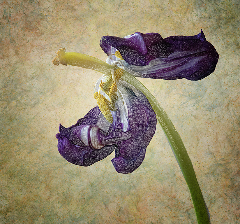
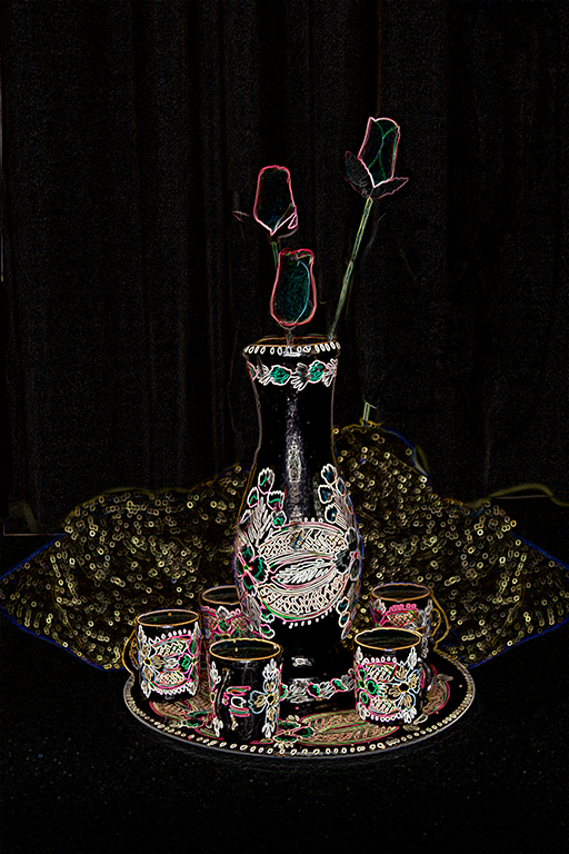
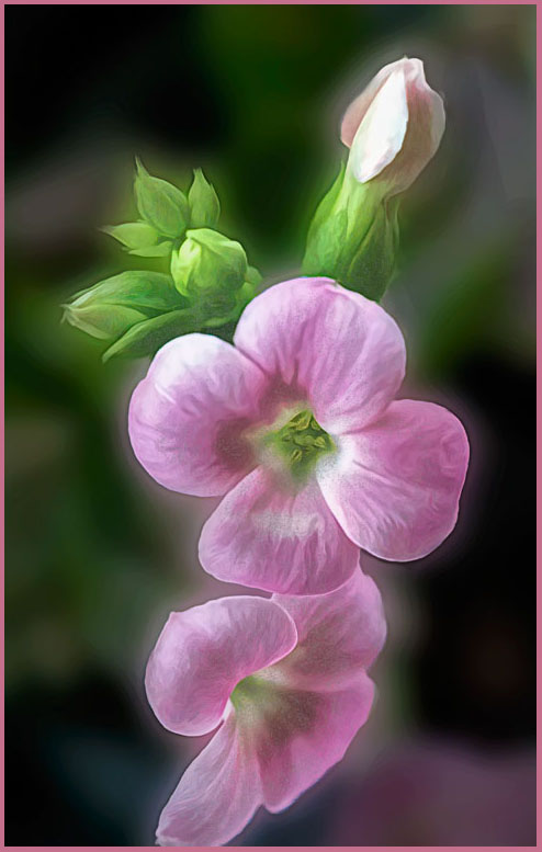
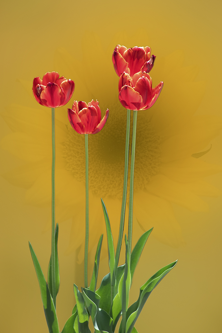
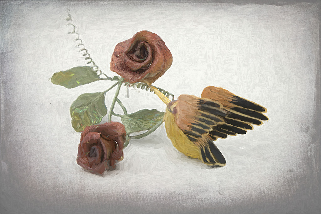
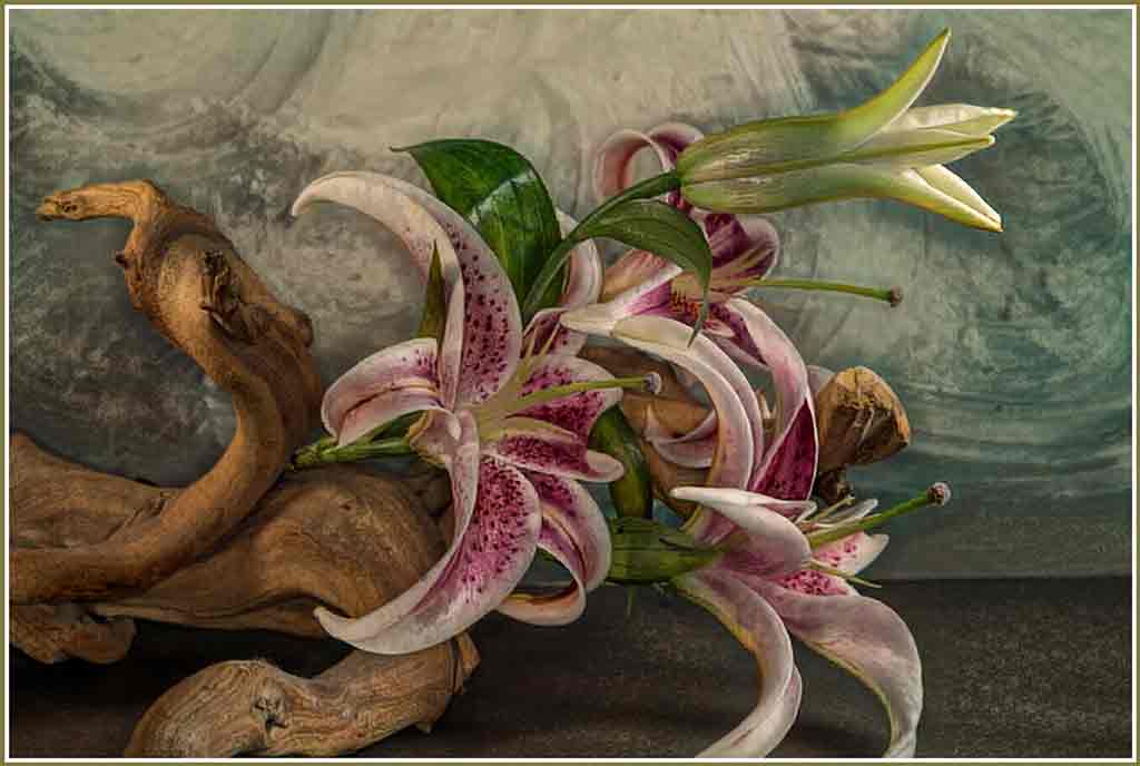
You found a good solution for handling flowers that won't cooperate. It worked out quite well. The vignette forces the eye to the subject perfectly. I have a hard time visualizing what a texture will do for an image. This is lovely. You certainly achieved your goal of "Old Masters" style. |
Sep 18th |
5 comments - 2 replies for Group 77
|
12 comments - 4 replies Total
|