|
| Group |
Round |
C/R |
Comment |
Date |
Image |
| 12 |
Jul 23 |
Reply |
Thank you. You and Carole are on the same page. |
Jul 20th |
| 12 |
Jul 23 |
Reply |
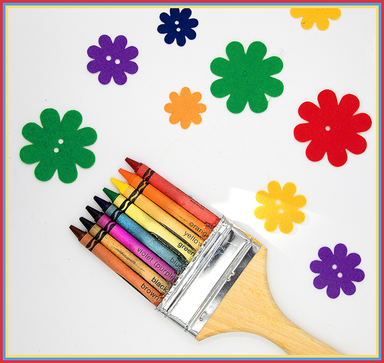
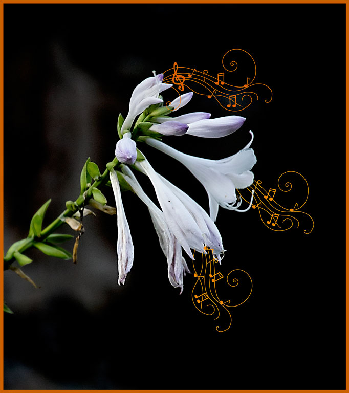
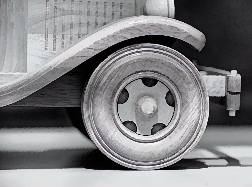
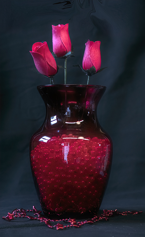
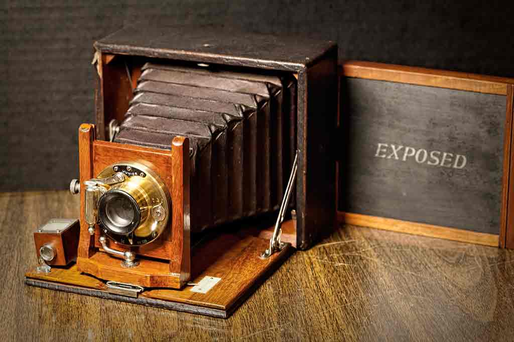
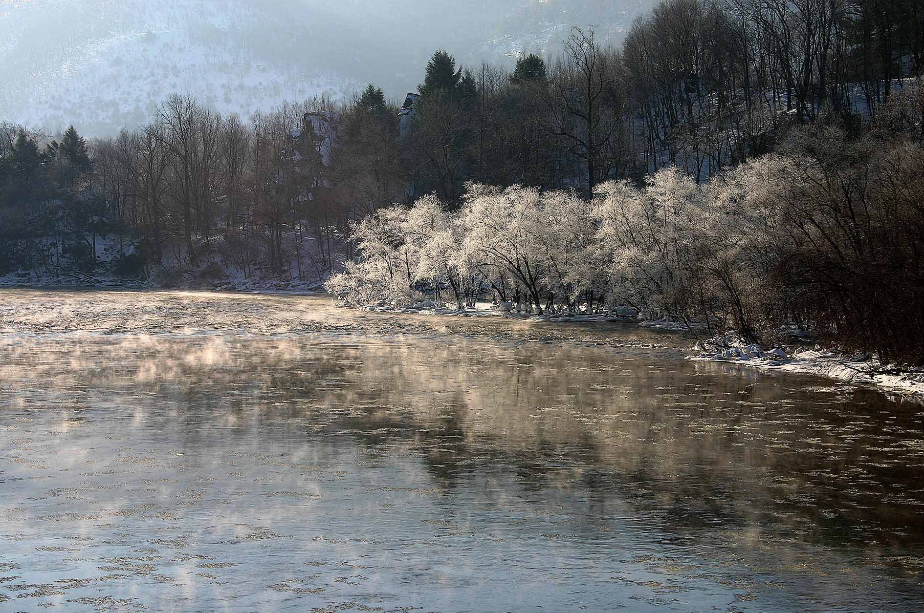
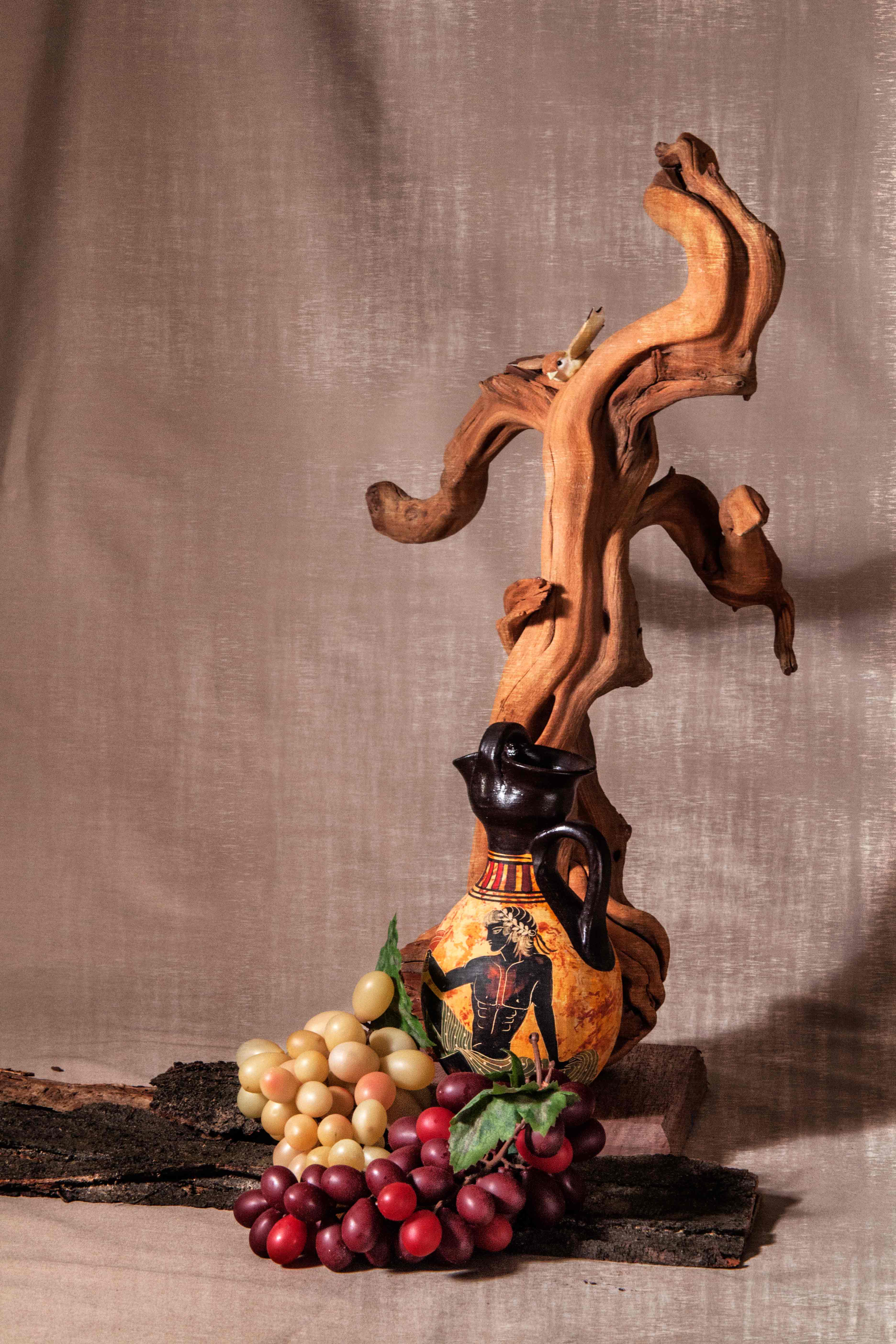
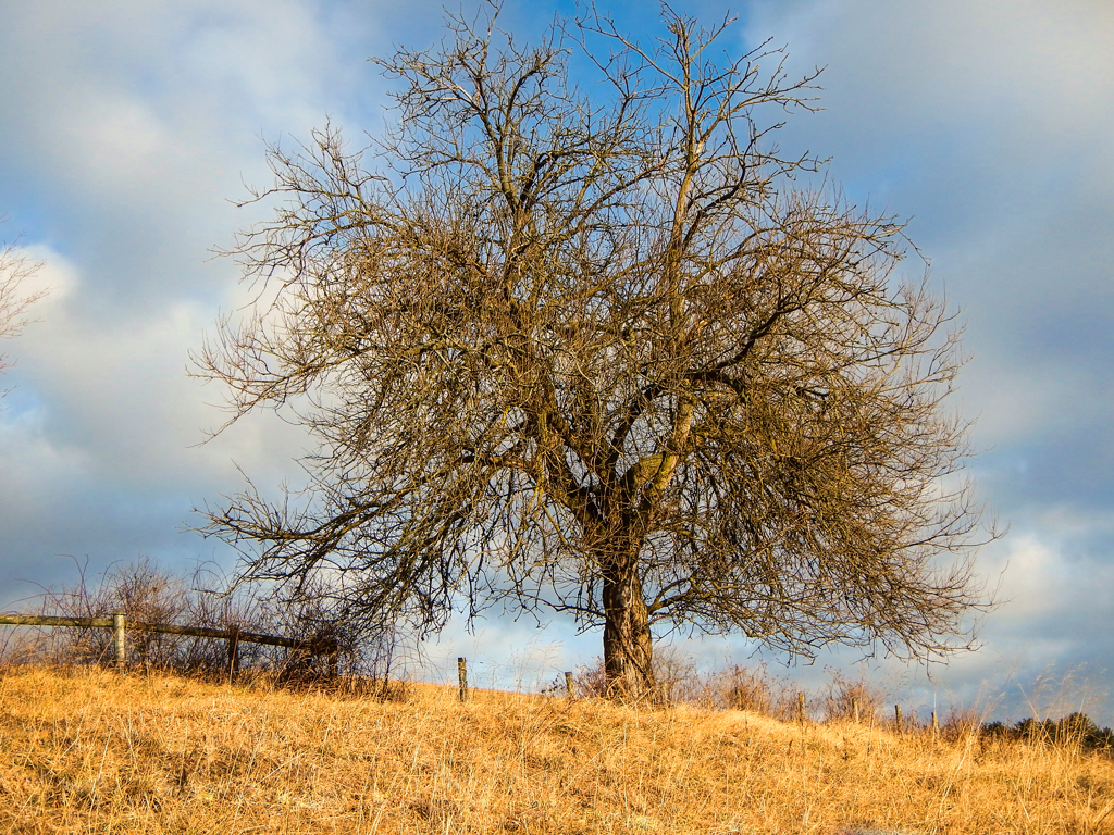
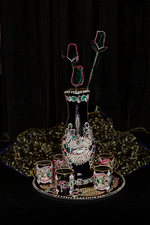
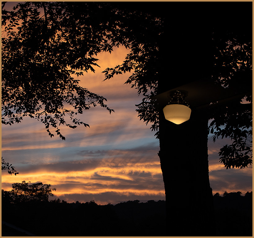
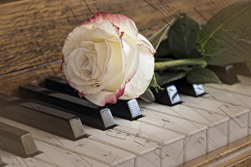
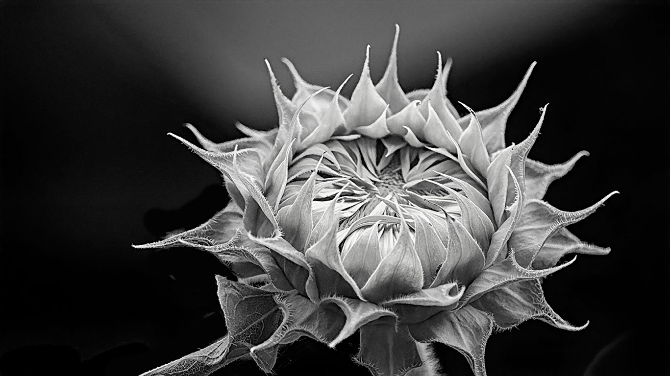
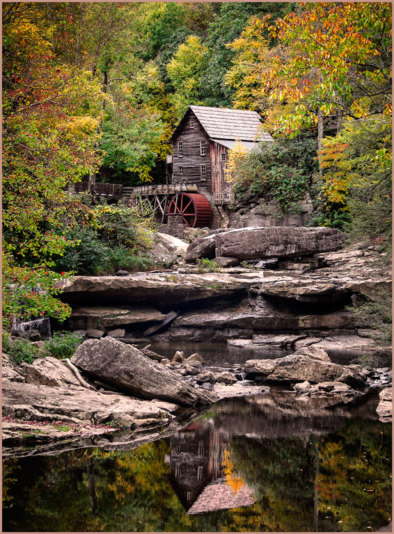
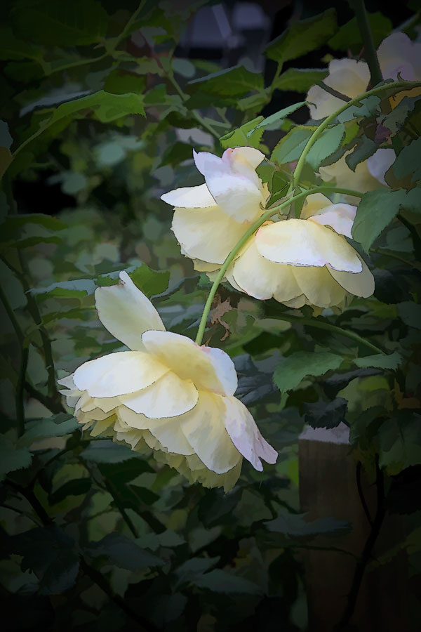
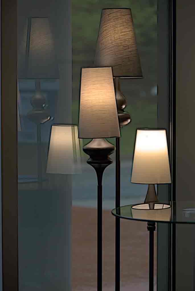
This is a nice version. The thumbnail doesn't do your version justice, but the full size image is quite nice. It might make a good greeting card. |
Jul 20th |
| 12 |
Jul 23 |
Reply |
Thank you. It is always good to get other people's opinions. I have learned a lot from this group. |
Jul 20th |
| 12 |
Jul 23 |
Reply |
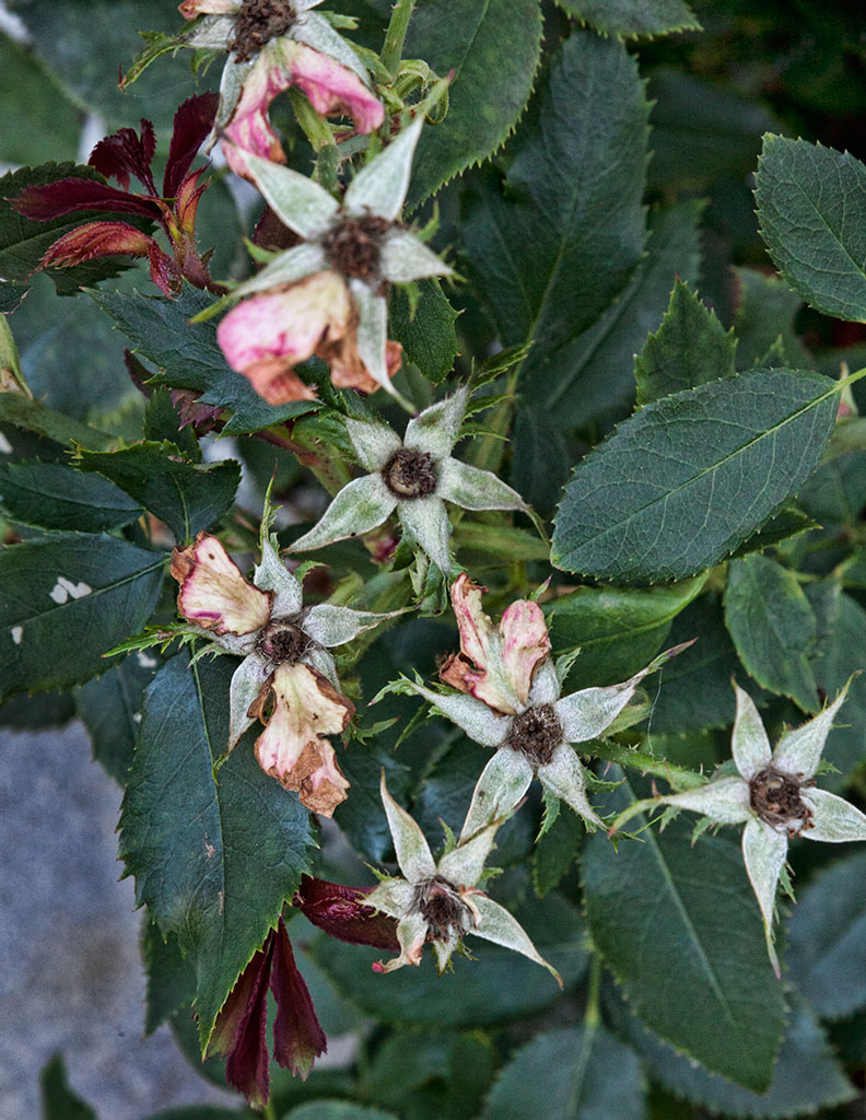
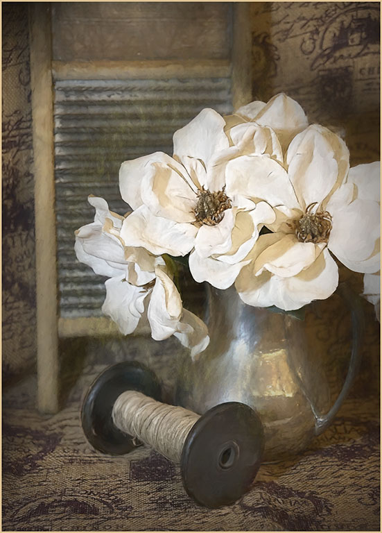
I've been experimenting on the 'sweet spot' in the lens, hence the choice of f/8. The roses are not nice right now, but I will try your idea when the new blossoms come out. |
Jul 20th |
| 12 |
Jul 23 |
Reply |
I like your version. Thanks. |
Jul 20th |
| 12 |
Jul 23 |
Comment |
A higher shutter speed woul have frozen the movement of the horse a little better, but it would also have made the background sharper. You might have lost the sense of movement. This is a good opportunity to practice panning. In fact, that is what I thought you had done. The flying flag the girl's hair and the horse's tail and mane really emphisize not only action, but speed. This is well done. Oh. Now I have read the other comments, and you did pan. And you did an excellent job of it. |
Jul 20th |
| 12 |
Jul 23 |
Comment |
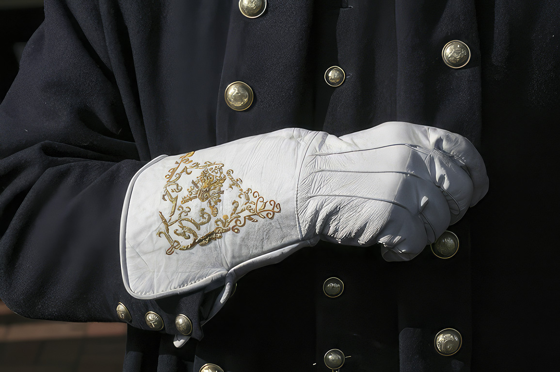
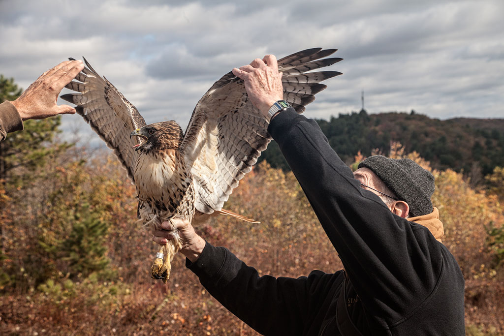
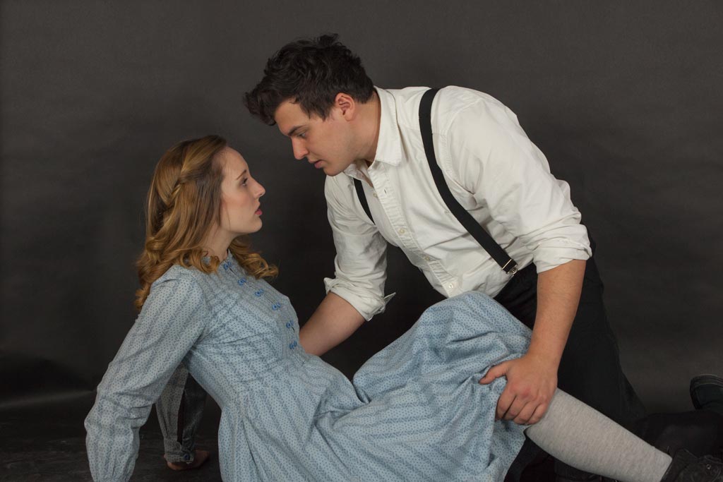
The enlargement is very well done. The final image is probably only half of the original. Judos for having the patience to wait for the decisive moment. Another interesting detail - she is wearing traditional garb that hasn't changed for a very long timie, and carrying a cell phone and dragging a roll-along suitcase. This is perfect in its simplicity. |
Jul 20th |
| 12 |
Jul 23 |
Comment |
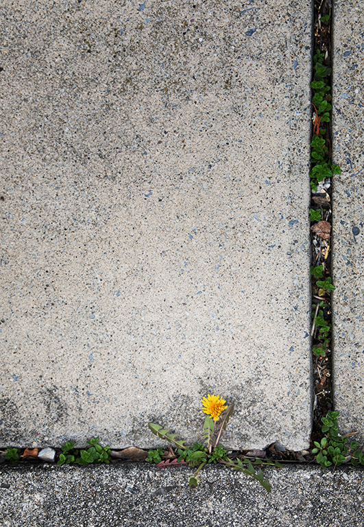
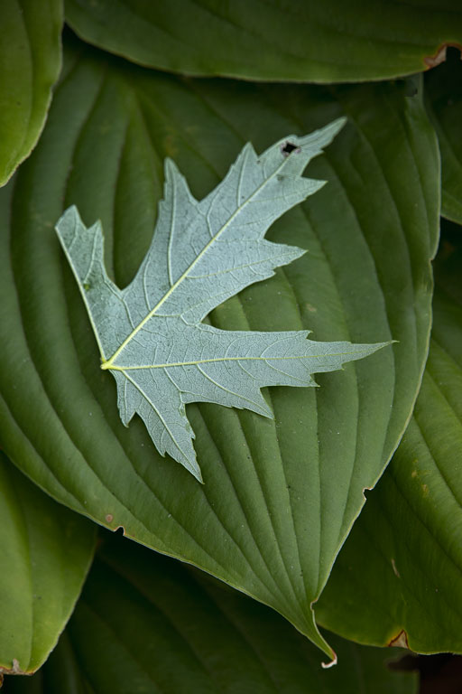
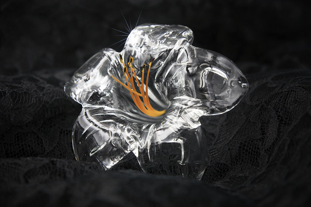
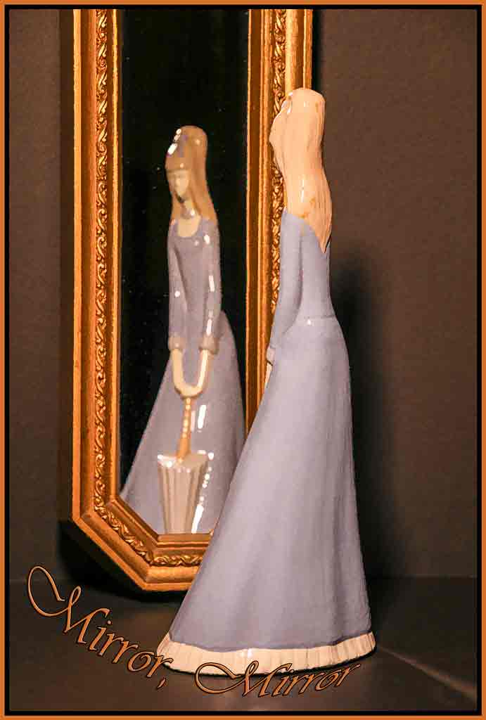
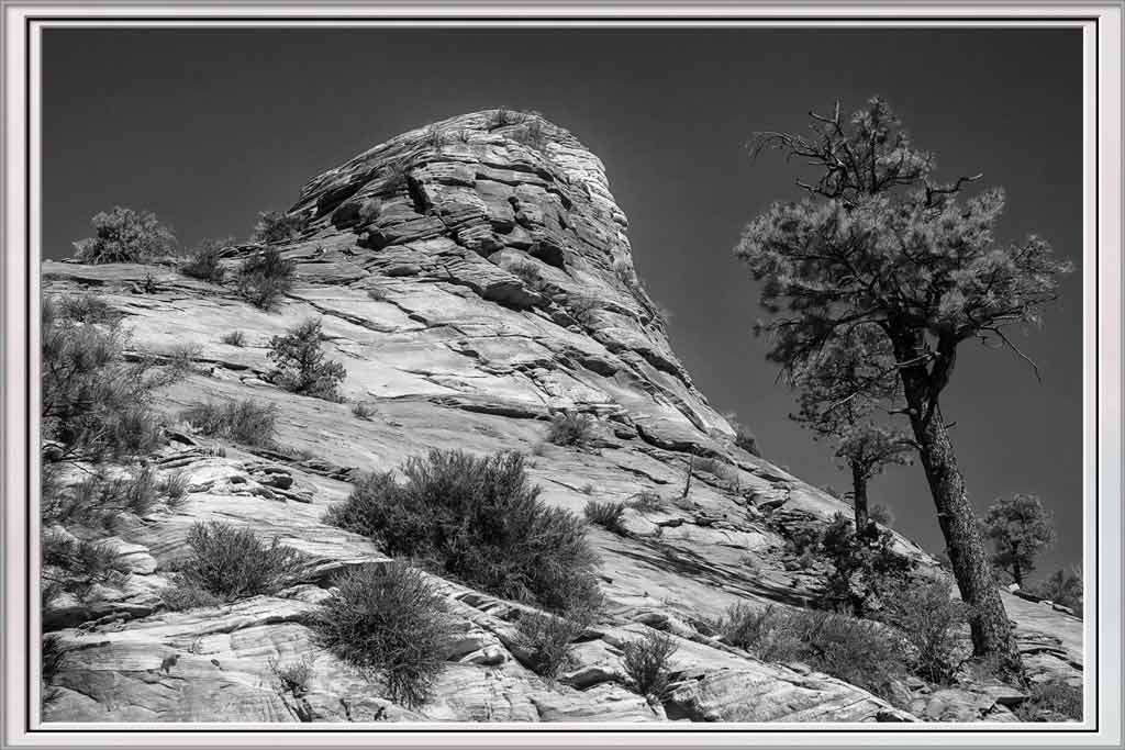
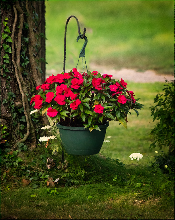
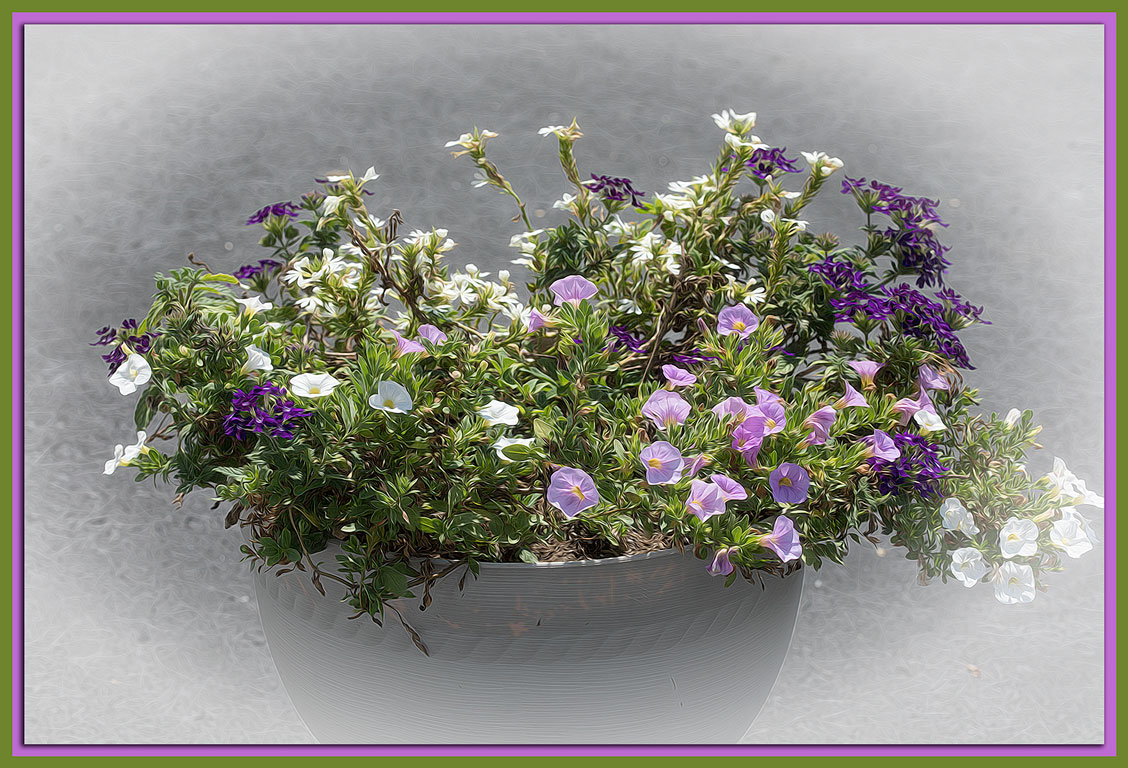
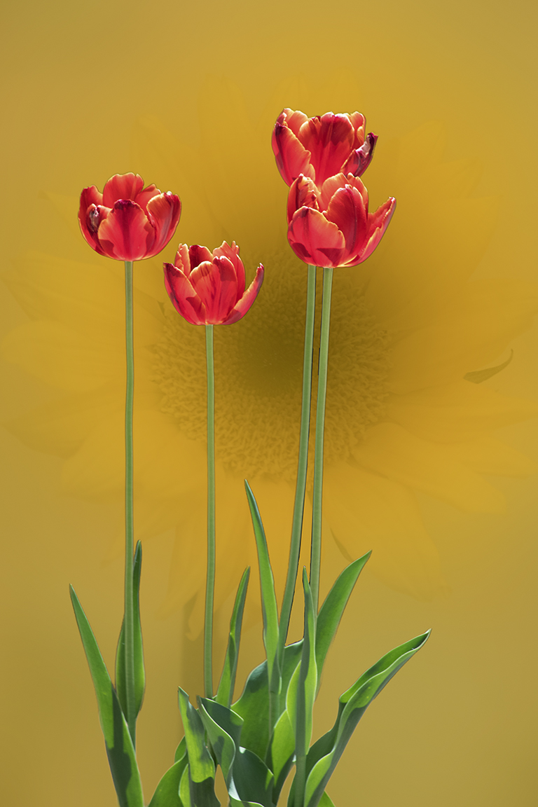
It is truly eye catching. Your focus is even throughout. The exposure is spot on. This would make a good background for another image. It would make a good greeting card also. |
Jul 20th |
| 12 |
Jul 23 |
Comment |
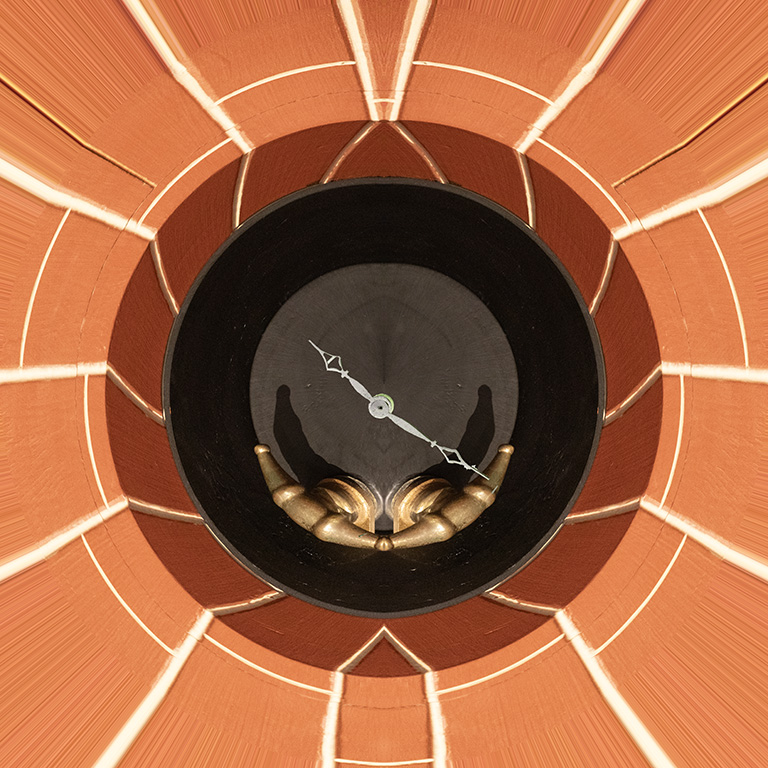
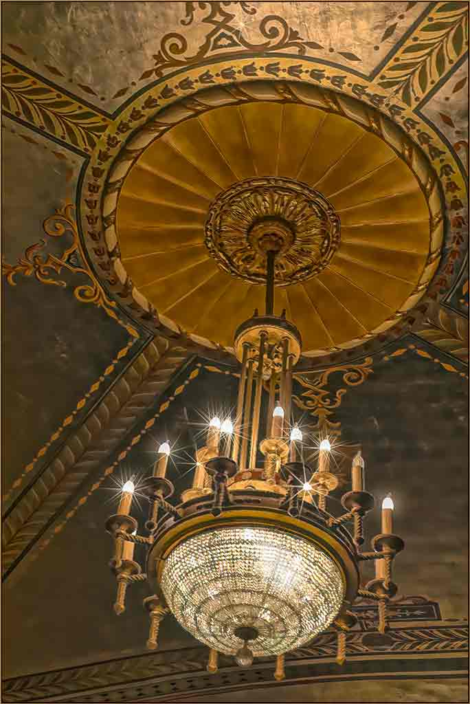
Clever idea. And Annie did her part well. Her position, coming in from the upper left, makes sure that Woody is the subject. Adjusting the shadows does, indeed, make Woody project farther front in the scene. The black vignette helps to hold in the edges of the image, but is perjhps a little too dark. |
Jul 20th |
| 12 |
Jul 23 |
Comment |
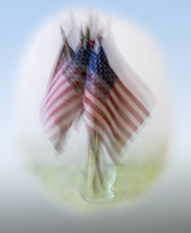
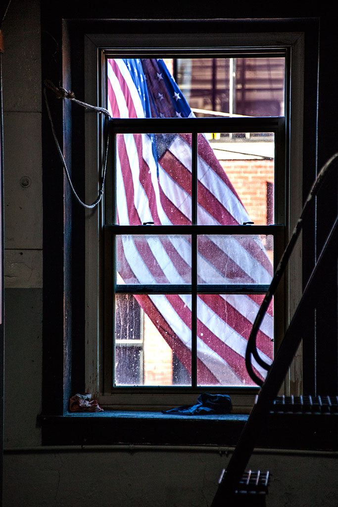
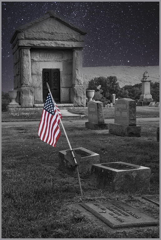
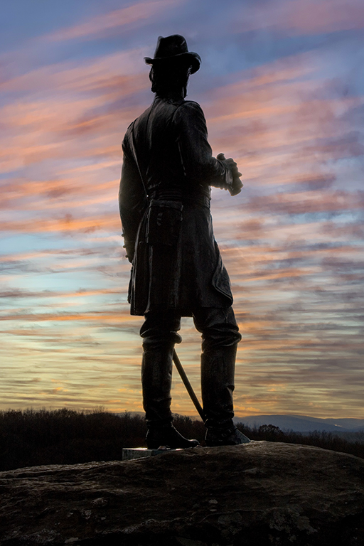
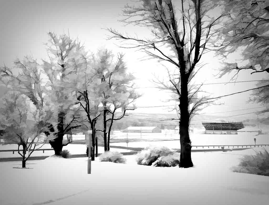
Yes, this is a rather standard view of the flag, but that doesn't make it any less inspiring. This is very well done. If you could have ordered a sky, it would probably look like this one. The angle of the pole is a little different. The furling of the flag is very good. Did you do this on multi-shot? If not, this was a lucky catch. Very nice. |
Jul 20th |
5 comments - 5 replies for Group 12
|
| 77 |
Jul 23 |
Reply |
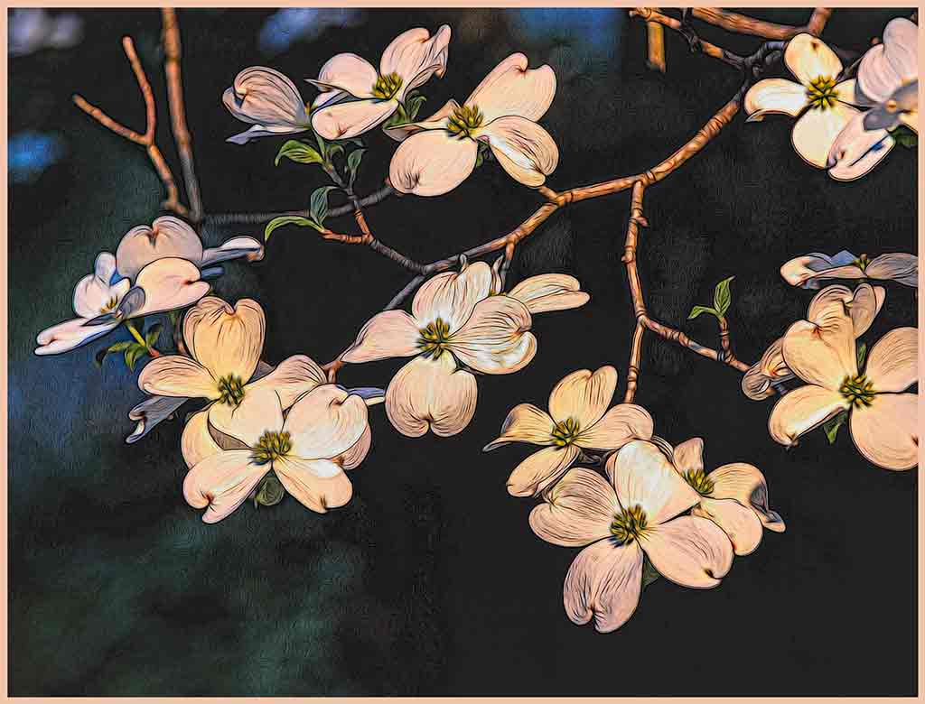
Fortuneatly, our neighbor has lots of flowers so I can work on this idea. Thanks. |
Jul 26th |
| 77 |
Jul 23 |
Reply |
Indeed, it might. This is worth working on with all your suddestions. |
Jul 26th |
| 77 |
Jul 23 |
Reply |
It looks like one of your textures is a wood grain. Very nice. |
Jul 26th |
| 77 |
Jul 23 |
Reply |
Oh, that's more of what I had in mind. Thank you. |
Jul 26th |
| 77 |
Jul 23 |
Comment |
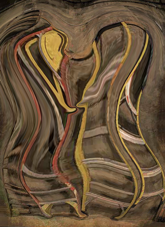
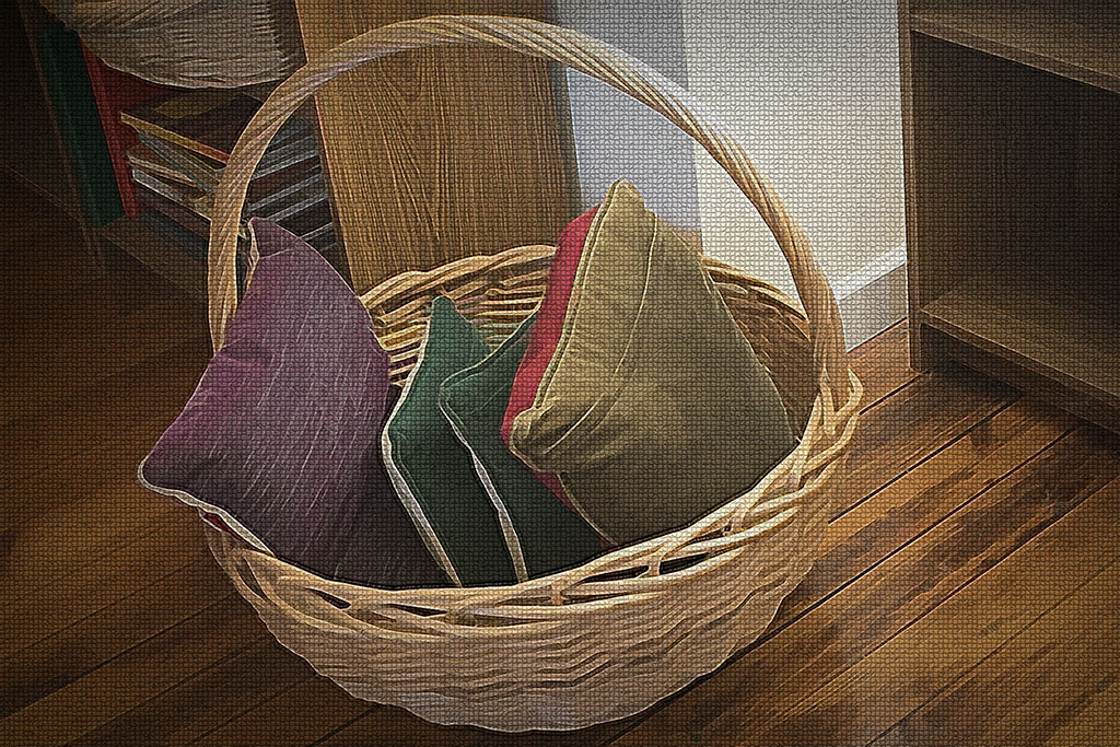
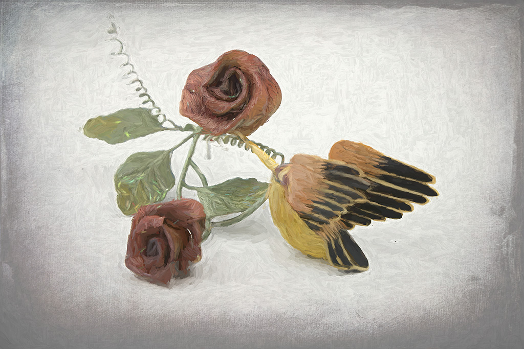
This is adorable. It would make a good poster. Something like "Look before you leap!" Yeah, that's corny, sorry. Your decision to make this look more like a painting was a good one; the original looks good in the thumbnail, but not so much full size. That doesn't matter. You made a great final image. |
Jul 26th |
| 77 |
Jul 23 |
Comment |
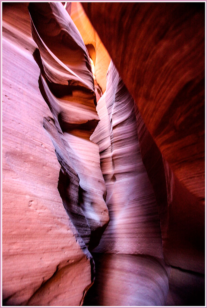
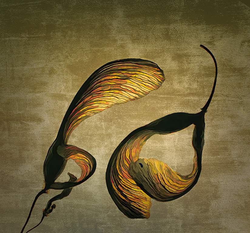
Would never have known you 'added some real estate' if you hadn't said so. Nice job. The reversal helps lead the eye into the pictues. In the original, the eye just falls out of the image. Your edits bring out the beautiful red coloring of the rocks. They really do look like that. |
Jul 26th |
| 77 |
Jul 23 |
Comment |
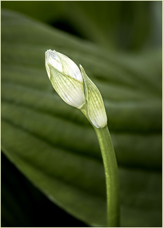
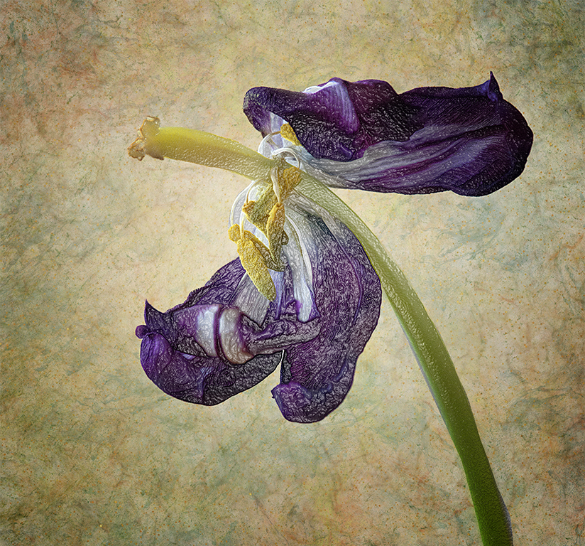
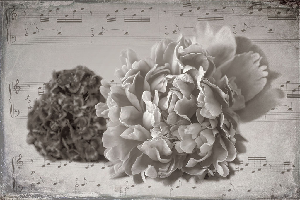
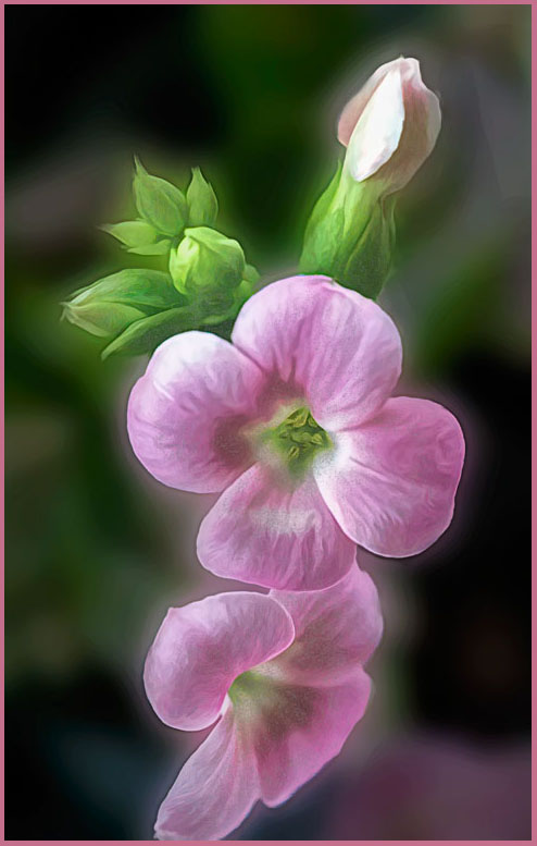
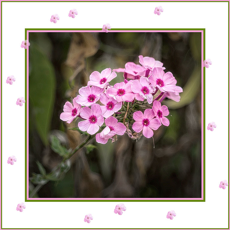
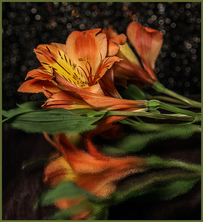
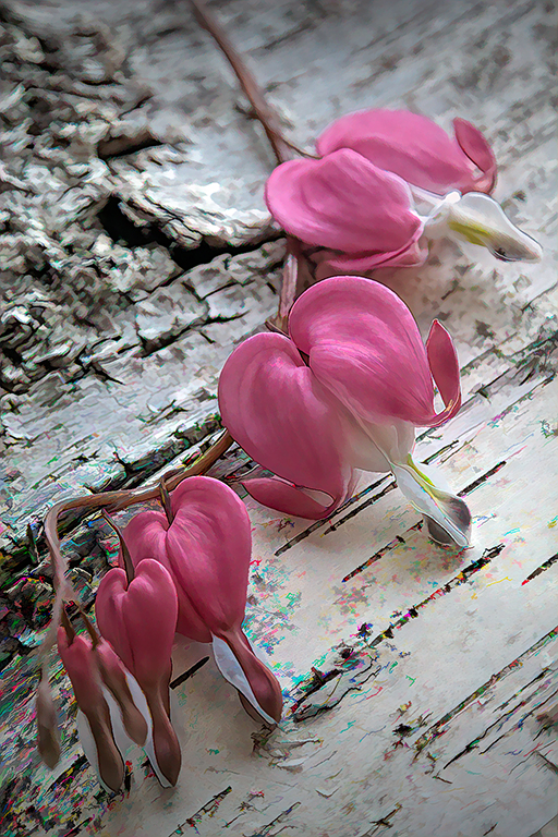
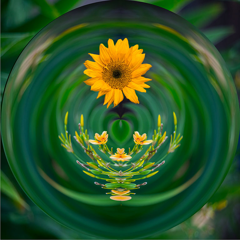
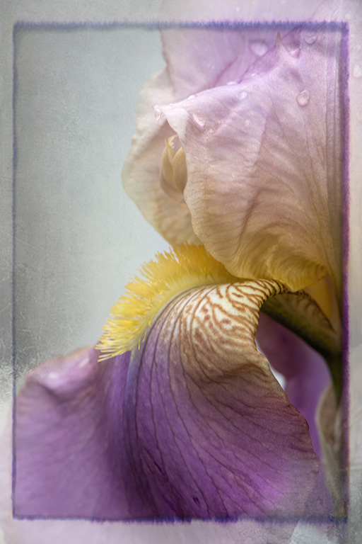
Okay about the bright spot in upper left. It makes a sort of light source. I really like your end result - but. There seems to be some detail left in the flower. Perhaps you could increase the contrast a tidge to bring it out. Not so much as to lose the nice impressionism you have going. |
Jul 26th |
| 77 |
Jul 23 |
Comment |
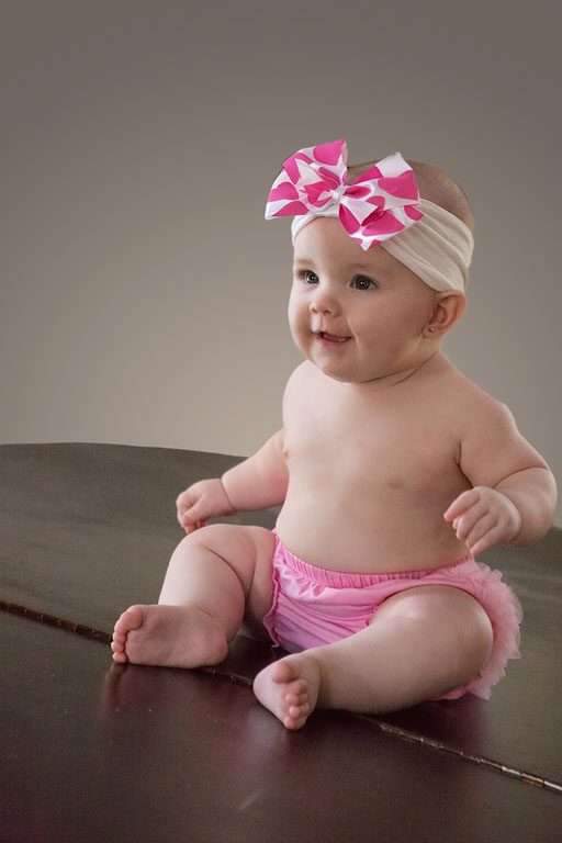
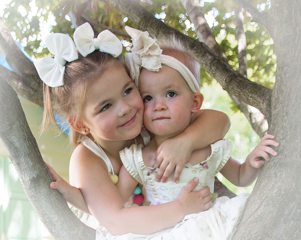
What a beautiful young girl. Those flyaway hairs are part of the charm of young people. Please don't take them out. I would only remove the remaining light spots on the left side. Bet when she sees this, she will be more willing to have her picture taken. |
Jul 26th |
| 77 |
Jul 23 |
Comment |
Very nice. I am impressed that you got such a beautiful result from what is clearly aa vary big enlargement. The creeping flocks on the subject add a nice touch of whinsy. You also did an excellent job of selecting just your subject. Beautiful. |
Jul 26th |
| 77 |
Jul 23 |
Comment |
This is lovely. The pose of the dancer is graceful. The flare of the skirt adds an extra delicacy. The lighting is perfect; the diagonal shadows lead the viewer's eye to the dancer. The cloud texture adds an air of mystery to the image, and the vignette contains the edges of the frame. I wouldn't change a thing. |
Jul 26th |
6 comments - 4 replies for Group 77
|
11 comments - 9 replies Total
|