|
| Group |
Round |
C/R |
Comment |
Date |
Image |
| 12 |
Oct 22 |
Comment |
You are all correct about the background. On careful review, I should have rotated the setup so that the light hit the bird's face. The background is, indeed, distracting. Perhaps depth of field would help that, but there is less than a foot between the bird and the background. So enlarging that gap will help. Still life photography can be done any time, during any weather; I love it. The PSA course was very helpful. |
Oct 14th |
| 12 |
Oct 22 |
Comment |
Black and white is perfect for this image. Color would just distract from the action taking place. Yes, I agree with Lee Ann's crop. Kudos on seeing this great scene. |
Oct 14th |
| 12 |
Oct 22 |
Comment |
There is a perfect balance between the backgound and foreground. Details in the flowers and texture of the wood is perfect. The background is soft and not too bright. In fact, if it were darker, the flowers would not be as prominent. I'm undecided about the upper window frame. Perhaps cropping down, but leaving just enopugh of the frame to keep the image from bleeding out through the top edge. I bet the owners of the restaurant would love a copy of this. |
Oct 14th |
| 12 |
Oct 22 |
Comment |
Sorry; I see a spider, not a serpent. You were able to remove the screening with Denoise? Thanks for the tip. I like all the versions. Smoke pictures are great fun. You never know what the results will be, and you never get the same image twice! Welcome to the group. |
Oct 14th |
| 12 |
Oct 22 |
Comment |
Our house has a lot of windows, and I love watching the critters, the clouds, the shadows, the blossoms. So this image looks just right to me. |
Oct 14th |
| 12 |
Oct 22 |
Comment |
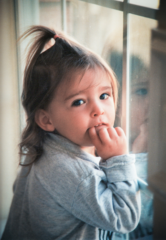
What a beautiful child; and how proud you must be of the woman she has become. You should definately take a currstn photo in just the same pose - even with the finger in the mouth. I thought the colors were a bit oversaturated. I reduced the red and lightened the red just a bit. |
Oct 14th |
 |
6 comments - 0 replies for Group 12
|
| 77 |
Oct 22 |
Reply |
I like the color that was added to the sky in this version. I thought the first was perfect, but this is better. |
Oct 18th |
| 77 |
Oct 22 |
Reply |
Ooooh, yes. I like this. Thanks. |
Oct 18th |
| 77 |
Oct 22 |
Comment |
Hmmm. The flowers may still be there; perhaps I can re-shoot.
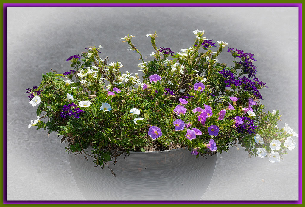
Yes, the flowers are much more noticeable to the naked eye rather than in the image. Here is another version with the greens and yellows darkened and the blue, pink, and magenta more saturated. I am always afraid of over saturating the colors, so probably err on the side of caution. Is this better? I'm really not up to adding space for those petals on the right. |
Oct 14th |
 |
| 77 |
Oct 22 |
Comment |
There are many apps for post-processing on the smart phones. But you can always do a better job on the computer. I tried a graduated neutral density filter in NIK color Effects to darken the sky and force the eye to see the lovely fog on the water. It made the sky a little bluer and brought out that nice littel cloud. |
Oct 14th |
| 77 |
Oct 22 |
Comment |
I didn't notice the workers either. But the diagonal of the poles leading to the vanishing point is excellent, as is the wires leading to the sun. Not sure how that grewenish color got in there, but the yellow is better. |
Oct 14th |
| 77 |
Oct 22 |
Comment |
I agree with Witta's crop. It's a small thing, but once noticed, it is distracting. B&W is the only way to go for this image; the colors in the original are far too distracting. The sepia goes well with the vintage of the truck. Very well done. |
Oct 14th |
| 77 |
Oct 22 |
Comment |
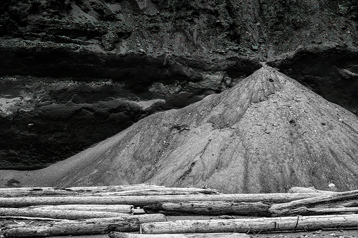
The logs give the image a solid base. The diagonal slope of the sand mound adds dynamic interest. The sand mound is separated from the background very well. But that background has potential. I tried to bring out more detail without interfering with the sand mound. Finally settled on a graduated neutral density filter in NIK to darken just the upper edge. But I don't know if this is any better. It's always hard (mostly impossible) to improve on your work, Witta. |
Oct 14th |
 |
| 77 |
Oct 22 |
Comment |
Wow! You changed a typical portrait workshop image into a fine work of art. The selection of the model was very well done. What masking software did you use? Other than the string, I can find no improvements to make. |
Oct 14th |
6 comments - 2 replies for Group 77
|
12 comments - 2 replies Total
|