|
| Group |
Round |
C/R |
Comment |
Date |
Image |
| 12 |
Aug 22 |
Comment |
Okay, it's not really symmetry. But it does illustrate depth of field, vanishing point, repetition, and nice diagonal composition. Perhaps as Fran sadi, moving to your left would have made the other row visible, and the composition would have been a V instead of of line. Nice shot. Well cropped. |
Aug 30th |
| 12 |
Aug 22 |
Comment |
Yes, I too think you should crop the top. It may not be what we think of as symmetry, but it is a good pattern shot. I cropped the top, brightened the image, then added a vignette to emphasize the large central flag. |
Aug 30th |
 |
| 12 |
Aug 22 |
Comment |
Like Fran's horses, you really need both halves of this image. Any cropping of top or bottom would result in disconnected tree trunks. I love the simplicity. Your choice to not oversaturate the sunset colors was a good one. Very well done. |
Aug 4th |
| 12 |
Aug 22 |
Comment |
This is beautiful. The horses arranged themselves perfectly. Your exposure and focus are spot on. Many might say that the water's edge cuts the image in half; you should concentrate on the horses or the reflection. Not here! This is perfect. |
Aug 4th |
| 12 |
Aug 22 |
Comment |
Rene, your father was an excellent photographer. We all enjoyed his images and his comments. I will miss him, even though I never met him. This image is a beautiful tribute to him. Thank you for posting it. |
Aug 4th |
| 12 |
Aug 22 |
Comment |
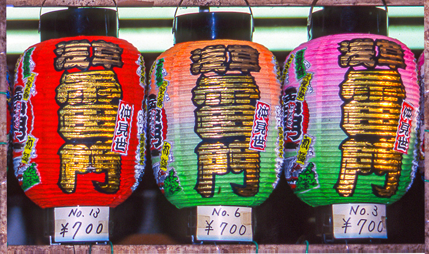
You did a good job with the brightness/contrast of the dark and light areas. Cropping the top definately brings the attention to the subjects. Out of curiosity I cropped off the left lantern. The darkness seems to block the eye from entering the image. Can't reverse it because of the writing. Then just for fun created a border by copying the wooden shelf to the sides to make a border. Thanks for this fun and colorful image. |
Aug 4th |
 |
6 comments - 0 replies for Group 12
|
| 77 |
Aug 22 |
Reply |
Thank you, Bev. And thanks for visiting. |
Aug 30th |
| 77 |
Aug 22 |
Reply |
Thank you. Having tried one, I can see many possibilities now. I used this technique to scatter pink flowers as a background to another flower image, like pink polka dots. |
Aug 30th |
| 77 |
Aug 22 |
Reply |
Patience and perseverance. Each flower is on its own layer. I won't do too many of these! |
Aug 30th |
| 77 |
Aug 22 |
Reply |
Yes, on review, you are right. The drop shadow is too heavy. I just did another image picking a color from the image for the shadow. When you follow directions too strictly, you miss creative opportunities. |
Aug 30th |
| 77 |
Aug 22 |
Reply |
I like that background. Thanks. |
Aug 30th |
| 77 |
Aug 22 |
Comment |
As a fan of science fiction and fantasy, I really like your milky way. Yes, it is busy, there is a lot to look at, but I still like it. Perhaps the foreground is a little bright. Something between your version and Denise's is probably good. |
Aug 30th |
| 77 |
Aug 22 |
Comment |
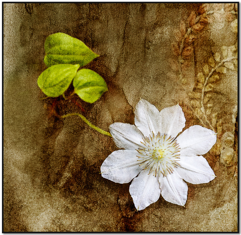
Having spent years trying to reduce grain in our B&W images, adding grain/noise doesn't really appeal to me. But this image is quite nice. Perhaps as Witta says, bringing out a little more detail in the flower would be a plus. Actually, the flower center looks a little blown out. I copied the center from the original and adjusted the hue/saturation to match the tones of the fianl image. |
Aug 4th |
 |
| 77 |
Aug 22 |
Comment |
The light seems to be coming from behind you. The highlights and shadows on the clouds seem to match that light directions. But just as an experiment I selected the sky and reversed it. There was little difference. So you chose the sky well. I'm not well-versed on artists and their styles, but this looks like an Andrew Wyath (spelling?). Very nice. |
Aug 4th |
| 77 |
Aug 22 |
Comment |
The texture and detail in this image make the B&W version much more dynamic tghan the color version. It's real and yet surreal at the same time. It would be interesting to know which Topaz effects you used. |
Aug 4th |
4 comments - 5 replies for Group 77
|
10 comments - 5 replies Total
|