|
| Group |
Round |
C/R |
Comment |
Date |
Image |
| 12 |
Feb 22 |
Comment |
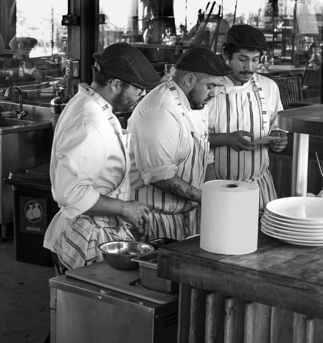
I agree that B&W is much better for this image and that there is no way to clone out the towels. I used the magic wand to separate the towels and put them on their own layer. Then adjusted the exposure to -.5 stop. Much more than that looked too fake. |
Feb 21st |
 |
| 12 |
Feb 22 |
Comment |
It's interesting that we all like the unusual angle of view. But if you think about it,this is the view we get when making a smoothie. This shows that 'ordinary' can indeed be 'unusual'. Incidentally, you can make breakfast for me any day. |
Feb 21st |
| 12 |
Feb 22 |
Comment |
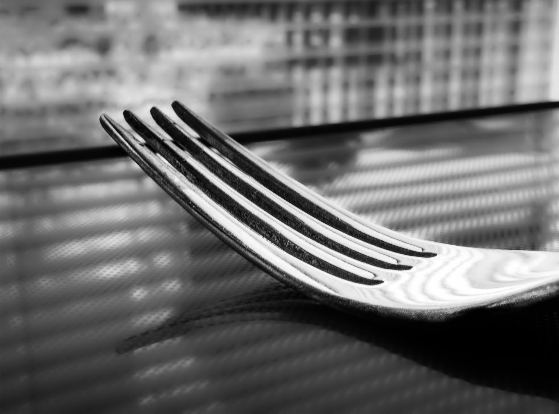
Our Camera Club had an assignment of "Point of View". NOBODY thought of this. Great job! |
Feb 21st |
| 12 |
Feb 22 |
Comment |
I like the diagonal lines, the reflectivity of the fork, the ubusual view point. The colors are soft, pleasing pastels. But my eye keeps wandering around trying to decide what to focus on. I converted to B&W, but was not satisfied. Used Topaz precision contrast. That helped. Precision detail with the detail sliders moved to the left to blur background, then masked the fork to bring the detail back. Ultimate NIK SF filter was Grad ND with -2 EV. |
Feb 21st |
 |
| 12 |
Feb 22 |
Reply |
It's really easy to get rid of distractions on apure black background. You can master this easily. |
Feb 21st |
| 12 |
Feb 22 |
Reply |
Fading the border is a good tip to keep in mind. |
Feb 21st |
| 12 |
Feb 22 |
Reply |
It's definately better without the hot spots. |
Feb 21st |
| 12 |
Feb 22 |
Reply |
Hope you enjoyed the course as much as I did. Will maybe fo the light-painting course next. |
Feb 21st |
| 12 |
Feb 22 |
Reply |
Actually, this was one of those things that takes longer to describe than to do. But it was fun to do. The teacher liked it. Thanks. |
Feb 21st |
4 comments - 5 replies for Group 12
|
| 77 |
Feb 22 |
Reply |
Very nice. It does tell a better story with more background in it.
|
Feb 22nd |
| 77 |
Feb 22 |
Reply |
Perhaps I never noticed that 'black thing' because it's always there. The image looks much better without it. |
Feb 22nd |
| 77 |
Feb 22 |
Reply |
Very nice adjustments. I really like this version. That 'black thing' in the lower right corner is part of the lathe. I could have elminated that with a different camera angle. I never noticed it. Thanks.
|
Feb 21st |
| 77 |
Feb 22 |
Reply |
I left some suggestion of background to help set the scene. While it is meaningful to me, I can see how it would be distracting to the viewer. Thanjs. |
Feb 21st |
| 77 |
Feb 22 |
Reply |
You are right; the bowl on the right is brighter than his face. I'll try your suggestions. Thanks. |
Feb 21st |
| 77 |
Feb 22 |
Reply |
That would probably be a good touch. Thanks. |
Feb 21st |
| 77 |
Feb 22 |
Comment |
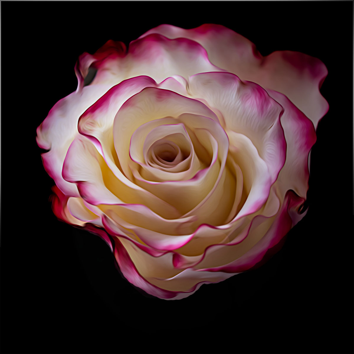
This is beautiful rose. Your use of the smudge filter is just the right touch. The only thing I would do is to minimize the body of the flower. Yes, it is integral to the flower, but keeps pulling my eye away from the beautiful swirl of the petals. I tried filling that area with black, but just camera angle would probably do it. Again, this is personal preference - I might see it differently next week. |
Feb 21st |
 |
| 77 |
Feb 22 |
Comment |
Linda is right about the dark green stem; it really distracts from the delicate flower. You have done a good job showing the soft curves and the interesting stamen. Keep working on flowers - they don't move, get bored or wander off. and they are readily available subjects all year round. |
Feb 21st |
| 77 |
Feb 22 |
Comment |
You put a lot of work into this image and succeeded very nicely. Is the roadrunner too bright? We've all seen that odd ray of sunshine spotlighting a fern in the forest or a farmhouse against a stormy sky. I would probably have warmed up the colors in the bird, but that's just personal preference. Don't you love those selection programs that preserve every litttle stray hair in the demonstration? But that never seems to happen in real usage. |
Feb 21st |
| 77 |
Feb 22 |
Comment |
This is an excellent photo of the magic of the sea shore. Sorry, but the man-o-war image looks out of place ( bright and colorful). But the rest is beautiful. Reverse it? Why not. The conventional wisdom is that the flow of the image should follow from left to right because that's the way we read. But nature can't read. Making your husband a silohuette is a nice touch. You should print it for him and hang it on a wall. |
Feb 21st |
4 comments - 6 replies for Group 77
|
8 comments - 11 replies Total
|