|
| Group |
Round |
C/R |
Comment |
Date |
Image |
| 12 |
Jan 22 |
Reply |
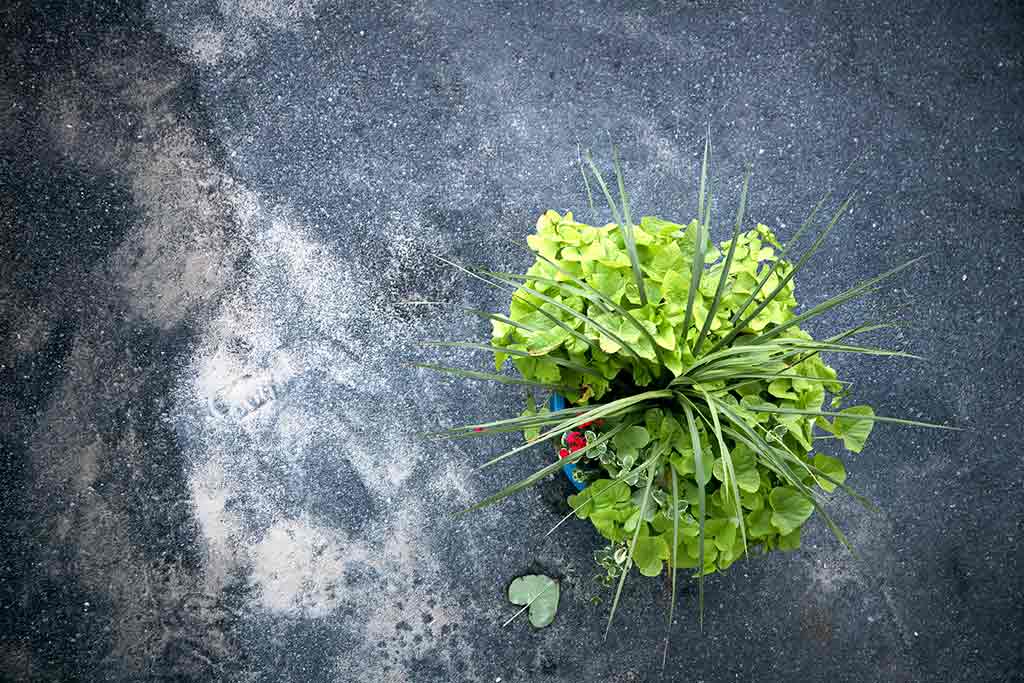
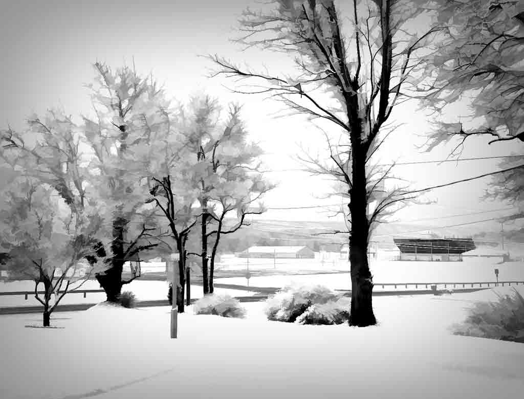
I'm very short. This grass is probably 6 feet high. Did have to crouch down, though.
|
Jan 18th |
| 12 |
Jan 22 |
Reply |
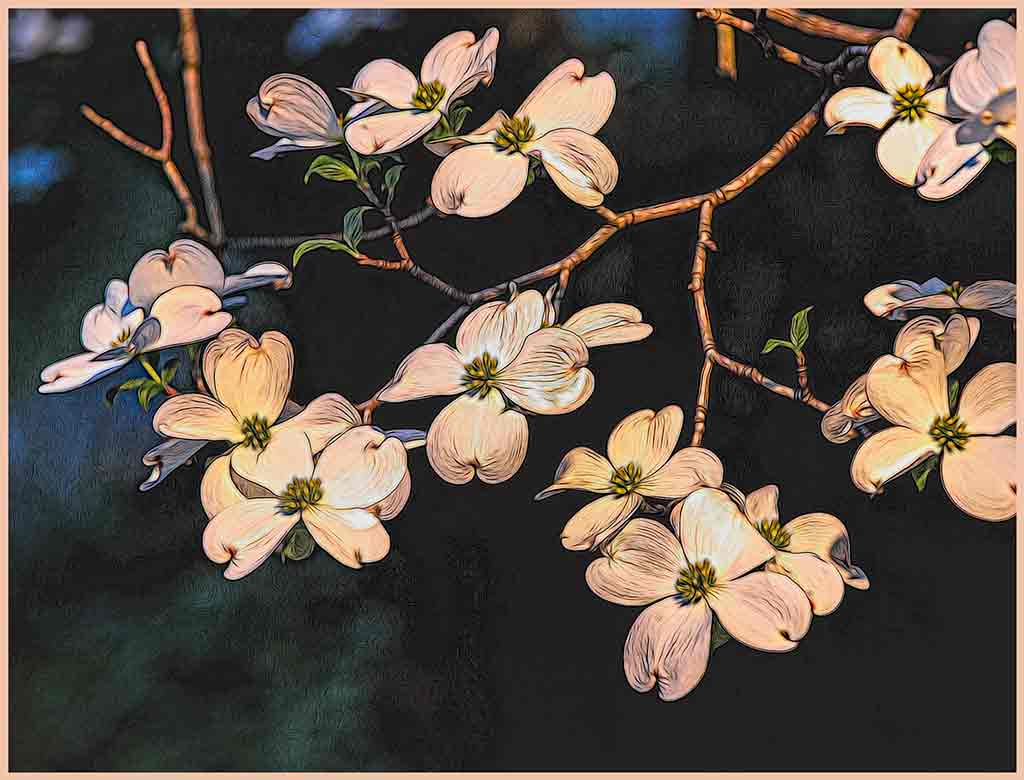
There is a dust spot! How could I have missed that? Thanks. |
Jan 15th |
| 12 |
Jan 22 |
Comment |
The contrast between the blues and the yellows is perfect. The slight diagonals of the building and the safety ropes add interest. This is proof that perspective issues do not always need correcting. Would it look netter in B&W? I tried using NIK SFX. This example is just the default setting with a little structure added. The yellows in all the presets were totally blown out, even though they are good in the original. That lovely contrast bewteen yellow and blue is gons. Your original is better. |
Jan 13th |
 |
| 12 |
Jan 22 |
Comment |
See; we should always look around us as we go about this world. Hand-holding at 1/25 second is amazing. The little birds smiles are delightful. I find that the dark area above the nest is a bit distracting. I cropped out as much as possible without cutting into the main part of the image. |
Jan 13th |
 |
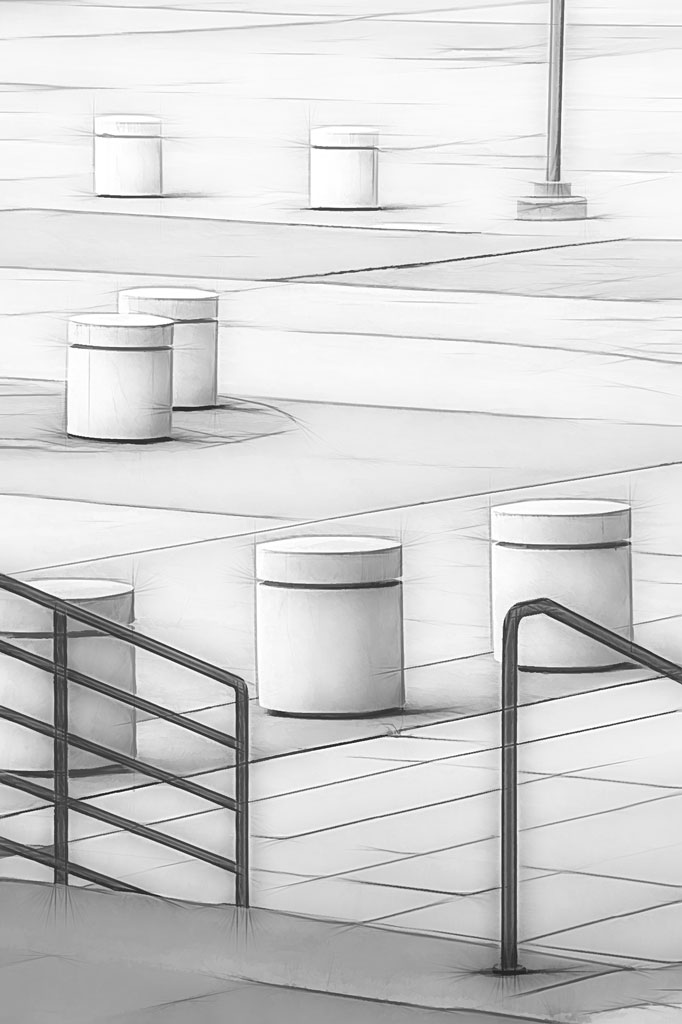
| 12 |
Jan 22 |
Comment |
The cropping is good - it removes distracting elements from the main subject. Your adjustments to the stairs is excellent; The brightness and color balance on each is identical. I never noticed the people in the original, and they do add quite a lot to this photo. Well done. |
Jan 13th |
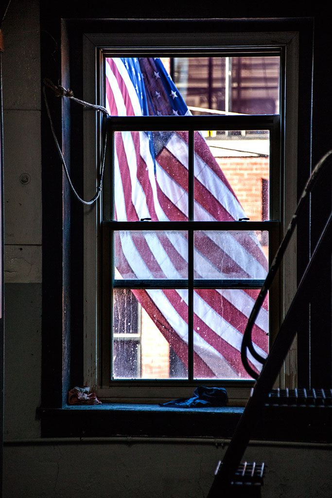
| 12 |
Jan 22 |
Comment |
Through the window of a moving bus!! Well done. I like the foggy atmosphere of the image. It makes me feel that this is early morning before the workday begins. The positioning of the crane and the sun is perfect. How many photographers plan for days to get a shot like this! |
Jan 13th |
| 12 |
Jan 22 |
Comment |
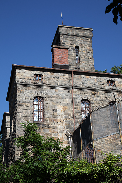
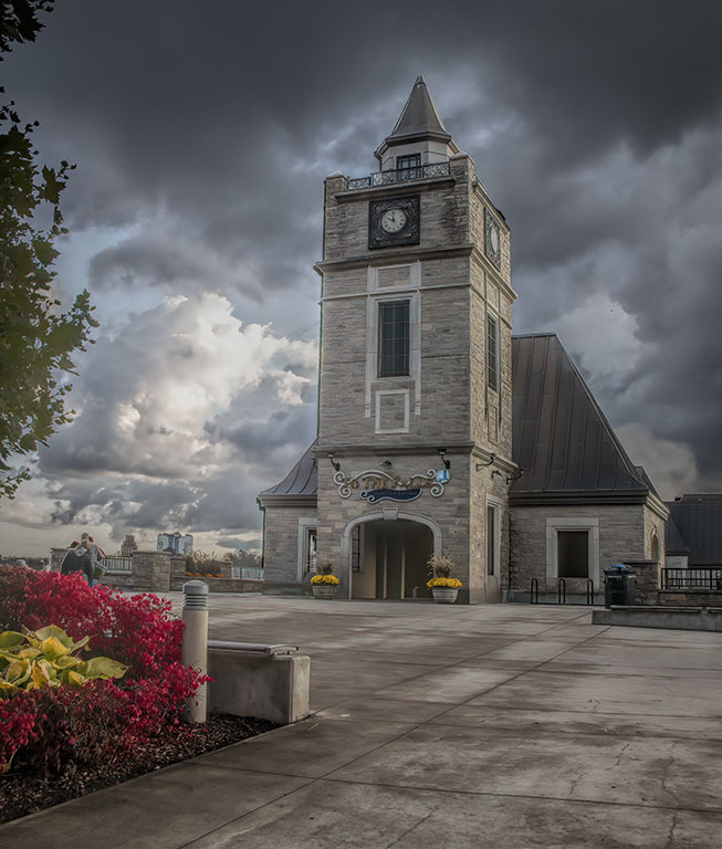
The angle adds tension, and thus excitement to the image. The lights on the building add brightness to an otherwise dark structure. Yes, the architect placed the lights, but you took good advantage of them. The subtle texture makes the sky more interesting than plain blue (even though that is pretty, too.) Some may take issue with the top corner of the building being cut off, bu that doesn't bother me. |
Jan 13th |
| 12 |
Jan 22 |
Comment |
Everything works in this image. The contrast between blue and yellow, the busy bees, the leaves that look like wings, and that bee coming in for a landing. There is even a spider web filament near that same bee. Youy have good detail in both highlights and shadows. Well done. |
Jan 13th |
6 comments - 2 replies for Group 12
|
| 77 |
Jan 22 |
Reply |
High key - very nice treatment for this. A vignette is a kind of border. I played with high key on this after listening to Lisa Langell on high key nature images. Must have done something wrong; my effort was terrible. |
Jan 13th |
| 77 |
Jan 22 |
Reply |
I hadn't thought of using this for a card. Thanks for the idea. Making cards is a good creative outlet. |
Jan 13th |
| 77 |
Jan 22 |
Reply |
The square crop works very well here. I tried brightening the eye, but was afraid of going too far. Your version is quite good. |
Jan 13th |
| 77 |
Jan 22 |
Reply |
Yes, all the images of the horses were soft. This is a classic case of emotional attachment to an image. My border is too heavy for the subject matter. Your adaptation is much better. |
Jan 13th |
| 77 |
Jan 22 |
Comment |
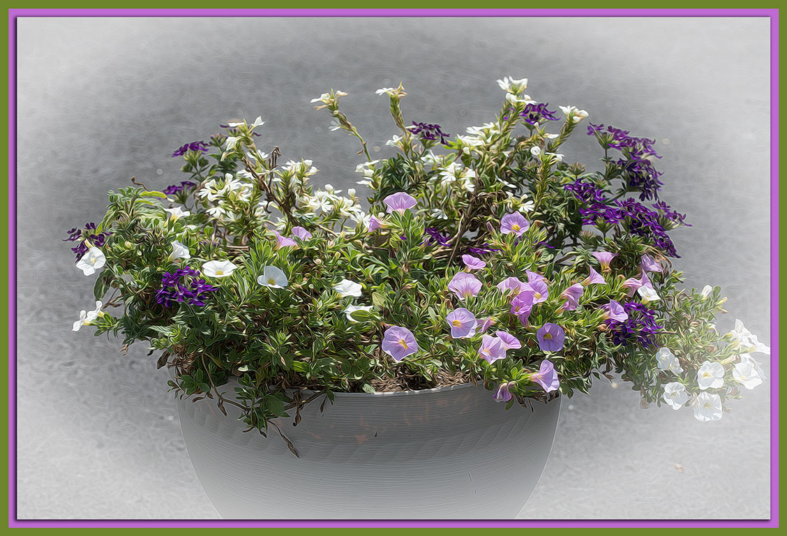
I love these pastoral scenes. You did a lot of work removing extraneous objects, and did it well. If you hadn't told us, we would have never known. Good job. But my first reaction to this image was that it is over-processed.As Witta said, this is a good subject for HDR. Also, it is difficult to adjust that bright sky without affecting the dark foreground. Perjaps masking off the sky and adjusting each half individually would work. That's what I tried to do here. Oh, I do like the pano crop, just forgot to do the crop. |
Jan 13th |
 |
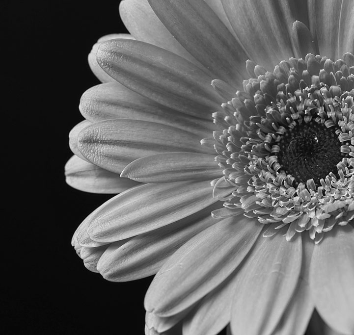
| 77 |
Jan 22 |
Comment |
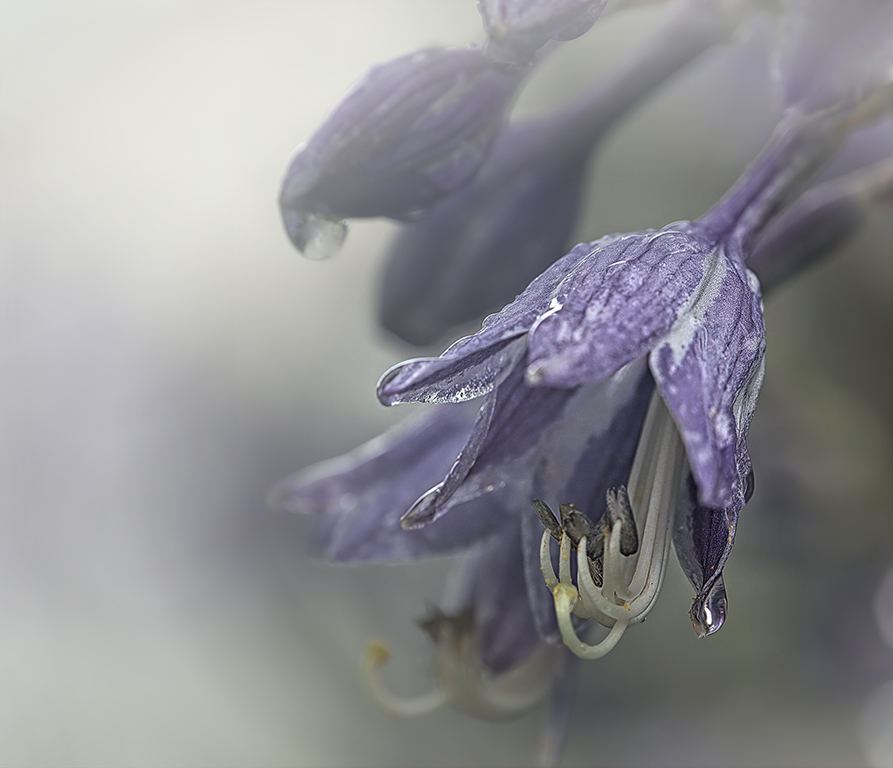
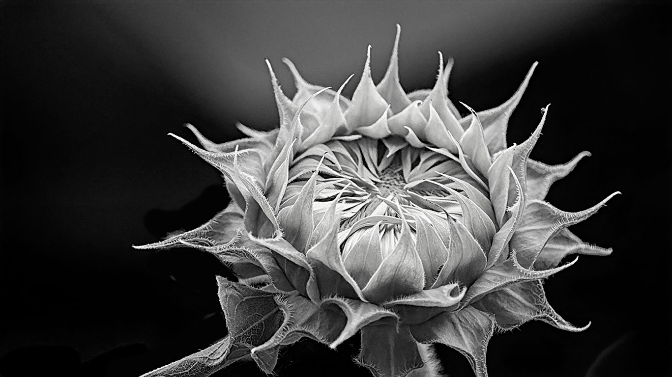
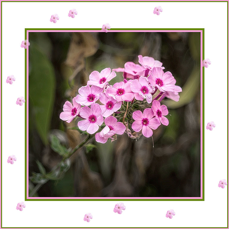
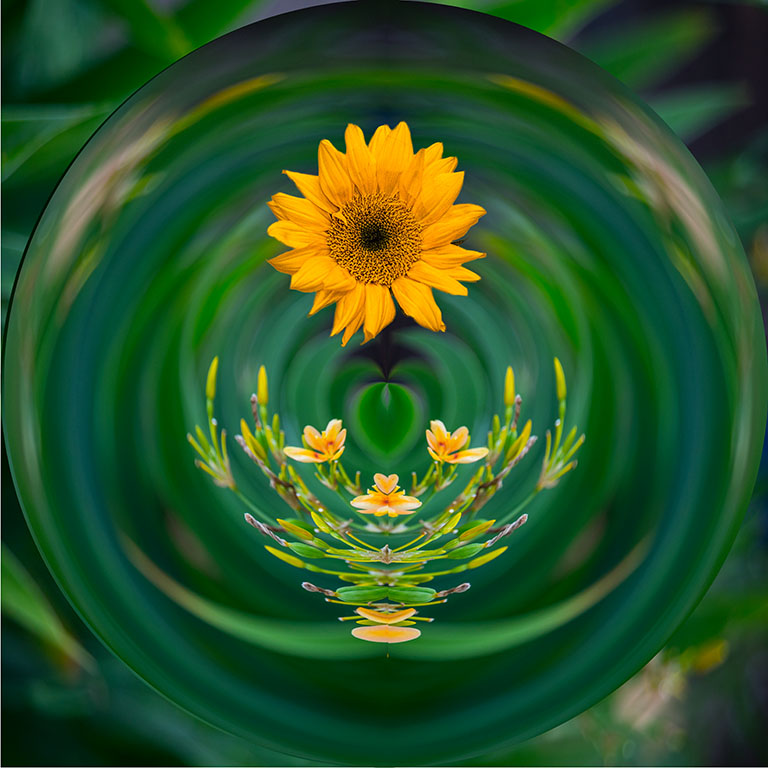
I have a gerbera daisy very similar to this. It got many the same comments that yours did. But we still like them, don't we? Black and white is counter-intuitive for flowers, but texture makes them ideal for monochrome. That said, my preference would be for a little softness on the petals, preserving the beautiful texture of the center. As for borders, they are dependent upon the final use of the image. For websites like this they can separate the image from the background. For prints or canvas wraps you probably don't want a border. A border on this picture would just let us know how you cropped it. |
Jan 13th |
 |
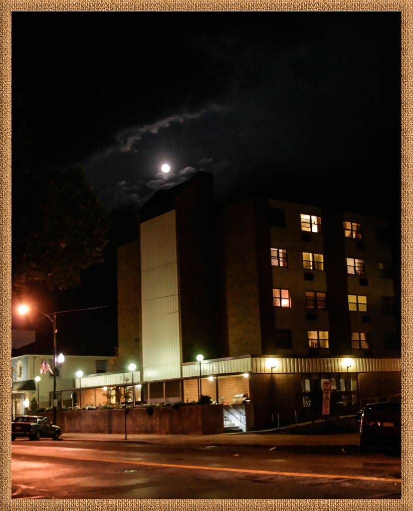
| 77 |
Jan 22 |
Comment |
The direction of the moonlight is reasonable. The light is on the left side of the buildings; the moon is not quite behind them. A building across the street could be reflecting the moonlight onto the buildings. However the lighting came to be, the image is one of a sci-fi cityscape, just dark enough to be interesting, not scary. I love it. When working on an idea like this, do you know what tools to use or do you just experiment? |
Jan 13th |
| 77 |
Jan 22 |
Comment |
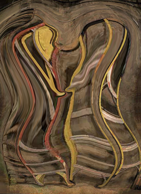
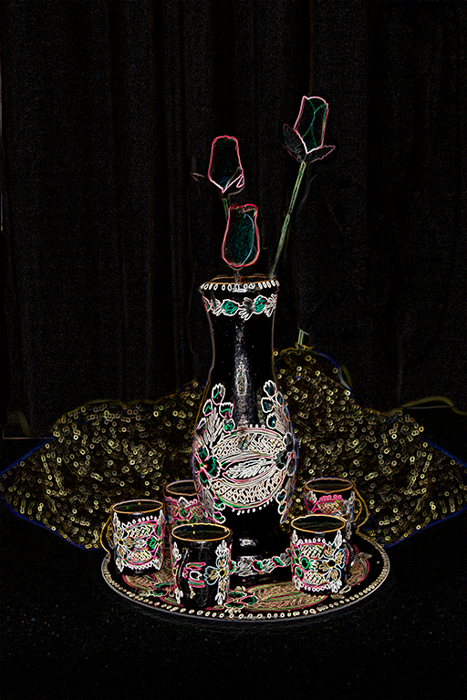
Welcome back Georgianne. Wow! This is way out of the box for you! How very creative! Is this the image you saw in your daydream, or did your imagination take over once you got started? I have used Topaz "Edges" (not "Edge Exposure) but can't always see difference. Witta suggested a little turqoise in the borrom right. Do you have a littel turqoise tortoise? That would be cute with the turtles. |
Jan 13th |
4 comments - 4 replies for Group 77
|
10 comments - 6 replies Total
|