|
| Group |
Round |
C/R |
Comment |
Date |
Image |
| 12 |
Nov 21 |
Reply |
It is indeed a weed - and almost impossible to dig out. But it's still beautiful. |
Nov 15th |
| 12 |
Nov 21 |
Comment |
What a delightful catch! (I think you paid that squirrel a bag of peanuts to pose for you.) I wouldn't change a thing. |
Nov 15th |
| 12 |
Nov 21 |
Comment |
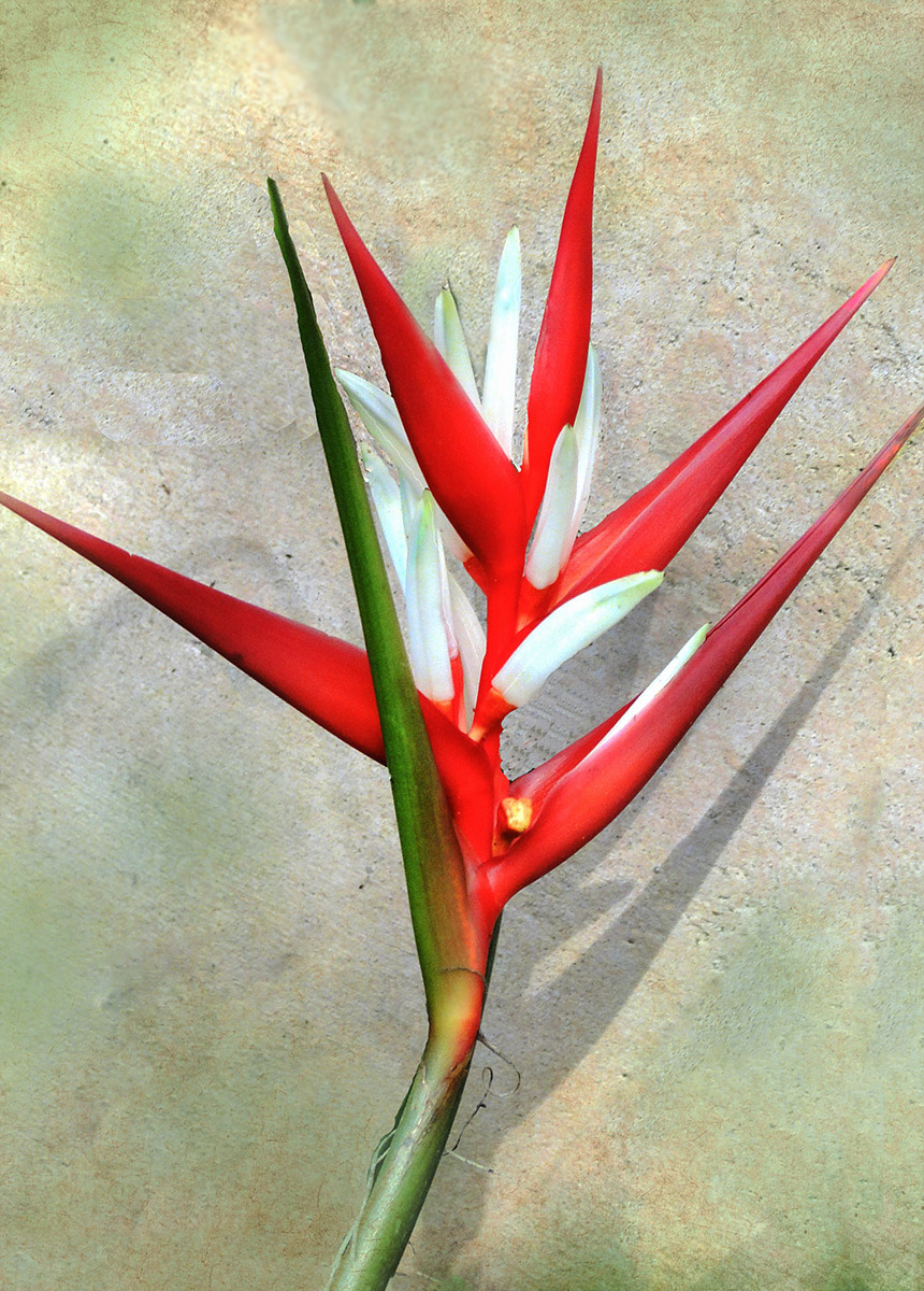
The red triangles are very eye-catching. You exposed them properly. Bright colors are often blown out, but these are perfect. I'm debating about that green leaf (stem) leading out of the toop of the image. I tried removing it; but on second thought, one can imagine it joining the other graan leaf to make yet another triangle. Hmmm... |
Nov 15th |
 |
| 12 |
Nov 21 |
Comment |
The lighting adds dimension to the planes - makes them look like planes rather than triangles with lines. Good job on the pink planes! I thought they were really like that to begin with. Good diagonals and good repeating pattern. |
Nov 15th |
| 12 |
Nov 21 |
Comment |
I really have trouble holding the cell phone steady, so rarely use the images captured with it. I know nothing about processing software for cell phones. I do know that this is a strikingly graphic image, very geometric. Is the building really this blue? Your cropping is good. Is it possible to get rid of that litttle white spot in the lower left corner? |
Nov 15th |
| 12 |
Nov 21 |
Comment |
Old cars are rich sources for photographs. You did very well with exposure, composition, color, and everything else. Circles and triangles; what a find! |
Nov 15th |
| 12 |
Nov 21 |
Reply |
I sould have cast a shadow on that bright stem. I was concentrating too hard on the stamens. No excuse. Was using a tripod and had a hand free. Incidentally, the triangular leaves are actually the sepals. The real leaves are tall and spiky - rather like daffodil leaves. |
Nov 8th |
5 comments - 2 replies for Group 12
|
| 77 |
Nov 21 |
Reply |
I couldn't find "conceptional Graphic" either. Now I have no idea what the label on that layer should really be. |
Nov 24th |
| 77 |
Nov 21 |
Reply |
Interestingly enough, that long, straight, bright tree fell down in the early spring. |
Nov 24th |
| 77 |
Nov 21 |
Reply |
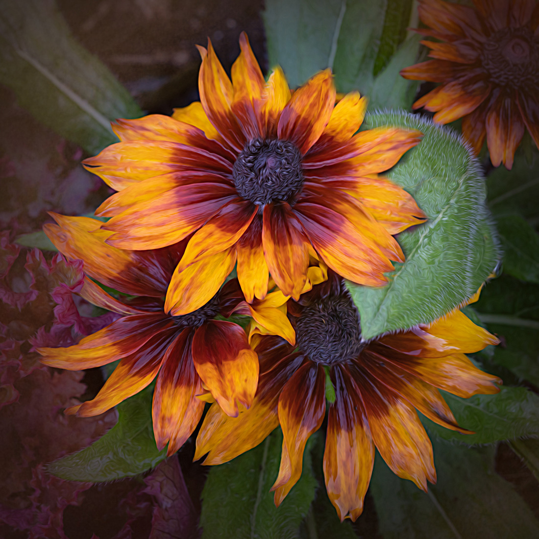
I actually like the leaf. It is in a natural position; it has a beautiful fuzzy texture, and it seems to be protectively caressing the petals. |
Nov 16th |
| 77 |
Nov 21 |
Comment |
Well done. Your editing adds to the painterly look of this image. The only thing I might have done was to mask some of the Smudge from the very center of the flowers - just a bit. But that's just personal preference. I played with adding petals and making the leaf less prominent. It was fun, but not necessarily better. Painters will often put imperfect petals on flowers because that's the nature is. |
Nov 15th |
 |
| 77 |
Nov 21 |
Comment |
Our area has had increasing rain and ominous black clouds. On days like that the green grasses and blue flowers seem to almost glow. So to my eye the sky is a good choice. The crop is very well done. The quality of the final image is also very good considering that it is only half the original image. Well done. |
Nov 15th |
| 77 |
Nov 21 |
Comment |
I love it. |
Nov 15th |
| 77 |
Nov 21 |
Comment |
How many shots did it take to get this? The baby is holding her sister's thumb - a very intimate gesture. Both girls are looking at the camera and have natural expressions in their eyes. I see nothing technically wrong. Changes would be based on personal preferences. |
Nov 15th |
| 77 |
Nov 21 |
Comment |
Foredt paths always look peacful and inviting. But getting a good image of one is sometimes difficult. Yes, your final image looks a little over-processed to my eye. It looks as if the path were almost buried in leaves. It's interesting that Linda lightened the edges to emphasize the path, and Denise darkened the edges to do the same thing. And they both look good. |
Nov 15th |
| 77 |
Nov 21 |
Comment |
Wow! I only have CS6, and the content-aware fill is hit or miss. This worked perfectly for you. Adding the fog gives a mystical feel to the iimage, perfectly complimenting the old mill. Color or B&W? We started out with B&W film, so that is always my favorite. But both are beautiful. |
Nov 15th |
| 77 |
Nov 21 |
Reply |
Yes, your crop does put more emphasis on the stars. Also that little patch that looks like a critter is gone. I never realized how much that pulls the eye away from the stars. Thanks. |
Nov 8th |
| 77 |
Nov 21 |
Reply |
Your crop is good. The large medium gray area in the branches on the right was bothersome. Your drop gets rid of most of that. Thank you. |
Nov 8th |
6 comments - 5 replies for Group 77
|
11 comments - 7 replies Total
|