|
| Group |
Round |
C/R |
Comment |
Date |
Image |
| 12 |
Sep 21 |
Reply |
Thank you. Perhaps the tracks are a litttle short for leading lines, but the rest of the scene was far more interesting than the tracks. Perhaps I should have removed the tracks from the lower left corner. |
Sep 24th |
| 12 |
Sep 21 |
Reply |
I agree that the image looks a bit out of kilter, but this is an old sight. Everything was slightly off balance. I left the tank in to tell the story. Perhaps it should be reversed to allow the tank to stop the eye from going out of the picture. |
Sep 24th |
| 12 |
Sep 21 |
Reply |
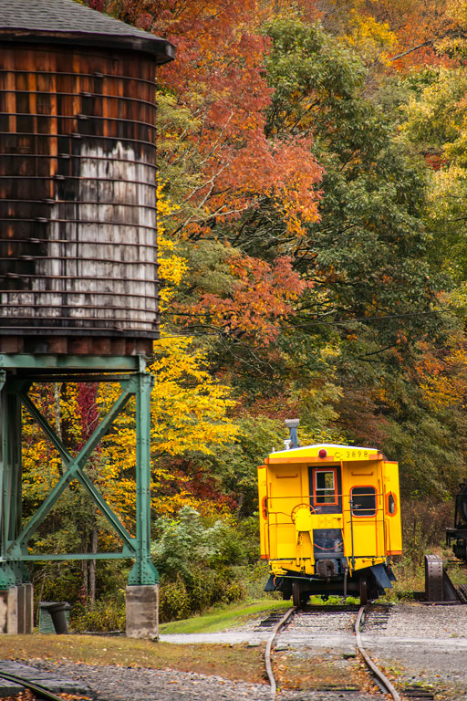
Perhaps the yellow caught my eye. There were a couple of red cabooses, but I didn't really work them. |
Sep 24th |
| 12 |
Sep 21 |
Reply |
Unfortuneately, I never thought of that crop. Should have, though. |
Sep 24th |
| 12 |
Sep 21 |
Reply |
Perhaps a crop of just the caboose would work. Leavingpart of the tank in the image would just make it an unidentifiable object. |
Sep 24th |
| 12 |
Sep 21 |
Comment |
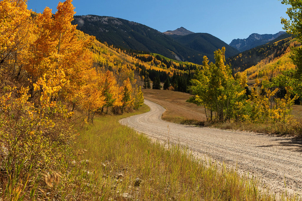
Having been out west for a much to brief vacation, I can say that the beauty there is unmatched. This is a lovely scene, making the viewer wish he could walk along that road, feel the breeze and listen to the birds. But to my eye it is a little washed out. Sometimes underexposing gives better color rendition than hue/saturation. In PS levels, the midtones were brightened just a smidgeon. |
Sep 24th |
 |
| 12 |
Sep 21 |
Comment |
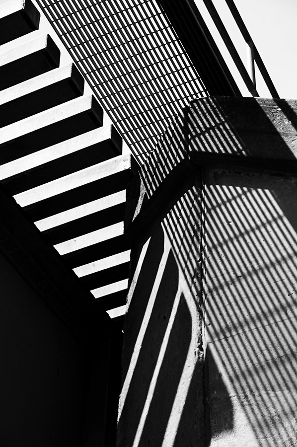
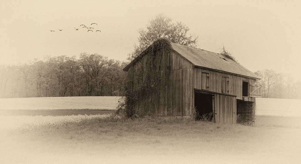
Horizontal leading llines - great idea. We usually think of the leading lilnes as being diagonal. Yes, there is an air of intrigue. There can be many stories here. The shadows of the blinds open up lots of creative ideas. |
Sep 24th |
| 12 |
Sep 21 |
Comment |
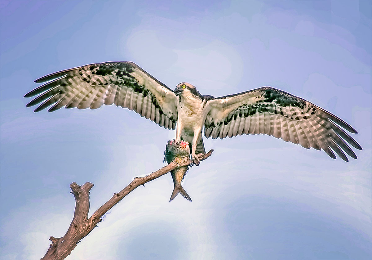
The wings and the branch make an almost radial lead into the face of the osprey. This is great - and from a rocking boat yet! The background is pale, but a fix is pretty easy. I used NIK Color FX polarizing filter, then added the darken/lighten center to give a vignette. This would have to be done on the original, because the result appears to be overdone here. But it gives the idea. |
Sep 24th |
 |
| 12 |
Sep 21 |
Comment |
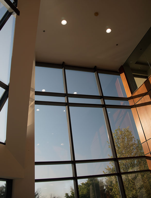
Indeed, shadows make good leading lines. And the glare under the stand is a nice touch. Well done, Walter. |
Sep 24th |
| 12 |
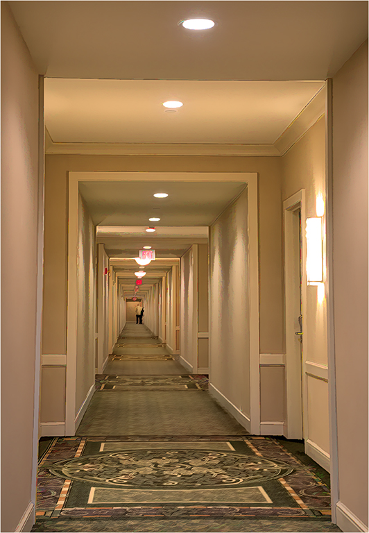
Sep 21 |
Comment |
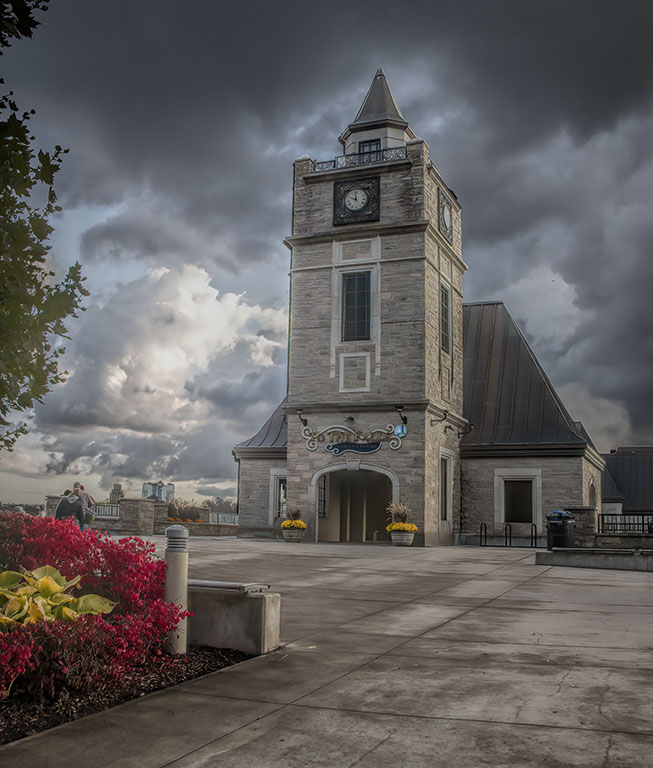
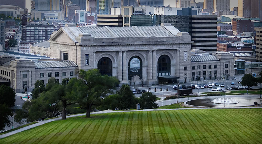
I prefer the cropped version. Yes, the original has the sidewalk as well as the grass, but I have trouble deciding which way to go. I agree with Carole that the main building needs to be brighter. After palying with several ideas, I worked with hue/saturation, emphasizing the yellows and greens, desaturating the blues. Then I added a vignette just to the upper half. My monitor is very bright, so added brightness to the overall image. |
Sep 24th |
 |
| 12 |
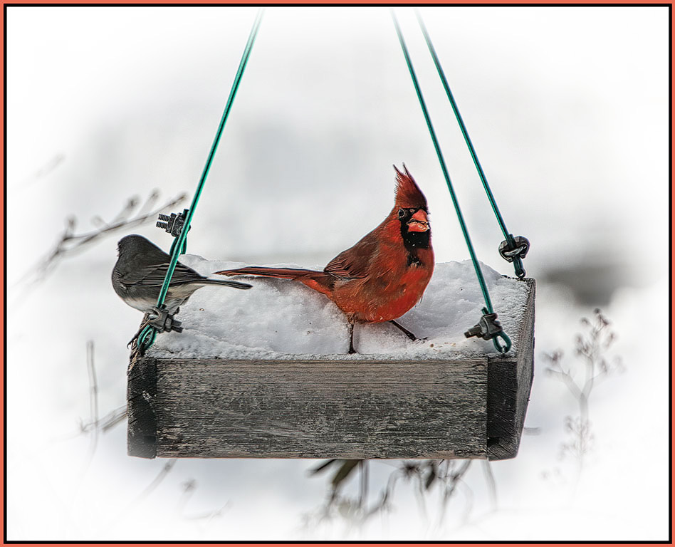
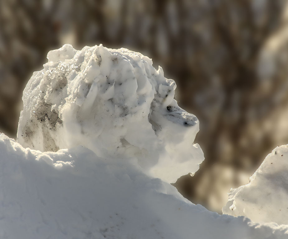
Sep 21 |
Comment |
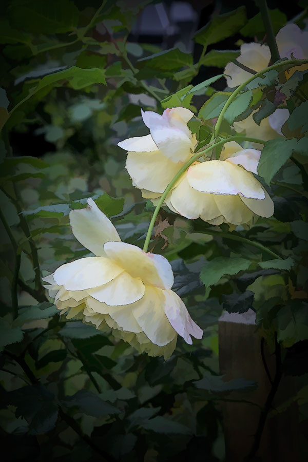
White on white is very difficult to do well. Often the white is too bright or the shadows too dark. Here you have very delicate subtle shades of white. Excellent. I didn't notice the little glasres either. Good eyes Gavin. |
Sep 24th |
6 comments - 5 replies for Group 12
|
| 77 |
Sep 21 |
Comment |
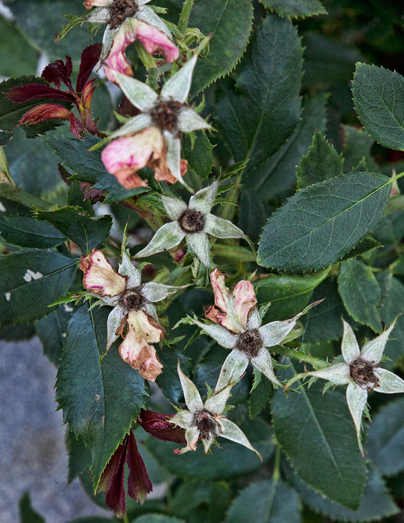
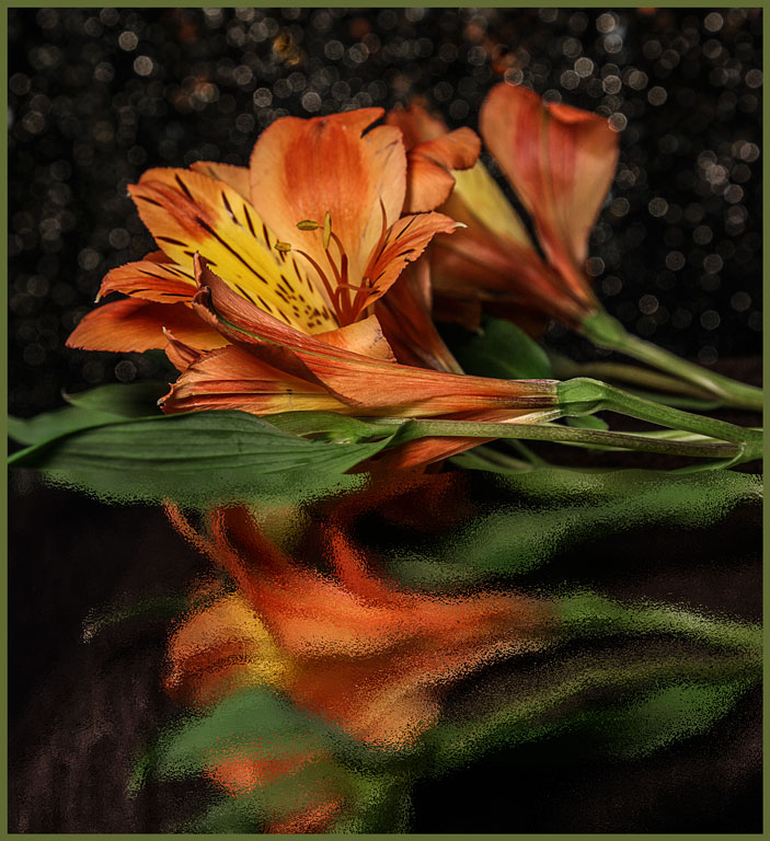
Thank you everyone. You are all correct that the background is too pronounced. The darkened backgrounds are so much better. Linda, I like the addition of the radial filter. Yes, sadly the roses were passed their prime. We intend to return to that garden in June. |
Sep 24th |
| 77 |
Sep 21 |
Comment |
Red and green are opposites on the color wheel. That helps make this image stand out - as well as the nice diagonal composition and the 'interaction' of the flower and butterfly. Denise's addition of the filter suggests the light that is casting the shadows; good addition.
|
Sep 24th |
| 77 |
Sep 21 |
Comment |
Id this fine art? Well, that is in the eye of the beholder. I can see this on the wall in a Biology professor's office. Or perhaps as one of a set of similar images for a nature lover's family room. This caterpillar could be the main character in a children's book. It is truly beautiful. |
Sep 24th |
| 77 |
Sep 21 |
Comment |
The soft lighting on the face is beautiful; the pose goes well with the mood that the lighting suggests. If your aim was to show transformation the brush should have been more noticeable. To show mystery, eliminating the brush is best. We have such ability to change our images even after taking them. I wonder if painters wish they could do that to a finished work? |
Sep 24th |
| 77 |
Sep 21 |
Comment |
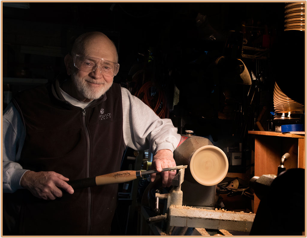
I can see this as an album cover or thte author's portrait on the fly leaf of a book. I do like Linda's version. Personally, I prefer the warm tones of your first version to the muted tones of your competition version. Something about this man says that he is not muted in any way. |
Sep 24th |
| 77 |
Sep 21 |
Comment |
I agree with all the others that the flower has been weakened. Perhaps you can reduce the effects on the flower with a low opacity mask. I, too, like the original better. But that is just personal preference. Both versions have a place in the art world. |
Sep 24th |
6 comments - 0 replies for Group 77
|
12 comments - 5 replies Total
|