|
| Group |
Round |
C/R |
Comment |
Date |
Image |
| 12 |
Nov 20 |
Reply |
I have played with various brushes and still don't know how to get the effect I'm looking for. Yes, more practice. |
Nov 10th |
| 12 |
Nov 20 |
Reply |
I love the starbursts, but they are easily overdone. Since this is really a fantasy image, I used a large size. The real tiger lily is masked, so it could fade in and out until something clicked. |
Nov 10th |
| 12 |
Nov 20 |
Comment |
You know, the possible stories behind an image may be what draws and keeps the viewer's attention. This has the look of HDR that is not overdone. The straight "in your face" composition works well here. The background helps with the story rather than detracts. Very good depth of field. |
Nov 10th |
| 12 |
Nov 20 |
Comment |
What a charming little lady! And how very creative you were. From the flower cap to the face to the pendant, it all works together beautifully. The sunbeams from the upper left are a nice touch. This would make a lovely Valentine's Day card. |
Nov 10th |
| 12 |
Nov 20 |
Comment |
Great image, and not an easy one to capture. Often there are too many distractions around the mirror. Here you have good framing for the reflection. The viewer can look ahead and behind simultaneously. Hmmm sounds like a good subject for a philosophical discussion. |
Nov 10th |
| 12 |
Nov 20 |
Comment |
I like the flip; the leaves look like little arms saying, "This way, please." You should play with a solid background as Carole suggests, but be careful not to block the light. I don't find the background disturbing, but we should learn to explore all possibilities. It's interesting that you were waiting for a reason to photograph the flowers; I have been trying for a couple of years to photograph the glass flower in my image to no success. This was a lucky month for both of us. |
Nov 10th |
| 12 |
Nov 20 |
Comment |
Your slide show is very moving. And very professionally done. There is a lot to see in this image, especially knowing the story behind it. The flag pole and flag echo the shape of the girder. The exposure and color balance is perfect. The texture of the girder shows up well, even though the light is almost straight. I'm sure there were many compositions to work with in this scene, but you picked the best one. |
Nov 10th |
5 comments - 2 replies for Group 12
|
| 77 |
Nov 20 |
Comment |
I like the horizontal flip that Linda did. We read from left to right, so the horizontal lines lead right to the grill. I added another grunge texture from Topaz, but it made little difference. Nice job. |
Nov 14th |
| 77 |
Nov 20 |
Reply |
Oh! Removing those extra leaves really puts the emphasis right where it should be. Thanks. |
Nov 14th |
| 77 |
Nov 20 |
Reply |
I was considering changing the tones to the red family. But what captured my eye the the beautiful golden color of the back-lit leaves. But I like your reds, too. Unlike painters, we can easily make these changes. But then how do we choose? |
Nov 14th |
| 77 |
Nov 20 |
Comment |
Back in the film days there were two standard exposures: sunny 16 and moon 11. That meant to expose the moon at f/11 at 1/ISO (whatever the ISO of your film was.) That would translate to f/11 at 1/400 for Tri-X film (ISO 400). In this case, detail on the moon would compete with those delicate back-lit branches encircling it. The warm softness of the moon adds to the mystery of this image. Anyone can get the 'face' on the moon, but I have never seen one gently embraced by tree branches. |
Nov 10th |
| 77 |
Nov 20 |
Comment |
What could I possibly add to what the others have said? This is lovely. My personal taste prefers the more saturated water (Witta's version). Good job cleaning up the stray branches in the upper left. |
Nov 10th |
| 77 |
Nov 20 |
Comment |
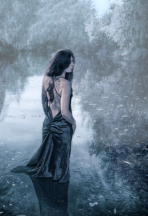
I am not sure about the cyanotype filter either. It seems a little too cold for the mood of the image. But Witta's version with the warmer skin is more appealing to me. She needs a bit of mystery - perhaps fog with her showing clearly, looking like the Lady of the Lake. |
Nov 10th |
 |
| 77 |
Nov 20 |
Comment |
As a fan of science fiction and fantasy novels, I can say that this would be a perfect cover for one of Poul Anderson's books. A bluish cast (Original 2) gives a very different mood. For that one I would try to give the moon the same blue cast. But what you came up with is perfect. |
Nov 10th |
| 77 |
Nov 20 |
Comment |
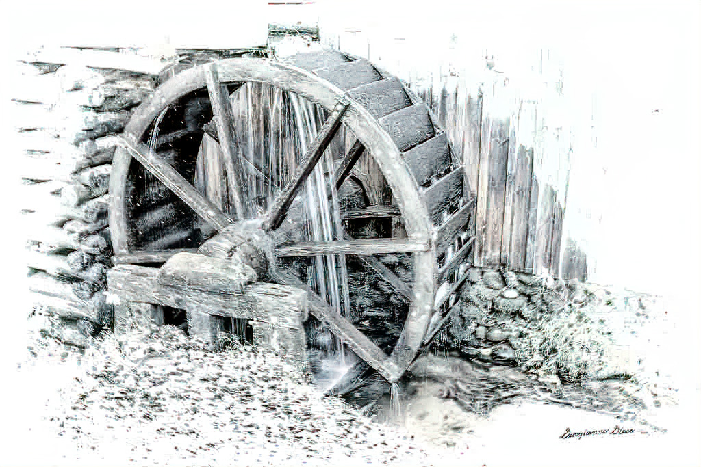
This is a very good treatment of the old mill at Cade's Cove. The whole little village is quite picturesque. I love everything about your image, from the high key treatment to the light vignette. I like Willa's version with blue water. I hate tripods, and often get shots that are just a little "jiggly". I put you finished image through Topaz Studio AI Clear. Then used "Lines" (black) adjusting the sliders to taste. The blacks are darker, but contrast adjustment can correct that. |
Nov 10th |
 |
6 comments - 2 replies for Group 77
|
11 comments - 4 replies Total
|