|
| Group |
Round |
C/R |
Comment |
Date |
Image |
| 12 |
Oct 20 |
Reply |
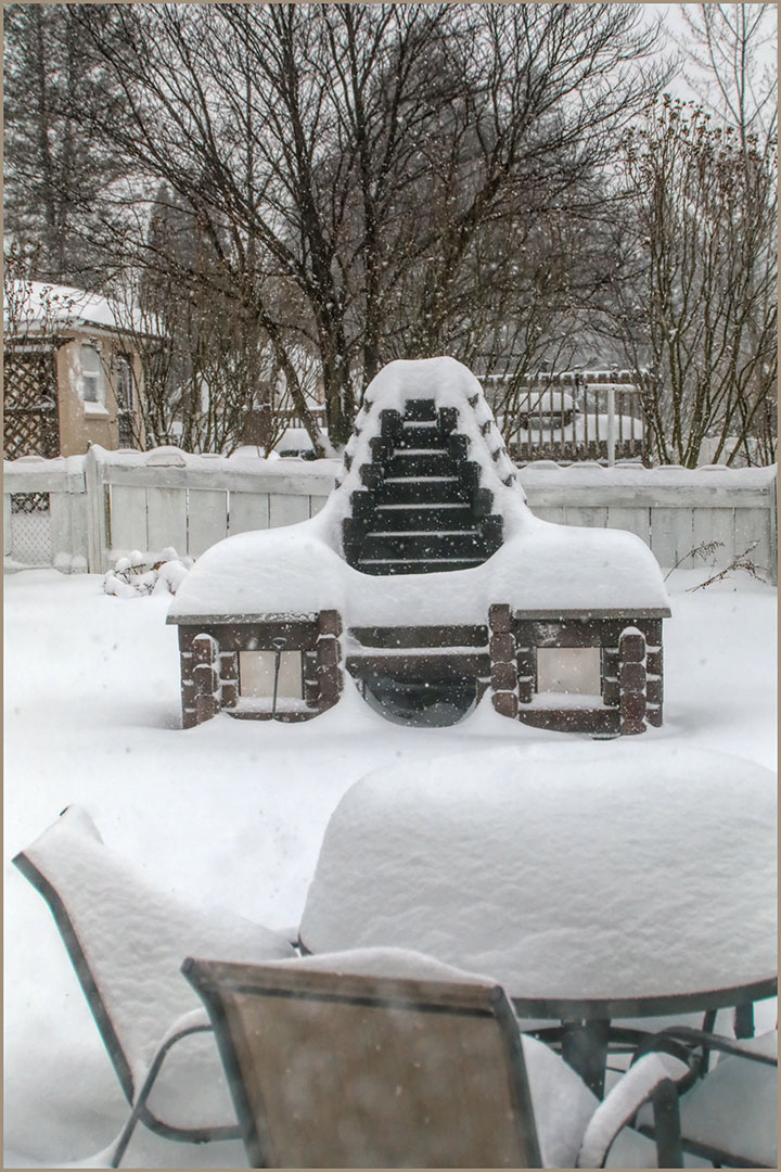
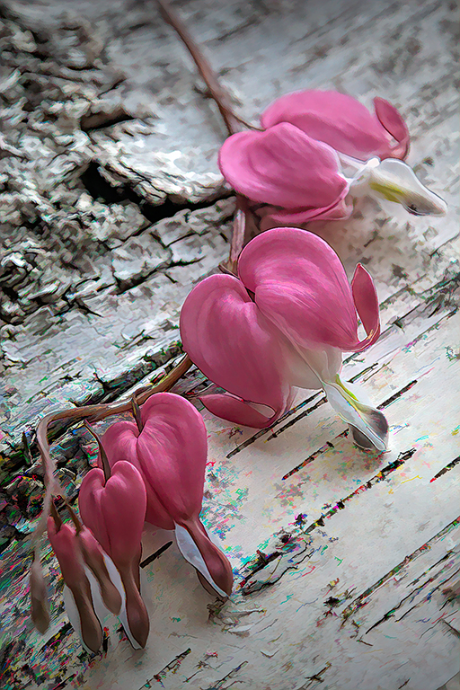
There is a little one-step deck outside the back door. I sat on that and braced elbows on knees. |
Oct 26th |
| 12 |
Oct 20 |
Reply |
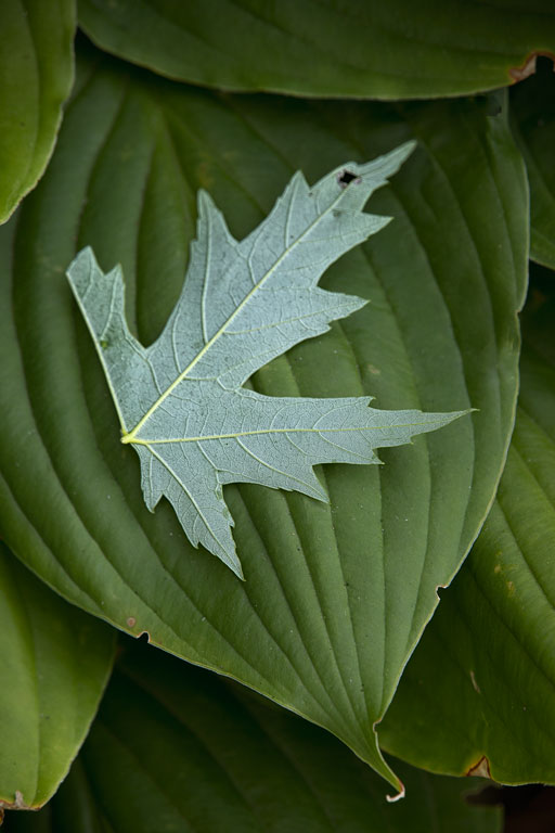
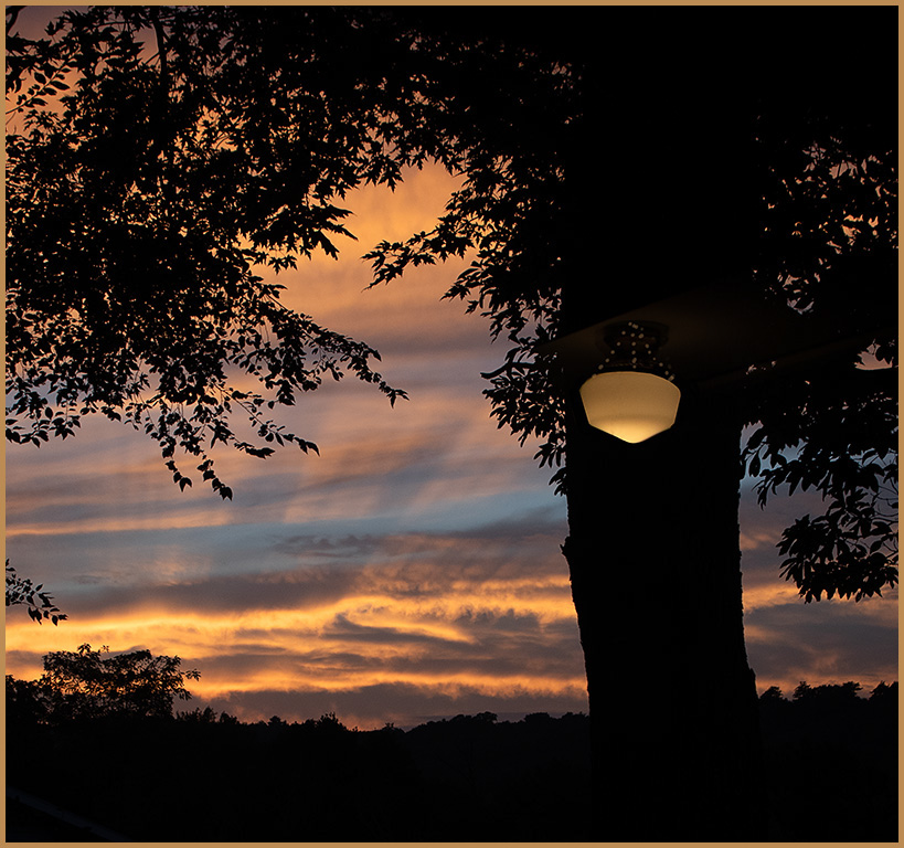
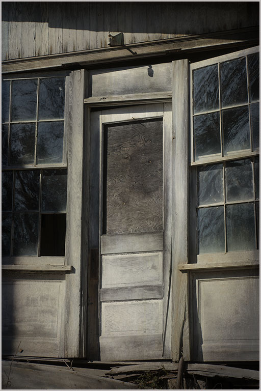
I tried filling the black area with a dark green. Didn't do a good job - need practice on that technique. |
Oct 26th |
| 12 |
Oct 20 |
Comment |
I also find street photography intimidating. And you are right - it's impossible to predict just what you will get. This shot is very busy but loaded with human interest. Well done. |
Oct 10th |
| 12 |
Oct 20 |
Comment |
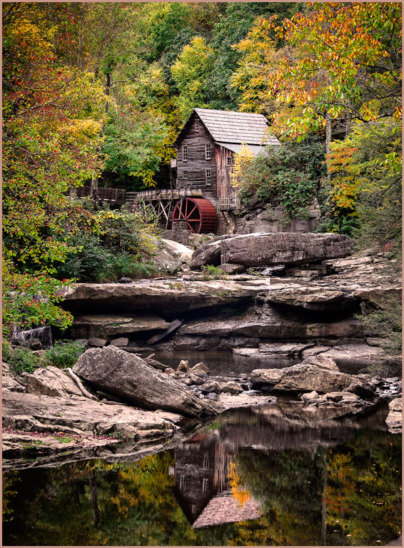
The overcast light was definitely an advantage here. But such a cute scene has to be captured no matter what. The wide pano cropping is perfect. Even the ducks are all very interesting. None are hiding their heads in the grass or disrupting the nice line. Did you take multiple shots? |
Oct 10th |
| 12 |
Oct 20 |
Comment |
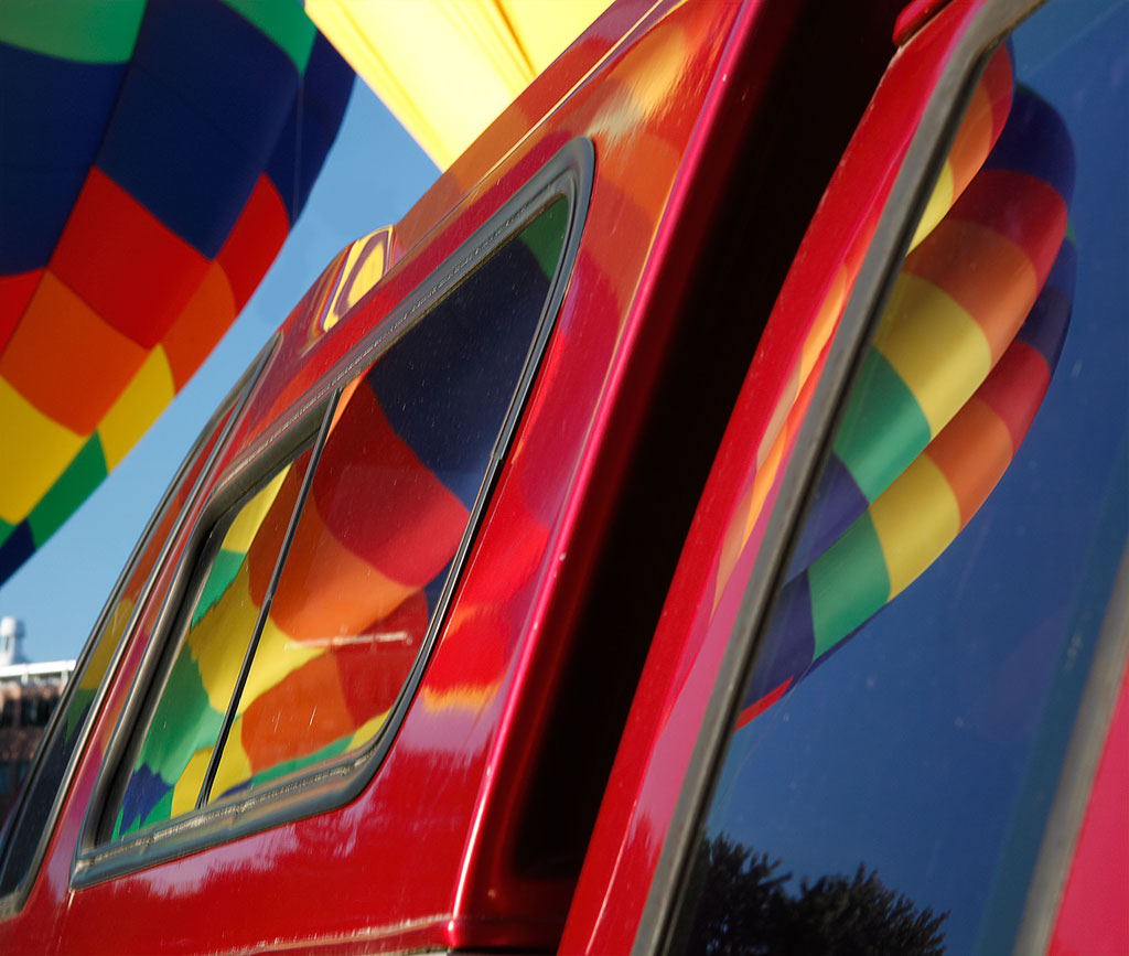
The composition is so good, one would think you had planned this shot. The position of the balloon in the curve of the shore, the balance provided by the road to the tight, the smooth water and textured land. Very well done. |
Oct 10th |
| 12 |
Oct 20 |
Comment |
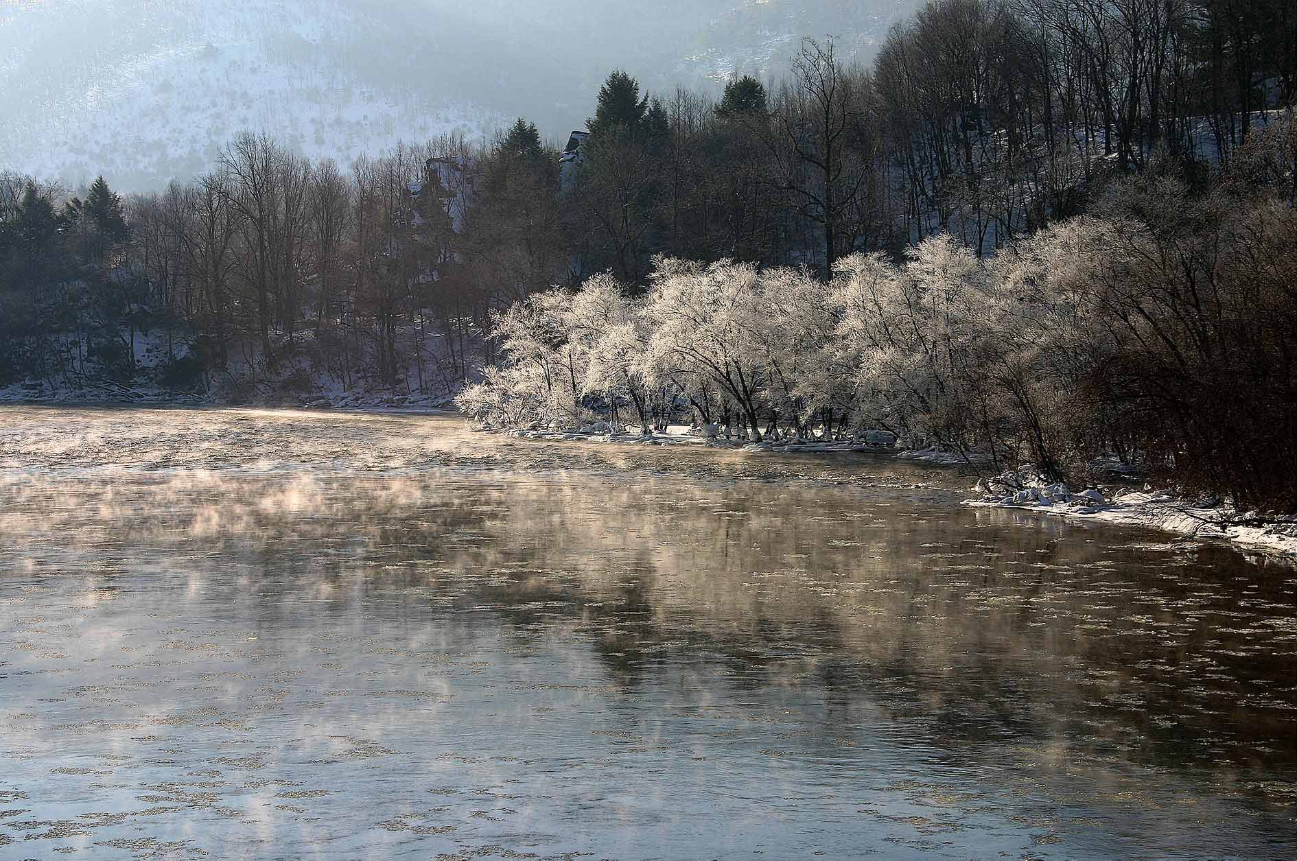
I recently watched a webinar on long exposures, both daytime and night. I like the more muted colors of your shot because quiet simple images appeal to me. Carole's brighter version is very pretty, so this comes down to what the viewer prefers. But how can we ever predict the viewer's thoughts? The water is quite smooth. It would be interesting to know if there were any ripples in the water at the time the photo was taken. |
Oct 10th |
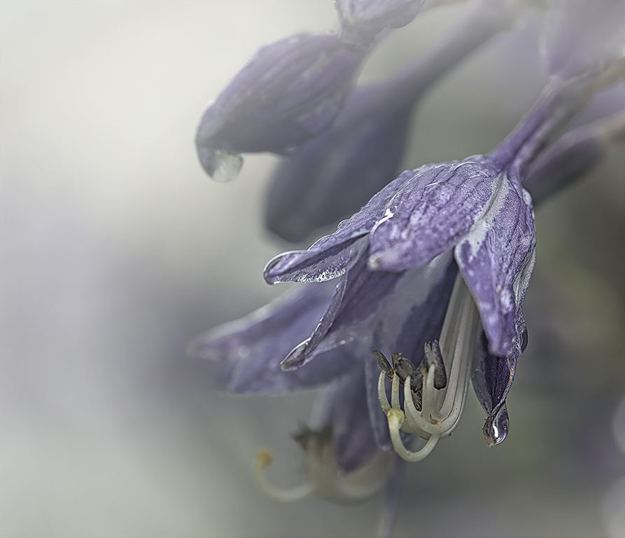
| 12 |
Oct 20 |
Reply |
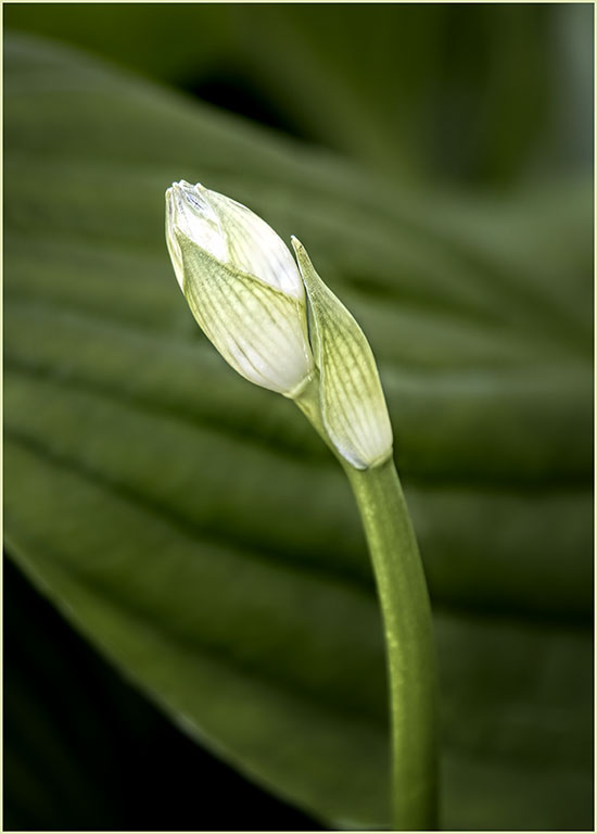
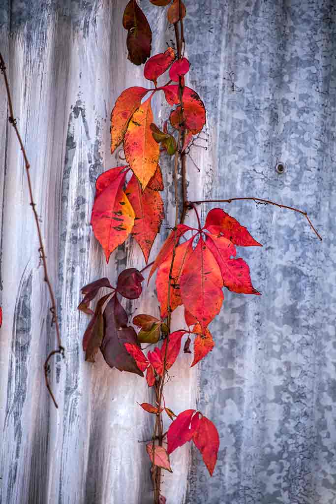
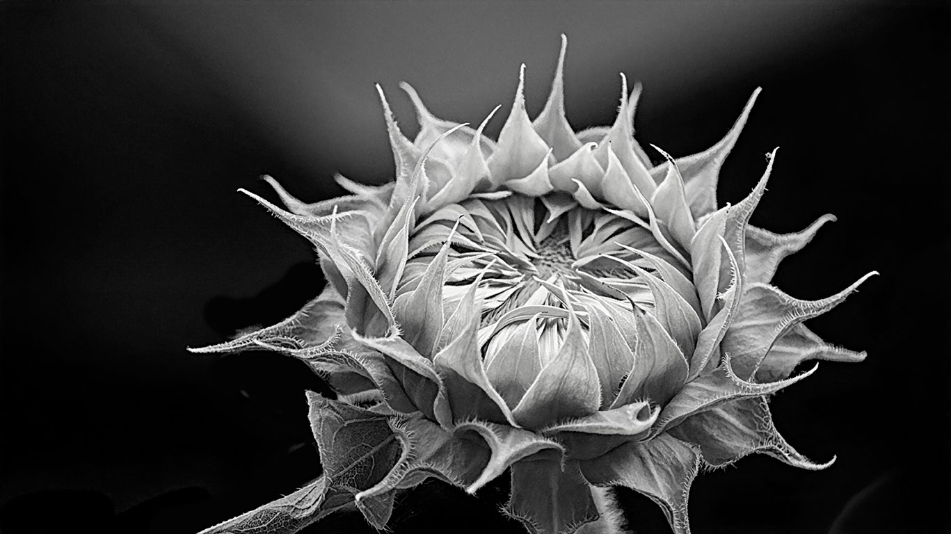
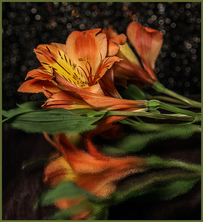
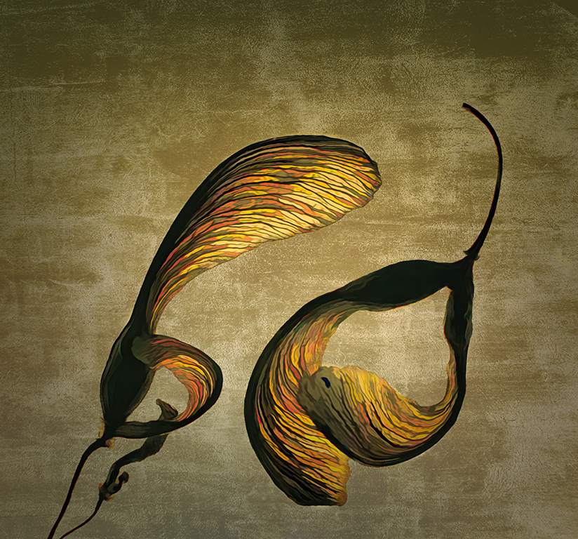
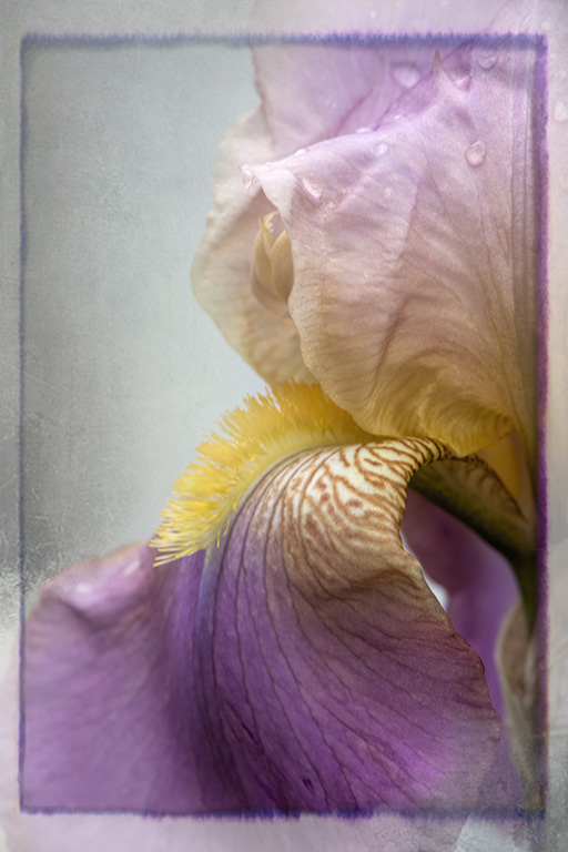
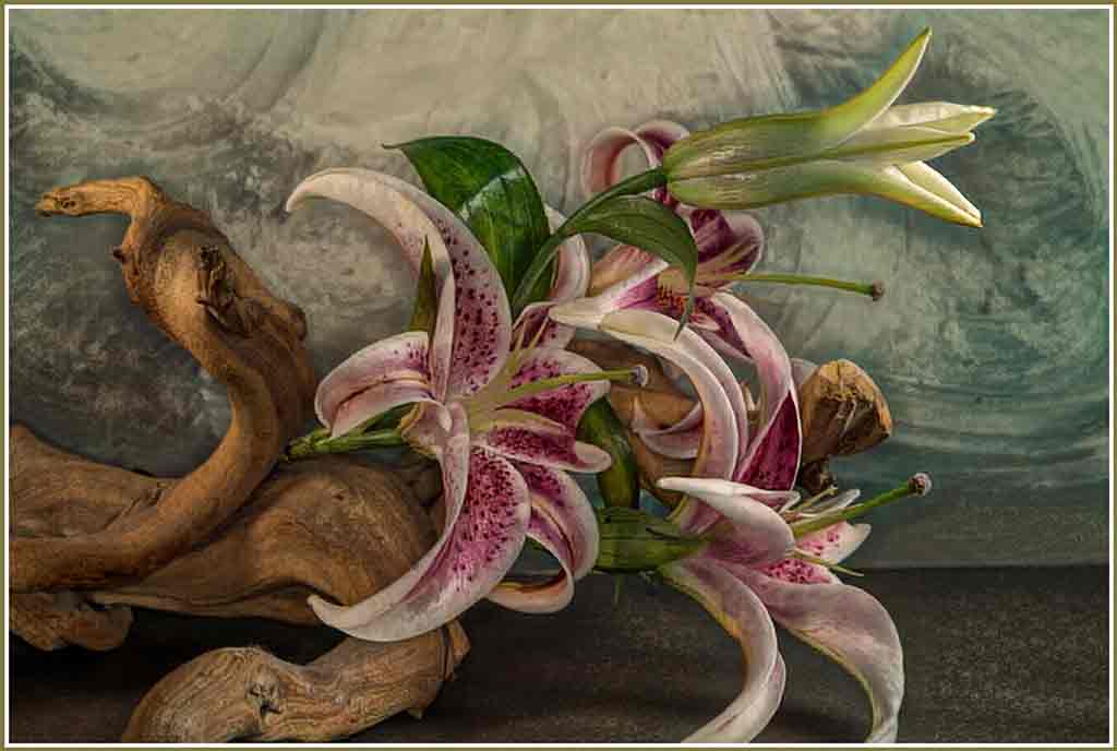
I wondered if the bud itself was too small within the frame. But cropping it didn't really help. In addition to bracing the camera I used multi-shot in the hopes that one of the shots would be in good enough focus. |
Oct 5th |
| 12 |
Oct 20 |
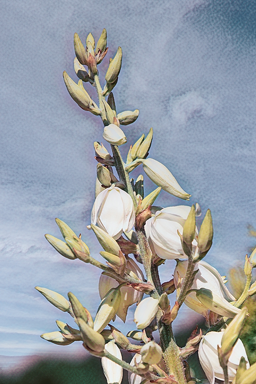
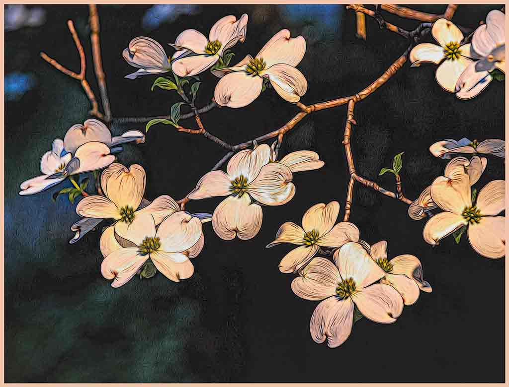
Comment |
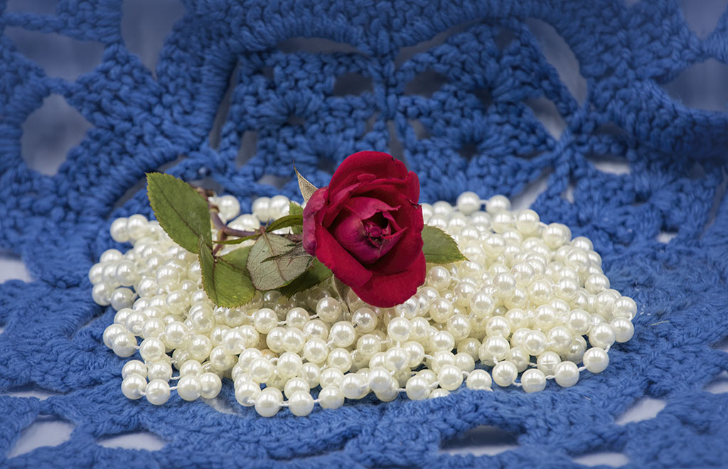
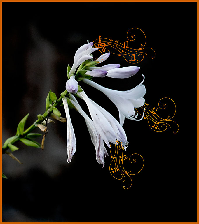
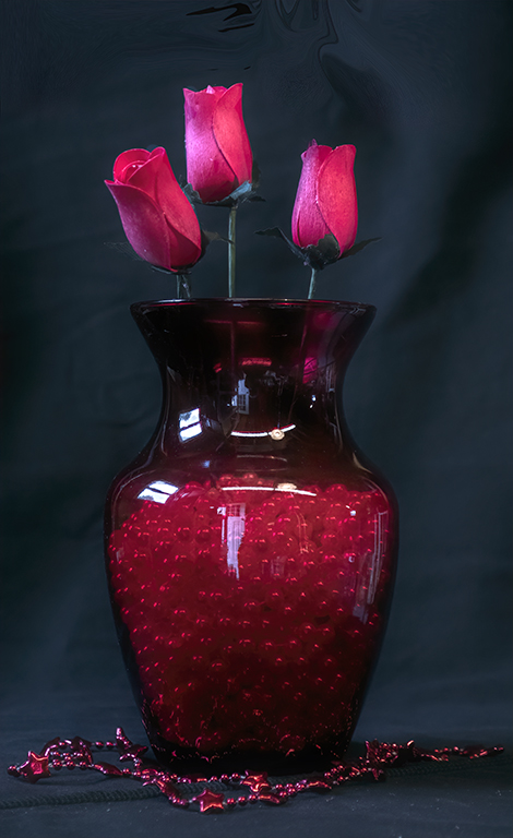
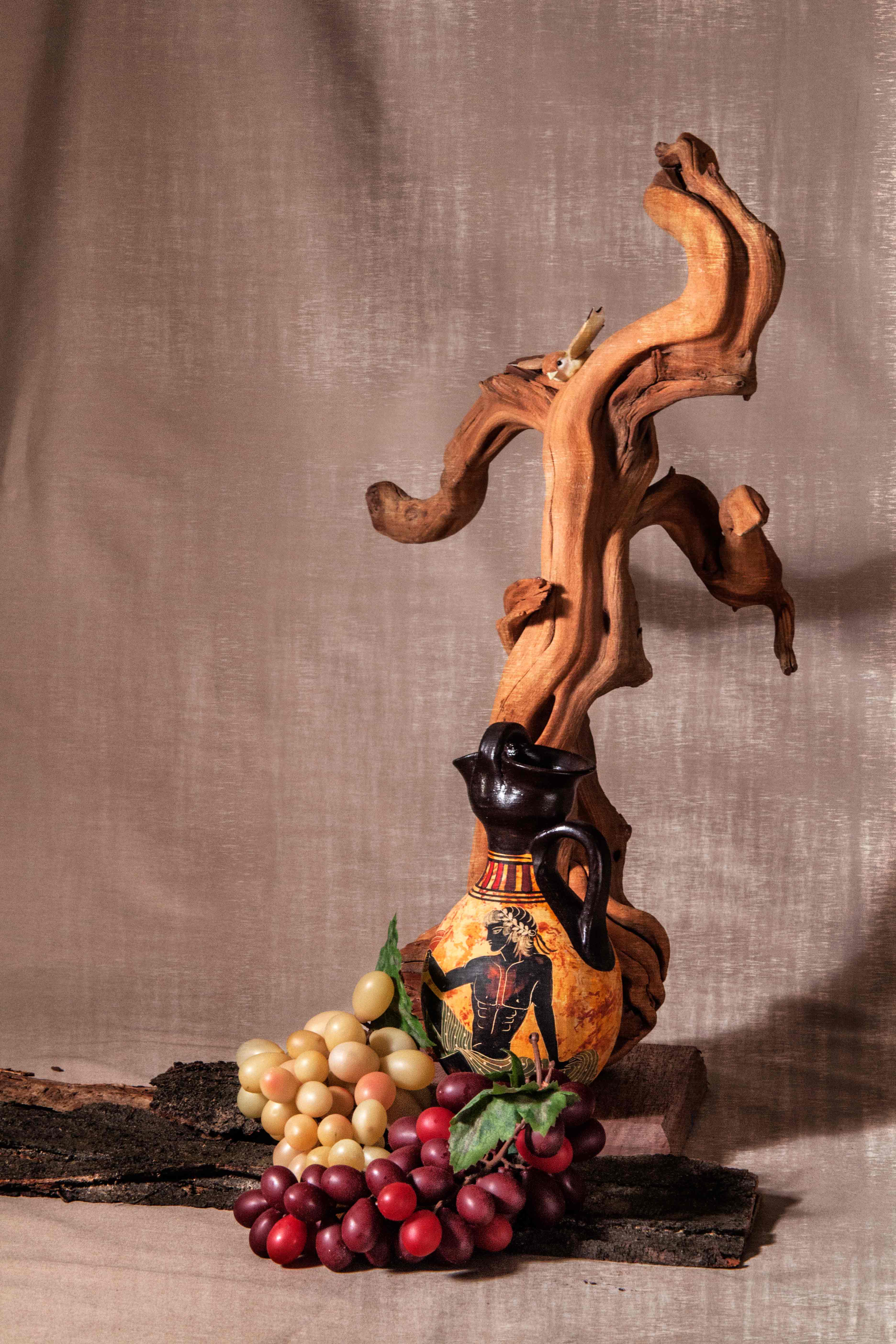
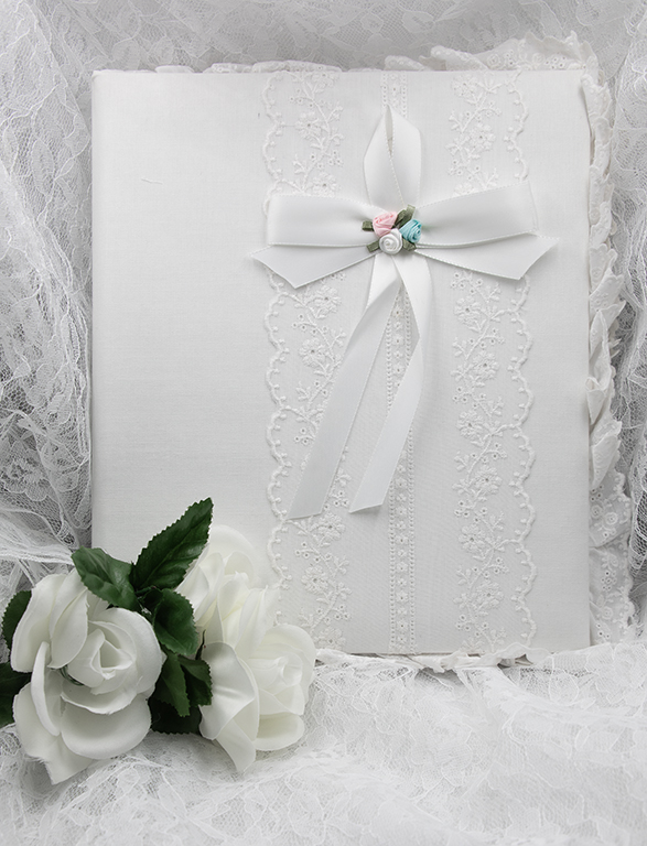
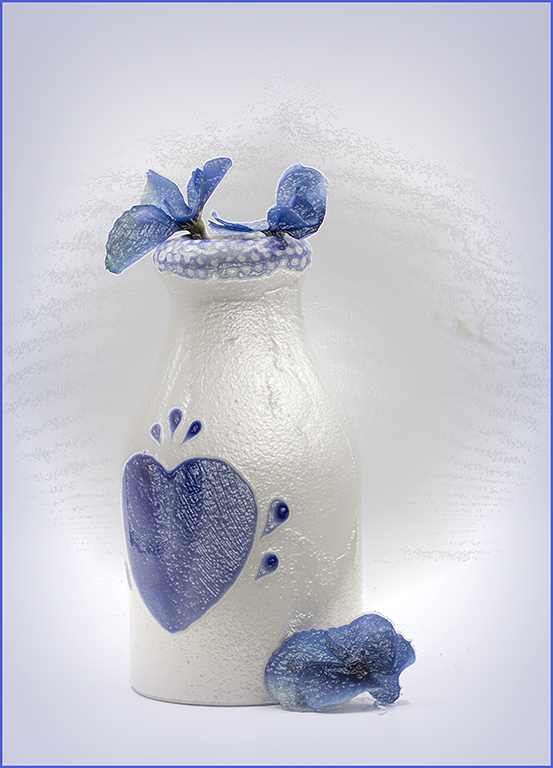
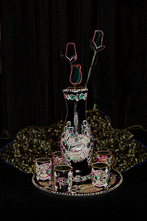
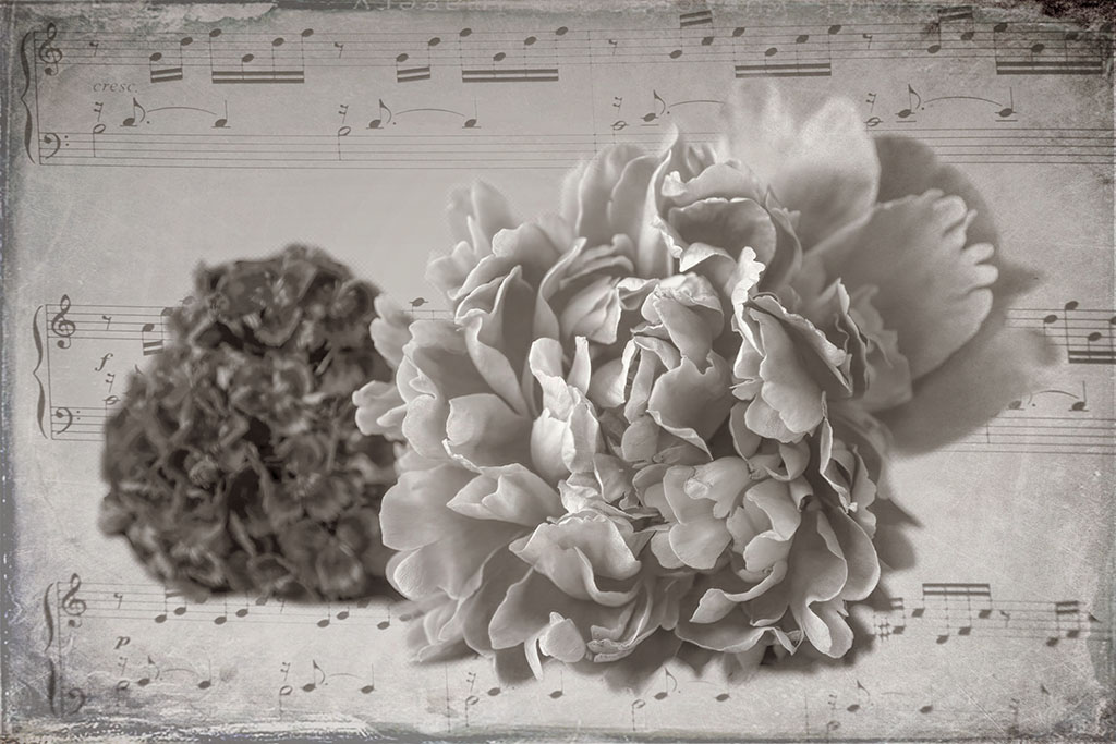
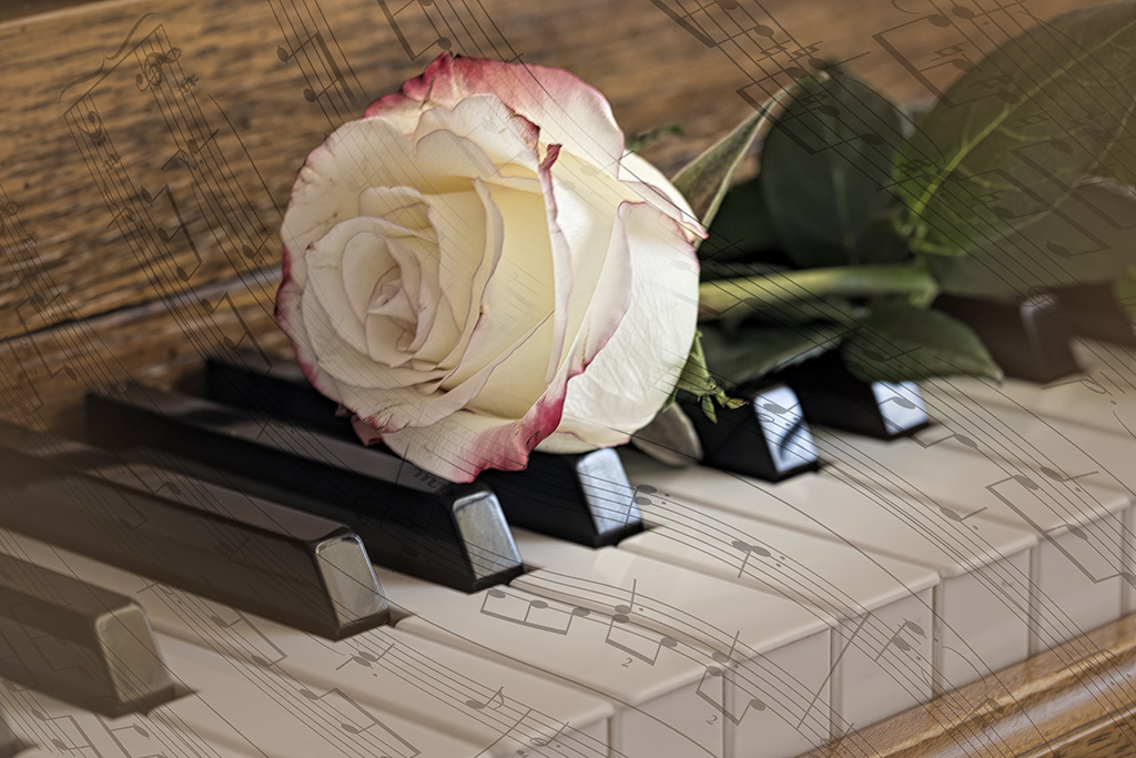
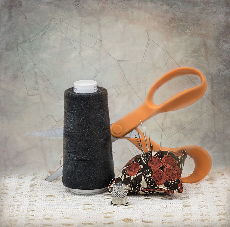
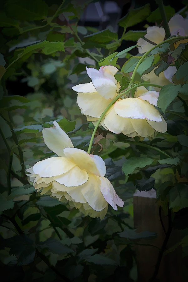
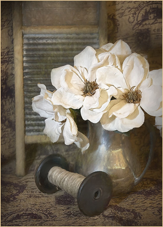
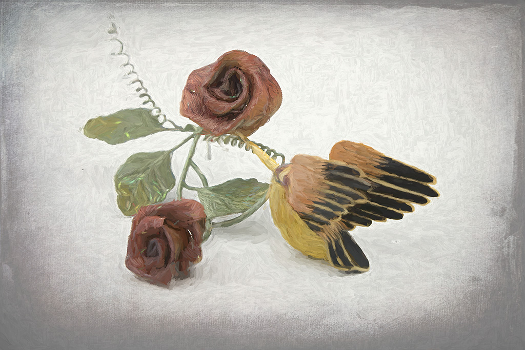
The lighting on the white flower is lovely. It goes from a dreamy high key on the left to almost low key on the right side. The soft colors blend perfectly. The white lace on the bottle is a bit distracting in the photo, but probably enhances the arrangement as a centerpiece. This would be lovely hanging on a wall.
|
Oct 5th |
| 12 |
Oct 20 |
Comment |
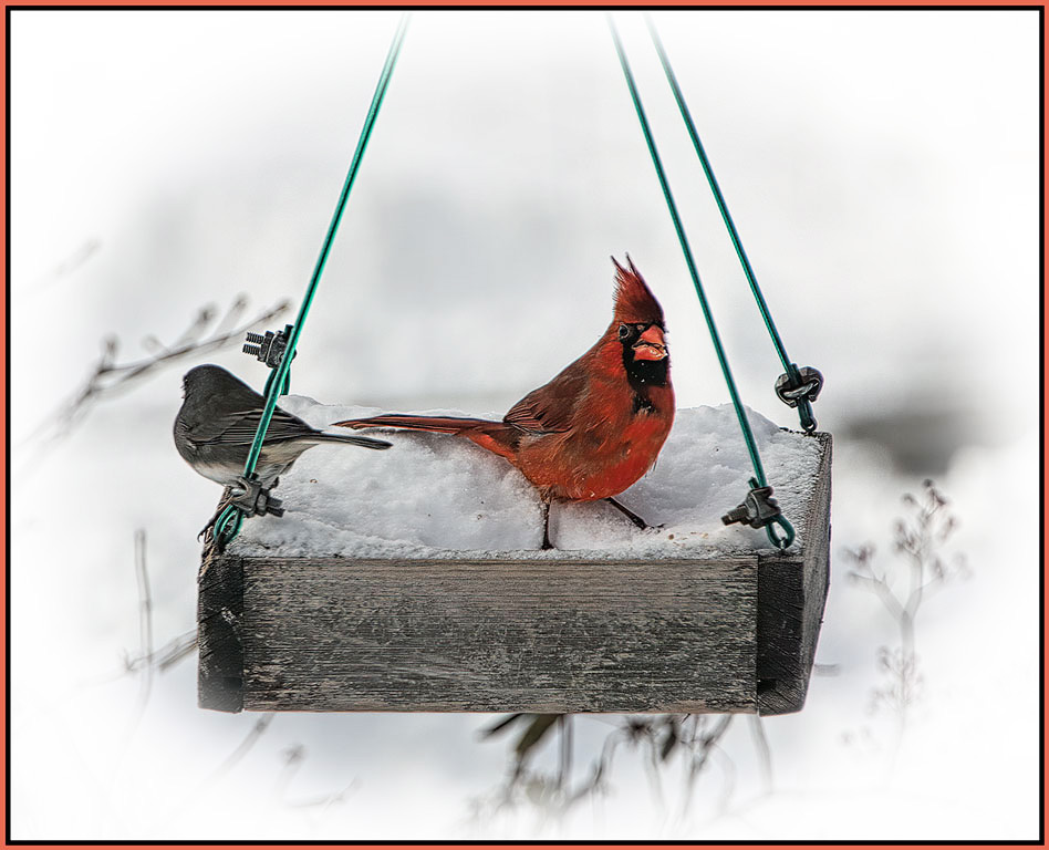
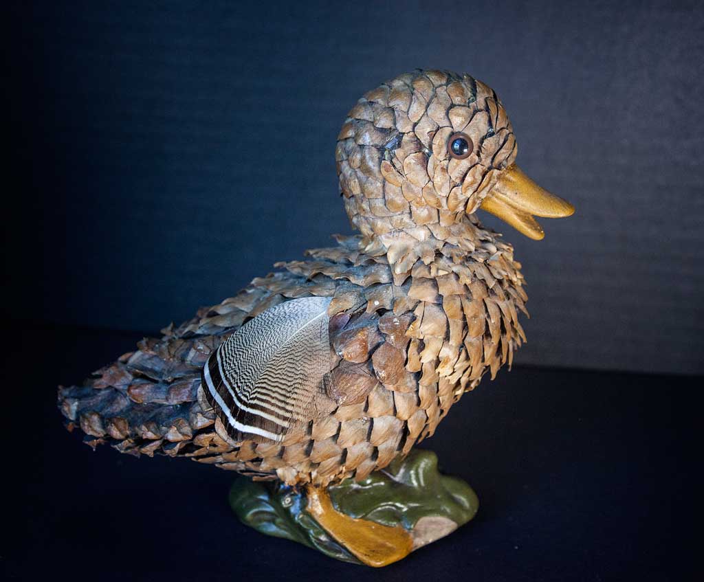
In this case the composition depends on the bird itself. If he had been considerate of you, he would have positioned himself so that the branch was not growing out of his head. All kidding aside, this is quite good. The bird is on a diagonal, the branches nicely framing and supporting him. There is a catch light in his eye and good feather detail. If this were a pictorial photograph you could remove the offending branch. If this were a nature entry you would have to leave it there. If you cropped from either left or right, the bird would be too crowded. Leaving room at the left for him to look into (like the original) is an option, but I like the cropped composition better. Rule of thirds is actually the 'suggestion' of thirds. |
Oct 5th |
6 comments - 3 replies for Group 12
|
| 77 |
Oct 20 |
Comment |
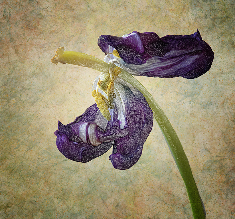
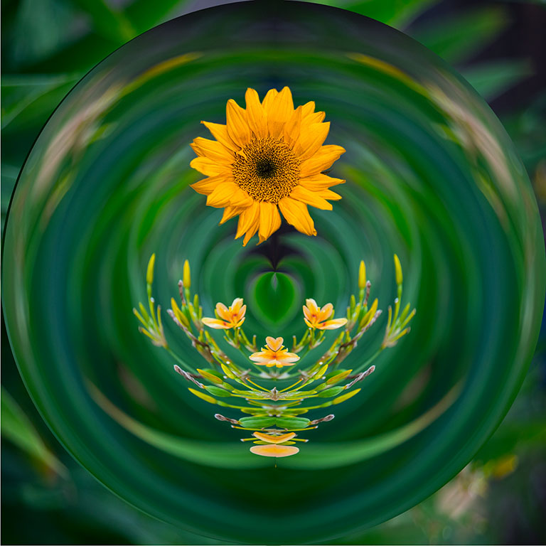
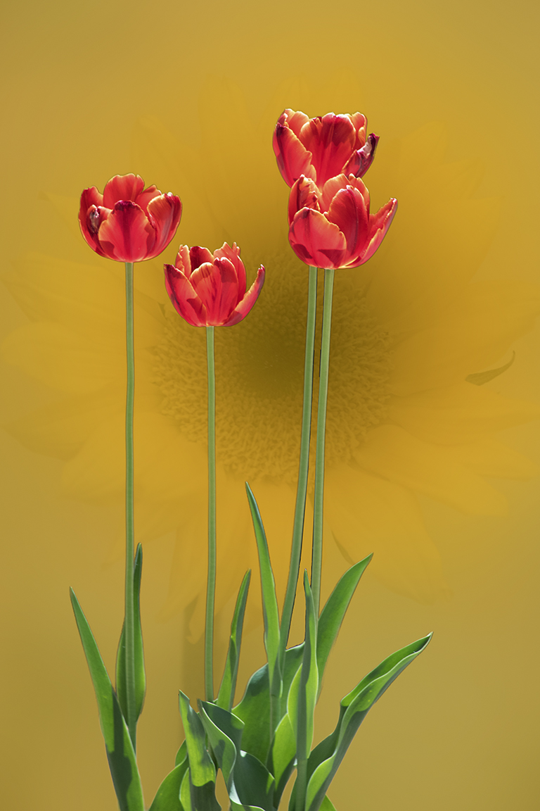
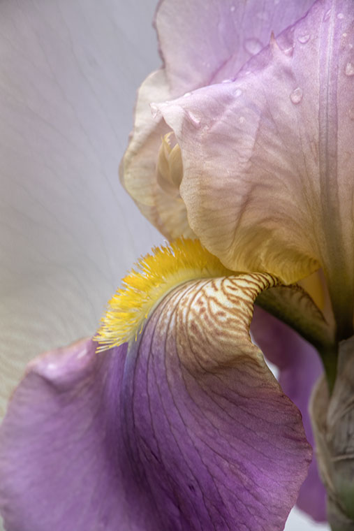
Thank you all for your excellent advice. The iris will come back next spring, so I can try your suggestions. Meanwhile here is a rough draft of a new background. Following Witta's suggestion to use the flower itself as a back ground - copied the whole layer, rotated it 180 degrees, lowered the opacity to 20%, and used a mask to bring back the original flower. |
Oct 26th |
 |
| 77 |
Oct 20 |
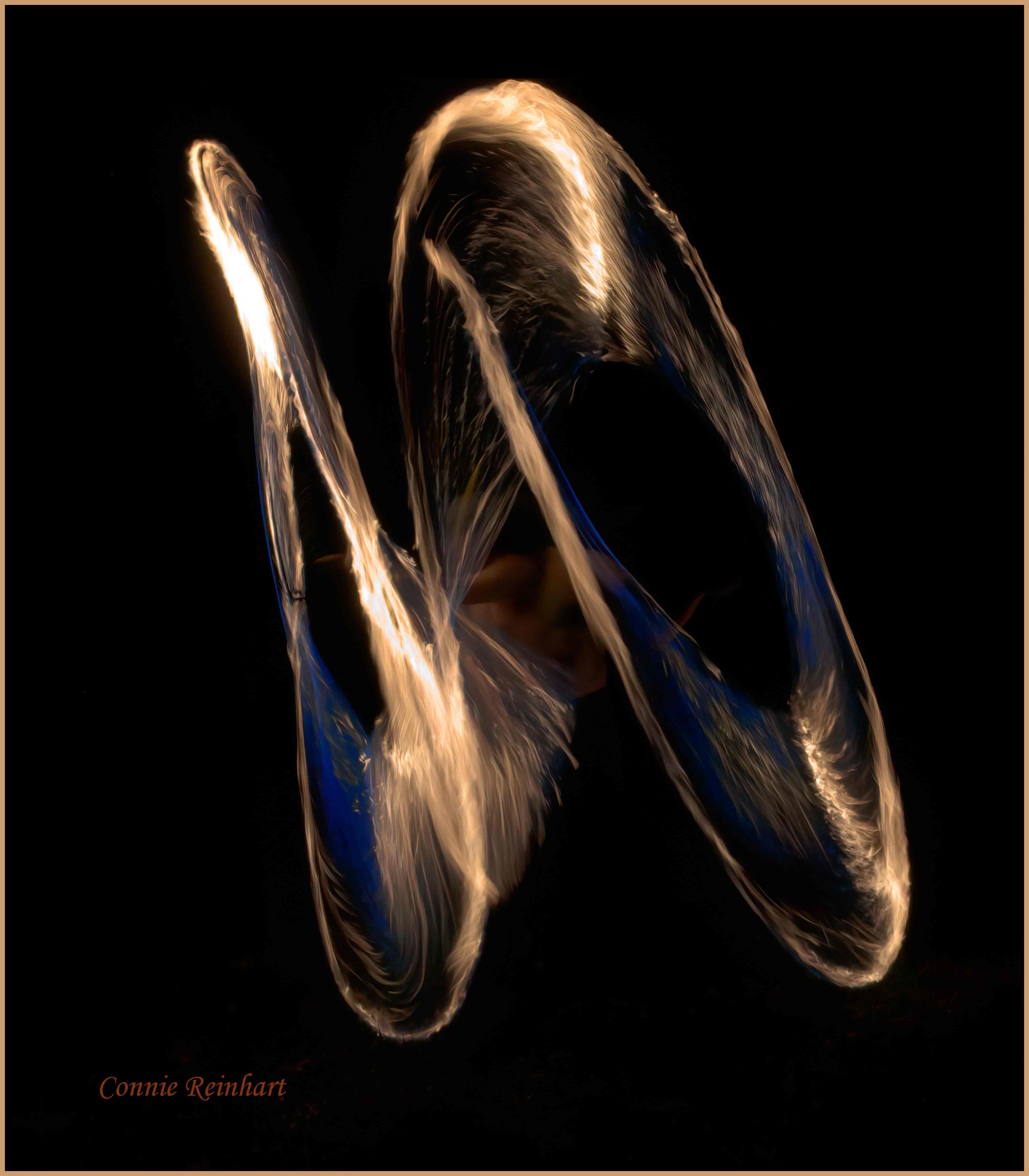
Comment |
Thank you Witta. I was playing with different effects in Topaz and thought this was quite different. So I submitted it to see what the rest of us thought. I agree with you. Some images grow on me after a while. But this is just the opposite. I wanted to fill up the empty corner in the upper left. Any suggestions? |
Oct 5th |
| 77 |
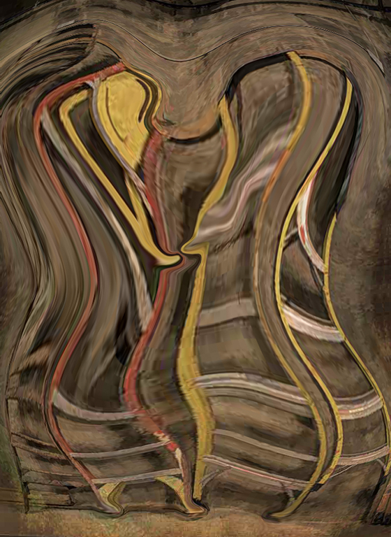
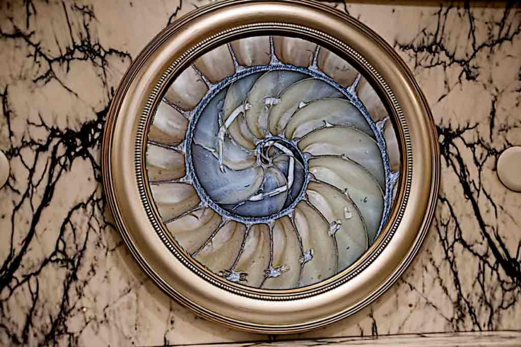
Oct 20 |
Comment |
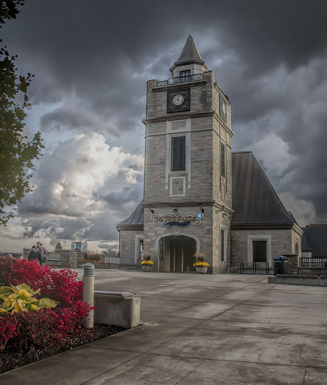
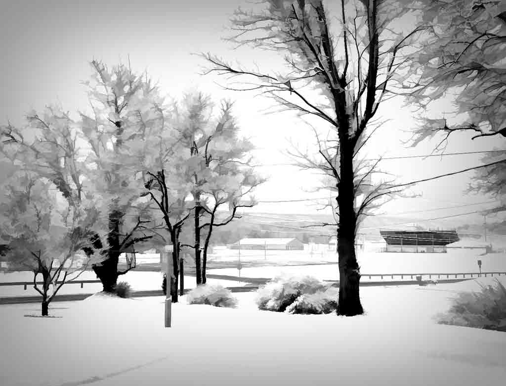
I like original 2 better. It has a smoother look that adds to the natural abstractness. There is a lot to see here, and my eye can't settle. Have you tried cropping from the top to the horizontal bar above the thing that looks like an Aztec temple? Stephen's suggestion of "Things That Go" is pretty good. If it is a historical museum, perhaps that could be "Things That Went." |
Oct 5th |
| 77 |
Oct 20 |
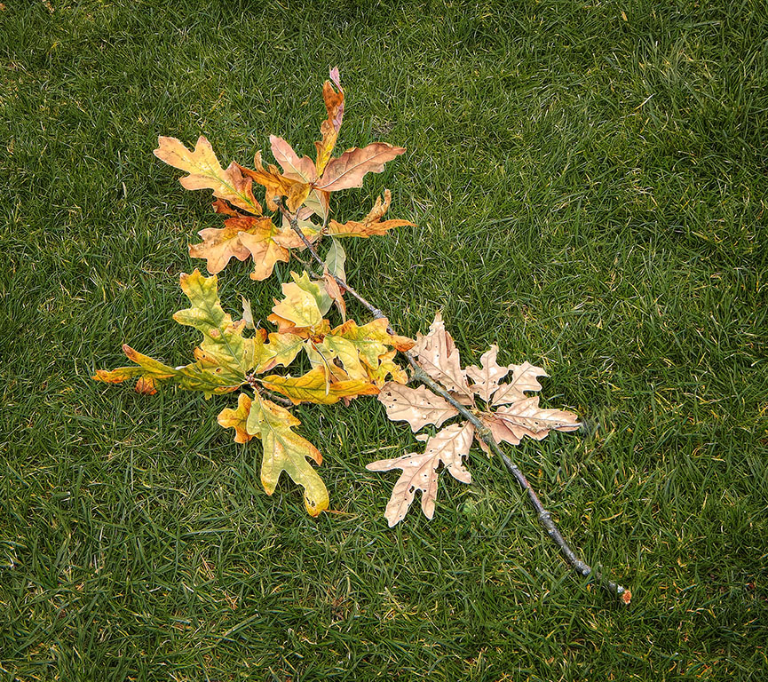
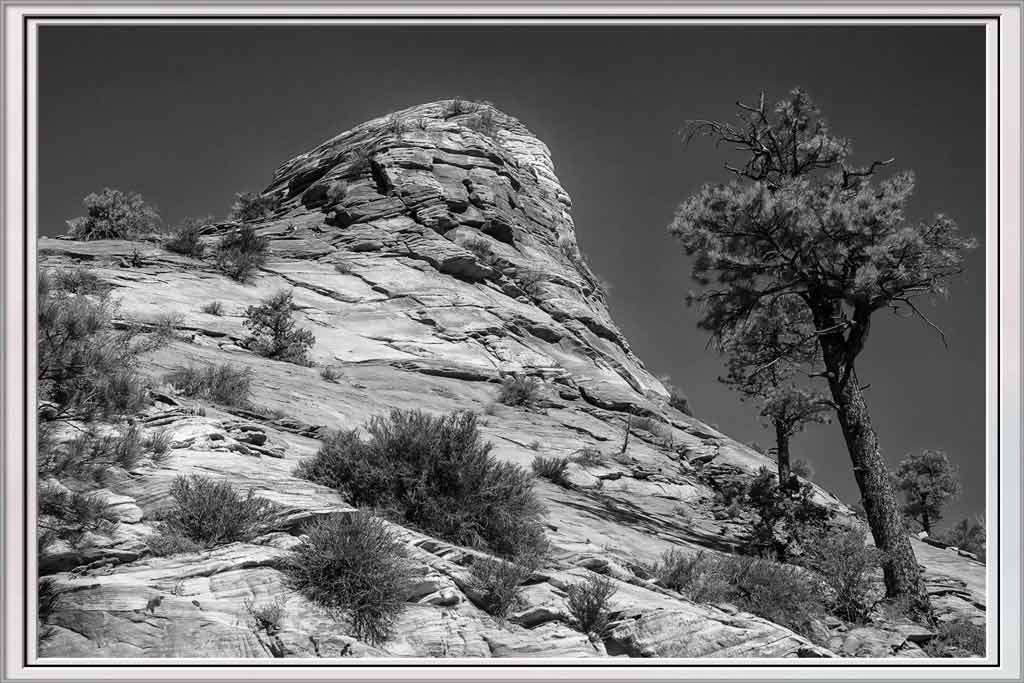
Comment |
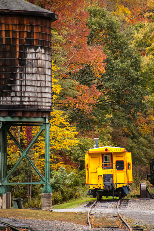
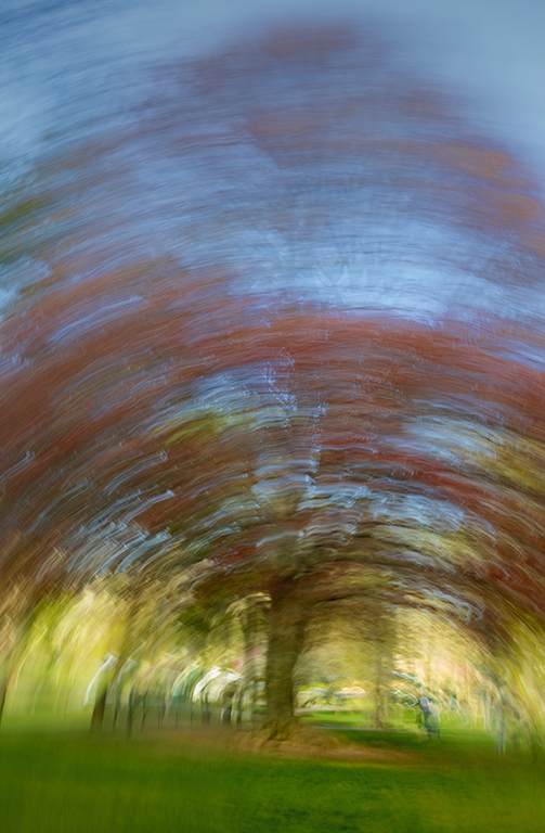
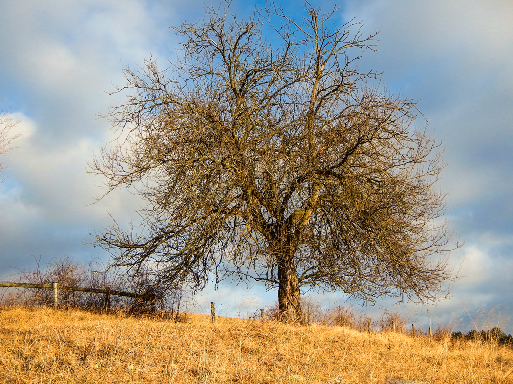
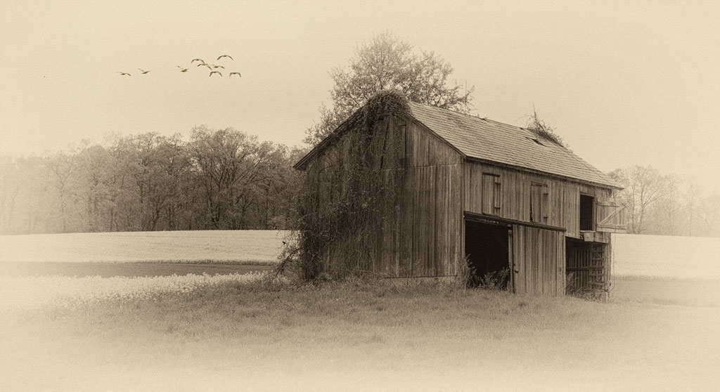
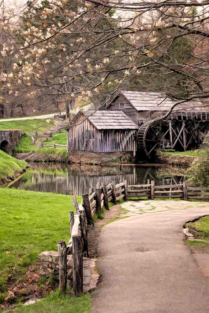
Fall pictures are so beautiful because of all the colors. But they are also common. Your use of the wide angle and low viewpoint raises this to a very high level. Positioning the white birch in front of the dark tree trunk shows how observant you are. Though the sky is interesting, the dead branches filling in the empty space is perfect. |
Oct 5th |
| 77 |
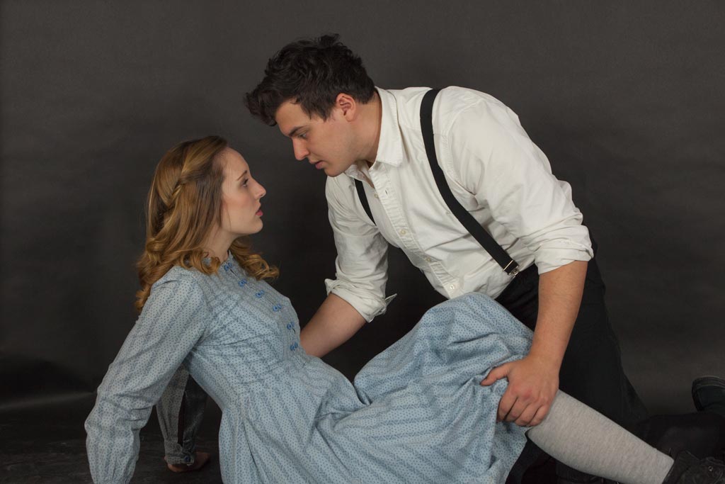
Oct 20 |
Comment |
The black and white is much better than the color. The color version is just a portrait. The B&W is a mood. The dark shadows suggest the 'sinking into the shadows' rather than lying on a bed of books. She might have a more contemplative look if she were looking slightly to the viewer's left. But those eyes looking straight into the camera are very compelling. Perhaps she is saying, "Follow me if you dare." |
Oct 5th |
| 77 |
Oct 20 |
Comment |
This is beautiful. You should print it on canvas and call it a Monet (or Manet? I mix them up.) Another way to work on just one color in Topaz Studio is to use HSL Color Tuning. You can change saturation, dark/lightness, or tone of any of 8 different colors. Lest anyone thinks that 60+ shots of one subject is overkill, it is not. Especially with a moving object there will be subtle differences in each of them. As to recording what tool you use in Topaz, I keep a note pad handy and write each step down. Then in PS rename the layer with that information. That's tedious, but helpful for a group that learns from each other. |
Oct 5th |
6 comments - 0 replies for Group 77
|
12 comments - 3 replies Total
|