|
| Group |
Round |
C/R |
Comment |
Date |
Image |
| 12 |
Jul 20 |
Reply |
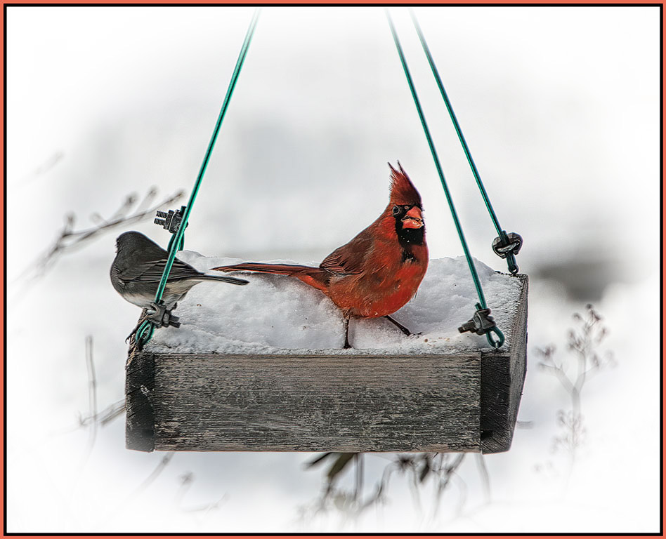
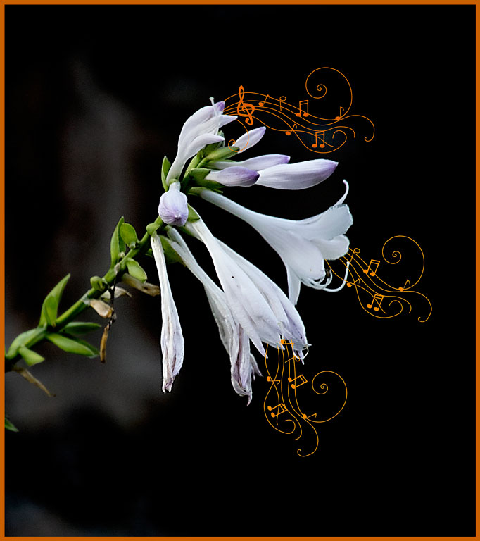
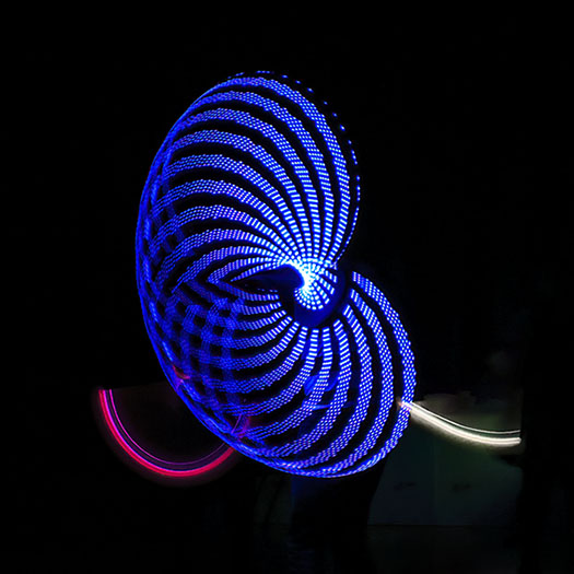
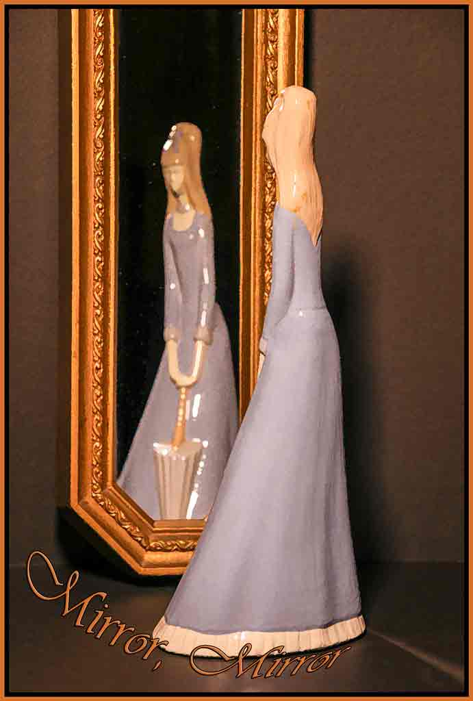
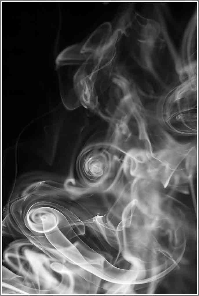
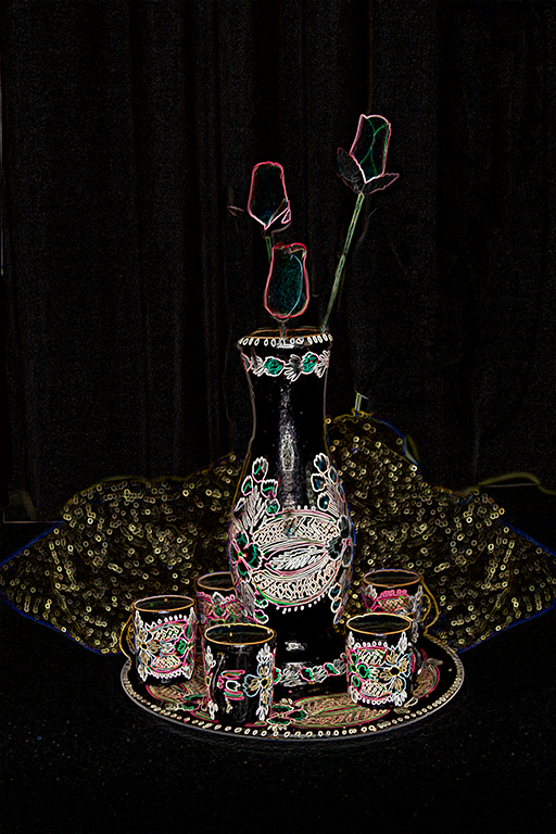
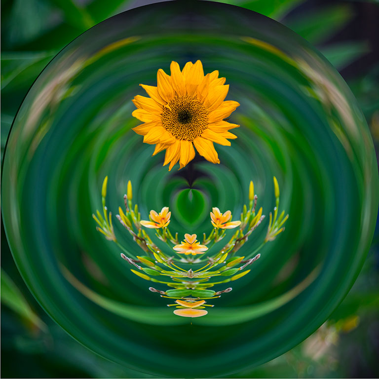
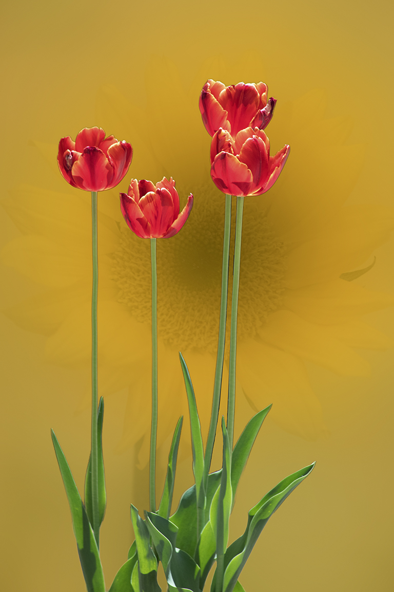
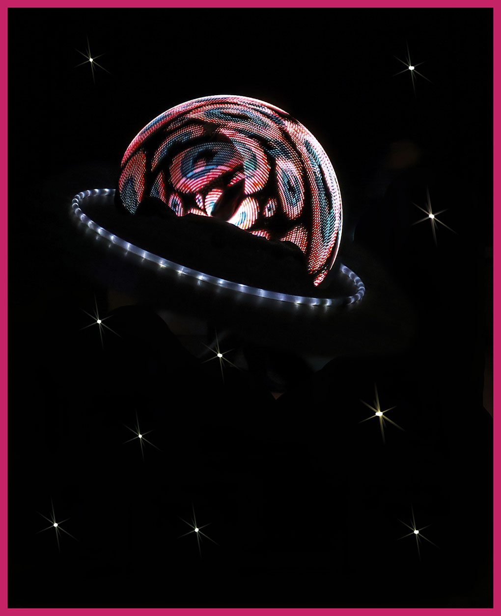
Wow, Gavin. You have a good memory. This was the same group that demonstrated the fire spinning for us at a previous photo shoot. They are very talented and fascinating to watch. Here is a picture I made from pieces of other images that night. (I added a stroke, Barbara, but it's a little too wide.) |
Jul 23rd |
 |
| 12 |
Jul 20 |
Reply |
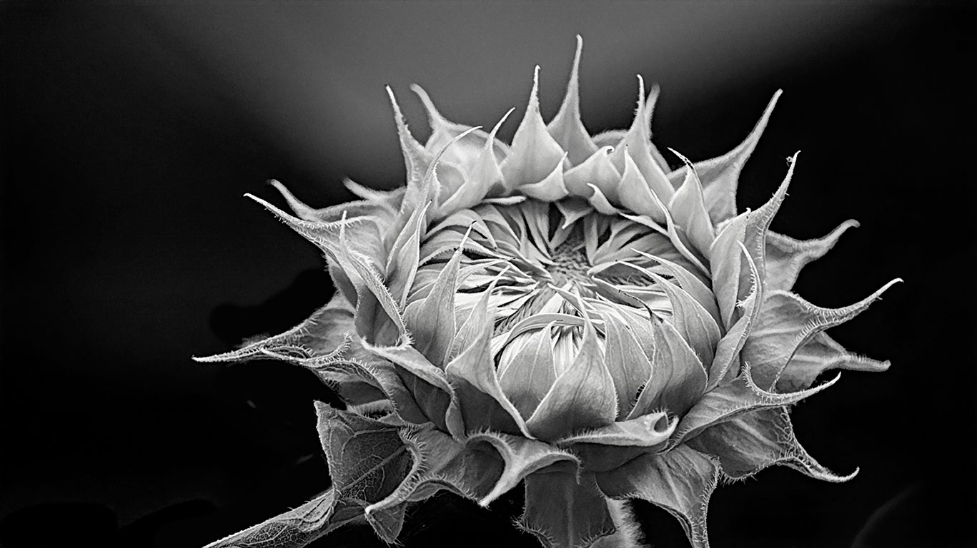
I was late submitting this image and just grabbed it. You're right; there should be a stroke to separate it from our black background. Thanks. |
Jul 23rd |
| 12 |
Jul 20 |
Comment |
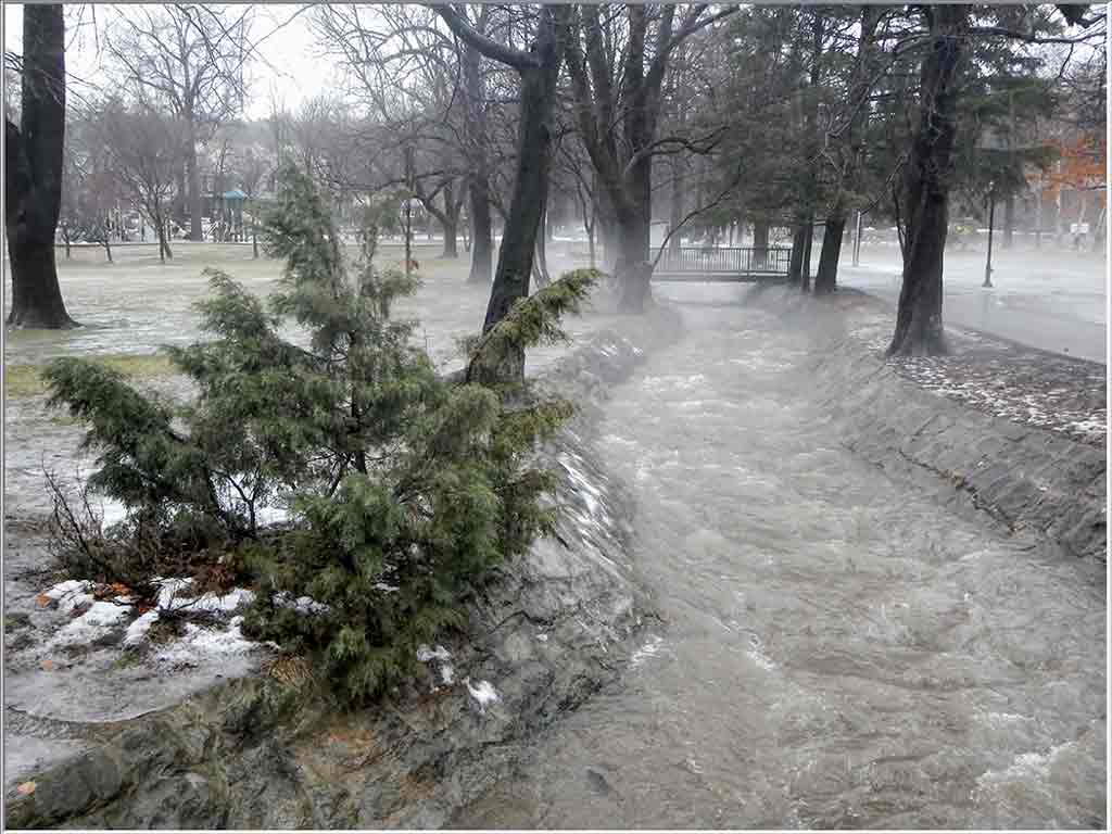
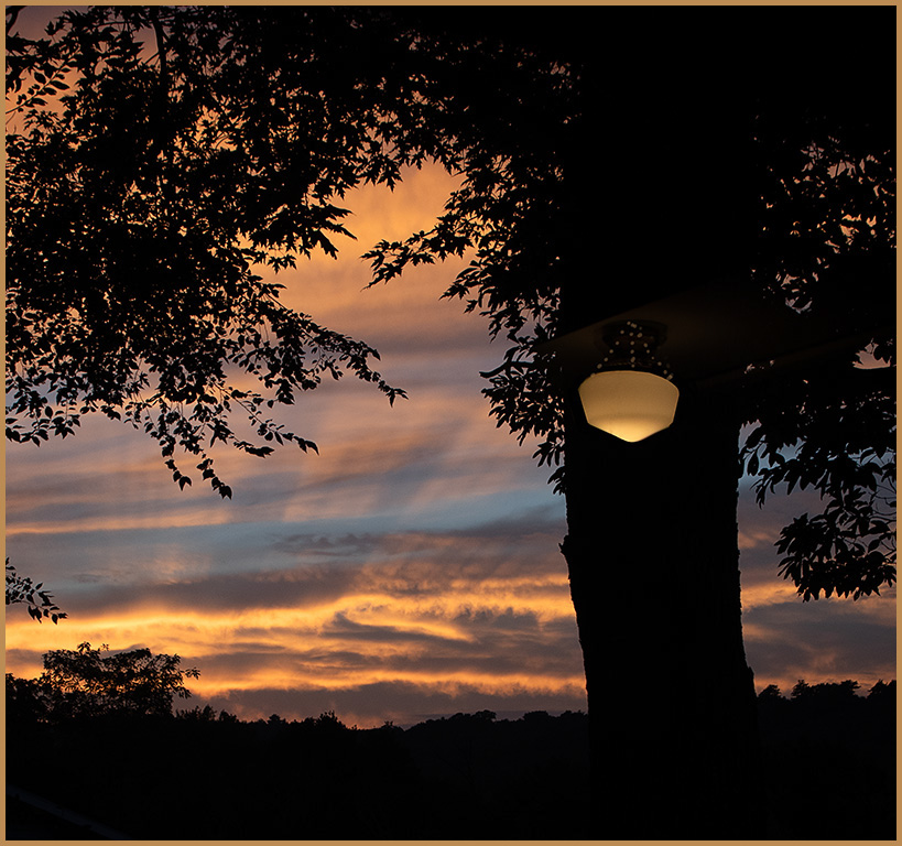
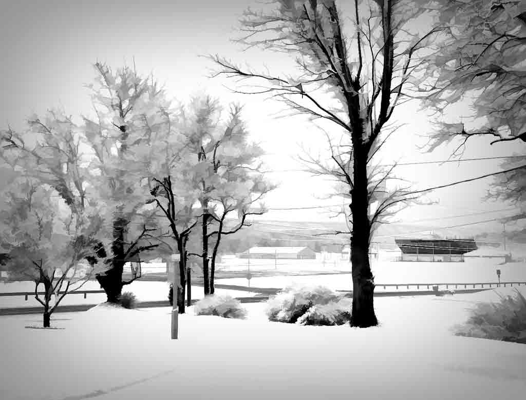
The camera was on a tripod and set to automatic. Light level varied from minute to minute. All shots were jpgs, because I really didn't expect to get anything useful. This same group did a demonstration for us using fire. This was outside and after dark. |
Jul 12th |
| 12 |
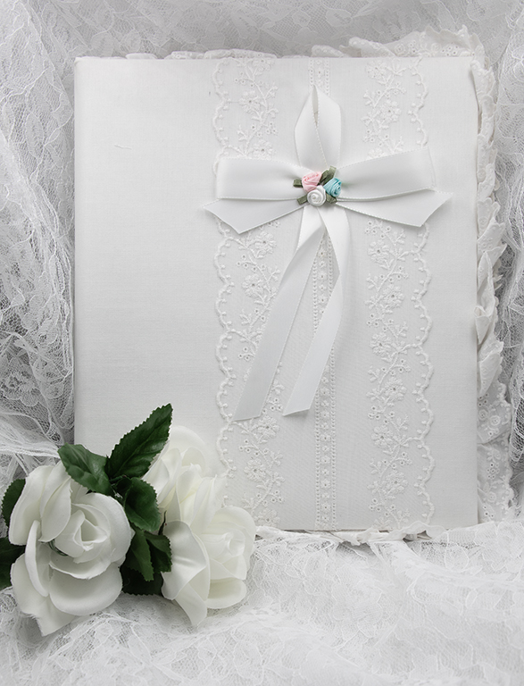
Jul 20 |
Comment |
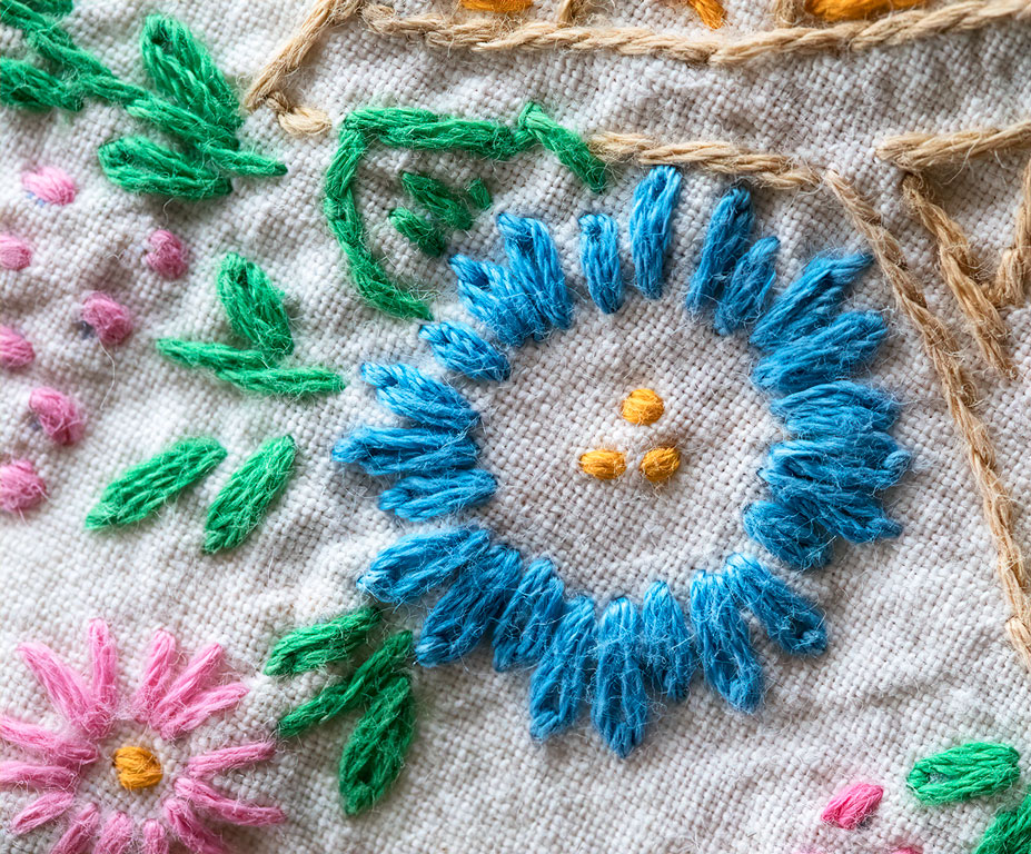
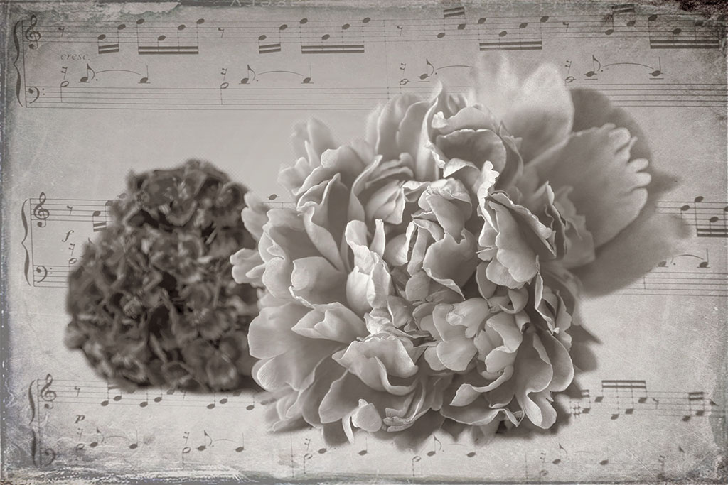
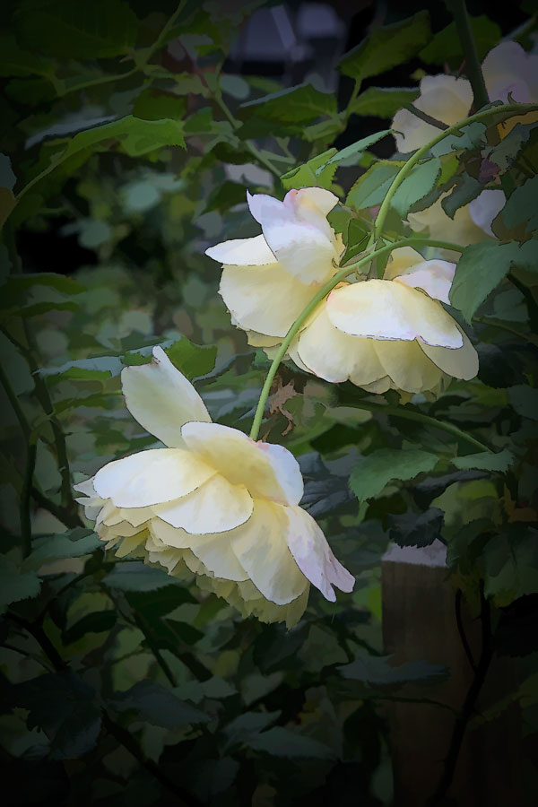
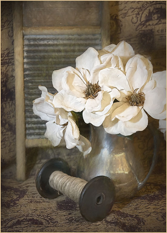
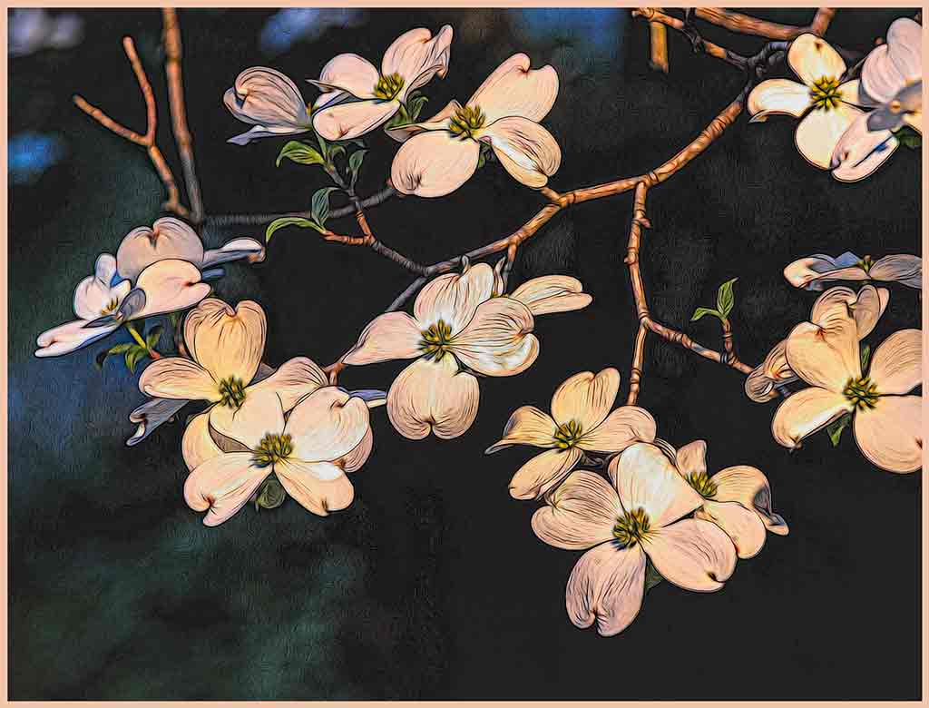
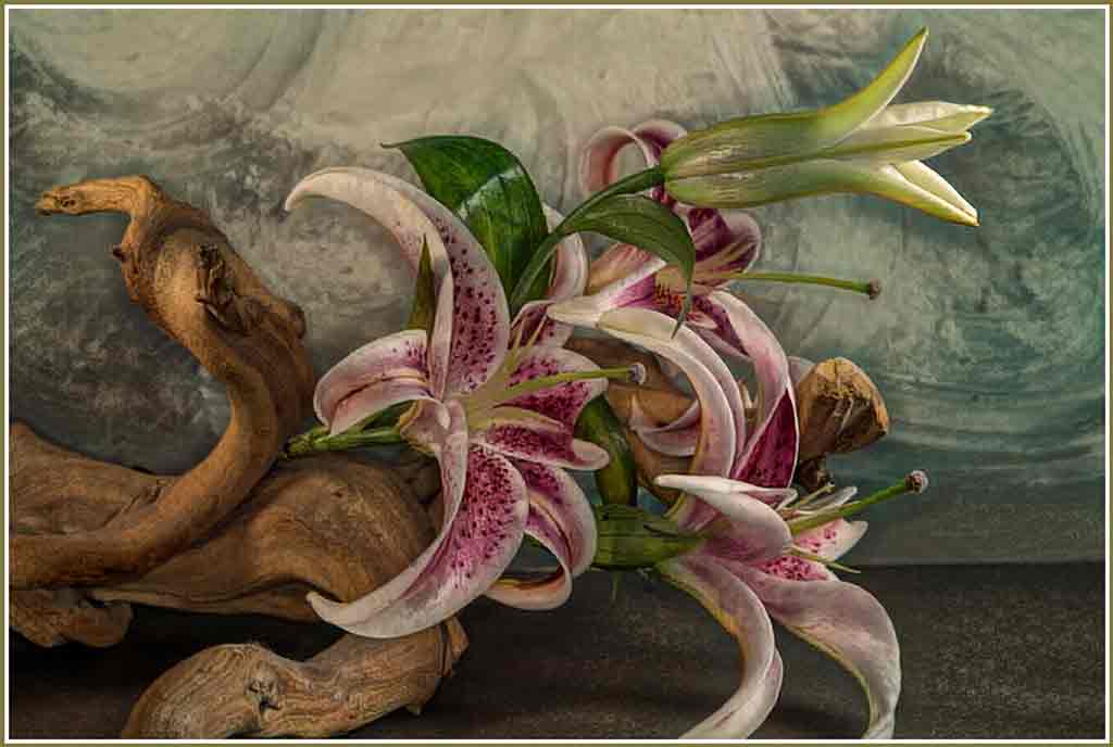
Welcome back, Kerstin. The elements of your still life work very well together. The petals on the book help to blend book and vase together. The blurred vignette gives the whole image a nice vintage look. The white blossoms look like strawberries; are they? I enjoy doing still life, but have trouble making pleasing arrangements. You did very well. |
Jul 12th |
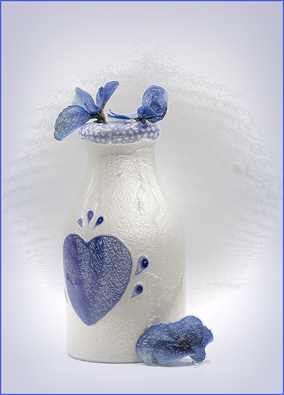
| 12 |
Jul 20 |
Comment |
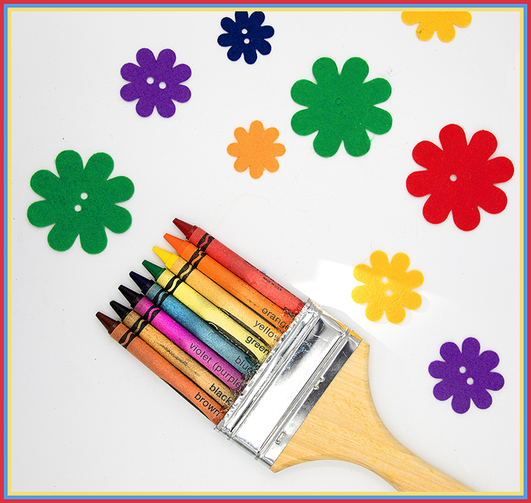
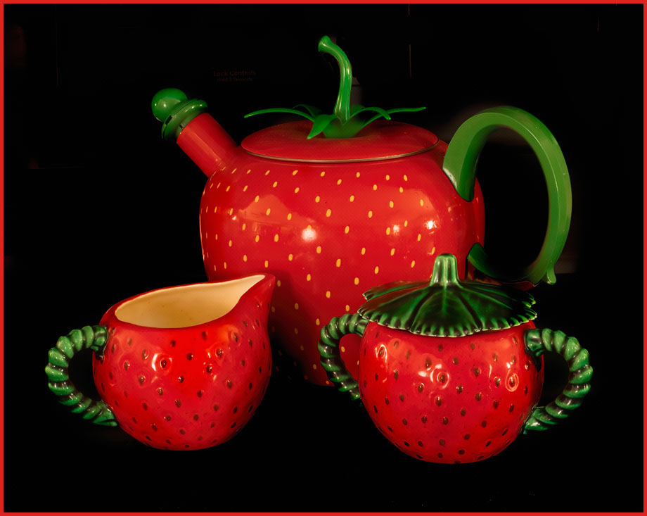
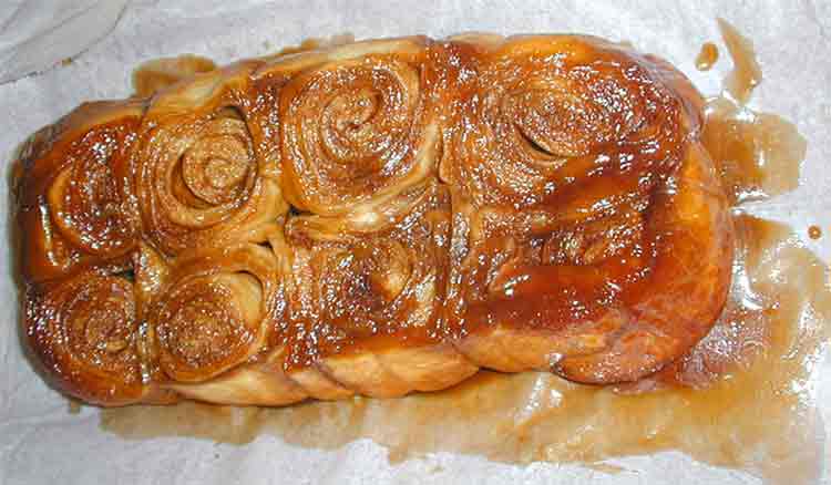
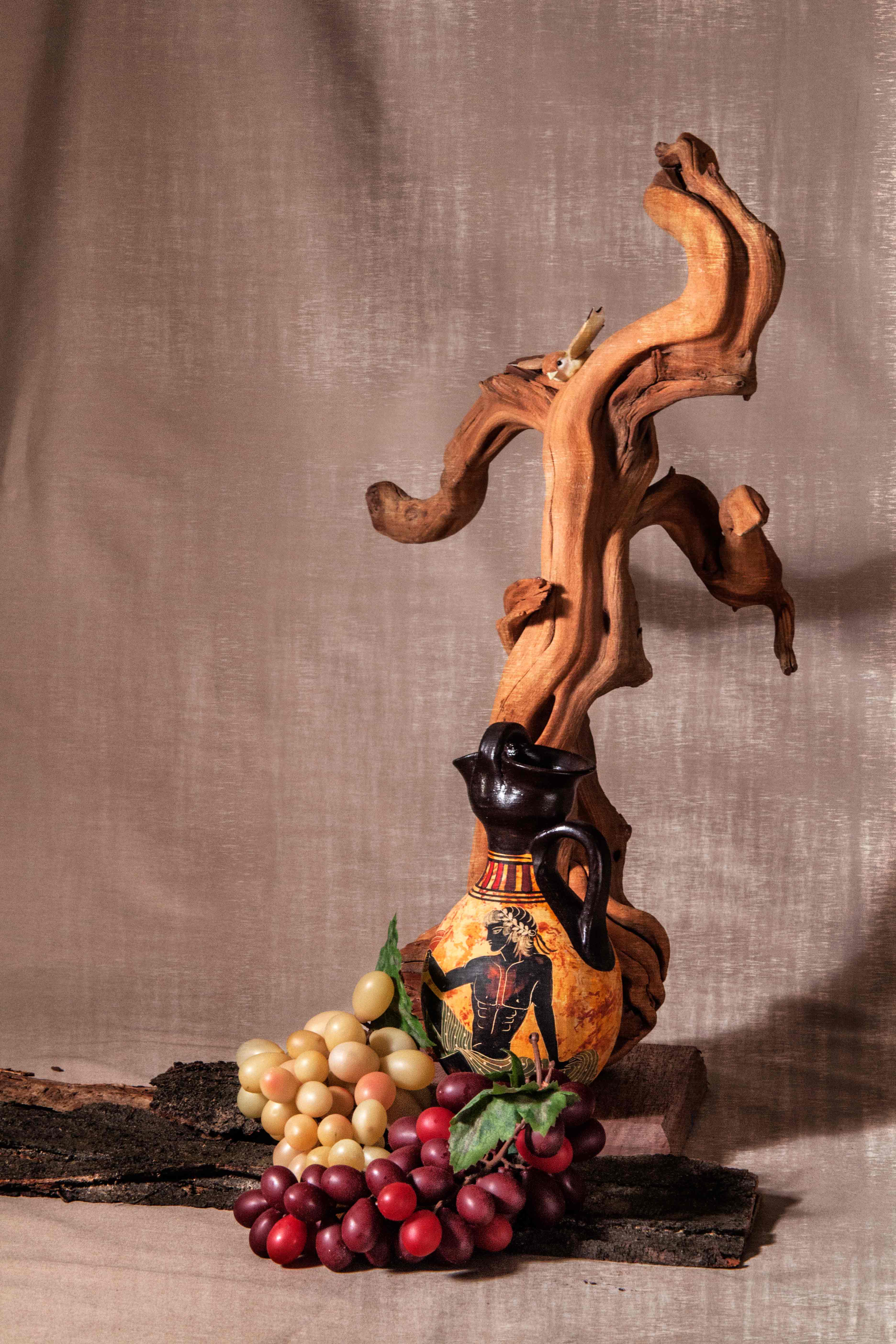
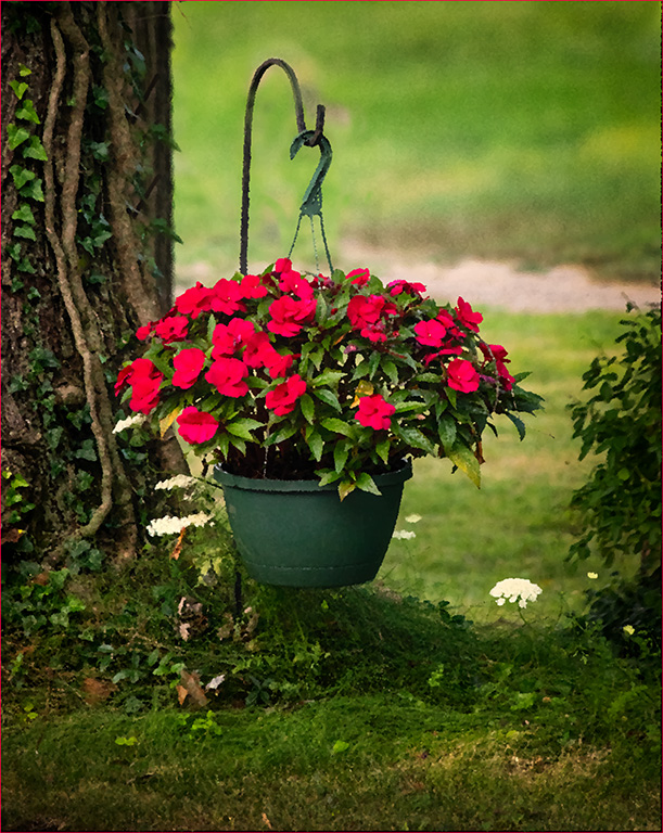
Very well done. Often we don't have an opportunity to find new subjects to fit the topic of the month. You got very creative with this one. Congratulations. This makes my mouth water! |
Jul 12th |
| 12 |
Jul 20 |
Comment |
This is lovely. I can see it hanging on the wall of a beach house. When cell phones take such good pictures do you ever wonder why we carry around 10 pounds of camera and lens? But this is more than just a lucky find. If you had moved left or right, the arrangement of the chairs would not be pointed in the right direction. The human presence provided by the towels and tote bag help the viewer make a connection to the image. |
Jul 12th |
| 12 |
Jul 20 |
Comment |
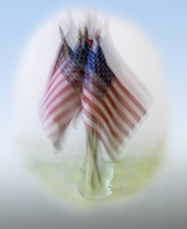
The line of flags almost parallels the line of lamp posts; very nice. The fog helps to emphasize the flags. To me, tour technique of the colored flags on the B&W background was a good way to present this image. I really would like to see the curve of the uppermost lamp post and the bottom of the lowest flag. I assumed that your crop was done to eliminate the dark squares (signs?) just to the left of the tip of the lowest flag. I like the desaturated yellows in Carole's version. |
Jul 12th |
| 12 |
Jul 20 |
Comment |
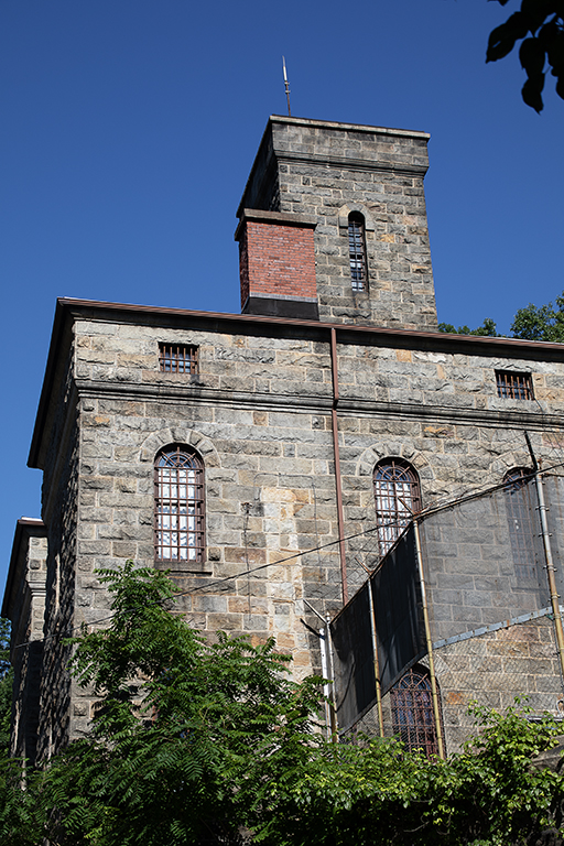
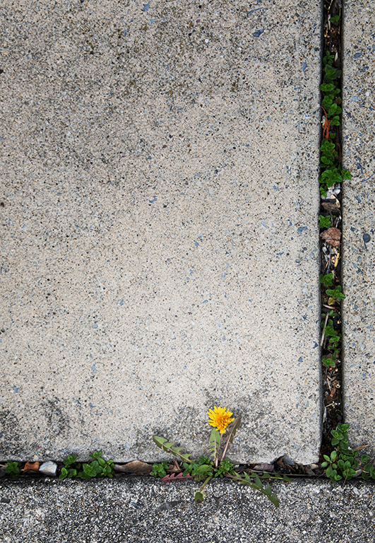
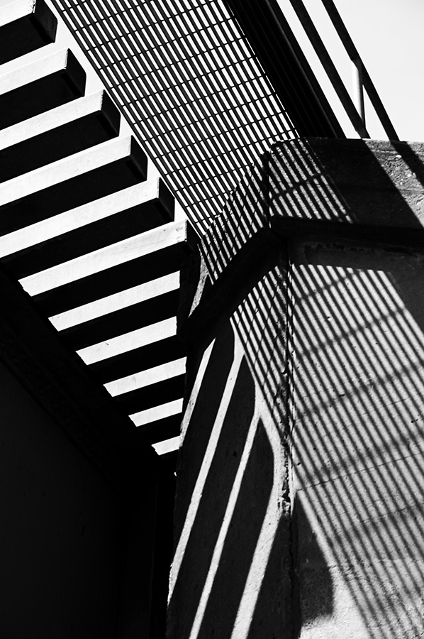
These geometrical patterns are very effective because of their simplicity. Striking colors, excellent exposure, clear focus throughout. You may consider it a record shot, but I can see it as the background for an inspirational poster, or for the words to patriotic anthems during a sing-a-long. Kudos for not cloning out the natural blemishes in the concrete blocks. Well done. |
Jul 12th |
6 comments - 2 replies for Group 12
|
| 67 |
Jul 20 |
Comment |
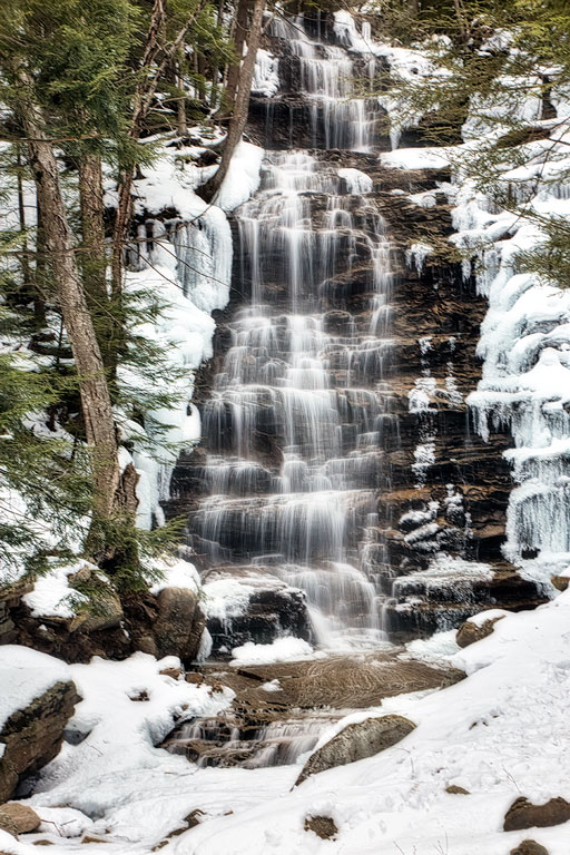
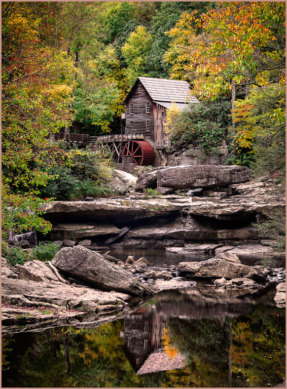
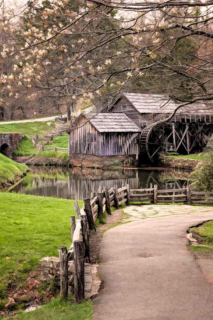
Hi Larry. We attended a workshop in the Smokies and learned about photographing waterfalls. I kept trying to take pictures of the water - and of course the pictures looked like white blobs. At the workshop we learned to include objects around the waterfall to add scale, interest, and to set the scene. This is perfect. |
Jul 5th |
1 comment - 0 replies for Group 67
|
| 77 |
Jul 20 |
Reply |
I like this one better also. In the color shot, the blue of the legs is incongruous. In the B&W they fit better with the surroundings and create curiosity in the viewer. |
Jul 23rd |
| 77 |
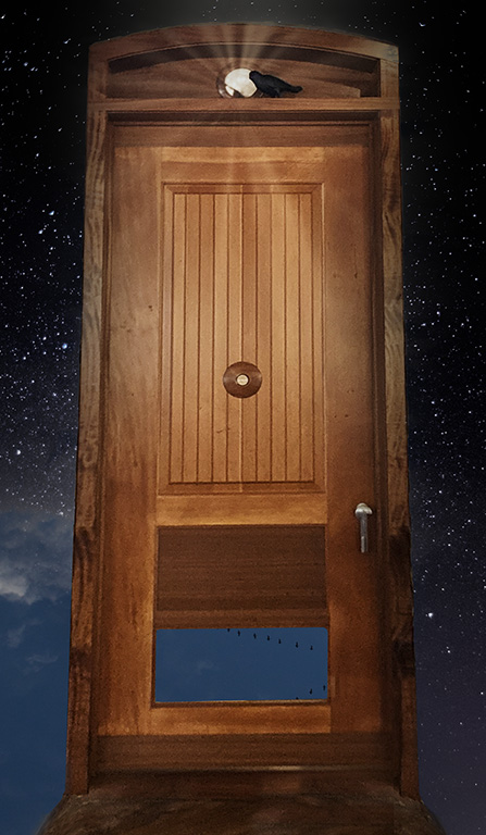
Jul 20 |
Reply |
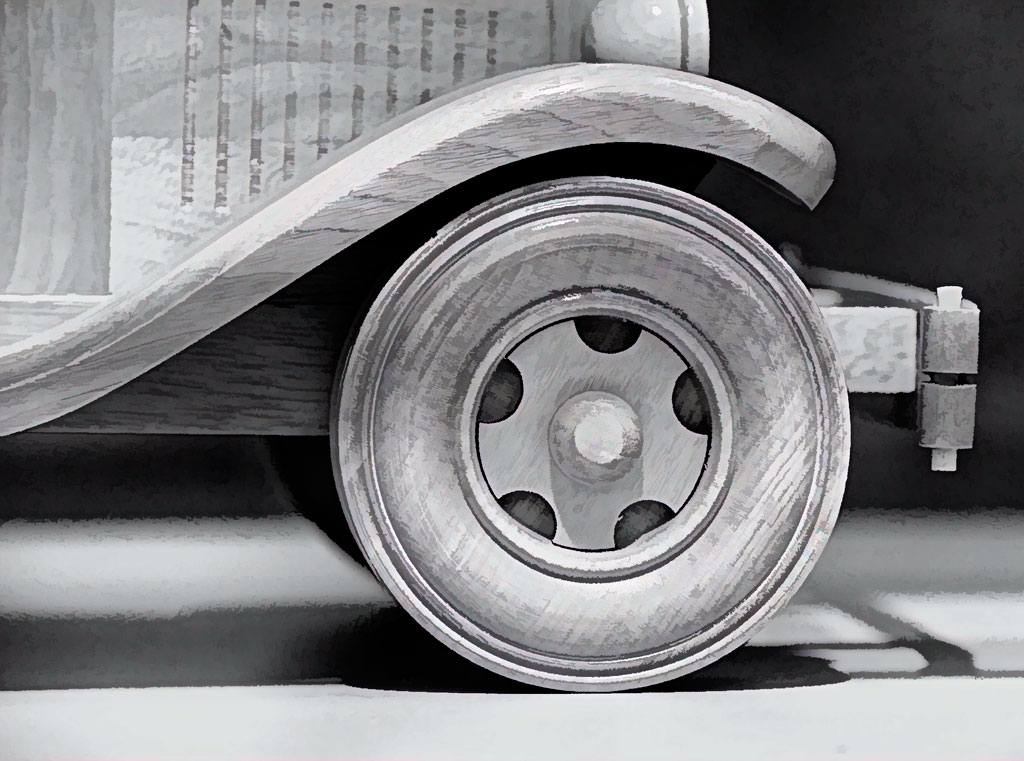
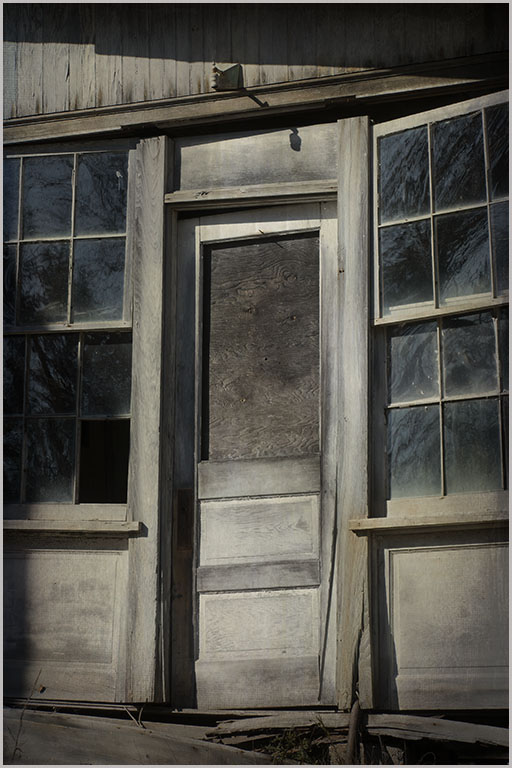
Why don't I notice things like the bright bricks, the hinge on the door, and the bits of ceiling beams at the top corners? Do we become so involved with our images that we can't see the trees for the forest? Do we look at these images so long while processing that we overlook details? Thank you for your comments and helping me to be more alert. |
Jul 23rd |
| 77 |
Jul 20 |
Reply |
Oooops. Missed that black mark on upper right. However, the flowers were not adjusted in the remake, but I agree that they should be brighter. Thanks. |
Jul 23rd |
| 77 |
Jul 20 |
Comment |
To all of you, thank you for your comments. The original is around somewhere, probably on a nameless CD. Meanwhile, check out the revision. Dodged the right hand brightness and cropped slightly from left. Should have cropped from the top also, sorry. To get rid of the unknown object on the door (at right) I made a generous selction around the door, feathered by about 50 pixels. After Copy, Paste, I used Edit>Distort to stretch the selection enough to get rid of the blob. |
Jul 5th |
 |
| 77 |
Jul 20 |
Reply |
Oooh. Nice. I'm currently in B&W Study Group 30. Mybe I could use this. Thanks, Steven. |
Jul 5th |
| 77 |
Jul 20 |
Comment |
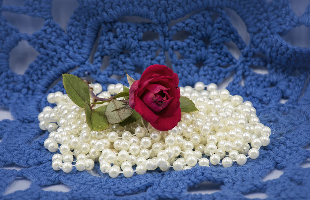
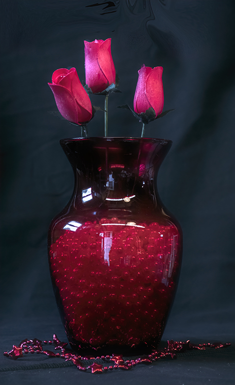
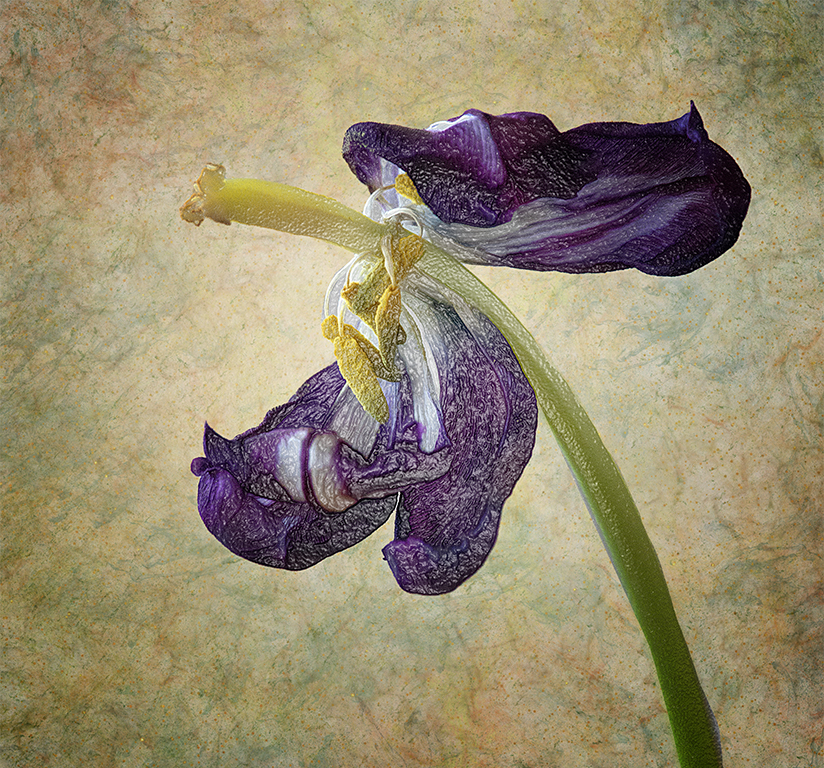
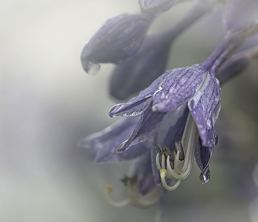
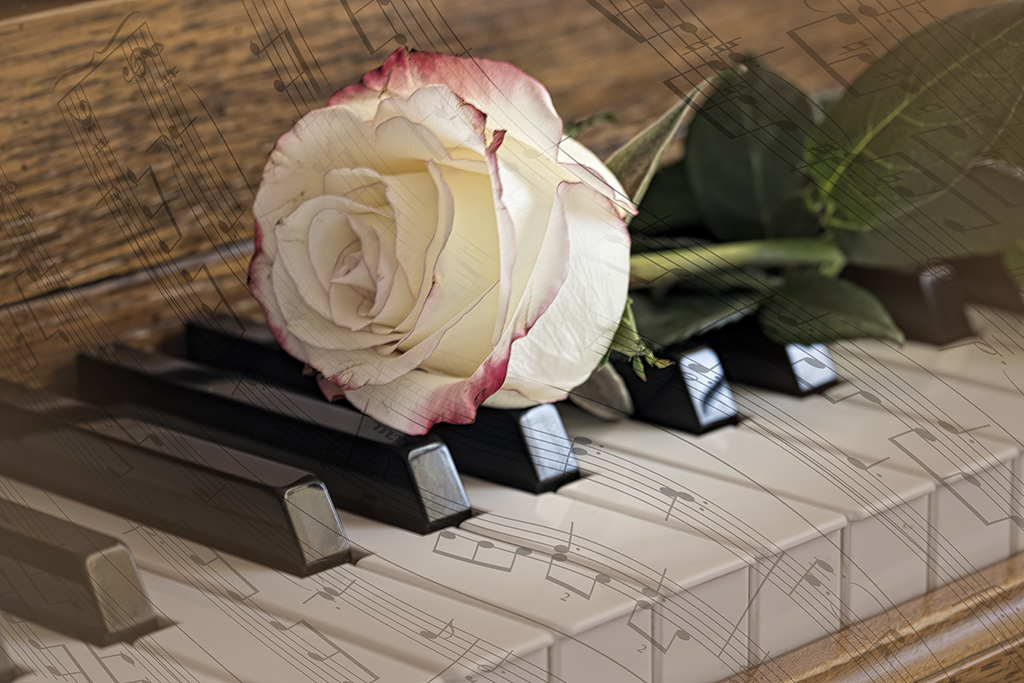
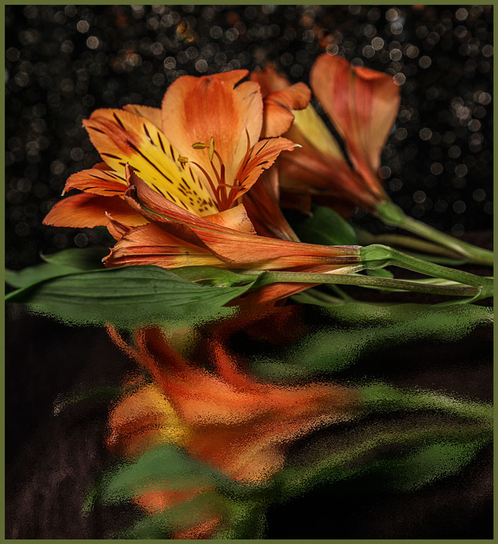
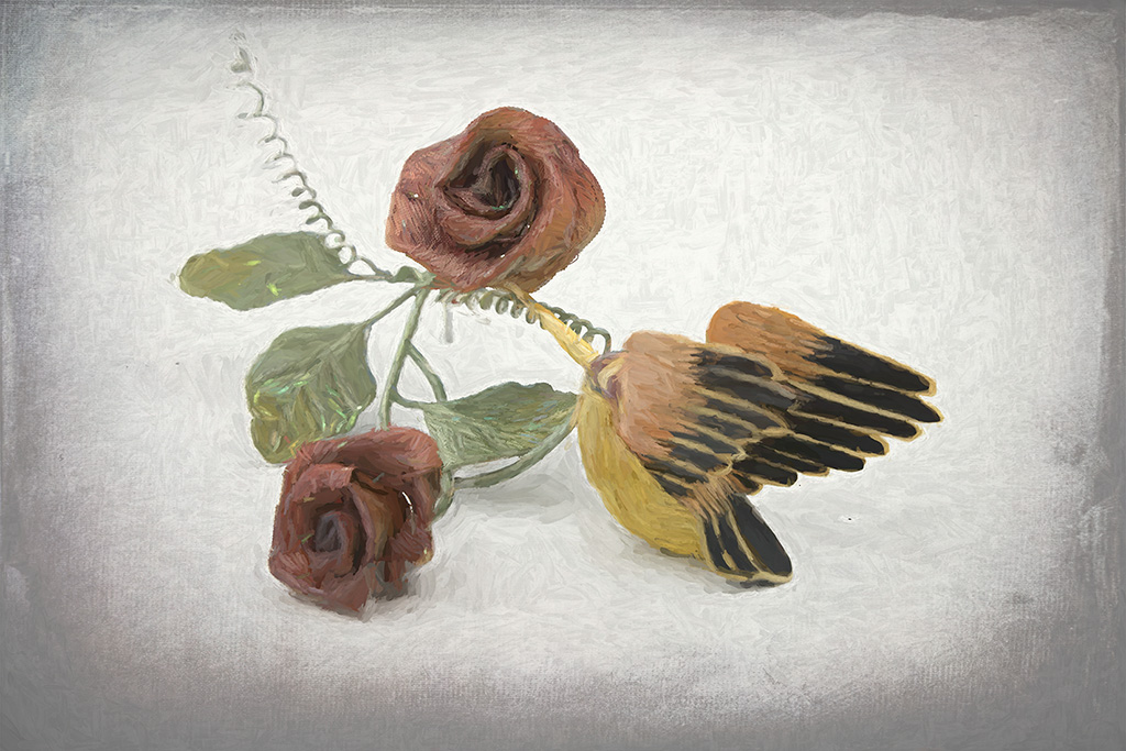
When the viewer looks at this image he will not see background, placement, even a rose. He will see perfection. You have done everything right. In portraiture (and this is indeed a portrait of that rose), the key indicator of the skill of the photographer is the lighting. Your lighting is perfectly controlled. In all the suggestions, I like the addition of the stem; the textures neither add nor detract; and Witta's composition with the rose in the lower left is lovely. Another way to put a tiny border is in Photo Shop. Simply increase the canvas size proportionately and fill with the desired color. Image size>canvas size>check the 'relative' box, choose measurement (inches, pixels, etc.) I use 0.125 inches both horizontally and vertically and pick a color from the image. |
Jul 5th |
| 77 |
Jul 20 |
Comment |
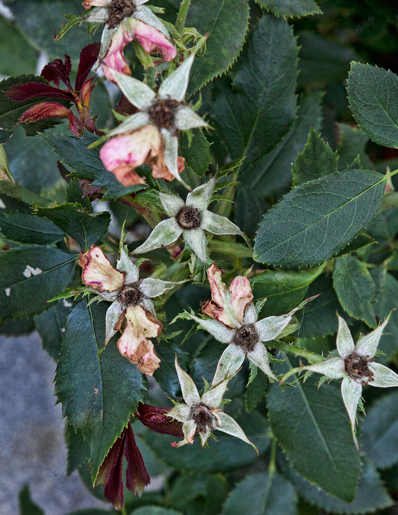
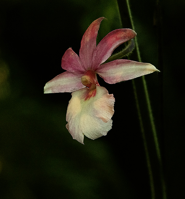
The circular composition is well done. No matter whwere the viewer's eye enters the image, it travels from roses to artichoke, to radishes. (Watermelon radishes?) Duh! I didn't notice the bottle either until reading Larry's comments. The white background looks a little greenish. Maybe you wanted it that way for the color scheme. But a gentle vignette would help keep the edges contained. |
Jul 5th |
| 77 |
Jul 20 |
Comment |
This scene is so outre that it is well worth exploring. While it's not a style that is comfortable for me, you have done well. But I agree with the direction of the legs. If you do get out there again, walk around and get the legs pointing in different directions. Maybe add some props like a horse shoe or cowboy hat. |
Jul 5th |
| 77 |
Jul 20 |
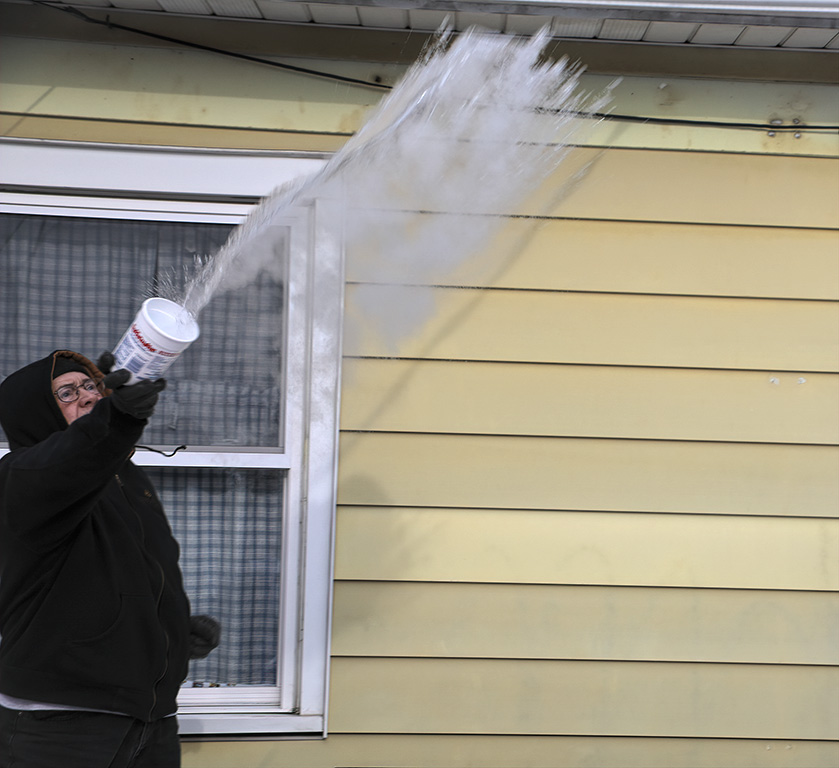
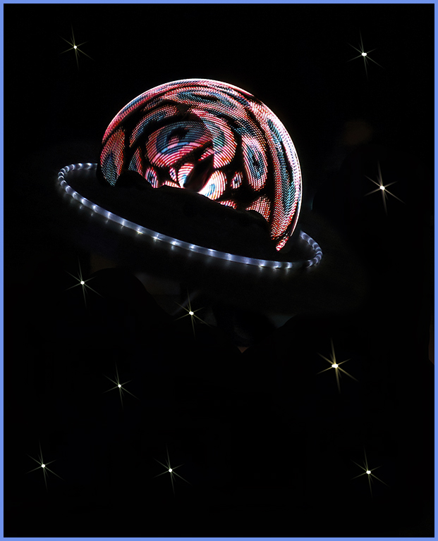
Comment |
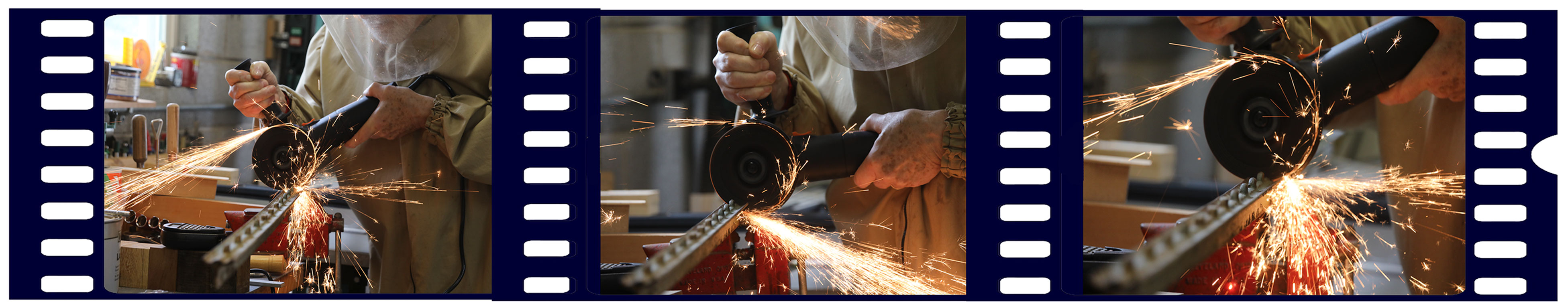
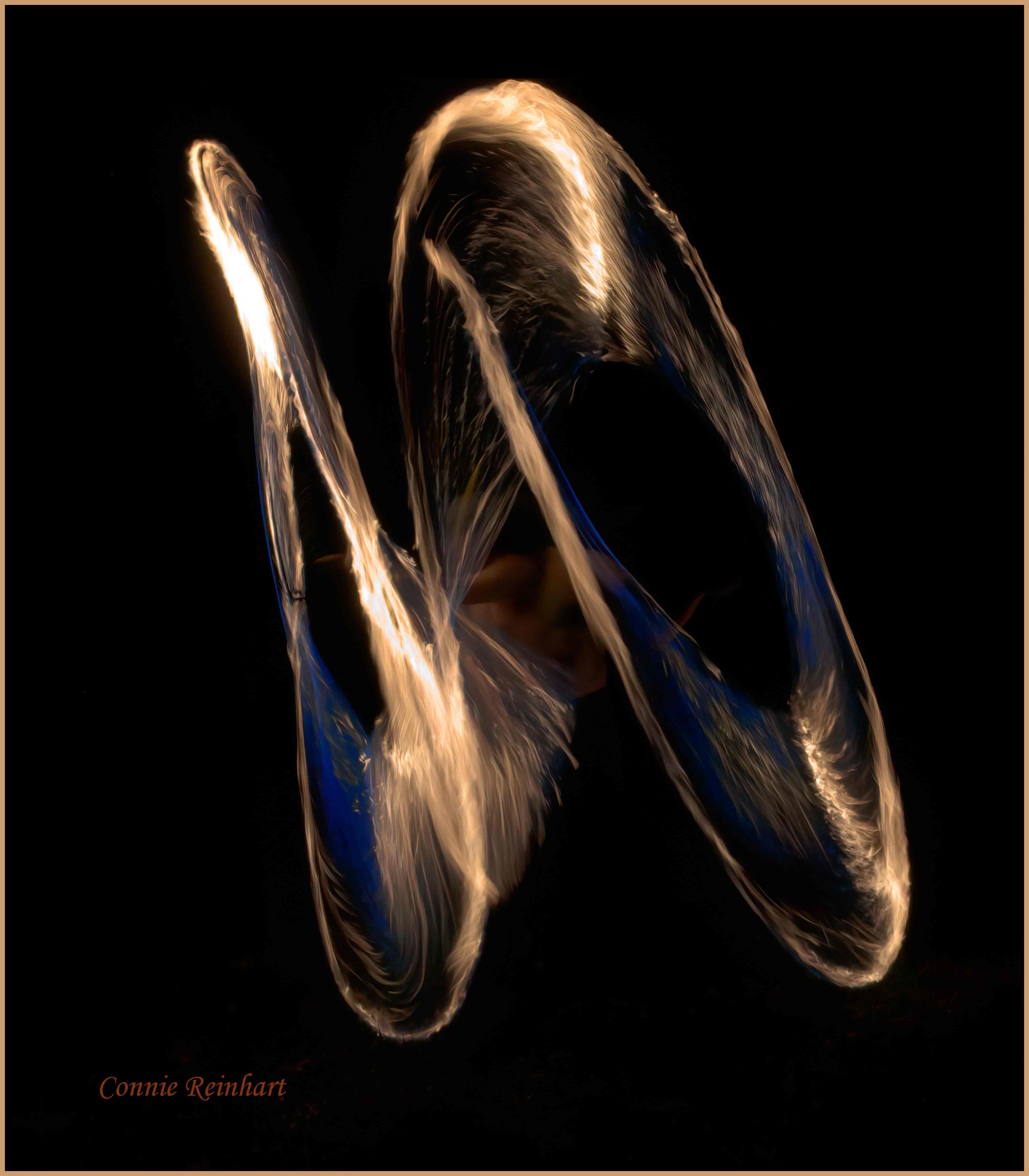
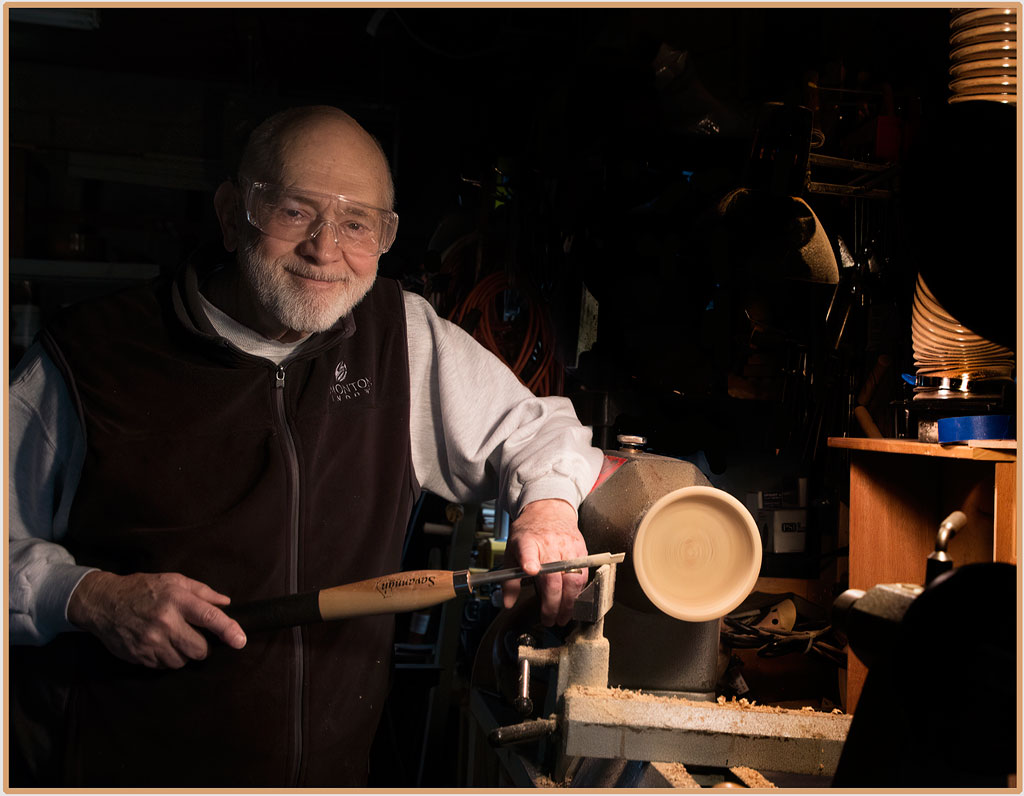
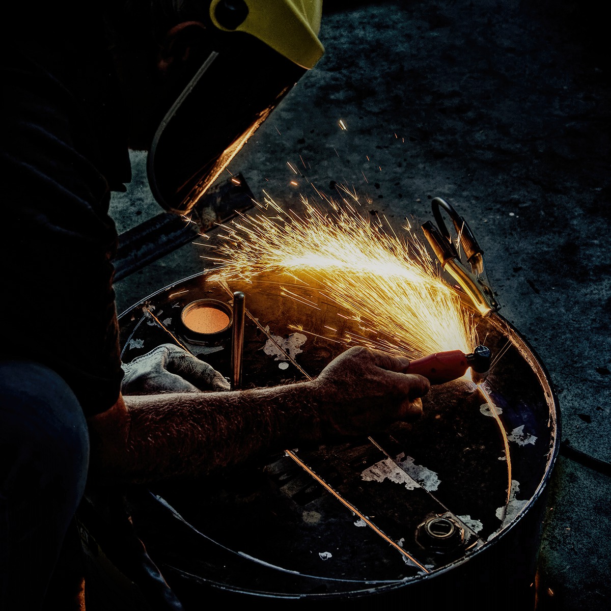
The center of the sparks is indeed white hot; detail in that area is impossible. A little fill light on the right arm would help the viewer see more clearly what is happening. If I may add one more version - Topaz studio Precision Contrast with micro at about 40, small about 30, medium about 10, and maximum at -30. Then used basic adjustment to set black and white points, masked for just the sparks. These kinds of images are very difficult to expose, and no two are ever alike. Kudos on staying productively busy by making your new home truly your own. We need to see a picture of the finished product! |
Jul 5th |
 |
| 77 |
Jul 20 |
Comment |
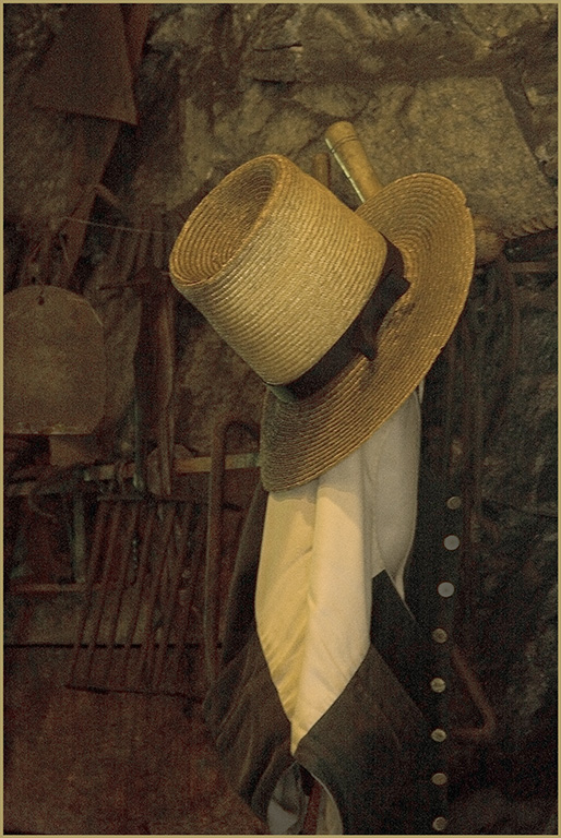
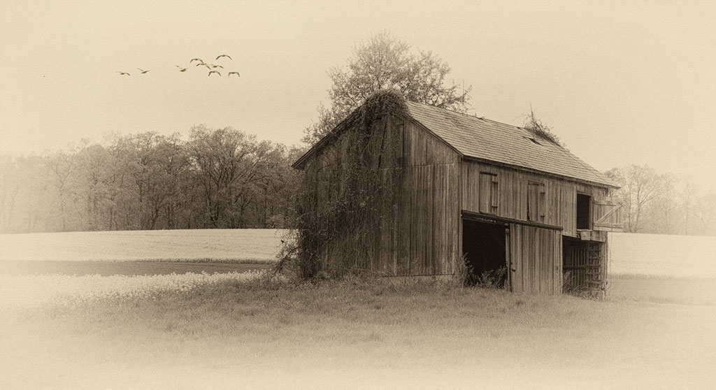
Ah, the eye of the beholder. To my husband and I, the house doesn't look abandoned. The siding, roof, and windows are in decent shape. Rather it looks like it is waiting patiently for the right family; one who's children will play in the field of daisies, read in the cool shade of the trees, plant flowers under the front windows. B&W makes this more than just a capture, it sets the mood. Your final version is so much better than the original (even though I think the original is quite good). I tried to put a glow on just the house to give it a ghostly effect, but it really didn't improve anything. Very nice. |
Jul 5th |
| 77 |
Jul 20 |
Comment |
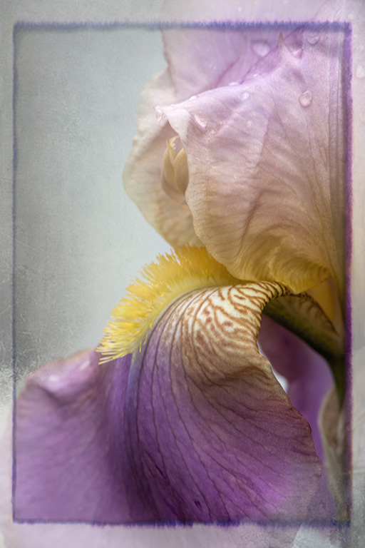
What a lovely gift. Your friend must feel very special. You certainly know what is in your photographic toolbox, and you know exactly how to use those tools. This image is exquisite and deserves a place of honor on your friend's wall. All of us should learn to create our own textures. Many competition rules do not allow the use of textures created by someone else. Even Hazel Meredith cautions that purchased textures are fine for exhibits, gifts, etc., but not for competitions. |
Jul 5th |
7 comments - 4 replies for Group 77
|
14 comments - 6 replies Total
|