|
| Group |
Round |
C/R |
Comment |
Date |
Image |
| 12 |
May 20 |
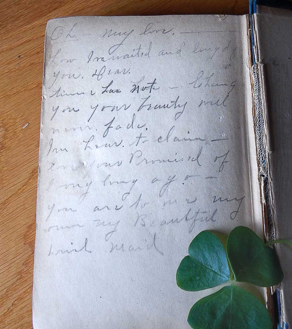
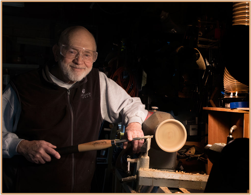
Reply |
Carole, your version looks great. Now why didn't I think of that! |
May 20th |
| 12 |
May 20 |
Comment |
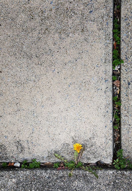
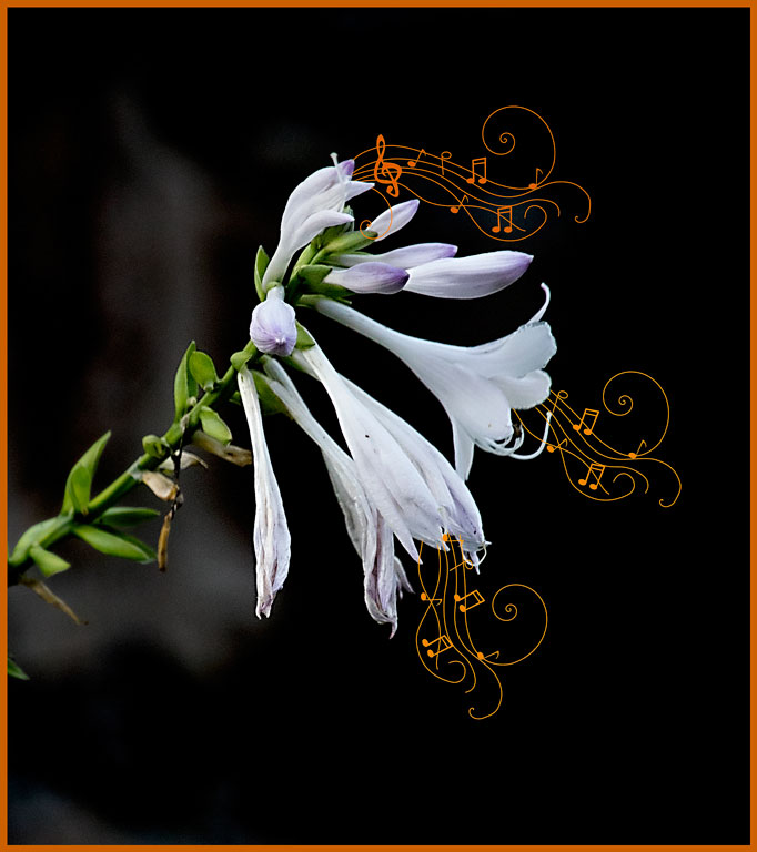
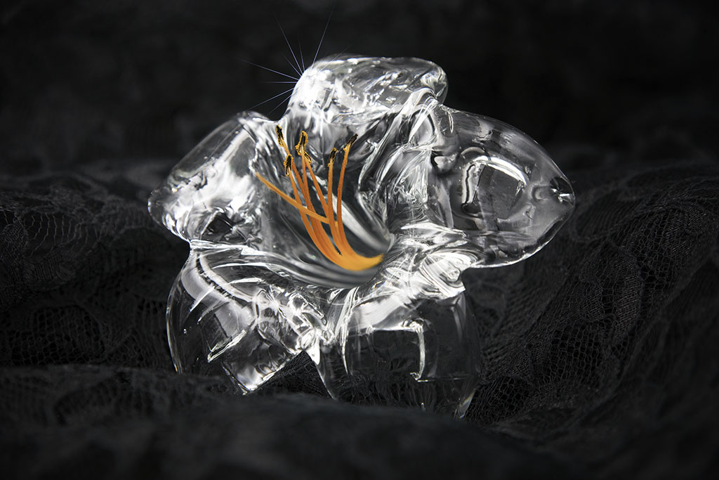
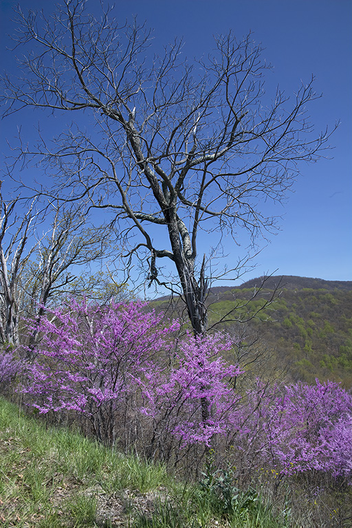
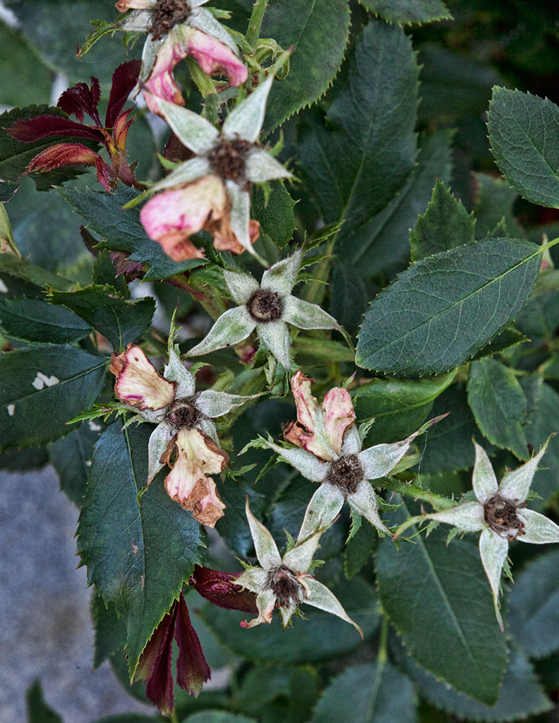
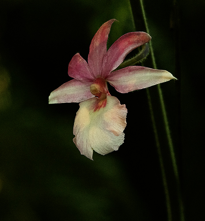
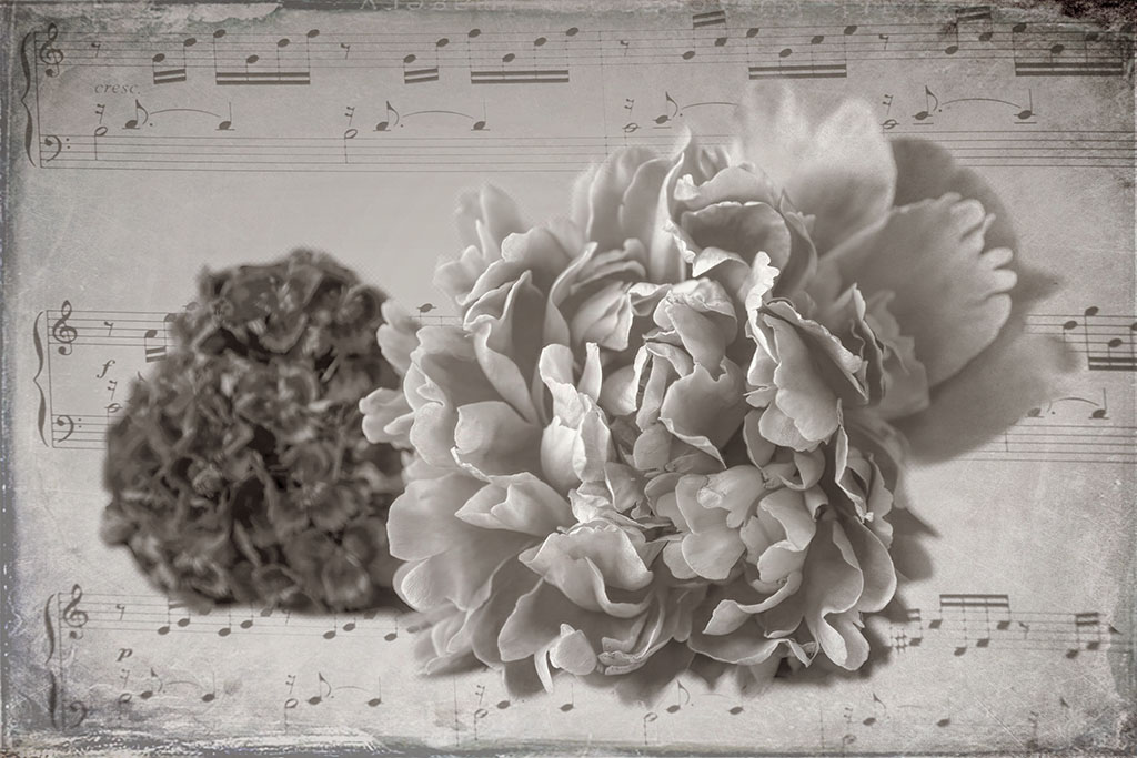
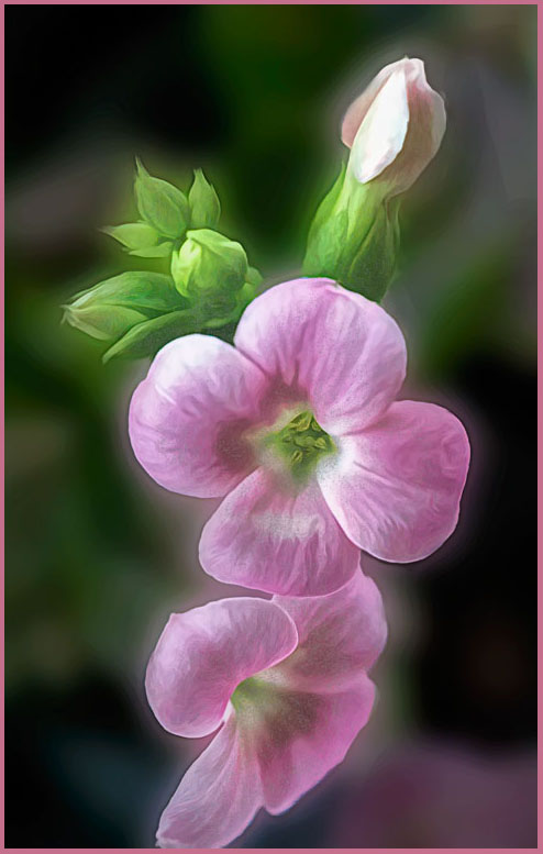
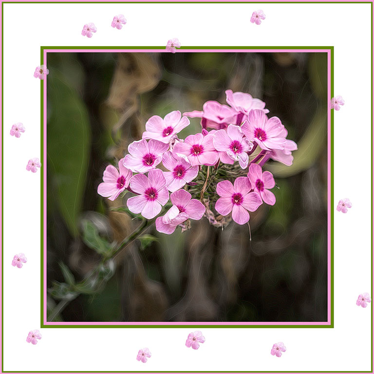
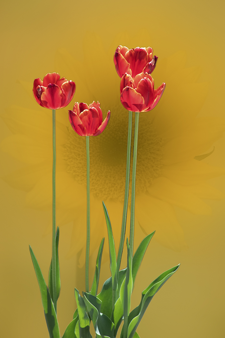
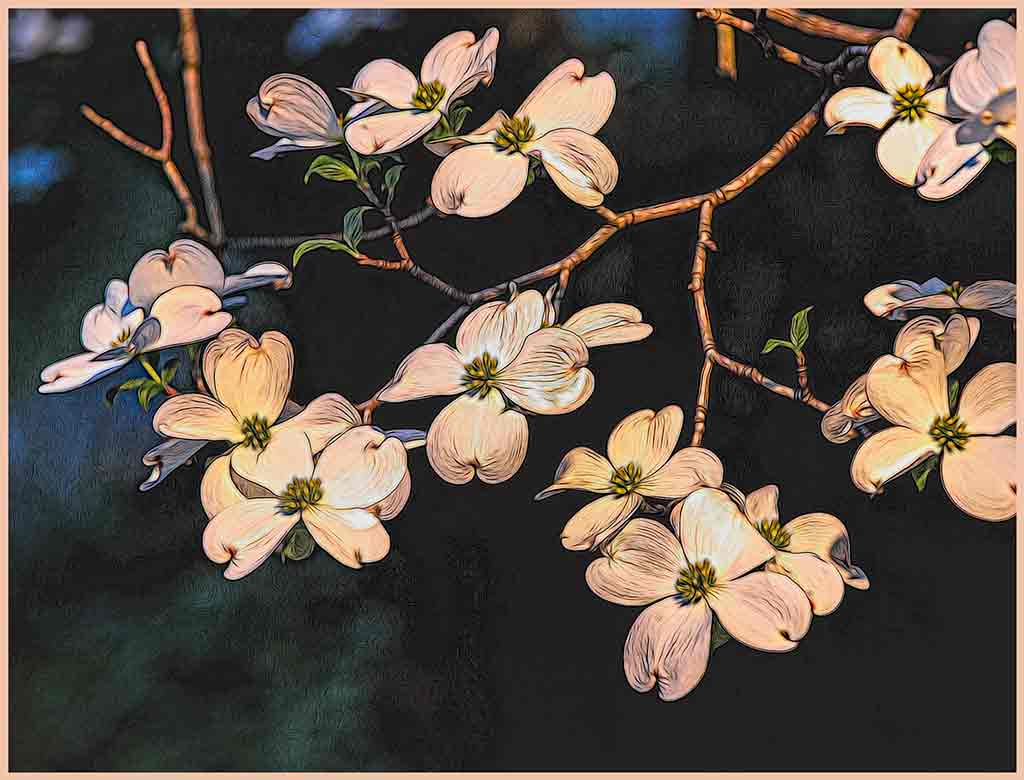
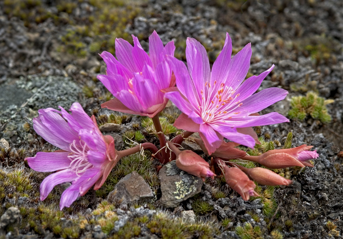
Beautiful flowers. Yes, the fan-shaped composition is the way these blossoms grow, but you took good advantage of that. The depth of field puts the background out of focus, yet still establishes the environment. It is hard to believe that these lovely flowers prefer to grow in such a hard-scrabble place. It seems to be overexposed, causing loss of detail in the stamens. I played with black point, white point, Precision contrast to fix the stamens without hurting the petals. Don'y know if it's an improvement or not. |
May 10th |
 |
| 12 |
May 20 |
Comment |
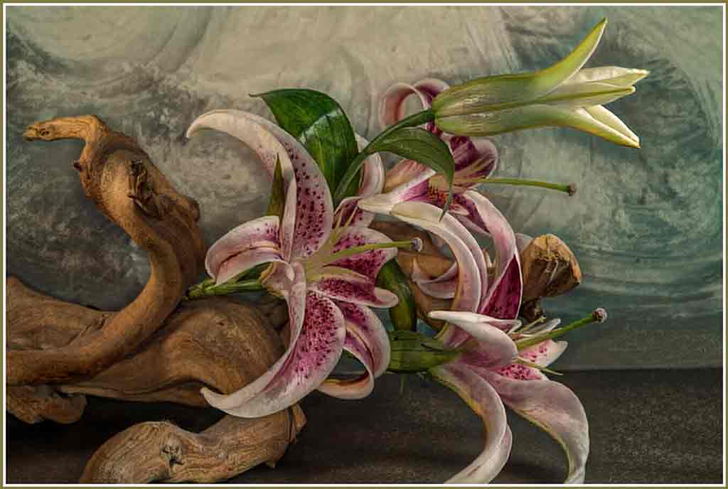
The magnolia blossoms nicely compliment the pagoda shape of the fountain. Even the colors - which would normally clash - work nicely together. I would like to see the background in even softer focus, perhaps by changing f/stop. Those dancing water droplets would make masking was too difficult. This image certainly does say "Spring". That said, the rain puddles in our driveway were ice yesterday morning. This fountain would be a good subject for images in all 4 seasons. |
May 10th |
| 12 |
May 20 |
Comment |
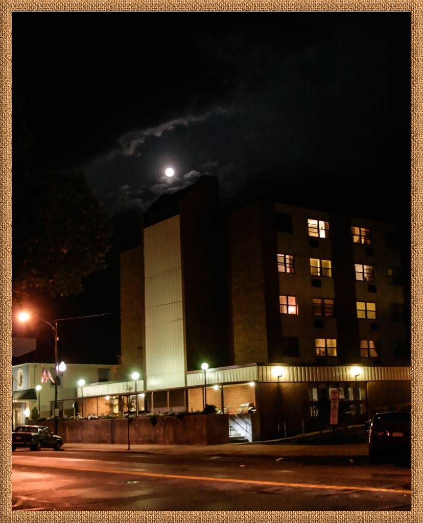
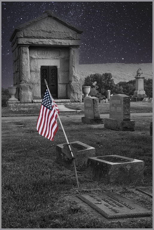
Very nice. You did an excellent job exposing the moon for detail while also keeping the foreground light enough for detail. What settings did you use? I can see this image as the cover of a book with the title in the sky to the right of the moon. Around here we call creeping phlox 'mountain pink". It truly is a sign of spring. |
May 6th |
| 12 |
May 20 |
Comment |
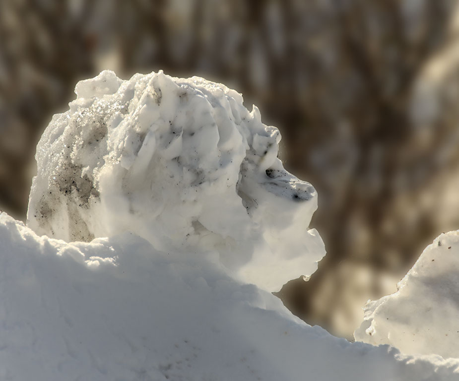
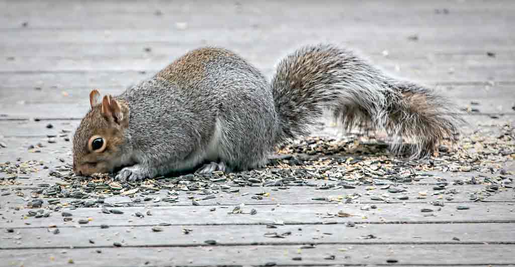
What a delightful little creature. He seems to be enjoying his shower. The top lighting molds his ears nicely and puffs out his little cheeks. I wouldn't change a thing. |
May 6th |
| 12 |
May 20 |
Comment |
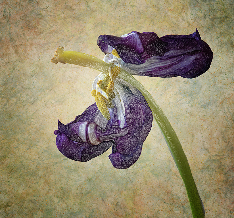
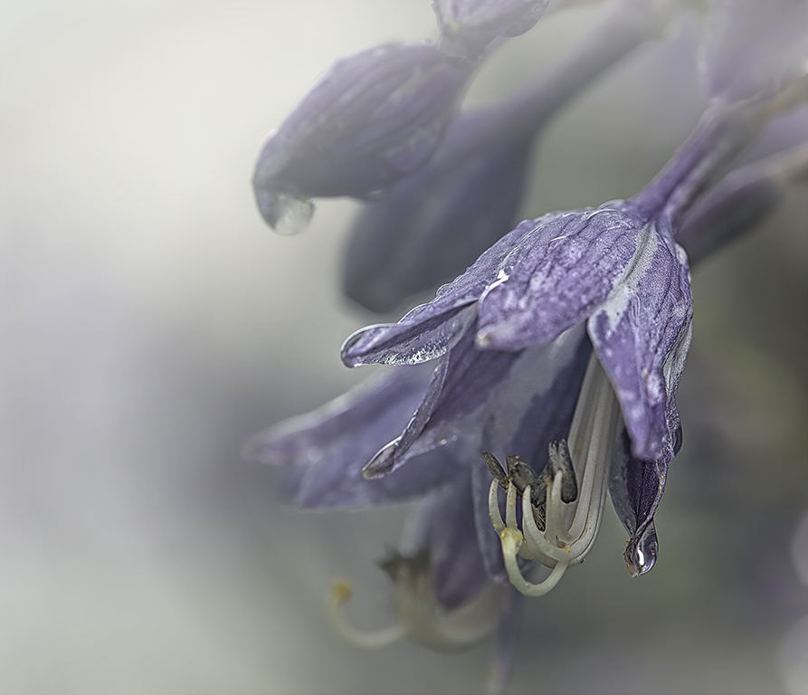
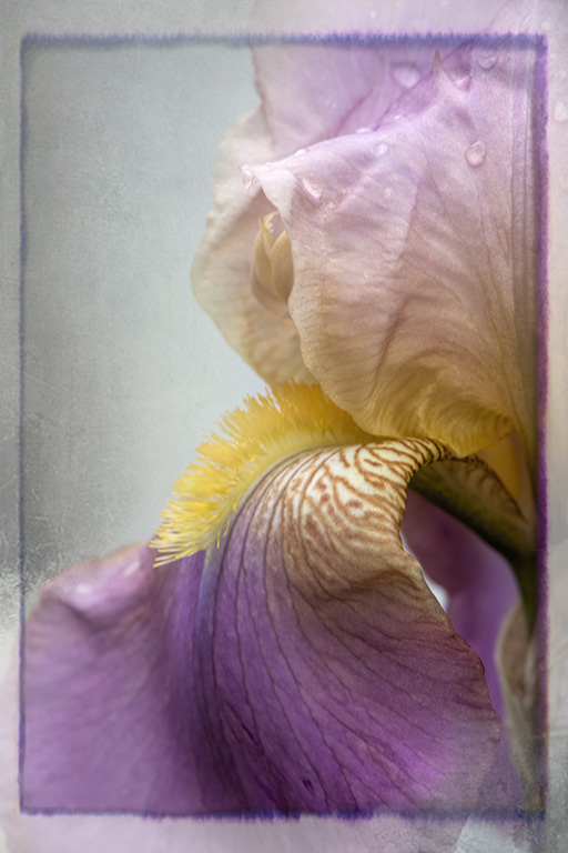
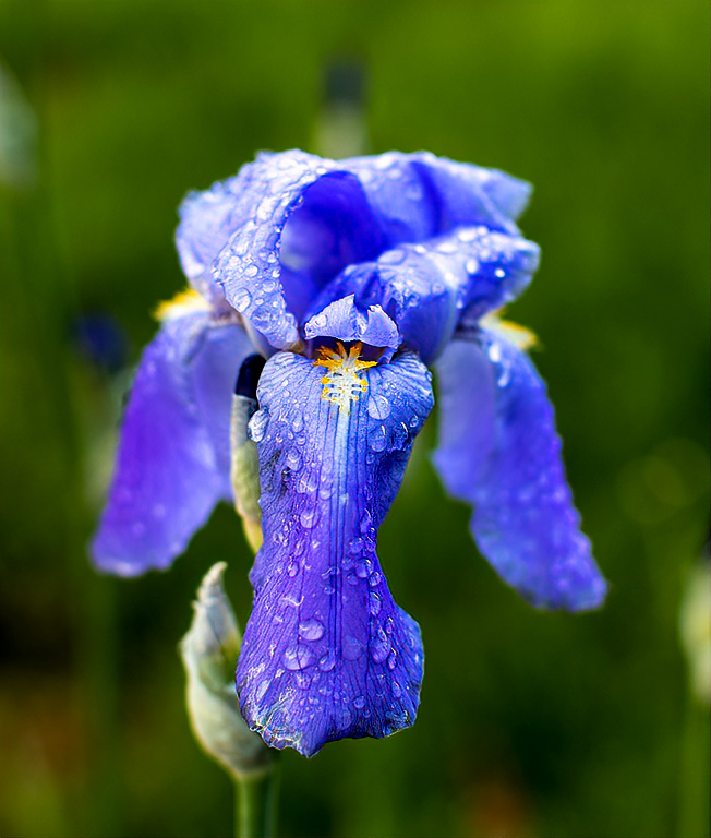
Irises are beautiful flowers, and this one is a lovely color. Your cropping is good. The background is a beautiful blur. However, the original looks sharper and more saturated than the single blossom. I used Topaz AI Clear to sharpen the image, then increased saturation of the blues, and adjusted contrast ever so slightly using PS levels. Good for you for going out in the wetness to catch those nice fat raindrops. |
May 6th |
 |
5 comments - 1 reply for Group 12
|
| 77 |
May 20 |
Reply |
I would probably do the same thing. Work appreciated is far more important than color scheme. |
May 20th |
| 77 |
May 20 |
Reply |
Which color would I prefer? This brings a question to mind: If someone asked for a print of this image, but wanted a color to match her decor, would you do that? What statement does that say about how a photographer feels about his own work? Hmmmm... |
May 20th |
| 77 |
May 20 |
Reply |
With NIK Viveza you use a control point as an anchor. The diameter of the affected area can be adjusted from minute to the entire image. Adjustments include brightness, contrast, structure, hue, warmth, etc. What happens is that a circular selection is made that is VERY softly feathered. The adjustments fade out seamlessly into the rest of the image. Pro Contrast simply uses a broader stroke and affects just the contrast without doing much for brightness, structure, etc. I don't use Pro Contrast much, but always check it out because sometimes it is just what I want. BTW, high pass filter is an excellent sharpener. |
May 7th |
| 77 |
May 20 |
Reply |
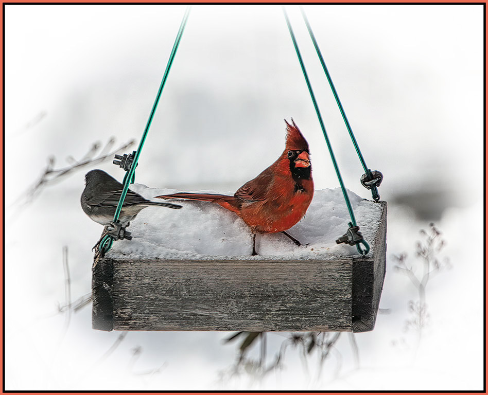
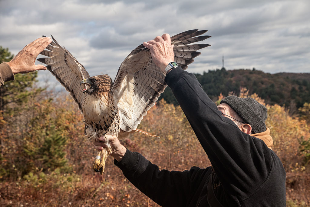
Welcome Denise. You will like it here. You know, I like that vertical composition. We have lots of birds at our house, and they often fly in at that angle. Shadows are easy enough to get rid of. Thank you. |
May 6th |
| 77 |
May 20 |
Reply |
On review, I agree that the painterly effect is a bit overdone. Perhaps masking it off of the tip of the beak would be an improvement. I tend to do my processing with a wide brush rather than an artist's brush. I have much to learn from the rest of you. |
May 6th |
| 77 |
May 20 |
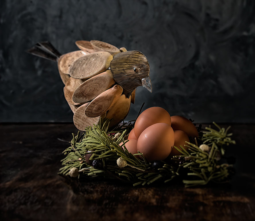
Reply |
Thank you Witta. I do have many birds. Perhaps some experimenting is in order. At our new house I was able to get all my tabletop props in one place. Experimenting should be easier now. |
May 6th |
| 77 |
May 20 |
Reply |
We have modeling clay, but I am often too lazy to go to the basement and get it. And depth of field in my table tops is also a problem. Even at small f/stops I don't get good focus throughout. f/8 is supposed to be the 'prime' f/stop for many lenses. Perhaps I should standardize on that. |
May 6th |
| 77 |
May 20 |
Reply |
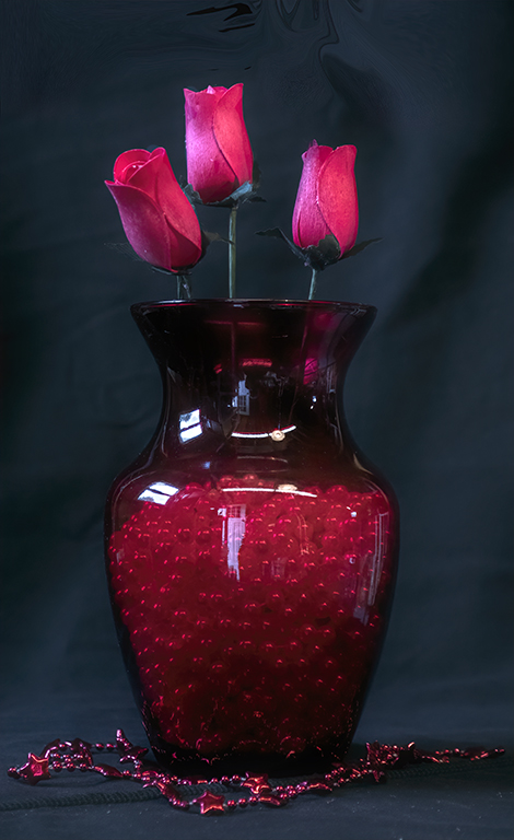
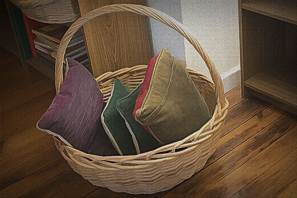
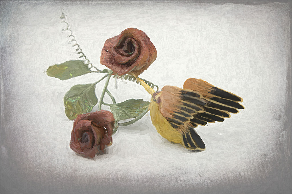
The wire is part of the rose arrangement. But it does look strange. I could try erasing it. |
May 6th |
| 77 |
May 20 |
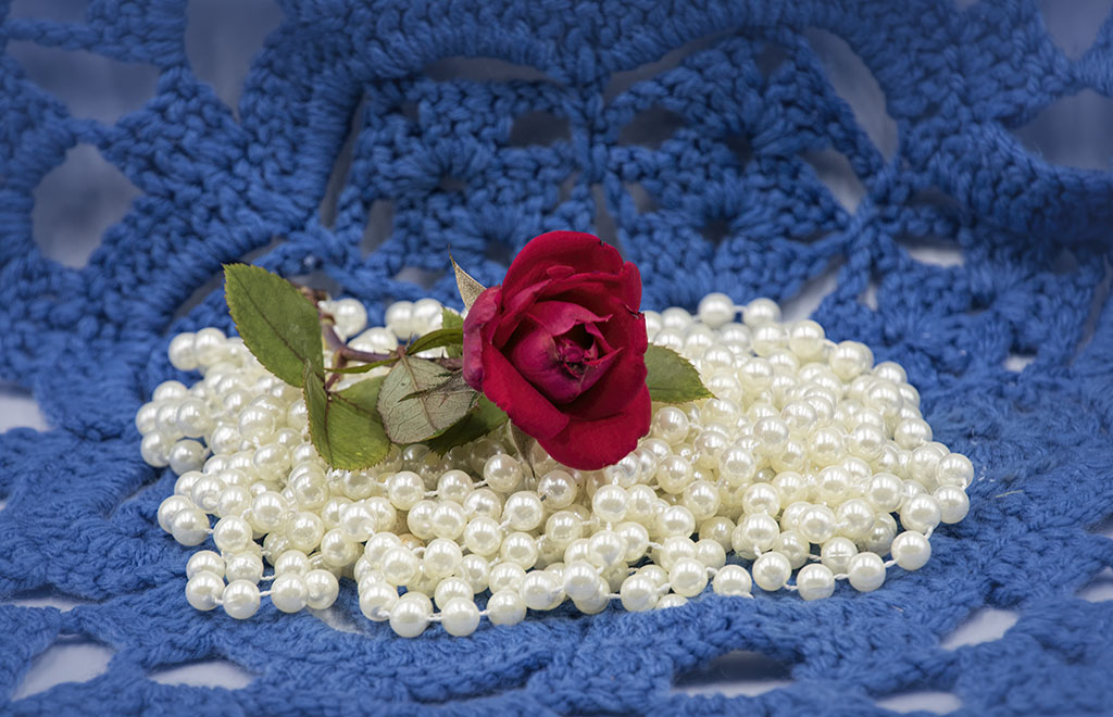
Comment |
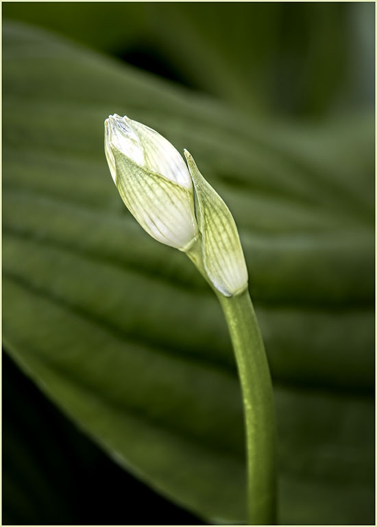
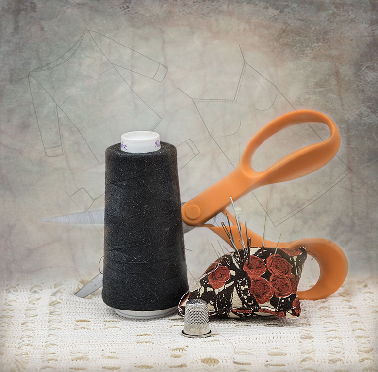
Well done. Color Composition, exposure are spot on. We often miss the beauty of nature up close. I, too, would like to see more sharpness in the bud, especially the edge of the petal. Using layers, one can make many adjustments, mask each layer and preserve the detail in something like the tip of the bud. It is in the original. Perhaps you can get it back. In any case, this is a lovely image, well done. I also like the B&W versions. We see beauty in flowers because of their color. But the texture and details come out batter in B&W. Welcome to the group. |
May 6th |
| 77 |
May 20 |
Comment |
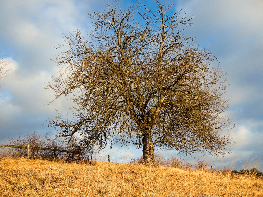
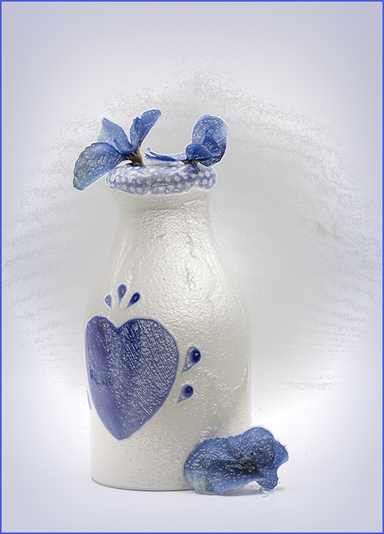
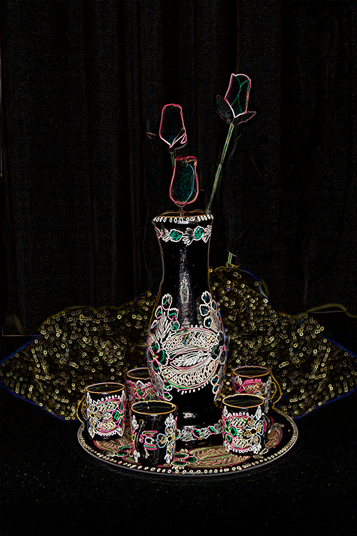
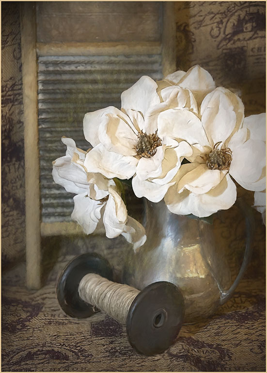
It is yours, and you use it! How wonderful. Okay - if you add brightness and detail to the house, will that compete with the tree? Hmmm. So I used Topaz precision contrast overall to brighten micro, small, and medium contrast areas. That left the lower right too bright. Another Precision Contrast with the sliders going the opposite direction fixed the grass. A mask brought back the tree and house. Nik Viveza was used to add brightness, contrast and structure to right side of the house and to the deck on the left. Turns out that the texture of the tree and house are differnt enough that they don't compete. Enjoy your cocktails! |
May 6th |
 |
| 77 |
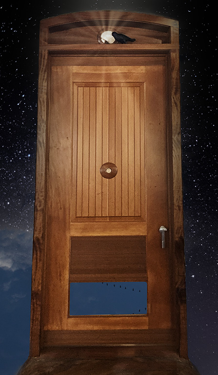
May 20 |
Comment |
The first thing that caught my eye was the interloper. That vulture takes this from a vacation shot to something far better. Yes, the reflection at the top should probably go. If you were painting the scene, you would most likely not include it. Using the table legs as a straightening guide is iffy at best. Try using the legs of the foreground flamingo instead. They stand straight. I like this image - and flamingos are not my favorite bird. |
May 6th |
| 77 |
May 20 |
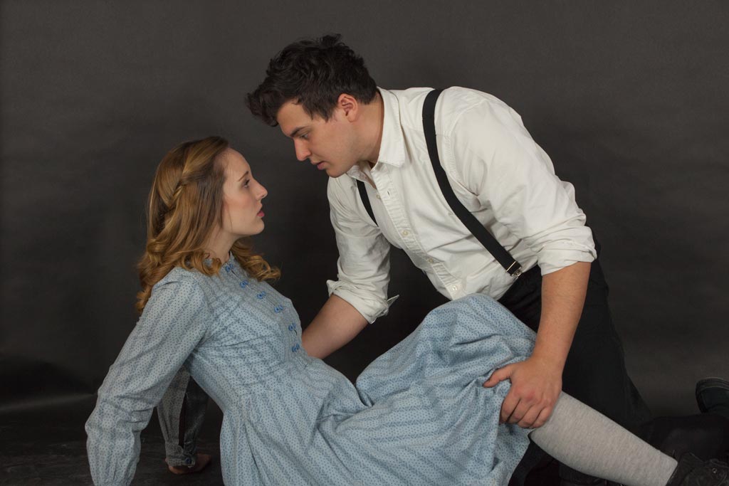
Comment |
Great action shot. You caught the decisive moment. Black and White is perfect for this scene. But I agree with the others that the added light rays diminish the importance of what is happening. The clearer images with a vignette are much more dynamic. Is it art? If she wants to hang it on her wall, it definitely is! We can create all we want. But if no one else appreciates it, the image is just a quiet personal statement that goes unheard. |
May 6th |
| 77 |
May 20 |
Comment |
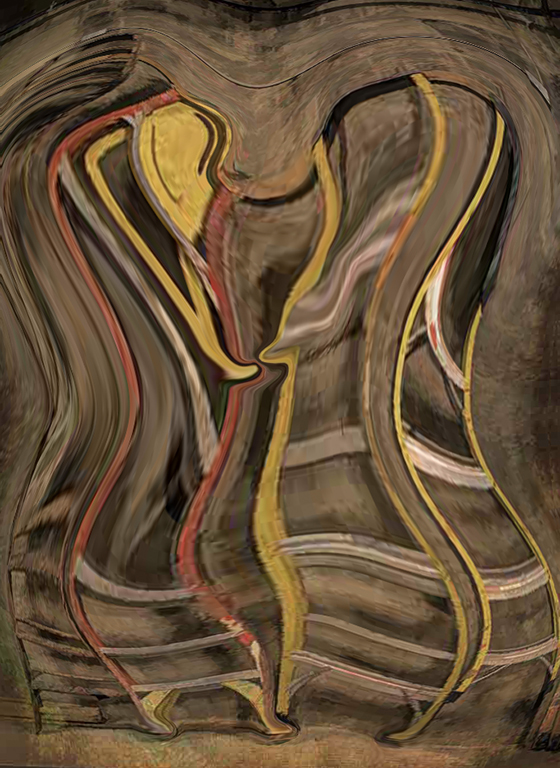
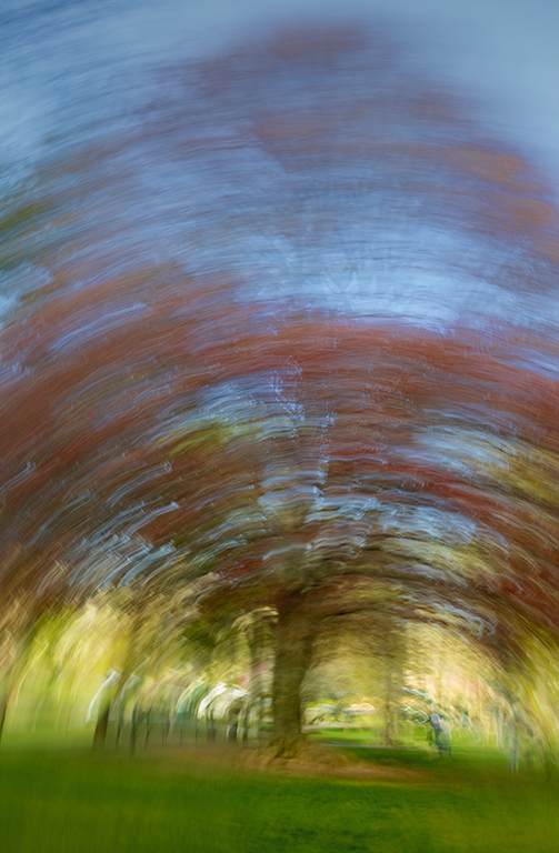
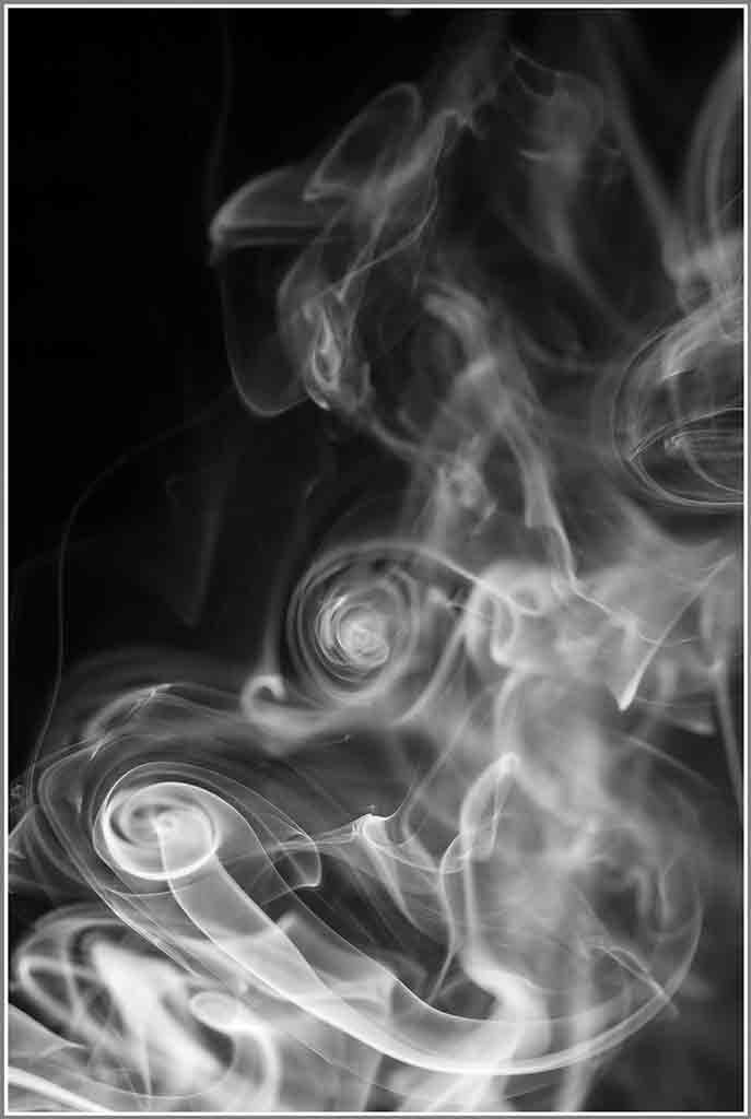
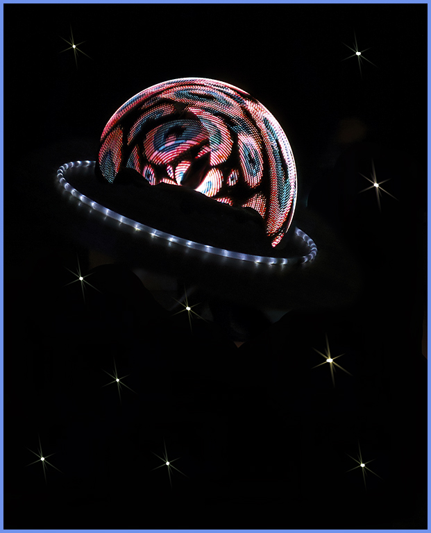
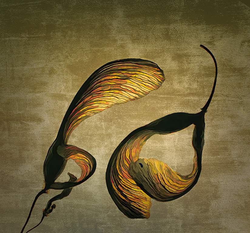
Witta, did you have an idea where you wanted all these image rotations to go, or did you just play until you liked what you got? This is exquisitely beautiful. It reminds me of Georgia O'Keefe. And isn't it nice that we can take our image, add a duplicate layer, and change the color scheme if we are not perfectly pleased? A painter would have to start over. |
May 6th |
| 77 |
May 20 |
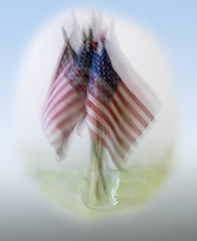
Comment |
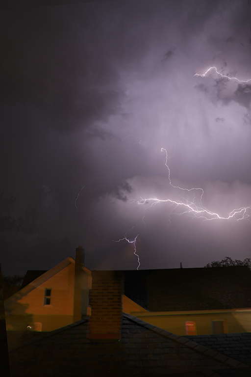
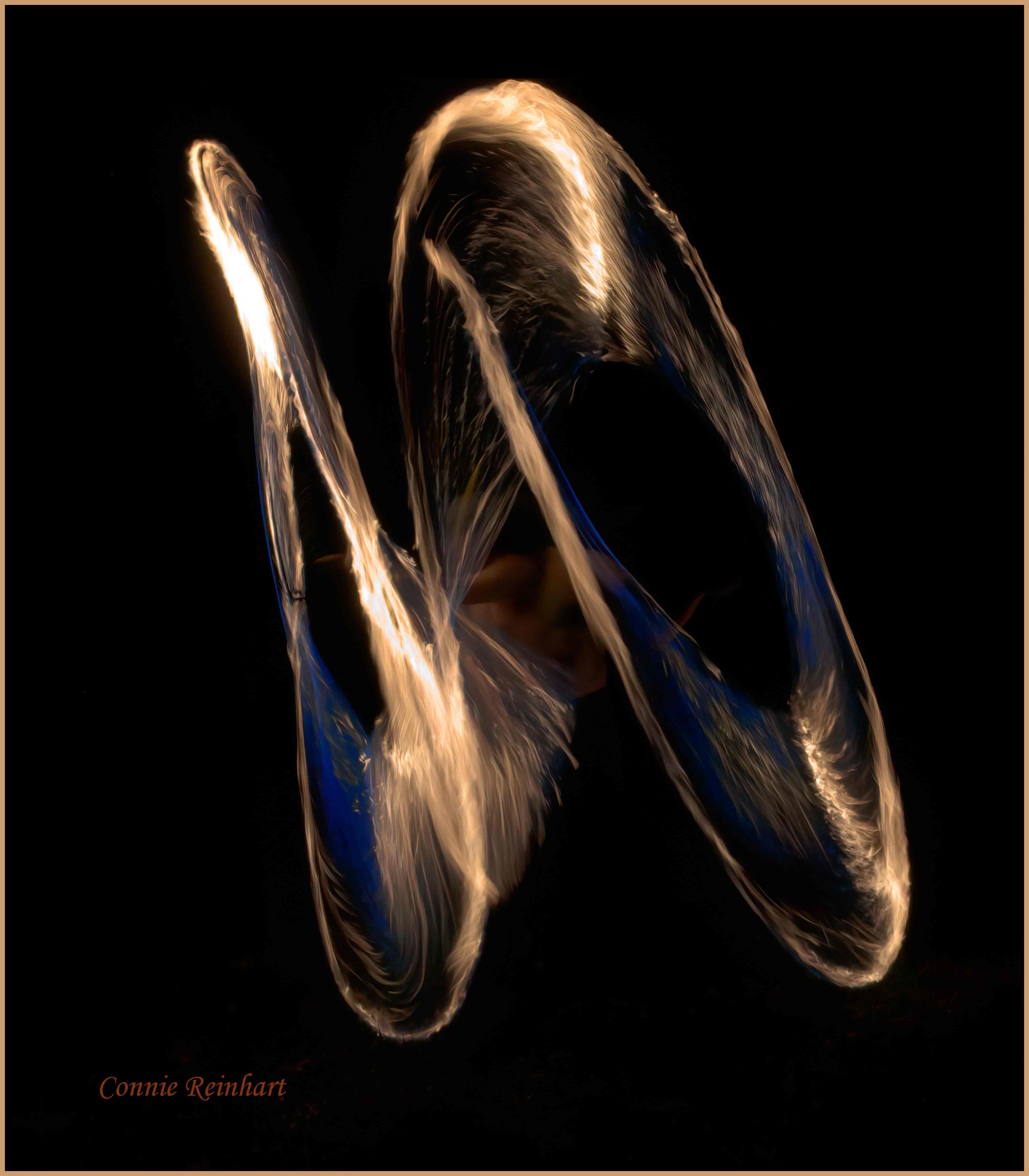
This is beautiful, and very creative. The arrangement is well-balanced with the dramatic clouds filling in the upper right corner very nicely. It has a mysterious, magical quality that one would expect from the 3 young witches in the story (You should watch the movie; it's cute). I feel that the texture combined with the clouds gives it that feeling. Yes, the red candle is a little crowded on the left. This image is truly representative of taking the image our camera catches and making it look like what we "saw". |
May 6th |
6 comments - 8 replies for Group 77
|
11 comments - 9 replies Total
|