|
| Group |
Round |
C/R |
Comment |
Date |
Image |
| 12 |
Apr 20 |
Comment |
The story sounds too fantastic to be real, but we heard it from the hotel clerk and read it in a brochure. For $15 you can ride to the top. We stayed at the bottom. |
Apr 17th |
| 12 |
Apr 20 |
Reply |
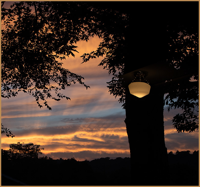
Thanks Carole. I wanted this image to be brighter, but didn't take it far enough. My monitor is too bright; even calibration doesn't correct the problem. Please continue to comment on this problem so I know how to compensate. |
Apr 17th |
| 12 |
Apr 20 |
Comment |
The volcano is huge and quite a distance away, but this is one of those quietly personal images that I love. The lake leads the viewer into the image stopping at the volcano with its pretty pink cloud. Continuing to the right, the rocks pull the eye back in for another look. I like both the original and the brighter version. They represent different moods. |
Apr 17th |
| 12 |
Apr 20 |
Comment |
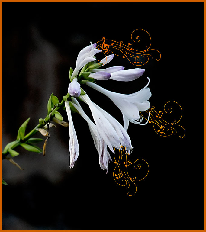
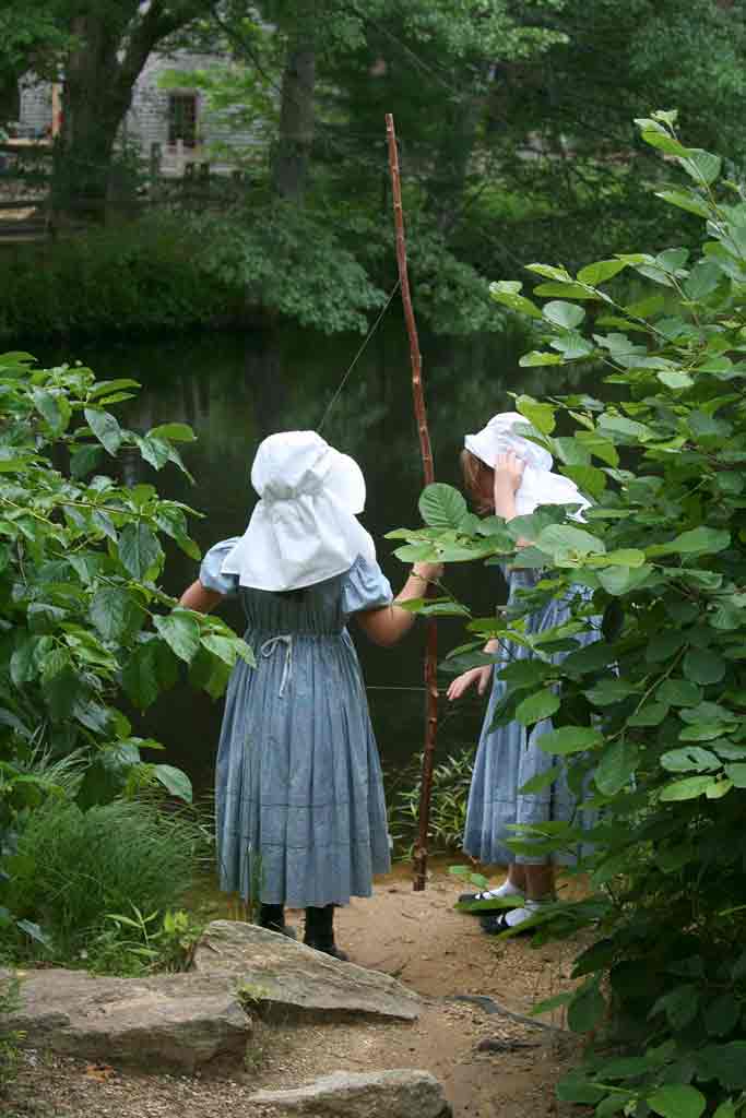
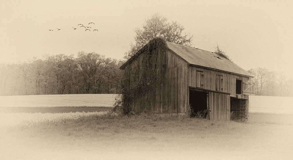
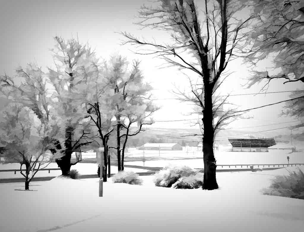
This is a delightful image! I like the almost poster-like style. I can just see some inspirational writing across the sky, "Dream big" The diagonals of trees, fence dirt, sign add dynamics to the image. The glowering sky behind those colorful trees adds emotional depth. |
Apr 17th |
| 12 |
Apr 20 |
Comment |
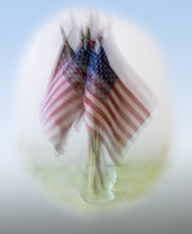
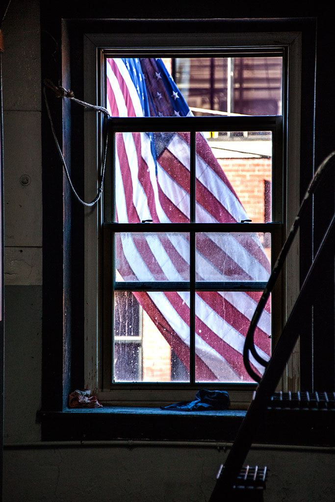
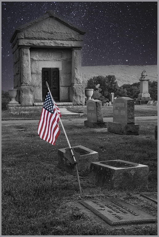
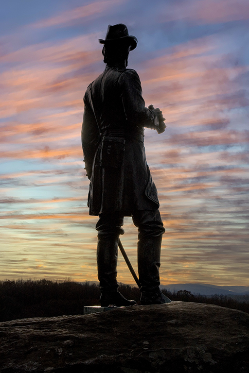
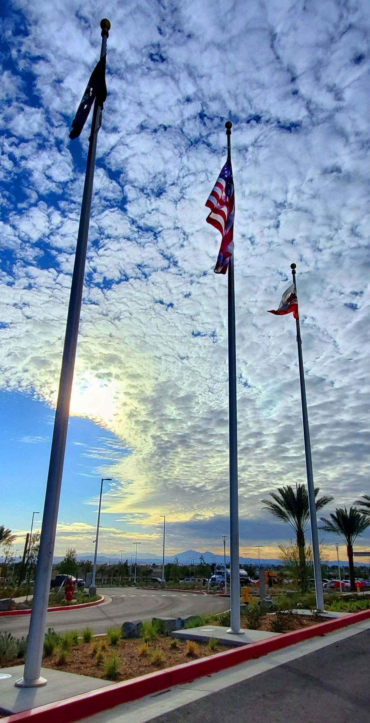
Very nice. The way the flagpoles converge at the top really emphasizes "tall". We don't always have to correct the perspective; after all, this is the way tiny humans see these tall objects. It adds drama. The sky is beautiful; the road gives the image a strong base. In NIK filters or Topaz Studio you could fix just the flags without brightening the sky too much. This example uses NIK Viveza. The foreground was lightened; American flag was lightened; the brightest part of the sunset was darkened a little to bring out texture in the clouds. |
Apr 17th |
 |
| 12 |
Apr 20 |
Comment |
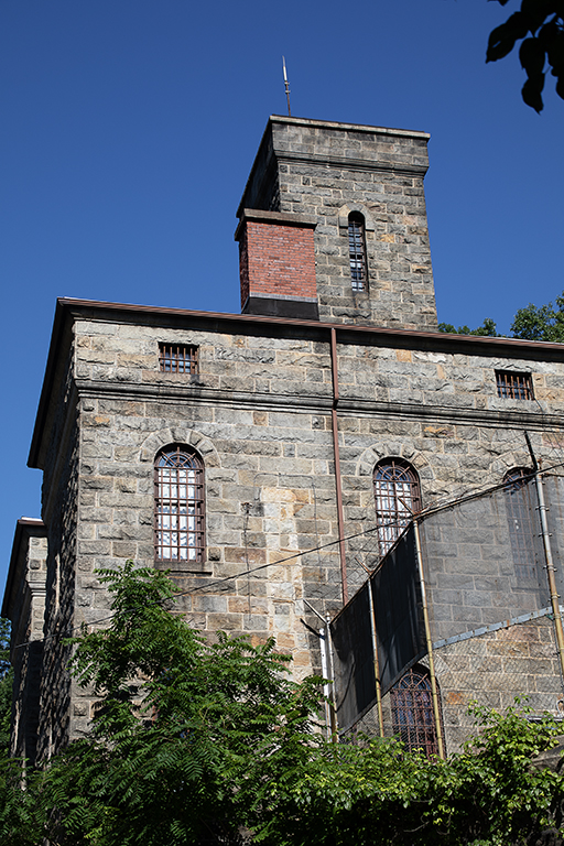
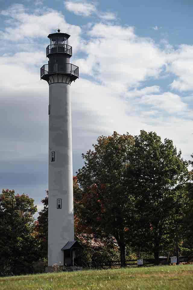
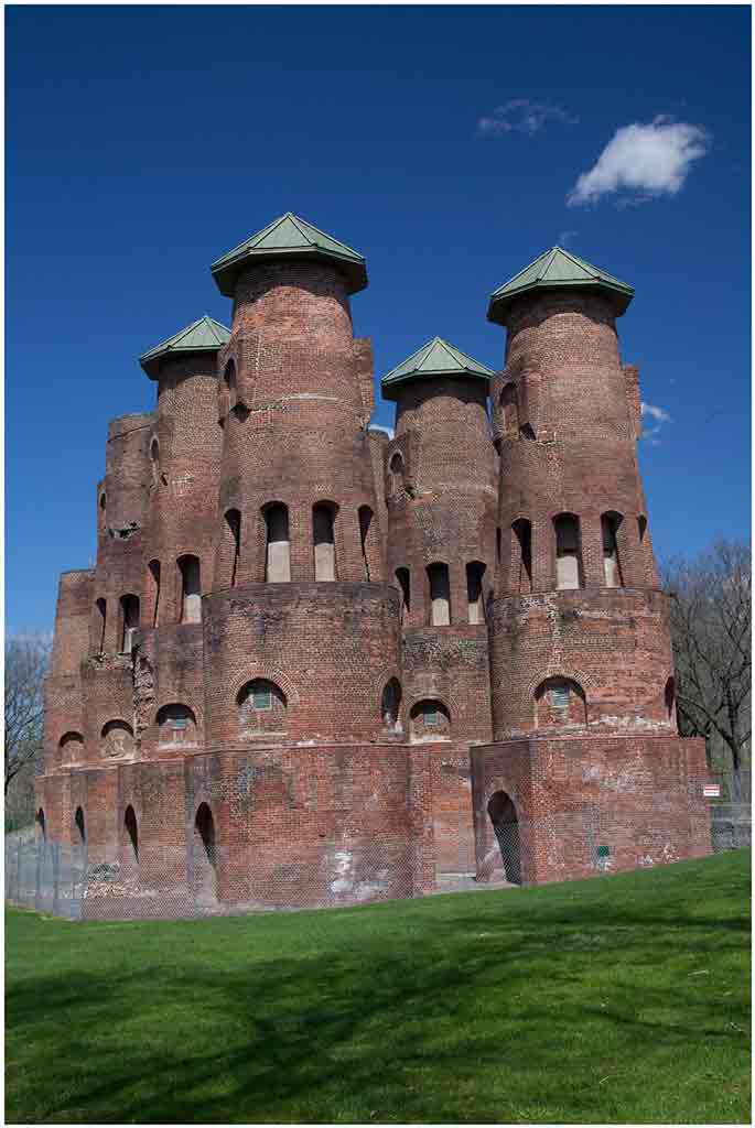
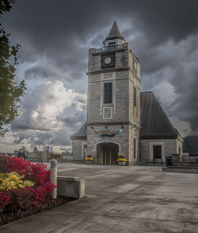
You have done a good job on a very contrasty subject. The shadow areas give dimension to the tower, adding depth to the picture. I agree with the concrete parts and the tree branches. If you have Topaz Studio, there is an adjustment called "Precision Contrast" that allow you to work on micro, small, medium, and large contrst areas. This makes it easy to adjust the shadow details without touching the highlights. |
Apr 17th |
| 12 |
Apr 20 |
Comment |
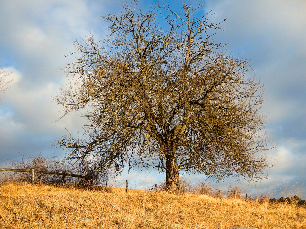
Love it! Even though the sky has really great clouds, the framing trees are lovely. I especially like the lacy pattern of the bare branches. This image certainly says "TALL". I find the color of the sky to be a little too much toward turquoise. As to the trees on the left, cropping them out makes the monument too centered. Cloning in sky to cover them can be done, but is tricky as the shading of the sky from top to bottom, side to side, varies more than is evident. |
Apr 17th |
6 comments - 1 reply for Group 12
|
| 77 |
Apr 20 |
Comment |
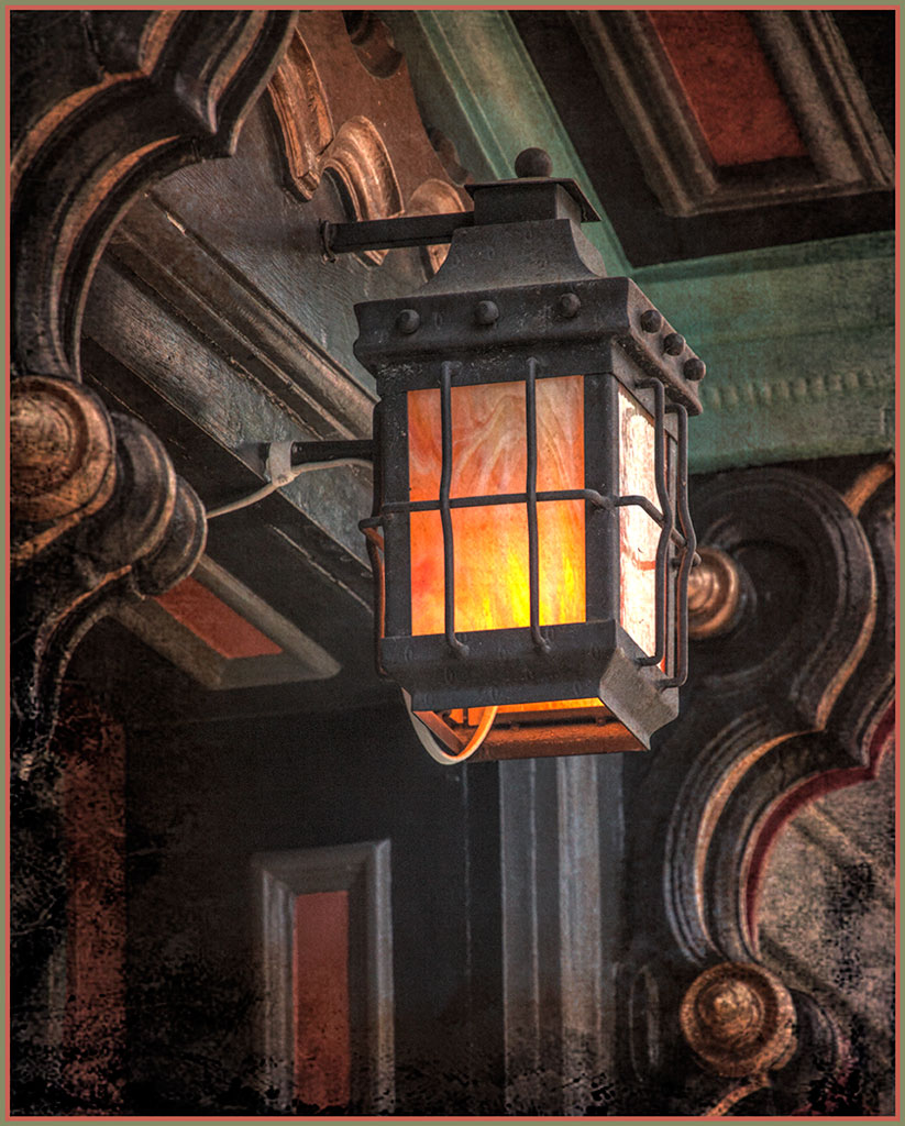
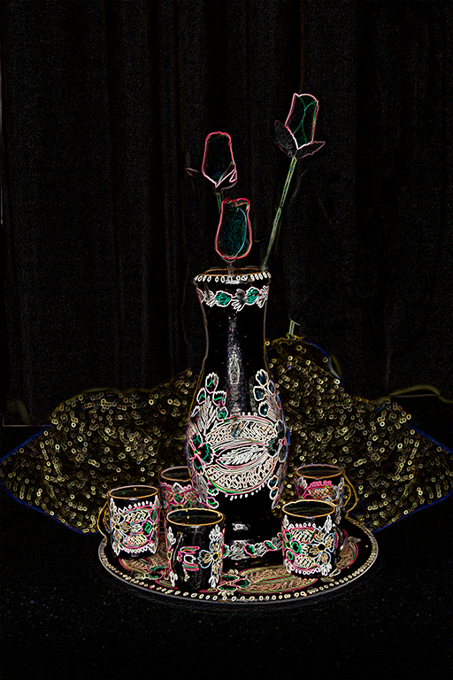
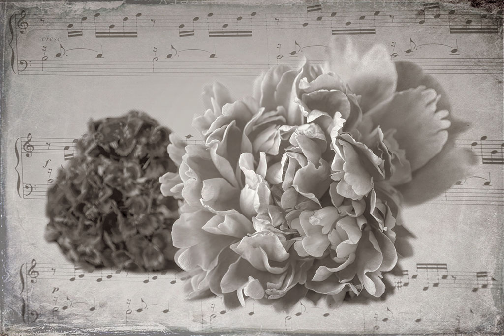
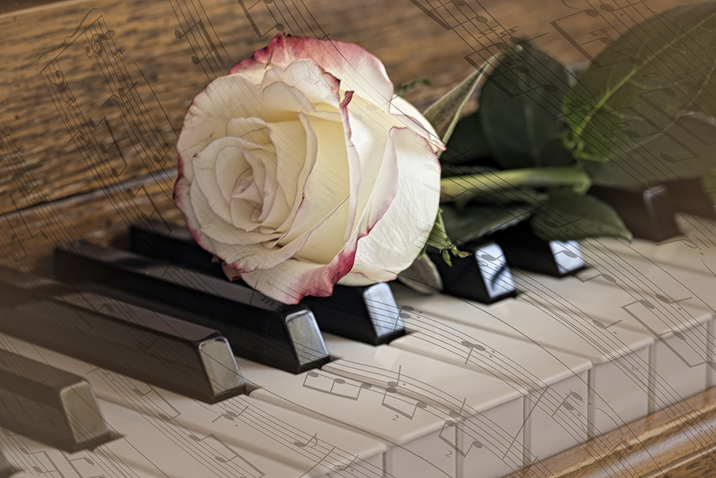
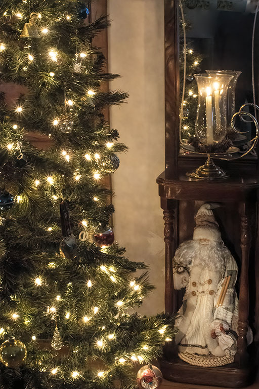
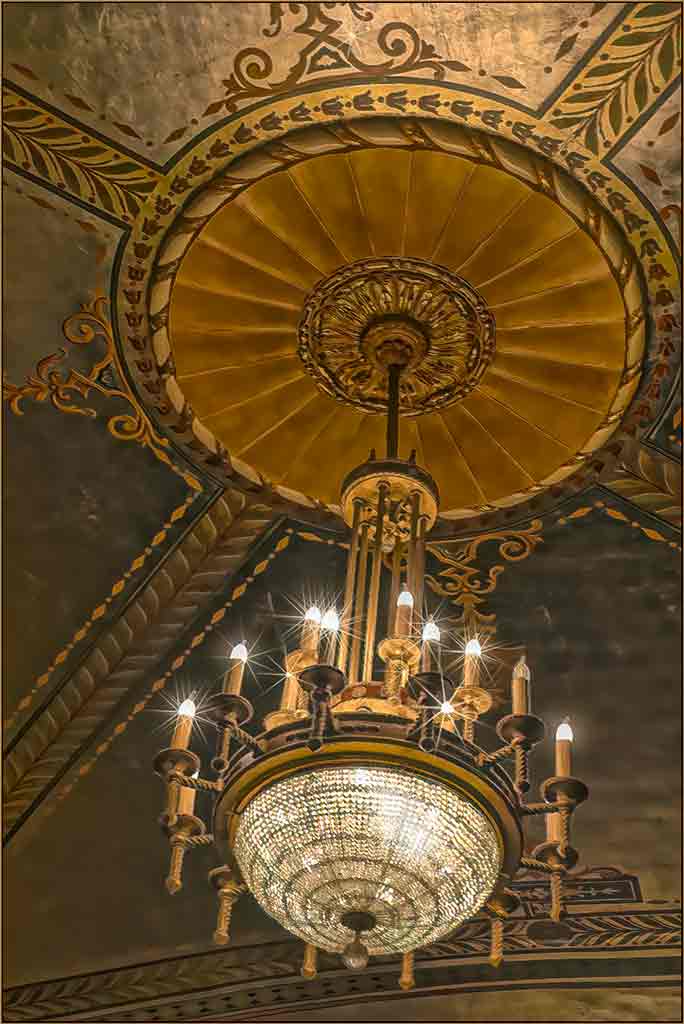
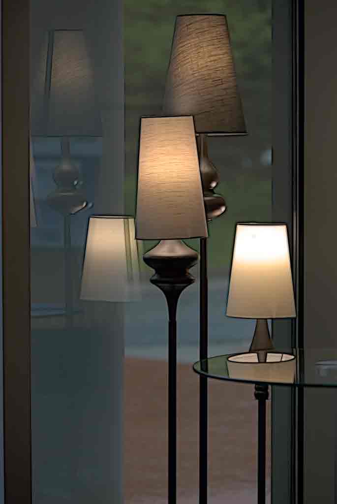
Would you believe that I never noticed the burned out lightbulb until ready to submit it? Also never noticed the missing starburst on the far tight candle. Duh. Photographers are supposed to notice these things, right? It's interesting that almost everyone said they would not hang it. In our new house I converted a small office to my piano room. There is a B&W version of an auxiliary chandelier hanging on the wall there. It works because printed music is B&W, the piano and the Theater are related through music. Thank you all for your comments. You are big part of helping to improve my skills. |
Apr 17th |
| 77 |
Apr 20 |
Comment |
Well, I think everyone else has covered any adjustments to your image. I think it's great. It would make a good Mardi Gras poster. You have shown us that we should not give up on an image; just because it doesn't appeal to us right away, doesn't mean that it is not valuable. Not only do you have better tools today, you are much more skilled at using them. |
Apr 17th |
| 77 |
Apr 20 |
Comment |
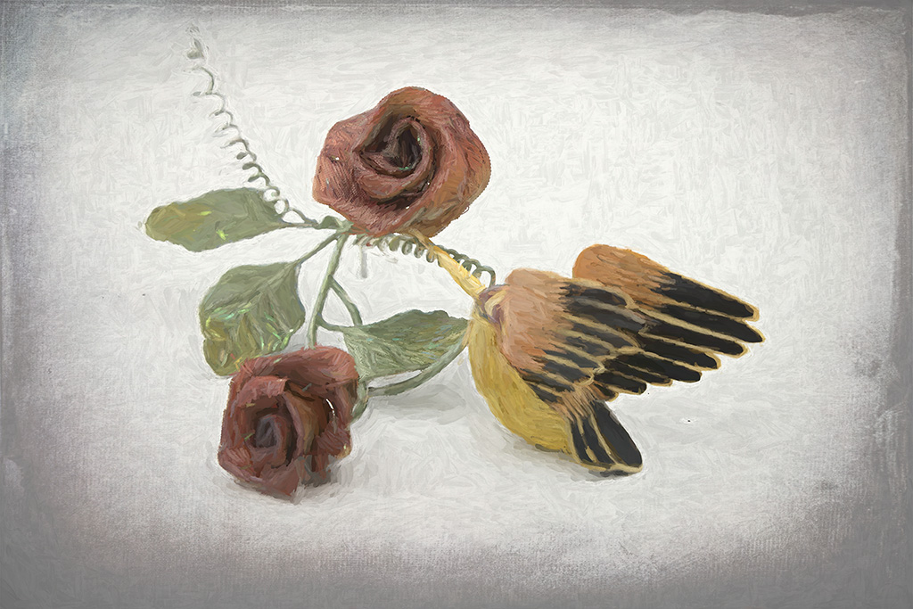
I love the lacy patterns of tree branches, but unfortunately the camera records the tree, while my eye interprets the tree. All the work you did on this image brings out that interpretation, putting the clutter of leaves and shadows into the background. As to file formats, I save in PSD for Photo Shop images and in TIF for Topaz images. I use jpg only for images for the web. Early on, before Photo Shop became CS, I learned the hard way not to continually resave jpg images. |
Apr 17th |
| 77 |
Apr 20 |
Comment |
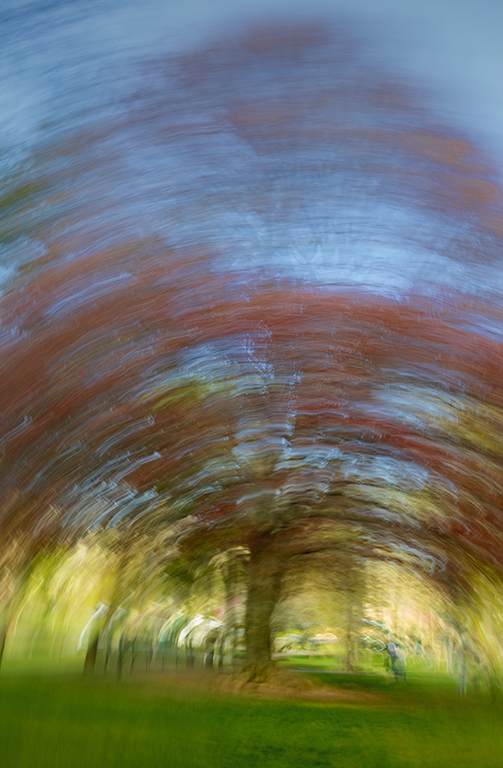
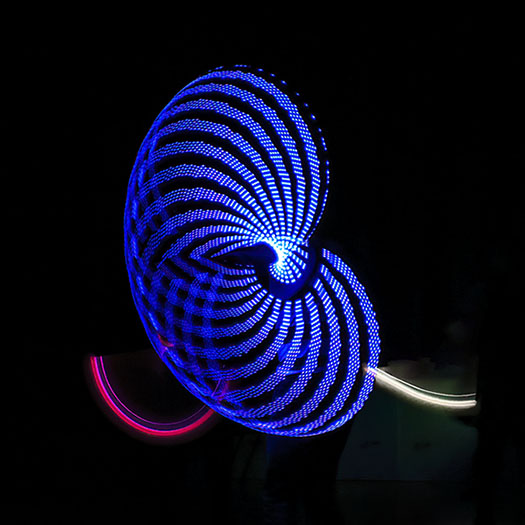
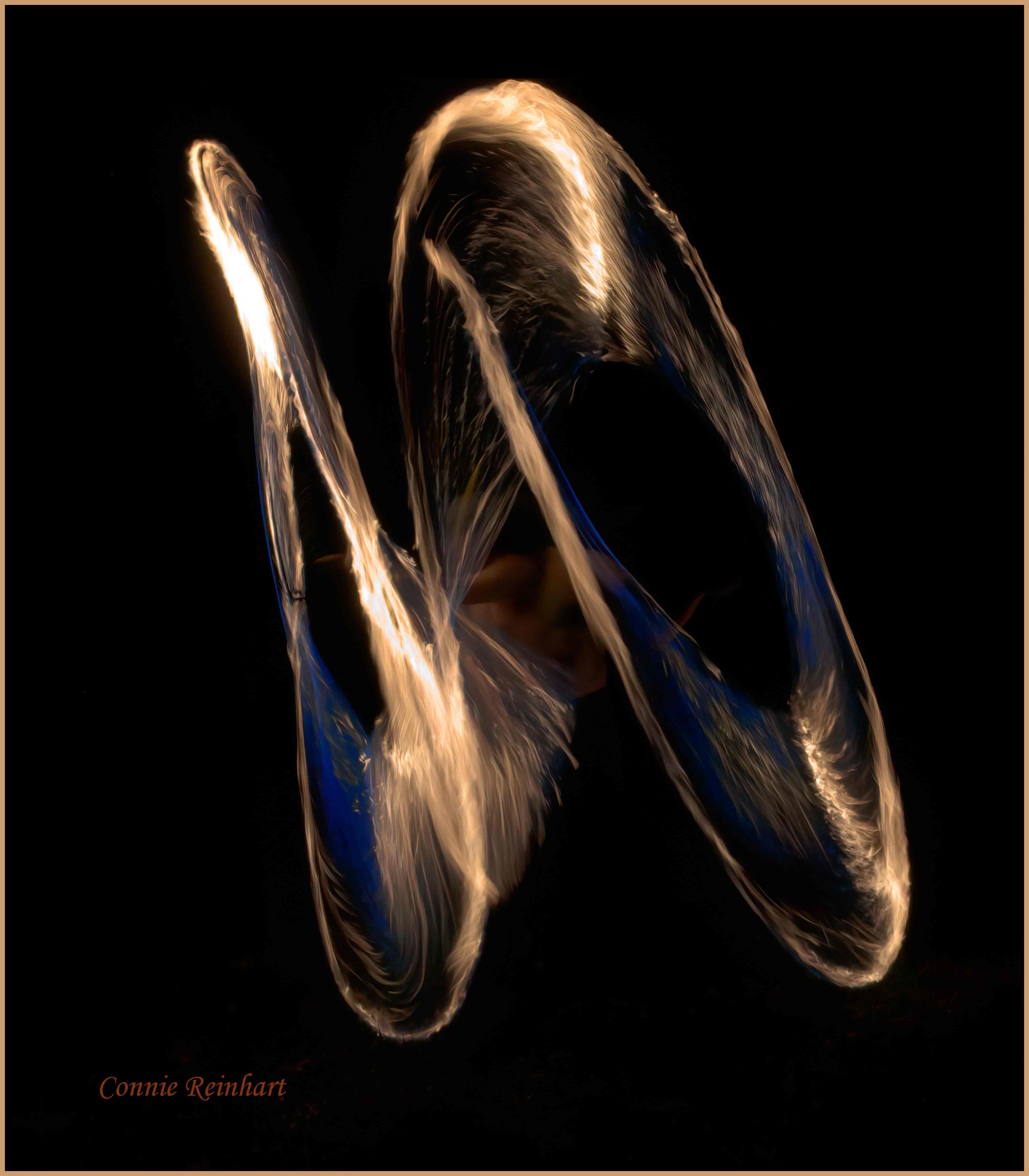
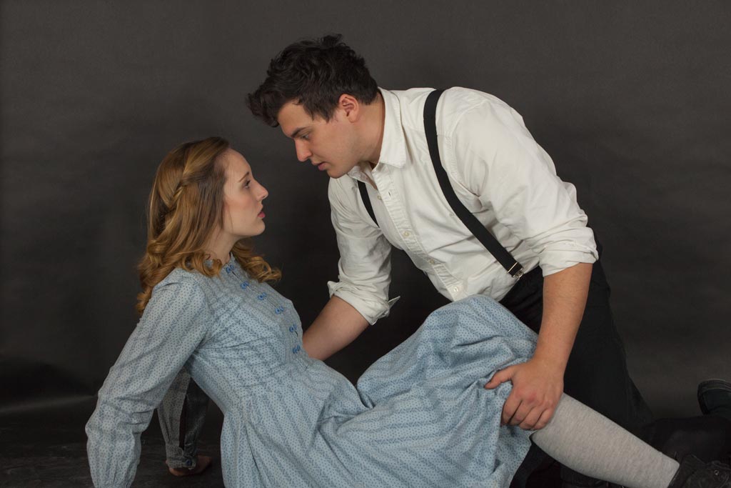
What a powerful image. All of the versions are pretty good, though your version and the gritty one are my favorites. In spite of the woman's posture, she seems to be a strong woman, in charge of her own destiny. Of course, interpretation of the image is up to the viewer. You did an excellent job with moving the woman, adjusting colors/contrast, and adding the spin blur. That spin blur changes this image from a recording of the moment to an interpretation. |
Apr 17th |
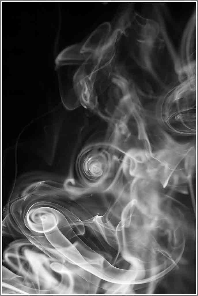
| 77 |
Apr 20 |
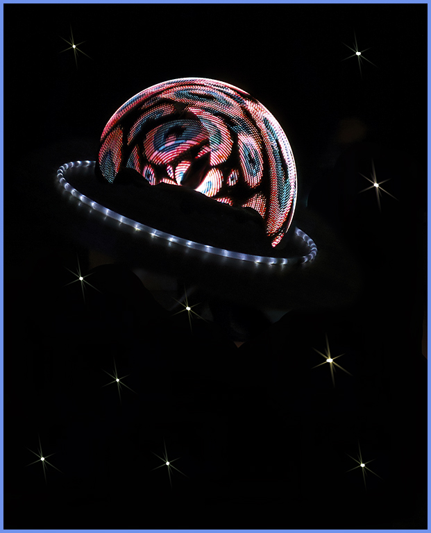
Comment |
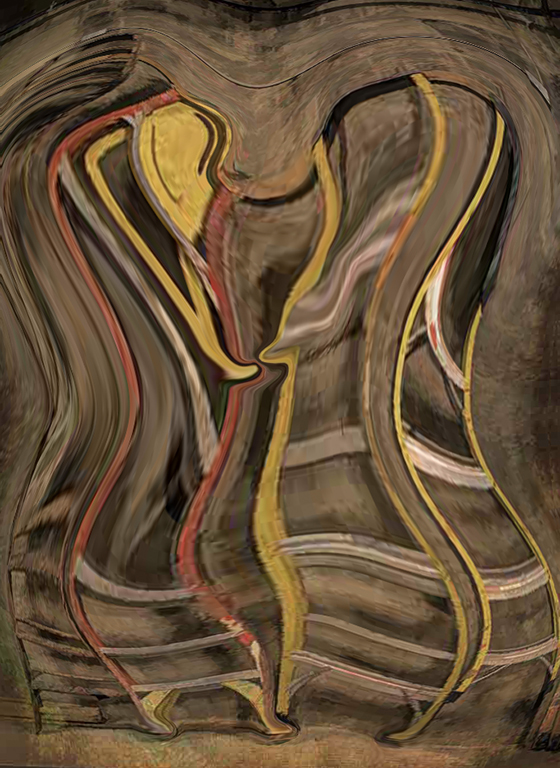
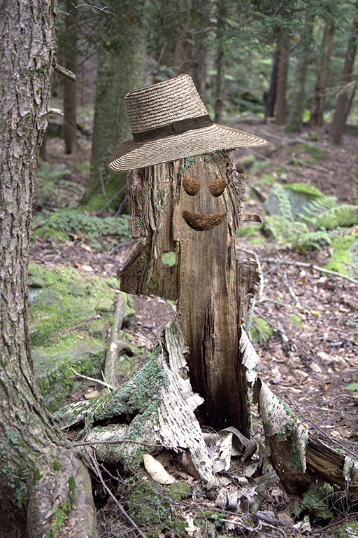
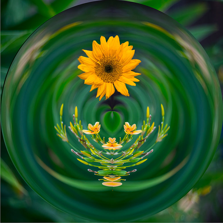
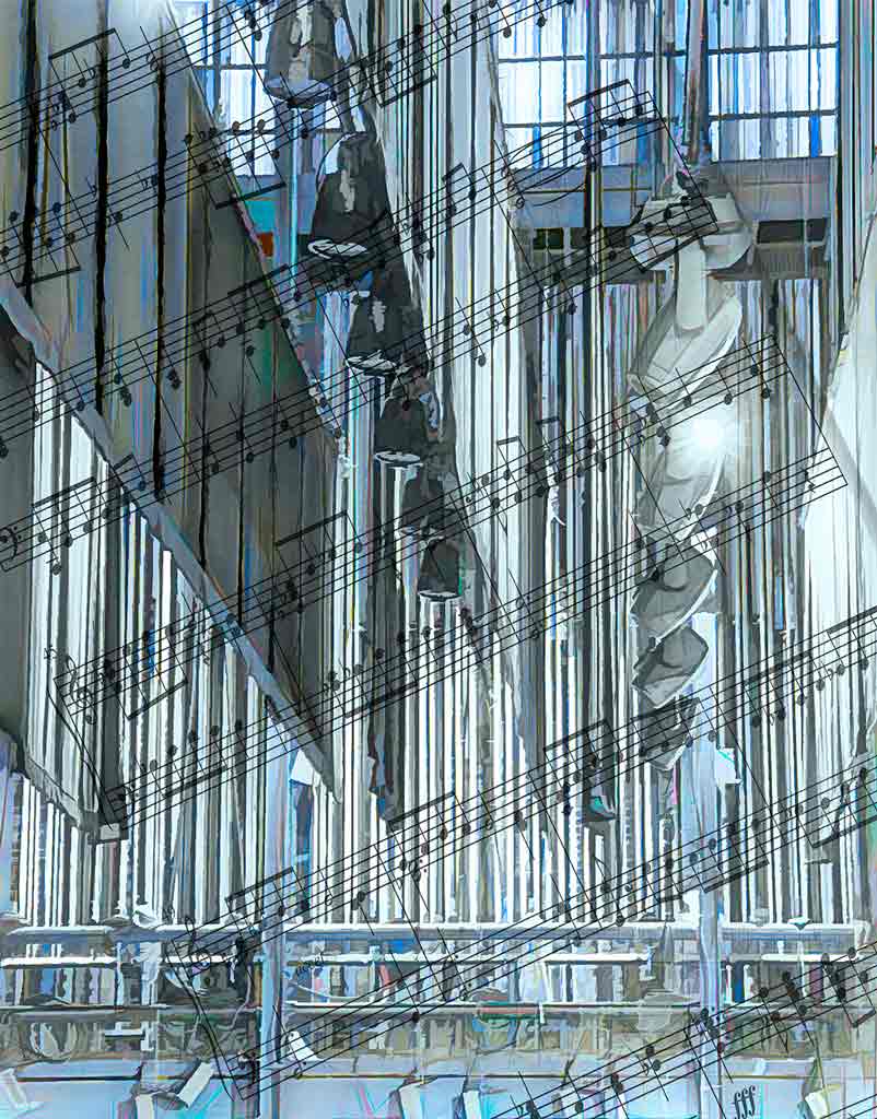
You put a lot of thought and skill into this image. I think it looks like nerve ganglia - some food for thought. This is a beautiful abstract, certainly worthy of hanging on someone's wall. Witta, you have shown us that we must always be open to the images possibilities around us; that we should learn to use the photographic tools at our disposal; and that we should keep working and creating. |
Apr 17th |
| 77 |
Apr 20 |
Comment |
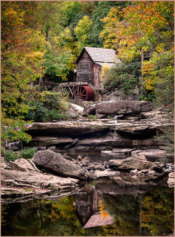
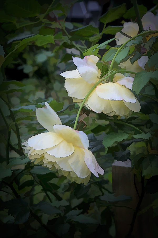
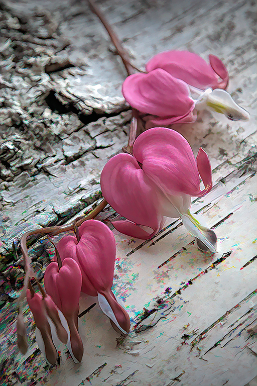
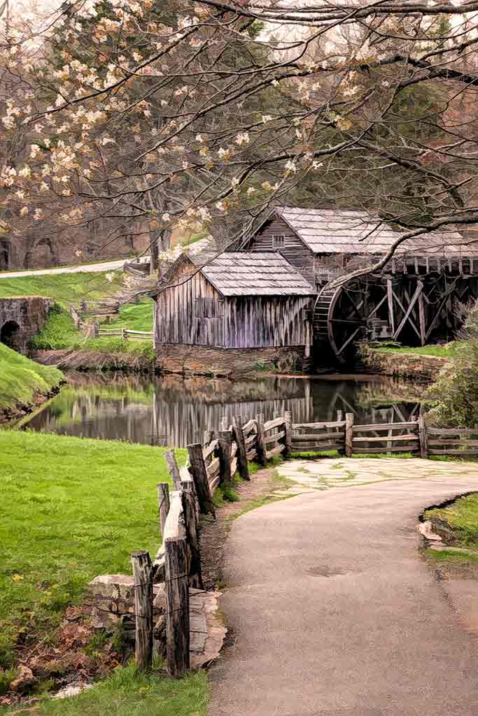
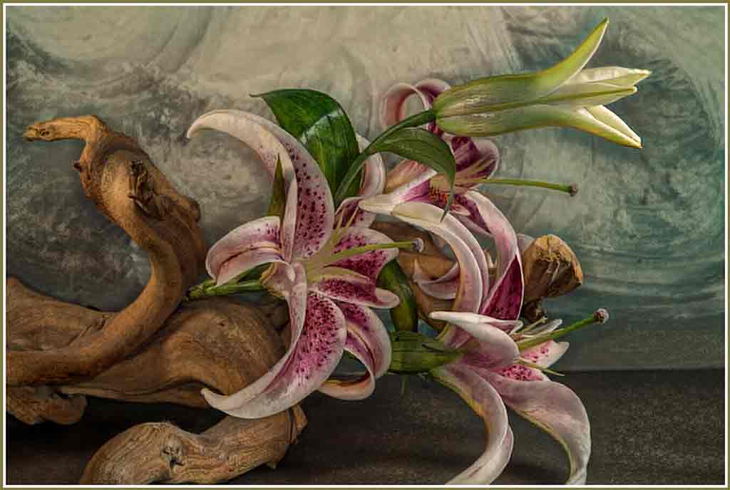
This looks like a painting. There is a lot of detail, but it doesn't seem cluttered. The HDR was done with a delicate touch - just right for this sentimental subject. Ah, the fence post...If you had painted this, you would have omitted it. Cloning is tricky here, but Witta did a good job. I like both your version and Witta's, but see them as two different images. This would make a marvelous background for a "hidden object" game! |
Apr 17th |
6 comments - 0 replies for Group 77
|
12 comments - 1 reply Total
|