|
| Group |
Round |
C/R |
Comment |
Date |
Image |
| 12 |
Oct 19 |
Comment |
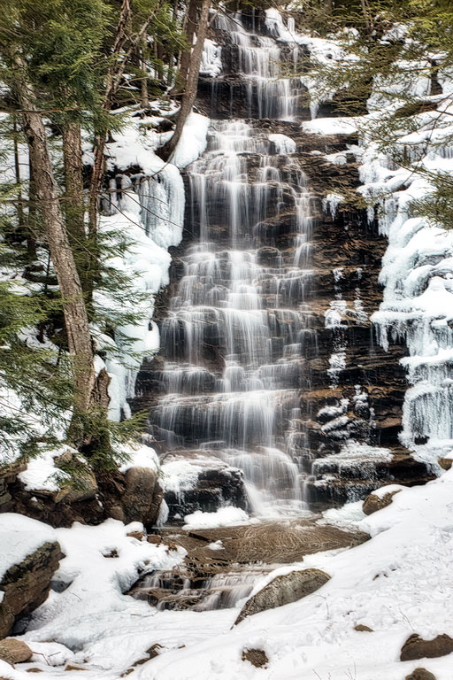
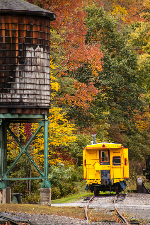
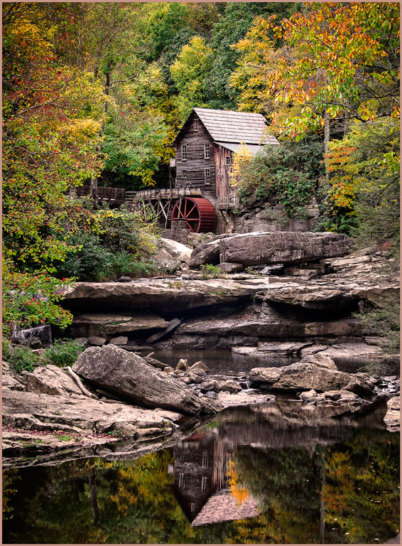
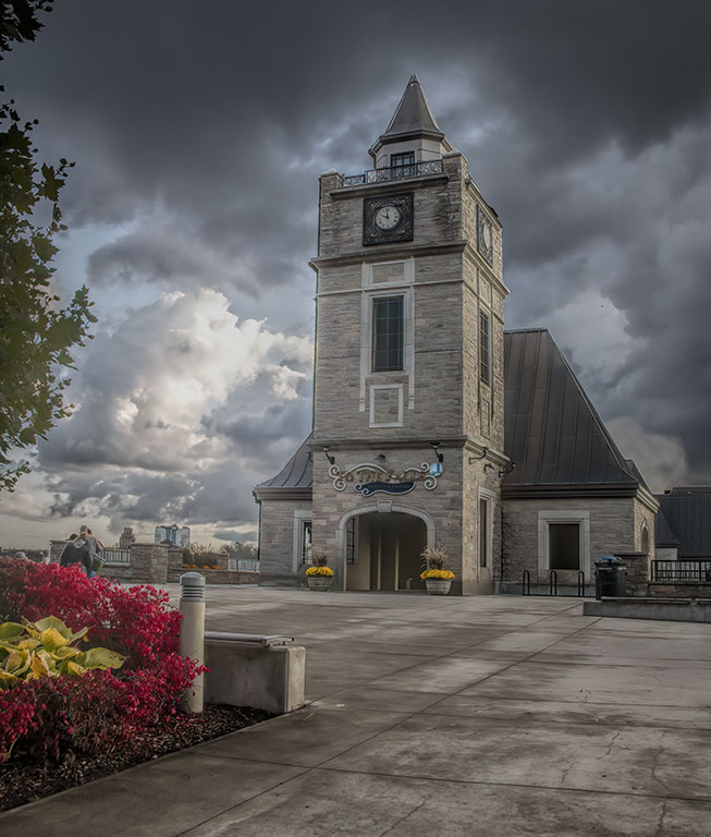
Your image has a good foreground, middle, and background, giving the image good depth. Your focus is sharp throughout, as it should be for this kind of landscape. But I agree that the foreground is a bit faded compared to the brilliant colors of the background. If you have the NIK filters, try the polarizer for the background. Then use the graduated neutral density filter to darken the foreground without affecting the background. Yes, Carole; Ansel Adams would have loved Photo Shop. |
Oct 21st |
| 12 |
Oct 19 |
Comment |
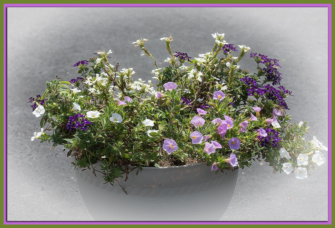
Black or white, be it vignettes or borders, is always the question. Black always seems to make the colors look brighter. White adds a gentle touch to an image. Which vignette is better may be determined by the final use of the image. I can see the white vignette framed using a white mat with black core. Use the reverse mat for the black vignette. Or either one as greeting card using the vignette to set the tone of the card. Goodness! With all these wonderful tools we have, is any image ever 'done'? |
Oct 21st |
| 12 |
Oct 19 |
Comment |
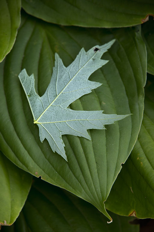
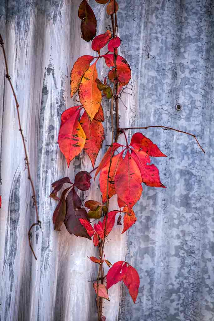
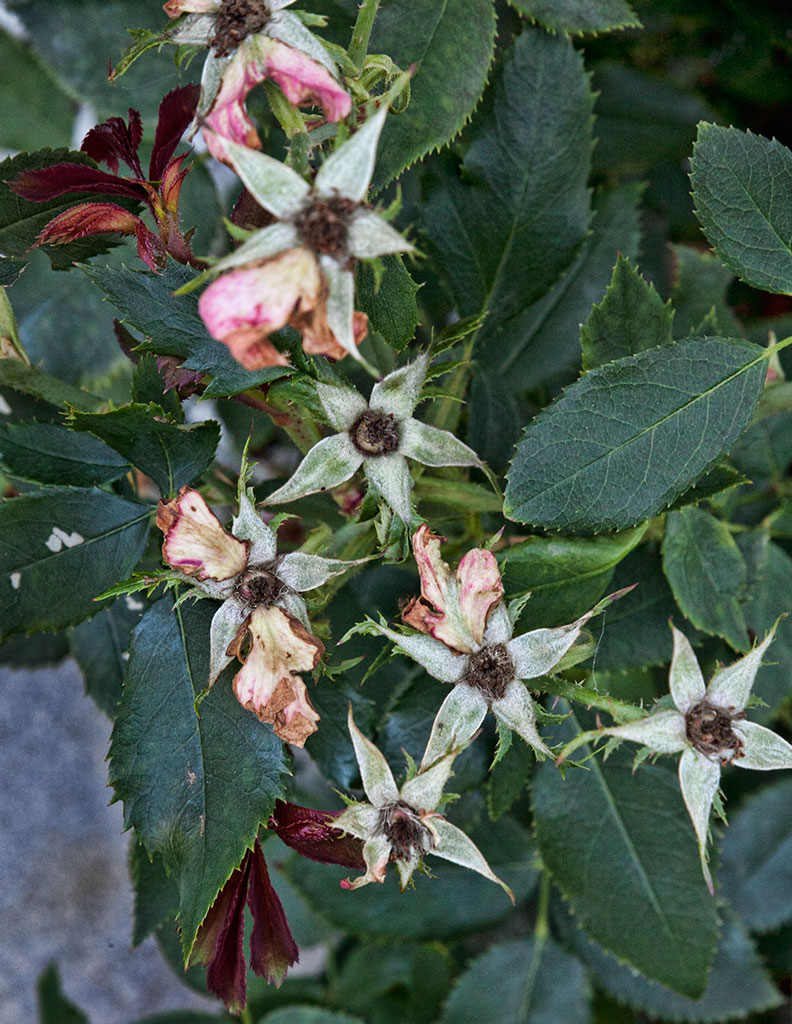
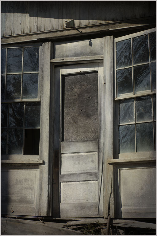
The background was a galvanized wall on an old shack. Yes, the twig on the left is a bit distracting. Perhaps zooming in on just one leaf cluster would have been better. I never saw that circle on the right, but it would be easily dealt with. The light was diffused. One thing about Virginia creeper is that it fairly glows on overcast days. Thank you for your comments. |
Oct 21st |
| 12 |
Oct 19 |
Comment |
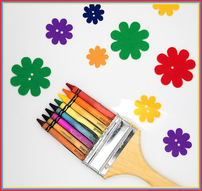
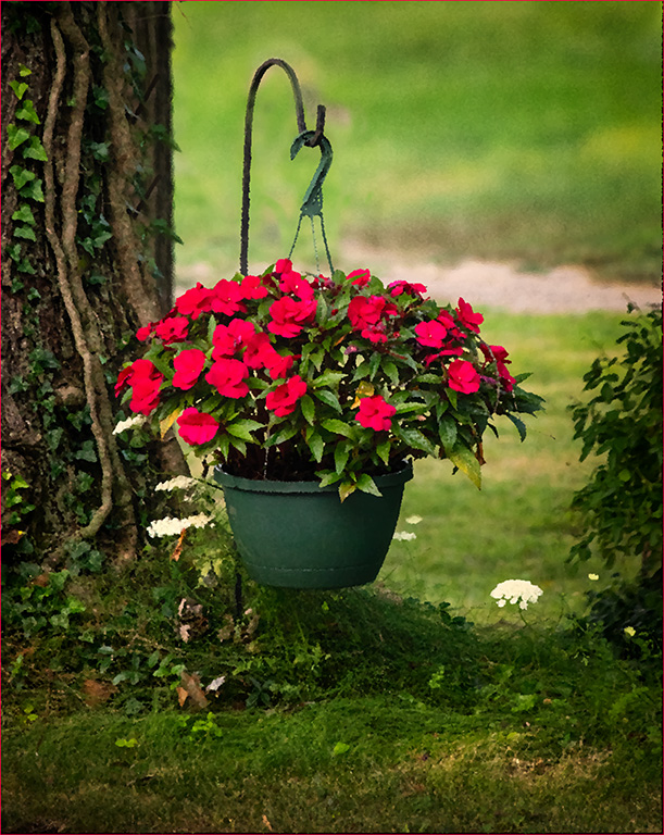
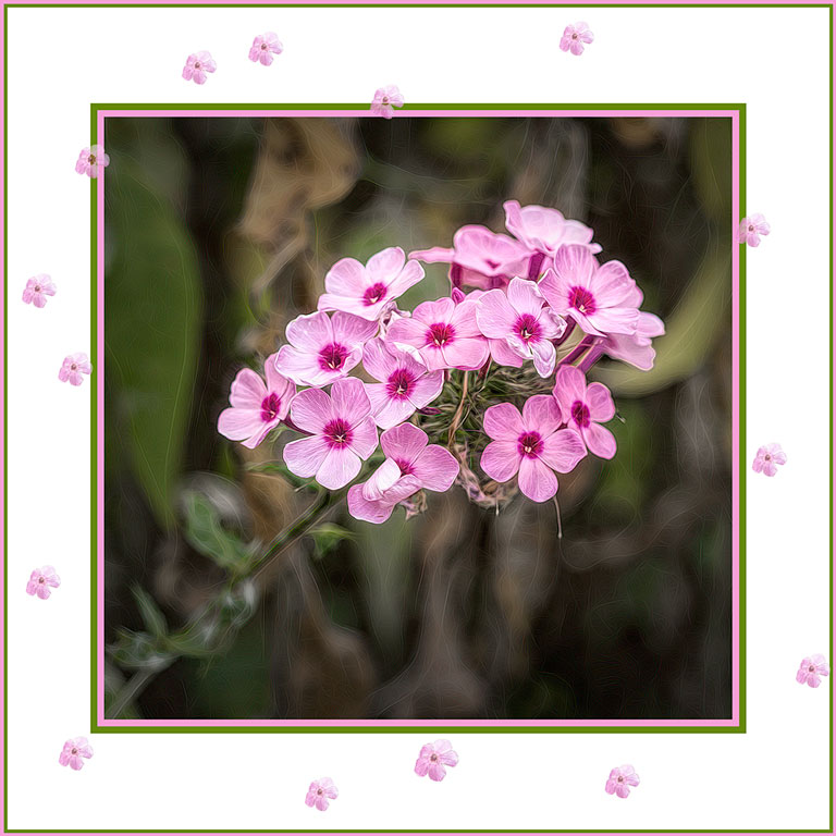
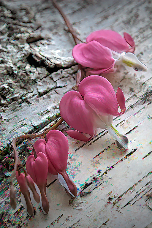
My eye seems to go up the diagonal from lower left to upper right, then across the top to the left, and back to the starting point. Your excellent depth of field helps make that happen. The texture on the pumpkins moves the image higher than the smooth-skinned jack-o-lantern pumpkins. It seems as though the light is a bit flat. Perhaps just a feather light touch on contrast and on orange saturation would make it pop a little more. We all love pumpkins, starting with carving them as children to eating pumpkin pie as adults. |
Oct 21st |
| 12 |
Oct 19 |
Comment |
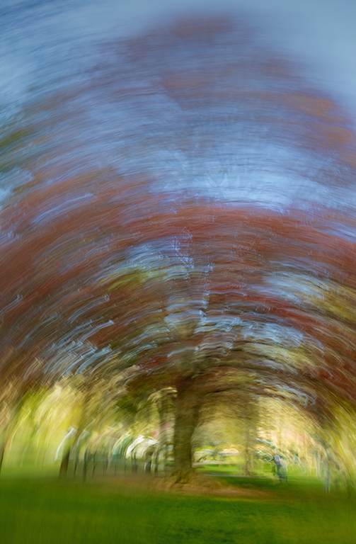
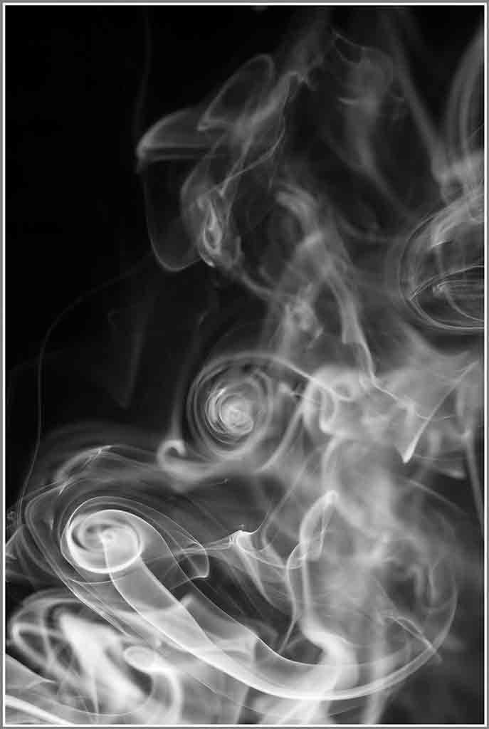
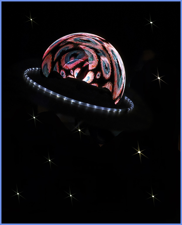
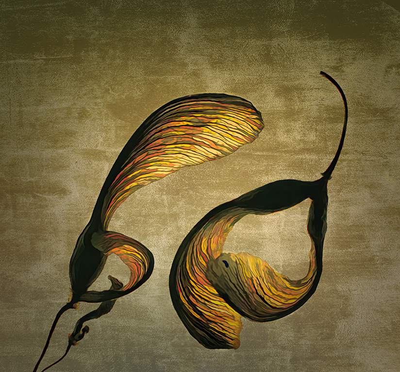
My first impression was "Wow!" I might have tamed down the neon effect just a tad - but I would have to see the result. Maybe it wouldn't have the impact. But kudos to you for playing with the software and letting your imagination run free. The leaves themselves are beautiful. And your treatment of them makes them spectacular. |
Oct 21st |
5 comments - 0 replies for Group 12
|
| 77 |
Oct 19 |
Comment |
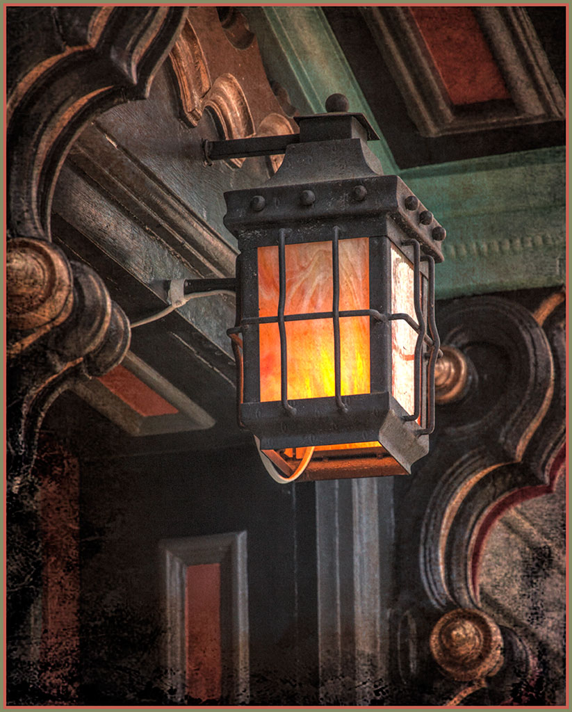
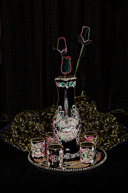
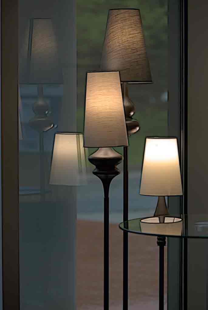
The edges were emphasized with a Topaz filter called 'edges'. This is different from 'edge exposure. Thank you all for your comments. There are some adjustments to make to this. But I purposely kept the reflections in the frame because they looked like ghost images. Next time I will straighten the lamp shade. |
Oct 21st |
| 77 |
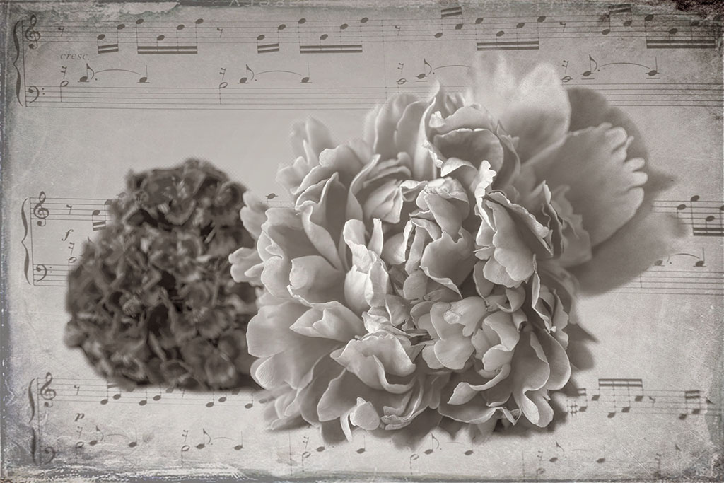
Oct 19 |
Comment |
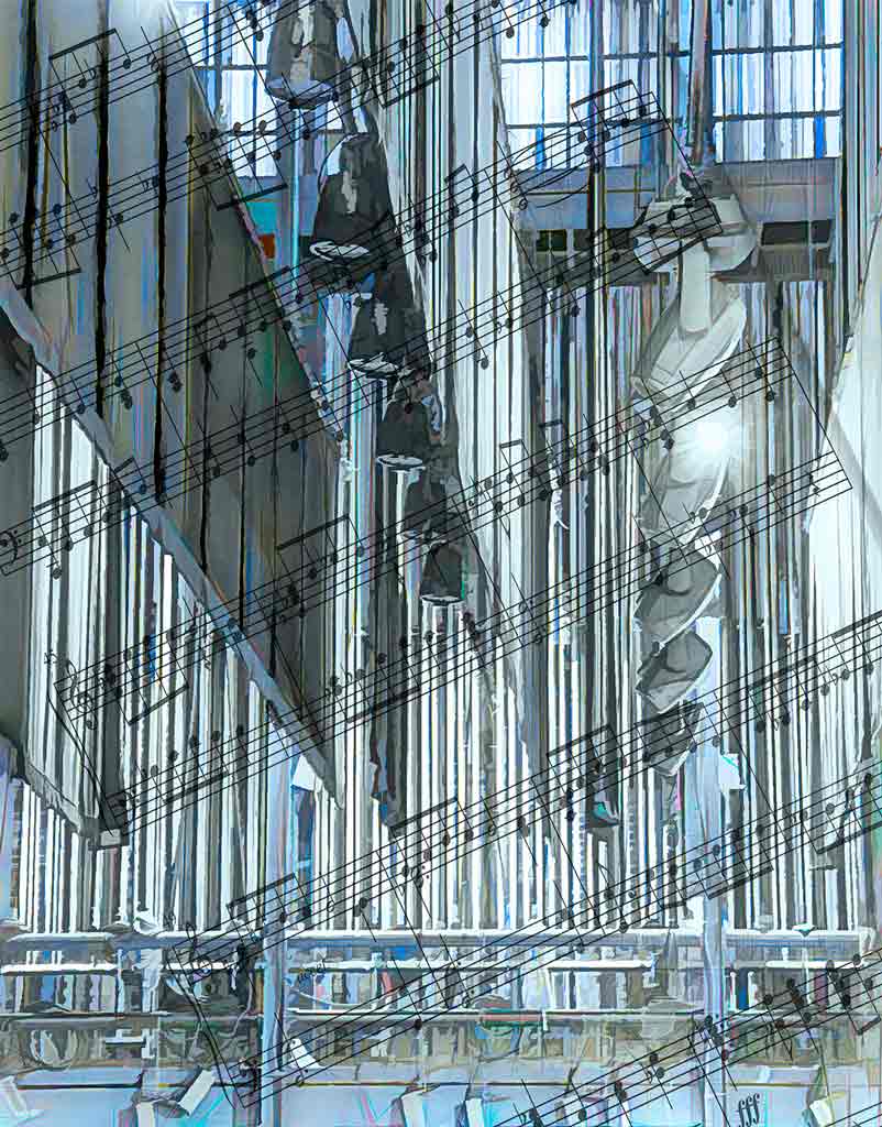
The black and white is perfect for this shot because sheet music is black and white. The expression on Hayden's face is also perfect. There comes a time in every practice session when the mind says, "Stop!" Any musician would love this image. |
Oct 21st |
| 77 |
Oct 19 |
Comment |
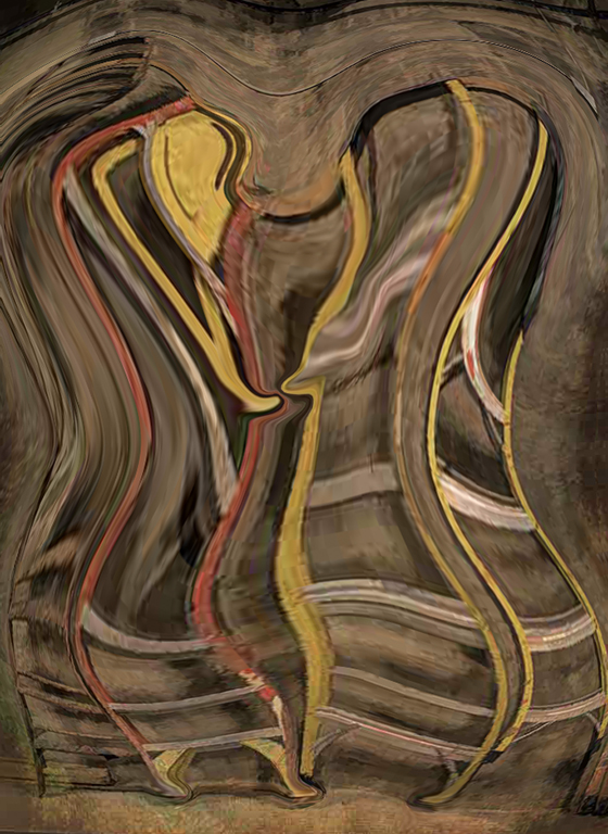
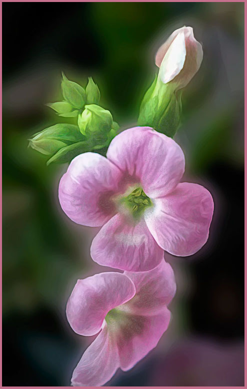
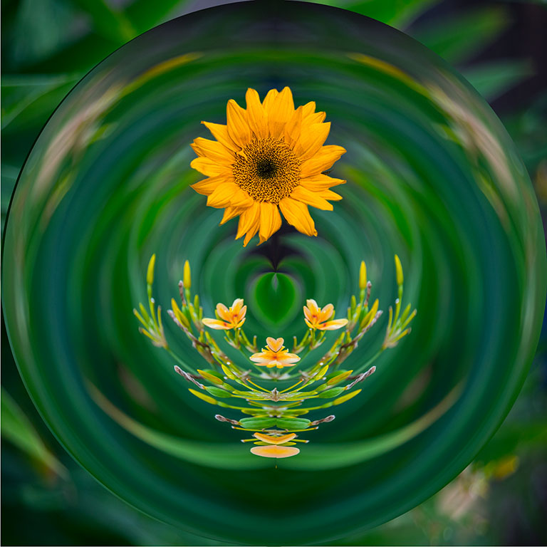
Yes, the colors are not quite true to life. But instead of taming them down, why not emphasize them and make a really wild abstract? Or crop in on some interesting sections? There are lots of possibilities here. |
Oct 21st |
| 77 |
Oct 19 |
Comment |
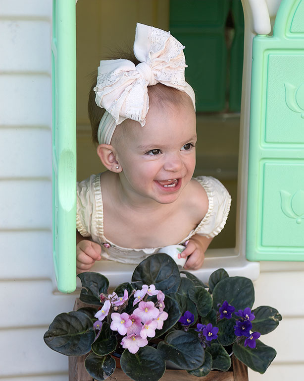
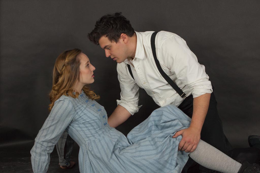
I do like the light and shadow pattern on the wall and think you chose it well for a background. The young lady is attractive and well-posed. The shadow falls awkwardly on her face. Perhaps this could be evened out if she moved a little towards or away from the light. Oh! What a wonderful suggestion. As if this situation arises every day. Sorry. street photography isn't about perfection but about the stories it tells. Her story suggests freshness, optimism, and a joy of life. Well done. |
Oct 21st |
| 77 |
Oct 19 |
Comment |
The original image looks like a nice experiment in unusual posing that doesn't quite make it. But you made it work! The cropping and the work on the eyes is perfect. Including elbows is a whole different shot and a whole different mood. Perhaps the hand on the bottom could be darkened bit because the eye goes first to the brightest area. That said, I went first to the darker face peeking through the hands. Hmmm. |
Oct 21st |
| 77 |
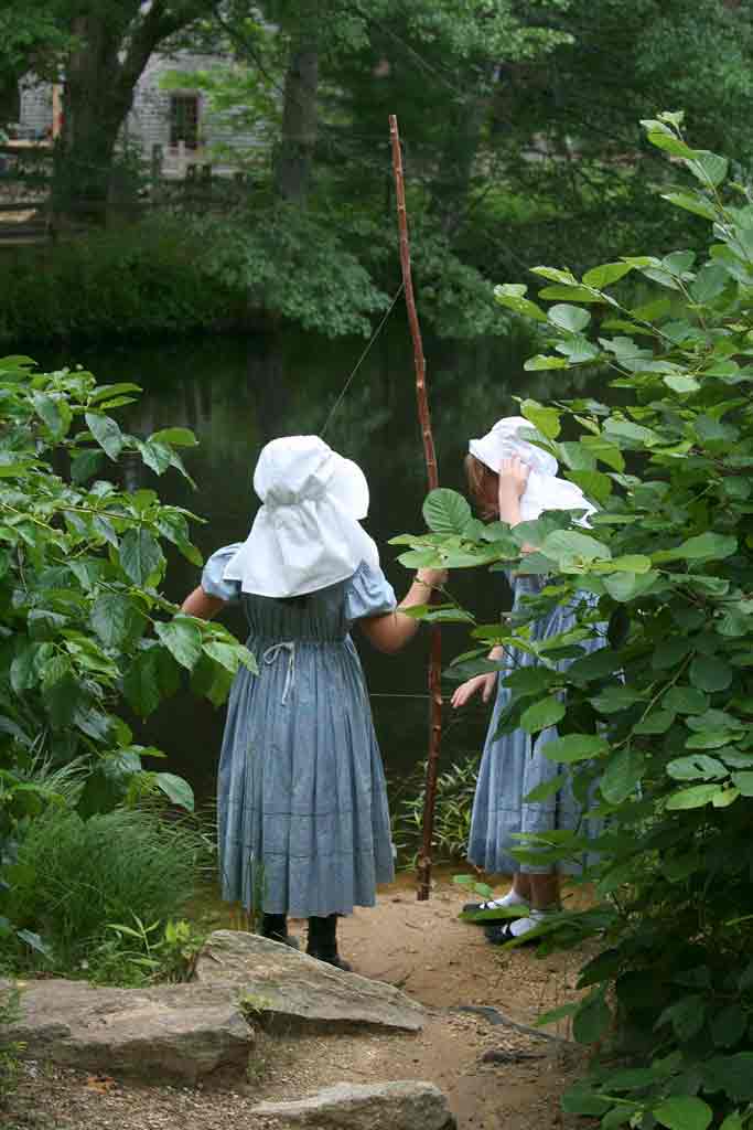
Oct 19 |
Comment |
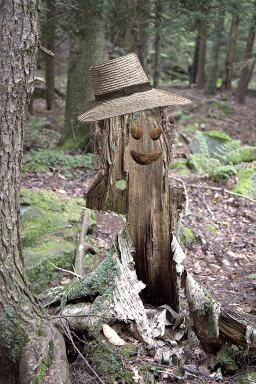
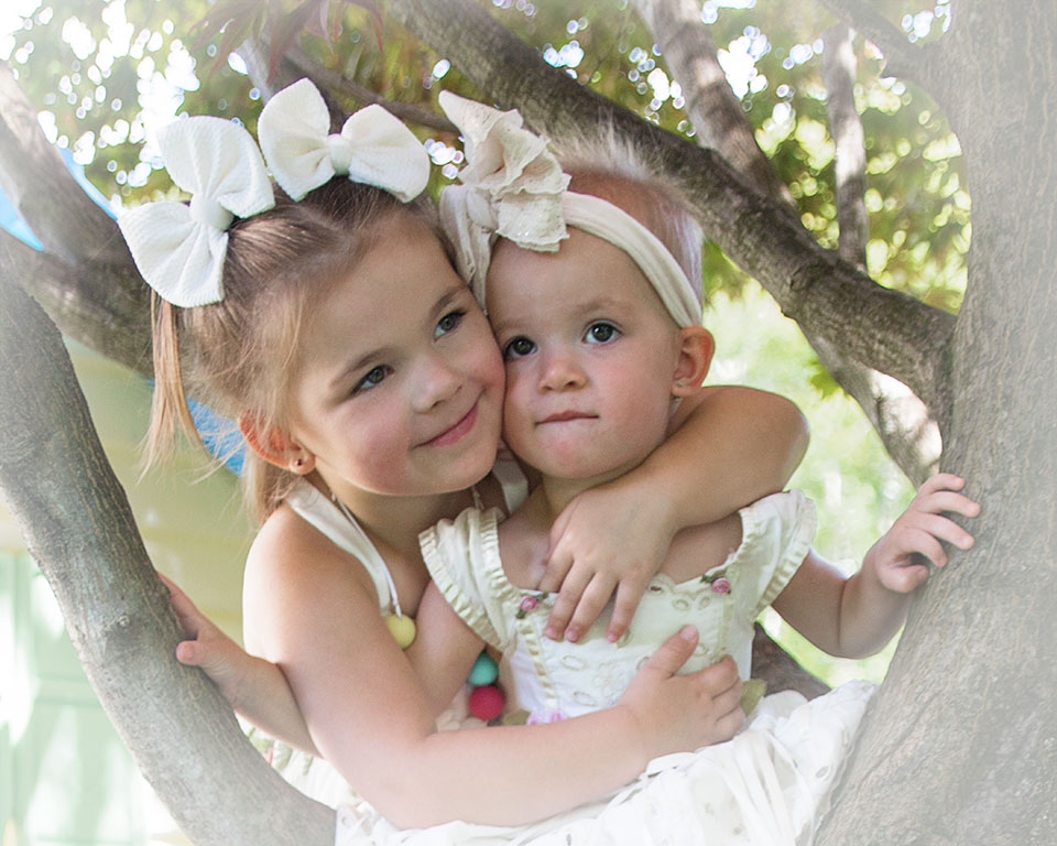
The original is a lovely shot, and, yes, it would have been nice to have the girls look at you over their shoulders. But what a dramatic statement you made with the final image! One could imagine many stories for this shot, most of them scary as a Grimm's fairy tale. |
Oct 21st |
| 77 |
Oct 19 |
Comment |
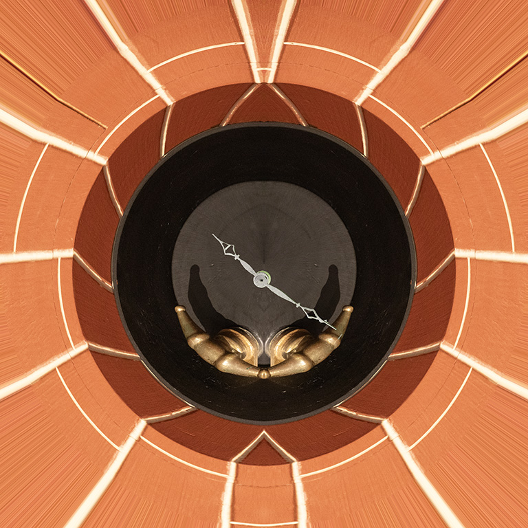
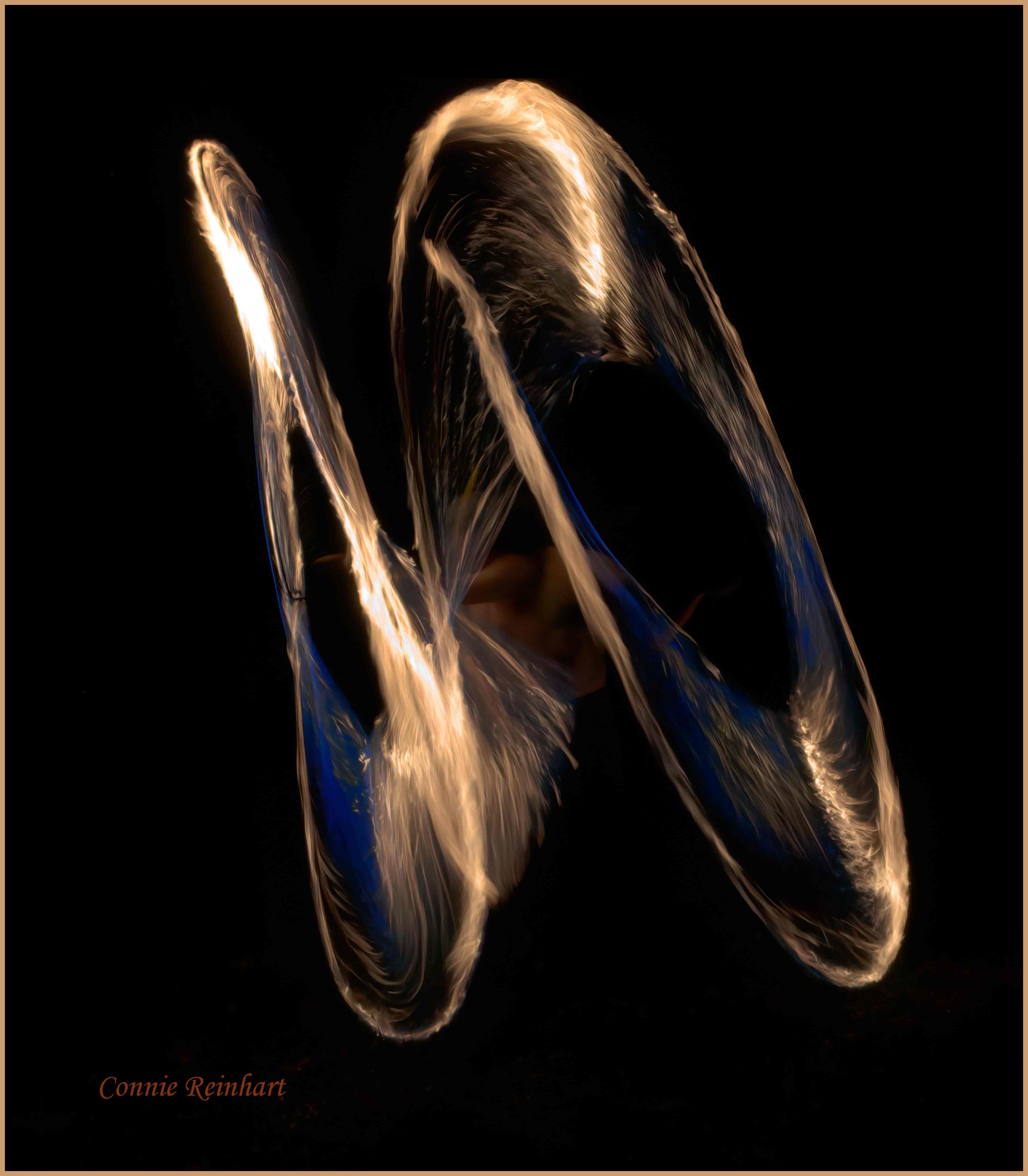
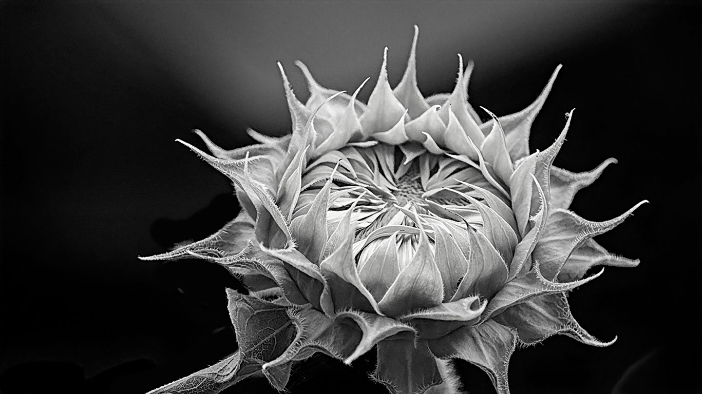
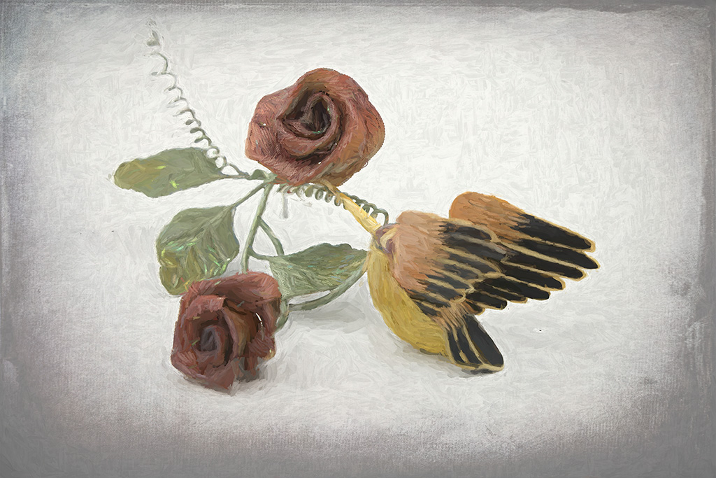
My husband just peeked over my shoulder and said that this looks like it belongs on the top of an antique jewelry box. He really liked it. You did a lot of work on this, and it was worth every pixel. I wouldn't change it - although I do understand the comments about that brighter green area. |
Oct 21st |
7 comments - 0 replies for Group 77
|
12 comments - 0 replies Total
|