|
| Group |
Round |
C/R |
Comment |
Date |
Image |
| 12 |
Sep 19 |
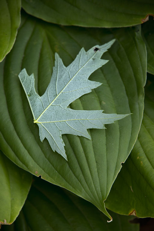
Comment |
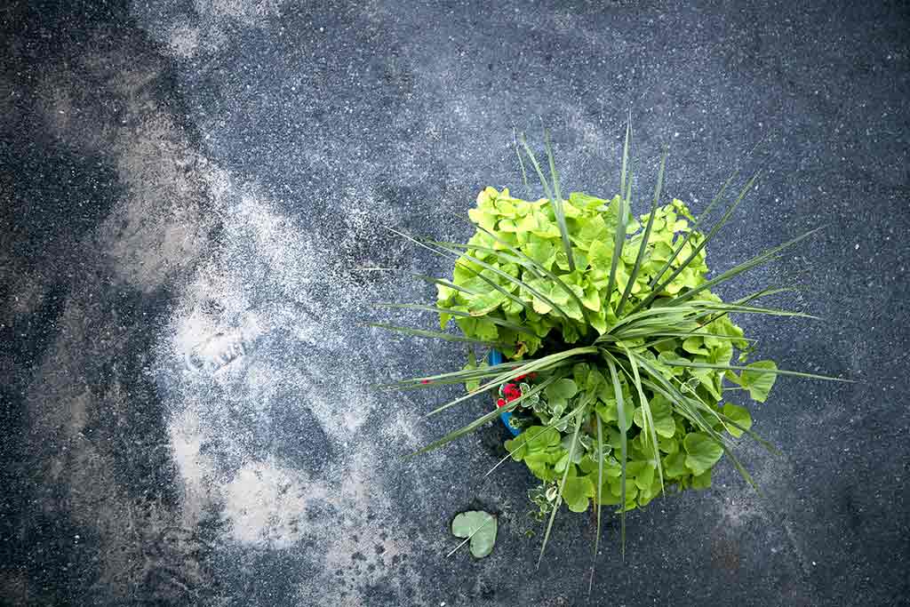
Thank you all for your comments. The leaf was there. What surprised me was the texture and various shades of the macadam. Yes, it's better with that upper right corner darkened. |
Sep 26th |
| 12 |
Sep 19 |
Comment |
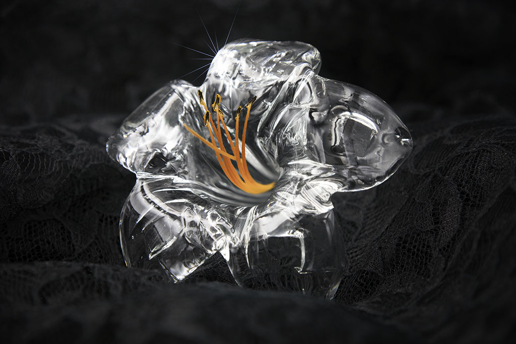
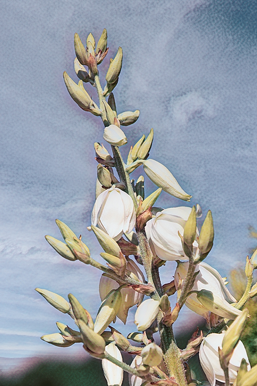
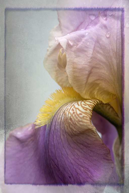
I love looking up through blossoms or leaves to see the transparency and softness of the colors. I also prefer the saturation that slight under exposure can give. That said, I do like the light pink background fill. It looks very natural. As to removing spots, I prefer to use the healing brush rather than the clone tool. But sometimes the clone tool is the only one that works. |
Sep 26th |
| 12 |
Sep 19 |
Comment |
Wow! were you lying on the bottom of the sea? This is great. And I like the fun suggestions listed above. The only thing I would do is clone or crop out that area in the upper left corner. The light on the fish creates an almost 3D effect.
|
Sep 16th |
| 12 |
Sep 19 |
Comment |
That is a looong way down. I like the cloud puffs and the bright sheen on the water. The curve of the bridge (is that the overwater highway?)is perfectly placed to my eye. The window frame and the spectator help to tell me the story of the shot. I think I might have liked to re-pose the girl if possible. However, it's difficult to approach a stranger and ask a favor. I hope you took lots of photos because this is a spectacular scene. I would suggest using a de-haze filter or hue/saturation to clear up some of that blue haze. |
Sep 16th |
| 12 |
Sep 19 |
Comment |
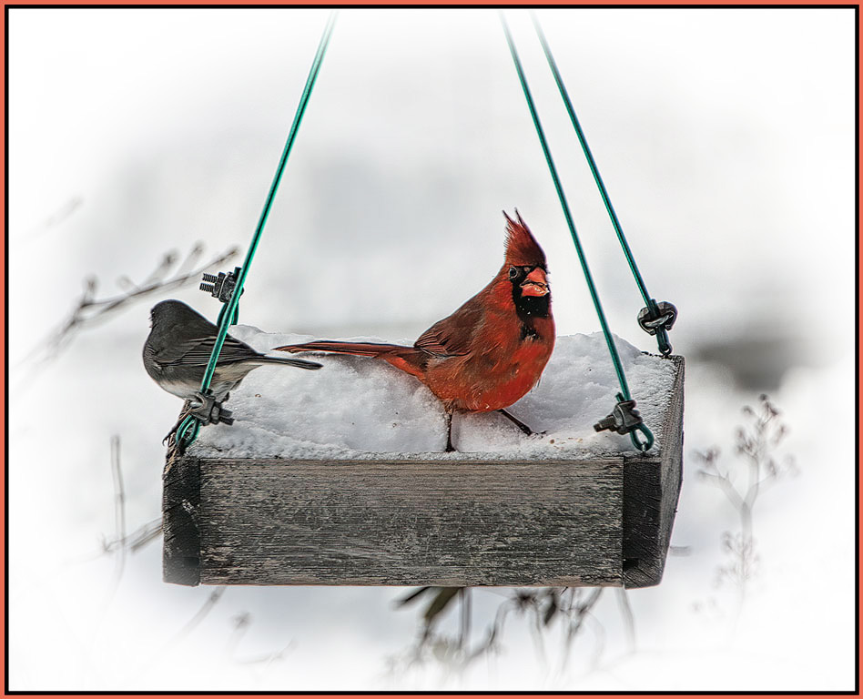
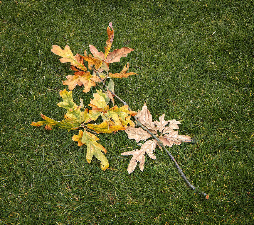
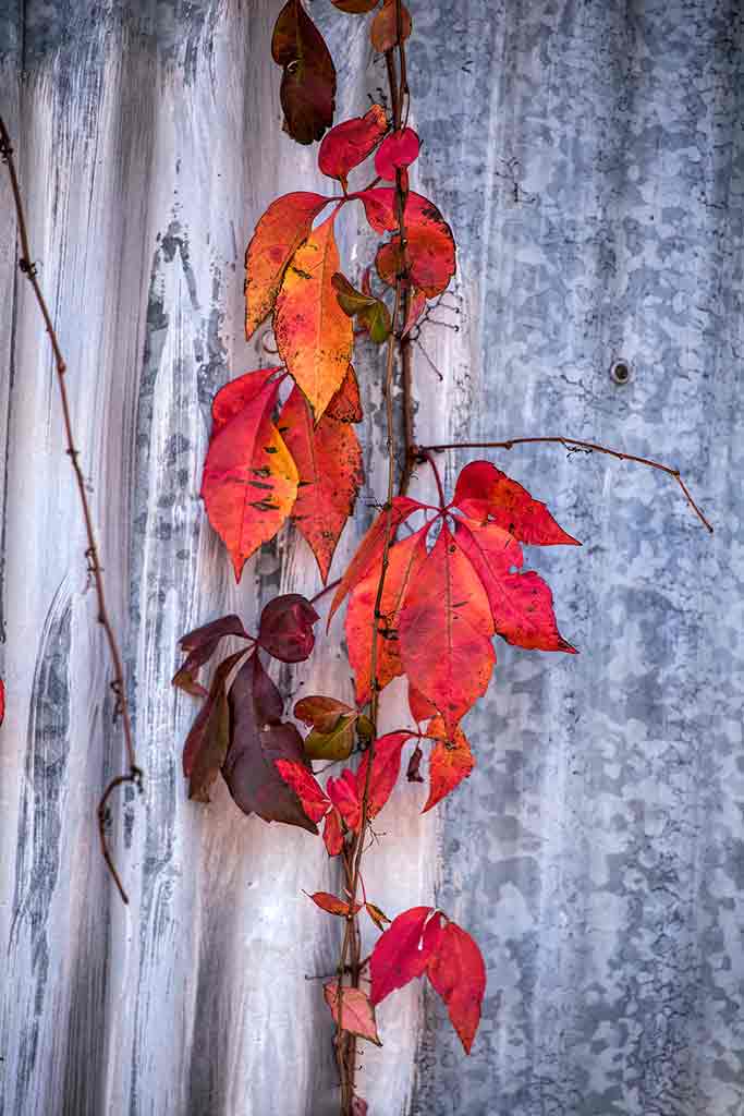
I like your composition with the tree leading in from the left right up to the eagle. The smaller branches fill in the bottom right area perfectly. The slightly ruffled feathers adds a lot of interest for me. I usually see eagle pictures showing the birds in their best 'bib and tucker'. I think that the empty sky helps the viewer concentrate on the eagle. I would like to see a subtle vignette around the edges. |
Sep 16th |
5 comments - 0 replies for Group 12
|
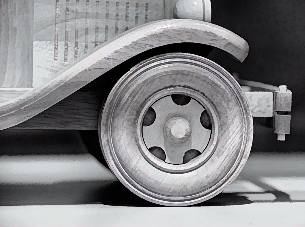
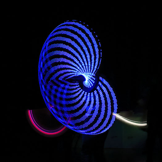
| 77 |
Sep 19 |
Comment |
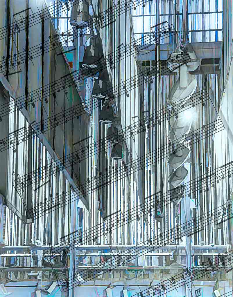
Thank you for your comments. I will make the suggested changes and continue to work on this image. Truthfully, on the home page, this image looks like a clutter of lines and does not compare favorably to all of yours. Your comments will definitely help my efforts. There must be at least 5 versions of this, none of them perfect. Which makes me think that we photographers are very lucky in that we can just keep on changing and adjusting until we hit that 'sweet spot.' |
Sep 16th |
| 77 |
Sep 19 |
Comment |
Well, we all see color differently. If the color in the final image is what the artist is looking for, then that is good. I like the curve of the boats. The anchors are part of the story, so I would keep them in. The half bird should definitely go, but I confess to not noticing it at first. The only thing I would change is the color of the sky. Adding a colored neutral density filter can give some problematic results. NIK Color Effects has a filter that simply darkens the colors that are there, rather than changing them. Topaz Studio has an adjustment that darkens the sides, but it is not as subtle as the NIK filter. |
Sep 16th |
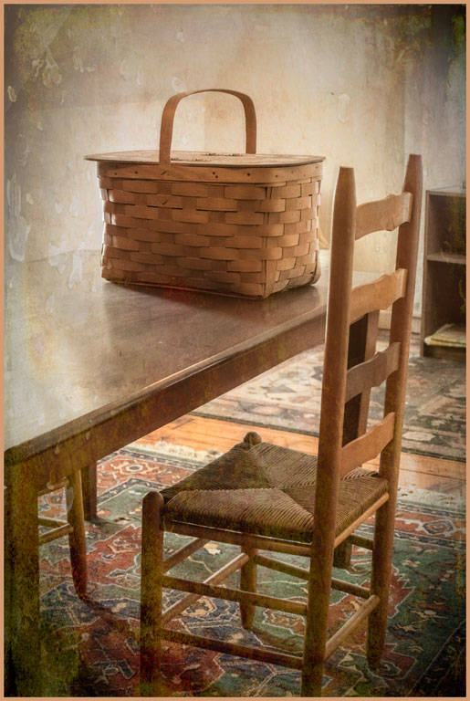
| 77 |
Sep 19 |
Comment |
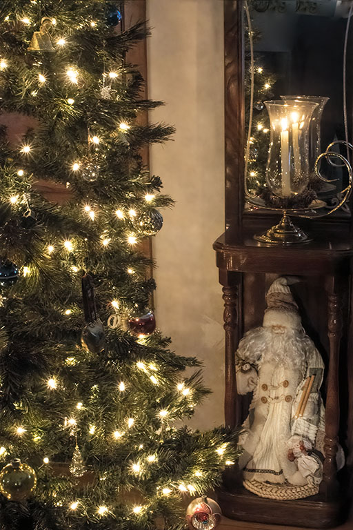
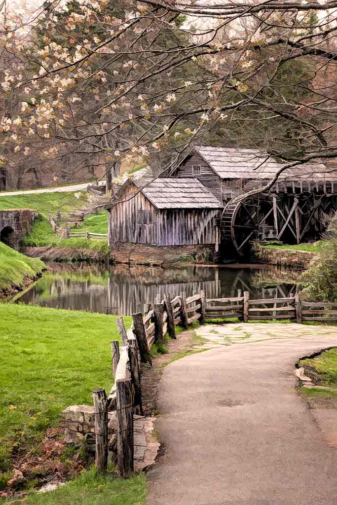
There are indeed several 'compositions' here. And perhaps you can just crop them out of the original. The line of lamp posts is a very nice diagonal. And the texture in the old tree is most interesting. I must confess a preference for darker images and richer colors. So I rather like the original better. However, you did a very nice job with the lilac wash. You could put a mask on the wash layer and bring back the original color on the 'turtle' area that Georgianne mentioned.
|
Sep 16th |
| 77 |
Sep 19 |
Comment |
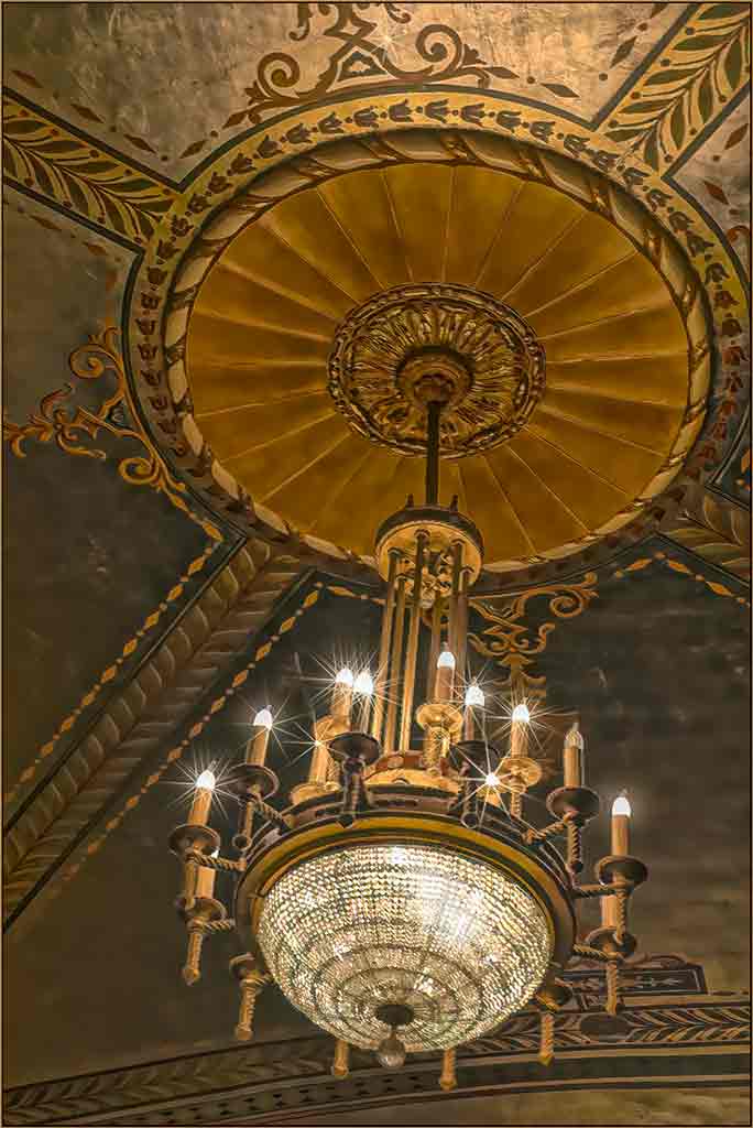
I love your interpretation of these skyscrapers. It certainly does make me feel very small in comparison - exactly the feeling you wanted. B&W removes the distraction of the blue. It's a lovely blue, but you want the viewers to concentrate on the buildings. I agree about the brightness of the lower left corner, but the light post doesn't bother me. Light posts are part and parcel of cities. Post processing can turn an OK picture into a good one. Nut it can also create something completely new, as you did here. |
Sep 16th |
| 77 |
Sep 19 |
Comment |
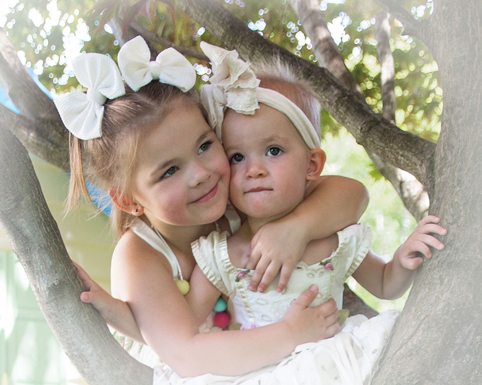
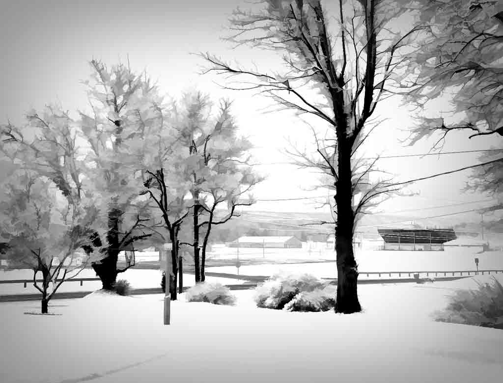
Here is a good lesson for all of us to keep our cameras handy and look all around us. A speaker at a photo conference was asked which camera takes the best pictures. His answer, "The one I have with me." I like the tighter cropping on the color version. But the B&W version is just marvelous. It does, indeed, make the viewer concentrate on the faces and the happiness shown. You have good tonal range, good composition, good focus. This image tells a story we would all like to be a part of. |
Sep 16th |
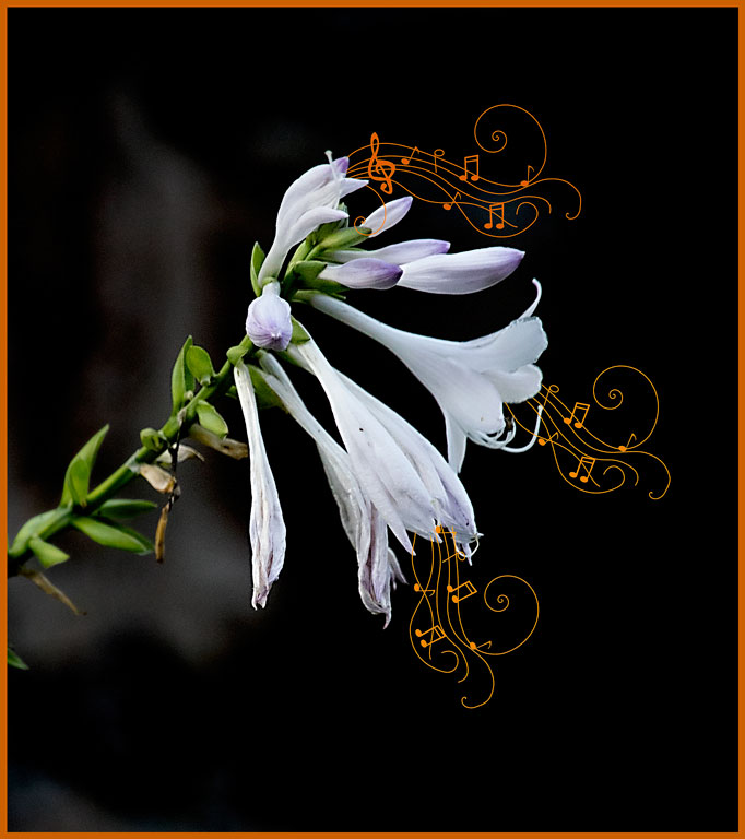
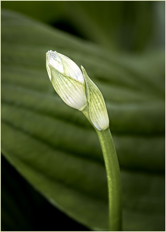
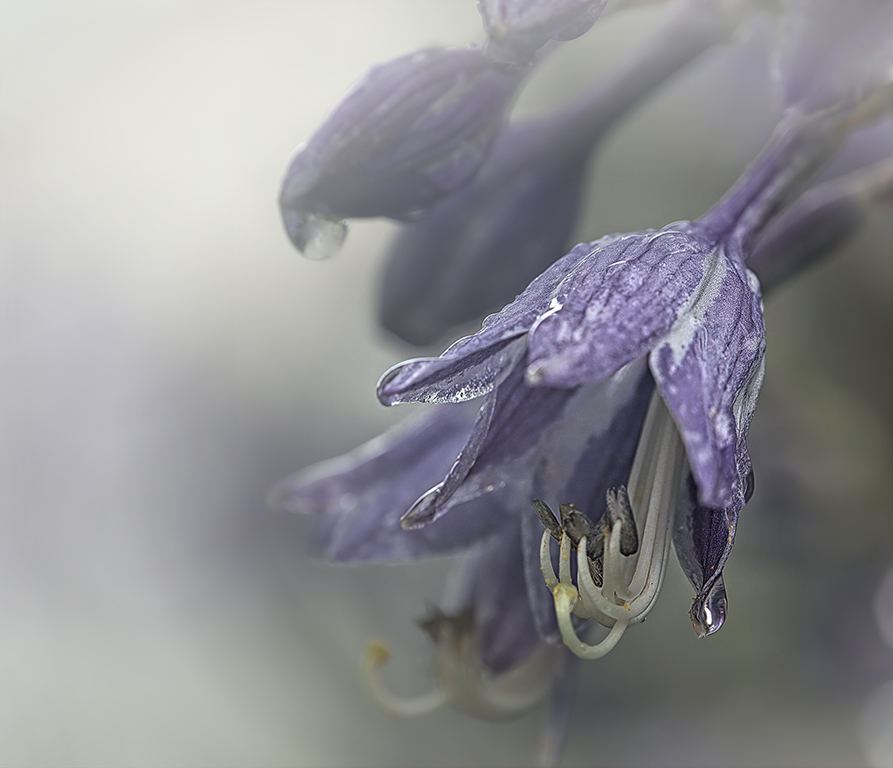
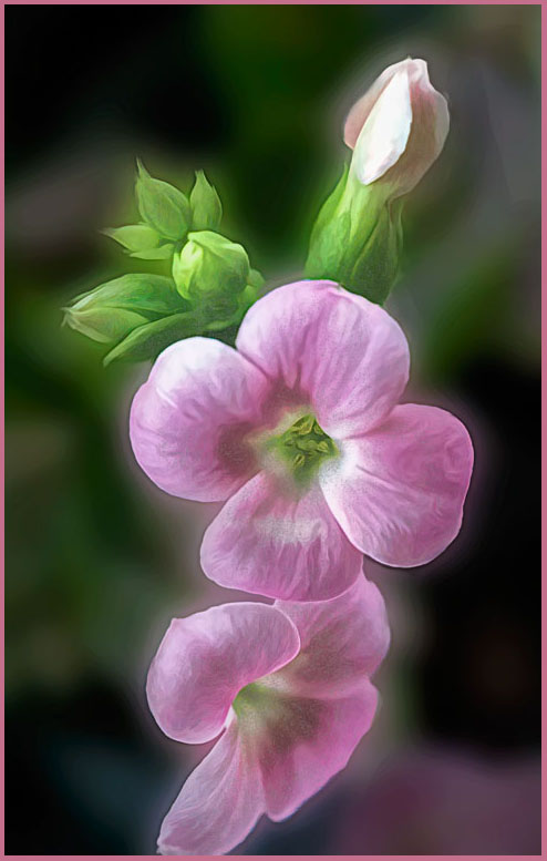
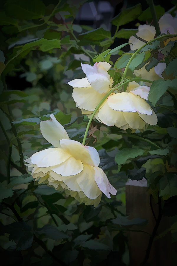
| 77 |
Sep 19 |
Comment |
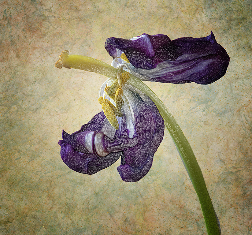
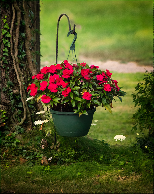
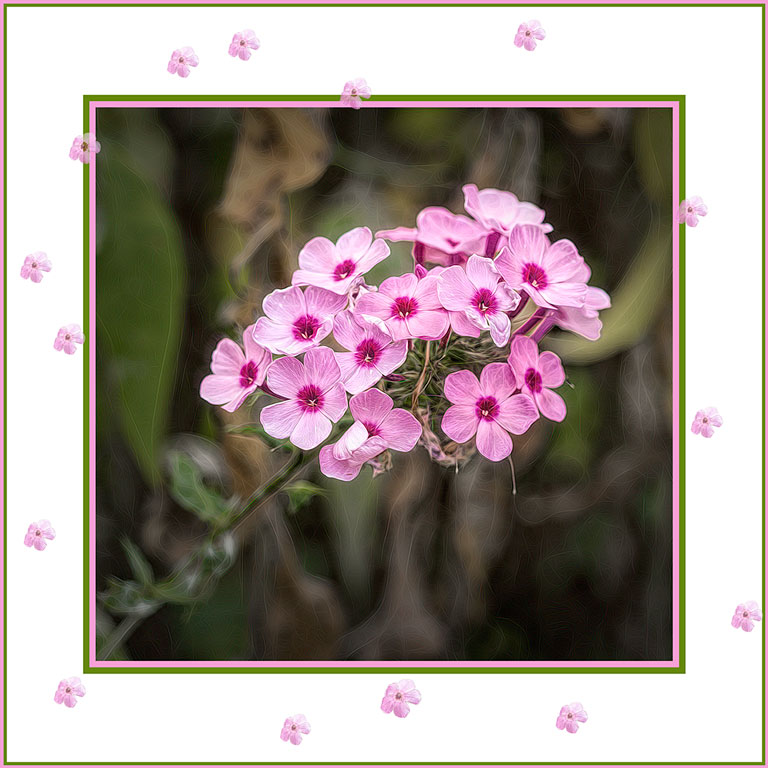
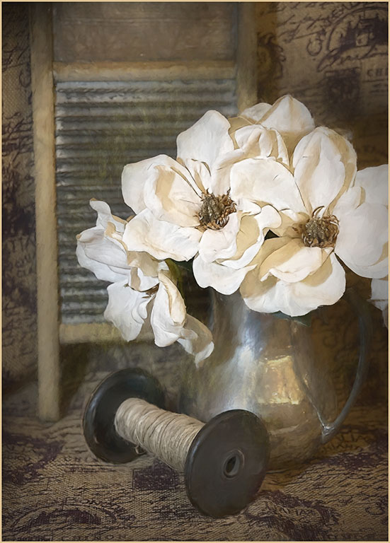
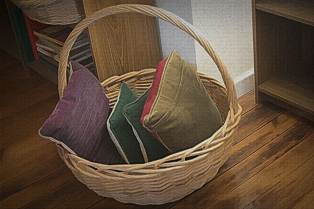
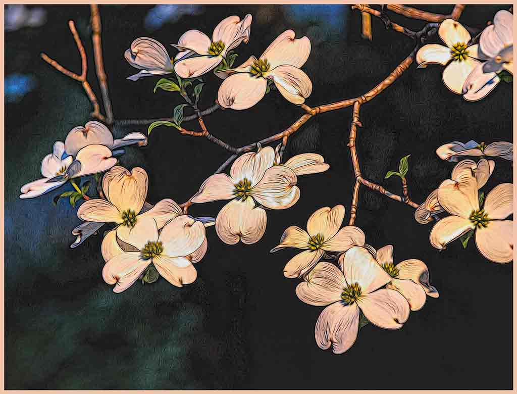
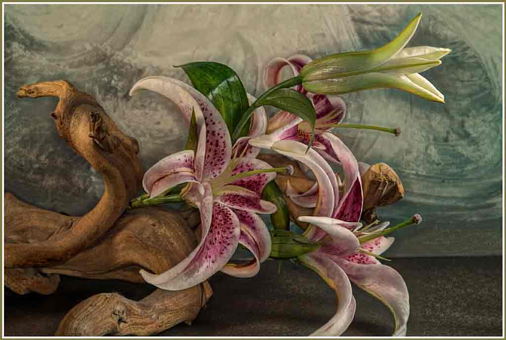
I too find the flowers to be beautiful. I especially like the graceful arch of the blooms and how it blends in to the bright stem on the right. I think I like the new version better. In the original, I would have left more of the foreground stems and leaves showing. Your texture is good, but I agree with Witta that you might move the bright highlight behind the blossoms. All that said, I do like the second version better. The flowers are brighter, the colors stronger, the background more homogeneous. |
Sep 16th |
6 comments - 0 replies for Group 77
|
11 comments - 0 replies Total
|