|
| Group |
Round |
C/R |
Comment |
Date |
Image |
| 31 |
Feb 17 |
Comment |
Hi, Ella!
Oh, a great image! Thank you so much! Rest for the eyes. I really like such decorative and beautiful still lifes with flowers. Especially in such a soft tone and contrast that you have made. |
Feb 22nd |
| 31 |
Feb 17 |
Comment |
Hi, Paul!
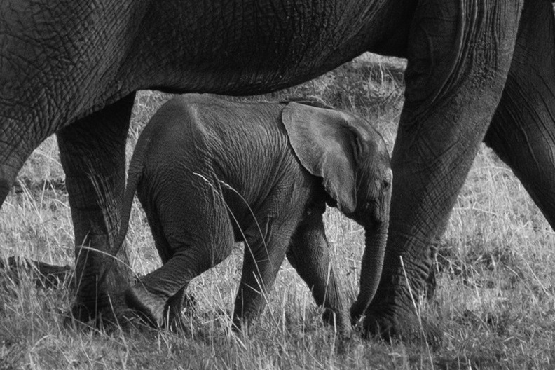
I like this image. Nothing to add. I saw at once the effect of the natural frame that highlights the main object, as Peter noted earlier in his comment. Good compositional method. I proposed options of a denser crop, but it is for my taste only. |
Feb 22nd |
 |
| 31 |
Feb 17 |
Comment |
Hi, Anu!
I like your image. Excellent hooked character. Really good piece of photojournalism. Agree with Peter about the good juxtaposition of the two heads. Do not even bother square crop, which is sometimes very controversial. Well done! |
Feb 22nd |
| 31 |
Feb 17 |
Reply |
Hi, Peter!
Thank you very much for the attention to details. Yes, totally agree with you. My rough technical error. I have missed halos. It's all my inattention to detail. I try to work with it. |
Feb 22nd |
| 31 |
Feb 17 |
Reply |
Hi, John!
Thank you very much for the assess of my image and analysis! The black square - ventilation grille. I have included in the frame for the balance with the object in the foreground. According to my feelings. ))) |
Feb 22nd |
| 31 |
Feb 17 |
Reply |
Hi, Ian!
Thank you very much for the assess of my image and analysis! Yes, the obvious details we sometimes do not notice, and the view from the side helps greatly. |
Feb 22nd |
| 31 |
Feb 17 |
Comment |
Hi, John!
Interesting image, a very beautiful place. Reflection gorgeous. But i agree with colleagues that the image is a little flat. I feel that there is missing something in the foreground to create depth. |
Feb 22nd |
| 31 |
Feb 17 |
Comment |
Hi, Peter!
An interesting combination of form and rhyme crosses on different planes. I like it!
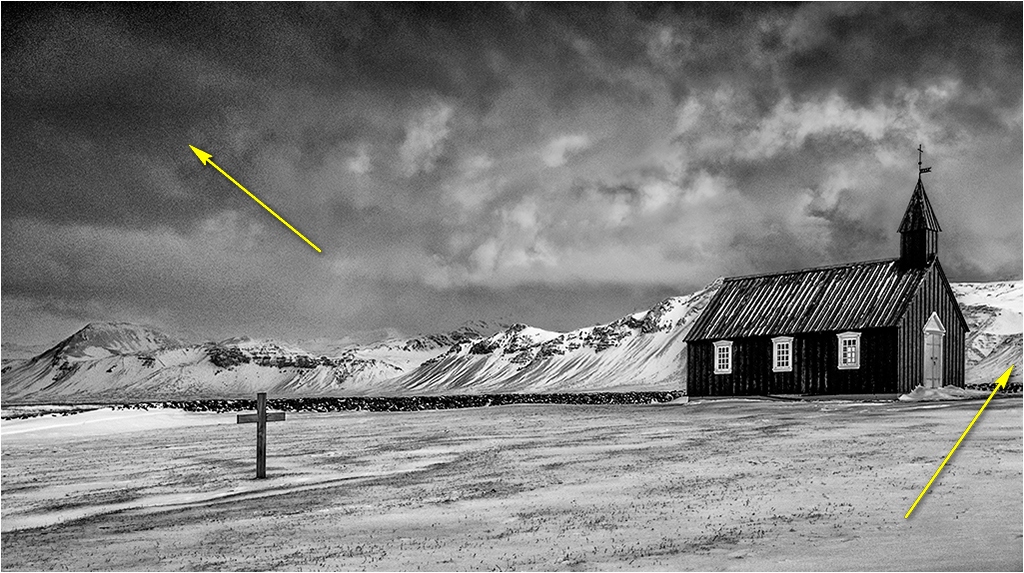
From my point of view, there is a slight feeling of imbalance in the frame. You can check flipping the image horizontally. Then an imbalance is amplified even more dynamic. Black Church outweighs the cross in the foreground. Probably need to leave more space after church or made more darken sky above cross on first plan. Perhaps this is just my feeling. ) |
Feb 22nd |
 |
| 31 |
Feb 17 |
Comment |
Hi, Ian!
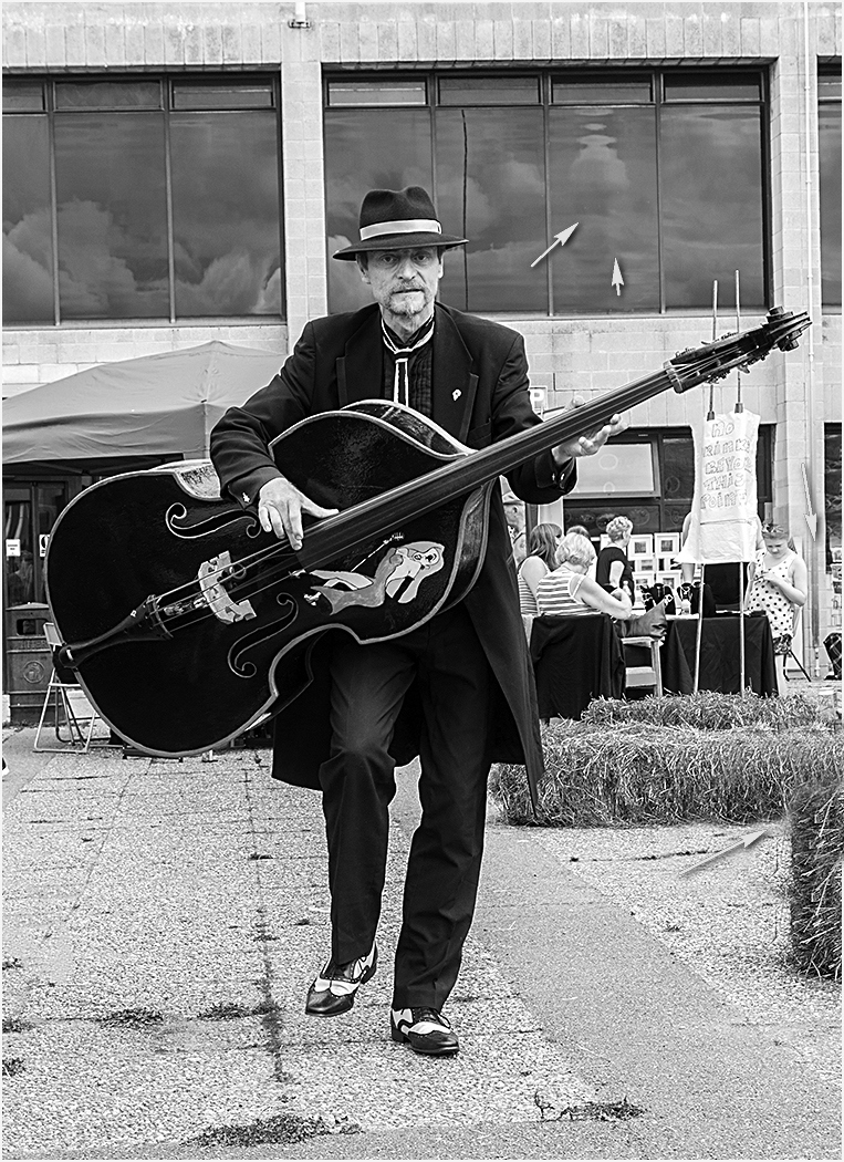
I like this character and situation. Well done. I have feeling that a little closely for character in frame. I would a bit cleaned some details on background, darken and add some contrast for character. |
Feb 22nd |
 |
| 31 |
Feb 17 |
Reply |
Hi, Paul!
Thank you for your examination and example. I like your version. I missed a spot on the first pillar, I have always had problems with some details on my images. My bad. With exposure too. Often I doubt that will be overexposure. |
Feb 13th |
6 comments - 4 replies for Group 31
|
6 comments - 4 replies Total
|