|
| Group |
Round |
C/R |
Comment |
Date |
Image |
| 33 |
Nov 19 |
Reply |
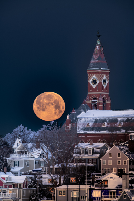
Where do you live Bob? |
Nov 18th |
| 33 |
Nov 19 |
Reply |
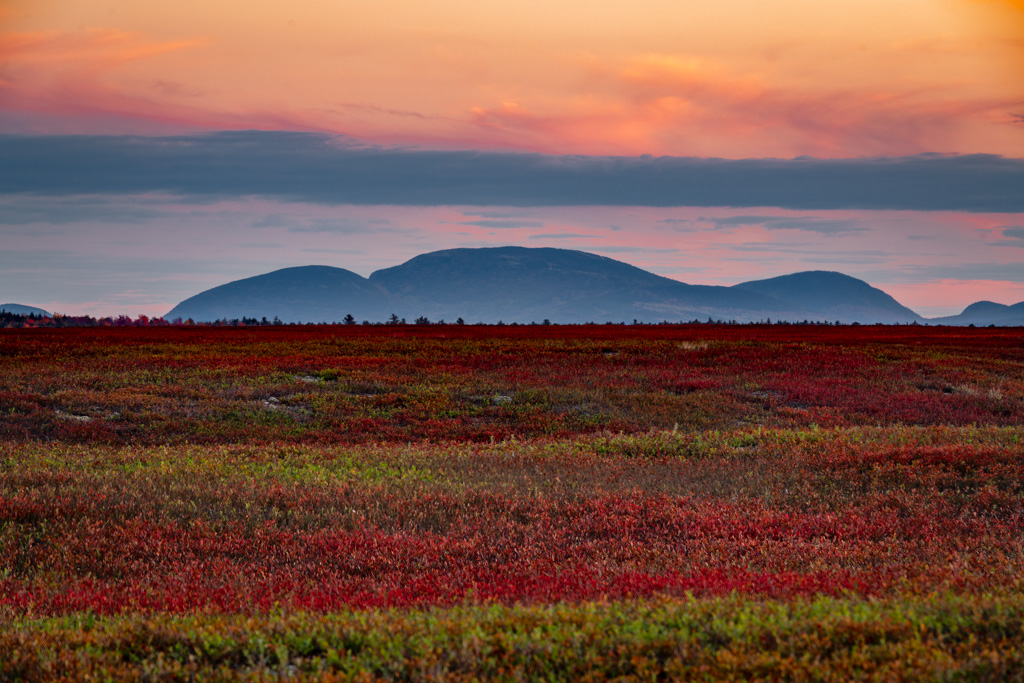
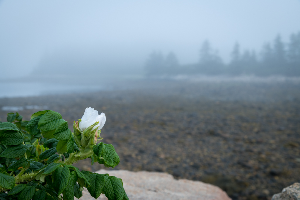
Hi Elizabeth,
Those are not blooms but the leaves and stems of fall colors, just like the maple trees. The leaves have now fallen off but the fields look somewhat red doe to the leftover stems. Wild blueberries are bi-annual and only get these colors during the year of production and will be many colors from crimson, red, pink, orange, yellow to lilac. I am not sure why the color variation but I would assume that it is due to soil type ar pH |
Nov 18th |
| 33 |
Nov 19 |
Comment |
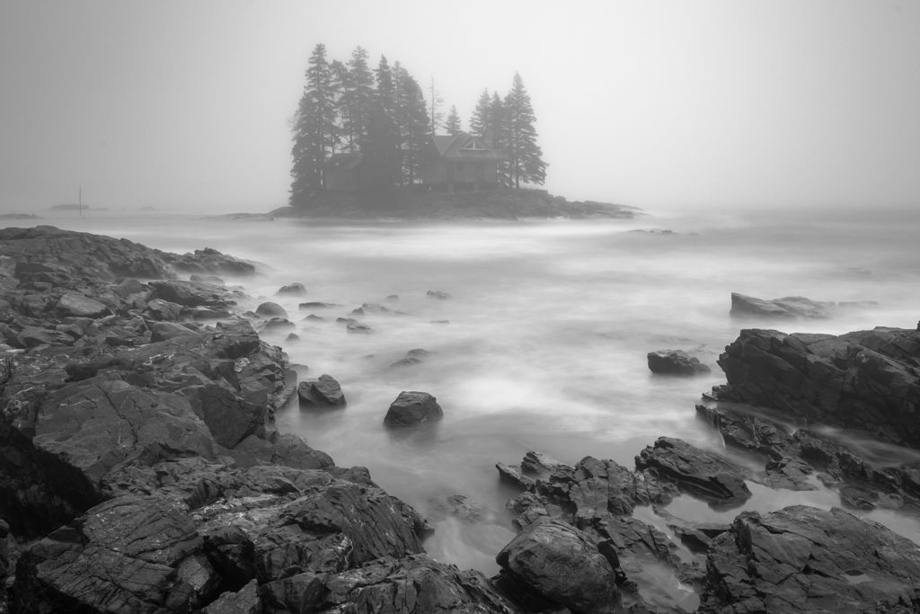
I noticed that there are not many comments on your image this month and I know for myself, if I am not sure what to say about an image, I post nothing. So in this case, I do know what to say so I will expand on my thoughts. First of all, I agree with what Marilyn has said. I find that horizontal lines often create a sense of calm and that the waterline, the dune line, the side view of the boats as well as the direction of the anchor line for the blue boat all give a consistent horizontal theme. I also think that your choice of a pano continues this trend. Cooler colors are more calming to the viewer and the blue cast, as well as the haze diminishing the background, is also very consistent. My only thought, which you may have tried would be to reduce the saturation a little bit on the green boat. As I said before, very nice and it seems to me, a very well thoughout image |
Nov 17th |
| 33 |
Nov 19 |
Reply |
Good observation Paul |
Nov 14th |
| 33 |
Nov 19 |
Comment |
Very nice! |
Nov 9th |
| 33 |
Nov 19 |
Comment |
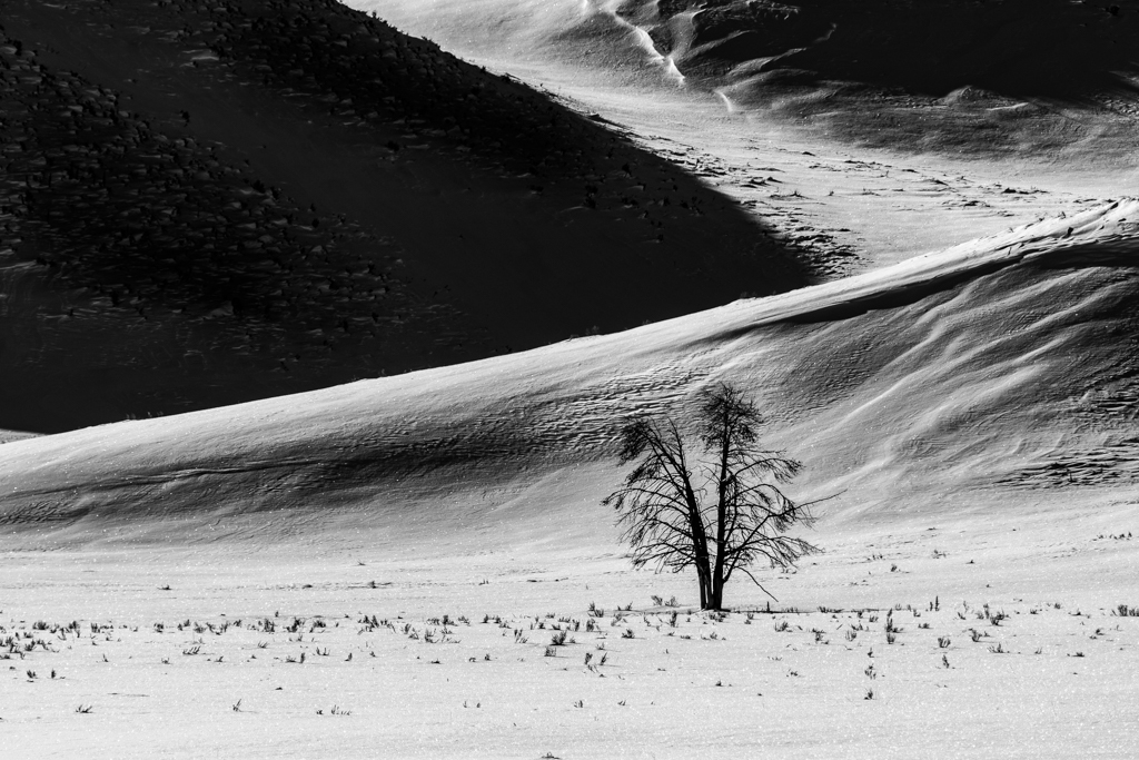
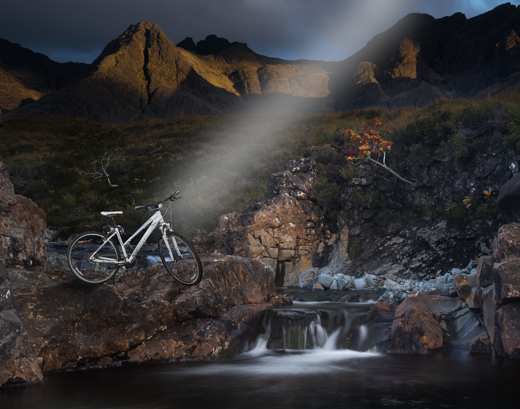
I love what you are trying to do and I think that the idea and the composition work really well. It looks as if you have some artifacts near the tall tree and on the left side of the bigger stack |
Nov 9th |
| 33 |
Nov 19 |
Comment |
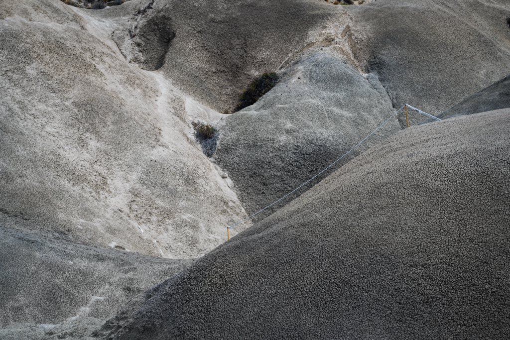
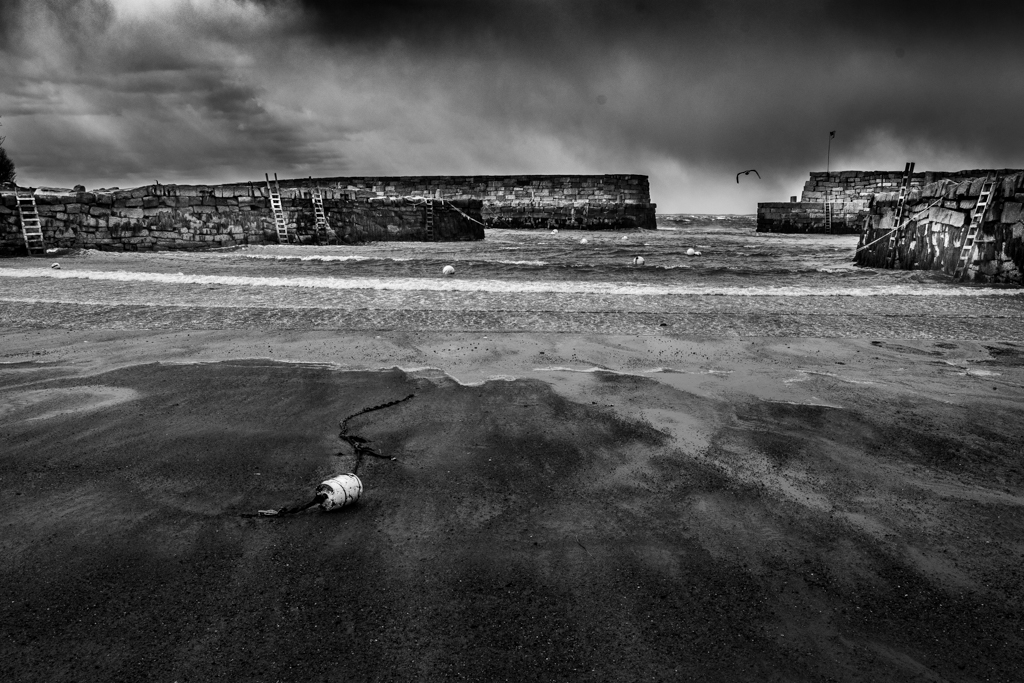
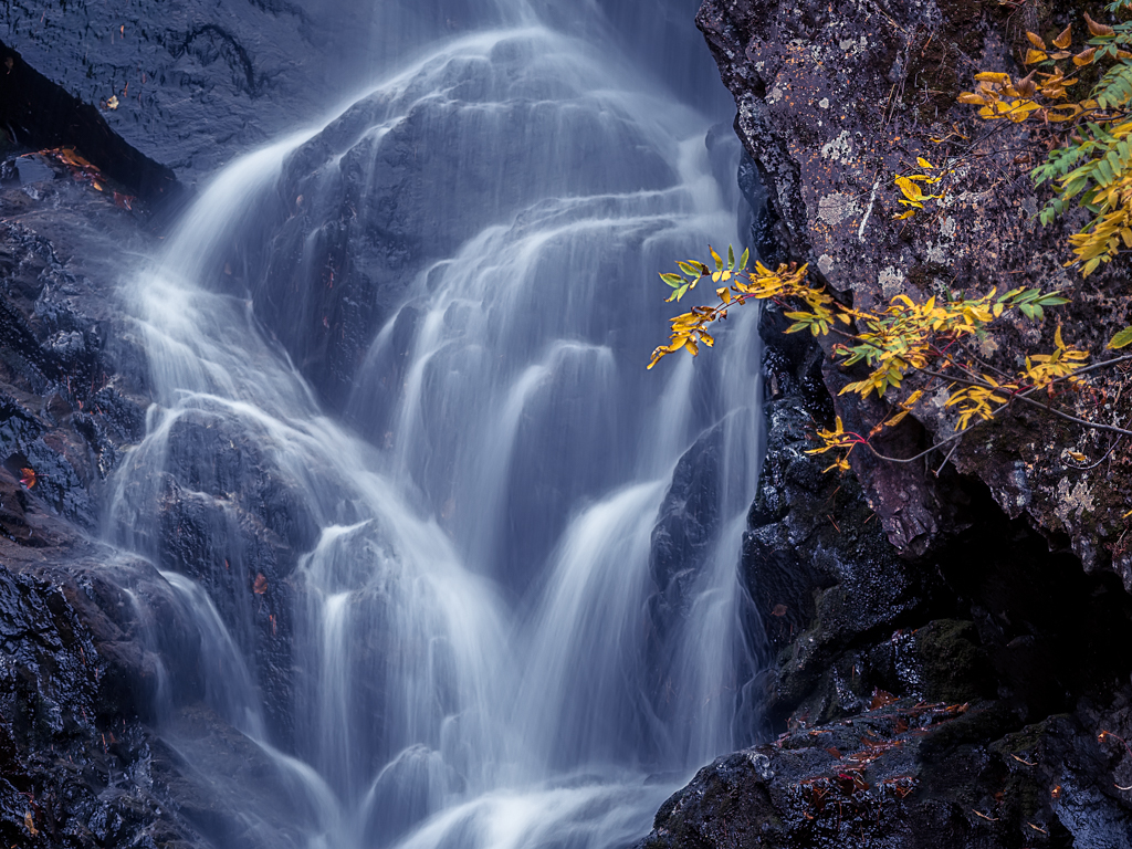
The image certainly looks very painterly, primarily because of the dunes being so soft. Did you plan that, did you want that or did you not want that? I sometimes get that look in low-frequency parts of my image, similar to your dunes, if I add too much noise reduction |
Nov 9th |
| 33 |
Nov 19 |
Comment |
The polarizer seems to have really brought out the colors and I love the color palette of this image. I think that the diagonal fence drives your eye to the building but the brush does interfere. Could you trim back the brush in from of the horizontal bush and trim back the reddish bushes in front of the house? It might also be fun to do some light painting on this scene. I think you have a very good idea about returning to the scene and trying to get new interpretations |
Nov 9th |
| 33 |
Nov 19 |
Comment |
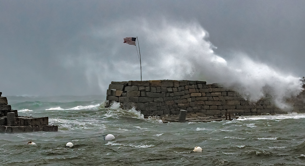
I have been there also and found the crowds to be aggravating but the sight is very impressive. There is a lot of atmospheric water vapor flattening out the image. Did you try some dehaze to perhaps improve the contrast? |
Nov 9th |
| 33 |
Nov 19 |
Comment |
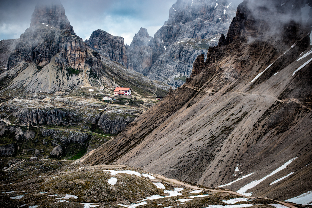
Hi Raymond,
Great scene with beautiful blue and sunlight on the mountains. I agree with Marilyn in that the white hotel seems too white. Perhaps you might bring up the luminosity of the shadows and see if the hotel seems more real or inc the shadows and reduce the luminance a bit on the hotel. Nice composition, especially with the road leading up to the buildings |
Nov 9th |
7 comments - 3 replies for Group 33
|
7 comments - 3 replies Total
|