|
| Group |
Round |
C/R |
Comment |
Date |
Image |
| 33 |
Feb 19 |
Reply |
Bob, see my reply to Elizabeth |
Feb 22nd |
| 33 |
Feb 19 |
Reply |
Larry, See my reply to Elizabeth |
Feb 22nd |
| 33 |
Feb 19 |
Reply |
Bob, see my reply to Elizabeth |
Feb 22nd |
| 33 |
Feb 19 |
Reply |
Mayilyn, see my reply to Elizabeth |
Feb 22nd |
| 33 |
Feb 19 |
Reply |
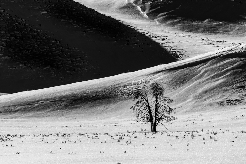
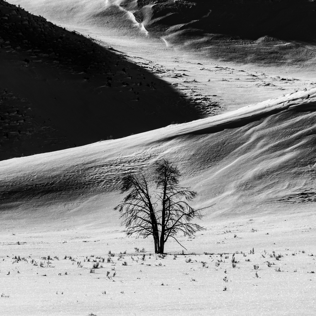
Hi Elizabeth. I think that this is when the DD groups are at their best i.e. getting different points of view. I love hearing how different people see different things in an image and being able to verbalize what they are seeing. I was told that this is one of the most photographed trees in Yellowstone in winter so it is interesting to have different interpretations. Is the large black are ominous or distracting? Are the stubbles in the field and hillside adding something or should there be none and simplicity as in a Japanese minimalist photo? What do the diagonal lines do for you and do they add? I am not sensitive to what may be perceived as criticism in any of the images that I present and welcome different interpretations as well as different thoughts on composition and post processing. Thank you all for your input and keep it coming. I will try to put in more provocative images in the future. |
Feb 22nd |
| 33 |
Feb 19 |
Comment |
You are absolutely right, Bob. Family is most important not to mention longevity in the job and should be highlighted. The heck with the tracks |
Feb 17th |
| 33 |
Feb 19 |
Comment |
Good Morning Larry,
I am not familiar with the Leica so I have a question about your scenic Mode and Vivid settings. Were these in camera settings and if so are the settings just for jpeg images seen in the LCD as it is in my Nikon? |
Feb 14th |
| 33 |
Feb 19 |
Reply |
Thanks for your thoughts Paul. I see what you are saying about the shadowed area on the left is overwhelming. What do you think about the square crop? |
Feb 11th |
 |
| 33 |
Feb 19 |
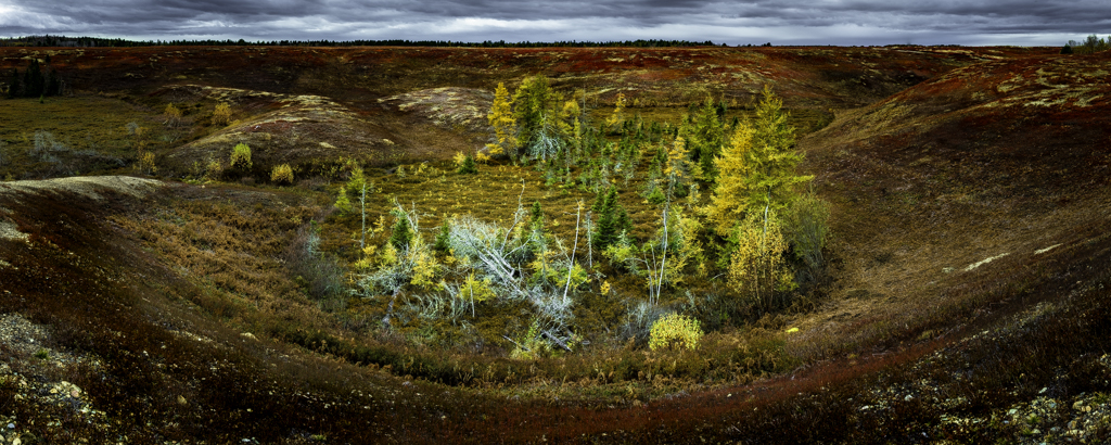
Comment |
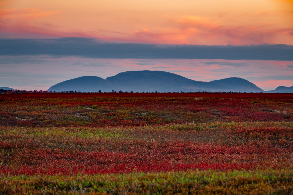
I feel like this is an abandoned home on a patch of weeds but in the background, there seems to be a farming community on the horizon with cared for crops. It does make me wonder and think about what happened to this place. I like to tones and colors, I like the position of the house with the rain showers to the left in the background and I like the little sliver of light on the right side of the horizon. Nice job |
Feb 11th |
| 33 |
Feb 19 |
Comment |
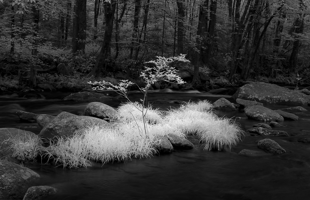
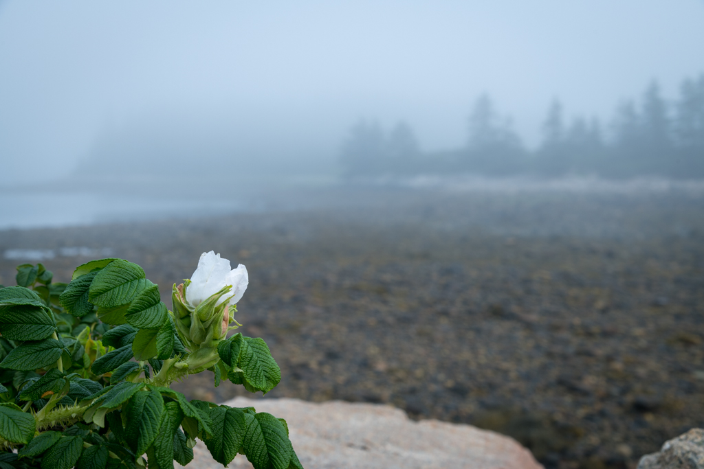
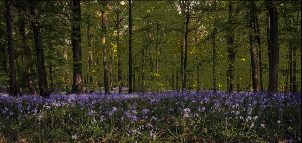
I would like to be there to work the scene. Very nice image. I really like the colors of the flowers vs the sunny woods and the reds in the leaves and tree trunks vs the green vegetation. One suggestion would be to lighten up the flowers and darken the sunlit area of the back ground. I tried it in the attached image |
Feb 7th |
 |
| 33 |
Feb 19 |
Comment |
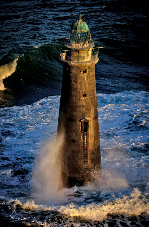
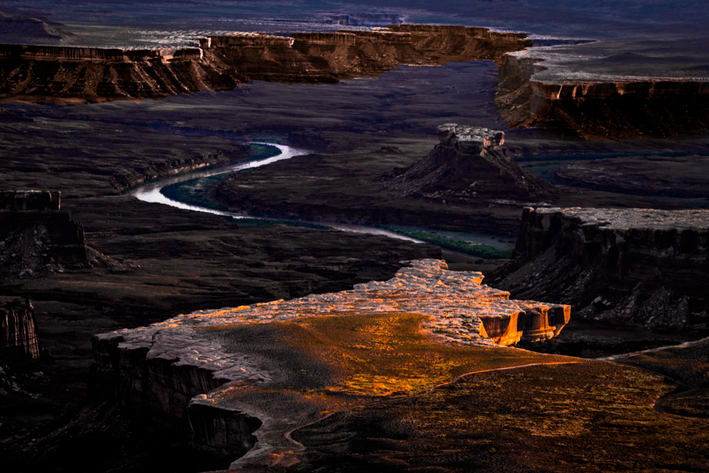
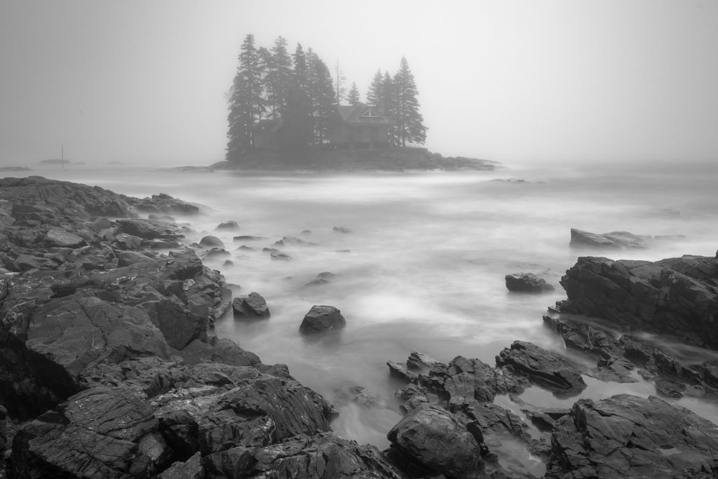
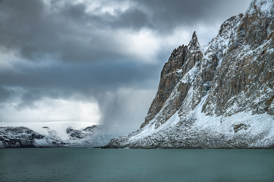
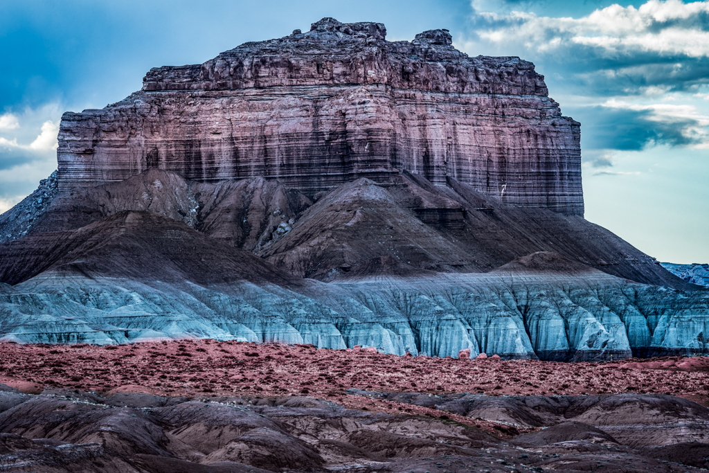
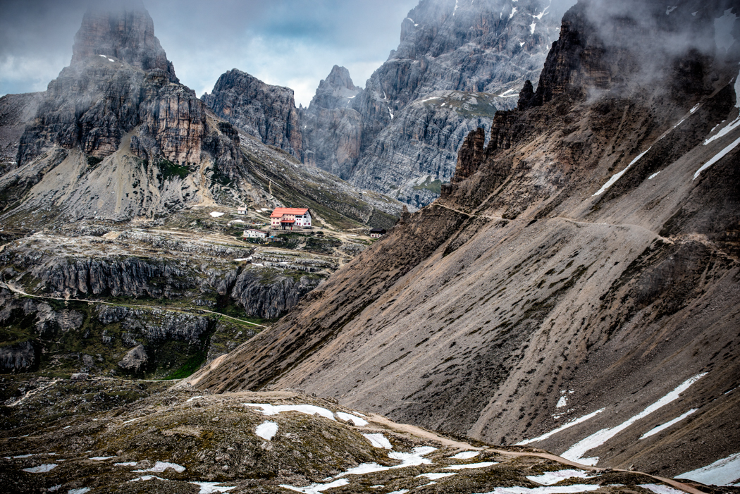
Great composition. I love the "grand" feeling of the building on the top of the rocks as well the triangle shape of the rocks & buildings going from right to left. I question the saturation a little because the trees in the background shore look too green. Usually the atmospherics at that distance will give a little more blue cast ?? |
Feb 7th |
| 33 |
Feb 19 |
Comment |
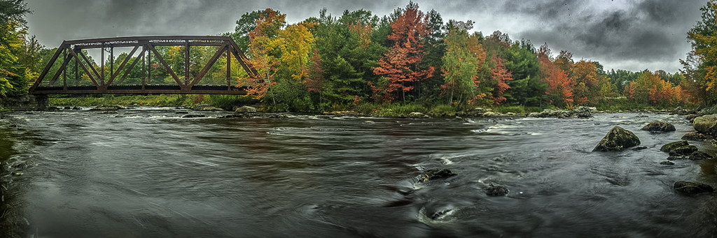
I really like the fact that it is in B&W, the strong leading line of the track and the placement of the switching device. slight suggestions, perhaps clone out the Greenbaum sign or at least the lettering and to darken the blue part of the sky |
Feb 7th |
| 33 |
Feb 19 |
Comment |
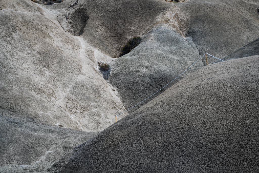
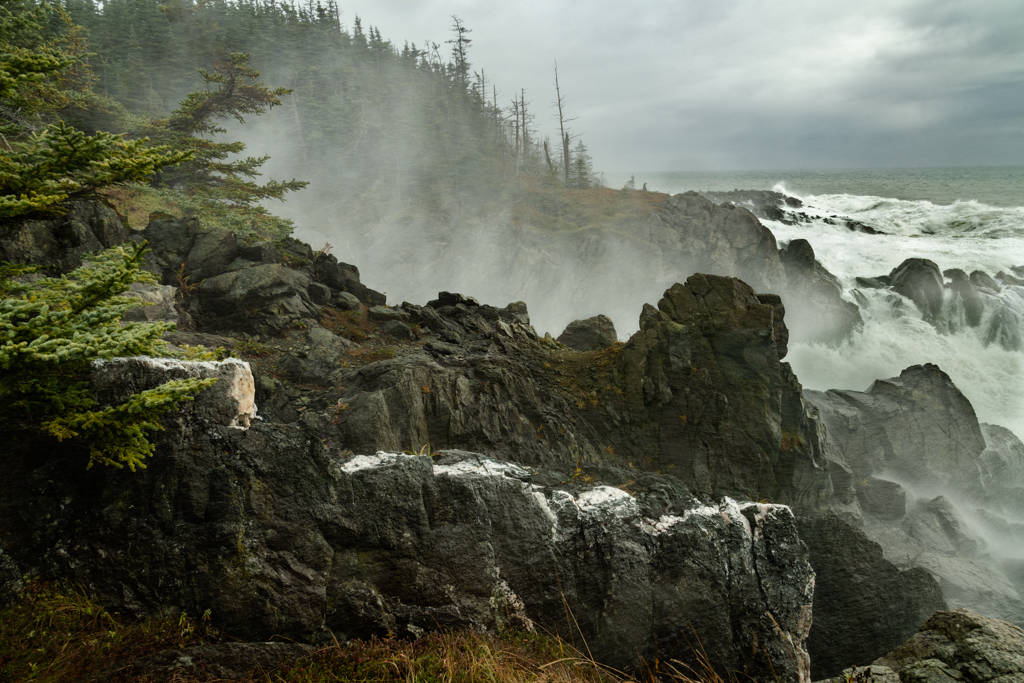
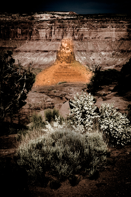
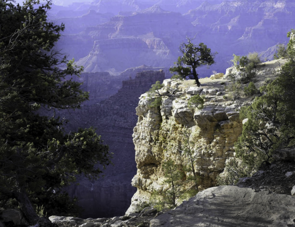
Hi Marilyn, welcome to the Group. I am not familiar with Paint Shop Pro so I will make my suggestions general and you can determine how to try them if you so wish. I find this a fascination location and I think that it has wonderful potential. First, let me tell you how I look at my images to help explain my suggestions. From a composition standpoint I try to decide where I want the viewers eye to go and try to make that happen. Sometimes that is described as the subject, sometimes it may be called the point of interest and sometimes it is called the main or supportive actors in the scene which is the stage. Anyway, as I look at this image I think to my self, what is the subject? Is the the tree on the cliff or is it the cliff itself. If it is the cliff, I would increase the saturation of the cliff. The warm yellows of the cliff really separate it well from the cool colors of the shadows in the background. Also, by burning the trees on the edge of the frame, this drives you eye more to the cliff and increases the feeling of three dimentionallity (is that a word Ms writer?). If you subject is the tree, the tonality between the tree and the shadowed back ground around it are very similar (in the 50-60% range as measured in Lightroom). So, what I have done in Lightroom is to burn (darken) the tree and dodge (lighten the area behind the tree slightly. You can see this in the attached image. I really like the sense of depth in the image, the tree on the left giving a feel of a frame, the placement of the cliff. Good capture, just some suggestions for post processing |
Feb 7th |
 |
7 comments - 6 replies for Group 33
|
7 comments - 6 replies Total
|