|
| Group |
Round |
C/R |
Comment |
Date |
Image |
| 33 |
Mar 18 |
Reply |
I wrote an article for our club newsletter called "Why People Hate the Rule of Thirds. As I said in my comments, I has hiding behind a 12" thick wall to try to keep my lens dry so I was stuck there |
Mar 18th |
| 33 |
Mar 18 |
Reply |
Thanks Larry |
Mar 18th |
| 33 |
Mar 18 |
Comment |
Your remake is very nice Dan |
Mar 17th |
| 33 |
Mar 18 |
Comment |
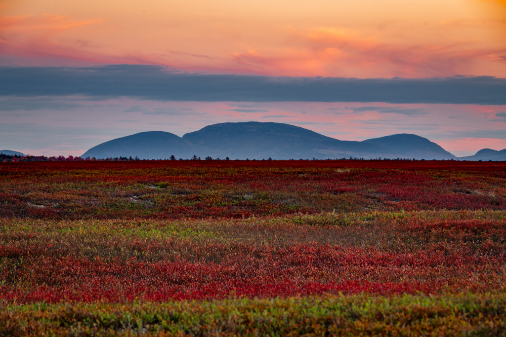
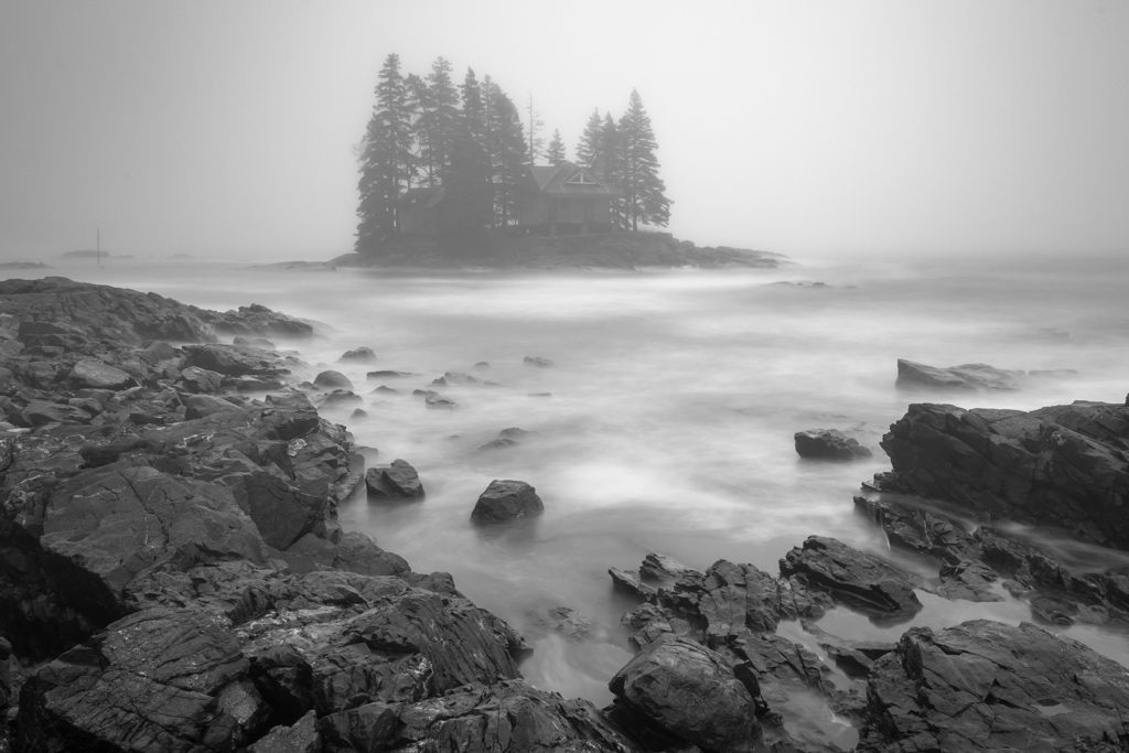
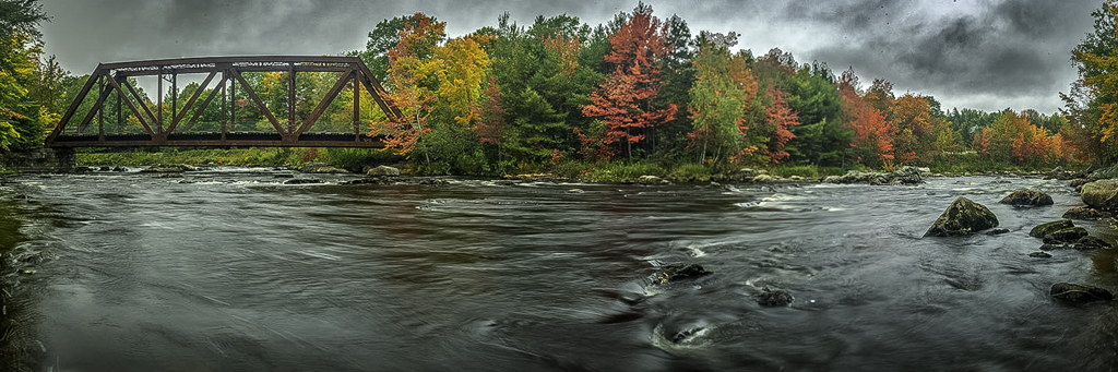
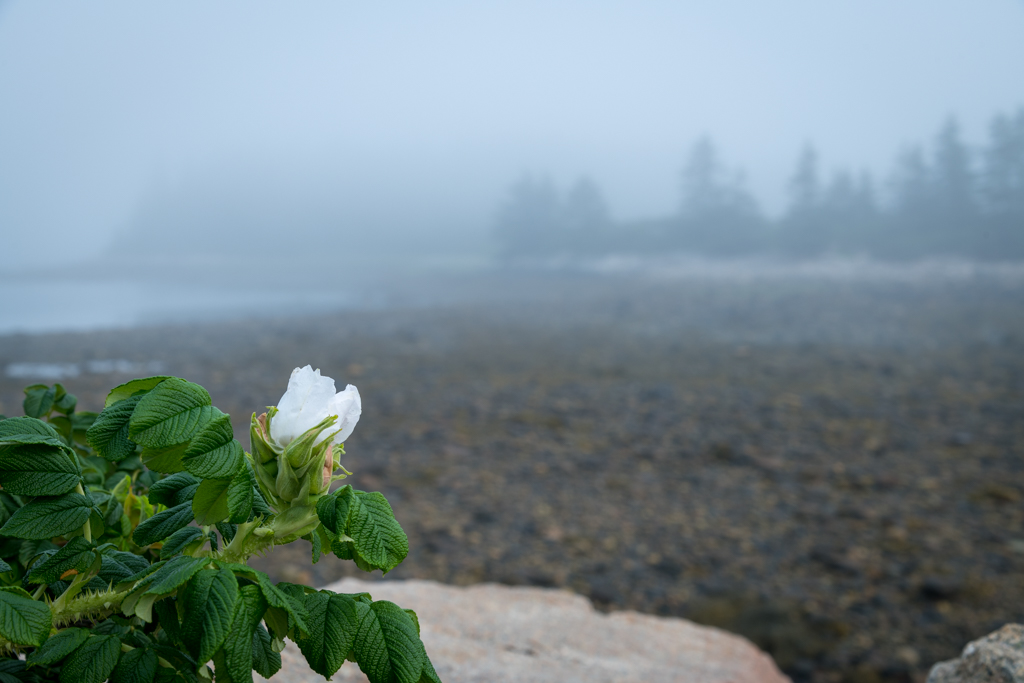
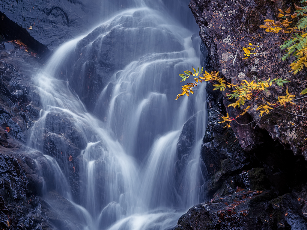
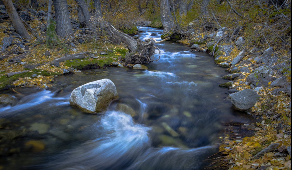
Here is a try Dan. From my point of view, I like the stream and the shutter speed to soften the riffles. I find the image sharp with good depth of field. For me, the subject is the stream and the rock in the water is just a supporting actor. Therefore, I find the tonality of the leaves and some of the bark to be competing with the white of the water. In Lightroom I increased the saturation of the yellows and reduced the saturation of the yellows. This seemed to separate the luminosity of the leaves from upper 60% to upper 40 or lower 50%. I then burned the fallen log on the left at the first bend and the upright tree in the upper center. To my eye the limited tonal difference between the yellow leaves and the white water seemed to make the image somewhat flat. Hope this helps |
Mar 13th |
 |
| 33 |
Mar 18 |
Reply |
Hi Dan, I put the reply in the wrong box so you need to go to the site to see it. |
Mar 13th |
| 33 |
Mar 18 |
Comment |
Thanks Dan,
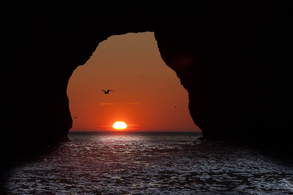
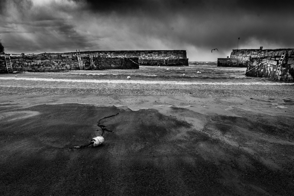
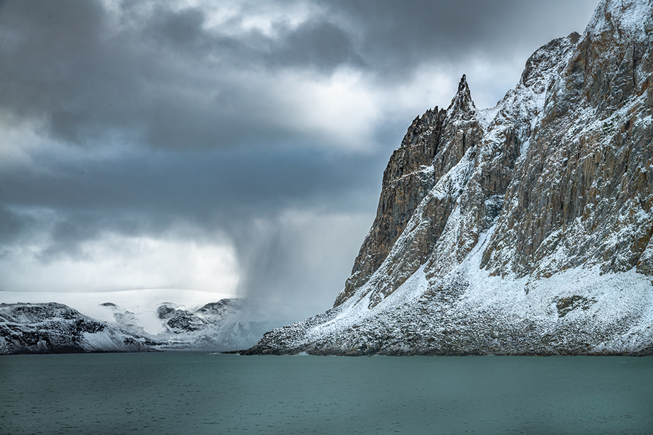
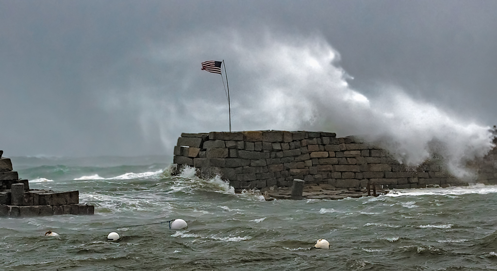
I took around 500 images from 4 locations during this storm and I have some with a similar crop to your suggestion. I find that when I have a lot of images, I have in my mind what I wish to illustrate. In this case, I wanted to reinforce that it was a small harbor and to compare the chop inside with the much larger rollers outside the harbor. Sometimes I get caught up with overthinking things and may not pick the best composition for the viewer. Thanks for the perspective and I will be excited to hear the opinion of others in the group. |
Mar 13th |
| 33 |
Mar 18 |
Comment |
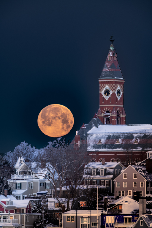
Nice job Elizabeth. The sky is wonderful, the tree, the pier and overhang really give it a sense of place. I like the hat and the position of the fishing pole of the boy on the right. The image appears sharp where it needs to be sharp. Since this was a set up with your grandsons, it would have been nice it the fishing pole for the boy on the right had been elevated more so we could see its outline against the sky. |
Mar 13th |
| 33 |
Mar 18 |
Comment |
Hi Bob, I liked the leading line going through some shadows and ending up in the sunlit grass area at the end. I think that the two signs on the tree also add a little interest but the dead branch above them distracts a little for me. The image also looks a little flat to me so if it were mind I would probably add a curves layer and to highlight the road, I might also might add a burn layer to the brown grass on the lower right. |
Mar 13th |
| 33 |
Mar 18 |
Comment |
I like the simplicity of the image with just the two buildings. The colors are great to my eye with the blue of the water and the early morning (afternoon) light and I like the diagonal lines of the hills heading to the water. I also like the direction of the light (light illuminates, shadows define) and it is really well focused. One thing that may help is that to me the white on the buildings is too bright in that I cannot see any detail. I wonder if you selected the whites and made a curves adjustment if you could get a little of the detail in the whites. You did well on the trip. |
Mar 13th |
6 comments - 3 replies for Group 33
|
6 comments - 3 replies Total
|