|
| Group |
Round |
C/R |
Comment |
Date |
Image |
| 33 |
Feb 18 |
Comment |
Much bettrer |
Feb 14th |
| 33 |
Feb 18 |
Comment |
I agree with Paul on leaving the cloud as is |
Feb 14th |
| 33 |
Feb 18 |
Reply |
I never saw it. That's why you have others look at your images. What do you think about the branch on the lower right? |
Feb 13th |
| 33 |
Feb 18 |
Comment |
Open the layer as a smart object in photoshop or convert it
-go to image>adjustments>shadows/highlights
-when open, check the box for "show more options"
-only deal with the shadows and/or highlight sliders
move the amount slider in say the shadows to some arbitrary number such as 30%, then play with the tone and radius sliders. Radius will adjust fine details when the number is low and flatter details when the number is higher.
-do the same with the highlight sliders
Just play around with it. Since you are concerned with the deep shadows around the engine, focus on that |
Feb 12th |
| 33 |
Feb 18 |
Comment |
Better. Have you tried shadows/highlights in photoshop? |
Feb 12th |
| 33 |
Feb 18 |
Comment |
Good Morning Paul,
Very nice image. I think that it is sharp, the colors are handled well, there is a definite fore ground and back ground. I think the the leaves at the edges give it a sense of frame within a frame which also adds to the image. I think that I would like to see a little more of the gravel walkways especially at the corner at the lower left center |
Feb 12th |
| 33 |
Feb 18 |
Comment |
Hi Dan,
It's great to have a vision of what you want to create and use all the tools to accomplish that. It has a strange effect on me in that it looks like a movie set from the 1950's. It has three dimensionality but at the same time a flattish look. Somewhere in my memory I think that I have seen a photo book using this style but I cannot put a finger on it. To me, the image is too soft most noticeable in the bridge and the works Key Bank on the building |
Feb 12th |
| 33 |
Feb 18 |
Comment |
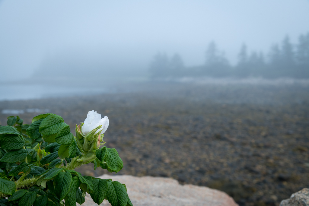
Good Morning Elizabeth,
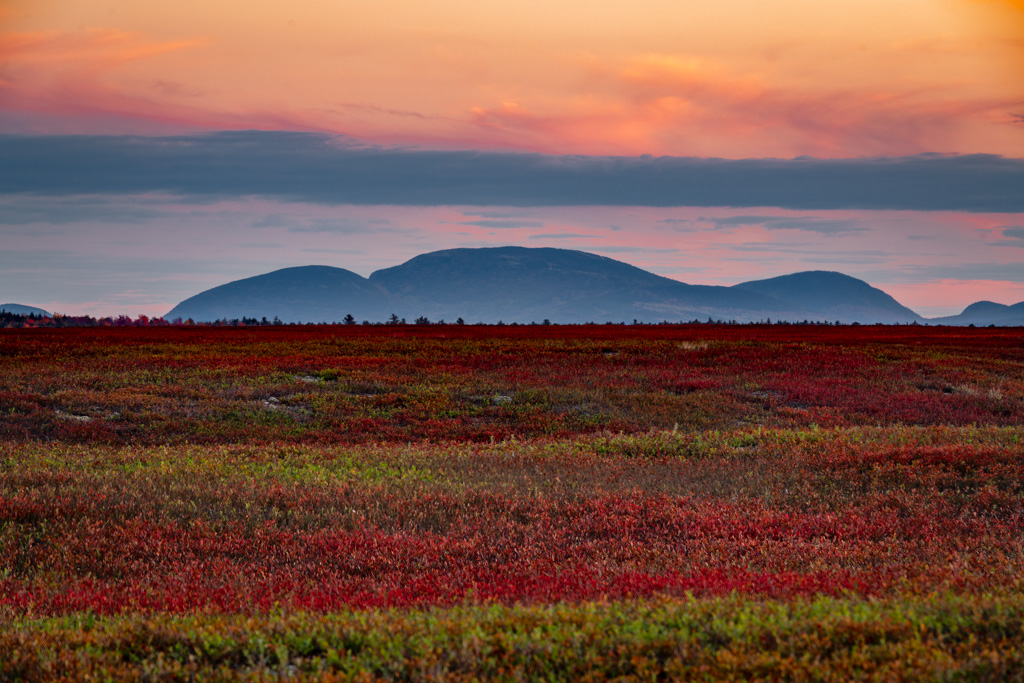
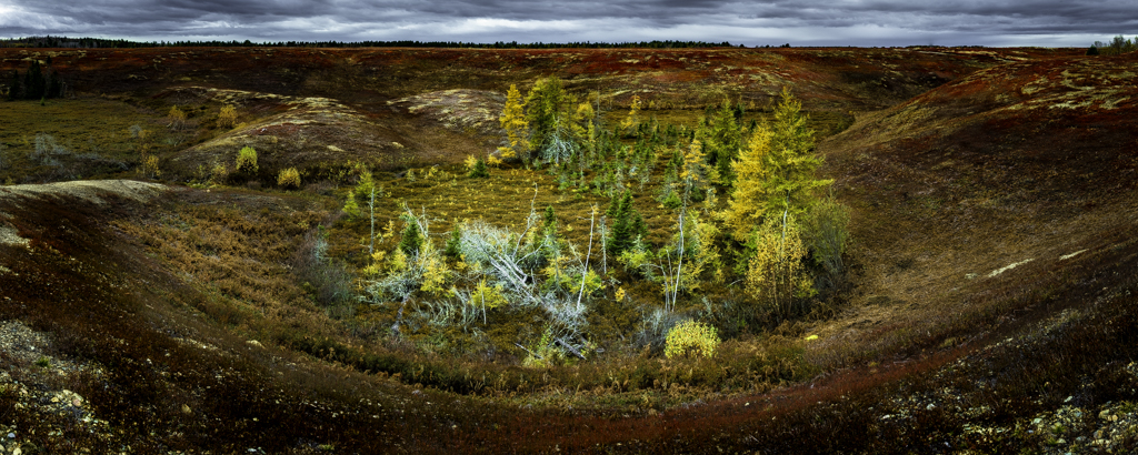
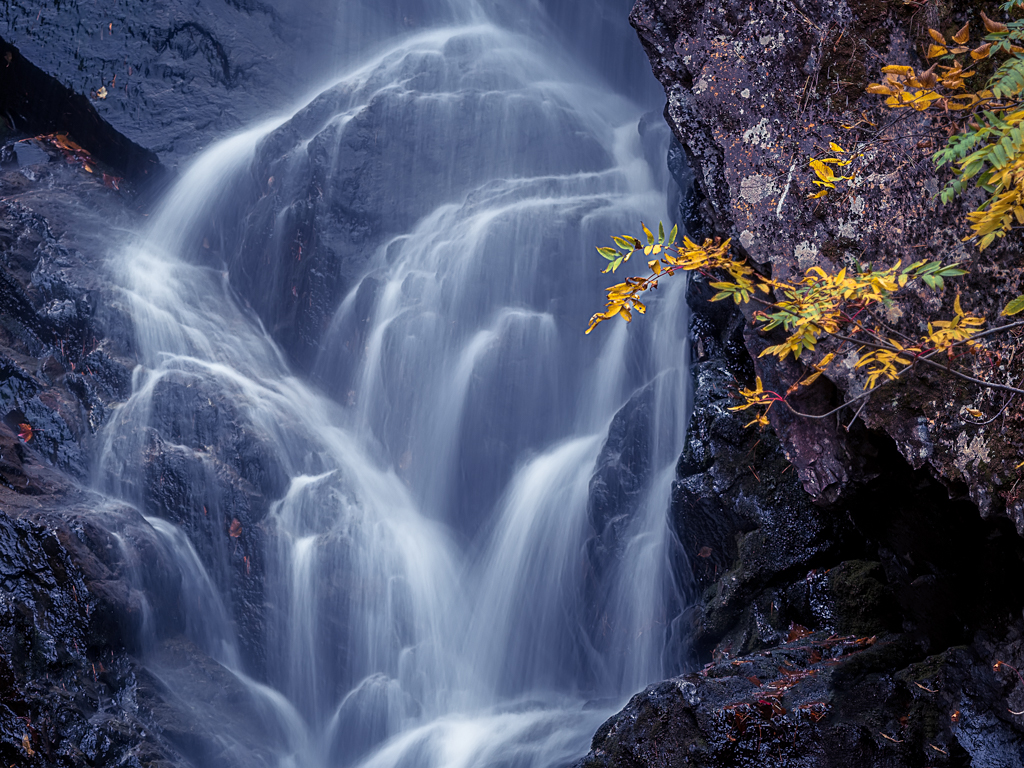
I can see why this caught you eye as your were driving by. I really like the sky and the almost painterly quality of it. I like the colors of the greens, tan of the fields and reddish brown of the road. Nice job of using the curve at the road which along with the color seems to balance the mass of the trees. I find the visual balance of this image pleasing from the tallest tree to the shorter one to the right going to the light and brights of the road. I find the image soft and at first thought it might be due to the wind moving the grasses but the stones in the road are not sharp also. One technical glitch but a very pleasing image. |
Feb 12th |
| 33 |
Feb 18 |
Comment |
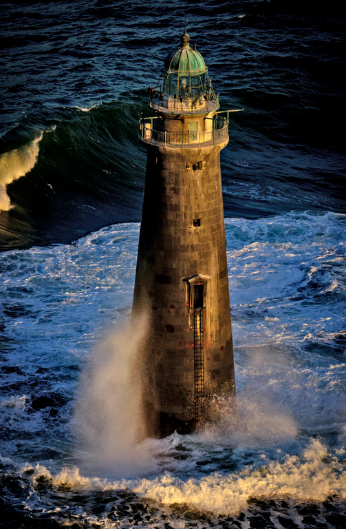
Hi Bob,
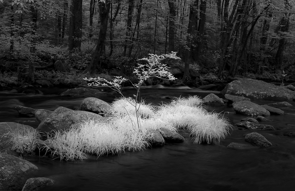
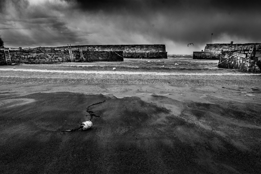
I have little to no experience with IR so I am not a great one to comment but I have one observation and that is that to my eye, I would like to see a little more detail in the very darks of the engine and tires. Having not worked with IR, is this possible? |
Feb 12th |
| 33 |
Feb 18 |
Comment |
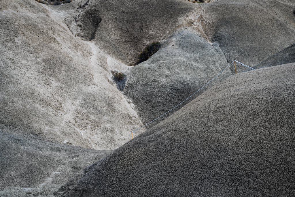
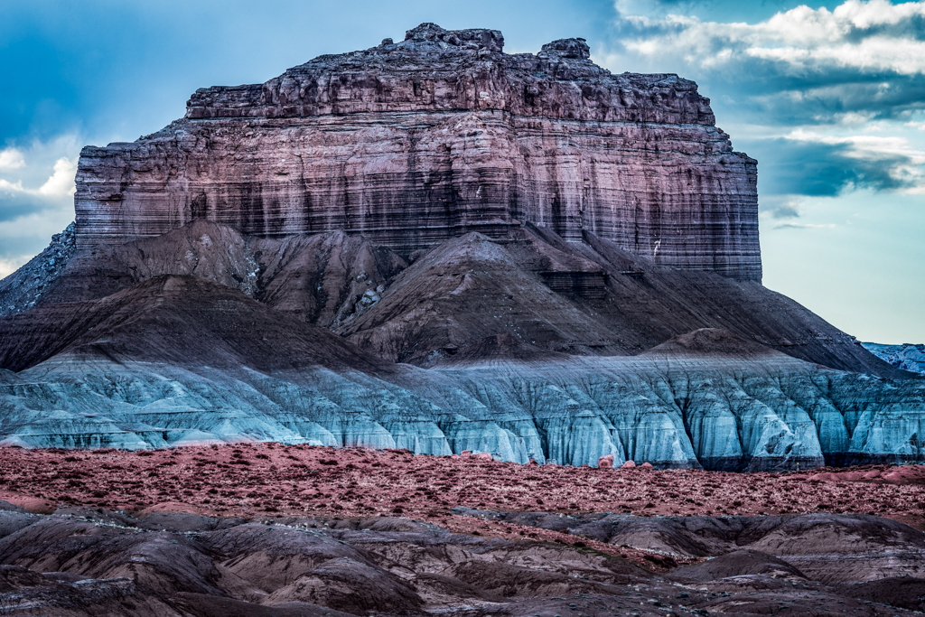
Hi Larry,
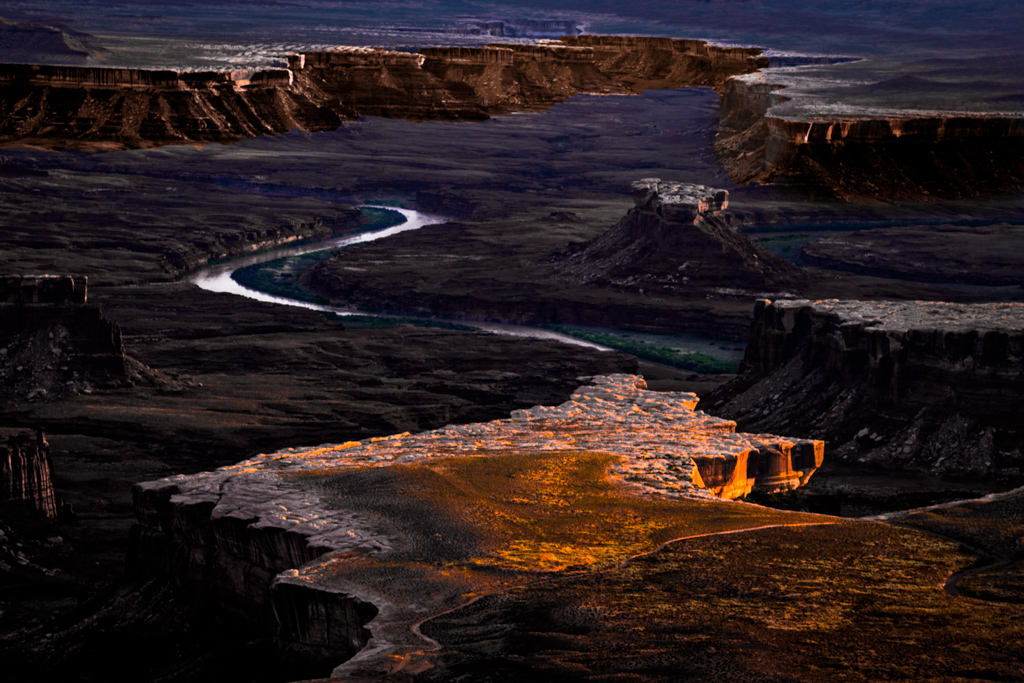
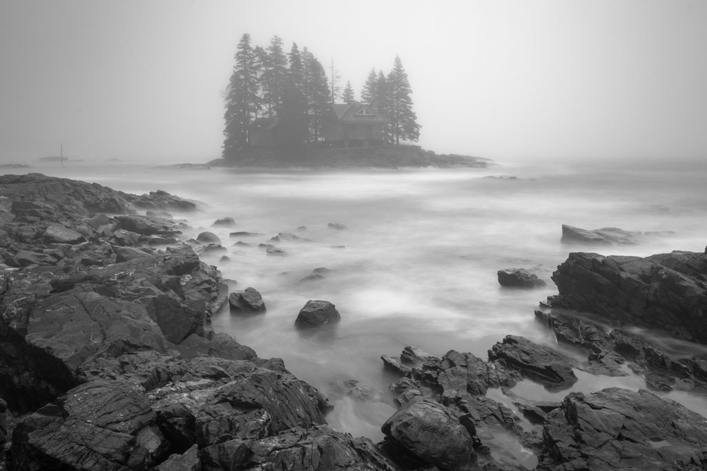
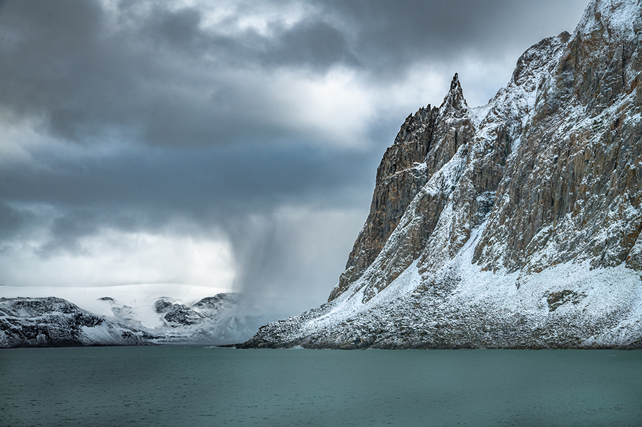
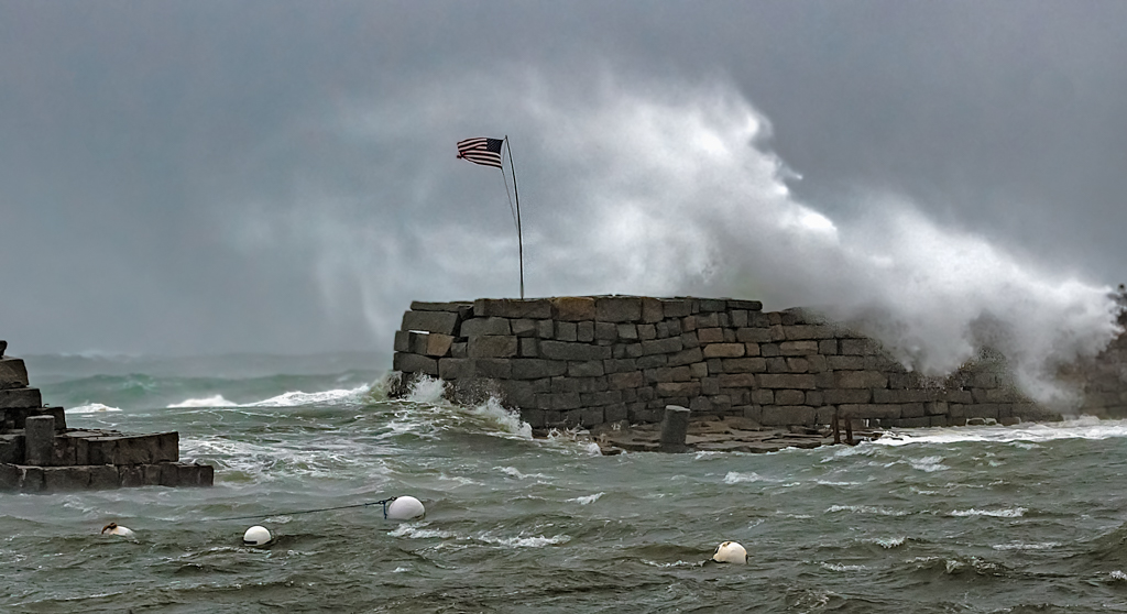
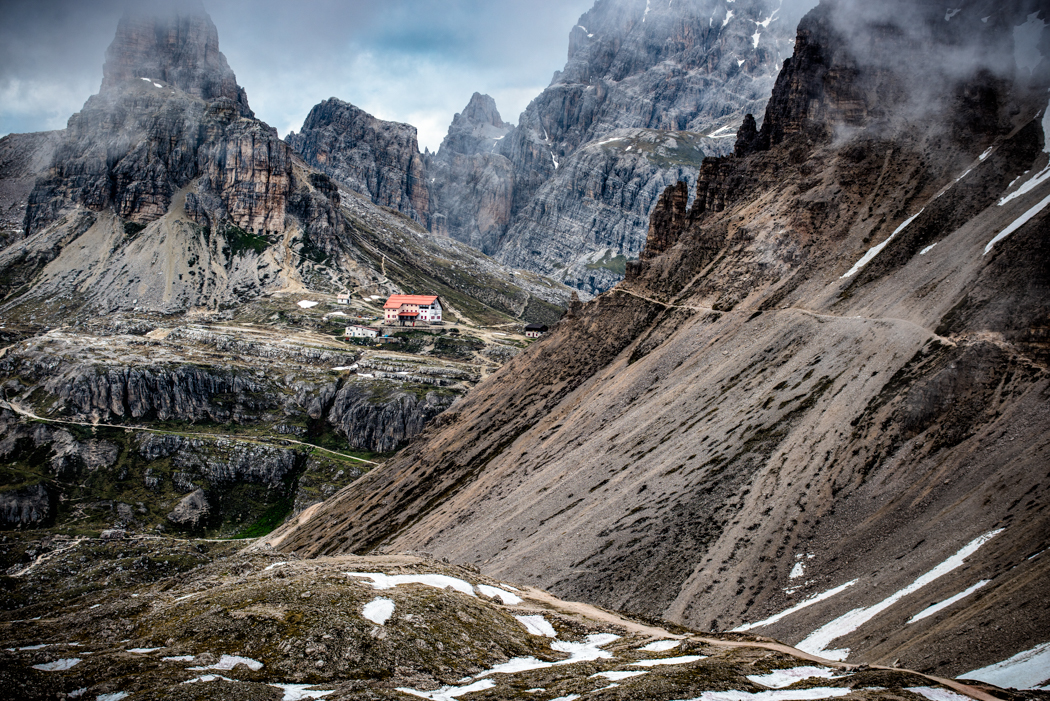
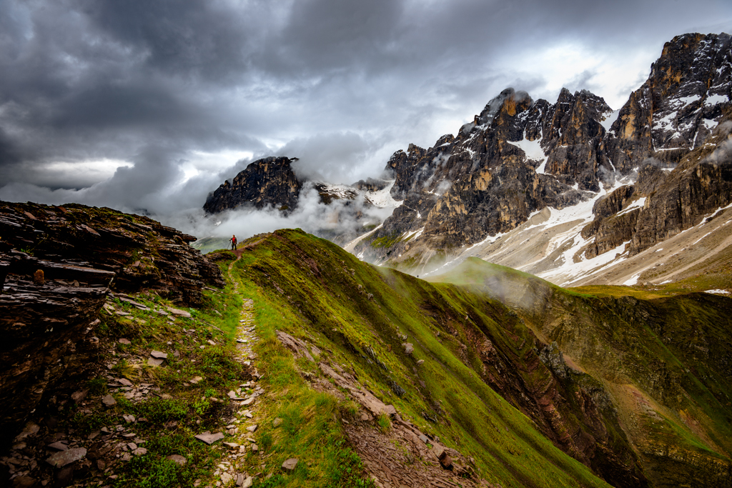
I really like the diagonals of this image as to my eye it brings a sense of energy going from upper left to lower right. I also feel that you have brought a sense of depth with the shadows as well as having a definite foreground, middle ground and back ground. I think that the clouds in the upper right help give it a sense of place. I wonder if the highlights on the ledges are a little too bright because they seem almost specular in places. Lastly the image seems a little soft to me, especially in the forest in the foreground. |
Feb 12th |
9 comments - 1 reply for Group 33
|
9 comments - 1 reply Total
|