|
| Group |
Round |
C/R |
Comment |
Date |
Image |
| 33 |
Dec 17 |
Comment |
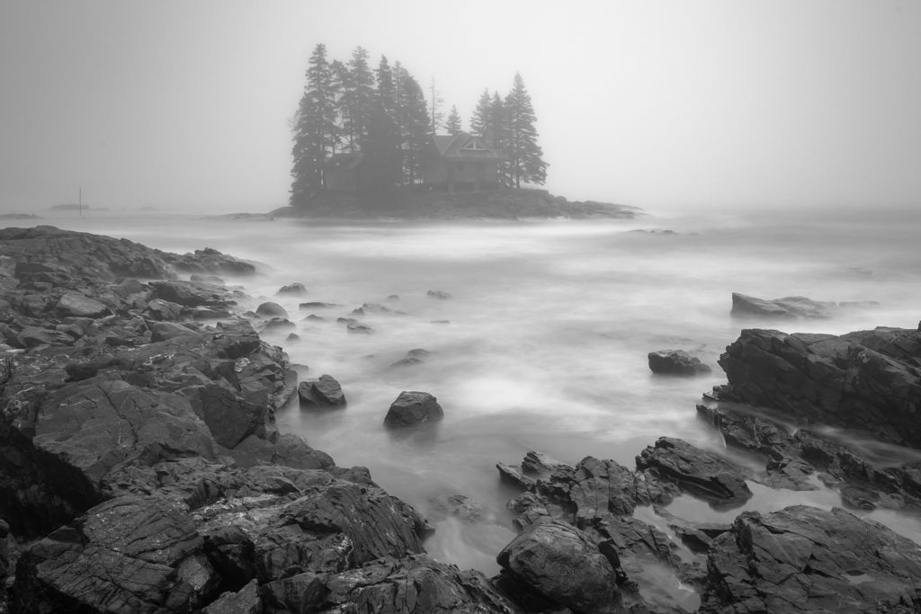
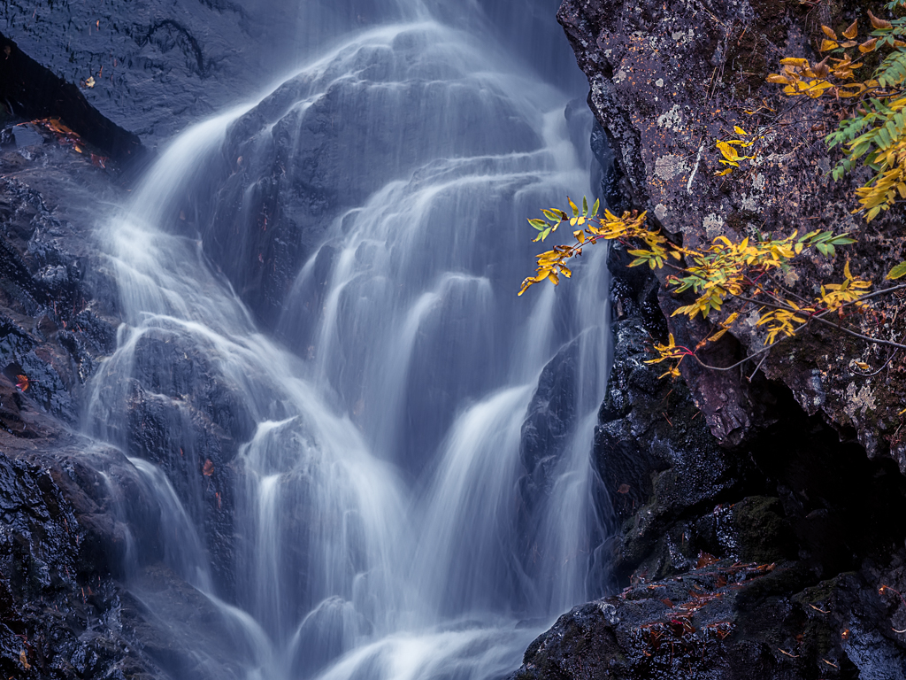
Thanks for you input. My vision was one which highlighted the pink granite leading off into the distance. Some comments seemed to get this and others no so much so that tells me that my intentions were not obvious or strong enough to accomplish that.
Thanks everyone |
Dec 21st |
| 33 |
Dec 17 |
Comment |
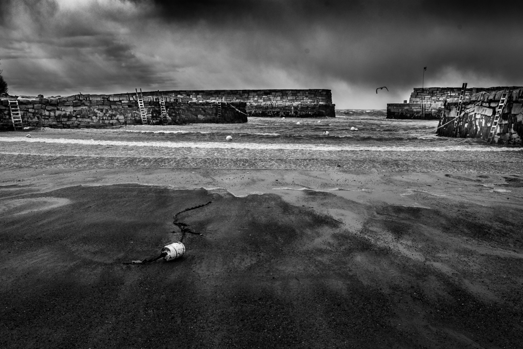
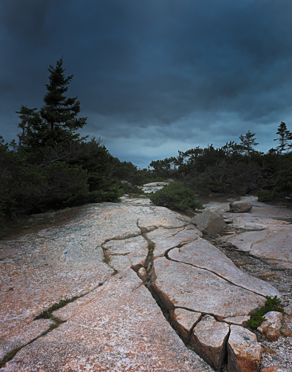
Oh yeah, I straightened the building some |
Dec 10th |
| 33 |
Dec 17 |
Comment |
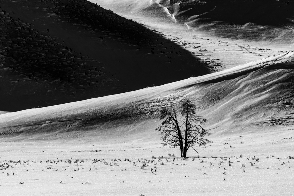
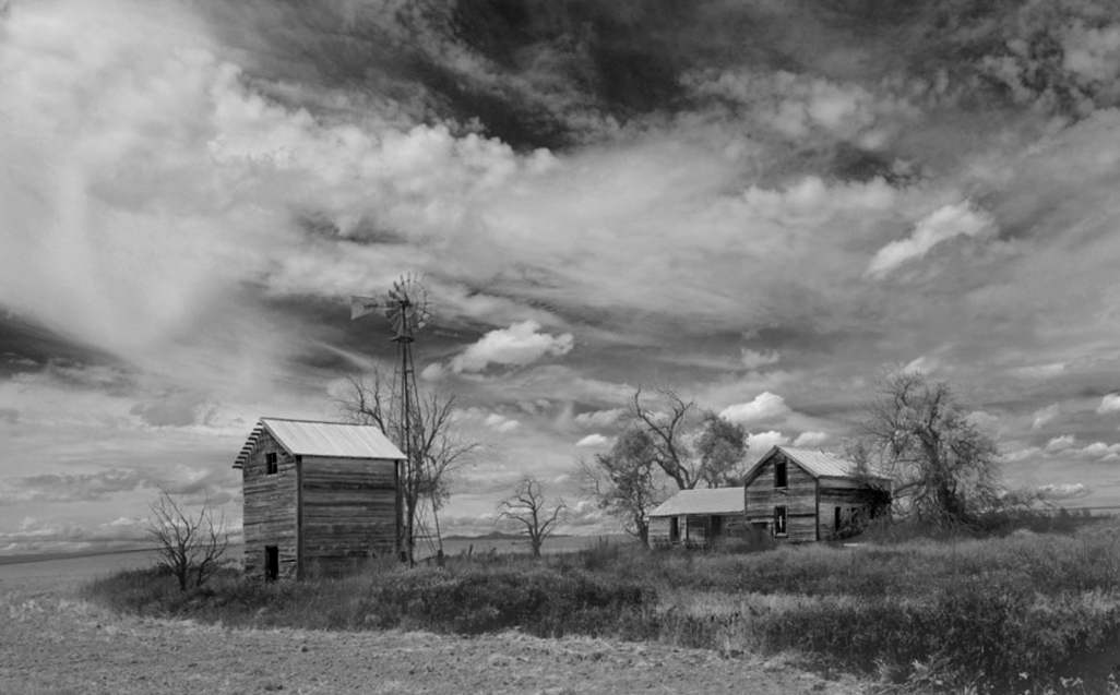
Hi Bob,
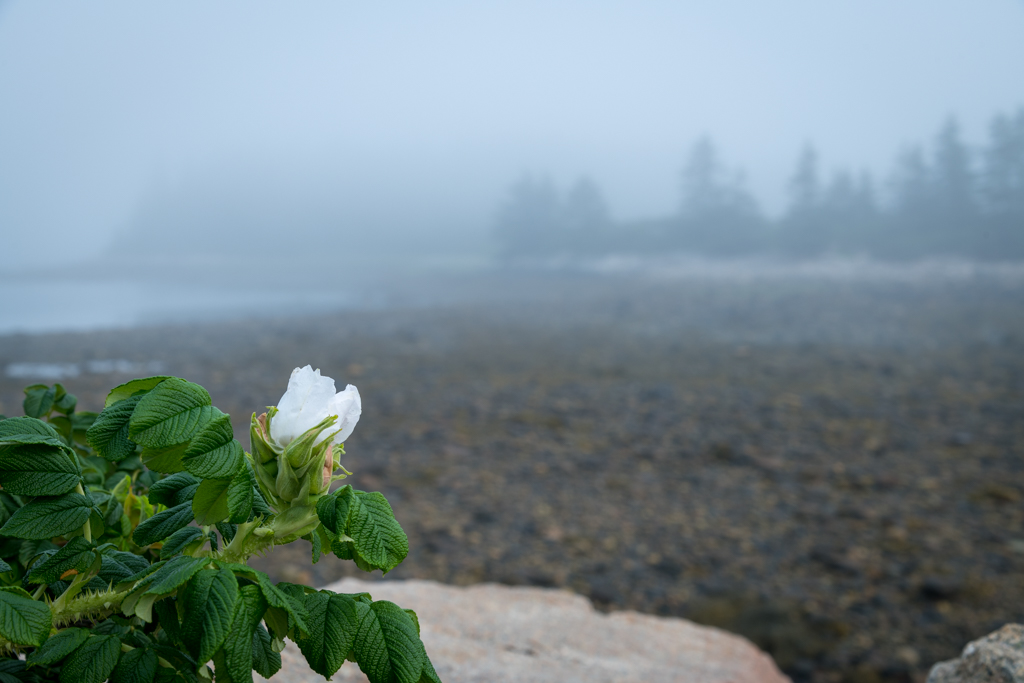
Loved the stark feel of this image.I think that you have covered the black points and white points, have it in focus, have a nice curved line where the grass meets the soil and had a good shutter speed as shown by the clouds. I think that whole tonal range in the foreground (other that the shed on the left) is very similar and I thought that it might be useful to adjust the buildings and the grass area to create a more three dimensional feel to it. Attached is one attempt. What do you think or did you have something else in mind that I did not see? |
Dec 10th |
 |
| 33 |
Dec 17 |
Comment |
Welcome Dan,
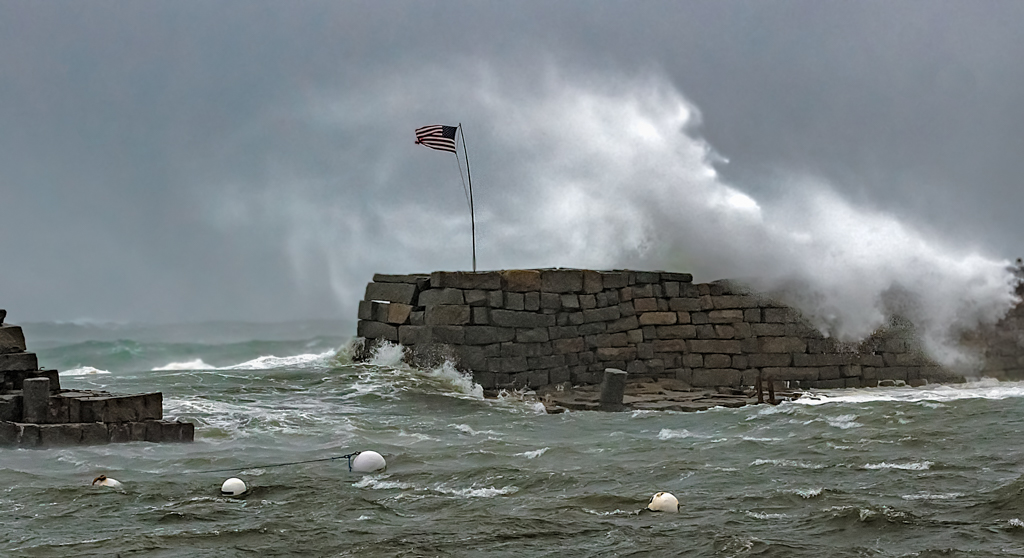
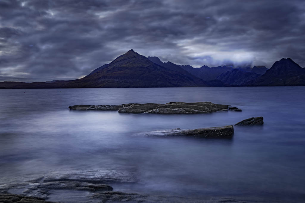
Nice colors, nice feeling of peacefulness with the horizontal clouds, reflection in the water and very calm water. Great foreground, middle ground and back ground. Nice spot and very nice image. Now for the but. Just as a way of introduction, I enjoy a dialog and I do not believe that my opinion is anything other than an opinion or a device to encourage discussion. So, you mentioned that you lightened the mountain in the background to make it stand out and I wonder if that means that it is important to you. If so, then the leading line of the rocks in front point right to it and are great. I then think that your lightening of the mountain is right on target. so my question to you is about the pilings. To my eye they block my visual journey from the rocks, across the reflection and to the mountain (sort of like the pot of gold at the end of the rainbow. Therefore, I do not think that they add to your image. Tell me what you think! |
Dec 10th |
| 33 |
Dec 17 |
Comment |
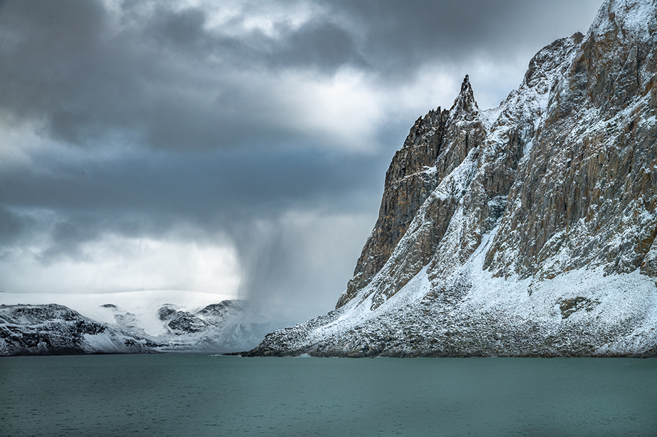
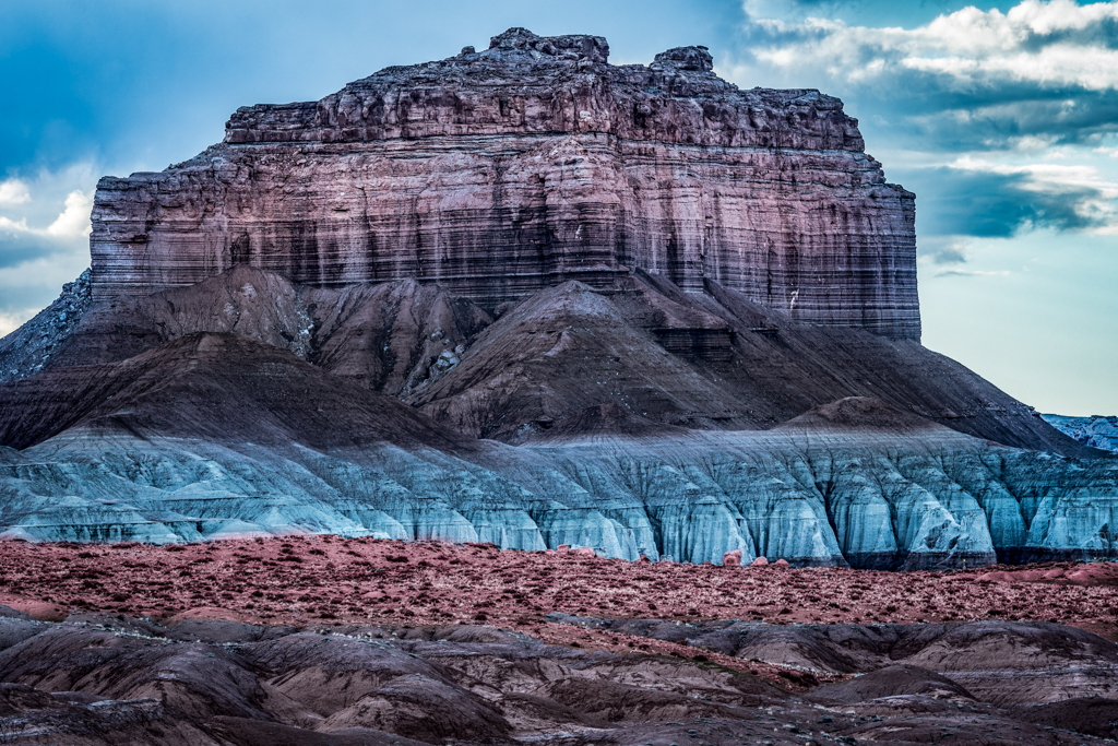
What great color! You nailed the color as well as texture in the scene. I look at this image and see a problem with visual balance. The big mountain on the right makes it seem heavy to the right in my eye. I really like what you did to counter this by using the clouds and the rocks in the foreground to add more weight to the left but is it enough? Just from a balance perspective you could crop the image on the left between the second and third rock to give the clouds more weight or you could crop the mountain perhaps in half??. My instinct tells me that the mountain and how it is right against the sea is more important. What do you think Paul? |
Dec 10th |
| 33 |
Dec 17 |
Comment |
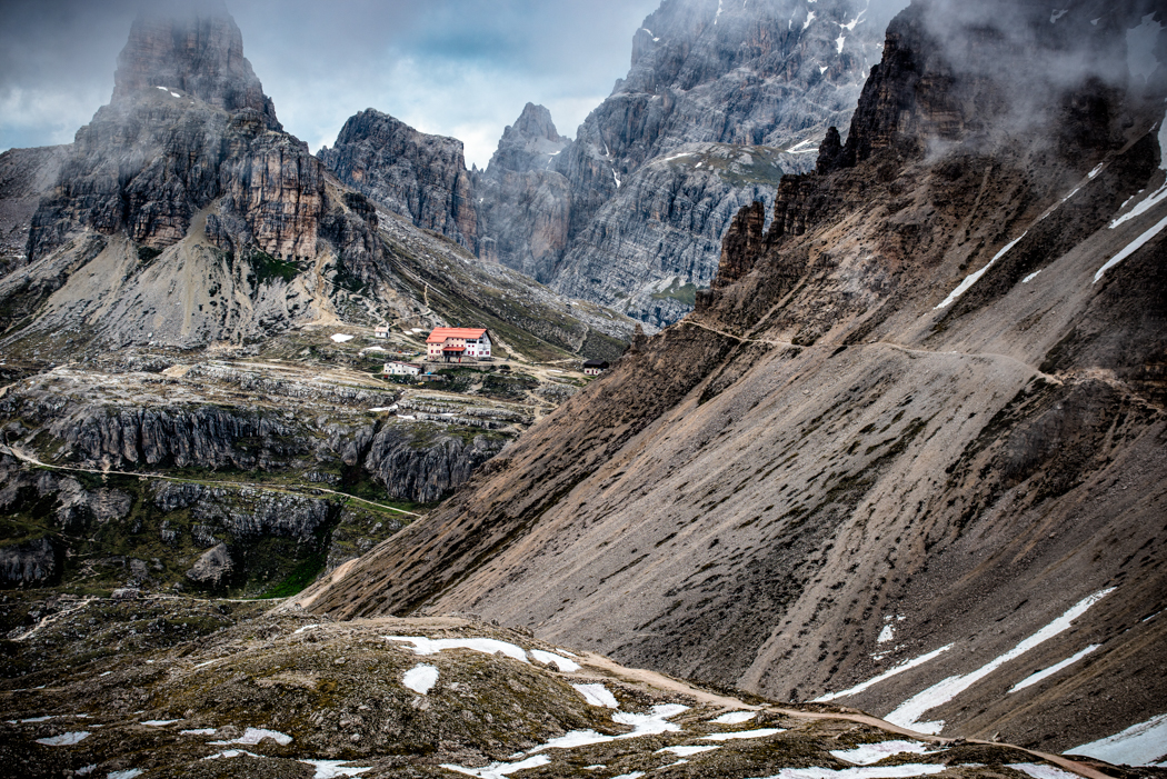
Hi Elizabeth,
Looks like a fun place to visit. Lots of shapes here from the spire on the left to the dome to the red triangle roof to the grey triangle roof in the center. The colors are great and it seems to be in good focus. I think that if you wished to highlight the dome, you may want to darken the whit building behind the dome quite a bit. I suspect that if you did that, then you might have the opportunity to make a nice triangle between the dome, the red roof and the shadowed building the the lower center. You then would need to lighten up the center building walls either through dodging or through shadow/highlights under adjustments in Photoshop. |
Dec 10th |
| 33 |
Dec 17 |
Comment |
Hi Larry,
I really like what you were trying to do here. I love the diagonal that you were bringing out which gives it a vector. I like the idea that you were trying to brighten the center diagonal line of trees by burning the corners. The colors are great. I agree with Dan about considering the complimentary color aspect of this image which would have also made a strong image but to me it would have been a different feel with the horizontal line 1/3 the way up the image. I feel that diagonal lines impart a sense of energy while horizontals impart more a sense of calm or serenity. Both concepts with this scene would make great images in my opinion. If you wished to continue with you use of the diagonal, I have a couple of thoughts. I wonder if you tried to flip the image horizontally if you would have the feeling of the eye going down to the water to having the eye go up and out. Second, how about reducing the luminosity of the yellow trees near the water slightly! and lighten the orange trees up the diagonal a little. Just some thoughts on an image that would be fun to play with compositionally. Nice job! |
Dec 10th |
7 comments - 0 replies for Group 33
|
7 comments - 0 replies Total
|