|
| Group |
Round |
C/R |
Comment |
Date |
Image |
| 33 |
Sep 17 |
Comment |
Hi Paul,
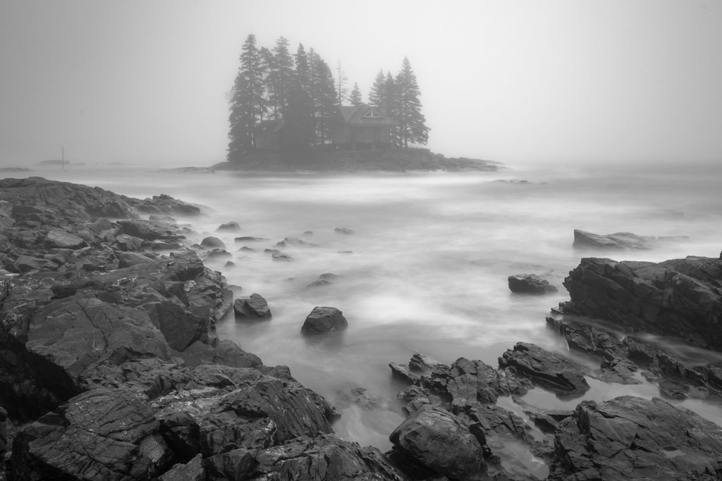
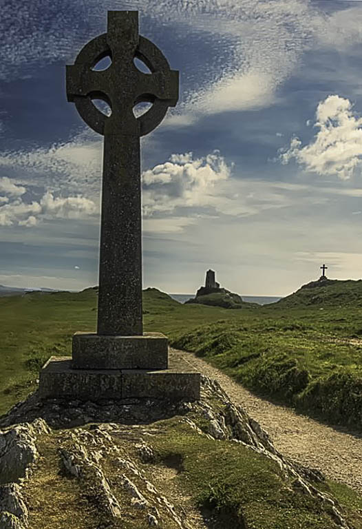
I tried to find a way to make the path to the upper left building more obvious as a leading line but I don't think my effort added anything to you image. So, I thought to my self, what if we tried to make the image simpler. Cut the number of structures from 4 to 3 (the magic of 3's) and eliminate the worn grass on the left and the path in the back left. It looked out of balance to me and I felt that the big Celtic cross was the key subject and you liked the building in the middle so I burned that a little to make it more of a silhouette. Just another idea |
Sep 11th |
 |
| 33 |
Sep 17 |
Comment |
Hi Elizabeth,
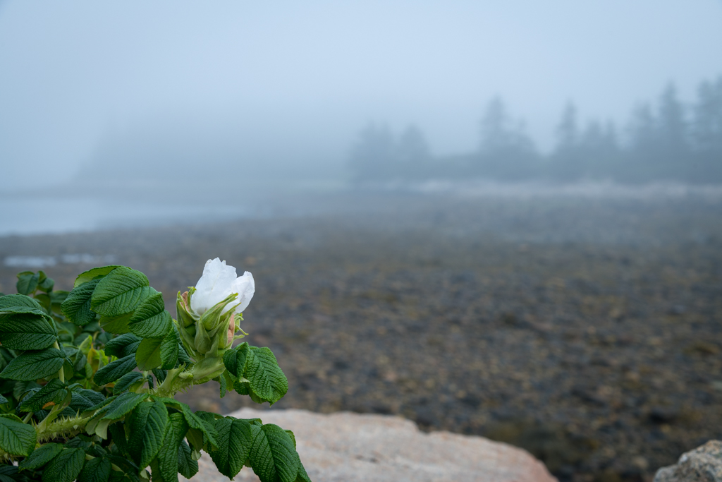
Very nice image. I really like the colors and the layers within the image |
Sep 11th |
| 33 |
Sep 17 |
Comment |
Great positioning on the eagle. I looked at the image without reading your description and it said Alaska all over it. You might want to lighten up with the shadows slider as the blacks seem to be blocking out on my computer. |
Sep 11th |
| 33 |
Sep 17 |
Comment |
Hi Larry,
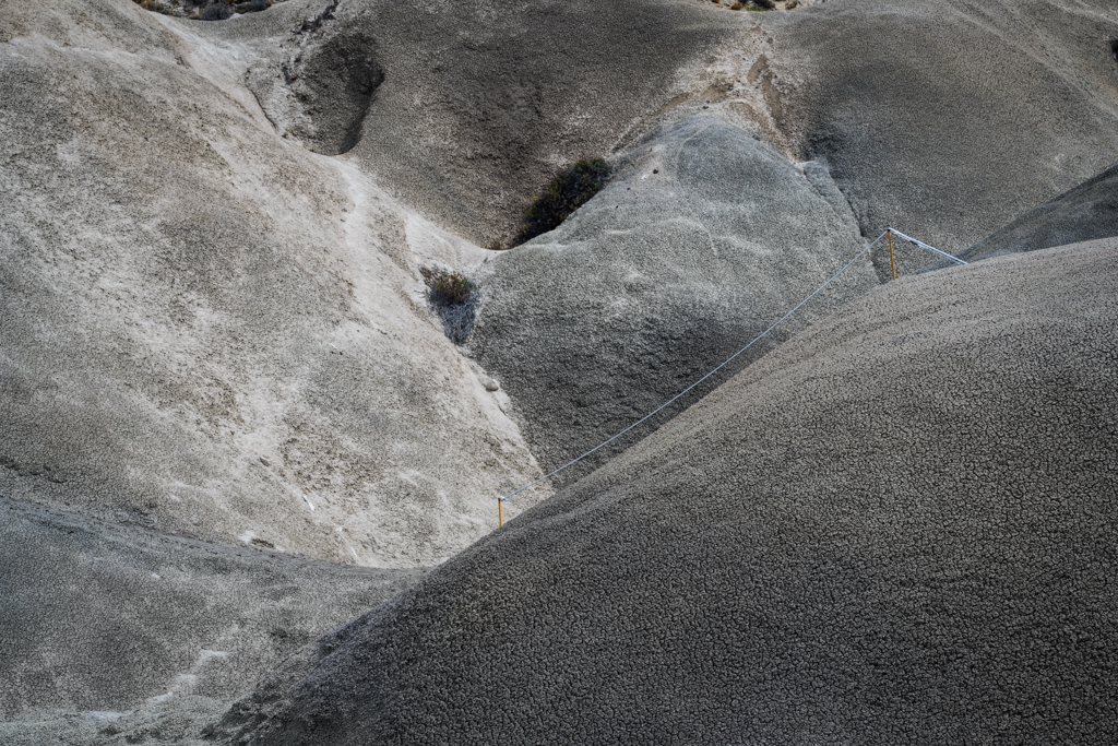
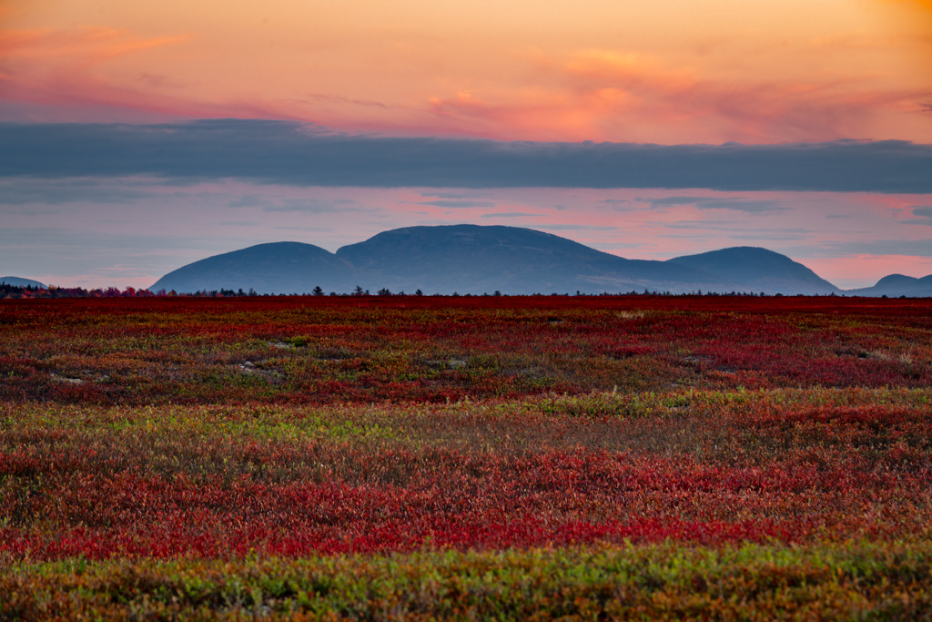
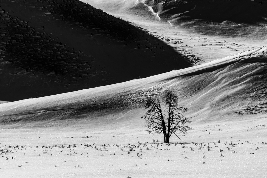
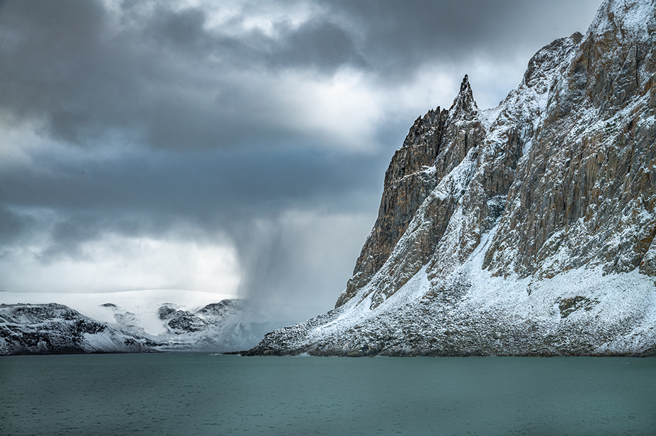
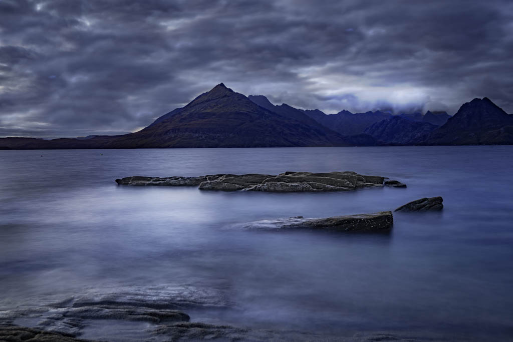
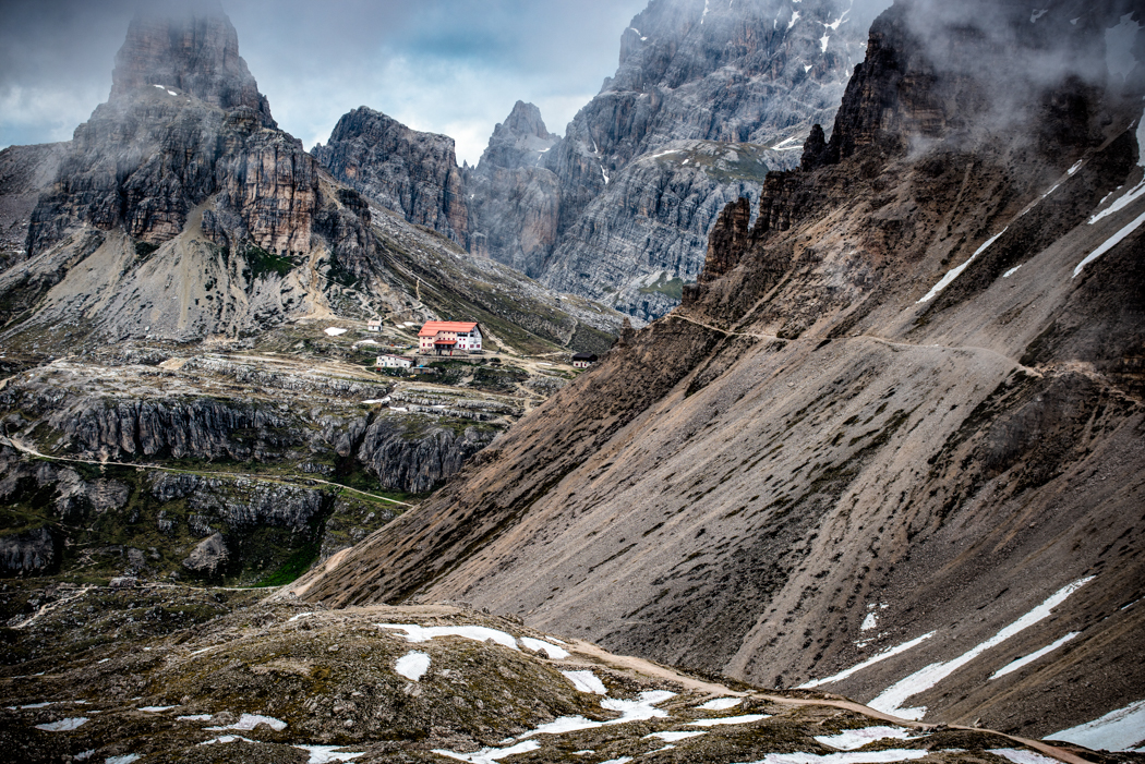
I like the blue tint of the snow and the orangish of the grass acting as complimentary colors and really bringing out the grass. The grass seems to me to be creating a leading line and the right side grass as it goes over the hill implies a left hand turn. So as I look at the image, where is the leading line leading to? We all know the hue, saturation and luminosity can be manipulated to force the eye where the maker wants it to go but faces and writing trump those. My eye went to the "X" on the hill in the background. Now as I think about your image, how can I take advantage of the letter and imply that the leading line is leading to that letter and the hill. My idea is to crop the left side of the hill at or about the third fence post from the left. Just my thought. |
Sep 11th |
| 33 |
Sep 17 |
Comment |
HI Lloyd,
Similar to the comments I gave you on last months image I like the warmth feeling in the image. The blacks are not as blocked out as with the vignetting in the last image and the sky has some blue both of which enhance the image in my opinion. The curve is great and the straight pole/tree or what ever it was in the water reflection is also not there. To my eye, the white lamp post on the left or what ever and the brown spot in the grass on the lower right could be cloned out and I think the image would benefit for that. |
Sep 11th |
5 comments - 0 replies for Group 33
|
5 comments - 0 replies Total
|