|
| Group |
Round |
C/R |
Comment |
Date |
Image |
| 33 |
Aug 17 |
Comment |
Thanks Bob,
If my camera club gives me a $1,000,000 honorarium I'll be sure to share it with you :) |
Aug 23rd |
| 33 |
Aug 17 |
Comment |
I understand what Larry is saying however, to my eye it creates an unbalanced feel as if your eye tilts to the right because of the brightness |
Aug 23rd |
| 33 |
Aug 17 |
Comment |
Larry, I love your adjustment. It certainly gives it another look |
Aug 23rd |
| 33 |
Aug 17 |
Comment |
Hi Bob,
I am giving a talk to my camera club called "Use of HSL to Enhance a Three Dimensional Effect to a Photo" and think that your photo would help me illustrate my point. I wonder if you would give me permission to use your photo in my lecture on that subject.
Thanks,
Ken |
Aug 21st |
| 33 |
Aug 17 |
Comment |
Hi Paul,
The thing that jumps out at me is that in my opinion the image is not balanced. With the large mass on the right and the tree leaning to the left, I feel as if the image metaphorically tilts left. Perhaps, as Larry suggests, you needed to put on your wellies and cross the stream or go barefoot in the park :) |
Aug 18th |
| 33 |
Aug 17 |
Reply |
are you implying that Wales is not very picturesque? |
Aug 18th |
| 33 |
Aug 17 |
Comment |
Oops, file too large |
Aug 18th |
 |
| 33 |
Aug 17 |
Comment |
Hi Bob,
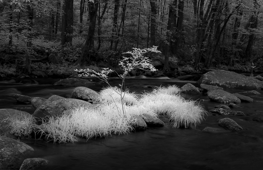
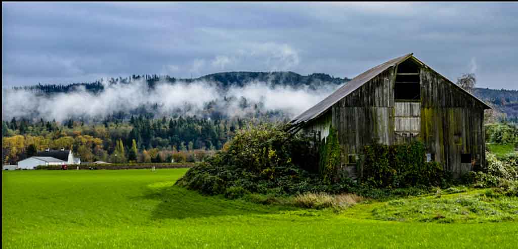
Here is another take on you image. My goal was to increase the sense of depth in the image and isolate the barn a little more. I cropped out some of the grass since in my opinion it did not add to the image, I cloned out the structure to the right of the barn, using the adjustment brush I darkened the sky and increased saturation and luminance of the orange trees above the white buildings on the right. The clarity slider seemed to increase the contrast on the barn to highlight the door a little. I felt like you had a lot of elements to wirk with and really felt that the cloud added a lot |
Aug 18th |
| 33 |
Aug 17 |
Comment |
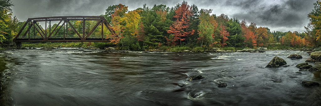
Hi Lloyd,
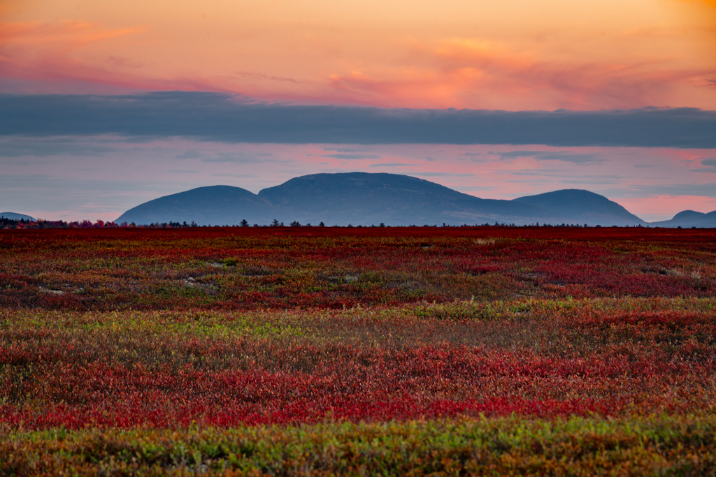
I really like the warmth feeling of this image and the complimentary blue and orange colors of the image. I also agree with Paul about the nice feeling of the curvature of the river bank. two things to consider in my opinion would be to reduce the vignetting in the lower left and upper right so that the detail in those areas and the sky in the top center is too grey and should have some blue as in the reflections of the water. a good image to hang in your living room |
Aug 18th |
| 33 |
Aug 17 |
Comment |
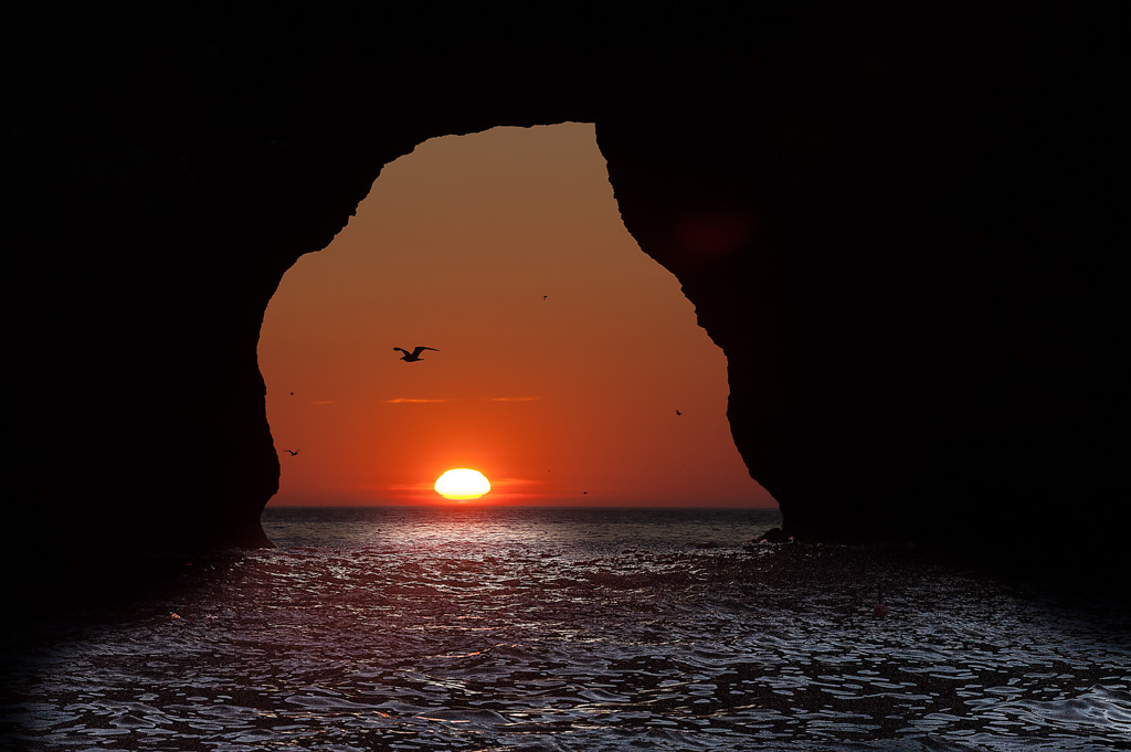
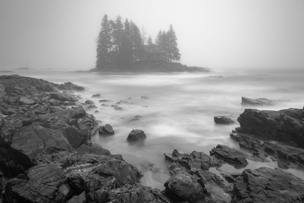
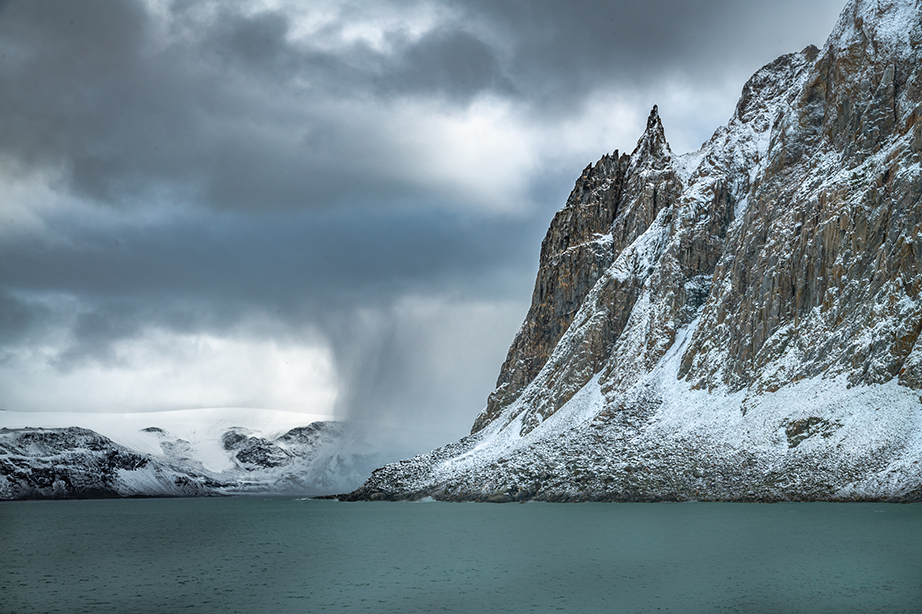
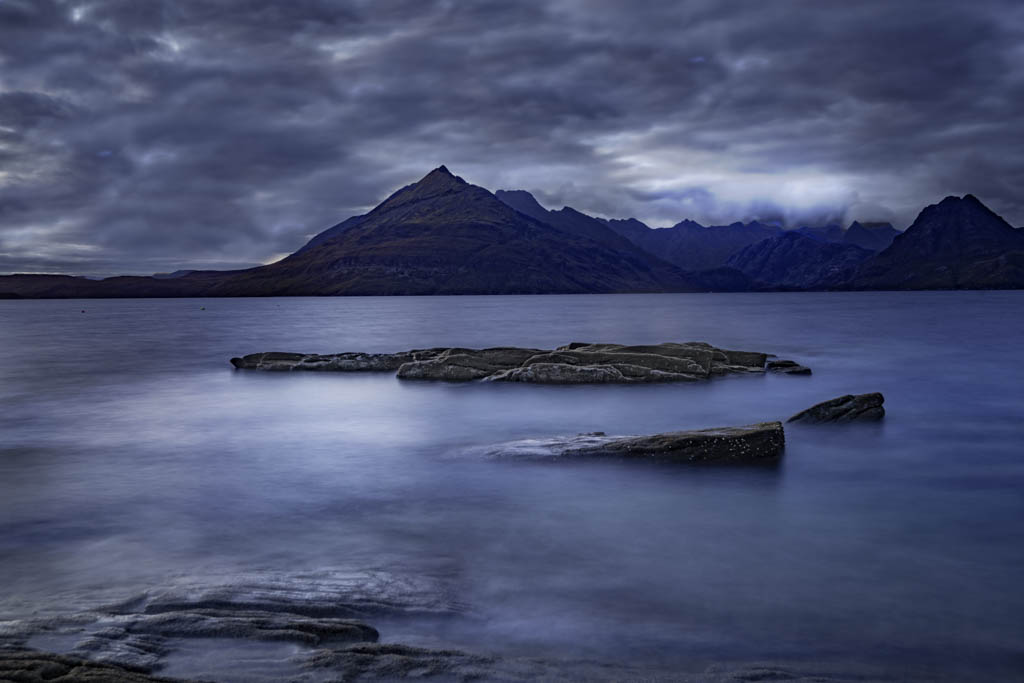
I really like the silhouette and the negative space between the trees and the rocks and the rocks and the horizon. I also like the tonal range of the blues throughout the sea and sky. Nice job |
Aug 18th |
| 33 |
Aug 17 |
Comment |
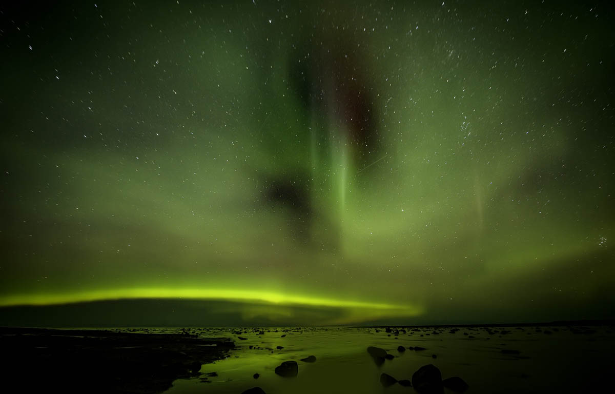
I love discussions and differing opinions. At times this aurora you could read by. Thanks guys for you input |
Aug 18th |
10 comments - 1 reply for Group 33
|
10 comments - 1 reply Total
|