|
| Group |
Round |
C/R |
Comment |
Date |
Image |
| 33 |
Jun 17 |
Reply |
Hey Paul,
Thanks for you thoughts. Overall, I like your thoughts except for the big slope on the right. To me it looks too flat and I might do some burning and dodging to bring out the countours a little |
Jun 15th |
| 33 |
Jun 17 |
Comment |
Hi Paul,
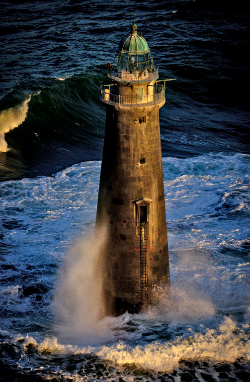
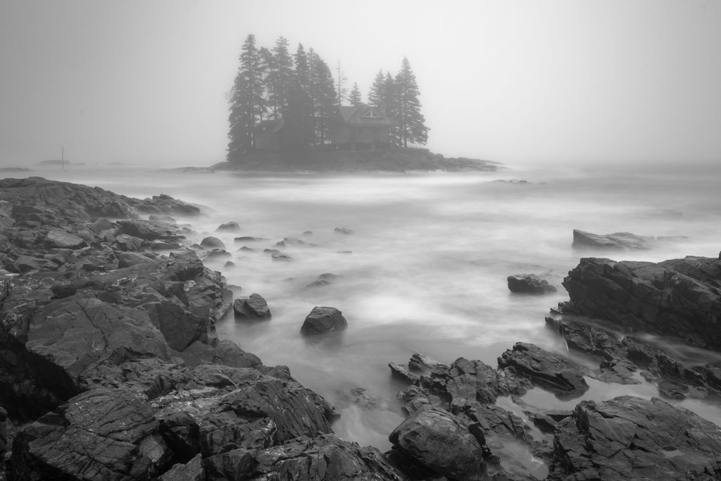
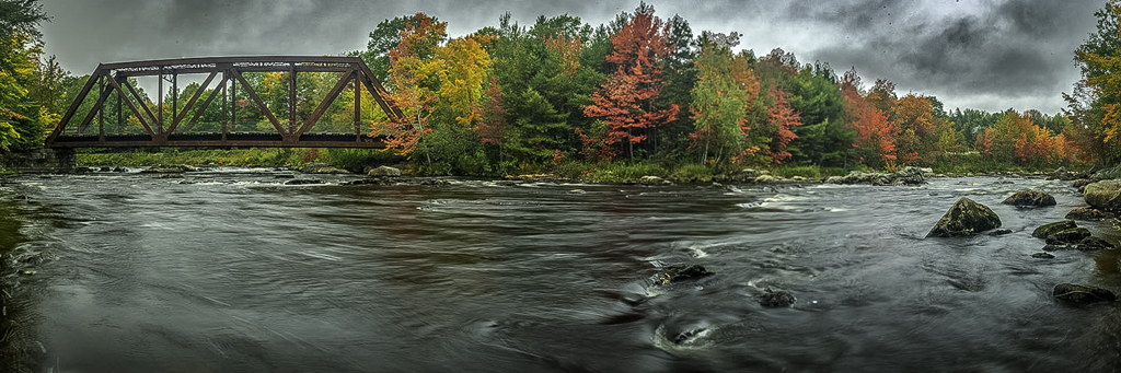
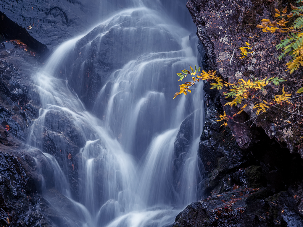
It is always nice when you turn around and find a good picture behind you. I like the effect of the slow shutter speed on the water and the clouds and I really like the warm colors. It has a nice fore ground middle ground and back ground whit the little red things on the rocks piquing my curiosity ( are they people or red stakes). I find the white on the house to look blown out to my eye. I would like that scaled back a little and the front of the house whitened up just a touch. Of course, one needs to see the change on your computer to see in it meets my imagination. |
Jun 15th |
| 33 |
Jun 17 |
Comment |
Hi Bob,
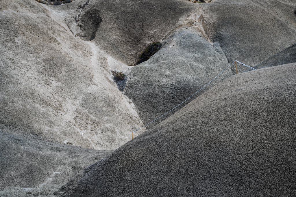
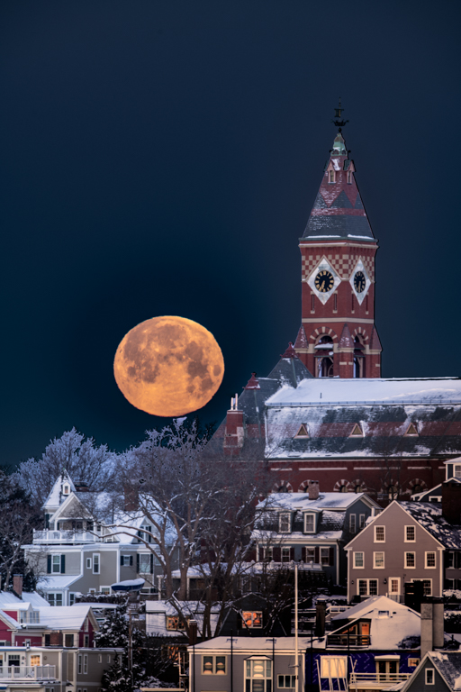
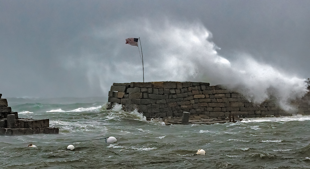
I see what the others are talking about with respect to the flag pole and the mountain in the distance. I assume that you put the flag pole in that location for the visual weight to off set the mass of the spruce trees on the left. If you moved to the left and the flag pole was closer to the edge, I don't think that would work but if you have suitable landscape to the right of the pole, it may be better |
Jun 15th |
| 33 |
Jun 17 |
Comment |
Hey Lloyd,
I love it. (That's a period) |
Jun 15th |
| 33 |
Jun 17 |
Comment |
Hi Larry,
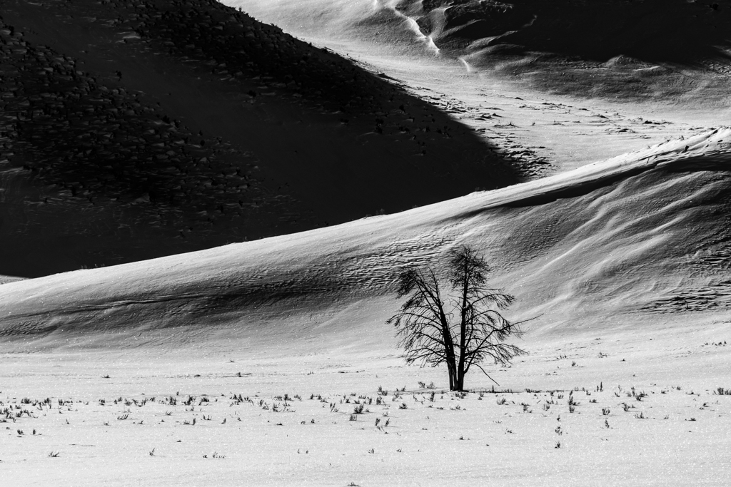
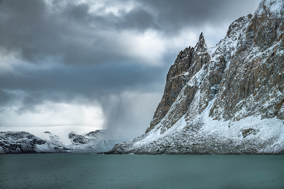
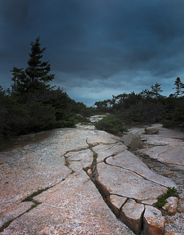
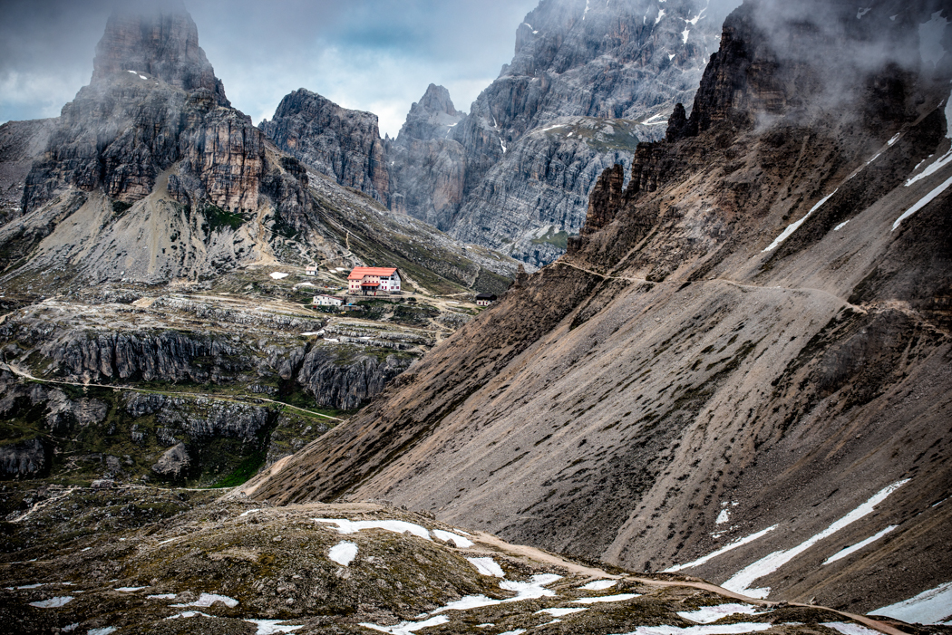
Sorry to be slow getting back but I have been traveling. I would agree with Paul about the crop on the left side. I like the diagonal of the ridge and the fact that the peak is not centered. I like the shading withing the snow valley to give a sense of depth. I see that the whites on the snow at the very right is good but to my eye, much of the snow in the valley is grey and might look better a little whiter. Also, on my screen some of the blacks are blocked out |
Jun 15th |
4 comments - 1 reply for Group 33
|
4 comments - 1 reply Total
|