|
| Group |
Round |
C/R |
Comment |
Date |
Image |
| 5 |
Jan 17 |
Reply |
Hey Nick,
What do you mean by embossed? |
Jan 21st |
| 5 |
Jan 17 |
Reply |
Hi Nick,
Thanks for the comments. When you suggested adding a little sky for the original which element of the sky were you thinking of. Was it the greater luminosity, the placement of the horizon line, the more dynamic god's beams or better cloud formations at the top of the sky? I am quite interested in how other people see the same image. |
Jan 21st |
| 5 |
Jan 17 |
Comment |
Thanks Joyce I like to hear how others see my images so I can hear another point of view or to stimulate discussion |
Jan 12th |
| 5 |
Jan 17 |
Comment |
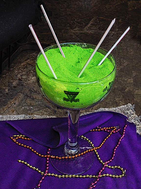
Hi John,
As a new member of the group, I am still learning the accepted protocol for commenting on each others images. From my perspective, I would like to give ideas that might stimulate discussion with very specific comments. I think that we all understand that it is just an opinion and one can take it or leave it.
I have made some changes in the image for your to consider using primarily photoshop. I agree with Barbara that the glass should be straightened so I did that with free transform. Then I cloned out the medallions and the beads going to the left and right but allowed the beads to go out of the frame on the bottom to give moor height to the subject. I then did some dodging and burning to the purple cloth to give a sense of 3 dimensionality, I burned the front edge of the glass and the logo on the front of the glass. Next I removed all the sand particles on the purple cloth with the spot healing brush and lastly I did a content aware fill of the straw that was going out of the frame.
My first impression of the image was that it showed enough creativity to catch my attention and see that it had excellent possibilities. Good job! |
Jan 11th |
 |
| 5 |
Jan 17 |
Reply |
Thanks David, that was my feeling also. I do have the advantage as I have a lot of similar images taken over a 10 minute period that morning that I can compare. Images that are similar but uniquely different varying from boring to intriguing. |
Jan 11th |
| 5 |
Jan 17 |
Reply |
Hey Tom,
Thanks for you input. Just for the sake of discussion, I have the feeling that in the pano version, the clay pans shift the visual weight of the image too much to the left. If you consider that your eye tends to go to bright and light, maybe this causes visual weight issues. What do you think? |
Jan 9th |
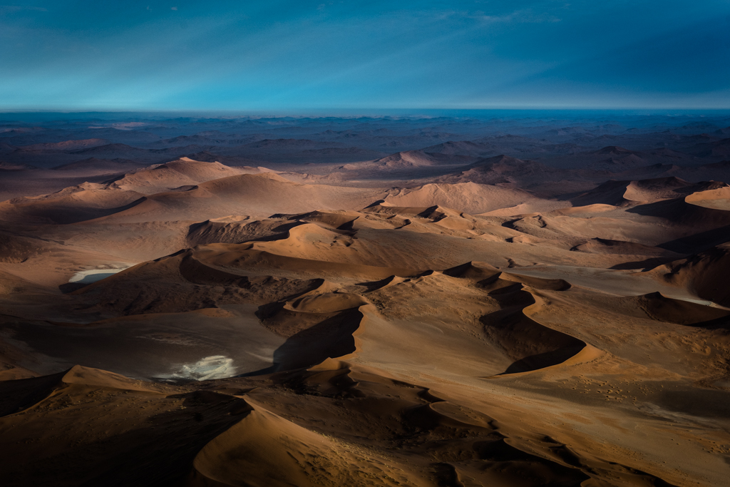
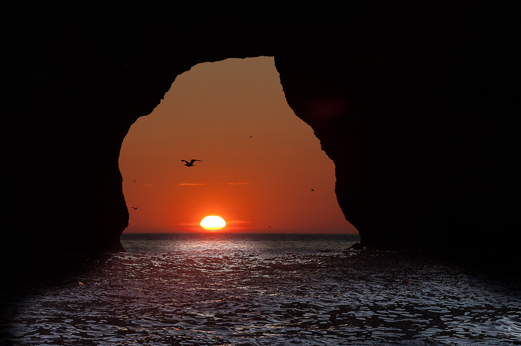
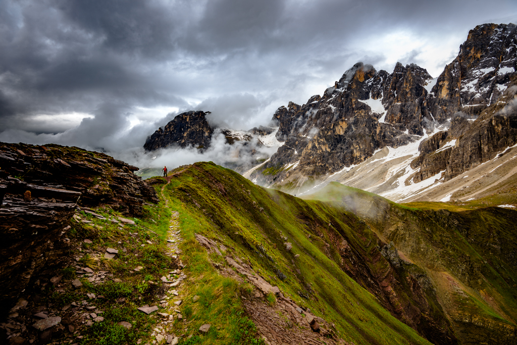
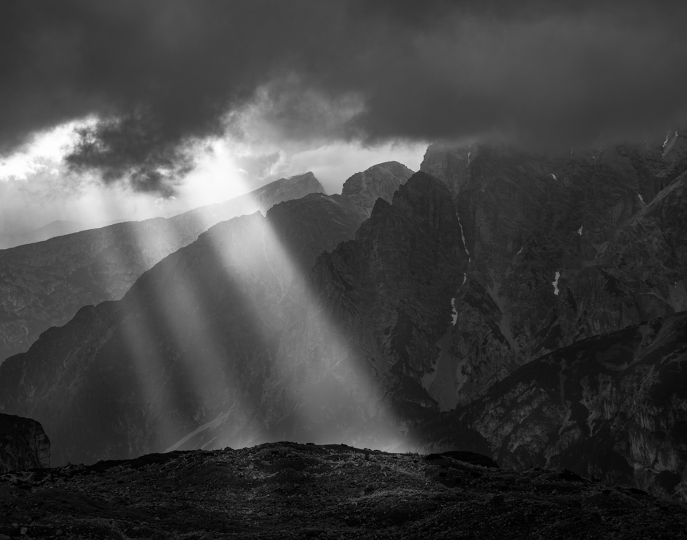
| 5 |
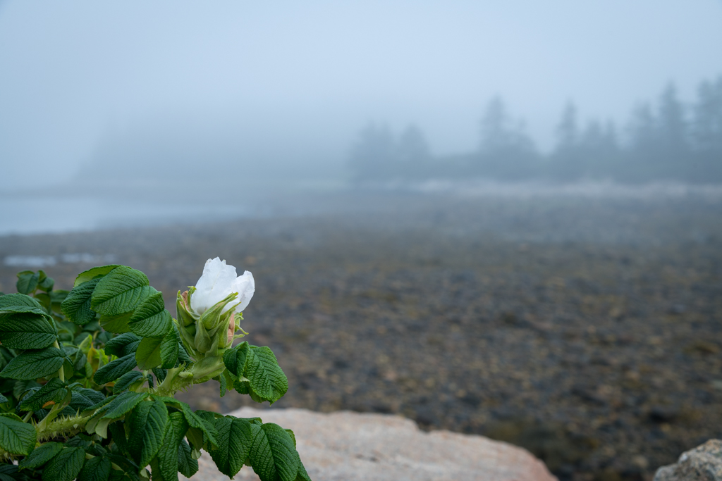
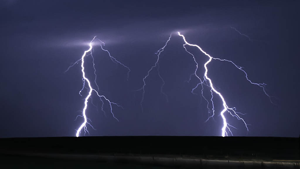
Jan 17 |
Comment |
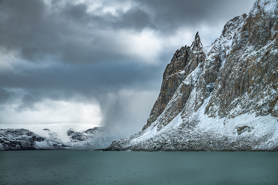
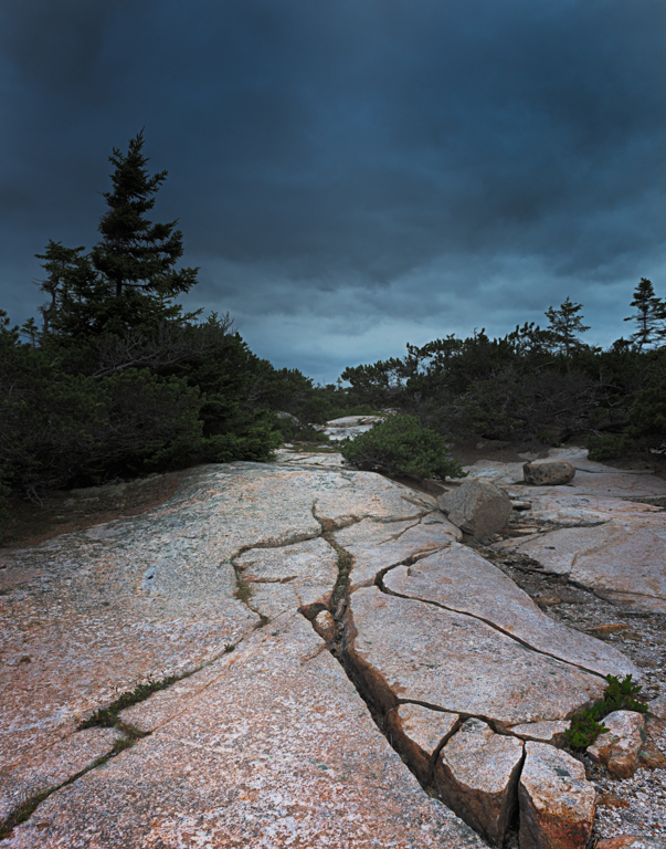
here is a more dramatic example of god beams or techincally crepuscular rays |
Jan 6th |
 |
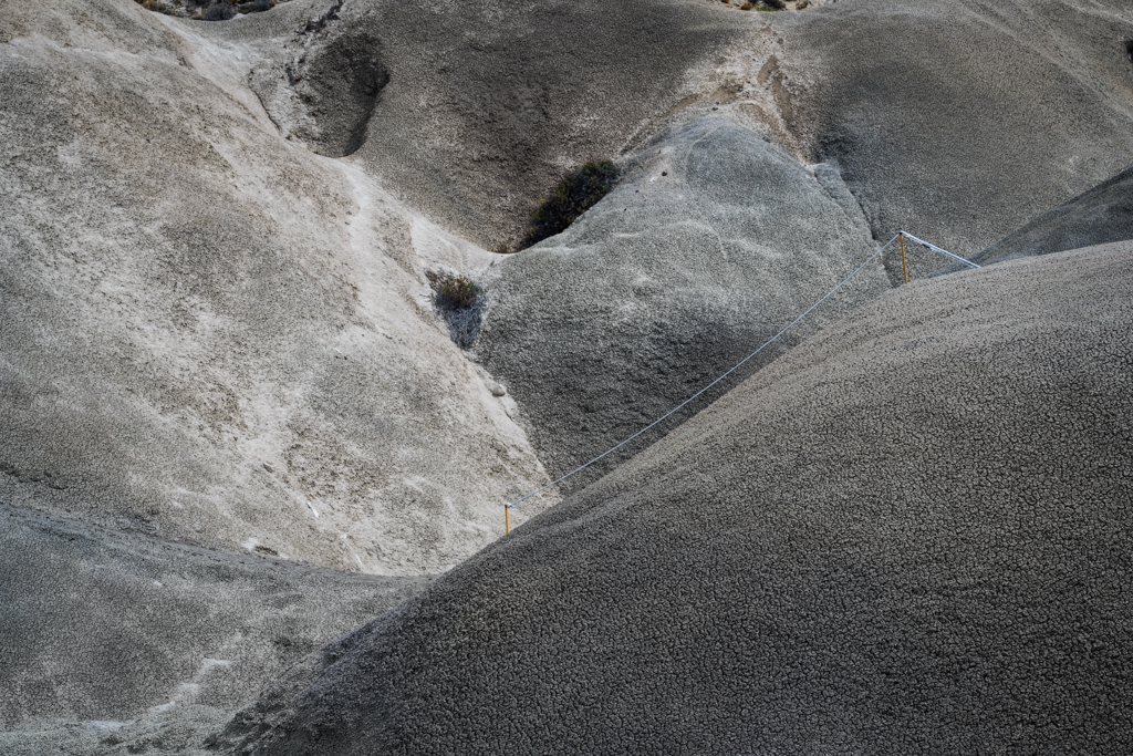
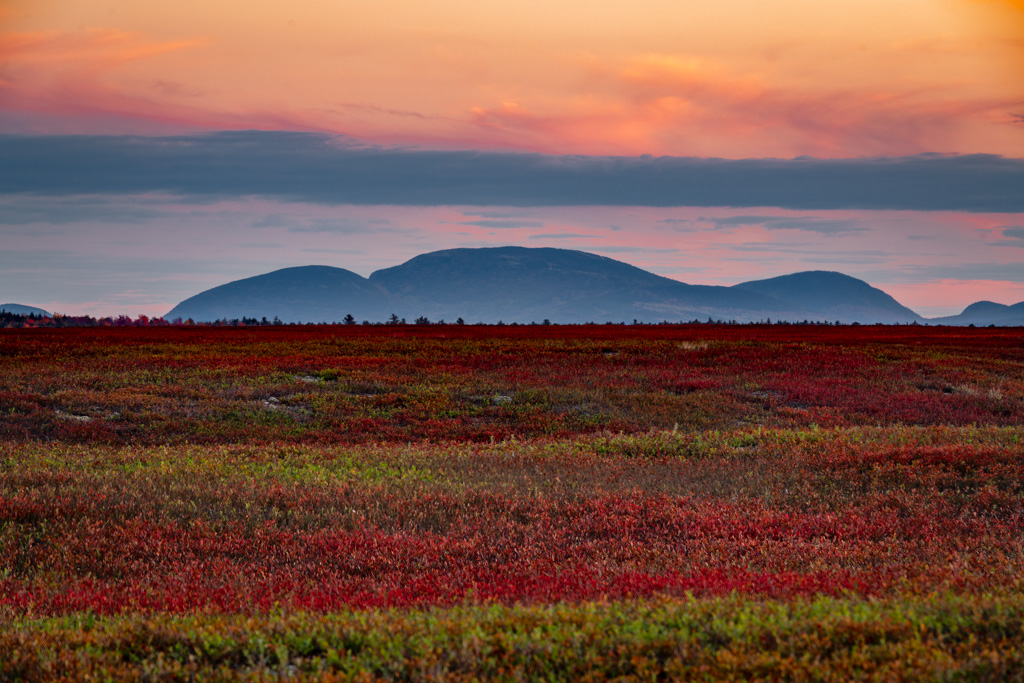
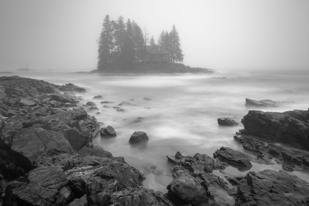
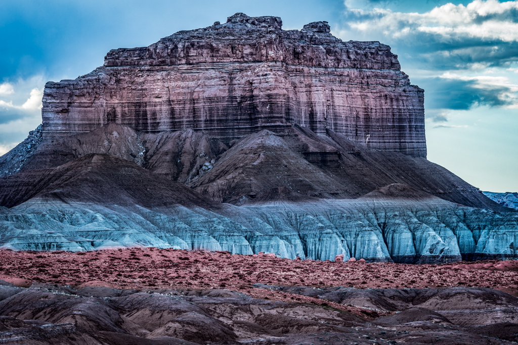
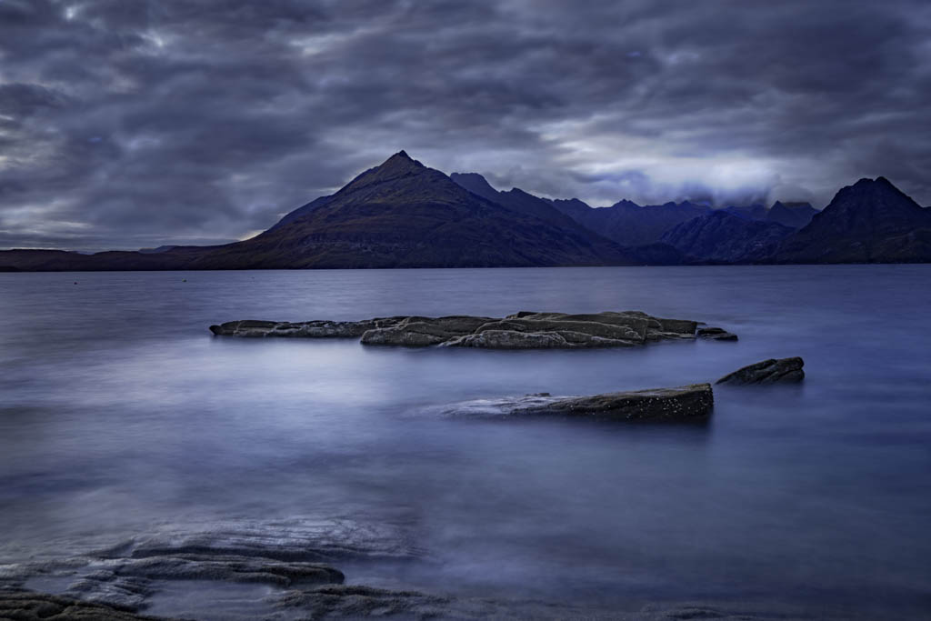
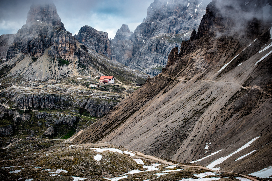
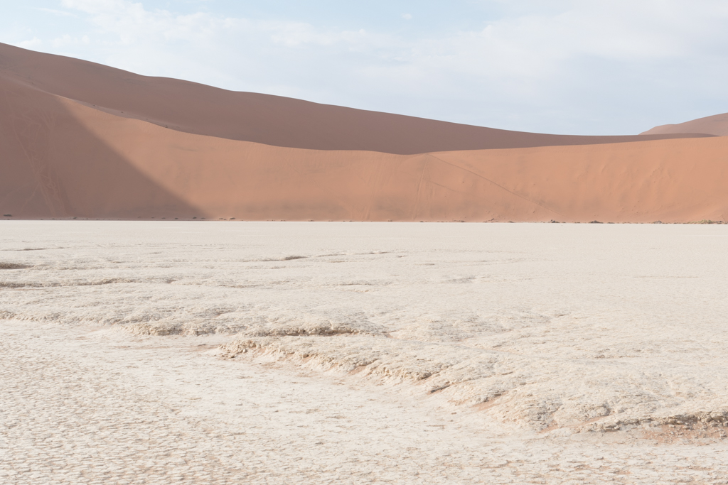
| 5 |
Jan 17 |
Comment |
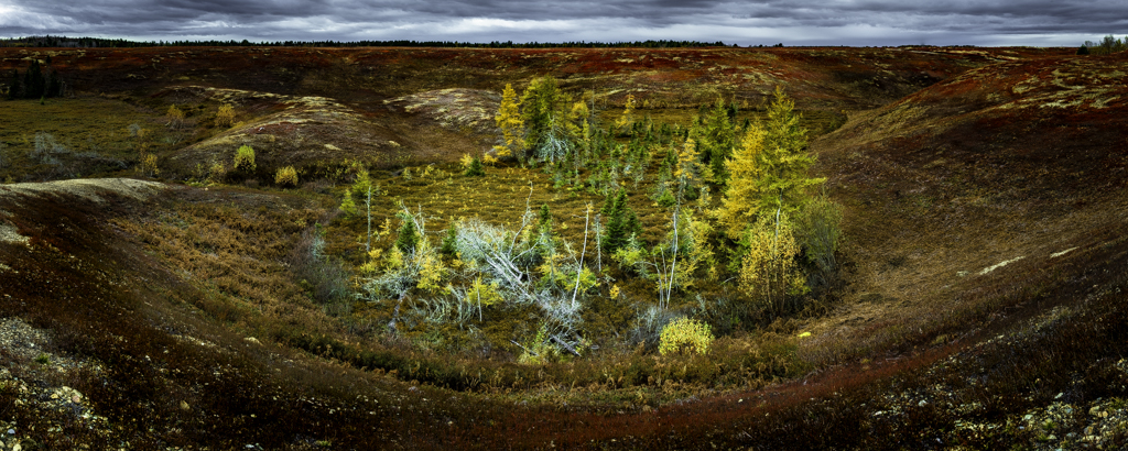
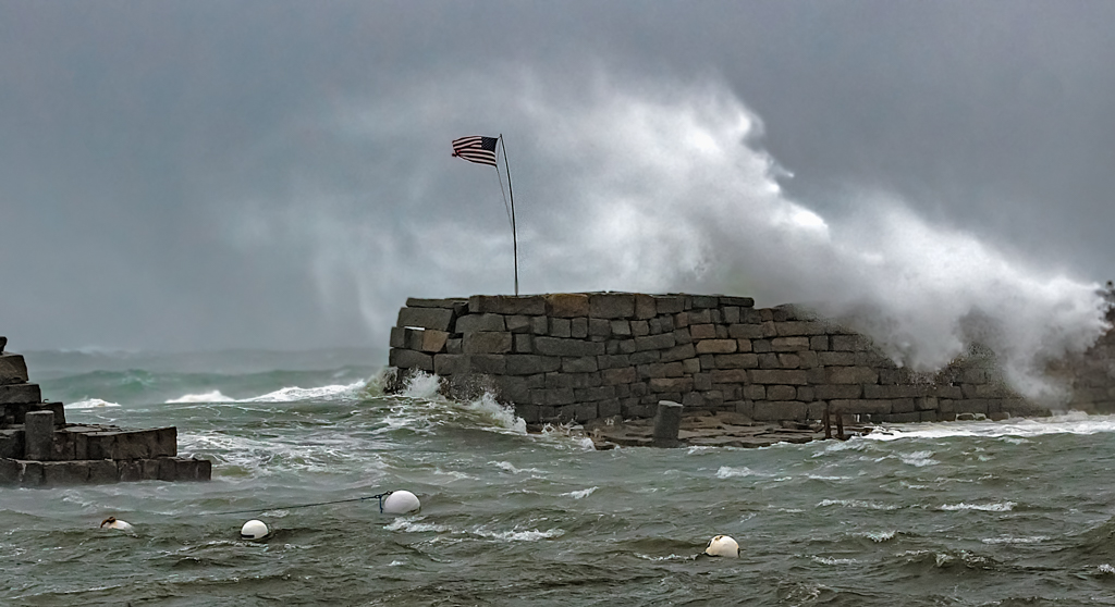
Here is a view of the clay pans in the desert |
Jan 6th |
 |
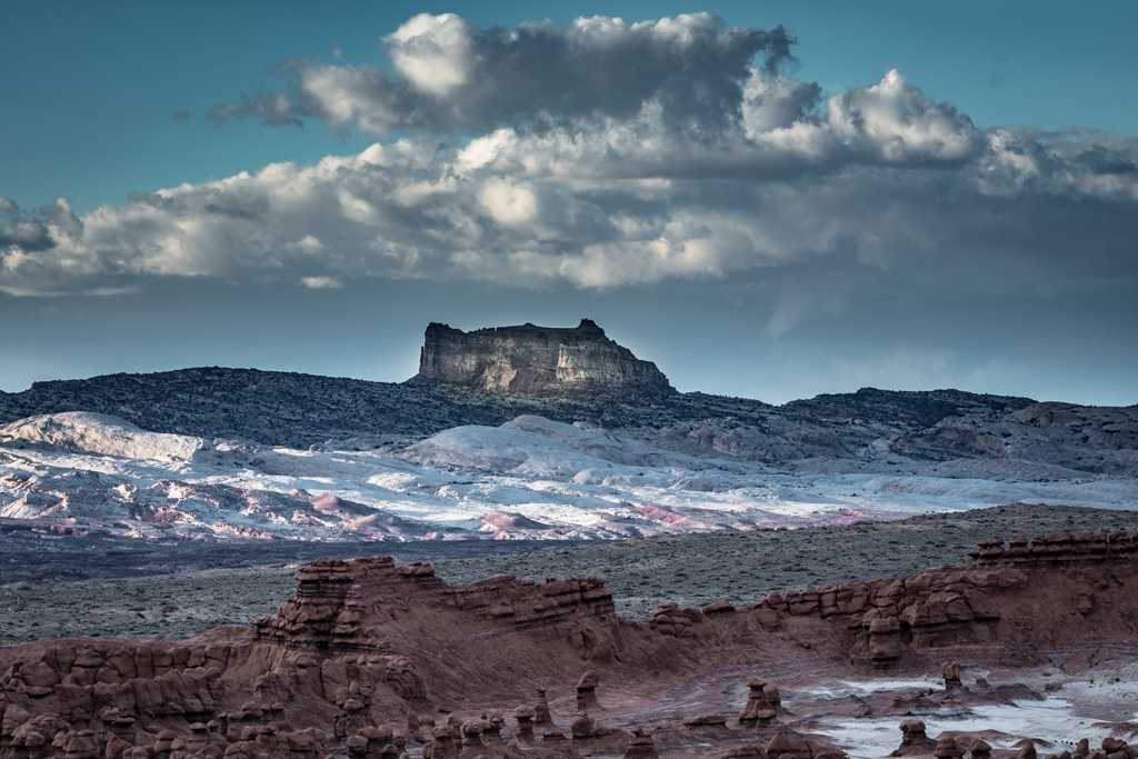
| 5 |
Jan 17 |
Comment |
Hi Barbara,
Thanks for you comments. I have copied the following definition from Wikipedia but they look like very bright sand from the air.
In geology, a claypan is a dense, compact, slowly permeable layer in the subsoil having a much higher clay content than the overlying material, from which it is separated by a sharply defined boundary. Claypans are usually hard when dry, and plastic and sticky when wet. They limit or slow the downward movement of water through the soil. |
Jan 6th |
| 5 |
Jan 17 |
Comment |
Hi Nick,
More imagination than I have,,, Good for you. I like the way that you have reduced the clarity on her legs as if you are looking at some distortion of the glass. Perhaps you might think of clearing up that distortion of her right hand and the lower part of her hair.
|
Jan 6th |
| 5 |
Jan 17 |
Comment |
Good Morning David,
I feel like you have truly caught an emotion be it exhaustion or sadness. I look at the histogram and although it does not show high key, I get the feeling of a relatively high key image. To my eye, something like a vignette around the subjects would add a different mood but I can see what you are trying to accomplish as an ethereal effect. |
Jan 6th |
| 5 |
Jan 17 |
Comment |
Good Morning Barbara,
I have looked over some of the comments from past months to see how your group works but I am going to put a little different twist on my comments. You clearly have technical competence in this image but I have no idea if you had an idea of what you wanted before you started or if you reacted to the filters as they came. I am curious about that. What struck me between the two images was balance versus tension. One of the ways that I think of tension is the moving away from balance in an image. I often think of a perfectly balance image as static or possibly boring. Frequently, as you move away from that perfectly balance image you can develop a continuum from more interesting to chaotic. Another way to look at that continuum is to consider at what point it becomes uncomfortable for the viewer. This is how I am looking at your three images. The original is very balanced (read boring) while the image on the left makes me uncomfortable. To my eye, the visual weight is too heavy to the left which also drives my eye to notice the black outer perimeter line located at 10 o'clock which seems to be too harsh an end. On the other hand, the center image has just enough out of balance elements to add some tension to make it interesting and in my eye a very pleasing image. |
Jan 6th |
8 comments - 4 replies for Group 5
|
8 comments - 4 replies Total
|